2.2 Histograms, Frequency Polygons, and Time Series Graphs
LEARNING OBJECTIVES
- Display data using an appropriate graph: histograms, frequency polygons, and time series graphs.
- Analyze and interpret data presented in a graph.
Histograms
For most of the work we do in this book, we will use a histogram to display the data. One advantage of a histogram is that it can readily display large data sets. A rule of thumb is to use a histogram when the data set consists of 100 values or more.
A histogram is a visual display of a frequency chart. It consists of contiguous, vertical boxes with both a horizontal axis and a vertical axis. The horizontal axis is labeled with the classes or categories from the frequency chart. The vertical axis is labeled either frequency or relative frequency (or percent frequency or probability). The graph will have the same shape with either label on the vertical axis but the scale on the vertical axis will be different. The histogram gives us the shape of the data, the center of the data, and the spread of the data.
Recall that the frequency is the number of times an observation falls into that particular class and the relative frequency is the frequency for the class divided by the total number of data values in the sample. For example, if three students in Mr. Ahab’s English class of 40 students received from 90% to 100%, then the frequency of the 90% to 100% class is 3 and the relative frequency is [latex]\displaystyle{\frac{3}{40}=0.075}[/latex]. So, 7.5% of the students received between 90% and 100%.
To construct a histogram, first decide how many bars or intervals, also called classes, represent the data. Many histograms consist of 5 to 15 bars or classes for clarity, but the number of bars is determined by the person constructing the histogram. Choose a starting point for the first class to be less than the smallest data value. A convenient starting point is a lower value carried out to one more decimal place than the value with the most decimal places. For example, if the value with the most decimal places is 6.1 and this is the smallest value, a convenient starting point is 6.05. We say that 6.05 has more precision. If the value with the most decimal places is 2.23 and the lowest value is 1.5, a convenient starting point is 1.495. If the value with the most decimal places is 3.234 and the lowest value is 1.0, a convenient starting point is 0.9995. If all the data happen to be integers and the smallest value is 2, then a convenient starting point is 1.5. Also, when the starting point and other boundaries are carried to one additional decimal place, no data value will fall on a boundary.
Watch this video: Histograms | Applying mathematical reasoning | Pre-algebra | Khan Academy by Khan Academy [6:07] (transcript available)
EXAMPLE
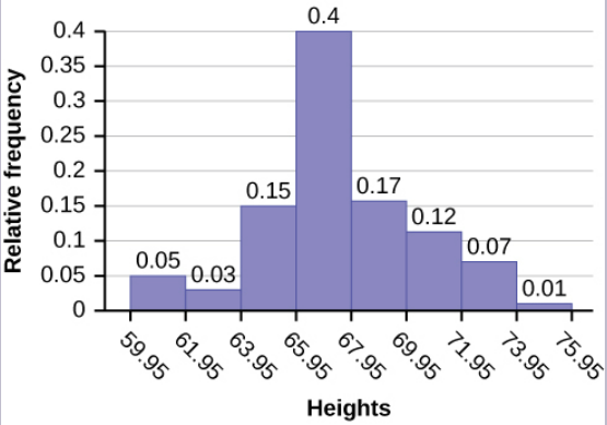
The following data are the heights (in inches to the nearest half inch) of 100 male semiprofessional soccer players. The heights are continuous data because height is a measurement.
| 60 | 64 | 64.5 | 66 | 66.5 | 67 | 67.5 | 69 | 70 | 71 |
| 60.5 | 64 | 64.5 | 66 | 66.5 | 67 | 67.5 | 69 | 70 | 71 |
| 61 | 64 | 64.5 | 66.5 | 66.5 | 67 | 67.5 | 69 | 70 | 72 |
| 61 | 64 | 66 | 66.5 | 67 | 67 | 68 | 69 | 70 | 72 |
| 61.5 | 64 | 66 | 66.5 | 67 | 67 | 68 | 69 | 70 | 72 |
| 63.5 | 64.5 | 66 | 66.5 | 67 | 67.5 | 69 | 69.5 | 70 | 72.5 |
| 63.5 | 64.5 | 66 | 66.5 | 67 | 67.5 | 69 | 69.5 | 70.5 | 72.5 |
| 63.5 | 64.5 | 66 | 66.5 | 67 | 67.5 | 69 | 69.5 | 70.5 | 73 |
| 64 | 64.5 | 66 | 66.5 | 67 | 67.5 | 69 | 69.5 | 70.5 | 73.5 |
| 64 | 64.5 | 66 | 66.5 | 67 | 67.5 | 69 | 69.5 | 71 | 74 |
The smallest data value is 60. Because the data with the most decimal places has one decimal (for instance, 61.5), we want our starting point to have two decimal places. Because the numbers 0.5, 0.05, 0.005, etc. are convenient numbers, use 0.05 and subtract it from 60, the smallest value, for the convenient starting point. Then the starting point is, then, [latex]60-0.05=59.95[/latex]. The largest value is [latex]74[/latex], so [latex]74 + 0.05 = 74.05[/latex] is the ending value.
Next, calculate the width of each bar or class interval. To calculate this width, subtract the starting point from the ending value and divide by the number of classes (you must decide how many classes you want). Suppose we want to have eight classes.
[latex]\displaystyle{\mbox{Class Width}=\frac{74.05-59.95}{8}=1.76}[/latex]
We will round up to two and make each bar or class interval two units wide. Rounding up to two is one way to prevent a value from falling on a boundary. Rounding to the next number is often necessary even if it goes against the standard rules of rounding. For this example, using 1.76 as the width would also work.
The boundaries for the classes are:
[latex]\begin{eqnarray*} 59.95 \\ 59.95+2 & = & 61.95 \\61.95+2 & = & 63.95 \\ 63.95+2 & = & 65.95 \\ 65.95+2 & = & 67.95 \\ 67.95+2 & = & 69.95 \\ 69.95+2 & = & 71.95 \\ 71.95+2 & = & 73.95 \\ 73.95+2 & = & 75.95\end{eqnarray*}[/latex]
The heights 60 through 61.5 inches are in the first class 59.95–61.95. The heights that are 63.5 are in the second class 61.95–63.95. The heights that are 64 through 64.5 are in the third class 63.95–65.95. The heights 66 through 67.5 are in the fourth class 65.95–67.95. The heights 68 through 69.5 are in the fifth class 67.95–69.95. The heights 70 through 71 are in the sixth class 69.95–71.95. The heights 72 through 73.5 are in the seventh class 71.95–73.95. The height 74 is in the last class 73.95–75.95.
The following histogram displays the heights on the [latex]x[/latex]-axis and relative frequency on the [latex]y[/latex]-axis.
NOTE
A guideline that is followed by some for the width of a bar or class interval is to take the square root of the number of data values and then round to the nearest whole number, if necessary. For example, if there are 150 values of data, take the square root of 150 and round to 12 bars or classes.
TRY IT
The following data are the shoe sizes of 50 male students. The sizes are continuous data since shoe size is measured. Construct a histogram and calculate the width of each bar or class interval. Suppose you choose six bars.
| 9 | 9 | 9.5 | 9.5 | 10 | 10 | 10 | 10 | 10 | 10 |
| 10.5 | 10.5 | 10.5 | 10.5 | 10.5 | 10.5 | 10.5 | 10.5 | 11 | 11 |
| 11 | 11 | 11 | 11 | 11 | 11 | 11 | 11 | 11 | 11 |
| 11 | 11.5 | 11.5 | 11.5 | 11.5 | 11.5 | 11.5 | 11.5 | 12 | 12 |
| 12 | 12 | 12 | 12 | 12 | 12.5 | 12.5 | 12.5 | 12.5 | 14 |
Click for the Solution
- Smallest value: [latex]9[/latex]
- Largest value: [latex]14[/latex]
- Convenient starting value: [latex]9 – 0.05 = 8.95[/latex]
- Convenient ending value: [latex]14 + 0.05 = 14.05[/latex]
- Class width: [latex]\displaystyle{\frac{14.05-8.95}{6}=0.85}[/latex]
The calculations suggest using [latex]0.85[/latex] as the width of each bar or class interval. You can also use an interval with a width equal to one.
EXAMPLE
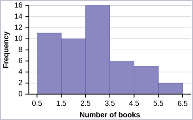
The following data are the number of books bought by 50 part-time college students at ABC College. The number of books is discrete data because books are counted.
| 1 | 1 | 1 | 1 | 1 | 1 | 1 | 1 | 1 | 1 |
| 1 | 2 | 2 | 2 | 2 | 2 | 2 | 2 | 2 | 2 |
| 2 | 3 | 3 | 3 | 3 | 3 | 3 | 3 | 3 | 3 |
| 3 | 3 | 3 | 3 | 3 | 3 | 3 | 4 | 4 | 4 |
| 4 | 4 | 4 | 5 | 5 | 5 | 5 | 5 | 6 | 6 |
Eleven students buy one book. Ten students buy two books. Sixteen students buy three books. Six students buy four books. Five students buy five books. Two students buy six books.
Because the data are integers, subtract 0.5 from 1, the smallest data value and add 0.5 to 6, the largest data value to get the starting and ending point. Then the starting point is 0.5 and the ending value is 6.5.
Next, calculate the width of each bar or class interval. If the data are discrete and there are not too many different values, a width that places the data values in the middle of the bar or class interval is the most convenient. Because the data consist of the numbers 1, 2, 3, 4, 5, 6 and the starting point is 0.5, a width of one places the 1 in the middle of the interval from 0.5 to 1.5, the 2 in the middle of the interval from 1.5 to 2.5, the 3 in the middle of the interval from 2.5 to 3.5, the 4 in the middle of the interval from _______ to _______, the 5 in the middle of the interval from _______ to _______, and the _______ in the middle of the interval from _______ to _______ .
Solution:
- 3.5 to 4.5
- 4.5 to 5.5
- 6
- 5.5 to 6.5
Calculate the number of bars as follows:
[latex]\begin{eqnarray*}\frac{6.5-0.5}{\mbox{number of bars}}& = & 1 \end{eqnarray*}[/latex]
where 1 is the width of a bar. Therefore, the number of bars is 6.
The following histogram displays the number of books on the [latex]x[/latex]-axis and the frequency on the [latex]y[/latex]-axis.
CREATING A FREQUENCY DISTRIBUTION AND HISTOGRAM IN EXCEL
In order to create a frequency distribution and its corresponding histogram in Excel, we need to use the Analysis ToolPak. Follow these instructions to add the Analysis ToolPak.
- Enter your data into a worksheet.
- Determine the classes for the frequency distribution. Using these classes, create a Bin column that contains the upper limit for each class.
- Go to the Data tab and click on Data Analysis. If you do not see Data Analysis in the Data tab, you will need to install the Analysis ToolPak.
- In the Data Analysis window, select Histogram. Click OK.
- In the Input range, enter the cell range for the data.
- In the Bin range, enter the cell range for the Bin column.
- Select the location where you want the output to appear.
- Select Chart Output to produce the corresponding histogram for the frequency distribution.
- Click OK.
This website provides additional information on using Excel to create a frequency distribution.
NOTE
The histogram produced by Excel uses the frequency column from the frequency table on the vertical axis, not the relative frequency column.
Watch this video: Frequency Distributions by Joshua Emmanuel [8:40] (transcript available).
Watch this video: How to Construct a Histogram in Excel Using Data Analysis by Joshua Emmanuel [1:58] (transcript available).
TRY IT
The following data are the number of sports played by 50 student athletes. The number of sports is discrete data because sports are counted.
| 1 | 1 | 1 | 1 | 1 | 1 | 1 | 1 | 1 | 1 |
| 1 | 1 | 1 | 1 | 1 | 1 | 1 | 1 | 1 | 1 |
| 2 | 2 | 2 | 2 | 2 | 2 | 2 | 2 | 2 | 2 |
| 2 | 2 | 2 | 2 | 2 | 2 | 2 | 2 | 2 | 2 |
| 2 | 2 | 3 | 3 | 3 | 3 | 3 | 3 | 3 | 3 |
Fill in the blanks for the following sentence. Because the data consist of the numbers 1, 2, 3, and the starting point is 0.5, a width of one places the 1 in the middle of the interval 0.5 to _____, the 2 in the middle of the interval from _____ to _____, and the 3 in the middle of the interval from _____ to _____.
Click to see Solution
- 1.5
- 1.5 to 2.5
- 2.5 to 3.5
EXAMPLE
Using this data set, construct a histogram.
| Number of Hours My Classmates Spent Playing Video Games on Weekends | ||||
| 9.95 | 10 | 2.25 | 16.75 | 0 |
| 19.5 | 22.5 | 7.5 | 15 | 12.75 |
| 5.5 | 11 | 10 | 20.75 | 17.5 |
| 23 | 21.9 | 24 | 23.75 | 18 |
| 20 | 15 | 22.9 | 18.8 | 20.5 |
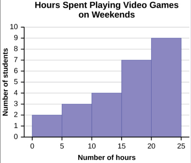
Some values in this data set fall on boundaries for the class intervals. A value is counted in a class interval if it falls on the left boundary, but not if it falls on the right boundary. Different researchers may set up histograms for the same data in different ways. There is more than one correct way to set up a histogram.
Frequency Polygons
Associated with frequency charts and histograms, frequency polygons are line graphs with the classes on the horizontal axis, frequency on the vertical axis, and the frequencies plotted against the midpoint of the class interval. As with histograms, start by examining the data and decide on the classes, using similar techniques as discussed above. Find the frequency for each class. Plot the classes on the [latex]x[/latex]-axis and the frequency on [latex]y[/latex]-axis. For each class, add a point on the graph with the [latex]x[/latex]-coordinate equal to the class midpoint and the [latex]y[/latex]-coordinate equal to the frequency of the class. Add points on the horizontal axis at the midpoint of the class before the first class and at the midpoint of the class after the last class. After all the points are plotted, draw line segments to connect them. Frequency polygons are useful for comparing distributions. This is achieved by overlaying the frequency polygons drawn for different data sets.
EXAMPLE
A frequency polygon was constructed from the frequency table below.
| Frequency Distribution for Calculus Final Test Scores | ||
| Lower Bound | Upper Bound | Frequency |
| 49.5 | 59.5 | 5 |
| 59.5 | 69.5 | 10 |
| 69.5 | 79.5 | 30 |
| 79.5 | 89.5 | 40 |
| 89.5 | 99.5 | 15 |
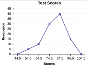
The first label on the [latex]x[/latex]-axis is 44.5. This represents an interval extending from 39.5 to 49.5. Because the lowest test score is 54.5, this interval is used only to allow the graph to touch the [latex]x[/latex]-axis. The point labeled 54.5 represents the next interval, or the first “real” interval from the table, and contains five scores. This reasoning is followed for each of the remaining intervals with the point 104.5 representing the interval from 99.5 to 109.5. Again, this interval contains no data and is only used so that the graph will touch the [latex]x[/latex]-axis. Looking at the graph, we say that this distribution is skewed because one side of the graph does not mirror the other side.
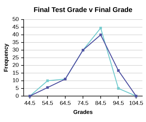
EXAMPLE
We will construct an overlay frequency polygon comparing the scores with the students’ final numeric grade.
| Frequency Distribution for Calculus Final Test Scores | ||
| Lower Bound | Upper Bound | Frequency |
| 49.5 | 59.5 | 5 |
| 59.5 | 69.5 | 10 |
| 69.5 | 79.5 | 30 |
| 79.5 | 89.5 | 40 |
| 89.5 | 99.5 | 15 |
| Frequency Distribution for Calculus Final Grades |
||
| Lower Bound | Upper Bound | Frequency |
| 49.5 | 59.5 | 10 |
| 59.5 | 69.5 | 10 |
| 69.5 | 79.5 | 30 |
| 79.5 | 89.5 | 45 |
| 89.5 | 99.5 | 5 |
Time Series Graphs
Suppose that we want to study the temperature range of a region for an entire month. Every day at noon we note the temperature and write this down in a log. A variety of statistical studies could be done with this data. We could find the mean or the median temperature for the month. We could construct a histogram displaying the number of days that temperatures reach a certain range of values. However, all of these methods ignore a portion of the data that we have collected.
One feature of the data that we may want to consider is that of time. Because each date is paired with the temperature reading for the day, we do not have to think of the data as being random. We can instead use the times given to impose a chronological order on the data. A graph that recognizes this ordering and displays the changing temperature as the month progresses is called a time series graph.
To construct a time series graph, we must look at both pieces of our paired data set. We start with a standard Cartesian coordinate system. The horizontal axis is used to plot the date or time increments and the vertical axis is used to plot the values of the variable that we are measuring. By doing this, we make each point on the graph correspond to a date and a measured quantity. The points on the graph are typically connected by straight lines in the order in which they occur.
EXAMPLE
The following data shows the Annual Consumer Price Index, each month, for ten years. Construct a time series graph for the Annual Consumer Price Index data only.
| Year | Jan | Feb | Mar | Apr | May | Jun | Jul |
| 2003 | 181.7 | 183.1 | 184.2 | 183.8 | 183.5 | 183.7 | 183.9 |
| 2004 | 185.2 | 186.2 | 187.4 | 188.0 | 189.1 | 189.7 | 189.4 |
| 2005 | 190.7 | 191.8 | 193.3 | 194.6 | 194.4 | 194.5 | 195.4 |
| 2006 | 198.3 | 198.7 | 199.8 | 201.5 | 202.5 | 202.9 | 203.5 |
| 2007 | 202.416 | 203.499 | 205.352 | 206.686 | 207.949 | 208.352 | 208.299 |
| 2008 | 211.080 | 211.693 | 213.528 | 214.823 | 216.632 | 218.815 | 219.964 |
| 2009 | 211.143 | 212.193 | 212.709 | 213.240 | 213.856 | 215.693 | 215.351 |
| 2010 | 216.687 | 216.741 | 217.631 | 218.009 | 218.178 | 217.965 | 218.011 |
| 2011 | 220.223 | 221.309 | 223.467 | 224.906 | 225.964 | 225.722 | 225.922 |
| 2012 | 226.665 | 227.663 | 229.392 | 230.085 | 229.815 | 229.478 | 229.104 |
| Year | Aug | Sep | Oct | Nov | Dec | Annual |
| 2003 | 184.6 | 185.2 | 185.0 | 184.5 | 184.3 | 184.0 |
| 2004 | 189.5 | 189.9 | 190.9 | 191.0 | 190.3 | 188.9 |
| 2005 | 196.4 | 198.8 | 199.2 | 197.6 | 196.8 | 195.3 |
| 2006 | 203.9 | 202.9 | 201.8 | 201.5 | 201.8 | 201.6 |
| 2007 | 207.917 | 208.490 | 208.936 | 210.177 | 210.036 | 207.342 |
| 2008 | 219.086 | 218.783 | 216.573 | 212.425 | 210.228 | 215.303 |
| 2009 | 215.834 | 215.969 | 216.177 | 216.330 | 215.949 | 214.537 |
| 2010 | 218.312 | 218.439 | 218.711 | 218.803 | 219.179 | 218.056 |
| 2011 | 226.545 | 226.889 | 226.421 | 226.230 | 225.672 | 224.939 |
| 2012 | 230.379 | 231.407 | 231.317 | 230.221 | 229.601 | 229.594 |
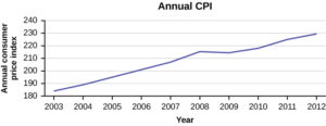
Time series graphs are important tools in various applications of statistics. When recording values of the same variable over an extended period of time, sometimes it is difficult to discern any trend or pattern. However, once the same data points are displayed graphically, some features jump out. Time series graphs make trends easy to spot.
Concept Review
A histogram is a graphic version of a frequency distribution. The graph consists of bars of equal width drawn adjacent to each other. The horizontal scale represents classes of quantitative data values and the vertical scale represents frequencies or relative frequencies. The heights of the bars correspond to frequency or relative frequency values. Histograms are typically used for large, continuous, quantitative data sets.
A frequency polygon can also be used when graphing large data sets with data points that repeat. The data usually goes on the [latex]x[/latex]-axis with the frequency being graphed on the [latex]y[/latex]-axis.
Time series graphs can be helpful when looking at large amounts of data for one variable over a period of time.
Attribution
“2.2 Histograms, Frequency Polygons, and Time Series Graphs“ in Introductory Statistics by OpenStax is licensed under a Creative Commons Attribution 4.0 International License.
