12.3 Scatter Diagrams
LEARNING OBJECTIVES
- Define independent and dependent variables.
- Create and analyze scatter diagrams.
Independent and Dependent Variables
An independent variable (or the [latex]x[/latex]-variable) is called the explanatory or predictor variable. The independent variable is used for prediction and provides the basis for estimation. The independent variable may be thought of as the input value and is used to determine the output value (the value of the dependent variable).
A dependent variable (or the [latex]y[/latex]-variable) is called the response or outcome variable. The dependent variable is the variable being predicted or estimated based on the value of the independent variable. The dependent variable may be thought of as the output value and is determined by the input value (the value of the independent variable).
EXAMPLE
Svetlana tutors to make extra money for college. For each tutoring session, she charges a one-time fee of $25 plus $25 per hour of tutoring. Here, there are two variables: the number of hours per session and the amount of money earned per session.
- The number of hours per session is the independent variable because it can be used to predict the value of the other variable (the amount of money earned per session).
- The amount of money earned per session is the dependent variable because its value can be determined from the value of the other variable (the number of hours per session).
Scatter Diagrams
Before we begin the discussion about correlation and linear regression, we need to consider ways to display the relationship between the independent variable [latex]x[/latex] and the dependent variable [latex]y[/latex]. The most common and easiest way to illustrate the relationship between the two variables is with a scatter diagram.
A scatter diagram (or scatter plot) is a graphical presentation of the relationship between two numerical variables. Each point on the scatter diagram represents the values of two variables. The [latex]x[/latex]-coordinate is the value of the independent variable and the [latex]y[/latex]-coordinate is the value of the corresponding dependent variable.
To construct a scatter diagram:
- Identify the independent and dependent variables.
- Assign the independent variable to the horizontal or [latex]x[/latex]-axis. Assign the dependent variable to the vertical or [latex]y[/latex]-axis.
- Plot the points on an [latex](x,y)[/latex]-grid.
- Label the axes, including both the variable names and units.
- Include a chart title. A common chart title is independent variable vs dependent variable, using the actual names of the variables.
EXAMPLE
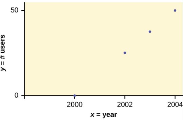
In Europe and Asia, m-commerce is popular. M-commerce users have special mobile phones that work like electronic wallets as well as provide phone and internet services. Users can do everything from paying for parking to buying a TV set or soda from a machine to banking to checking sports scores on the internet. Data for the number of user from years 2000 through 2004 is given in the table below.
| Year | Number of Users (in millions) |
| 2000 | 0.5 |
| 2002 | 20.0 |
| 2003 | 33.0 |
| 2004 | 47.0 |
Which variable is the independent variable? Which variable is the dependent variable? Construct a scatter diagram for this data.
Solution:
- The year is the independent variable because it can be used to predict the value of the other variable (the number of users).
- The number of users is the dependent variable because its value can be determined from the value of the other variable (year).
TRY IT
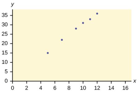
Amelia plays basketball for her high school. She wants to improve her play so she can compete at the college level. The table below records the number of hours she spends practicing her jump shot before a game and the number of points she scored in the following game.
| Hours Spent Practicing Jump Shot | Points Scored in Game |
| 5 | 15 |
| 7 | 22 |
| 9 | 28 |
| 10 | 31 |
| 11 | 33 |
| 12 | 36 |
Which variable is the independent variable? Which variable is the dependent variable? Construct a scatter diagram for this data.
Click to see Solution
- The hours spent practicing jump shot is the independent variable because it can be used to predict the value of the other variable (points scored in game).
- The points scored in game is the dependent variable because its value can be determined from the value of the other variable (hours spent practicing jump shot).
CONSTRUCTING A SCATTER DIAGRAM IN EXCEL
To create a scatter diagram in Excel:
- Identify the independent and dependent variables.
- If necessary, rearrange the columns so that the column containing the independent variable data is on the left and the dependent variable is on the right. (Excel always places the variable on the left on the horizontal axis.)
- Go to the Insert tab. In the Charts group, click on Scatter. Select the scatter diagram with only markers (points).
- Using the chart tools, add axis titles, including both the variable names and units on the axes.
- Using the chart tools, add a chart title. A common chart title is independent variable vs dependent variable, using the actual names of the variables.
Visit the Microsoft page for more information about creating a scatter diagram in Excel.
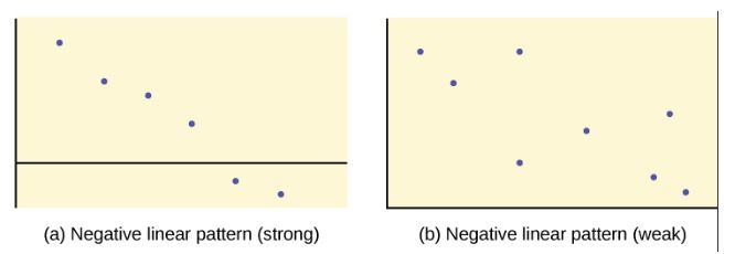
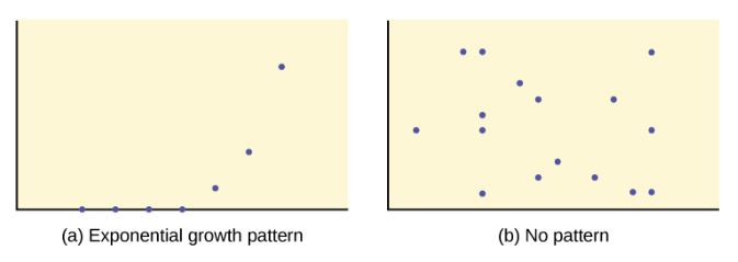
We can determine the strength of the relationship by looking at the scatter diagram to see how close the points are to a line, a power function, an exponential function, or to some other type of function. The stronger the relationship, the better the corresponding regression model (linear, exponential, etc.) will be a predicting values of the dependent variable.
When we look at a scatter diagram, we want to notice the overall pattern and any deviations from the pattern. The scatter diagrams shown below illustrate these concepts.
In this chapter, we are only concerned with the strength and direction of the linear relationship between the independent and dependent variables. In the next section, we will learn about a numerical measure, the correlation coefficient, that measures the strength and direction of the linear relationship.
Because linear patterns are quite common, we are interested in scatter diagrams that show a linear pattern. The linear relationship is strong if the points are close to a straight line, except in the case of a horizontal line where there is no relationship. If a scatter diagram shows a linear relationship, we would like to create a model based on this apparent linear relationship. This model is constructed through a process called simple linear regression. However, we only calculate a regression line if one of the variables, [latex]x[/latex], helps to explain or predict the other variable, [latex]y[/latex]. If [latex]x[/latex] is the independent variable and [latex]y[/latex] is the dependent variable, then we can use a regression line to predict a value for [latex]y[/latex] for a given value of [latex]x[/latex].
Watch this video: Introduction to Linear Regression and Scatter Diagrams by ExcelIsFun [15:45]
Concept Review
Scatter diagrams are particularly helpful graphs when we want to see if there is a linear relationship between two variables. They indicate both the direction of the relationship between the independent variable [latex]x[/latex] and the dependent variable [latex]y[/latex], and the strength of the relationship.
Attribution
“12.2 Scatter Plots“ in Introductory Statistics by OpenStax is licensed under a Creative Commons Attribution 4.0 International License.


