12.4 Correlation
LEARNING OBJECTIVES
- Calculate and interpret the correlation coefficient.
The purpose of simple linear regression is to build a linear model that can be used to make predictions for the [latex]y[/latex] variable for given value of the [latex]x[/latex] variable. Of course, we want the model to give us good predictions—there is no point in using a model that gives bad or inaccurate predictions. But how can we tell if the linear model will provide accurate predictions? As we have seen, we can examine the scatter diagram for a set of data to get a sense of the strength and direction of the linear relationship between the independent variable [latex]x[/latex] and the dependent variable [latex]y[/latex]. But we would like a numerical measure of the strength and direction of the linear relationship we observe on the scatter diagram. This numerical measure is called the correlation coefficient.
The correlation coefficient was developed by Karl Pearson in the early 1900s, and is sometimes referred to as Pearson’s correlation coefficient. Denoted by [latex]r[/latex], the correlation coefficient is a numerical measure of the strength and direction of the linear relationship between the independent variable [latex]x[/latex] and the dependent variable [latex]y[/latex]. Although there is an algebraic formula to find the value of [latex]r[/latex], we will perform the calculation using the built-in function in Excel.
Interpreting the Correlation Coefficient
The value of [latex]r[/latex]:
- The value of the correlation coefficient [latex]r[/latex] is always a number between [latex]-1[/latex] and [latex]1[/latex].
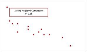
- Values of [latex]r[/latex] close to [latex]1[/latex] or [latex]-1[/latex] indicate a strong linear relationship between [latex]x[/latex] and [latex]y[/latex]. If [latex]r=1[/latex], then there is a perfect, positive correlation between [latex]x[/latex] and [latex]y[/latex], in which case the points on the scatter diagram would all lie on a straight line that rises from left to right. If [latex]r=-1[/latex], then there is a perfect, negative correlation between [latex]x[/latex] and [latex]y[/latex], in which case the points on the scatter diagram would all line on a straight line that falls from left to right.
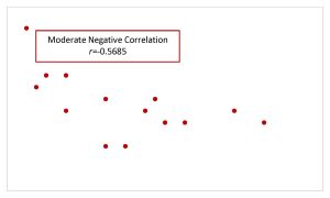
- Values of [latex]r[/latex] close to [latex]0.5[/latex] or [latex]-0.5[/latex] indicate a moderate linear relationship between [latex]x[/latex] and [latex]y[/latex].
- Values of [latex]r[/latex] close to 0 indicate a negative linear relationship between [latex]x[/latex] and [latex]y[/latex]. If [latex]r=0[/latex], then there is no correlation between [latex]x[/latex] and [latex]y[/latex].
The sign of [latex]r[/latex]:
- A positive value of [latex]r[/latex] means that the points on the scatter diagram have the general tendency to rise from left to right. In other words, when [latex]x[/latex] increases, [latex]y[/latex] tends to increase and when [latex]x[/latex] decreases, [latex]y[/latex] tends to decrease.
- A negative value of [latex]r[/latex] means that the points on the scatter diagram have the general tendency to fall from left to right. In other words, when [latex]x[/latex] increases, [latex]y[/latex] tends to decrease and when [latex]x[/latex] decreases, [latex]y[/latex] tends to increase.
| Positive Correlation | Negative Correlation | |
| Strong Correlation | 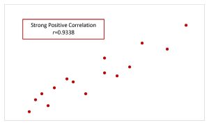 |
 |
| Moderate Correlation | 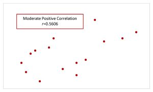 |
 |
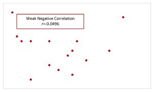
| Weak Correlation | 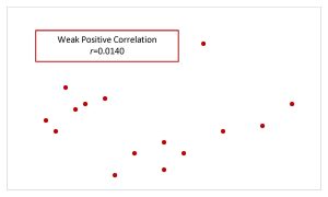 |
 |
CALCULATING THE CORRELATION COEFFICIENT IN EXCEL
To calculate the correlation coefficient, use the correl(array,array) function. Enter the cell array containing the independent variable data into one of the arrays and enter the cell array containing the dependent variable data into the other array.
The output from the correl function is the value of the correlation coefficient.
Visit the Microsoft page for more information about the correl function.
NOTE
The arrays containing the independent and dependent variable data may be entered into the correl function in either order. The output from the correl function does not depend on the order in which the arrays are entered.
EXAMPLE
A statistics professor wants to study the relationship between a student’s score on the third exam in the course and their final exam score. The professor took a random sample of 11 students and recorded their third exam score (out of 80) and their final exam score (out of 200). The results are recorded in the table below.
| Student | Third Exam Score | Final Exam Score |
| 1 | 65 | 175 |
| 2 | 67 | 133 |
| 3 | 71 | 185 |
| 4 | 71 | 163 |
| 5 | 66 | 126 |
| 6 | 75 | 198 |
| 7 | 67 | 153 |
| 8 | 70 | 163 |
| 9 | 71 | 159 |
| 10 | 69 | 151 |
| 11 | 69 | 159 |
- Find the correlation coefficient for this data.
- Interpret the correlation coefficient found in part 1.
Solution:
- Enter the data into an Excel spreadsheet. For this example, suppose we entered the data (without the column headings) so that the student column is in column A from A1 to A11, the third exam score is in column B from B1 to B11, and the final exam score is in column C from C1 to C11.
Function correl Answer Field 1 B1:B11 0.6631 Field 2 C1:C11 The value of the correlation coefficient is [latex]r=0.6631[/latex].
By examining the scatter diagram for this data, shown below, we can see that the points are rising from left to right (corresponding to the fact that [latex]r[/latex] is positive) and the general pattern of points corresponds to a moderate linear relationship (corresponding to the fact that [latex]r[/latex] is close to [latex]0.5[/latex]).

- There is a moderate, positive linear relationship between the third test score and the final exam score.
NOTES
- In this case the value of [latex]r[/latex] is close to [latex]0.5[/latex], so we would consider this a moderate linear relationship.
- When writing down the interpretation of the correlation coefficient, remember to be specific to the question using the actual names of the independent and dependent variables. Also make sure to include in the sentence the strength of the linear relationship (strong, moderate, or weak) and the direction of the linear relationship (positive or negative).
TRY IT
SCUBA divers have maximum dive times they cannot exceed when going to different depths. The data in the table below shows different depths with the maximum dive times in minutes.
| Depth (in feet) | Maximum Dive Time (in minutes) |
| 50 | 80 |
| 60 | 55 |
| 70 | 45 |
| 80 | 35 |
| 90 | 25 |
| 100 | 22 |
- Find the correlation coefficient for this data.
- Interpret the correlation coefficient found in part 1.
Click to see Solution
- [latex]\displaystyle{r=-0.9629}[/latex]
- There is a strong, negative linear relationship between depth and maximum dive time.
Correlation versus Causation
The correlation coefficient only measures the correlation between two variables, not causation. A strong correlation between two variables does not mean that changes in one variable actually cause changes in the other variable. The correlation coefficient can only tell us that changes in the independent variable and dependent variable are related. In general remember “correlation does not equal causation.”
Watch this video: Using Excel to Calculate a Correlation Coefficient by Matt Macarty [5:21]
Concept Review
The correlation coefficient [latex]r[/latex] measures the strength and direction of the linear relationship between [latex]x[/latex] and [latex]y[/latex]. The value of [latex]r[/latex] is between [latex]–1[/latex] and [latex]1[/latex]. When [latex]r[/latex] is positive, the values of [latex]x[/latex] and [latex]y[/latex] will tend to increase and decrease together. When [latex]r[/latex] is negative, [latex]x[/latex] will increase and [latex]y[/latex] will decrease, or the opposite, [latex]x[/latex]will decrease and [latex]y[/latex] will increase.
Attribution
“12.3 The Regression Equation“ and “12.4 Testing the Significance of the Correlation Coefficient“ in Introductory Statistics by OpenStax is licensed under a Creative Commons Attribution 4.0 International License.
