3.8 – Demand, Supply, and Efficiency
Learning Objectives
- Contrast consumer surplus, producer surplus, and social surplus
- Explain why price floors and price ceilings can be inefficient
- Analyze demand and supply as a social adjustment mechanism
The familiar demand and supply diagram holds within it the concept of economic efficiency. One typical way that economists define efficiency is when it is impossible to improve the situation of one party without imposing a cost on another. Conversely, if a situation is inefficient, it becomes possible to benefit at least one party without imposing costs on others.
Efficiency in the demand and supply model has the same basic meaning: The economy is getting as much benefit as possible from its scarce resources and all the possible gains from trade have been achieved. In other words, the optimal amount of each good and service is produced and consumed.
Consumer Surplus, Producer Surplus, Social Surplus
Consider a market for tablet computers, as Figure 3.8a shows. The equilibrium price is $80 and the equilibrium quantity is 28 million. To see the benefits to consumers, look at the segment of the demand curve above the equilibrium point and to the left. This portion of the demand curve shows that at least some demanders would have been willing to pay more than $80 for a tablet.
For example, point J shows that if the price were $90, 20 million tablets would be sold. Those consumers who would have been willing to pay $90 for a tablet based on the utility they expect to receive from it, but who were able to pay the equilibrium price of $80, clearly received a benefit beyond what they had to pay. Remember, the demand curve traces consumers’ willingness to pay for different quantities. The amount that individuals would have been willing to pay, minus the amount that they actually paid, is called consumer surplus. Consumer surplus is the area labeled F—that is, the area above the market price and below the demand curve.
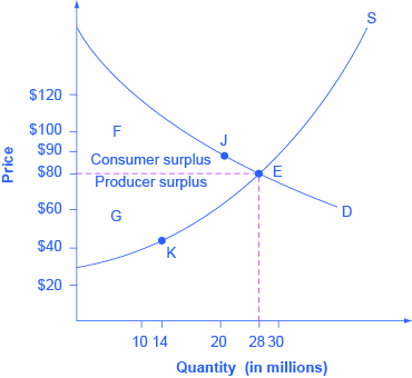
Figure 3.8a Consumer and Producer Surplus (Text Version)
The vertical axis is Price ($) in $20 increments and the horizontal axis is Quantity (in millions) in increments of 2. Supply curve (S) is curved sloping from left to right. The demand curve (D) is curved and slopes downward left to right. The Supply curve (S) and demand curve (D) intersects at Point E (28 million quantity, $80).
The dotted line running from Point E to the vertical axis price at $80 denotes the space for consumer surplus (F) and Producer surplus (G). Consumer surplus (F) occurs the left of point E above $80 and below the where the demand curve (D) slopes downward. Producer surplus (G) occurs the left of point E below $80 and above the where the supply curve (D) slopes upwards.
Point K (14 million quantity, $45) occurs earlier in the supply curve (S).
Point J (20 million quantity, $90) occurs along the demand curve (D).
Figure 3.23 Consumer and Producer Surplus The somewhat triangular area labeled by F shows the area of consumer surplus, which shows that the equilibrium price in the market was less than what many of the consumers were willing to pay. Point J on the demand curve shows that, even at the price of $90, consumers would have been willing to purchase a quantity of 20 million. The somewhat triangular area labeled by G shows the area of producer surplus, which shows that the equilibrium price received in the market was more than what many of the producers were willing to accept for their products. For example, point K on the supply curve shows that at a price of $45, firms would have been willing to supply a quantity of 14 million.
The supply curve shows the quantity that firms are willing to supply at each price. For example, point K in Figure 3.8a illustrates that, at $45, firms would still have been willing to supply a quantity of 14 million. Those producers who would have been willing to supply the tablets at $45, but who were instead able to charge the equilibrium price of $80, clearly received an extra benefit beyond what they required to supply the product. The extra benefit producers receive from selling a good or service, measured by the price the producer actually received minus the price the producer would have been willing to accept is called producer surplus. In Figure 3.8a, producer surplus is the area labeled G—that is, the area between the market price and the segment of the supply curve below the equilibrium.
The sum of consumer surplus and producer surplus is social surplus, also referred to as economic surplus or total surplus. In Figure 3.8a we show social surplus as the area F + G. Social surplus is larger at equilibrium quantity and price than it would be at any other quantity. This demonstrates the economic efficiency of the market equilibrium. In addition, at the efficient level of output, it is impossible to produce greater consumer surplus without reducing producer surplus, and it is impossible to produce greater producer surplus without reducing consumer surplus.
Inefficiency of Price Floors and Price Ceilings
The imposition of a price floor or a price ceiling will prevent a market from adjusting to its equilibrium price and quantity, and thus will create an inefficient outcome. However, there is an additional twist here. Along with creating inefficiency, price floors and ceilings will also transfer some consumer surplus to producers, or some producer surplus to consumers.
Imagine that several firms develop a promising but expensive new drug for treating back pain. If this therapy is left to the market, the equilibrium price will be $600 per month and 20,000 people will use the drug, as shown in Figure 3.8b (a). The original level of consumer surplus is T + U and producer surplus is V + W + X. However, the government decides to impose a price ceiling of $400 to make the drug more affordable. At this price ceiling, firms in the market now produce only 15,000.
As a result, two changes occur. First, an inefficient outcome occurs and the total surplus of society is reduced. The loss in social surplus that occurs when the economy produces at an inefficient quantity is called deadweight loss. In a very real sense, it is like money thrown away that benefits no one. In Figure 3.8b (a), the deadweight loss is the area U + W. When deadweight loss exists, it is possible for both consumer and producer surplus to be higher, in this case because the price control is blocking some suppliers and demanders from transactions they would both be willing to make.
A second change from the price ceiling is that some of the producer surplus is transferred to consumers. After the price ceiling is imposed, the new consumer surplus is T + V, while the new producer surplus is X. In other words, the price ceiling transfers the area of surplus (V) from producers to consumers. Note that the gain to consumers is less than the loss to producers, which is just another way of seeing the deadweight loss.
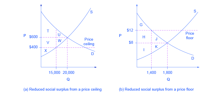
Figure 3.8b Efficiency and Price Floors and Ceilings (Text Version)
Figure 3.8b Efficiency and Price Floors and Ceilings contains 2 graphs: Graph A is the reduced social surplus from a price ceiling, Graph B is the reduced social surplus from a price floor. Both graphs have the vertical axis is Price (P) and the horizontal axis is Quantity (Q).
Graph A is the reduced social surplus from a price ceiling: The supply curve (S) slopes upward from left to right and the demand curve (D) slopes downward right to left. The point where S and D intersect is the original equilibrium price (20,000 quantity, $600). The Price ceiling is at $400 and is denoted by straight horizontal dotted line. A price ceiling is imposed at $400, so firms in the market now produce only a quantity of 15,000.
A horizontal dotted line runs from the original equilibrium price (20,000 quantity, $600) to the vertical axis Price. Vertical and horizontal dotted lines originating from their respective axis indicate the new equilibrium price (15,000 quantity, $400). The vertical dotted line runs upwards from 15,000 quantity and intersects with supply curve (S) at $400 and the and the horizontal dotted line denoting the original equilibrium price at $600 until it reaches demand curve (D).
U is the section to the left of the original equilibrium(20,000 quantity, $600) between the horizontal dotted line of $600 and the demand curve D, occurring between 15,000 and 20,000 quantity. To the left of section U is section T which is the remaining space between the horizontal dotted line of $600 and the demand curve (D) and between 0 to 15,000 quantity.
W is the section to the left of the original equilibrium between the horizontal dotted line of $600 and the Supply curve (S), occurring between 15,000 and 20,000 quantity. To the left of section W is section V which is the remaining space between the horizontal dotted line of $600 and dotted line $400 (price ceiling) and between 0 to 15,000 quantity. The X section is below section W and is the remaining space between the horizontal dotted line $400 (price ceiling) and the supply curve (S) between 0 to 15,000 quantity.
Graph B is the reduced social surplus from a price floor: The supply curve (S) slopes upward from left to right and the demand curve (D) slopes downward right to left. The point where S and D intersect is the original equilibrium price (1,800 quantity, $8). The Price floor is at $12 and is denoted by straight horizontal dotted line. A price floor is imposed at $12, which means that quantity demanded falls to 1,400: the new equilibrium is at (1,400 quantity, $12).
A horizontal dotted line runs from the original equilibrium price (1,800 quantity, $8) to the vertical axis Price. Vertical and horizontal dotted lines originating from their respective axis indicate the new equilibrium price (1,400 quantity, $12). The vertical dotted line runs upwards from 1,400 quantity and intersects with supply curve (S) and continues through the horizontal dotted line denoting the original equilibrium price at $8 until it reaches demand curve (D) at the price floor ($12).
J is the section to the left of the original equilibrium (1,800 quantity, $8) between the horizontal dotted line of $8 and the demand curve (D), occurring between 1,800 and 1,400 quantity. To the left of section J is section H which is the remaining space between the horizontal dotted line of $8 and dotted line $12 (price floor) and between 0 to 1,400 quantity. Above Section H is section G which is the remaining space between the price floor ($12) and the demand curve (D) between 0 and 1,400 quantity.
K is the section to the left of the original equilibrium between the horizontal dotted line of $8 and the Supply curve (S), occurring between 1,800 and 1,400 quantity. To the left of section K is section I which is the remaining space between the horizontal dotted line of $8 and the supply curve (S) from 0 and 1,400 quantity.
Figure 3.8b Efficiency and Price Floors and Ceilings (a) The original equilibrium price is $600 with a quantity of 20,000. Consumer surplus is T + U, and producer surplus is V + W + X. A price ceiling is imposed at $400, so firms in the market now produce only a quantity of 15,000. As a result, the new consumer surplus is T + V, while the new producer surplus is X. (b) The original equilibrium is $8 at a quantity of 1,800. Consumer surplus is G + H + J, and producer surplus is I + K. A price floor is imposed at $12, which means that quantity demanded falls to 1,400. As a result, the new consumer surplus is G, and the new producer surplus is H + I.
Figure 3.8b (b) shows a price floor example using a string of struggling movie theaters, all in the same city. The current equilibrium is $8 per movie ticket, with 1,800 people attending movies. The original consumer surplus is G + H + J, and producer surplus is I + K. The city government is worried that movie theaters will go out of business, reducing the entertainment options available to citizens, so it decides to impose a price floor of $12 per ticket. As a result, the quantity demanded of movie tickets falls to 1,400. The new consumer surplus is G, and the new producer surplus is H + I. In effect, the price floor causes the area H to be transferred from consumer to producer surplus, but also causes a deadweight loss of J + K.
This analysis shows that a price ceiling, like a law establishing rent controls, will transfer some producer surplus to consumers—which helps to explain why consumers often favor them. Conversely, a price floor like a guarantee that farmers will receive a certain price for their crops will transfer some consumer surplus to producers, which explains why producers often favor them. However, both price floors and price ceilings block some transactions that buyers and sellers would have been willing to make, and creates deadweight loss. Removing such barriers, so that prices and quantities can adjust to their equilibrium level, will increase the economy’s social surplus.
Demand and Supply as a Social Adjustment Mechanism
The demand and supply model emphasizes that prices are not set only by demand or only by supply, but by the interaction between the two. In 1890, the famous economist Alfred Marshall wrote that asking whether supply or demand determined a price was like arguing “whether it is the upper or the under blade of a pair of scissors that cuts a piece of paper.” The answer is that both blades of the demand and supply scissors are always involved.
The adjustments of equilibrium price and quantity in a market-oriented economy often occur without much government direction or oversight. If the coffee crop in Brazil suffers a terrible frost, then the supply curve of coffee shifts to the left and the price of coffee rises. Some people—call them the coffee addicts—continue to drink coffee and pay the higher price. Others switch to tea or soft drinks. No government commission is needed to figure out how to adjust coffee prices, which companies will be allowed to process the remaining supply, which supermarkets in which cities will get how much coffee to sell, or which consumers will ultimately be allowed to drink the brew. Such adjustments in response to price changes happen all the time in a market economy, often so smoothly and rapidly that we barely notice them.
Think for a moment of all the seasonal foods that are available and inexpensive at certain times of the year, like fresh corn in midsummer, but more expensive at other times of the year. People alter their diets and restaurants alter their menus in response to these fluctuations in prices without fuss or fanfare. For both the U.S. economy and the world economy as a whole, markets—that is, demand and supply—are the primary social mechanism for answering the basic questions about what is produced, how it is produced, and for whom it is produced.
Bring It Home
Why Can We Not Get Enough of Organic?
Organic food is grown without synthetic pesticides, chemical fertilizers or genetically modified seeds. In recent decades, the demand for organic products has increased dramatically. The Organic Trade Association reported sales increased from $1 billion in 1990 to $35.1 billion in 2013, more than 90% of which were sales of food products.
Why, then, are organic foods more expensive than their conventional counterparts? The answer is a clear application of the theories of supply and demand. As people have learned more about the harmful effects of chemical fertilizers, growth hormones, pesticides and the like from large-scale factory farming, our tastes and preferences for safer, organic foods have increased. This change in tastes has been reinforced by increases in income, which allow people to purchase pricier products, and has made organic foods more mainstream. This has led to an increased demand for organic foods. Graphically, the demand curve has shifted right, and we have moved up the supply curve as producers have responded to the higher prices by supplying a greater quantity.
In addition to the movement along the supply curve, we have also had an increase in the number of farmers converting to organic farming over time. This is represented by a shift to the right of the supply curve. Since both demand and supply have shifted to the right, the resulting equilibrium quantity of organic foods is definitely higher, but the price will only fall when the increase in supply is larger than the increase in demand. We may need more time before we see lower prices in organic foods. Since the production costs of these foods may remain higher than conventional farming, because organic fertilizers and pest management techniques are more expensive, they may never fully catch up with the lower prices of non-organic foods.
As a final, specific example: The Environmental Working Group’s “Dirty Dozen” list of fruits and vegetables, which test high for pesticide residue even after washing, was released in April 2013. The inclusion of strawberries on the list has led to an increase in demand for organic strawberries, resulting in both a higher equilibrium price and quantity of sales.
Key Concepts and Summary
Consumer surplus is the gap between the price that consumers are willing to pay, based on their preferences, and the market equilibrium price. Producer surplus is the gap between the price for which producers are willing to sell a product, based on their costs, and the market equilibrium price. Social surplus is the sum of consumer surplus and producer surplus. Total surplus is larger at the equilibrium quantity and price than it will be at any other quantity and price. Deadweight loss is loss in total surplus that occurs when the economy produces at an inefficient quantity.
Attribution
Except where otherwise noted, this chapter is adapted from “Demand, Supply, and Efficiency” and “key concepts and summary” In Principles of Economics 2e (OpenStax) by Steven A. Greenlaw & David Shapiro, licensed under CC BY 4.0. / Adaptations include addition of key concepts and summary.
Access for free at Principles of Microeconomics 2e
Original Source Chapter Reference
Costanza, Robert, and Lisa Wainger. “No Accounting For Nature: How Conventional Economics Distorts the Value of Things.” The Washington Post. September 2, 1990.
European Commission: Agriculture and Rural Development. 2013. “Overview of the CAP Reform: 2014-2024.” Accessed April 13, 205. http://ec.europa.eu/agriculture/cap-post-2013/.
Radford, R. A. “The Economic Organisation of a P.O.W. Camp.” Economica. no. 48 (1945): 189-201. http://www.jstor.org/stable/2550133.
Landsburg, Steven E. The Armchair Economist: Economics and Everyday Life. New York: The Free Press. 2012. specifically Section IV: How Markets Work.
National Chicken Council. 2015. “Per Capita Consumption of Poultry and Livestock, 1965 to Estimated 2015, in Pounds.” Accessed April 13, 2015. https://www.nationalchickencouncil.org/about-the-industry/statistics/per-capita-consumption-of-poultry-and-livestock-1965-to-estimated-2012-in-pounds/.
Wessel, David. “Saudi Arabia Fears $40-a-Barrel Oil, Too.” The Wall Street Journal. May 27, 2004, p. 42. https://online.wsj.com/news/articles/SB108561000087822300.
Pew Research Center. “Pew Research: Center for the People & the Press.” http://www.people-press.org/.
Media Attributions
- Figure 3.23 Consumer and Producer Surplus © Steven A. Greenlaw & David Shapiro (OpenStax) is licensed under a CC BY (Attribution) license
- Figure 3.24 Efficiency and Price Floors and Ceilings © Steven A. Greenlaw & David Shapiro (OpenStax) is licensed under a CC BY (Attribution) license
The extra benefit consumers receive from buying a good or service, measured by what the individuals would have been willing to pay minus the amount that they actually paid
The extra benefit producers receive from selling a good or service, measured by the price the producer actually received minus the price the producer would have been willing to accept
The sum of consumer surplus and producer surplus
See social surplus
See social surplus
The loss in social surplus that occurs when a market produces an inefficient quantity
The total number of units of a good or service consumers are willing to purchase at a given price
