3.4 – Demand, Supply, and Equilibrium
Learning Objectives
- Use demand and supply to explain how equilibrium price and quantity are determined in a market.
- Understand the concepts of surpluses and shortages and the pressures on price they generate.
- Explain the impact of a change in demand or supply on equilibrium price and quantity.
- Explain how the circular flow model provides an overview of demand and supply in product and factor markets and how the model suggests ways in which these markets are linked.
In this section we combine the demand and supply curves we have just studied into a new model. The model of demand and supply uses demand and supply curves to explain the determination of price and quantity in a market.
The Determination of Price and Quantity
The logic of the model of demand and supply is simple. The demand curve shows the quantities of a particular good or service that buyers will be willing and able to purchase at each price during a specified period. The supply curve shows the quantities that sellers will offer for sale at each price during that same period. By putting the two curves together, we should be able to find a price at which the quantity buyers are willing and able to purchase equals the quantity sellers will offer for sale.
Figure 3.4a “The Determination of Equilibrium Price and Quantity” combines the demand and supply data introduced in Figure 3.1a “A Demand Schedule and a Demand Curve” and Figure 3.2a “A Supply Schedule and a Supply Curve” Notice that the two curves intersect at a price of $6 per pound—at this price the quantities demanded and supplied are equal. Buyers want to purchase, and sellers are willing to offer for sale, 25 million pounds of coffee per month. The market for coffee is in equilibrium. Unless the demand or supply curve shifts, there will be no tendency for price to change. The equilibrium price in any market is the price at which quantity demanded equals quantity supplied. The equilibrium price in the market for coffee is thus $6 per pound. The equilibrium quantity is the quantity demanded and supplied at the equilibrium price.
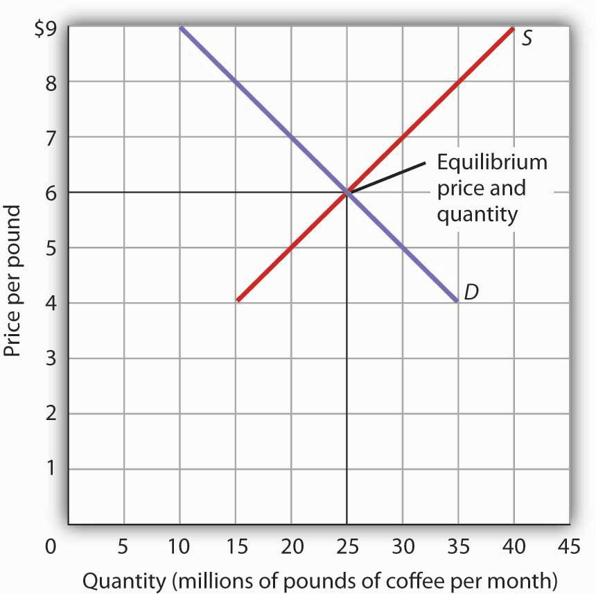
Figure 3.4a The Determination of Equilibrium Price and Quantity Textual Version
Figure 3.4a has a vertical axis of Price per pound ($) and horizontal axis of Quantity (millions of pounds of coffee per month). The supply curve (S) slopes upward from left to right and the demand curve (D) slopes downward left to right. The equilibrium price and quantity occurs at the point where the supply curve (S) and the demand curve (D) intersect, 25 millions of pounds of coffee per month at $6 per pound. Table 3.4a contains data for the supply and demand curves for the Figure 3.4a.
| Points | Supply Curve (S) (Quantity, Price) | Demand Curve (D) (Quantity, Price) |
|---|---|---|
| 1 | (15 million, $4) | (10 million, $9) |
| 2 | (20 million, $5) | (15 million, $8) |
| 3 | (25 million, $6) | (20 million, $7) |
| 4 | (30 million, $7) | (25 million, $6) |
| 5 | (35 million, $8) | (30 million, $5) |
| 6 | (40 million, $9) | (35 million, $4) |
When we combine the demand and supply curves for a good in a single graph, the point at which they intersect identifies the equilibrium price and equilibrium quantity. Here, the equilibrium price is $6 per pound. Consumers demand, and suppliers supply, 25 million pounds of coffee per month at this price. With an upward-sloping supply curve (S) and a downward-sloping demand curve (D), there is only a single price at which the two curves intersect. This means there is only one price at which equilibrium is achieved. It follows that at any price other than the equilibrium price, the market will not be in equilibrium. We next examine what happens at prices other than the equilibrium price.
Surpluses
Figure 3.4b A Surplus in the Market for Coffee shows the same demand and supply curves we have just examined, but this time the initial price is $8 per pound of coffee. Because we no longer have a balance between quantity demanded and quantity supplied, this price is not the equilibrium price. At a price of $8, we read over to the demand curve to determine the quantity of coffee consumers will be willing to buy—15 million pounds per month. The supply curve tells us what sellers will offer for sale—35 million pounds per month. The difference, 20 million pounds of coffee per month, is called a surplus. More generally, a surplus is the amount by which the quantity supplied exceeds the quantity demanded at the current price. There is, of course, no surplus at the equilibrium price; a surplus occurs only if the current price exceeds the equilibrium price.
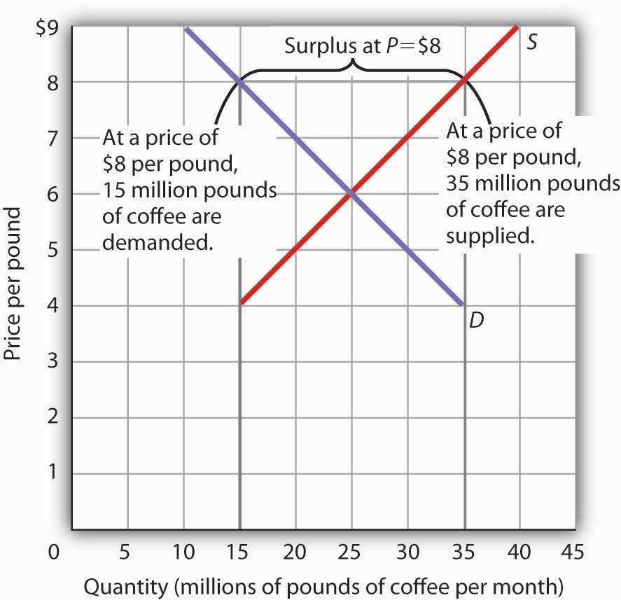
Figure 3.4b A Surplus in the Market for Coffee
Figure 3.4b has a vertical axis of Price per pound ($) and horizontal axis of Quantity (millions of pounds of coffee per month). An upward sloping supply curve (S) and and downward sloping demand curve (D) intersecting at 15 millions of pounds of coffee per month and $6 per pound. At a price of $8, the quantity supplied is 35 million pounds of coffee per month and the quantity demanded is 15 million pounds per month; there is a surplus of 20 million pounds of coffee per month. The surplus is at price of $8. Given a surplus, the price will fall quickly toward the equilibrium level of $6.
| Points | Supply Curve (S) (Quantity, Price) | Demand Curve (D) (Quantity, Price) |
|---|---|---|
| 1 | (15 million, $4) | (10 million, $9) |
| 2 | (20 million, $5) | (15 million, $8) |
| 3 | (25 million, $6) | (20 million, $7) |
| 4 | (30 million, $7) | (25 million, $6) |
| 5 | (35 million, $8) | (30 million, $5) |
| 6 | (40 million, $9) | (35 million, $4) |
At a price of $8, the quantity supplied is 35 million pounds of coffee per month and the quantity demanded is 15 million pounds per month; there is a surplus of 20 million pounds of coffee per month. The surplus is at price of $8. Given a surplus, the price will fall quickly toward the equilibrium level of $6.
A surplus in the market for coffee will not last long. With unsold coffee on the market, sellers will begin to reduce their prices to clear out unsold coffee. As the price of coffee begins to fall, the quantity of coffee supplied begins to decline. At the same time, the quantity of coffee demanded begins to rise. Remember that the reduction in quantity supplied is a movement along the supply curve—the curve itself does not shift in response to a reduction in price. Similarly, the increase in quantity demanded is a movement along the demand curve—the demand curve does not shift in response to a reduction in price. Price will continue to fall until it reaches its equilibrium level, at which the demand and supply curves intersect. At that point, there will be no tendency for price to fall further. In general, surpluses in the marketplace are short-lived. The prices of most goods and services adjust quickly, eliminating the surplus. Later on, we will discuss some markets in which adjustment of price to equilibrium may occur only very slowly or not at all.
Shortages
Just as a price above the equilibrium price will cause a surplus, a price below equilibrium will cause a shortage. A shortage is the amount by which the quantity demanded exceeds the quantity supplied at the current price.
Figure 3.4c “A Shortage in the Market for Coffee” shows a shortage in the market for coffee. Suppose the price is $4 per pound. At that price, 15 million pounds of coffee would be supplied per month, and 35 million pounds would be demanded per month. When more coffee is demanded than supplied, there is a shortage.
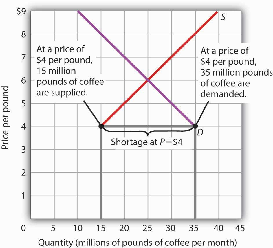
Figure 3.4c A Shortage in the Market for Coffee Textual Version
Figure 3.4c has a vertical axis of Price per pound ($) and horizontal axis of Quantity (millions of pounds of coffee per month). An upward sloping supply curve (S) and and downward sloping demand curve (D) intersect at 15 million and $6 per pound. At a price of $4 per pound, the quantity of coffee demanded is 35 million pounds per month and the quantity supplied is 15 million pounds per month. The shortage is at price of $4. The result is a shortage of 20 million pounds of coffee per month.
| Points | Supply Curve (S) (Quantity millions of pounds per month, Price per pound) | Demand Curve (D) (Quantity millions of pounds per month, Price per pound) |
|---|---|---|
| 1 | 15 million, 4 dollars | 10 million, 9 dollars |
| 2 | 20 million, 5 dollars | 15 million, 8 dollars |
| 3 | 25 million, 6 dollar | 20 million, 7 dollars |
| 4 | 30 million, 7 dollars | 25 million, 6 dollars |
| 5 | 35 million, 8 dollars | 30 million, 5 dollars |
| 6 | 40 million, 9 dollars | 35 million, 4 dollars |
At a price of $4 per pound, the quantity of coffee demanded is 35 million pounds per month and the quantity supplied is 15 million pounds per month. The shortage is at price of $4. The result is a shortage of 20 million pounds of coffee per month.
In the face of a shortage, sellers are likely to begin to raise their prices. As the price rises, there will be an increase in the quantity supplied (but not a change in supply) and a reduction in the quantity demanded (but not a change in demand) until the equilibrium price is achieved.
Shifts in Demand and Supply
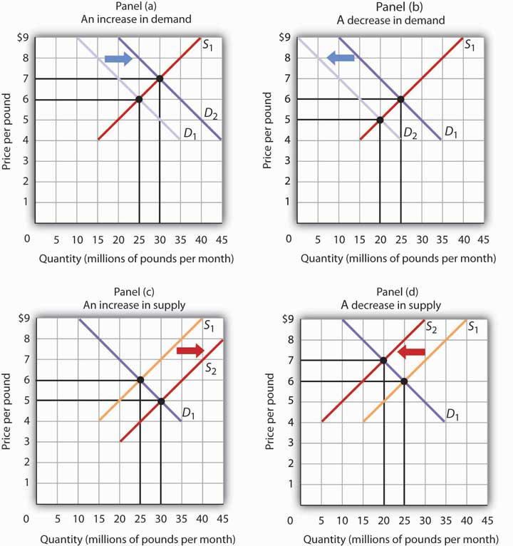
Figure 3.4d Changes in Demand and Supply Textual Version
Figure depicts four graphs. The vertical axis is Price per pound (dollars) and a horizontal axis Quantity (millions of pounds per month). The equilibrium occurs where supply and demand curves intersect.
Panel (a) depicts an increase in demand. Supply Curve (S1) is linear sloping upward from left to right. The Demand Curve (D1) is linear sloping downward left to right and intersects with S1 at 25 million pounds per month and 6 dollars per pound. D1 shifts to the right to D2 and now intersects S1 at 30 million pounds per month and 7 dollars per pound.
| Points | Supply Curve (S1) (Quantity millions of pounds per month, Price per pound) | Demand Curve (D1) (Quantity millions of pounds per month, Price per pound) | Demand Curve (D2) (Quantity millions of pounds per month, Price per pound) |
|---|---|---|---|
| 1 | 15 million pounds , 4 dollars | 35 million pounds , 4 dollars | 45 million pounds , 4 dollars |
| 2 | 20 million pounds, 5 dollars | 30 million pounds , 5 dollars | 40 million pounds , 5 dollars |
| 3 | 25 million pounds , 6 dollars | 25 million pounds , 6 dollars | 35 million pounds , 6 dollars |
| 4 | 30 million pounds , 7 dollars | 20 million pounds , 7 dollars | 30 million pounds , 7 dollars |
| 5 | 35 million pounds , 8 dollars | 15 million pounds , 8 dollars | 25 million pounds , 8 dollars |
| 6 | 40 million pounds , 9 dollars | 10 million pounds , 9 dollars | 20 million pounds , 9 dollars |
Panel (b) depicts a decrease in demand. Supply Curve (S1) is linear sloping upward from left to right. The Demand Curve (D1) is linear sloping downward left to right and intersects with S1 at 25 million pounds per month and 6 dollars per pound. D1 shifts to the left to D2 and now intersects S1 at 20 million pounds per month and 5 dollars per pound.
| Points | Supply Curve (S1) (Quantity millions of pounds per month, Price per pound) | Demand Curve (D1) (Quantity millions of pounds per month, Price per pound) | Demand Curve (D2) (Quantity millions of pounds per month, Price per pound) |
|---|---|---|---|
| 1 | 15 million pounds , 4 dollars | 35 million pounds , 4 dollars | 25 million pounds , 4 dollars |
| 2 | 20 million pounds , 5 dollars | 30 million pounds , 5 dollars | 20 million pounds , 5 dollars |
| 3 | 25 million pounds , 6 dollars | 25 million pounds , 6 dollars | 15 million pounds , 6 dollars |
| 4 | 30 million pounds , 7 dollars | 20 million pounds , 7 dollars | 10 million pounds , 7 dollars |
| 5 | 35 million pounds , 8 dollars | 15 million pounds , 8 dollars | 5 million pounds , 8 dollars |
| 6 | 40 million pounds , 9 dollars | 10 million pounds , 9 dollars | 0 million pounds , 9 dollars |
Panel (c) depicts an increase in supply. The Demand Curve (D1) is linear sloping downward left to right and intersects with S1 at 25 million pounds per month and 6 dollars per pound. Supply Curve (S1) is linear sloping upward from left to right. The S1 shifts to the right to S2 and now intersects D1 at 30 million pounds per month and 5 dollars per pound.
| Points | Supply Curve (S1) (Quantity millions of pounds per month, Price per pound) | Supply Curve (S2) (Quantity millions of pounds per month, Price per pound) | Demand Curve (D1) (Quantity millions of pounds per month, Price per pound) |
|---|---|---|---|
| 1 | 15 million pounds , 4 dollars | 20 million pounds , 3 dollars | 35 million pounds , 4 dollars |
| 2 | 20 million pounds , 5 dollars | 25 million pounds , 4 dollars | 30 million pounds , 5 dollars |
| 3 | 25 million pounds , 6 dollars | 30 million pounds , 5 dollars | 25 million pounds, 6 dollars |
| 4 | 30 million pounds , 7 dollars | 35million pounds , 6 dollars | 20 million pounds , 7 dollars |
| 5 | 35 million pounds , 8 dollars | 40 million pounds , 7 dollars | 15 million pounds , 8 dollars |
| 6 | 40 million pounds, 9 dollars | 45 million pounds , 8 dollars | 10 million pounds , 9 dollars |
Panel (d) depicts a decrease in supply. The Demand Curve (D1) is linear sloping downward left to right and intersects with S1 at 25 million pounds per month and 6 dollars per pound. Supply Curve (S1) is linear sloping upward from left to right. The S1 shifts to the left to S2 and now intersects D1 at 20 million pounds per month and 7 dollars per pound.
| Points | Supply Curve (S1) (Quantity millions of pounds per month, Price per pound) | Supply Curve (S2) (Quantity millions of pounds per month, Price per pound) | Demand Curve (D1) (Quantity millions of pounds per month, Price per pound) |
|---|---|---|---|
| 1 | 15 million pounds , 4 dollars | 5 million pounds , 4 dollars | 35 million pounds , 4 dollars |
| 2 | 20 million pounds , 5 dollars | 10 million pounds , 5 dollars | 30 million pounds , 5 dollars |
| 3 | 25 million pounds , 6 dollars | 15 million pounds , 6 dollars | 25 million pounds , 6 dollars |
| 4 | 30 million pounds , 7 dollars | 20 million pounds , 7 dollars | 20 million pounds , 7 dollars |
| 5 | 35 million pounds , 8 dollars | 25 million pounds , 8 dollars | 15 million pounds , 8 dollars |
| 6 | 40 million pounds , 9 dollars | 30 million pounds , 9 dollars | 10 million pounds , 9 dollars |
A change in one of the variables (shifters) held constant in any model of demand and supply will create a change in demand or supply. A shift in a demand or supply curve changes the equilibrium price and equilibrium quantity for a good or service. Figure 3.4d “Changes in Demand and Supply” combines the information about changes in the demand and supply of coffee presented in Figure 3.1b “An Increase in Demand” Figure 3.1c “A Reduction in Demand” Figure 3.2b “An Increase in Supply” and Figure 3.2c “A Reduction in Supply” In each case, the original equilibrium price is $6 per pound, and the corresponding equilibrium quantity is 25 million pounds of coffee per month. Figure 3.4d “Changes in Demand and Supply” shows what happens with an increase in demand, a reduction in demand, an increase in supply, and a reduction in supply. We then look at what happens if both curves shift simultaneously. Each of these possibilities is discussed in turn below.
An Increase in Demand
An increase in demand for coffee shifts the demand curve to the right, as shown in Panel (a) of Figure 3.4d “Changes in Demand and Supply”. The equilibrium price rises to $7 per pound. As the price rises to the new equilibrium level, the quantity supplied increases to 30 million pounds of coffee per month. Notice that the supply curve does not shift; rather, there is a movement along the supply curve.
Demand shifters that could cause an increase in demand include a shift in preferences that leads to greater coffee consumption; a lower price for a complement to coffee, such as doughnuts; a higher price for a substitute for coffee, such as tea; an increase in income; and an increase in population. A change in buyer expectations, perhaps due to predictions of bad weather lowering expected yields on coffee plants and increasing future coffee prices, could also increase current demand.
A Decrease in Demand
Panel (b) of Figure 3.4d “Changes in Demand and Supply” shows that a decrease in demand shifts the demand curve to the left. The equilibrium price falls to $5 per pound. As the price falls to the new equilibrium level, the quantity supplied decreases to 20 million pounds of coffee per month.
Demand shifters that could reduce the demand for coffee include a shift in preferences that makes people want to consume less coffee; an increase in the price of a complement, such as doughnuts; a reduction in the price of a substitute, such as tea; a reduction in income; a reduction in population; and a change in buyer expectations that leads people to expect lower prices for coffee in the future.
An Increase in Supply
An increase in the supply of coffee shifts the supply curve to the right, as shown in Panel (c) of Figure 3.4d “Changes in Demand and Supply”. The equilibrium price falls to $5 per pound. As the price falls to the new equilibrium level, the quantity of coffee demanded increases to 30 million pounds of coffee per month. Notice that the demand curve does not shift; rather, there is movement along the demand curve.
Possible supply shifters that could increase supply include a reduction in the price of an input such as labour, a decline in the returns available from alternative uses of the inputs that produce coffee, an improvement in the technology of coffee production, good weather, and an increase in the number of coffee-producing firms.
A Decrease in Supply
Panel (d) of Figure 3.4d “Changes in Demand and Supply” shows that a decrease in supply shifts the supply curve to the left. The equilibrium price rises to $7 per pound. As the price rises to the new equilibrium level, the quantity demanded decreases to 20 million pounds of coffee per month.
Possible supply shifters that could reduce supply include an increase in the prices of inputs used in the production of coffee, an increase in the returns available from alternative uses of these inputs, a decline in production because of problems in technology (perhaps caused by a restriction on pesticides used to protect coffee beans), a reduction in the number of coffee-producing firms, or a natural event, such as excessive rain.
Heads Up!
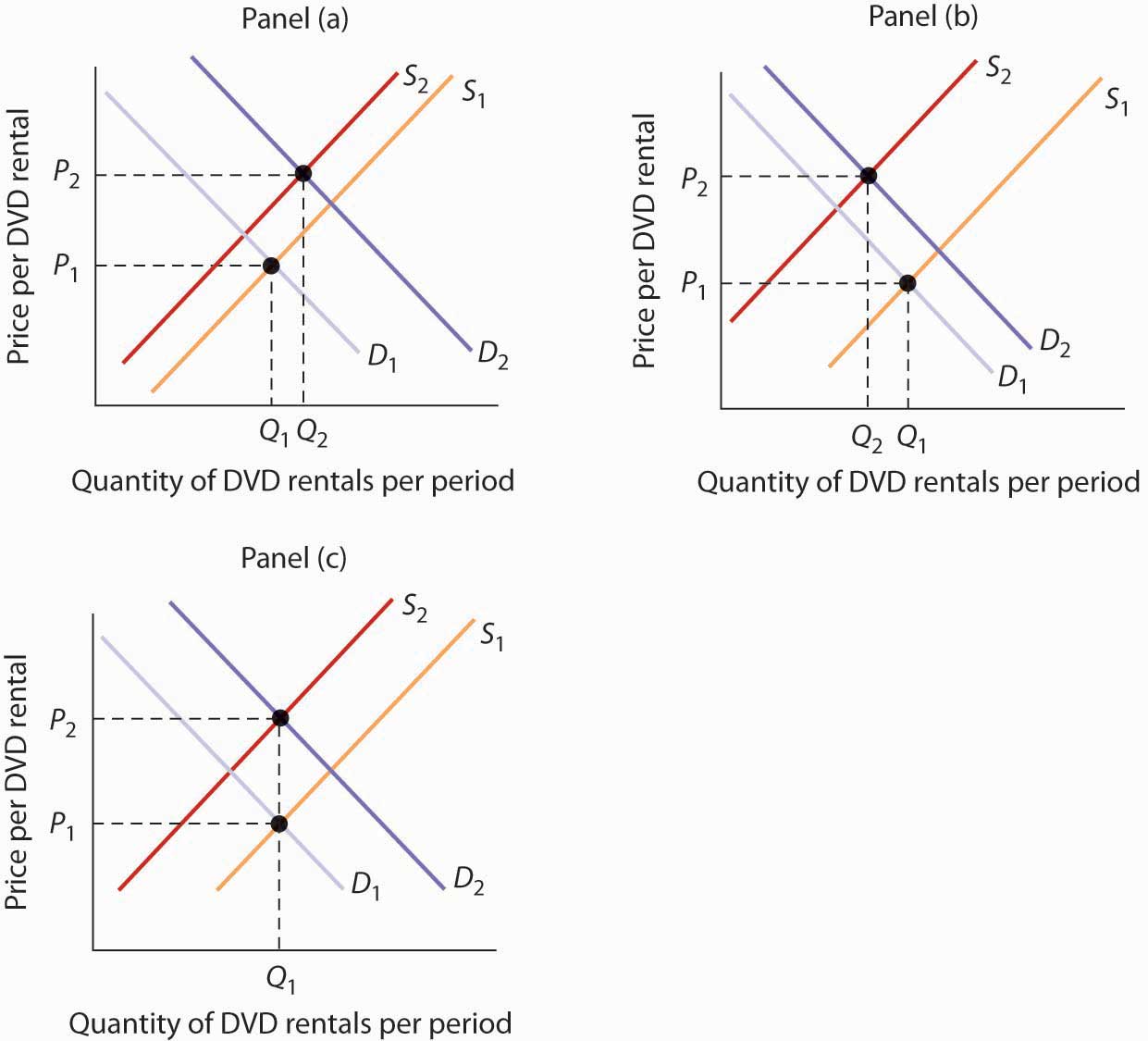
Figure 3.4e Textual Version
Figure 3.4e contains 3 graphs. All 3 graphs have the same axis: the vertical axis is price per pound (P) and the horizontal axis is quantity (lb of peas per month) (Q).
- Graph 1 – Set up the graph: depicts a linear supply curve (S1) that slopes upward left to right and a linear demand curve (D1) sloping downward left to right. D1 and S1 intersect in the middle at point (Q1, P1).
- Graph 2 -Shift the curve: depicts original supply curve (S1) shifting to the left to supply curve (S2) intersecting further up D1 at a new point (Q2, P2).
- Graph 3 -Troubleshoot: depicts S1 and D2 intersecting at (Q1, P1). The original demand curve (D1) shifts to the left to D2, intersecting further down the supply curve (S1). Overlaying the graph is a circle with an two lines intersecting in an ‘x’ extending the diameter of the circle.
Suppose you are told that an invasion of pod-crunching insects has gobbled up half the crop of fresh peas, and you are asked to use demand and supply analysis to predict what will happen to the price and quantity of peas demanded and supplied. Here are some suggestions.
Put the quantity of the good you are asked to analyze on the horizontal axis and its price on the vertical axis. Draw a downward-sloping line for demand and an upward-sloping line for supply. The initial equilibrium price is determined by the intersection of the two curves. Label the equilibrium solution. You may find it helpful to use a number for the equilibrium price instead of the letter “P.” Pick a price that seems plausible, say, 79¢ per pound. Do not worry about the precise positions of the demand and supply curves; you cannot be expected to know what they are.
Step 2 can be the most difficult step; the problem is to decide which curve to shift. The key is to remember the difference between a change in demand or supply and a change in quantity demanded or supplied. At each price, ask yourself whether the given event would change the quantity demanded. Would the fact that a bug has attacked the pea crop change the quantity demanded at a price of, say, 79¢ per pound? Clearly not; none of the demand shifters have changed. The event would, however, reduce the quantity supplied at this price, and the supply curve would shift to the left. There is a change in supply and a reduction in the quantity demanded. There is no change in demand.
Next check to see whether the result you have obtained makes sense. The graph in Step 2 makes sense; it shows price rising and quantity demanded falling.
It is easy to make a mistake such as the one shown in the third figure of this Heads Up! One might, for example, reason that when fewer peas are available, fewer will be demanded, and therefore the demand curve will shift to the left. This suggests the price of peas will fall—but that does not make sense. If only half as many fresh peas were available, their price would surely rise. The error here lies in confusing a change in quantity demanded with a change in demand. Yes, buyers will end up buying fewer peas. But no, they will not demand fewer peas at each price than before; the demand curve does not shift.
Simultaneous Shifts
As we have seen, when either the demand or the supply curve shifts, the results are unambiguous; that is, we know what will happen to both equilibrium price and equilibrium quantity, so long as we know whether demand or supply increased or decreased. However, in practice, several events may occur at around the same time that cause both the demand and supply curves to shift. To figure out what happens to equilibrium price and equilibrium quantity, we must know not only in which direction the demand and supply curves have shifted but also the relative amount by which each curve shifts. Of course, the demand and supply curves could shift in the same direction or in opposite directions, depending on the specific events causing them to shift.
For example, all three panels of Figure 3.4f “Simultaneous Decreases in Demand and Supply” show a decrease in demand for coffee (caused perhaps by a decrease in the price of a substitute good, such as tea) and a simultaneous decrease in the supply of coffee (caused perhaps by bad weather). Since reductions in demand and supply, considered separately, each cause the equilibrium quantity to fall, the impact of both curves shifting simultaneously to the left means that the new equilibrium quantity of coffee is less than the old equilibrium quantity. The effect on the equilibrium price, though, is ambiguous. Whether the equilibrium price is higher, lower, or unchanged depends on the extent to which each curve shifts. The vertical axis is price per pound and the horizontal axis is quantity (millions of pounds per month). The Supply Curve is linear sloping upwards from left to right and the Demand Curve is linear sloping downwards from left to right.
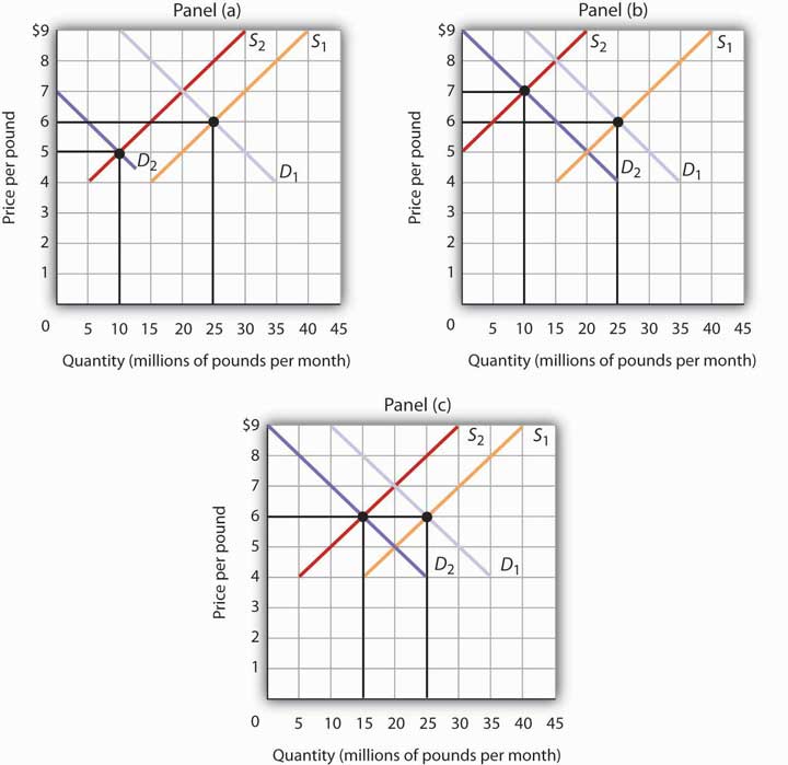
Both the demand and the supply of coffee decrease. Since decreases in demand and supply, considered separately, each cause equilibrium quantity to fall, the impact of both decreasing simultaneously means that a new equilibrium quantity of coffee must be less than the old equilibrium quantity. In Panel (a), the demand curve shifts farther to the left than does the supply curve, so equilibrium price falls. In Panel (b), the supply curve shifts farther to the left than does the demand curve, so the equilibrium price rises. In Panel (c), both curves shift to the left by the same amount, so equilibrium price stays the same.
If the demand curve shifts farther to the left than does the supply curve, as shown in Panel (a) of Figure 3.4f “Simultaneous Decreases in Demand and Supply”, then the equilibrium price will be lower than it was before the curves shifted. In this case the new equilibrium price falls from $6 per pound to $5 per pound. If the shift to the left of the supply curve is greater than that of the demand curve, the equilibrium price will be higher than it was before, as shown in Panel (b). In this case, the new equilibrium price rises to $7 per pound. In Panel (c), since both curves shift to the left by the same amount, equilibrium price does not change; it remains $6 per pound.
Regardless of the scenario, changes in equilibrium price and equilibrium quantity resulting from two different events need to be considered separately. If both events cause equilibrium price or quantity to move in the same direction, then clearly price or quantity can be expected to move in that direction. If one event causes price or quantity to rise while the other causes it to fall, the extent by which each curve shifts is critical to figuring out what happens. Figure 3.4g “Simultaneous Shifts in Demand and Supply” summarizes what may happen to equilibrium price and quantity when demand and supply both shift.
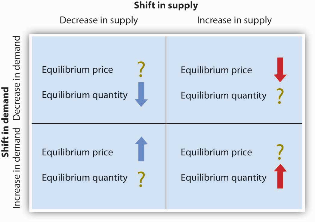
If simultaneous shifts in demand and supply cause equilibrium price or quantity to move in the same direction, then equilibrium price or quantity clearly moves in that direction. If the shift in one of the curves causes equilibrium price or quantity to rise while the shift in the other curve causes equilibrium price or quantity to fall, then the relative amount by which each curve shifts is critical to figuring out what happens to that variable.
As demand and supply curves shift, prices adjust to maintain a balance between the quantity of a good demanded and the quantity supplied. If prices did not adjust, this balance could not be maintained.
Notice that the demand and supply curves that we have examined in this chapter have all been drawn as linear. This simplification of the real world makes the graphs a bit easier to read without sacrificing the essential point: whether the curves are linear or nonlinear, demand curves are downward sloping and supply curves are generally upward sloping. As circumstances that shift the demand curve or the supply curve change, we can analyze what will happen to price and what will happen to quantity.
An Overview of Demand and Supply: The Circular Flow Model
Implicit in the concepts of demand and supply is a constant interaction and adjustment that economists illustrate with the circular flow model. The circular flow model provides a look at how markets work and how they are related to each other. It shows flows of spending and income through the economy.
A great deal of economic activity can be thought of as a process of exchange between households and firms. Firms supply goods and services to households. Households buy these goods and services from firms. Households supply factors of production—labour, capital, and natural resources—that firms require. The payments firms make in exchange for these factors represent the incomes households earn.
The flow of goods and services, factors of production, and the payments they generate is illustrated in Figure 3.4h “The Circular Flow of Economic Activity”. This circular flow model of the economy shows the interaction of households and firms as they exchange goods and services and factors of production. For simplicity, the model here shows only the private domestic economy; it omits the government and foreign sectors.
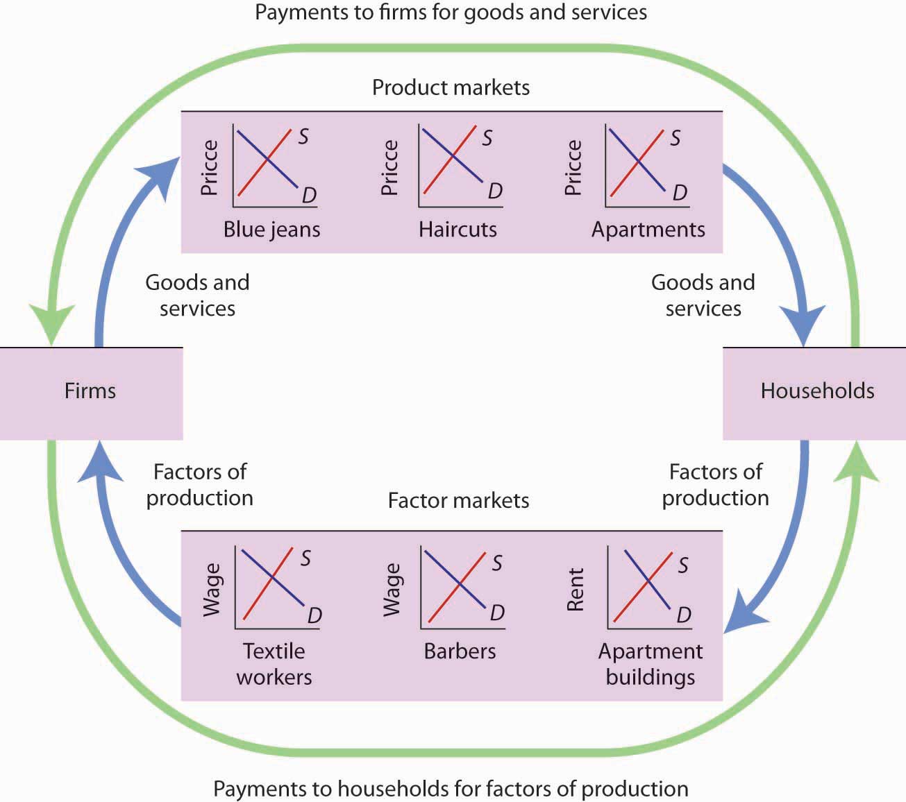
This simplified circular flow model shows flows of spending between households and firms through product and factor markets. The inner arrows show goods and services flowing from firms to households and factors of production flowing from households to firms. The outer flows show the payments for goods, services, and factors of production. These flows, in turn, represent millions of individual markets for products and factors of production.
The circular flow model shows that goods and services that households demand are supplied by firms in product markets. The exchange for goods and services is shown in the top half of Figure 3.4h “The Circular Flow of Economic Activity”. The bottom half of the exhibit illustrates the exchanges that take place in factor markets. factor markets are markets in which households supply factors of production—labour, capital, and natural resources—demanded by firms.
Our model is called a circular flow model because households use the income they receive from their supply of factors of production to buy goods and services from firms. Firms, in turn, use the payments they receive from households to pay for their factors of production.
The demand and supply model developed in this chapter gives us a basic tool for understanding what is happening in each of these product or factor markets and also allows us to see how these markets are interrelated. In Figure 3.4h “The Circular Flow of Economic Activity”, markets for three goods and services that households want—blue jeans, haircuts, and apartments—create demands by firms for textile workers, barbers, and apartment buildings. The equilibrium of supply and demand in each market determines the price and quantity of that item. Moreover, a change in equilibrium in one market will affect equilibrium in related markets. For example, an increase in the demand for haircuts would lead to an increase in demand for barbers. Equilibrium price and quantity could rise in both markets. For some purposes, it will be adequate to simply look at a single market, whereas at other times we will want to look at what happens in related markets as well.
In either case, the model of demand and supply is one of the most widely used tools of economic analysis. That widespread use is no accident. The model yields results that are, in fact, broadly consistent with what we observe in the marketplace. Your mastery of this model will pay big dividends in your study of economics.
Key Takeaways
- The equilibrium price is the price at which the quantity demanded equals the quantity supplied. It is determined by the intersection of the demand and supply curves.
- A surplus exists if the quantity of a good or service supplied exceeds the quantity demanded at the current price; it causes downward pressure on price. A shortage exists if the quantity of a good or service demanded exceeds the quantity supplied at the current price; it causes upward pressure on price.
- An increase in demand, all other things unchanged, will cause the equilibrium price to rise; quantity supplied will increase. A decrease in demand will cause the equilibrium price to fall; quantity supplied will decrease.
- An increase in supply, all other things unchanged, will cause the equilibrium price to fall; quantity demanded will increase. A decrease in supply will cause the equilibrium price to rise; quantity demanded will decrease.
- To determine what happens to equilibrium price and equilibrium quantity when both the supply and demand curves shift, you must know in which direction each of the curves shifts and the extent to which each curve shifts.
- The circular flow model provides an overview of demand and supply in product and factor markets and suggests how these markets are linked to one another.
Try It!
What happens to the equilibrium price and the equilibrium quantity of DVD rentals if the price of movie theater tickets increases and wages paid to DVD rental store clerks increase, all other things unchanged? Be sure to show all possible scenarios, as was done in Figure 3.4f “Simultaneous Decreases in Demand and Supply”. Again, you do not need actual numbers to arrive at an answer. Just focus on the general position of the curve(s) before and after events occurred.
Check your Answer
An increase in the price of movie theater tickets (a substitute for DVD rentals) will cause the demand curve for DVD rentals to shift to the right. An increase in the wages paid to DVD rental store clerks (an increase in the cost of a factor of production) shifts the supply curve to the left. Each event taken separately causes equilibrium price to rise. Whether equilibrium quantity will be higher or lower depends on which curve shifted more.
Figure 3.4i Textual Version
Figure 3.4i contains 3 graphs: panel (a), panel (b) and panel (c). All graphs have the same vertical and horizontal axes: the vertical axis is price per DVD rental (P) and the horizontal axis is quantity of DVD rentals per period (Q). The original supply curve (S1) is linear sloping upward from left to right and the original demand curve (D1) is linear sloping downwards from left to right.
Panel (a) depicts if the demand curve shifted more, then the equilibrium quantity of DVD rentals will rise. The supply curve (S1 ) occurs in the central are of the graph and the demand curve (D1) is further to the left of the graph. S1 and D1 intersect at point (Q1, P1). S1 shifts to the left to S2 and D1 shifts substantially to the right to D2. S2 and D2 now intersect at (Q2, P2), further right along the supply curve in the centre area of the graph.
Panel (b) depicts if the supply curve shifted more, then the equilibrium quantity of DVD rentals will fall. The supply curve (S1 ) occurs further to the right on the graph and the demand curve (D1) is further to the left. S1 and D1 intersect at point (Q1, P1). S1 shifts to substantially to the left to S2 and D1 shifts right to D2. S2 and D2 now intersect at (Q2, P2), further right along the supply curve towards the left area of the graph.
Panel (c) depicts if the curves shifted by the same amount, then the equilibrium quantity of DVD rentals would not change. The supply curve (S1 ) occurs further to the right on the graph and the demand curve (D1 ) is further to the left. S1 and D1 intersect at point (Q1, P1). S1 shifts to the left to S2 and D1 shifts right to D2. S2 and D2 now intersect at (Q1, P2), further right along the supply curve in the central area of the graph.
Case in Point: Demand, Supply, and Obesity

Why are so many Americans fat? Put so crudely, the question may seem rude, but, indeed, the number of obese Americans has increased by more than 50% over the last generation, and obesity may now be the nation’s number one health problem. According to Sturm Roland in a recent RAND Corporation study, “Obesity appears to have a stronger association with the occurrence of chronic medical conditions, reduced physical health-related quality of life and increased health care and medication expenditures than smoking or problem drinking.”
Many explanations of rising obesity suggest higher demand for food. What more apt picture of our sedentary life style is there than spending the afternoon watching a ballgame on TV, while eating chips and salsa, followed by a dinner of a lavishly topped, take-out pizza? Higher income has also undoubtedly contributed to a rightward shift in the demand curve for food. Plus, any additional food intake translates into more weight increase because we spend so few calories preparing it, either directly or in the process of earning the income to buy it. A study by economists Darius Lakdawalla and Tomas Philipson suggests that about 60% of the recent growth in weight may be explained in this way—that is, demand has shifted to the right, leading to an increase in the equilibrium quantity of food consumed and, given our less strenuous life styles, even more weight gain than can be explained simply by the increased amount we are eating.
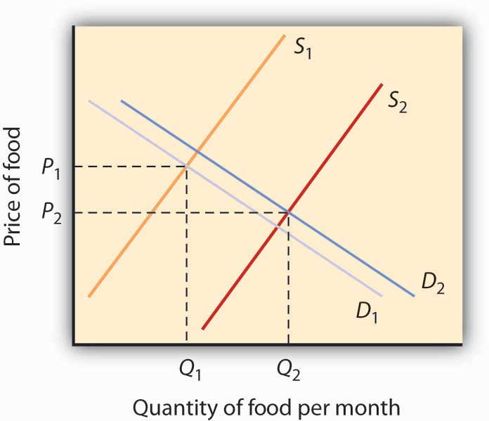
What accounts for the remaining 40% of the weight gain? Lakdawalla and Philipson further reason that a rightward shift in demand would by itself lead to an increase in the quantity of food as well as an increase in the price of food. The problem they have with this explanation is that over the post-World War II period, the relative price of food has declined by an average of 0.2 percentage points per year. They explain the fall in the price of food by arguing that agricultural innovation has led to a substantial rightward shift in the supply curve of food. As shown in Figure 3.23, lower food prices and a higher equilibrium quantity of food have resulted from simultaneous rightward shifts in demand and supply and that the rightward shift in the supply of food from S1 to S2 has been substantially larger than the rightward shift in the demand curve from D1 to D2.
Sources:
Sturm, R. (2002). The effects of obesity, smoking, and problem drinking on chronic medical problems and health care costs. Health Affairs, 21(2), 245–253.
Lakdawalla, D. & Philipson, T. (2002). The growth of obesity and technological change: A theoretical and empirical examination. NEBR Working Paper Series [no. 8946]. http://dx.doi.org/10.3386/w8946
Attribution
Except where otherwise noted, this chapter is adapted from “Demand, Supply, and Equilibrium” In BUS 400 Business Economics by Sandra Wellman, licensed under CC BY-NC-SA 4.0 / A derivative of Principles of Economics by University of Minnesota Libraries Publishing, licensed under CC BY-NC-SA.
Media Attributions
- Figure © University of Minnesota is licensed under a CC BY-NC-SA (Attribution NonCommercial ShareAlike) license
- Figure © University of Minnesota is licensed under a CC BY-NC-SA (Attribution NonCommercial ShareAlike) license
- Figure © University of Minnesota is licensed under a CC BY-NC-SA (Attribution NonCommercial ShareAlike) license
- Figure © University of Minnesota is licensed under a CC BY-NC-SA (Attribution NonCommercial ShareAlike) license
- Figure © University of Minnesota is licensed under a CC BY-NC-SA (Attribution NonCommercial ShareAlike) license
- 4de186bfe4404db143192a98d11a9f46 © University of Minnesota is licensed under a CC BY-NC-SA (Attribution NonCommercial ShareAlike) license
- Figure © University of Minnesota is licensed under a CC BY-NC-SA (Attribution NonCommercial ShareAlike) license
- Figure © University of Minnesota is licensed under a CC BY-NC-SA (Attribution NonCommercial ShareAlike) license
- American fat beauty © rattopennugu is licensed under a CC BY-NC-ND (Attribution NonCommercial NoDerivatives) license
- Figure © University of Minnesota is licensed under a CC BY-NC-SA (Attribution NonCommercial ShareAlike) license
The situation where quantity demanded is equal to the quantity supplied; the combination of price and quantity where there is no economic pressure from surpluses or shortages that would cause price or quantity to change
The total number of units of a good or service consumers are willing to purchase at a given price
The total number of units of a good or service producers are willing to sell at a given price
The resources such as labor, materials, and machinery that are used to produce goods and services; also called factors of production
