3.5 – Demand, Supply, and Equilibrium in Markets for Goods and Services
Learning Objectives
- Explain demand, quantity demanded, and the law of demand
- Identify a demand curve and a supply curve
- Explain supply, quantity supplied, and the law of supply
- Explain equilibrium, equilibrium price, and equilibrium quantity
First let’s first focus on what economists mean by demand, what they mean by supply, and then how demand and supply interact in a market.
Demand for Goods and Services
Economists use the term demand to refer to the amount of some good or service consumers are willing and able to purchase at each price. Demand is fundamentally based on needs and wants—if you have no need or want for something, you won’t buy it. While a consumer may be able to differentiate between a need and a want, from an economist’s perspective they are the same thing. Demand is also based on ability to pay. If you cannot pay for it, you have no effective demand. By this definition, a homeless person probably has no effective demand for shelter.
What a buyer pays for a unit of the specific good or service is called price. The total number of units that consumers would purchase at that price is called the quantity demanded. A rise in price of a good or service almost always decreases the quantity demanded of that good or service. Conversely, a fall in price will increase the quantity demanded. When the price of a gallon of gasoline increases, for example, people look for ways to reduce their consumption by combining several errands, commuting by carpool or mass transit, or taking weekend or vacation trips closer to home. Economists call this inverse relationship between price and quantity demanded the law of demand. The law of demand assumes that all other variables that affect demand (which we explain in the next module) are held constant.
We can show an example from the market for gasoline in a table or a graph. Economist call a table that shows the quantity demanded at each price, such as Table 3.5a, a demand schedule. In this case we measure price in dollars per gallon of gasoline. We measure the quantity demanded in millions of gallons over some time period (for example, per day or per year) and over some geographic area (like a state or a country). A demand curve shows the relationship between price and quantity demanded on a graph like Figure 3.5a, with quantity on the horizontal axis and the price per gallon on the vertical axis. (Note that this is an exception to the normal rule in mathematics that the independent variable (x) goes on the horizontal axis and the dependent variable (y) goes on the vertical. Economics is not math.)
Table 3.5a shows the demand schedule and the graph in Figure 3.5a shows the demand curve. These are two ways to describe the same relationship between price and quantity demanded.
| Price (per gallon) ($) | Quantity Demanded (millions of gallons) |
|---|---|
| 1.00 | 800 |
| 1.20 | 700 |
| 1.40 | 600 |
| 1.60 | 550 |
| 1.80 | 500 |
| 2.00 | 460 |
| 2.20 | 420 |
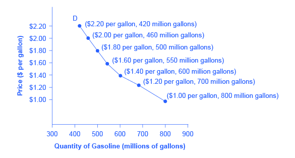
Demand curves will appear somewhat different for each product. They may appear relatively steep or flat, or they may be straight or curved. Nearly all demand curves share the fundamental similarity that they slope down from left to right. Demand curves embody the law of demand: As the price increases, the quantity demanded decreases, and conversely, as the price decreases, the quantity demanded increases.
Confused about these different types of demand? Read the next Clear It Up feature.
Clear it Up: Is demand the same as quantity demanded?
In economic terminology, demand is not the same as quantity demanded. When economists talk about demand, they mean the relationship between a range of prices and the quantities demanded at those prices, as illustrated by a demand curve or a demand schedule. When economists talk about quantity demanded, they mean only a certain point on the demand curve, or one quantity on the demand schedule. In short, demand refers to the curve and quantity demanded refers to the (specific) point on the curve.
Supply of Goods and Services
When economists talk about supply, they mean the amount of some good or service a producer is willing to supply at each price. Price is what the producer receives for selling one unit of a good or service. A rise in price almost always leads to an increase in the quantity supplied of that good or service, while a fall in price will decrease the quantity supplied. When the price of gasoline rises, for example, it encourages profit-seeking firms to take several actions: expand exploration for oil reserves; drill for more oil; invest in more pipelines and oil tankers to bring the oil to plants for refining into gasoline; build new oil refineries; purchase additional pipelines and trucks to ship the gasoline to gas stations; and open more gas stations or keep existing gas stations open longer hours. Economists call this positive relationship between price and quantity supplied—that a higher price leads to a higher quantity supplied and a lower price leads to a lower quantity supplied—the law of supply. The law of supply assumes that all other variables that affect supply (to be explained in the next module) are held constant.
Still unsure about the different types of supply? See the following Clear It Up feature.
Clear it Up: Is supply the same as quantity supplied?
In economic terminology, supply is not the same as quantity supplied. When economists refer to supply, they mean the relationship between a range of prices and the quantities supplied at those prices, a relationship that we can illustrate with a supply curve or a supply schedule. When economists refer to quantity supplied, they mean only a certain point on the supply curve, or one quantity on the supply schedule. In short, supply refers to the curve and quantity supplied refers to the (specific) point on the curve.
Figure 3.5b illustrates the law of supply, again using the market for gasoline as an example. Like demand, we can illustrate supply using a table or a graph. A supply schedule is a table, like Table 3.5b, that shows the quantity supplied at a range of different prices. Again, we measure price in dollars per gallon of gasoline and we measure quantity supplied in millions of gallons. A supply curve is a graphic illustration of the relationship between price, shown on the vertical axis, and quantity, shown on the horizontal axis. The supply schedule and the supply curve are just two different ways of showing the same information. Notice that the horizontal and vertical axes on the graph for the supply curve are the same as for the demand curve.
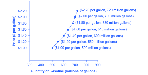
| Price (per gallon) ($) | Quantity Supplied (millions of gallons) |
|---|---|
| 1.00 | 500 |
| 1.20 | 550 |
| 1.40 | 600 |
| 1.60 | 640 |
| 1.80 | 680 |
| 2.00 | 700 |
| 2.20 | 720 |
Equilibrium—Where Demand and Supply Intersect
Because the graphs for demand and supply curves both have price on the vertical axis and quantity on the horizontal axis, the demand curve and supply curve for a particular good or service can appear on the same graph. Together, demand and supply determine the price and the quantity that will be bought and sold in a market.
Figure 3.5c illustrates the interaction of demand and supply in the market for gasoline. The demand curve (D) is identical to Figure 3.5a. The supply curve (S) is identical to Figure 3.5b. Table 3.5b contains the same information in tabular form.

| Price ( $ per gallon) | Demand Curve (D): Quantity demanded (millions of gallons) | Supply Curve (S) : Quantity supplied (millions of gallons) |
|---|---|---|
| 1.00 | 800 | 500 |
| 1.20 | 700 | 550 |
| 1.40 | 600 | 600 |
| 1.60 | 550 | 640 |
| 1.80 | 500 | 680 |
| 2.00 | 460 | 700 |
| 2.20 | 420 | 720 |
In Figure 3.5c, the equilibrium price is $1.40 per gallon of gasoline and the equilibrium quantity is 600 million gallons. If you had only the demand and supply schedules, and not the graph, you could find the equilibrium by looking for the price level on the tables where the quantity demanded and the quantity supplied are equal.
The word “equilibrium” means “balance.” If a market is at its equilibrium price and quantity, then it has no reason to move away from that point. However, if a market is not at equilibrium, then economic pressures arise to move the market toward the equilibrium price and the equilibrium quantity.
Imagine, for example, that the price of a gallon of gasoline was above the equilibrium price—that is, instead of $1.40 per gallon, the price is $1.80 per gallon. The dashed horizontal line at the price of $1.80 in Figure 3.5c illustrates this above equilibrium price. At this higher price, the quantity demanded drops from 600 to 500. This decline in quantity reflects how consumers react to the higher price by finding ways to use less gasoline.
Moreover, at this higher price of $1.80, the quantity of gasoline supplied rises from the 600 to 680, as the higher price makes it more profitable for gasoline producers to expand their output. Now, consider how quantity demanded and quantity supplied are related at this above-equilibrium price. Quantity demanded has fallen to 500 gallons, while quantity supplied has risen to 680 gallons. In fact, at any above-equilibrium price, the quantity supplied exceeds the quantity demanded. We call this an excess supply or a surplus.
With a surplus, gasoline accumulates at gas stations, in tanker trucks, in pipelines, and at oil refineries. This accumulation puts pressure on gasoline sellers. If a surplus remains unsold, those firms involved in making and selling gasoline are not receiving enough cash to pay their workers and to cover their expenses. In this situation, some producers and sellers will want to cut prices, because it is better to sell at a lower price than not to sell at all. Once some sellers start cutting prices, others will follow to avoid losing sales. These price reductions in turn will stimulate a higher quantity demanded. Therefore, if the price is above the equilibrium level, incentives built into the structure of demand and supply will create pressures for the price to fall toward the equilibrium.
Now suppose that the price is below its equilibrium level at $1.20 per gallon, as the dashed horizontal line at this price in Figure 3.5c shows. At this lower price, the quantity demanded increases from 600 to 700 as drivers take longer trips, spend more minutes warming up the car in the driveway in wintertime, stop sharing rides to work, and buy larger cars that get fewer miles to the gallon. However, the below-equilibrium price reduces gasoline producers’ incentives to produce and sell gasoline, and the quantity supplied falls from 600 to 550.
When the price is below equilibrium, there is excess demand, or a shortage—that is, at the given price the quantity demanded, which has been stimulated by the lower price, now exceeds the quantity supplied, which had been depressed by the lower price. In this situation, eager gasoline buyers mob the gas stations, only to find many stations running short of fuel. Oil companies and gas stations recognize that they have an opportunity to make higher profits by selling what gasoline they have at a higher price. As a result, the price rises toward the equilibrium level.
Key Concepts and Summary
A demand schedule is a table that shows the quantity demanded at different prices in the market. A demand curve shows the relationship between quantity demanded and price in a given market on a graph. The law of demand states that a higher price typically leads to a lower quantity demanded.
A supply schedule is a table that shows the quantity supplied at different prices in the market. A supply curve shows the relationship between quantity supplied and price on a graph. The law of supply says that a higher price typically leads to a higher quantity supplied.
The equilibrium price and equilibrium quantity occur where the supply and demand curves cross. The equilibrium occurs where the quantity demanded is equal to the quantity supplied. If the price is below the equilibrium level, then the quantity demanded will exceed the quantity supplied. Excess demand or a shortage will exist. If the price is above the equilibrium level, then the quantity supplied will exceed the quantity demanded. Excess supply or a surplus will exist. In either case, economic pressures will push the price toward the equilibrium level.
Attribution
Except where otherwise noted, this chapter is adapted from “Demand, Supply, and Equilibrium in Markets for Goods and Services” and “Key Concepts and Summary” In Principles of Economics 2e (OpenStax) by Steven A. Greenlaw & David Shapiro, licensed under CC BY 4.0./ Adaptations include addition of key concepts and summary.
Access for free at Principles of Microeconomics 2e
Original Source Chapter References
Costanza, Robert, and Lisa Wainger. “No Accounting For Nature: How Conventional Economics Distorts the Value of Things.” The Washington Post. September 2, 1990.
European Commission: Agriculture and Rural Development. 2013. “Overview of the CAP Reform: 2014-2024.” Accessed April 13, 205. http://ec.europa.eu/agriculture/cap-post-2013/.
Radford, R. A. “The Economic Organisation of a P.O.W. Camp.” Economica. no. 48 (1945): 189-201. http://www.jstor.org/stable/2550133.
Landsburg, Steven E. The Armchair Economist: Economics and Everyday Life. New York: The Free Press. 2012. specifically Section IV: How Markets Work.
National Chicken Council. 2015. “Per Capita Consumption of Poultry and Livestock, 1965 to Estimated 2015, in Pounds.” Accessed April 13, 2015. https://www.nationalchickencouncil.org/about-the-industry/statistics/per-capita-consumption-of-poultry-and-livestock-1965-to-estimated-2012-in-pounds/.
Wessel, David. “Saudi Arabia Fears $40-a-Barrel Oil, Too.” The Wall Street Journal. May 27, 2004, p. 42. https://online.wsj.com/news/articles/SB108561000087822300.
Pew Research Center. “Pew Research: Center for the People & the Press.” http://www.people-press.org/.
Media Attributions
- A Demand Curve for Gasoline © Steven A. Greenlaw & David Shapiro (OpenStax) is licensed under a CC BY (Attribution) license
- A Supply Curve for Gasoline © Steven A. Greenlaw & David Shapiro (OpenStax) is licensed under a CC BY (Attribution) license
- Demand and Supply for Gasoline © Steven A. Greenlaw & David Shapiro (OpenStax) is licensed under a CC BY (Attribution) license
The relationship between price and the quantity demanded of a certain good or service
The common relationship that a higher price leads to a lower quantity demanded of a certain good or service and a lower price leads to a higher quantity demanded, while all other variables are held constant
A table that shows a range of prices for a certain good or service and the quantity demanded at each price
A graphic representation of the relationship between price and quantity demanded of a certain good or service, with quantity on the horizontal axis and the price on the vertical axis
The relationship between price and the quantity supplied of a certain good or service
The common relationship that a higher price leads to a greater quantity supplied and a lower price leads to a lower quantity supplied, while all other variables are held constant
A table that shows a range of prices for a good or service and the quantity supplied at each price
A line that shows the relationship between price and quantity supplied on a graph, with quantity supplied on the horizontal axis and price on the vertical axis
The price where quantity demanded is equal to quantity supplied
The quantity at which quantity demanded and quantity supplied are equal for a certain price level
At the existing price, quantity supplied exceeds the quantity demanded; also called excess supply
At the existing price, the quantity demanded exceeds the quantity supplied; also called a shortage
At the existing price, the quantity demanded exceeds the quantity supplied; also called excess demand
