

The Life Table is a fascinating tool that provides us with an estimate of life expectancy. It computes, for every age group, how many years of life are left to the average person in that age group.
The Life Table should really be called the Death Table, because it begins with an arbitrary number of births in a given year and calculates how quickly the newborns die off.
The first person to perform such calculations was John Graunt (1662), a hat maker living in London in the seventeenth century. He took a keen interest in the weekly death bulletins issued by the various parishes[1]. He estimated that, out of 100 people conceived in London in his day, only 64 percent would survive to age 6, only 40 to age 16, and so forth. Three of every one hundred newborns would make it to age 66, and only one to age 76. Graunt was not able to say, however, how long the average newborn could be expected to live. The complete method for estimating life expectancy would be delineated later by the astronomer Edmond Halley.[2]

To compute life expectancy at birth, as well as life years remaining at any particular age, age-specific mortality rates are manipulated in a series of calculations that are best organized in the rows and columns of a table or spreadsheet. Life Tables are constructed for men, women, or both. When data suffice, a Life Table could be constructed for other sex identities. Life Tables are constructed for particular occupational categories, ethnicities etc. by interested parties such as life insurance companies.
The entire Life Table depends on the age-specific mortality rates that are inputted. We use the latest data available. But the Life Table will soon be out of date, because mortality rates are constantly changing. As a matter of fact, Queen’s University in Kingston, Ontario was found in the 2010s to have under-invested in its professors’ pensions. Actuaries[3]advising the University had failed to realize that Queens professors’ mortality rates were declining faster than the mortality rates of other groups.
Typically, each life table begins with 100,000 hypothetic newborns. The actual number doesn’t matter, since we’re only concerned with the proportion that dies in any age group. We like to begin with a nice big number so that, when we multiply by mortality rates, we won’t get tiny fractions. We like a number divisible by ten so we can easily calculate percentages. In the Life Table below, the one hundred thousand newborns are Canadian females born in 2019. You’ll find them in first row of numbers, fifth column, the column labeled “l” (lowercase “L”).

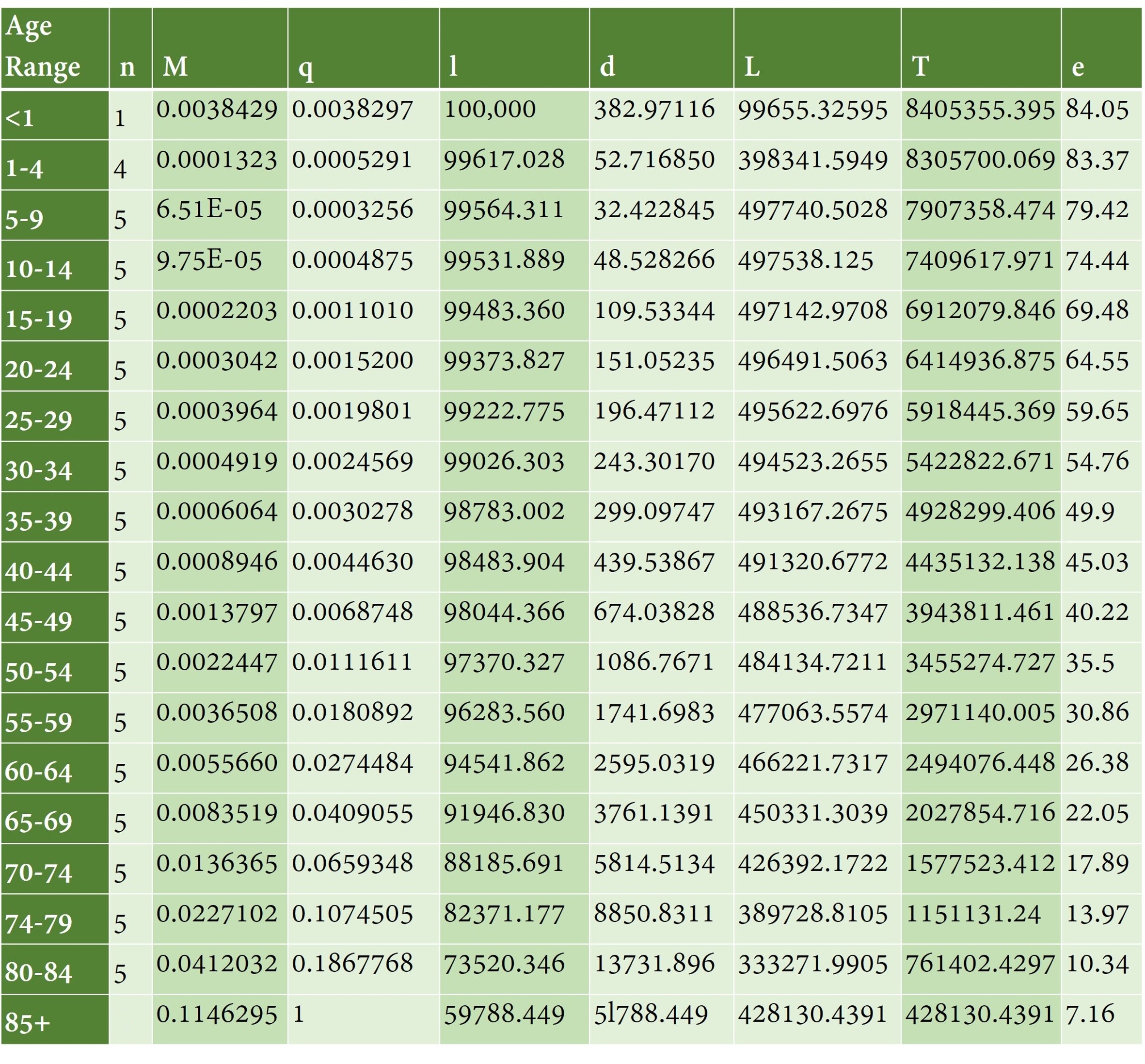
Have a look at those 100,000 newborns highlighted in Table 6-1. In the cell to the left of the highlighted cell, you see the number q=0.0038297. This is the probability that a newborn will die before it reaches the age of 1. The number to the left of that is the mortality rate expressed as a decimal, M. M=.0038429.
Why is M, the mortality rate, not the same as q, the probability of dying? Recall that M is always defined over the midyear population. But the probability of dying is defined from the beginning of the year, or birth. We’ll talk more about that later.
Multiplying q by the 100,000 newborns, we can figure that 382.97 of them will die before reaching the age of 1. That’s the number you see in the cell to the right of the 100,000, the column labeled d for deaths.
Since 382.97 newborns are estimated to die, that leaves 100,000-383 = 99,617 babies making it to age 1. That’s why, in the next row, under the 100,000, you have 99,617 individuals.
We track a cohort of babies over time, not just one baby. That’s because we don’t know if an individual is going to die or not. We do know that, for every 100,000 newborns, 383 die.
Each successive row is an older age group, all the way down to the last row. In each successive row we have fewer and fewer people in the l column, the column that shows us the number of people entering the age group.
In each row, moving left to right, we have the age group, the length of that age group, the mortality rate, the probability of dying, the number of individuals entering the age group, the number of individuals dying, then big L, big T, and “e”. “e” is the expected number of life years remaining for the average person in the age group.
In Table 6-1, we see that our 100,000 newborns each have 84.05 life years remaining. As a group, they have 84.05 x 100,000 life years remaining, as shown in big T.
Unlike big T, which shows all the life years remaining for the group of babies, the first row of big L shows just how many years of life they will spend being babies; due to infant mortality, this is some number less than 100,000 babies x 1 year of life. The rest of the Big L column shows how many life years the group (constantly diminishing in number) will enjoy during each successive phase of life.

Before we learn more about these calculations, let’s observe some basic features of the Life Table.
1) Typically, the older the age group, the lower the expected life years remaining.
2) The number of people entering age group x, divided by the number of newborns, gives you the probability that a newborn will survive to age x.
Ready for more?
As you know, the first column shows the age group. Newborns have an age group all their own, because they are unique. Not only do they have a very high mortality rate, but it is also true that their deaths are concentrated in the first months of life rather than being spread out randomly over the year. The newborn phase of life lasts 1 year minus one second.
The next age group is ages 1-4. That’s a four-year phase of life: being one, being two, being three, and being four, all the way from age 1 to one second before you turn 5 years old.
The rest of the age groups, except for the last, are five years long.
The highest age group is defined without an upper age limit, for example 85+, 90+, 100+, whatever seems most appropriate for the population being studied. We’re not sure how long that last phase of life will last. That’s why the second column corresponding to that final age group is blank.
The second column gives us the number of years of life covered by that age group. For the newborns, it’s one year of life, and for the age group 1-4, it’s four years of life: being a 1 year-old, being a 2 year-old, being a 3-year old, and being a 4-year old. All other age groupings are typically five years long, because people tend to round their age to the nearest five years.
Because the highest age group has no upper age limit, we don’t know how many years of life this age group covers, so the last entry in the second column is a question mark.
The third column of the Life Table, M, is the mortality rate expressed as a decimal. We do not use the mortality rate to calculate deaths because the mortality rate is a yearly calculation which assumes that people die randomly throughout the year and employs the mid-year population as its base. But in the Life Table
- newborn deaths cluster near the beginning of the year
- initial population sizes, not mid-year population sizes, are used
- age categories may cover more than a single year
Consequently, we manipulate the mortality rate so that we get q in column four. q is the probability of dying before the end of the age category. q is the probability of not making it to the next age category.
Translating mortality rates expressed as a decimal into probabilities of dying q works as follows[4]:

For most age groups, f = 0.5, meaning that the average person in that age group dies halfway through the period of time covered by that age group. But for newborns (age 0-1), f = 0.9, because most newborns who die, die soon after birth and miss out on 90% of their year.
Multiplying q by the 100,000 newborns we see that about 383 newborns die, leaving 99,617 to graduate into the second age group, as you can see in column 5, labelled l. lx is the number of people entering age x.
The next age group is 1-4 year-olds. People who survive this age group have spent a full 4 years in it. The probability of dying before reaching the age of 5 is 0.0005291. Pretty low!
What is q for the highest age group? Once a person reaches the highest age group, they have a 100% chance of dying in that age group, since there is no higher age group. q is therefore equal to one.
We now understand the meaning of the first six columns!
Columns 7, 8, and 9 are even more interesting.
- Column 7, labelled “L”, represents the total years lived in that age group by all those who made it to that age.
- Column 8, labelled “T”, represents the total years lived by that age group from that age onward. The age group will shrink over time, but life will go on for at least some of them.
Column 9, labelled “e”, gives you the life years remaining for the average person in that row’s age group. We saw that “e” for our newborns, life expectancy at birth for Canadian females born in 2019, is 84.09.
Does that mean that today, the average Canadian girl born in 2019 can expect to die when she is 84? Only if mortality rates have not changed since this Life Table was calculated.
Let’s look at what’s going on when Canadian females born in 2019 turn 40. According to the mortality rates in this Life Table, for every 100,000 newborns, there will only be 98,484 women left. Big T, total life years remaining for the whole group, is 4,435,132.138 years. That doesn’t include the years they spent as newborns to age 39. Those years are gone. We only look forward. 40-44 year olds as a group can expect to live 4,435,132.138 more years: 491,320 years as 40-44 year-olds; 488,536 years as 45-49 year-olds; 484,135 years as 50-54 year-olds, and so on as listed in column L.
To get the expected life years remaining for these 40-44 year-olds, we divide the 4,435,132.138 years of life left to this group by the 98,483.9 people who entered this age group. This gives us an average of 45.034 years of life left to live for each person who entered the 40-44 year old age category. These people are truly middle-aged, as their expectation of life is roughly the same as their current age. They are half-way through.
We haven’t yet discussed how to find L, the number of years lived by an age group in a particular age category. This is the hardest part, but it’s not so bad.
If everyone who entered age group x survived age group x, we could just multiply the number of people entering the age group by the number of years in that age bracket to get Lx. Lx would be equal to lx multiplied by nx. This is like multiplying the number of people who go to a party by the number of hours the party lasted, in order to find out how many party hours were enjoyed by people. However, what if some people leave the party early?

Because some people die before graduating from the age group, and don’t get to experience the entire age interval for that age group,
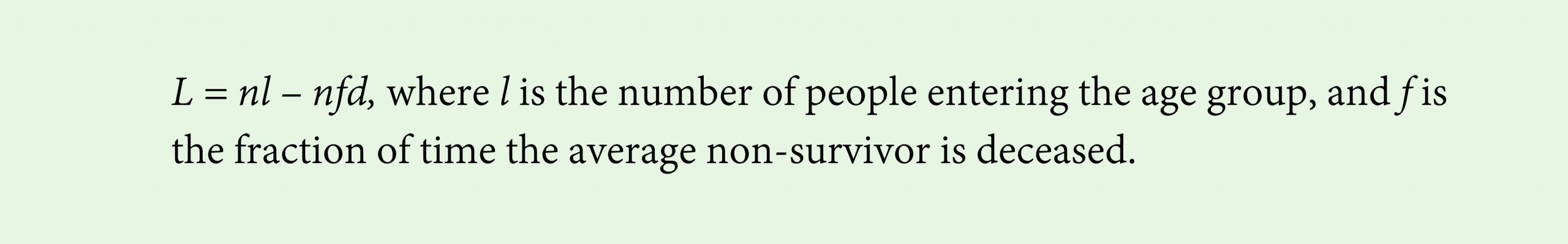
f is the fraction of time in the age interval that the person missed. f is like the fraction of a party that a person missed by leaving the party early. Multiplying f by n gives you the average number of years the deceased person has missed. d is the number of deaths in the age group.
For the last age group, where we don’t have an “n”, the calculation is slightly different [5]:

Now that we have gone through all the calculations, we know some other important points about Life Expectancy:
3) The expected number of years of life you have remaining depends on your mortality at every future stage of your life.
4) If the mortality rate for an age group older than you changes, your expected life years remaining will be affected.
5) If the mortality rate for an age group younger than you changes, your expected life years remaining will not be affected.
6) If any mortality rate changes, life expectancy at birth will change.
We have now gone through all the calculations needed to produce life years remaining – at birth or at any other age. All we need is age-specific mortality data, and we are good to go. Try it yourself using the practice questions at the end of the chapter.

Now that we know how many life years remaining the average person of any particular age has left, we can go a step further by scoring each remaining year of life between 0 and 1 depending on health quality. This will give us Health-Adjusted Life Expectancy, indicating what those remaining years of life add up to in terms of years of perfect health.
To assign a health score between 0 and 1 to a year of disability or illness, researchers interview people and ask them how many months of perfect health they would like to trade for a full year with a particular disability or illness. For example, interviews show that many people would accept just 0.973 of a year with perfect sight in exchange for an entire year spent wearing glasses. This means that a year with glasses will be counted as only 97.3% of a year of life in perfect health, according to people’s own stated preferences.
A Health Utilities Index has been developed by Feeny, Furlong and Torrance (2002) to assign an overall health score to a person based on that person’s utility scores in eight categories: vision, hearing, speech, mobility, dexterity, emotion, cognition, and pain. The overall score can range from 1 (perfect health) through 0 (death) to -0.36 (worse than death).
Using data on health from the National Population Health Survey and the Canadian Community Health Survey, and using the Health Utilities Index values, Bushnik, Tjepkema and Martel (2018) found that, for men born in 1974-75, life years remaining at age 20 was 55.9 years, 47.3 years adjusted for health. For men born in 1995, life years remaining at age 20 was 60.5 years, 51.1 years if adjusting for health. For both cohorts of women age 20, life years remaining and health-adjusted life years remaining were higher than for men, but the gap between female and male life years remaining narrowed between 1994-5 and 2015. Life expectancy and Health-Adjusted Life Expectancy for women each rose 2.8 years between 1994-5 and 2015, a smaller increase in expected life years remaining than men experienced.


Figure 6-1 shows the substantial increases in Life Expectancy at Birth recently enjoyed by all the regions of the world. The data for this graph begins at 1770, a time of great inequality, colonization, and slavery. The transition to higher life expectancies will be explored in Chapters 8 and 9. Before we get there, we will explore the Life Table a little more.

Converting mortality rates into probabilities of dying
The probability of dying is not the same thing as the mortality rate. The mortality rate is expressed in terms of the underlying number of people in the age group, which changes over time. To get the probability of dying, one needs to adjust the mortality rate for the number of time periods involved and the average amount of time lost by a person who dies.
Define lx as the probability of surviving up to age x. If there were 100 people, lx would be the number of people who live up to age x. (lx – lx + n) is the probability that you die between age x and age x + n.
Let f be the fraction of time lived during an age interval, by the people who end up dying during that age interval.
Out of 100 people, (lx – lx + n) people are living nf years each. These are the people who die between time x and time x + n. lx + n people are living the full n years.
Add this up and you get that n/2 multiplied by (lx + lx + n) is the number of life years enjoyed in this age interval, or the average number of people alive each year multiplied by n years.
Expressed as a fraction of 1, the mortality rate for that age interval is equal to the number of people in that age group who die during the interval, divided by the number of people who are in that age group over the n years.
So the mortality rate is:

If you multiply both the numerator and the denominator by lx , and then rearrange, you will get this, let’s call it Equation A:

We can use this relationship to express the probability of dying in terms of M.
The probability of dying while age x to x + n is equal to 1 minus the probability of surviving the age period. The probability of surviving the age period is simply lx + n / lx . So the probability of dying, q, is equal to 1 – (lx + n / lx). Using Equation A, we can write:


1. a) Using Table 6-1 in Chapter 6 of our text, what is the life years remaining for the average Canadian woman born in 2019 expected to be once she reaches 50 years of age?
b) In 2069, what will be the life years remaining for women born in 2019?
2. Based on the chart below:
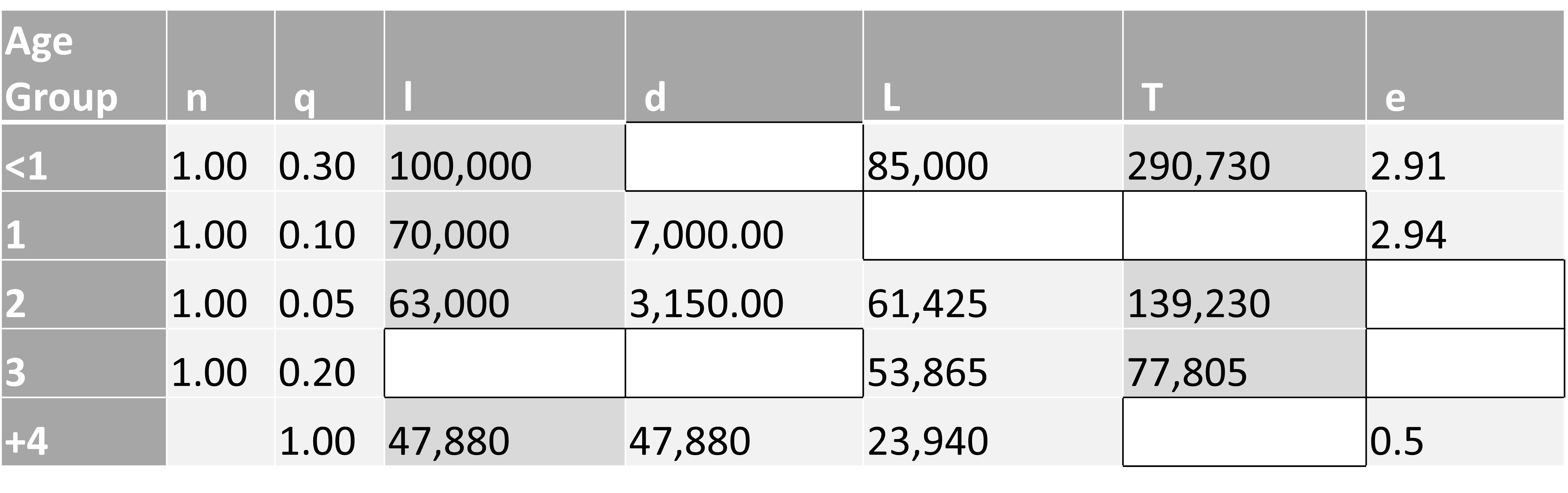
Fill in the blanks, assuming that gerbils die at a constant arithmetic rate during each age interval.
b) What changes if the average newborn dies 10% of the way through the first year?
- A parish is a neighbourhood served by a Christian church of some denomination, in this case, the Church of England. ↵
- Halley, Edmond, “An Estimate of the Degrees of Mortality of Mankind, Drawn from the Curious Tables of the Births and Funerals at the City of Breslaw, with an Attempt to Ascertain the Price of Annuities upon Lives,” Philosophical Transactions, Volume 17, 1693, pp. 596-610. ↵
- An actuary is a professional specializing in risk measurement and management. ↵
- derivation shown at end of chapter if you are interested ↵
- To understand why this is, think of deaths = M multiplied by L, so L = deaths/M and also deaths = l, since no one survives the last age group by definition. ↵
The Life Table computes expected life years remaining for each age group using age-specific mortality rates. It assumes that age-specific mortality rates will not change.
A cohort is a group of people born during the same time period, typically one year.
Infant mortality describes the age-specific mortality rate for babies during their first twelve months of life.
Expected life years remaining depends on a person's age. For a person age x, expected life years remaining is the number of additional years of life the average person age x can expect to experience, assuming that mortality rates do not change from today's levels
Health-Adjusted Life Expectancy at age x is expected life years remaining for the average person age x, adjusted for how healthy those life years will be.
