
Let’s now explore the different fertility rates and what they have to say.
The general fertility rate is measured differently from the birth rate. The birth rate’s denominator is the mid-year population, but the general fertility rate’s denominator is the mid-year population of females of child-bearing age.
The denominator should indicate what number of people in the population are (typically) capable of giving birth.

Age-specific fertility rates (ASFR) give even more precision as to the age of mothers. For example, the (age-specific) fertility rate for females 15 years old = number of live births to 15 year-olds during the year divided by the mid-year population of female 15 year-olds, all multiplied by 1000.
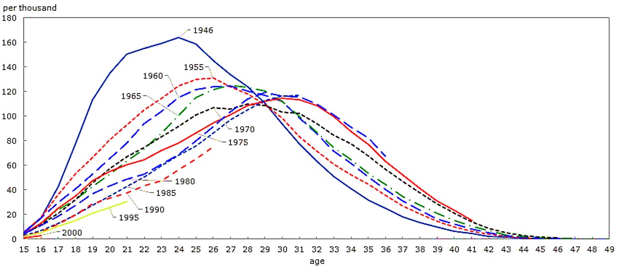
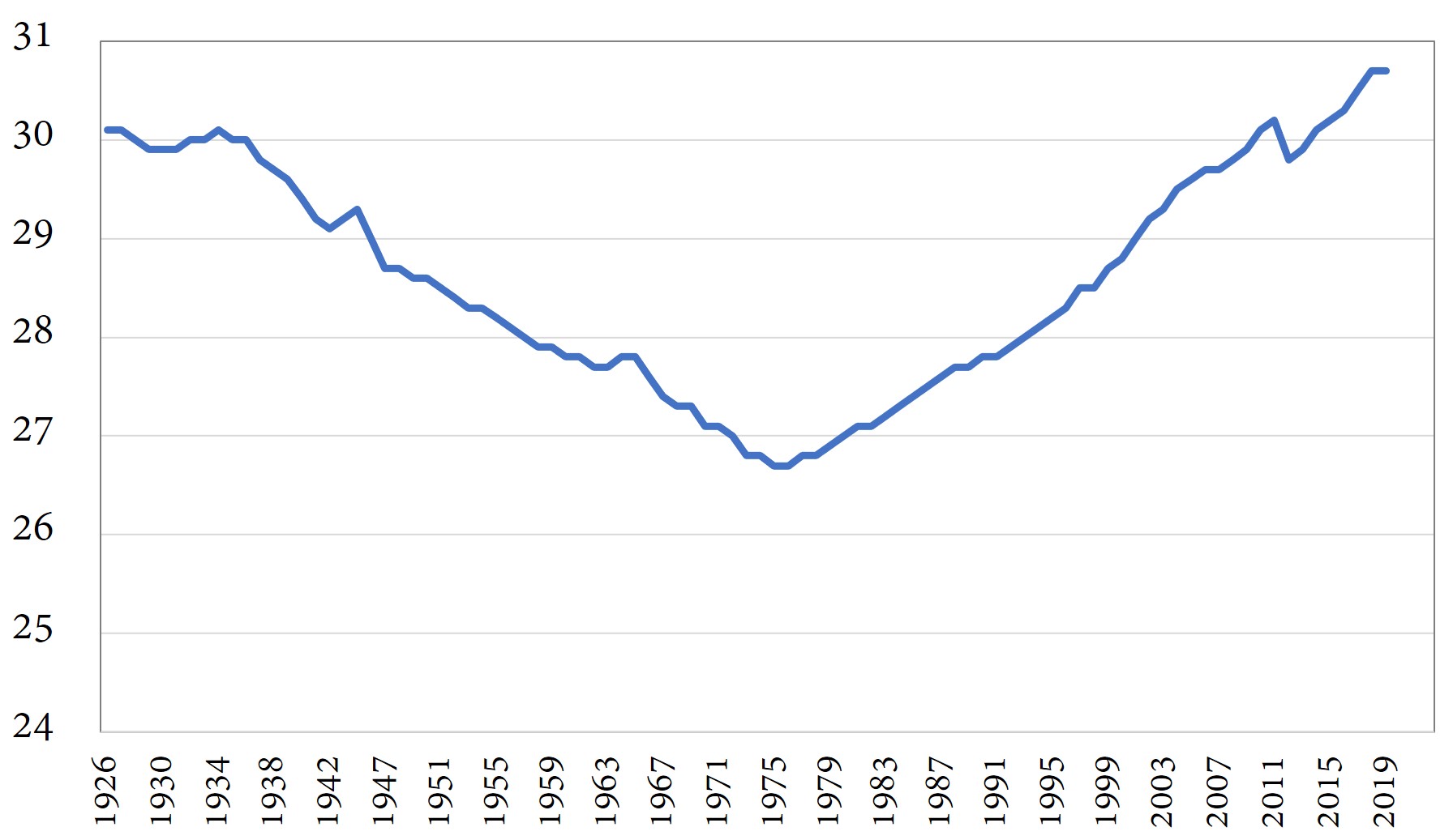
In Figure 11-1, each line represents a different cohort of mothers. The top, dark blue line is for women born in 1946. They experienced their highest fertility when they were 24 years old. This does not mean that women born in 1946 had their first child at age 24. It means that women born in 1946 were more likely to have a baby at age 24 then at any other age, whether to the first, second, or higher order child. Since the late 1970s, the average age of mothers in Canada has been rising. As the dark red line shows, women born in 1975 had their highest fertility at age 30. We cannot yet tell at what age women born in 2000 will have their highest fertility. Not enough time has gone by for them to complete their fertility experience.

Once a woman, or a group of women born the same year, is no longer of child-bearing age, we record how many children were actually born to that woman or that cohort of women. We can compute the completed fertility rate (CFR).

For example, for Canadian women born in 1946, the completed fertility rate was 2.1, i.e. 2.1 children per woman. This includes women who never had children.

But that is looking into the past. To get an idea of how many children today’s women will have, demographers compute a hypothetical statistic called the Total Fertility Rate. The total fertility rate is the number of children which would be born to the average woman IF the average woman will experience today’s age-specific fertility rates at each age of her life.
Just as life expectancy at birth for infants today is calculated assuming that infants today will have today’s age-specific mortality rates as they go through life, TFR today assumes that today’s young women will go through their lives bearing children at today’s age-specific fertility rates. So, TFR is hypothetical, an estimate based on today’s age-specific fertility rates.

where ASFR is age-specific fertility rates, and n represents the number of years in each age category. Age groups are usually 5 years in length e.g. 15-19, 20-24, 25-29 etc.
Why do we divide by 1000? Well, the ASFR gives you the number of children per 1000 women of that age, say 130 children. Now one woman cannot have 130 children. Only 1000 women can. So we divide by 1000 to get the number of children per woman.

If we were to count only the female babies in our ASFR, and then compute female baby TFR, we would have the Gross Reproduction Rate, which is the number of female babies each woman can be expected to have, if present day fertility rates persist.
If we added the step of multiplying each female baby ASFR by the probability of a female baby living to its mother’s age group, we would have the Net Reproduction Rate. A population is self-sustaining if its Net Reproduction Rate is greater than or equal to one.
A TFR of 2.1 is roughly equivalent to a Net Reproduction rate of 1.0. To get one female baby surviving until she reaches the age her mother was when she was born, we need at least two babies to be born per woman, so that one of the babies will be female (on average) and survive to her mother’s age. At least two because more boys are born than girls, and some of both sexes die before reaching reproductive age.
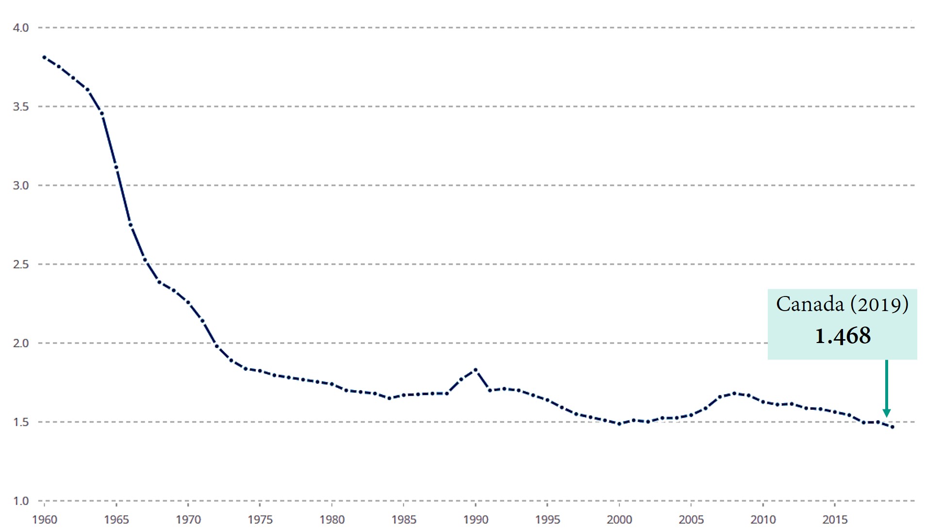
Thus a TFR of 2.1 represents the replacement rate or “replacement fertility”. As Figure 11-2a shows us, the last time Canadian TFR was computed to be above 2.1 was in 1972, when women born in 1946 were twenty-eight years old. Those women were the last women, to date, to achieve a CFR of 2.1.
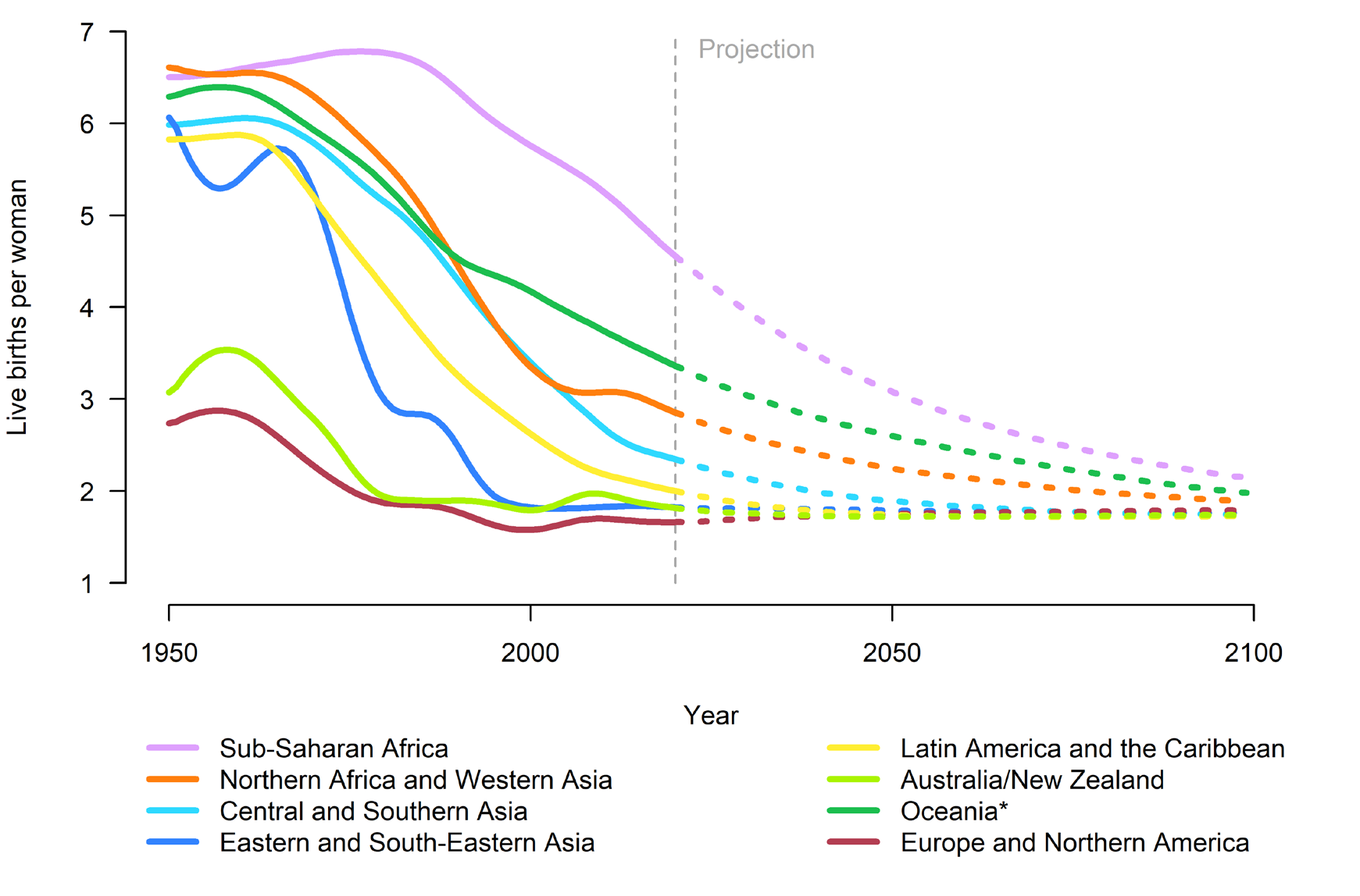
Figure 11-2a above shows us that Canada’s TFR has been below replacement since the early 1970s. Figure 11-2b below shows us that all the regions where TFR was above replacement in 2019 are projected to experience decreases in fertility, so that by 2100, TFR for the world as a whole will likely have fallen from 2.5 children per woman in 2019 to 1.9 children per woman in 2100.


Recall that TFR is computed by assuming that present fertility rates persist. In particular, it assumes that what is going to happen in the future is set. But sometimes parents will hurry or delay their childbearing, without changing the overall number of children they would like to have eventually.
For example, because of the COVID-19 pandemic 2020-2022, many people of various ages delayed having children. That means that various age-specific fertility rates dropped. This caused TFR to drop immediately; however, TFR may increase after the pandemic.
When people delay having children, TFR drops, since it assumes that once today’s women age x become age x+t they will have babies at the same rates as today’s women age x+t, which is lower due to the delays. But in reality, today’s women age x who are delaying childbearing may have children at higher rates than today’s women age x+t, once they reach age x+t.
As Figure 11-1 above showed us, women in Canada, and in many other countries, have over time pushed back the age at which they have children. They have delayed, not because of a pandemic, but for other reasons such as deciding to pursue higher education. This steady increase in the age at which a typical woman has her first baby has led to TFR underestimating the eventual completed fertility rate.

To minimize the discrepancy between TFR and the eventual number of children women will actually have (CFR), demographers have developed a tempo-adjusted TFR.

r(t) measures the influence of postponing fertility. This r(t) is a completely arbitrary way to measure changes in maternal age. Let’s use the Bongaarts-Feeney formula, where:
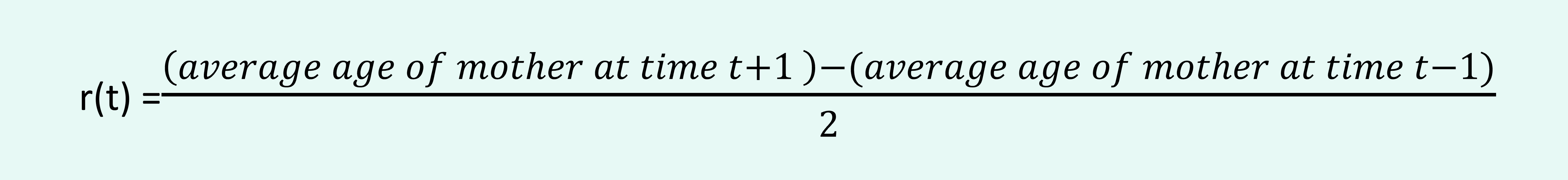 Figure 11-5 features an even more refined measure by Bongaarts and Feeney called Tempo- and Parity-adjusted TFR or TFRp*. TFRp* measures not only the fact that women are delaying births (the tempo effect) but also incorporates details about how many women have already had their first, second, etc. child (the parity effect).[1]
In this graph of Czechian fertility, TFRp* measure is the measure of choice:

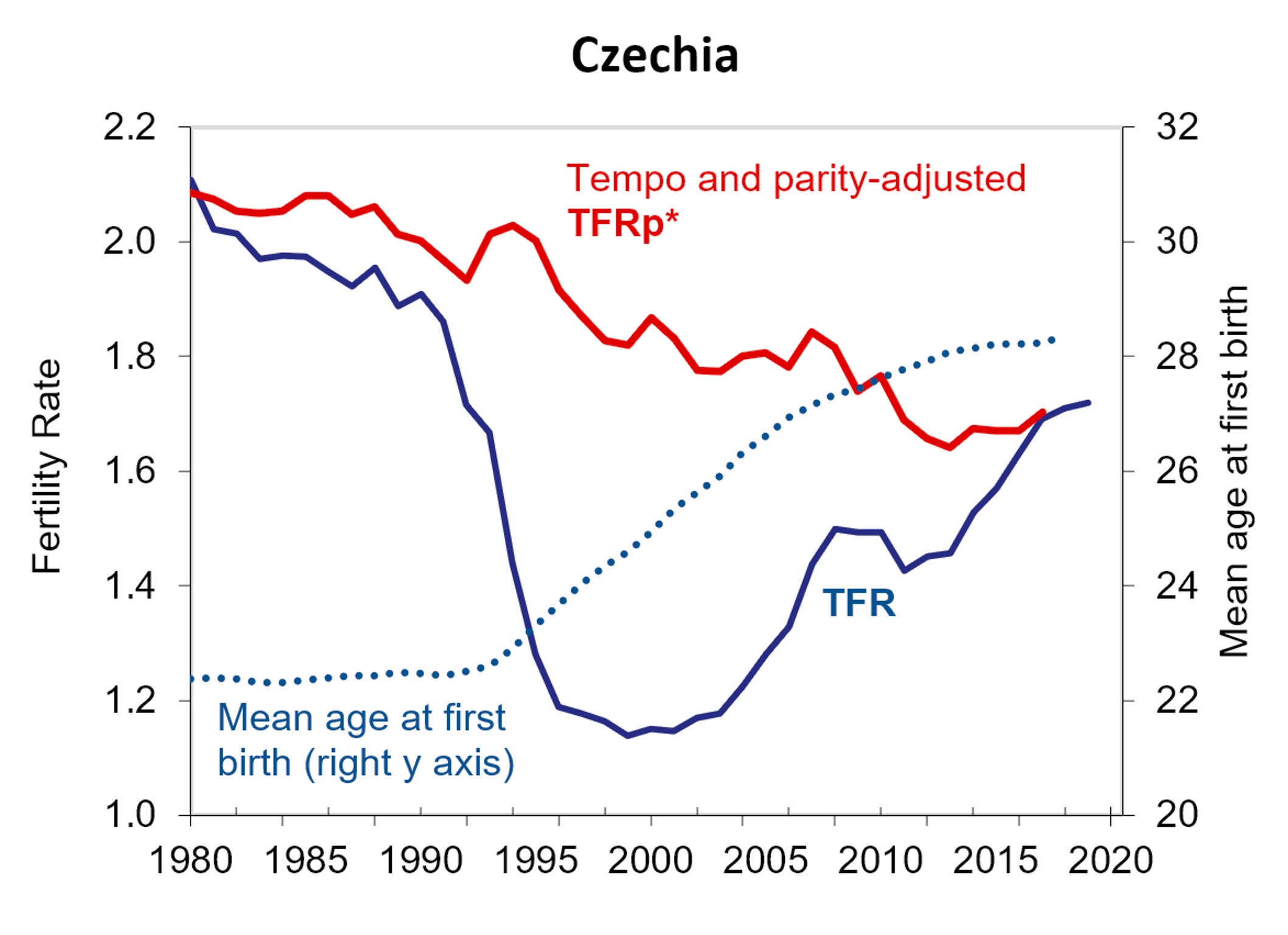
Figure 11-5 shows us that, between 1980 and 2020, TFR in Czechia fell steeply, then rose steeply. Changes in TFRp* were more moderate, and likely more accurate. We will know the Completed Fertility Rate, how many kids each cohort of women actually had, once each cohort of women becomes too old to have children. Since men are equally essential to procreation as are women, why not compute male fertility? Male fertility measures the number of live children born to the average man.

Male fertility can give us information about male health including reproductive health, as well as information regarding men’s choices around family formation. Like female fertility, it can help us predict population change in a country or region.
Some nations collect information on male fertility using the census and other surveys, birth certificate records, and even Life Tables. The Life Table’s mortality information can be used to look for “extra” people as well as missing people. The United Nation’s UN Demographic Yearbook reports birth rates by age of father.
Data collection challenges
There seem to be very few academic sources that have compiled and analyzed data on male fertility. This may be due to the data collection challenge. Whereas the mother of a child is obvious at the instant of birth, the father may be absent and not listed on the birth certificate. In some countries, birth certificates are not issued.
The presence of men temporarily in a region will lead to extra babies being born, but unless these men generate as many babies on average as local men, the presence of migrant men will actually reduce the male fertility rate in that region. For example, the male TFR of Qatar was registered as 0.6 children per male in 2010 in the UN Demographic Yearbook, but the Multiple Indicator Cluster Survey (MICS) in 2012, which excluded migrant workers, counted 2.6 children per male.
There are many different methods of computing male fertility including own-children method, reverse-survival method, date-of-last-birth method, criss-cross method etc., all of which are too involved for the purposes of this text.
Generally, male fertility is reported to be higher than female fertility. Can this in fact be true?
Certainly, the reproductive potential of a typical man exceeds the maximum number of live births an individual woman could experience. According to the Guinness World Records, the most prolific woman ever was Valentina Vasilyeva, who during the 18th century gave birth to 69 children as a result of 27 successful pregnancies.[2] However, that legacy pales in comparison to that of Moulay Ismael the Bloodthirsty, Sharifian Emperor of Morocco (1672–1727), who sired 1,171 children with over 500 women over 32 years.[3].
It is a mathematical reality, however, that if the number of men and women in the relevant age groups is equal, then the average number of live births must be the same for men and women. Male fertility rates must be equal to female fertility rates.
After all, every child born comes from one sperm and one egg. If only a few people with sperm are responsible for a large number of babies, then there must be many people with sperm who are not making babies at all. By the same logic, if the number of heterosexual men and women is equal, it is not possible for the number of heterosexual partners to be higher for men than for women, even though men typically report having more sexual partners.
David Gale proved this with his “High School Prom Theorem” as follows:[4].
“We suppose that on the day after the prom, each girl is asked to give the number of boys she danced with. These numbers are then added up giving a number G. The same information is then obtained from the boys, giving a number B.
Theorem: G=B
Proof: Both G and B are equal to C, the number of [unique, heterosexual] couples who danced together at the prom. Q.E.D.”
Now, the average number of partners for the girls is G divided by the number of girls, and the average number of partners for the boys is also G (because B=G) divided by the number of boys. If the numbers of boys is equal to the number of girls, the average number of partners will be the same for boys and girls.
An illustration of this is shown in the graphic below.

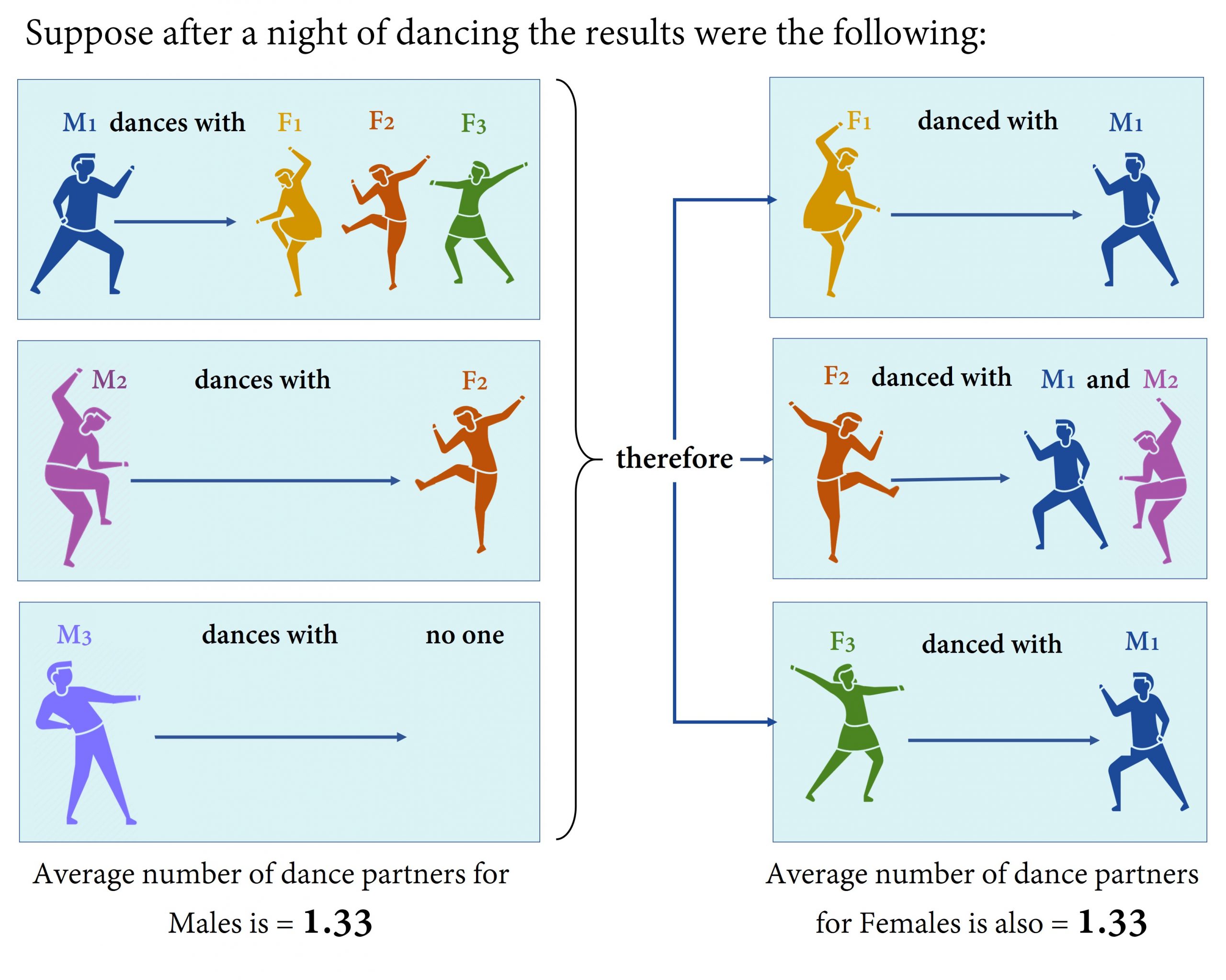
What if, in the high school prom example, there had been only one boy at the dance, and more than one girl? In that case, it is almost certain that the boy had multiple partners of the opposite sex while the girls each had maximum one partner of the opposite sex.
When there is a discrepancy in the number of men and women potentially getting together, there can be a difference in the average number of sexual partners for men and for women, as well as a difference in the TFR of men and the TFR of women.

Large differences in the TFR for men and women can occur when there is a shortage of men able to form families. This can occur due to lack of economic opportunity for men, losses of men during war, and migration of men for work. Social norms around the age of marriage for men and women can also make a difference.
Imagine a baby born to a 21-year old mother and a 28-year old father in a country where the 28-year old male cohort is smaller than the 21-year old female cohort. The baby becomes part of the ASFR for 21 year old females, with that large cohort of 21-year old females in the denominator. The same baby becomes part of the ASFR for 28-year old males, which has a smaller number (the number of 28-year old males) in the denominator. Since TFR is made up of the ASFRs at each age, we can see how TFR for men can be higher than TFR for women.
One of the few large-scale studies regarding male fertility is Bruno Schoumaker’s 2019 Male Fertility Around the World and Over Time: How Different is it from Female Fertility? According to Schoumaker, the difference in male versus female fertility rates can be attributed to the age gap between mothers and fathers, age of fathers at first birth, the physiological ability to have children (known as fecundity) at older ages being higher for men than for women, and the death rates for males of fertile age being higher than for females of fertile age; all these factors reduce the number of potential fathers relative to potential mothers. Schoumaker also refers to local sexual norms around heterosexual behaviour and polygamy, but the High School Prom Theorem declares that those cannot cause a gap between the total fertility rate for men and women when the numbers of available men and women are equal.

The subject of male fertility is interesting as it shifts our thinking about fertility to focus on the role of the man/father/sperm donor and his/their point of view and needs. Measuring children per man will expand the ways that the economics and sociology of procreation and parenthood is understood.

- Based on the following table:

a) What is the crude birth rate for this population?
b) What is the general fertility rate, using 15-49 as the age range of women of reproductive age?
c) What is the total fertility rate?
d) What different information would you need to calculate the completed fertility rate for women who are now age 50?
e) Assuming that the sex ratio at birth is 1.05 for all ages of mother, what is the gross reproduction rate?
- Use the following table to compute the tempo-adjusted TFR for Canada in 2001 and 2004. Can you predict which will be higher, 2001 or 2004, before performing the calculation?
The general fertility rate is the number of live births during the year, divided by the midyear population of women of child-bearing age, all multiplied by 1000.
The completed fertility rate is the average number of children per woman, for women belonging to a particular cohort. It cannot be computed until the women have completed their childbearing years, typically assumed to be age 50. Thus, after 2025 we can compute the completed fertility rate for women born in 1975.
The Total Fertility Rate is the number of biological children the average woman is expected to have during her lifetime. It is an estimate based on today's age-specific fertility rates.
The Gross Reproduction Rate is the number of female babies the average woman can be expected to have, based on today's age-specific fertility rates and sex ratio at birth.
The Net Reproduction Rate is the the number of female children - who survive to their mother's age - that the average woman can be expected to have, given today's age-specific fertility rates, today's sex ratio, and today's age-specific mortality rates.
Replacement exists when the average woman is expected to generate one or more female children by age x who will also survive to age x. A Total Fertility Rate of 2.1 children per woman is usually enough to guarantee replacement.
Tempo-adjusted TFR is the Total Fertility Rate (TFR) adjusted for the fact that the average age of mothers is changing. The definition and a calculation can be found in Chapter 11.
Fecundity is the physiological ability to conceive, have a successful pregnancy, and give birth.
