
In our previous chapter we learned how the age structure of a population changes during the demographic transition. Here we will examine the impacts of those changes on the economy.
Age Structure is not everything
Though the age structure can influence the economy, a country’s economy is influenced even more by its past history, its capital stock, and its current governance than by its current demographics. For example, let’s compare Bangladesh and Japan. In 2020, according to the World Bank[1], Japan had a population which was 25% smaller than Bangladesh’s. Japan also had a lower fraction of its population between the ages of 15 and 64 (58% versus 68% in Bangladesh). Its Aged Dependency Ratio was .51 compared to .08 for Bangladesh. Yet somehow Japan’s workforce was measured to be roughly the same size as Bangladesh’s, 69 million for Bangladesh vs. 71 million for Japan.

Despite having two million fewer people working, and despite those workers being older on average, Japan had a GDP which was more than thirteen times higher than that of Bangladesh, or more than five times higher when adjusting for the difference in the cost of living between the two countries.
Though age structure is not the most important consideration when explaining national income or national income per person, in this chapter we take a look at what role it may play.
Age Structure and GDP per person
Let’s use Y to represent output like gross domestic product (GDP), or GNP, NDP, NNP, Green GDP, Green GNP, etc. This model is going to be real, measured in stuff, not dollars. It won’t show prices or inflation.
N represents population size. So Y/N is output per person.
Output per person, Y/N, can be broken down into three components like this:
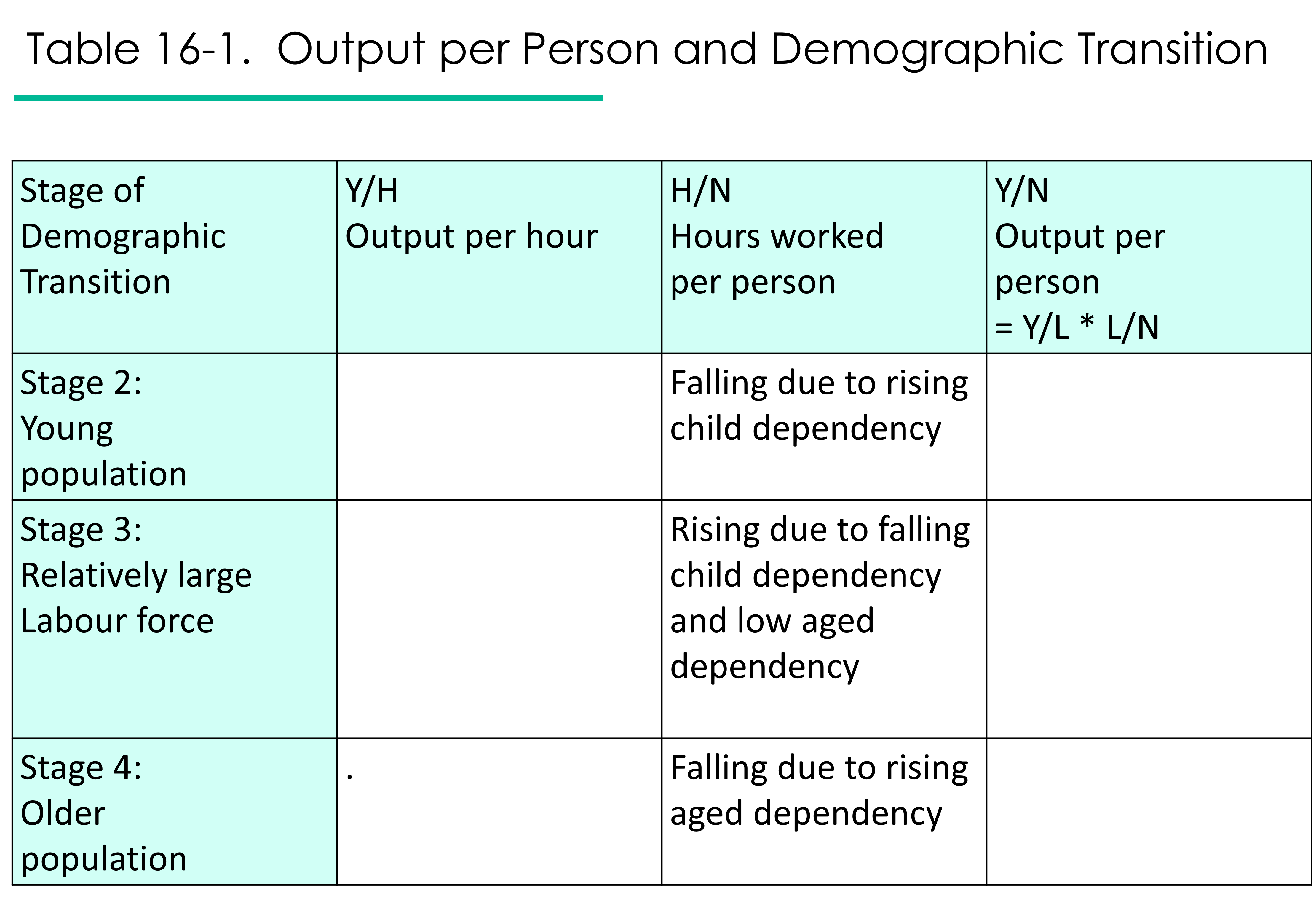
Equation 16-1. Y/N = Y/H * H/L * L/N
In other words,
output per person = output per worker hour * hours per worker * fraction of the population which works
There are then three ways to improve output per person: by increasing output per worker hour (known as labour productivity), by increasing the number of hours worked per worker, and by increasing the fraction of the population which is working.
Please note the following important point:
Output per person has nothing to do with the absolute size of the labour force.
Fiscal Dependency
What about the amount of money that governments spend on health care and other supports for older adults? Might that reduce GDP?
Spending does not necessarily affect income. Just because you are spending a lot on your elderly parents doesn’t mean your income has declined.
While money spent on particular groups affects the amount of money left for other groups, it doesn’t mean that income has declined. Taxes and transfers cancel out; they don’t reduce GDP per person unless they discourage productive activity or productive investments.
Age structure and hours worked per worker (H/L)
What is the affect of aging on H/L, hours worked per worker? We can expect that to lessen as workers age, though some older workers will be working more hours than very young workers or workers who also have caregiving responsibilities to children and elders.
Age structure and the fraction of the population that works (L/N)
The fraction of the population that works is inversely related to the Total Dependency Ratio, so we expect it to be lower for very young and very old populations. It will be highest in Stage 3 of the Demographic Transition, when both birth rates and elder survival are low.
Defining the Total Dependency ratio as the number of Canadians less than 20 years old and older than 65 years old divided by the number of Canadians between the ages of 20 and 65, Denton and Spencer (2019) estimated that the Total Dependency Ratio will increase from 0.383 in 2016 to 0.45 in 2036, then stabilize for at least ten years. Tracking the population by age and sex and likely employment rates, they calculated that, due to increasing aged dependency, GDP per person in 2036 will be only 91% of what it was in 2016, all other things being equal.
But not all things need remain equal. Denton and Spencer show that increasing the labour force participation rate for those over age 65 by 50%, reducing unemployment rates by 33%, and increasing hours worked for each worker by 20%, all by 2026, would be enough to keep GDP per person constant.
There are natural limits to how high we can get the labour force participation of 20-65 year-olds and 65+ year olds; there are structural limits to how low we can get the unemployment rate; and there may be natural, cultural, and political limits to how high we can get hours worked per worker.
So it is likely that aging will be associated with a falling fraction of the population that works, as well as reduced hours per worker.
Knowing what we do now about H/L (hours worked per worker) and L/N (fraction of the population that works), and realizing that multiplying them together gives us hours worked per person
Equation 16-2 H/N= H/L *L/N
let’s fill in the middle column of our chart.
Age structure and labour productivity (Y/H)
Besides possibly increasing the fraction of people working or the hours worked per worker, we may be able to increase output per person by increasing labour productivity. Labour productivity is output per worker hour.

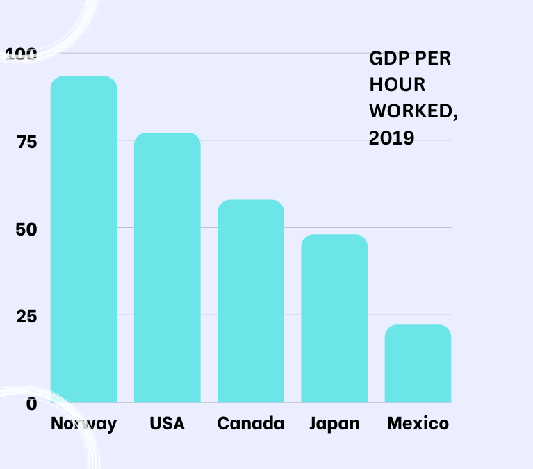
We see in the graphic above that in 2019, Norway’s GDP per hour worked was more than four times that of Mexico’s. The GDP is measured in US dollars and adjusted for differences in each country’s prices, so it measures physical output. Norway was literally producing four times as much in marketed goods and services per hour than was Mexico.
Going back to our comparison of Bangladesh and Japan, Japan’s higher labour productivity has allowed Japan to enjoy a high level of output per person despite decreases in the fraction of the population working and an aging workforce.
It’s usually assumed that a worker’s personal productivity rises, then falls, over the course of their working life. Denton and Spencer (2019), in their study of the Canadian labour force, estimate that decreases in productivity due to the Canadian workforce becoming older could slightly aggravate the loss in GDP per person due to a smaller fraction of the population being working age. For example, instead of GDP in 2036 being 91% of its 2016 level, it would be 90.7% if older workers are less productive.
They go on to estimate that, instead of improving employment rates and increasing hours worked to keep Canada’s GDP per capita steady to 2036, it would be sufficient to increase overall labour productivity by 0.62% per year 2016-2026 and by 0.33% per year 2026-2036. These rates are manageable when compared to the 0.76% average annual growth in labour productivity achieved during 2006-2016.
How to improve Labour Productivity? Labour Productivity is known to depend two things: the capital-to-labour ratio, and the efficiency with which capital and labour are combined.
Efficiency, denoted by “A”, can be improved with new technologies and techniques. It can also be improved by increasing the degree of competition, increasing worker motivation, and improving infrastructure. It is not the quality of labour or the quality of capital; it is not labor efficiency or capital efficiency; it is overall efficiency, sometimes called “multifactor productivity” or “total factor productivity“.
As the workforce ages, it may become less innovative and less able to cope with technological change. So labour productivity may decline due to a loss of efficiency. On the other hand, an older workforce embodies a lot of experience and institutional knowledge.
The capital-to-labour ratio or capital:labour ratio tells us how much capital is available per worker-hour. Call it K+/L. K normally represents physical capital like tools, equipment, computers and software, buildings, laboratories and roads. However, other forms of capital are also important to labour productivity, such as human capital (skills, knowledge, attitudes, health), environmental capital, and financial capital. Let’s include all the different kinds of capital in K+.
The capital-labour ratio likely increases through the Demographic Transition, ceteris paribus. In Stage 2, public and private savings that could be used to invest in capital are diverted to looking after the growing fraction of children and youth. The labour force begins to grow, and capital may not be able to keep up. This is called capital shallowing.
In Stage 3 of the Demographic Transition, dependency is low. Savings can be channeled to investments in the productive capacity of the economy. The labour force is growing rapidly, but capital might be able to keep up if the nation can borrow at affordable interest rates, if savings and borrowing are invested in the domestic economy, if the economy is well-run, and if foreign investors are not easily spooked.
In Stage 4 of the Demographic Transition, dependency begins to climb as older adults become an increasing share of the population. Though people in their sixties begin to spend their savings, people over sixty-five typically still have a fair amount of savings which can be invested in the productive capacity of the economy. That is one reason that interest rates have been so low in the western world in recent decades. Meanwhile, the labour force is not growing much, so the capital:labour ratio can stay strong.
Let’s fill in the first column of our table with what we’ve learned.
Finally, let’s fill in the last column to come to some conclusion about output per person.
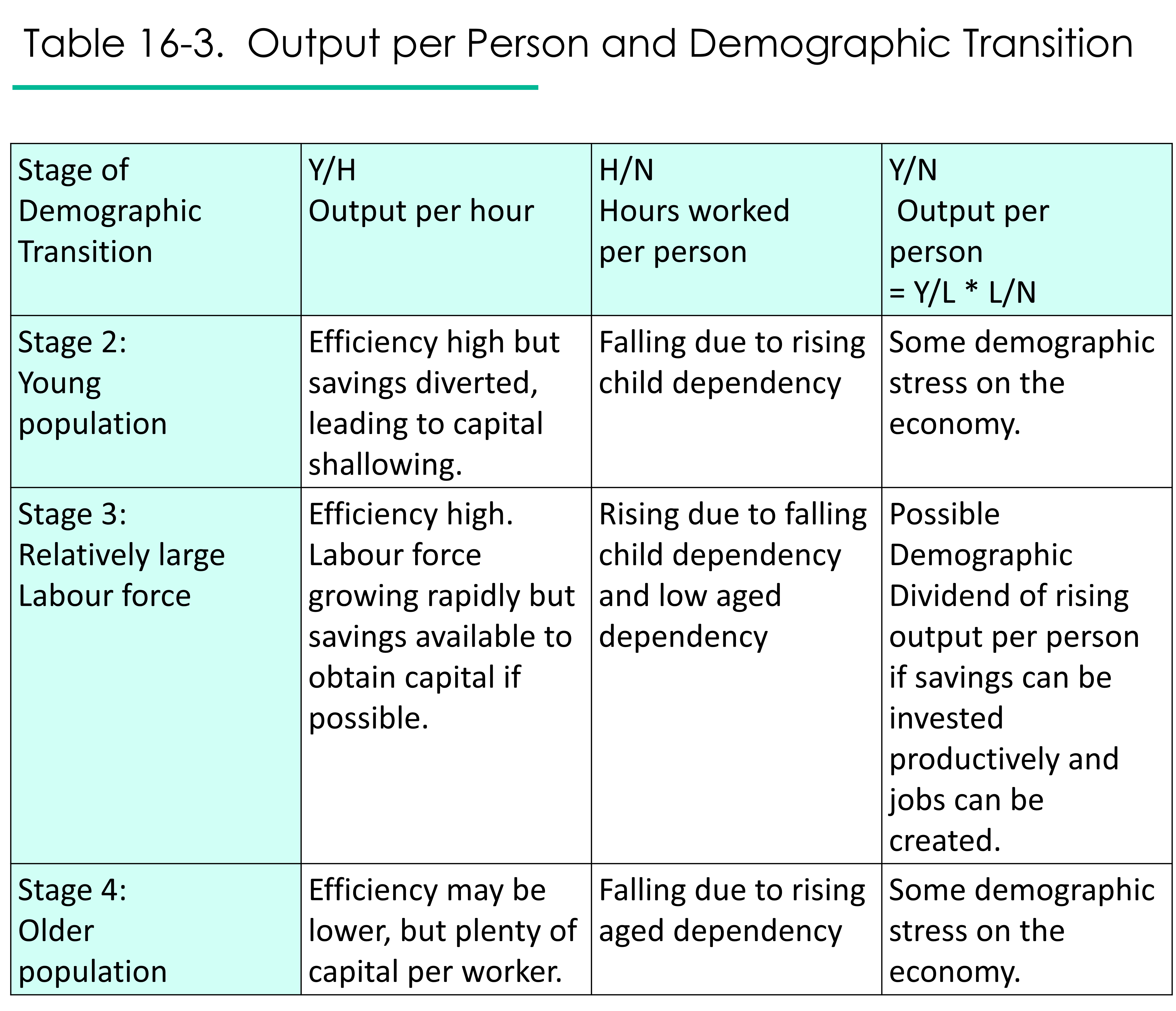
In summary, both young populations and aging populations are potential sources of stress on the material standard of living due to rising dependency and indeterminate effects on labour productivity. By contrast, Stage 3 of the Demographic Transition, where dependency is low and there is a large fraction of the population of working age, offers potential benefits known as the Demographic Dividend.

Age Structure and Wages
Anytime the age structure of society changes, various markets are affected – the labour market and wages, the loanable funds market and interest rates, the housing market, and the education market in particular.
When the labour force is rapidly growing, as in Stage 3 of the Demographic Transition, we expect wages to come down and jobs to be more difficult to find. In Stage 4, with labour force growth slowing down, there should be more job opportunities and higher wages. What about Stage 2, when the population is beginning to grow, and the labour force is not yet a large fraction of the population? A shortage of capital may limit the number of jobs or how well-paid they are.
Age Structure and Interest Rates
Interest rates are the prices for various kinds of loanable funds. Interest rates are going to be high anywhere that loans are expensive.
In the second stage of Demographic Transition, there may be a shortage of loanable funds because savings are being diverted to provide for children and youth. As well, most of the people in the population are young and not at the stage of life where they save. Meanwhile, there will be a growing demand for mortgages as the growing population seeks housing. Expect interest rates to be high.
In the third stage, where the working force is a large part of the population, things are more balanced. While there is still strong demand for housing and for business loans and equipment, there is now a strong supply of loanable funds as the number of people working and saving has increased and the dependency ratio is low. Expect interest rates to fall, other things being equal.
In the fourth stage, where the population is aging, interest rates may be lower yet. Demand for mortgages and business loans may be lower, as the population and the workforce is growing more slowly. Supply of loanable funds is still high as older workers save more than younger workers, and retired workers spend their savings only gradually.
Spending over the Life Cycle
Figure 16-1 shows us consumption and income for a typical person at each age in South Africa, in 2015. The red line shows the difference between consumption and income. Instead of dollar amounts being shown, all amounts have been divided by the average labour income for 30-49 years-olds (“peak labour income”).
We see that South African newborns, children and youth of course consumed more than they earned in 2015, since children typically cannot earn. Their consumption was paid for by the government (dark blue bars) and their family (medium blue bars). They saved some money (light blue/turquoise bars).

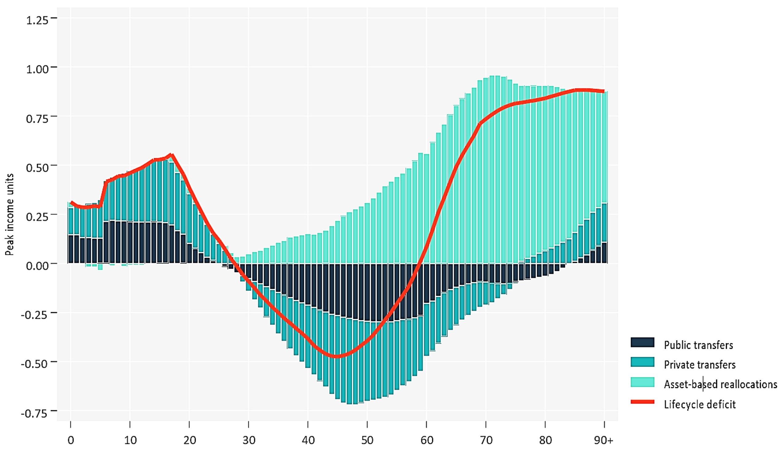
South Africans in their late twenties were paying their own way by consuming about the same value as what they earned. South Africans age 30ish to age 60ish were net earners; consumption was less than income, which is why the red line is in the negative region of the graph. People ages 30-60 paid taxes to the government (dark blue) and spent money on their family (medium blue). They also enjoyed returns on their investments (light blue), such as living rent-free in a home they owned. Between ages 60 and 75, South Africans consumed more than they earned (red line is above zero), even though they continued to pay taxes and support family. Investment income, and also the liquidation of savings, made this possible. Investment income was also the chief source of support for South Africans in their late fifties and older.
We see that, in this example,
- most taxes were paid by people in their forties and fifties
- most government transfers were received by people under the age of 25 and over 85
- people between the ages of 30 and 69 earned more than they consumed. Individuals ages 38 to 57 earned the highest incomes.
If we graphed savings by age, we would see that savings is done mostly by people who have been working for some time. The amount saved grows as workers age, and peaks right before retirement. After that, the amount saved may decline as retired adults begin to use up some of their savings. The decline in savings is steepest near the end of our lives when we require nursing care. The outline of savings over the life cycle would look similar to the outline of investment income over the life cycle in the graph above.
In 2019 the average net worth (savings[2] minus debt) of Canadians under 35 was $48,800; for Canadians ages 35-44 it was more than four times higher, at $234,400; for Canadians ages 45-54 it was $521,100; for Canadians ages 55-64 it was the highest, at $690,000 (about three times as high as it was for 35-44 year olds); and for Canadians 65+ it was $543,200.[3]
In our next chapter we’ll summarize the special challenges of young populations and of aging populations, and we’ll discuss the issue of intergenerational fairness.

- The United States typically has higher GDP per person than Canada. Imagine why using Equation 16.1.
- Trace the possible consequences of immigration on GDP per person using Equation 16.1.
- How would a prolonged period of high interest rates affect a young, growing population?
Labour productivity is a measure of how much output is produced per unit of labour. Labour units are usually hours worked.
In this text, capital shallowing refers to any decrease in the capital-to-labour ratio that is due to increases in the size of the labour force.
The Demographic Dividend is the material benefits a society may reap when it has a low Total Dependency Ratio. See Chapters 16 and 17 for details.
