Having studied stable populations and stable age structures, we will now study a very unstable period of time known as the Demographic Transition. The Demographic Transition is powered by natural increase and decrease.
After 1750, the standard of living in market economies improved gradually, then ever more rapidly. Even today we enjoy a level of material comfort and convenience almost indescribable to our great-grandparents. This new era was kickstarted by an episode known as the Industrial Revolution. The Industrial Revolution would be followed by a revolution in demographic trends which we call the Demographic Transition.
Much scholarship has been devoted to explaining the causes of the Industrial Revolution, and to pinpointing exactly when it began. A combination of factors including literacy, social mobility, and cheap coal gelled to create an atmosphere in England that was conducive to research, innovation, and mechanization. Coal fires heated water into steam, and steam engines drove all kinds of farm equipment, locomotives, and pumps. Major improvements to cotton processing and thread spinning transformed the textile industry.
During the Industrial Revolution, England had access to cheap raw materials from its colonies. Indigenous peoples were being dispossessed, and Africans, enslaved. Population pressures in England were eased by the possibility of emigration to the colonies. Job opportunities for English young men with education were expanding.
In the early years of the Industrial Revolution, most British and European people were farmers, without insurance, banking services, education, or the right to vote in national elections. Over forty percent of Englishmen had no access to common land let alone private property[1]. Most of them worked as labourers. Naturally, many people were frightened by the development of machines – especially threshers, mowers, and other agricultural equipment – to replace manual labour.

One remarkable thing about the Industrial Revolution is that it raised the standard of living for most people. You might think that labour-replacing machines would erode the incomes of labourers. You might remember images of eighteenth and nineteenth-century London filled with beggars and shady characters from the writing of Charles Dickens and others. However, the Industrial Revolution lifted millions of people out of abject poverty. Clark (2008) presents data to show that the share of English national income going to unskilled workers actually rose during the Industrial Revolution. How could this be?
The Industrial Revolution replaced unskilled workers with machines, but it also replaced skilled workers with machines. It replaced poorer machines with more effective machines. It made machines better and more affordable. It also made land more affordable: no longer would vast acreages be needed to grow food for horses and oxen. Horses and oxen were being replaced by coal-fed machines like mechanical threshers and locomotives. Because of these changes, the premium earned by skilled workers, equipment owners, and landowners fell, helping unskilled workers. Unskilled workers benefited from opportunities in the colonies, or the cheap commodities imported from those colonies. Emigration of unskilled workers to the colonies eased downward pressures on the wage of unskilled workers in England.
The Industrial Revolution was accompanied and facilitated by innovations in central banking and private finance. Loans became more plentiful and affordable, another reason that land, skilled services, and machinery became more accessible to unskilled workers.

The cost of living fell as land prices and machinery prices fell. The cost of living fell as the price of soap, cotton fabric, sugar and other products new and old fell with mass production and with the importation of raw materials from colonists and slave plantations.

In response to the rising standard of living in England, mortality rates in England began to fall, especially for children and young people. As shown in Figure 15-1, the crude death ratein England and Wales fell below the crude birth rate in the middle of the 1700s, and not until World War 1, more than one hundred and fifty years later, would the birth rate again get near the death rate. The gap between the birth rate and the death rate meant a growing population. As the number of people surviving to childbearing age began to increase, crude birth rates rose even more than they had been doing for the century before the Industrial Revolution.
In about 1800, the birth rate in England began to fall despite the positive population momentum, implying that fertility rates were now declining significantly.

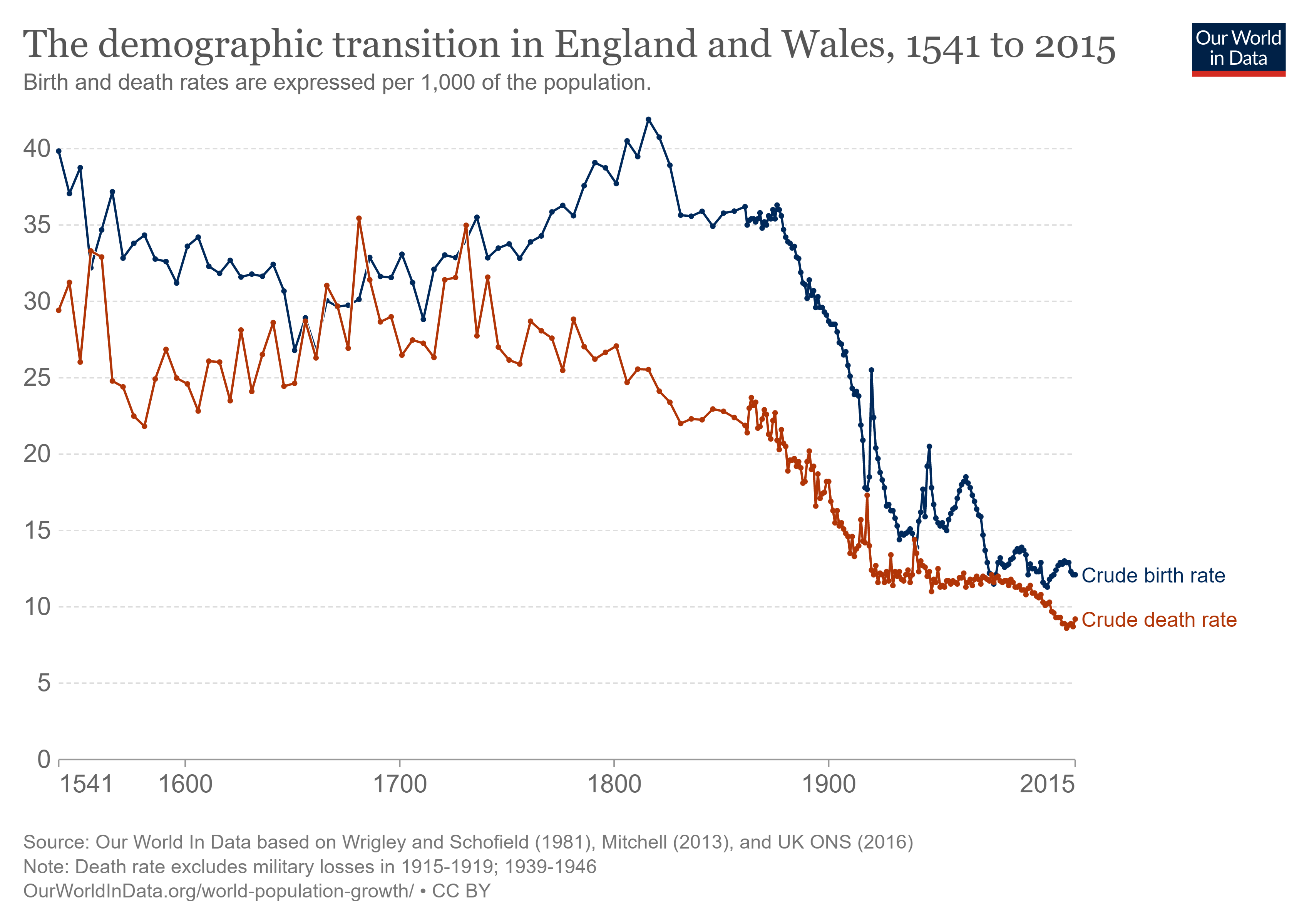
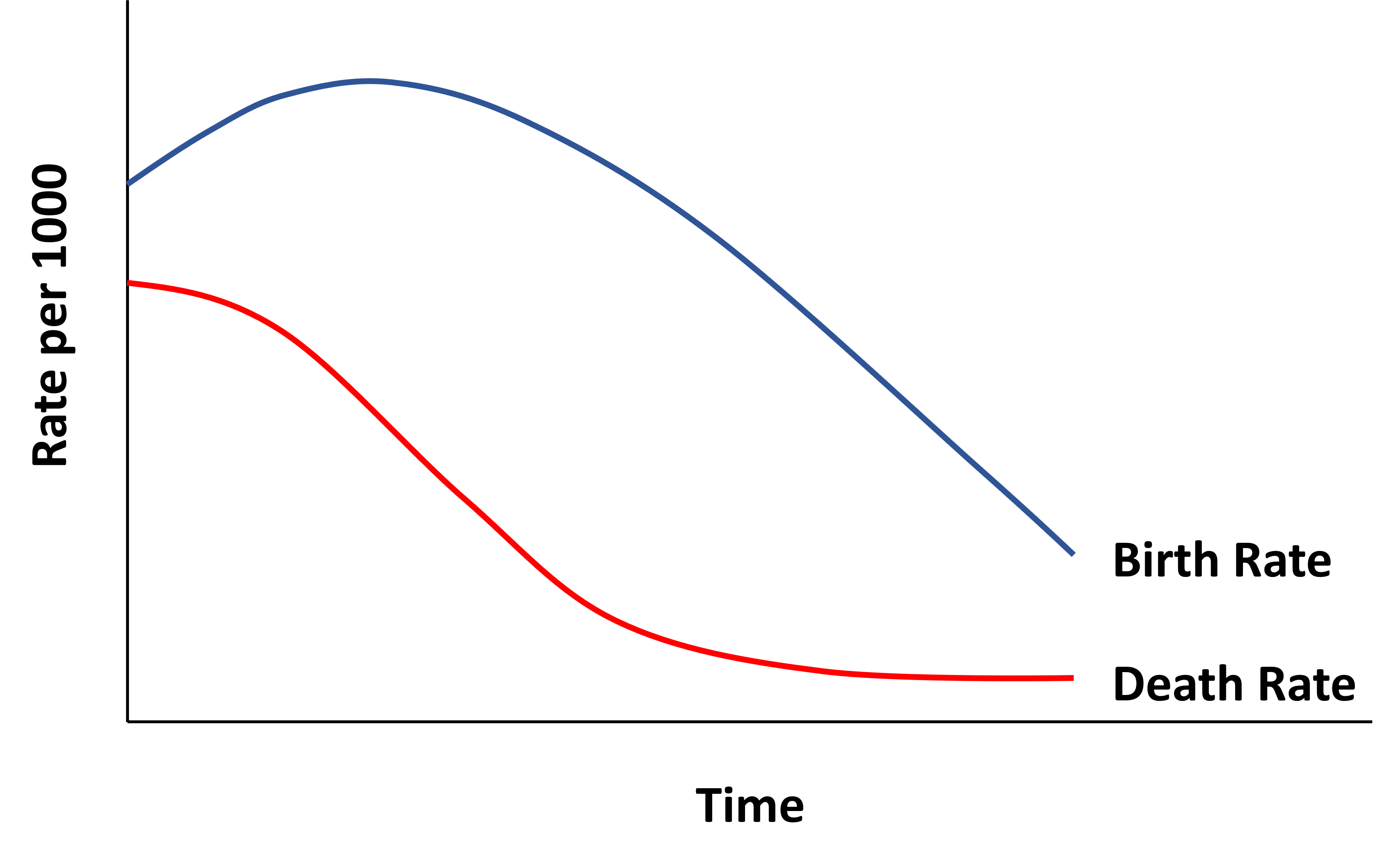
This pattern of demographic change, with death rates falling, and birth rates eventually falling whether or not they initially increased, accompanies economic modernization wherever it occurs and is known as the Demographic Transition. Figure 15-2 shows the typical pattern.

Jean-Claude Chesnais (1992) studied the Demographic Transition in sixty-seven countries. He examined data from the period 1720-1984 and concluded that “there are no two countries – even geographically and historically similar ones – that have traced the [exact] same course of transition…”
He did, however, uncover some common patterns:
- The transition begins with a decrease in mortality. ALL transitioning countries experienced a decrease in infant mortality and child mortality before experiencing a decrease in fertility.
- The mortality decline is usually accompanied by mass literacy, especially among females.
- Fertility decline happens at some point. Improvements in female literacy may be necessary for fertility decline to occur. Economic development also seems to be needed for fertility to decline. (However, this was not the case for France, Bulgaria, or Sri Lanka. Recall from Chapter 11 that the European Fertility History Project emphasized secularization most of all.)
- After fertility falls, marriage begins to occur later and less often.
- Urbanization and high land prices seem to reduce fertility.
- The higher the net reproduction rate, the higher the rate of emigration.
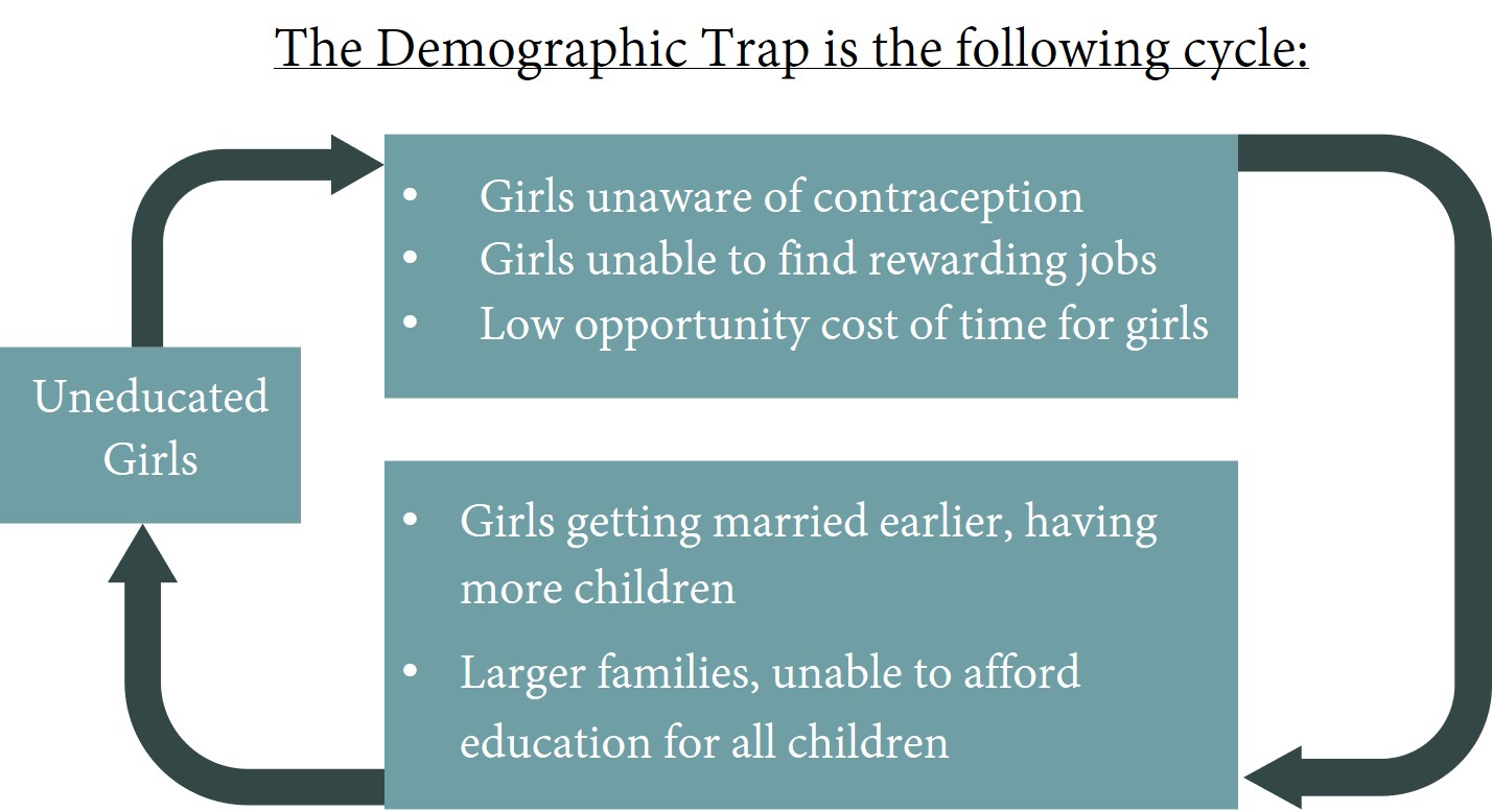
Notice Chenais’ emphasis on female literacy. Without it, Demographic Transition may be thwarted by the Demographic Trap, shown in Figure 15-3.

Comparing societies before and after industrialization, as we do in Table 15-1, we see that innovation accelerates, mortality falls, and fertility falls. Hence our ability to feed ourselves grows as our population grows. There is no guarantee, however, that this happy dynamic will continue forever.


During the demographic transition, population growth accelerates, then wanes. The age structure of the population also changes. Dependency ratios and population pyramids help us describe the changes in age structure.
The Child Dependency Ratio a.k.a Young Dependency Ratio (YDR) is the number of children per working age person, commonly computed as persons age 0-14 divided by persons age 15-64. The Aged Dependency Ratio is the number of older people per working age person, commonly persons age 65 and older divided by persons age 15-64. According to the World Bank, in 2022 Canada had a CDR of 0.24 and an ADR of 0.24. Table 15-2 shows the 2022 dependency ratios in Canada compared to those in a selection of African countries, and Japan.

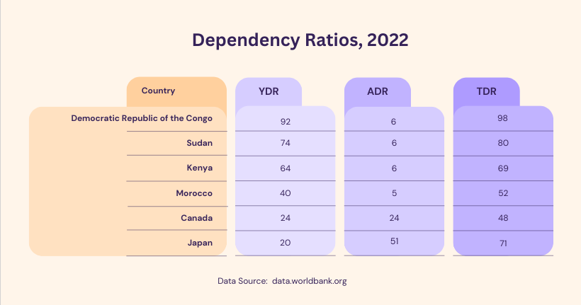
The Total Dependency ratio, (TDR) is equal to the Child Dependency Ratio plus the Aged Dependency Ratio. Canada’s 2022 TDR was 0.48.
Depending on the situation, you may wish to modify the dependency ratio calculations.

Looking back at Canada’s recent demographic history using Figure 15-4, we see that Canada’s Total Dependency Ratio rose during the 1940s and 1950s, fell during the 1960s and 1970s, and began to rise in a sustained way around 2010.

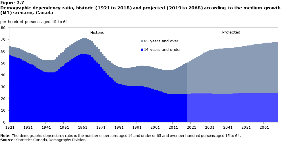
Figure 15-4 shows us that young dependency in Canada was about twice as high in 1921 than it was in 2018. Young dependency fell steadily until 1941, but surged after World War II as the Baby Boom Generation was born. Young dependency reached a local peak in the early sixties, and fell until the mid-nineties when there was a bump representing the grandchildren of the Baby Boomers.
Aged dependency in Canada has been growing since the late 1970s. It is currently propelling an increase in total dependency; however, total dependency is not predicted to be much higher in 1968 than it was in 1921.
As countries pass through the demographic transition, their dependency ratios change in a fairly predictable way which can be visualized using population pyramids.

The detailed age and sex composition of a population can be seen at a glance in a population pyramid. The various age groups ascend the vertical axis, while along the horizontal we see the number of people or the proportion of people in each age group: to the left, we see the males; to the right, we see the females.
The five-year age groupings are popular because, in interviews, people tend to round their ages to numbers ending in 5 and 0.
Population Pyramid Shapes
Figure 15-5 below, which is highly stylized, shows us how a nation’s population pyramid changes as it goes through the Demographic Transition.

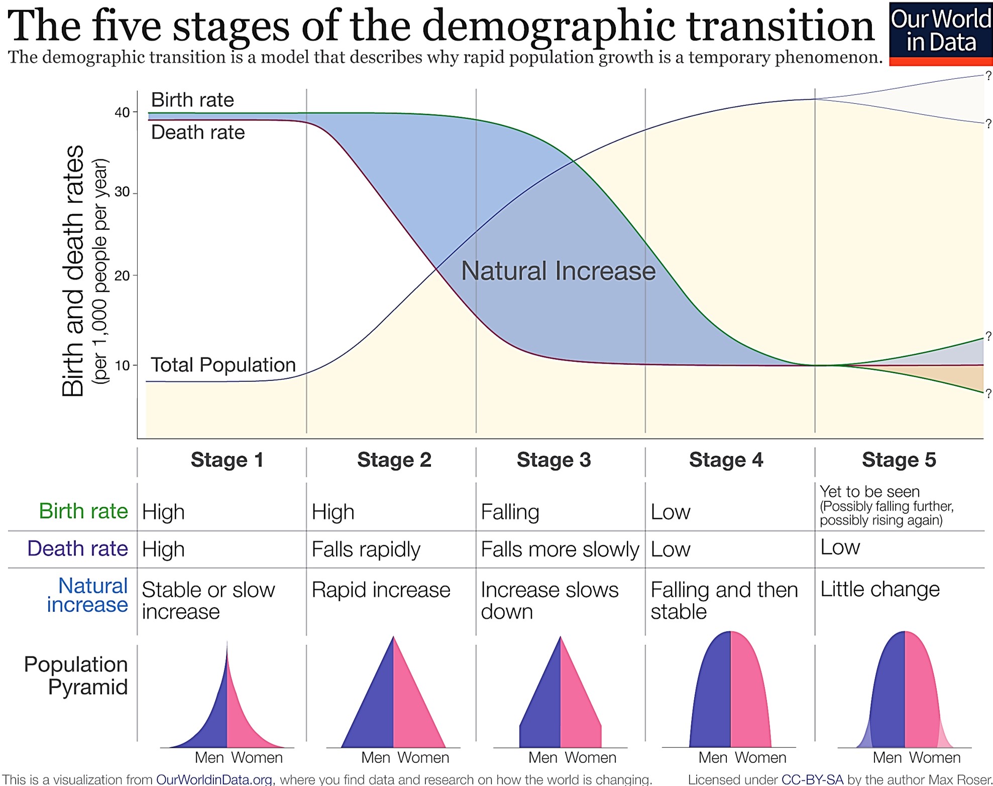
In Stage 1, before the Demographic Transition really begins, human societies have high birth and death rates, and especially high infant and child mortality rates. This means that the bottom of the pyramid is wide (many newborns), and that the width tapers off rapidly (many deaths in infancy and childhood). Young dependency is high because there are many newborns but far fewer adults. Aged dependency is low, because not many people survive to older ages. Total dependency is high.
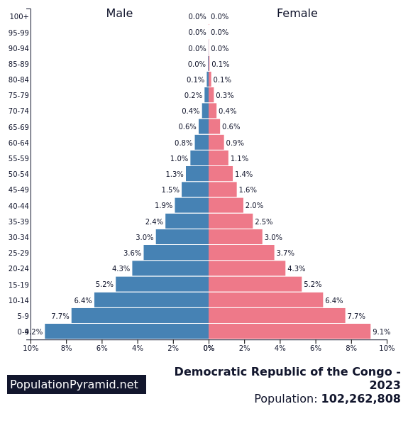
Figure 15-6 is an example of the Phase 1 shape. It was expected that 18.3% of the population of the Democratic Republic of the Congo would be under five years of age in 2023. In 2022 there were 92 children under 15 years of age for every adult of working age. Each successive age group was smaller in number, and the convexity of the pyramid indicates high death rates even for younger people. Less than five percent of the population is over sixty years old. Over 55% of the population is under twenty years of age.

Stage 2 of the Demographic Transition
In the early phase of the Demographic Transition, the death rate falls, mostly because of decreases in infant and child mortality. You may remember this from Chapter 9. These decreases will tend to increase the Young dependency ratio (YDR), and consequently, the total dependency ratio (TDR). If birth rates are increasing too, YDR and TDR will increase even more.
This pressure will ease somewhat as more youths survive into adulthood and working age.
In Figure 15-7 we have a population pyramid that is less convex overall. In Western Africa in 2023, it is mostly the older age groups that seem to have high death rates. The fraction of population that is under the age of 5 is still high, but less so than it was in DRC. The fraction of the population than twenty years old is less, though still over fifty percent. The fraction of the population over age sixty is about the same.


Stage 3 of the Demographic Transition
In the middle of the Demographic Transition, birth rates fall and the base of the pyramid shrinks, settling into a rectangular shape. Child dependency falls, but ADR is not moving much since there are not yet that many people surviving into old age. Old-age mortality is the last category of mortality to experience reductions. Total dependency falls. It is at this point that society has the potential to earn a Demographic Dividend, as will be discussed in more detail in Chapter 17.
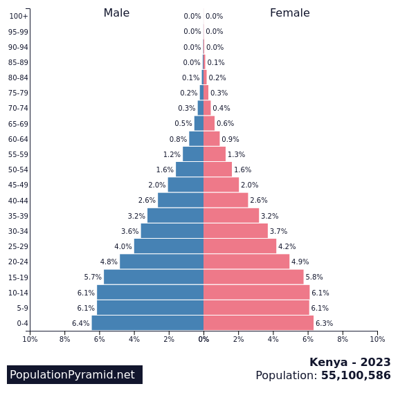
Kenya is a good example of this, as shown in Figure 15-8. Again, less than 5% of the population is over the age of sixty, but only 13% of the population is under the age of five. Slightly less than half the population is under the age of twenty. In 2022, there were only 5 people over age 65 for every 100 working age people.

Stage 4 of the Demographic Transition.
In the late phase of the Demographic Transition, infant and child mortality remain low, and the birth rate continues to drop. Now that more older adults are surviving, the population is aging. The Aged Dependency Ratio rises. It may rise to the point where the Total Dependency Ratio is rising as well.
The population pyramid may begin to resemble a muffin as young cohorts are smaller and the older cohorts are persistently large. If fertility continues to decline, the muffin may stretch into a kite. Eventually, a Stage 4 population with stable birth rates will be tall and rectangular.
Figure 15-9 shows us the population pyramid predicted for Morocco in 2023. There is not much tapering going on until middle age, and convexity is not seen until age 70. Finally, more than five percent of the population is over sixty years of age; in fact, more than twelve per cent is over sixty years of age. Less than thirty-five percent of the population is below the age of 20. In 2022 the Total Dependency Rate was 62 dependents for every 100 working-age people.

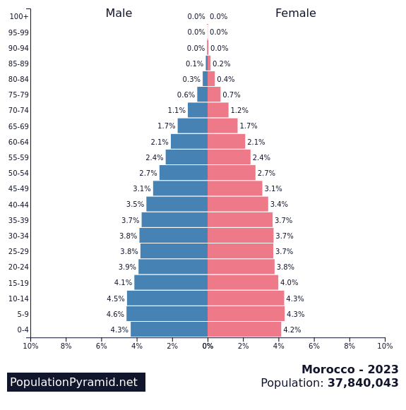
Downloaded 2023.
Stage 5 of the Demographic Transition
The most economically-developed nations of our world have passed through the demographic transition, and their rates of population growth have greatly declined. In fact, more than half of the world’s population lives in regions where fertility is less than replacement[2]. However, many of the word’s less economically-developed nations are still in Phase 2 of the Demographic Transition where death rates have fallen but birth rates remain high.
According to Sciubba (2022), the world’s population growth rate is slowing down. Whereas in 1950 there were 1.73 more births per thousand than deaths, by 2022 natural increase had fallen to 0.84 per 1000. It is now taking us longer to add successive billions of people to our planet.
The United Nations estimated in 2019 that we will reach a plateau of about 10.9 billion people in 2100, assuming continued mortality reductions, reductions in fertility in countries where the Total Fertility Rate is still high, and a slight increase in fertility in countries where the Total Fertility Rate is below 2.0 children per woman. [3]
What will happen for the world population beyond 2100, or even before then in individual nations? Will Stage 5 feature population shrinkage, with birth rates below death rates, and countries competing for immigrants? We will have to wait and see.
In the 1930s, demographers worried about declining birth rates. The baby boom that occurred after World War II put an end to their worries. Thirty or forty years ago academics and the media were worried about exploding population and environmental collapse. In the last ten or twenty years, attention has turned to the aging populations of the West and Japan, and the spectre of a shrinking labour force.
We should never panic, but remember that fertility and other decisions which bring about population change depend on the individual decisions of millions of fundamentally unpredictable people who singly and collectively influence and are influenced by social norms and economic pressures, and who may have a spirituality and sense of purpose capable of transcending any status quo.

Use the data in the chart below to answer questions 1-6.
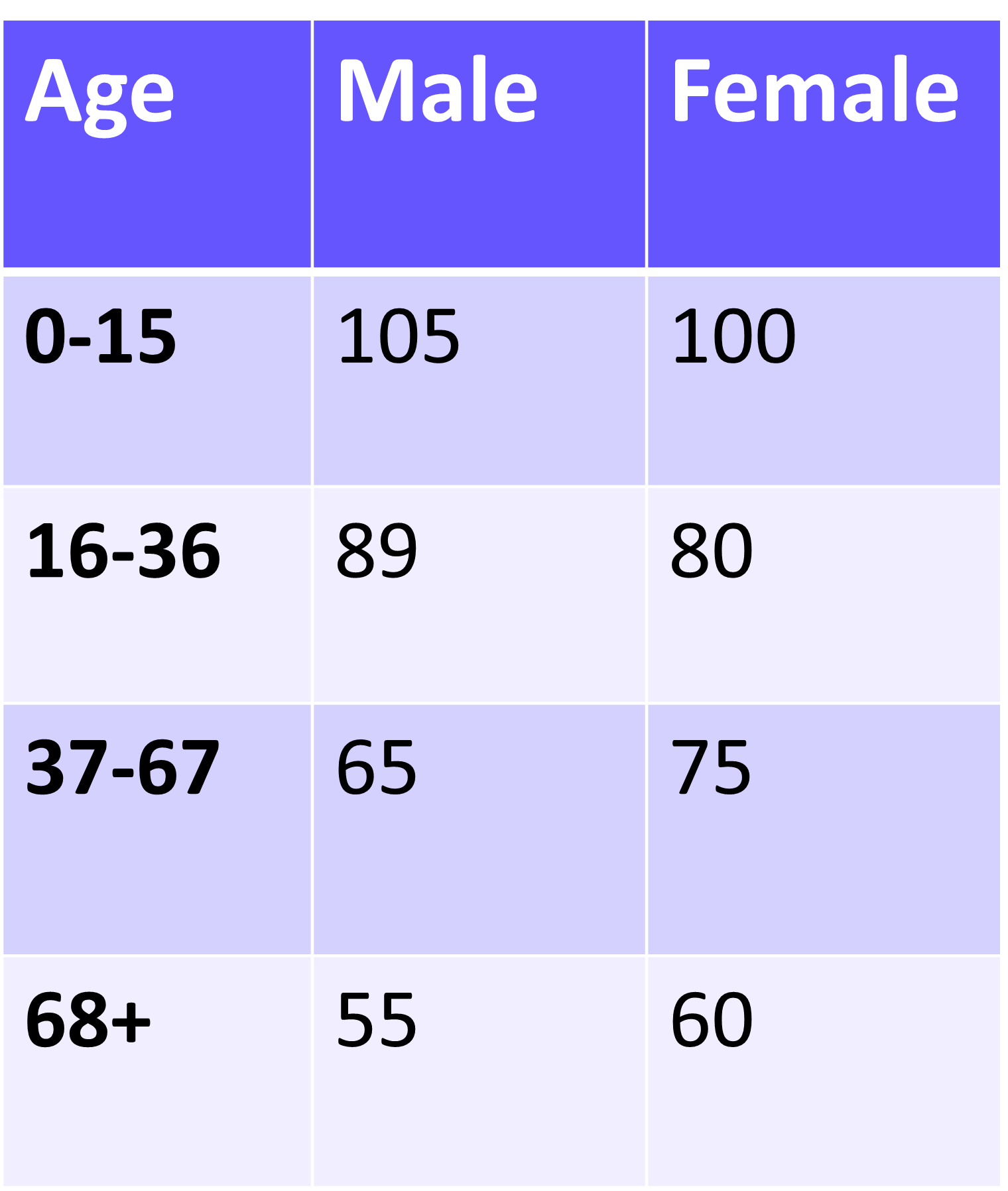
1. Construct an age-sex pyramid for this population. Let the horizontal axis show the percentage of the total population, rather than the raw numbers. (If using a spreadsheet, put a negative number in front of the numbers in the Male column to generate the left-hand-side of the pyramid.)
2. What is the Child Dependency Ratio, the Aged dependency ratio, and the Total Dependency Ratio?
3. How do these dependency ratios compare to Canada’s?
4. Roughly speaking, this pyramid most closely resembles what phase of Demographic Transition? (The grader would be looking more at your reasoning than at your assertion.)
5. What can you guess by looking at the sex ratios at each age?
6. What would the effective dependency ratio be if 20% of people between 16 and 36 years of age are addicted to heavy drugs?
The Demographic Transition is a process of change in birth and death rates. It is associated with industrialization and secularization. By the end of the Demographic Transition, birth and death rates are much lower than they were before the Demographic Transition
The Demographic Trap, illustrated in Figure 15-3, is a situation in which low educational achievement for women is correlated with high fertility. For details, see Chapter 15.
The Young Dependency Ratio is the number of people too young to work divided by the number of people of working-age. Typically, people too young to work are defined as being less than fifteen years old.
The Total Dependency Ratio is the number of people not of working age divided by the number of people of working age. It is typically calculated as the number of people under fifteen years of age or over sixty-five years of age, divided by the number of people ages 15-64.
A population pyramid is a two-dimension object showing a population's age structure and its biological sex ratio at each age. For examples, see Chapter 15.
The Demographic Dividend is the material benefits a society may reap when it has a low Total Dependency Ratio. See Chapters 16 and 17 for details.
