
Introduction
Product designers recognize the importance of designing products that people enjoy and may even grow to love. Products designed with multisensory features can create emotional and meaningful interactions between people and the products they use. The more designers become familiar with the sensory aspects of design, the better they will apply sensory interactions in their products; products that include features with sensory, emotional, and cognitive qualities as well as the traditional product design qualities of form and colour.
In Sense-It!: Insights into Multisensory Design you will gain insights into a range of multisensory concepts that contribute to the product design process and ultimately improve user experiences. We believe that the potential for innovation through multisensory interactions exists when sensory considerations are integrated into a design project from the beginning. The chapters that follow present a step-by-step discussion of design principles for each sensory theme that comes together in a final multisensory design chapter. These applied principles integrate traditional approaches to product form and colour with recent research on multisensory design. They provide a sensory lens for informing user-centred approaches to product design, research, and development. Many considerations that we address in this resource are useful for exploring multisensory design variations in the initial stages of design development and for evaluating the effectiveness of design concepts that enhance user experiences.
The primary objective of this resource is to introduce sensory aspects of design to industrial design (ID) students and professionals, as well as those in related design disciplines. It provides foundational knowledge about multisensory principles for designing products that engage users. Interactive learning activities are interspersed throughout and enable you to reflect on the sensory concepts discussed along the way. These interactive activities are unique to this resource, offering you the opportunity to explore foundational knowledge about multisensory design and to guide others, as appropriate. It strives to be interactive, AODA compliant, and culturally diverse, although we think that there is still room for improvement in these areas!
Learning Outcomes
The key objective of this Sense-It!: Insights into Multisensory Design resource is to provide a basic introduction to the multisensory aspects of design by translating research from key figures in the field of sensory design into more understandable content for a wider audience. We have compiled this information as a straightforward resource for novices – both novice designers and design researchers. As a result, illustrations, interactive examples, and evaluations that complement academic learning and design practice are integrated into each chapter. While we do not delve into multisensory academic design research data or statistics, the principles and theories described are informative and compatible with current design frameworks. Indeed, many traditional “form and colour” foundation studio design principles are reframed here as visual design guidelines according to our learning objectives below.
In reading and interacting with this resource, you will learn to:
- Identify the sensory, emotional, and cognitive qualities that contribute to human-product interactions.
- Understand how designers can integrate sensory and emotional attributes into designed products.
- Reflect on the variety of multisensory experiences that affect the design of products, services, and environments.
- Apply sensory design concepts through interactive simulations or related assessment activities.
- Qualitatively evaluate a product’s sensory design factors and how they contribute to emotional and meaningful responses.
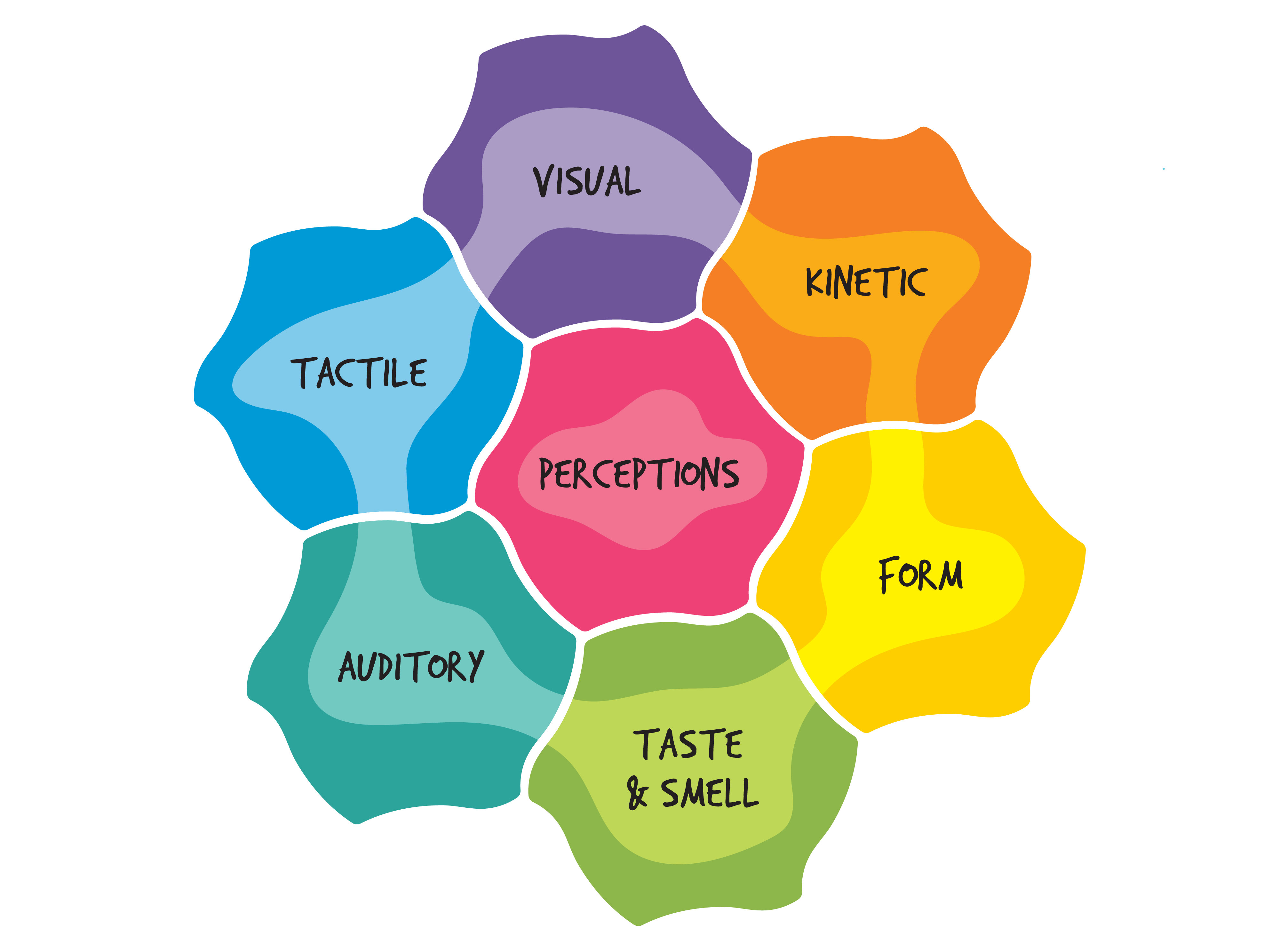
Multisensory Design Factors
Contextual Information and Definitions
While developing this resource we identified and categorized many professional terms that are relevant to this topic. These terms are addressed here in the following categories: Industrial (Product) Design, Product Experience, Multisensory Design, and Product Aesthetics.
Industrial (Product) Design is a profession that focuses on the design of concepts for physical products, devices, and related services that have interactive, utilitarian, and functional uses (Association of Industrial Designers of Ontario (ACIDO), Carleton University School of Industrial Design (CUSID), Industrial Designers Society of America (IDSA), & The World Design Organization (WDO)). Designers develop the physical appearance, functional properties, and manufacturing specifications for products and related services. On the product side of the design process, this resource focuses in part on a product’s physical appearance – its compositional, interactive, structural, and surface properties – that a user interacts with to accomplish their goals.
Design problem, problem space, design challenge, or challenge are used in this resource to refer to the context within which a product is to be used or experienced. These problems or challenges present a desired goal of product use. The design brief is a formal document that defines the client’s expectations with regard to the design problem and solution, the deliverables, limitations, and parameters for accomplishing the design task, along with timelines and costs. We also use the word value to refer to a quality of experience rather than a financial cost, where a user values one product or feature more than another. In addition, the design skill of creating coherent and attractive compositions is called “styling”, which was once considered to be the main strength designers brought to the design team (Hekkert and Schifferstein, 2009, p. 1-4).
Iterative design development refers to the ongoing process of concept development through continual variations of design concepts. Initial concepts may evolve through iterative stages with milestones for refinement before settling on a final concept. Designers refer to theoretical principles and guidelines, sometimes called tools and may be compiled into a toolkit or toolbox of approaches to consider when designing. Usability is also an important concept for product design; a product must be easy to understand and use, and perform its task effectively and efficiently. This is true whether the function is purely utilitarian or has features that engage one’s sensory perceptions and emotional responses.
Design research refers to the process in which designers, marketers, psychologists, anthropologists, and other researchers collect data about users’ goals, activities, and practices with products in specific contexts.
Product Experience is the term coined by Schifferstein and Hekkert in their seminal book about multisensory design entitled Product Experience (2009). They describe it as “awareness of the psychological effects elicited by the interaction with a product, including the degree to which all our senses are stimulated, the meanings and values we attach to the product, and the feelings and emotions that are elicited” (Hekkert & Schifferstein, 2009, p. 2). This resource was deeply influenced by their work on product experience design; it inspired us to simplify some of the material discussed to make it easy for novice learners to understand.
The term user experience is relevant across design fields and is the name of a field of its own. It refers to the experience a user has with a product, from first contact to post-use. User experience acknowledges that the perspective of the user must inform the perspective of the designer in developing new products and in improving existing products. For example, Cyril wants to design meaningful and appropriate experiences for young users who are new to bicycling, so they will focus on learning about the perspectives of parents and their children in all the stages of product interaction – from considering bicycle options to buying, adjusting, using, maintaining, and finally discarding their bicycles. The term user-centred design has long been relevant to industrial design and is discussed here because it addresses the importance of designing products that people can use in ways that centre on their needs, not only on the capabilities of the product. In other words, the design should fit the user, the user should not have to adjust to fit the design. If someone must have three hands and arms to use a drill press properly, it would be better to redesign the drill press to accommodate the tactile capabilities of existing users, rather than to add a mechanical third arm.
We also use terms – that emphasize the perspective of the person experiencing the activity – derived from other fields. The term experiential, coming from the field of education, is important in design because it focuses on the nature of the experience a person is having. For example, if we refer to Kai’s experiential development as a driver, we are discussing how, over time, Kai has developed driving skills by gaining practical experience on the road. Designers can use experiential knowledge, especially from firsthand observation or studies, to develop features for new products that contribute to improved experiences.
The term worldview is another important term borrowed from academia, specifically, the social sciences, and refers to the perspective that guides an individual’s understanding of the world. For example, your worldview may be that anyone can do anything with the right tools (a worldview that emphasizes the importance of design), whereas my worldview might be that anyone can do anything with enough training (a worldview that emphasizes the importance of education). Consideration of a user’s worldview can inform product design in context. For example, in an organization that emphasizes its workers’ health to the degree that it has a standing-only office, it does not make sense to improve the multisensory features of chairs, but it does support the opportunity to design footrests that provide comfort to a person standing for several hours.
The phrase sensory practices is also derived from the social sciences, in which anthropologists study patterns of sensory practices within cultures to learn about the sociocultural meanings associated with them (Classen 1997, p. 401; Howes 1991, p. 3). In this resource, we discuss sensory practices as part of peoples’ experiences – the how, what, why, when, and where of sensorially engaging with products to achieve a desired goal. We sometimes also refer to product interactions when we mean multisensory and sensory practices with products.
Multisensory Design refers to the design of multiple sensory features that contribute to layers of sensory experiences at the same time or in stages. These are experienced through the different sensory channels or modes of hearing, seeing, touching, tasting, and smelling. These sensory properties are referred to as multisensory or multimodal, in which more than one sense is involved when a person interacts with a product, service, or environment. Sometimes the adjective sensorial or multisensorial is used to describe a feature that specifically engages or appeals to one or more senses. Product interaction is inherently multisensory; every time a person uses or interacts with a product to complete a task, more than one sense is involved.
Product Aesthetics is a term that is associated with the appearance of artworks, to which we traditionally assign the term aesthetics. The term product aesthetics goes beyond the concept of styling that relates only to refining a product’s visual appearance. In this resource, we follow Hekkert and Leder’s lead in broadening the term to include “sensory pleasantness in general, things can be aesthetic or pleasant to listen to, to touch, smell, or taste. Aesthetic pleasure is not an emotion… it is the response limited to the gratification that comes from the sensory perception of an object” (Hekkert & Leder, 2009, p. 260).
In the chapters that follow, we address sensory design, whether we are discussing a product, thing, property, feature, form factor, or related attributes. We often use words like design features, design elements, and design qualities to describe the properties/factors that can be designed into a product, service, or environment, to improve the opportunities for people to engage with them in multisensory ways. These terms may be used interchangeably since they all apply to properties that can be designed into the user experience of a product with physical and/or digital attributes.
The Chapters
This book follows Schifferstein and Hekkert’s (2009) approach by presenting the senses individually. It discusses the many ways each sense can contribute to Design and people’s experiences and perceptions while engaging with designed products, environments, and services. The chapters lead to a final discussion of multisensory design where it becomes clear that people rarely experience products through one sense at a time and that there are many rich sensory layers that support product interactions.
Introduction
Here we describe what this book is about and what to expect in each chapter. We provide definitions of terms used throughout the book that are organized into these four categories: Industrial (Product) Design, Product Experience, Multisensory Design, and Product Aesthetics. We also explain how this resource is organized and provide samples of the interactive assessment activities. Lastly, we introduce the 3Ts (Thoughts, Tips, and Tools) at the end of each of the content chapters, in which readers can enter their key takeaways to print out or save.


1. Design for Emotion and Meaning
The topics in this chapter introduce the concepts of pleasure and design attraction, the importance of emotional and sensory impressions and other emotional responses to product experiences. We explain the ideas of product attachment, rituals and routines. We discuss people’s positive and negative emotional responses to product qualities and the effectiveness of emotional design elements such as affordances and semantic qualities.
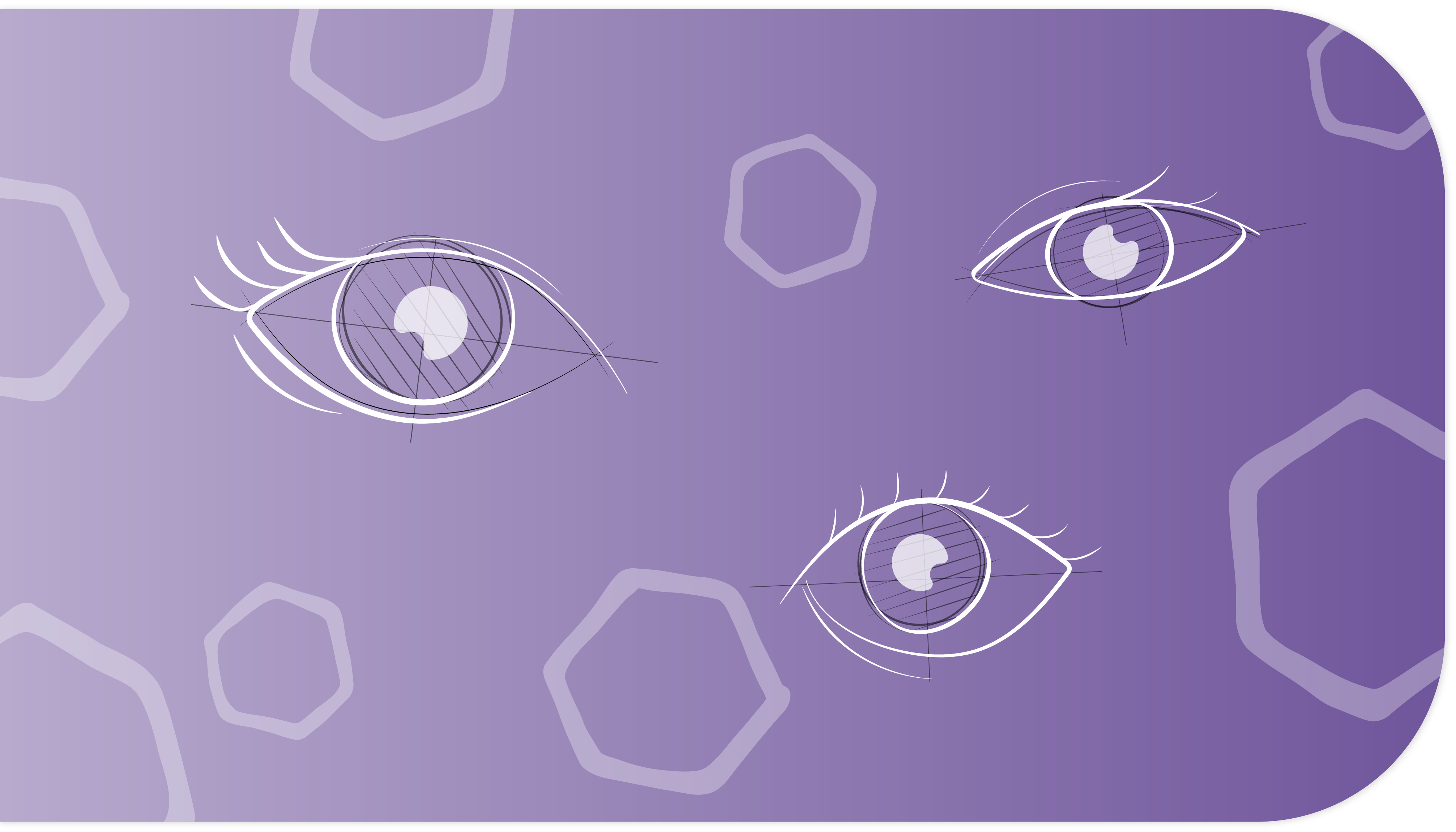

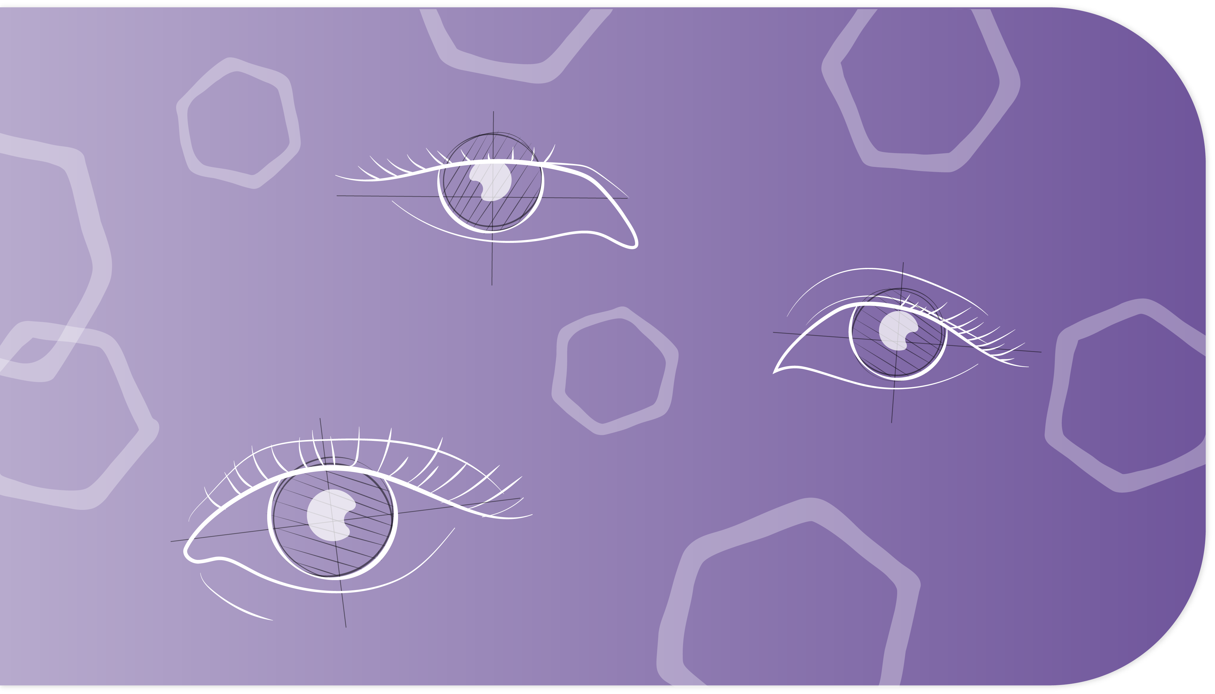
2. Design for Visual Perception
This chapter presents traditional design principles that are mostly oriented toward visual perception. We include a review of visual compositions for form-giving in both two and three dimensions, and a discussion about rectilinear, curvilinear, and organic form factors. We also explore Gestalt Perceptual Principles of composition such as closure, emphasis, continuity, symmetry, figure-ground, proximity, and similarity. In addition, our discussion about visual harmony explains the principles of unity and variety, rhythm, and connectedness. Finally, we explore relationships and hierarchies within compositions, describing how proportions and surface transitions contribute to the overall perception of the product.
3. Design for Visual Perception of Colour and Light
The topics in this chapter are also fundamental to design studies and are considered important to visual perception and design. We address basic colour theories such as colour mixing and discussions about hue, value, and saturation. We briefly introduce the concept of colour wheels and the types of perceived colour relationships or colour schemes that can be derived from various colour systems. Light is also discussed as a compositional element that is perceived as transparency, translucency, or opacity. In addition, we touch on colour specification systems and applications for design (Morris, 2006). Lastly, we introduce the psychology of colour in terms of the psychological, cultural, and emotional significance of colours.
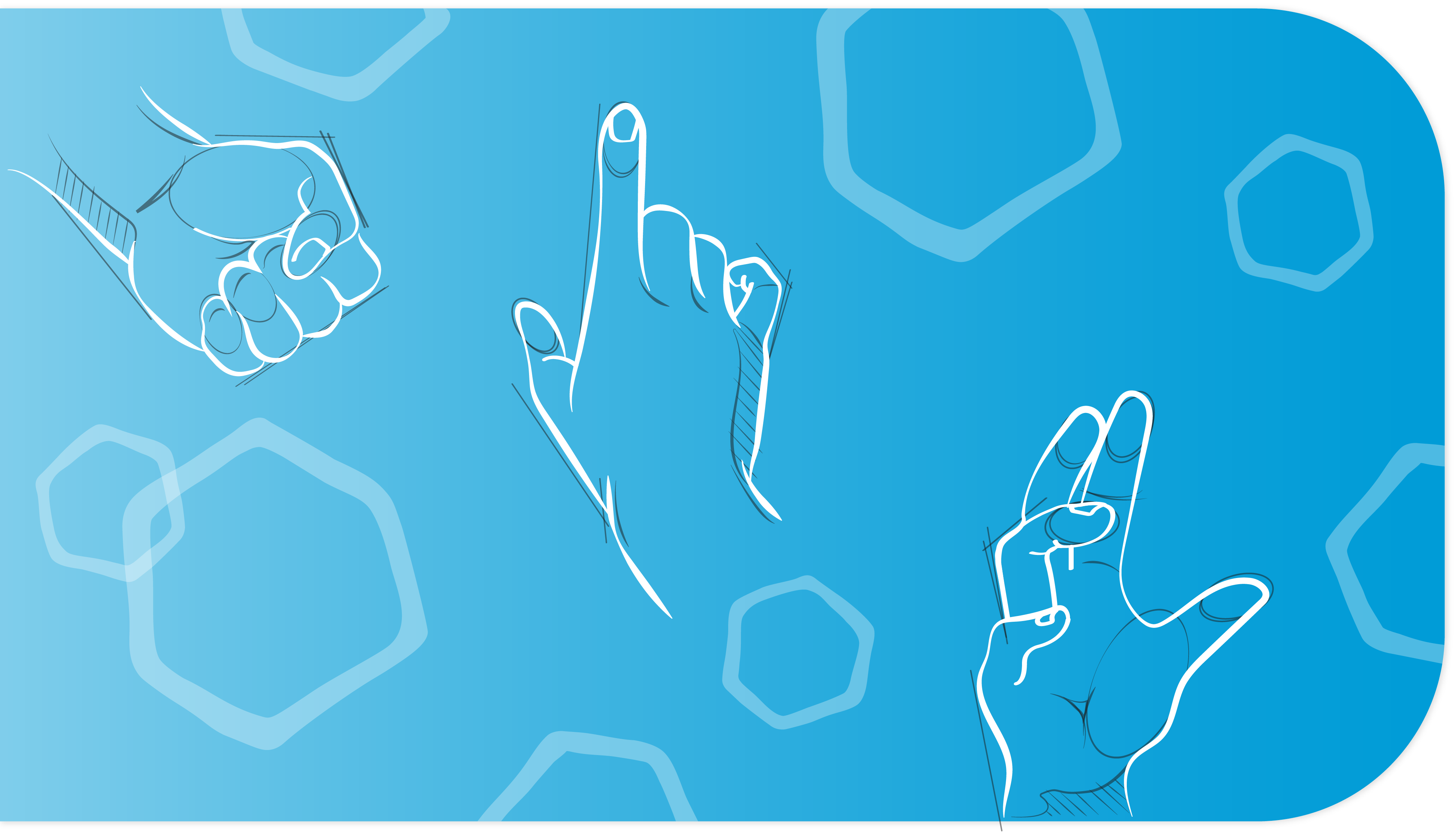

4. Design for Tactile Product Experience
This chapter focuses on touch experiences that contribute to the tactile aesthetics of products. We include a discussion about how people perceive different kinds of touch (such as active and passive touch) and explain the difference between instrumental and non-instrumental touch experiences. We provide insight into how substance, hardness, elasticity, and plasticity are perceived and how people react to the temperature, weight, and balance of products. We explore the tactile qualities of surfaces, addressing themes of textures, surface structures, surface aesthetics, and surface imperfections (Pedgley, O., 2014). We also focus on meanings associated with material sensations and end with a brief discussion of tactile affordances (Karana, E., 2010).

5. Design for Auditory Experiences
This chapter explores how sound adds information to peoples’ experiences with products. We introduce the properties of sound that convey auditory information such as pitch and frequency, timbre, loudness, duration, envelope, and diffusion. We discuss how people experience sounds, whether ambient, localized, or as part of larger soundscapes and explore how foreground, middle ground, and background layers of sounds convey different auditory information. We address how sounds can be tied to the passing of time.
The chapter also highlights the nature of wanted and unwanted sounds, especially those in hospitals and other noisy environments (Case & Day, 2019, Kristenson et al, 2016). How sounds can contribute to the emotional attachments people form with products and services are described. We present auditory principles for contributing to emotional connections, sonic branding, and anthropomorphism. We describe the seminal studies of consequential and inconsequential product sounds derived from Langeveld et al (2013) and go on to discuss additive and subtractive sounds as derived from Case and Day (2019). Lastly, we suggest ways for designers to become sensitized to sounds.

6. Design for Smell and Taste Experiences
This chapter addresses taste and smell and the relationship between these two senses. It begins with a discussion about smell – what it is from a biophysical perspective and its link to memory. We introduce terms for discussing the characteristics of smells. We note that some smells can be ephemeral while others can last for a long time and that the qualities of smell semantics can trigger emotional responses. We describe the layers of smell compositions derived from the top, middle, and base layers used in the perfume industry while introducing the history of fragrance wheels and exploring the idea of smellscapes or scentscapes. Lastly, we discuss the olfactory design principles of authenticity, intensity, quality, and suitability and how they can be applied to design.
The chapter then explores the concept of taste, which is the least applied sense in most product design experiences. We position the five tastes as flavours that engage the senses in ways that are like smell – as they can be both lasting and fleeting. Taste practices in the food industry are explored with a view to understanding how the principles of layering taste compositions may apply to product design. The taste of edible products and product packaging are a part of this discussion. Lastly, we touch on the relevance of design for the food industry.

7. Design for Multisensory and Kinetic Experiences
This chapter integrates information about the senses and sensory perceptions from previous chapters into a discussion about multisensory product experiences. We begin by exploring how people process multisensory experiences relevant to design. We describe the concept of sensory dominance developed by Fenko and Schifferstein (2008) and Ludden et al (2007) in which specific sensory modalities dominate people’s experiences at different stages of product use and change over time. We introduce the concept of multisensory delight, as derived from Park and Alderman (2018), which contributes to pleasant product experiences.
We explore multisensory design principles for improved multisensory product experiences by applying four principles derived from Park and Alderman (2018). Multisensory design applications are discussed that target different sensory abilities and unique multimodal design combinations of senses, either for crossmodal support or sensory surprise (Ludden et al, 2007 and 2008). Lastly, we explore the dynamics of multisensory movement, presenting the seven attributes of kinetic movement that are integral in the choreographed dynamics of interacting with multisensory products, environments, and services.
Conclusion
This chapter offers a brief conclusion and suggestions for further study. We explain how this resource came to be, the scholars who influenced its development, and recognize the team that contributed to designing it. We acknowledge the funding and support for the Sense-It! Project since it began in 2016.
Glossary
The Glossary provides definitions for terms frequently used in the professional practice of design that are mentioned throughout the book.
How to use this book
This resource is designed to enable you to use it in several ways. It can be read from the beginning to the end, in chapters, or in numbered segments within each chapter. You can use the left-side menu to navigate within chapters and from chapter to chapter.
The navigation menu is on the left

The navigation tabs between sections are always located at the bottom of the page
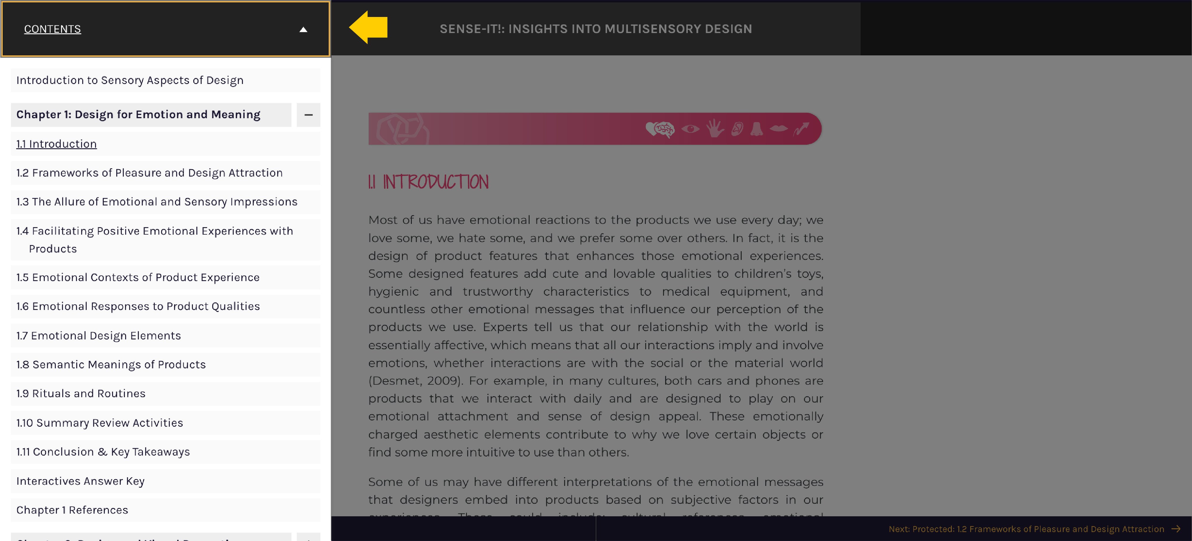
Each chapter contains textual information accompanied by illustrations, and in some cases, animations (gifs), and videos. Interactive assessment activities called “Activity Time” are interspersed throughout to provide the opportunity for fun, practice, and reflection. Some of the interactive activities are illustrations with hotspots like the one pictured here:
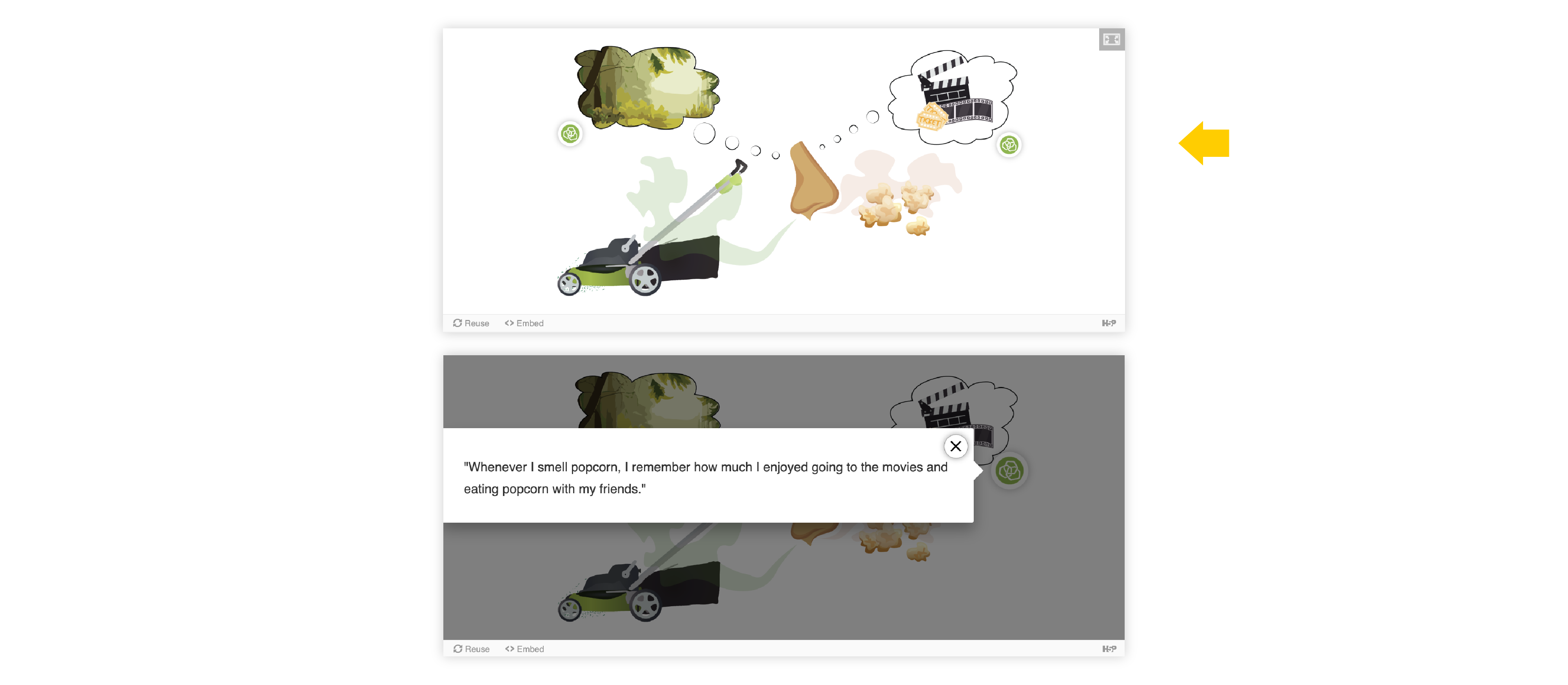
Steps for how to navigate an interactive image with hotspots. Clicking on each icon will provide the reader with more information to reflect on. It’s important to check within the text to understand why these statements are here.
Example of an interactive Image with green hotspot icons.
You will come across another “Activity Time” interactive format that involves dragging and dropping answers into place. You can check (see check tab) how accurate your answers are and retry until you are satisfied. An example of a Drag and drop activity is pictured here:
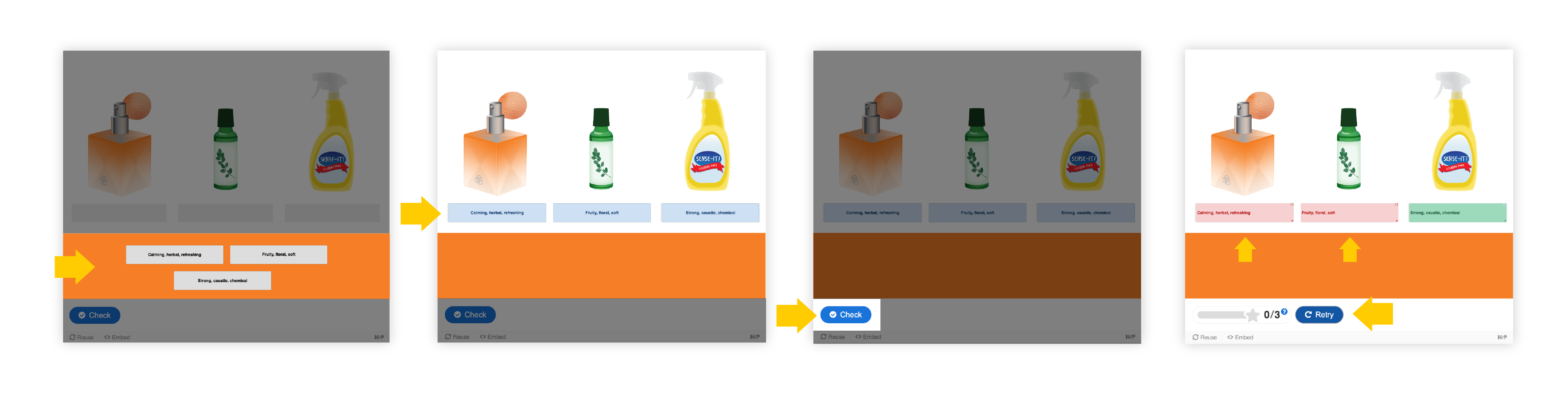
Steps for how to navigate a Drag and drop activity. The labels with text descriptions can be dragged to match the product they correspond with. Readers can use the check button to determine the accuracy of the matches. Once checked, The labels will indicate which matches are correct (in green) and which are not (in red).
Example of an interactive Drag and drop activity.
Throughout the chapters, we provide these and other activities that are fun and helpful for assessing how much of the content you grasp. Look out for mini Image Sliders and Memory Games to fine-tune your awareness along the way. In each chapter, the answers for the interactive activities can be found in the left navigation menu under the title “Interactives Answer Key”.
Reflection Time!
At the end of each chapter, you will have the opportunity to review the key points that you found significant. Reflection Time! encourages you to recall key concepts, principles, and guidelines to take away from each sensory theme. You will be prompted with the 3Ts:
- Thoughts: your ideas and opinions about the chapter.
- Tips: something you might try or share with others.
- Tools: concepts or frameworks that could have future applications.
Fill in the form by clicking through the three pages. When you are done, click “Export” to find the download icon to save or download your reflections document. This allows you to recall the key ideas from each chapter at a later date and to refer to them in future design situations.
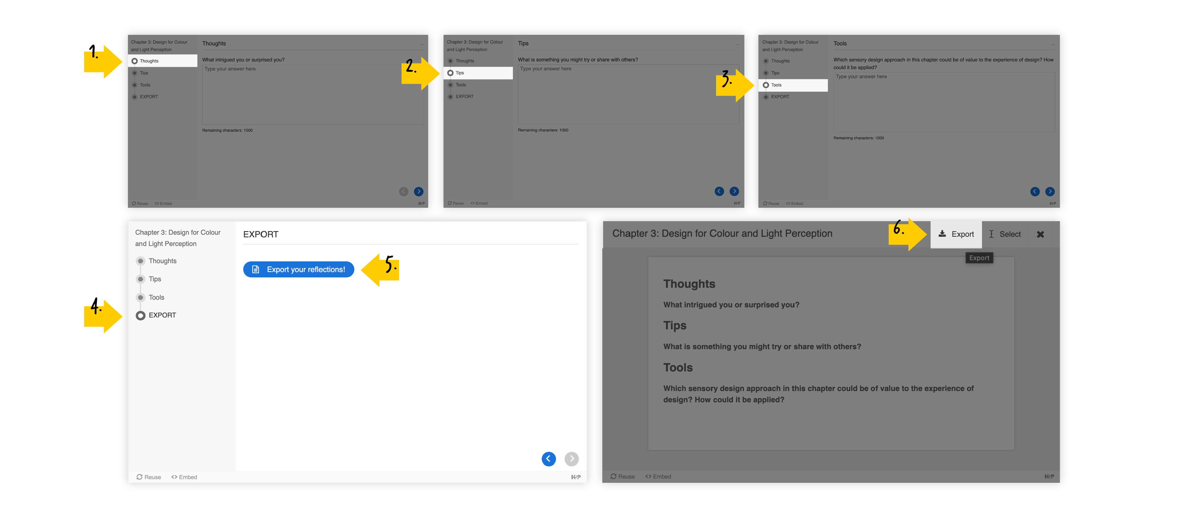
Steps for how to navigate a Reflection Time! activity. Steps 1-3: Navigate through the Thoughts, Tips, and Tools sections in the navigation menu on the left and complete each section. Steps 4-6: Export your reflections.
Example of an interactive reflection Time! activity.
Supplementary Materials
This section is primarily for educators and facilitators who would like to augment the creative learning process by providing hands-on team activities for practicing the concepts discussed in this book. The Supplementary Materials can be accessed from the book’s landing page within the folder labelled Resources for Educators: Interactive Activity Kit, which you can download here. The Sense-It! Kit includes a Facilitator’s Guide, Activity Cards, Product Cards, and Tiles. These sets of practical learning materials can be used to enhance specific chapter content as described thoroughly in the Sense-It! In Action booklet—our Facilitator’s Guide. Please begin with the Facilitators’ Guide to understand how and when to use each set of supplementary resources.
Additionally, at the end of each chapter within this book, there is a section entitled Supplementary Activities for this Chapter following the Conclusion & Key Takeaways. There is a specific set of Sense-It! Activities for each chapter that is designed to provide groups of learners with deeper engagement, learning, and application of the chapter content. We believe there is also an opportunity for educators to leverage the concepts in each chapter by developing Case Studies appropriate to their design field to optimize the opportunity for critical in-class learning. We hope that these additional resources will enable design students, designers, and non-designers to gain a further appreciation for the complexity of human experience that guides design decisions.
Accessibility and Diversity
Our Accessibility Statement can be found on the book’s landing page, where we express the Sense-It! team’s commitment to ensuring the digital accessibility of this resource—Sense-It! Insights into Multisensory Design—regardless of technology or ability. This resource strives to meet the relevant accessibility standards at the time of publication to improve the user experience for everyone. In our full statement, we share our process and the compatibility status of this OER, and we acknowledge its limitations and possible alternatives.
Conclusion
Sense-It!: Insights into Multisensory Design provides an easy-to-read and instructive overview for design students, design instructors, and practicing designers. It is for people who want to learn more about the significance of recognizing key sensory features and interactions in the early stages of design development. It is also for professionals in related fields such as applied social sciences and marketing, who want to understand the multisensory design issues that influence people’s everyday experiences with products. We hope you find it useful and enjoyable!
If you have any questions, comments, or concerns, we’d love to hear from you! Email: loisfrankel@cunet.carleton.ca
References
Association of Canadian Industrial Designers in Ontario
https://acido.info/id-in-ontario/
Carleton University School of Industrial Design
https://carleton.ca/id/
Case, A. and Day, A. (2018). Designing with Sound. O’Reilly Media Inc. Sebastopol
Classen, C. (1997). Foundations for an Anthropology of the Senses. International Social Science Journal 153. 401-412.
Fenko, A., Schifferstein, H.N.J. (2008). Which senses dominate at different stages of the product experience? In Proceedings Undisciplined! Design Research Society Conference. Sheffield University, 16-19.
Hekkert, P. and Leder, H. (2009). Product Aesthetics. In Schifferstein, H.N.J. & Hekkert, P. (Eds.) Product Experience, (pp. 259-285). Elsevier.
Hekkert, P. and Schifferstein, H.N.J. (2009). Introducing Product Experience. In Schifferstein, H.N.J. & Hekkert, P. (Eds.) Product Experience (pp. 1-8). Elsevier.
Hekkert, P. and Schifferstein (2009). Introducing Product Experience. In H.N.J. Schifferstein & P. Hekkert (Eds.), Product Experience (pp. 1-4). Elsevier.
Howes, D. (1991) (Ed.) The Varieties of Sensory Experience: A Sourcebook in the Anthropology of the Senses. University of Toronto Press.
Industrial Designers of America
https://www.idsa.org/what-industrial-design
Karana, E. (2010). How do Materials Obtain their Meanings? In Middle East Technical University Journal of the Faculty of Architecture 2010/2 (27:2) 271-285.
Kristensen, M. S., Edworthy, J., Özcan, E. (2016). Alarm fatigue in the ward: An acoustical problem? SoundEffects – An Interdisciplinary Journal of Sound and Sound Experience, 6(1), 88–104. https://doi.org/10.7146/se.v6i1.24915
Langeveld, L.H., van Egmond, R., Jansen, R., Özcan, E. (2013). Product Sound design: Intentional and Consequential Sounds in ed. Denis Coehlo, Advances in Industrial Engineering, InTechOpen, 47-73.
Ludden, G., Schifferstein, H.N.J, Hekkert, P. (2007). Surprising the Senses. The Senses and Society, 2(3), 353-360
Ludden, G., Schifferstein, H.N.J, Hekkert, P. (2008). Surprise as a Design Strategy. Design Issues, 24(2), 28-38.
Özcan, E., Cupchik, G.C., Schifferstein, H.N.J. (2017). Auditory and Visual Contributions to Affective Product Quality. International Journal of Design, 11(1), 35-50.
Özcan, E. and van Egmond, R. (2005). Characterizing Descriptions of Product Sounds. In Proceedings ICAD-05- Eleventh Meeting of the International Conference on Auditory Display, Limerick, Ireland, July 6-9, 55-60.
Özcan, E. and van Egmond, R. (2008). Product Sound Design: An Inter-Disciplinary Approach? In proceedings Undisciplined! Proceedings of the Design Research Society Conference 2008. Sheffield, UK. July 2008, 306/1 – 306-14.
Morris, J. (2006). The Purpose and Power of Color in Industrial Design: Encouraging the Meaningful Use of Color in Design Education. Proceedings of the IDSA National Education Conference. https://www.idsa.org/sites/default/files/nec06_morris_jason.pdf
Park, C.W. and Alderman, J, (2018). Designing Across Senses: A Multimodal Approach to Product Design. O’Reilly Media.
Pedgley, O. (2014). ‘Desirable imperfection in product materials’, DRS2014 Design Research Society International Conference, Umea Institute of Design, Umea University.
World Design Organization
https://wdo.org/about/definition/
