
4.4 Surfaces and Structures
Think about your tactile interactions with the products you use. How often do you hold the outer surface or shell of your phone or your hairdryer while using it? Every time, right? Compare that to how often you take apart either of those devices to get inside – likely rarely or never. For this reason, it is important for designers to focus on the details of the exterior shell that contains all the mechanical, electrical, and computational components. We traditionally refer to this shell as the product’s housing or formal envelope; it is the main tactile interaction surface. The inside of a plastic housing is designed for structural stability, with a framework of elevated ribs and bosses (indentations for positioning and fastening parts together). The housing is usually made in 2 parts, like a clamshell; the line or seam where they join together is called the parting line. We can see the parting line on products like hair dryers and drills.
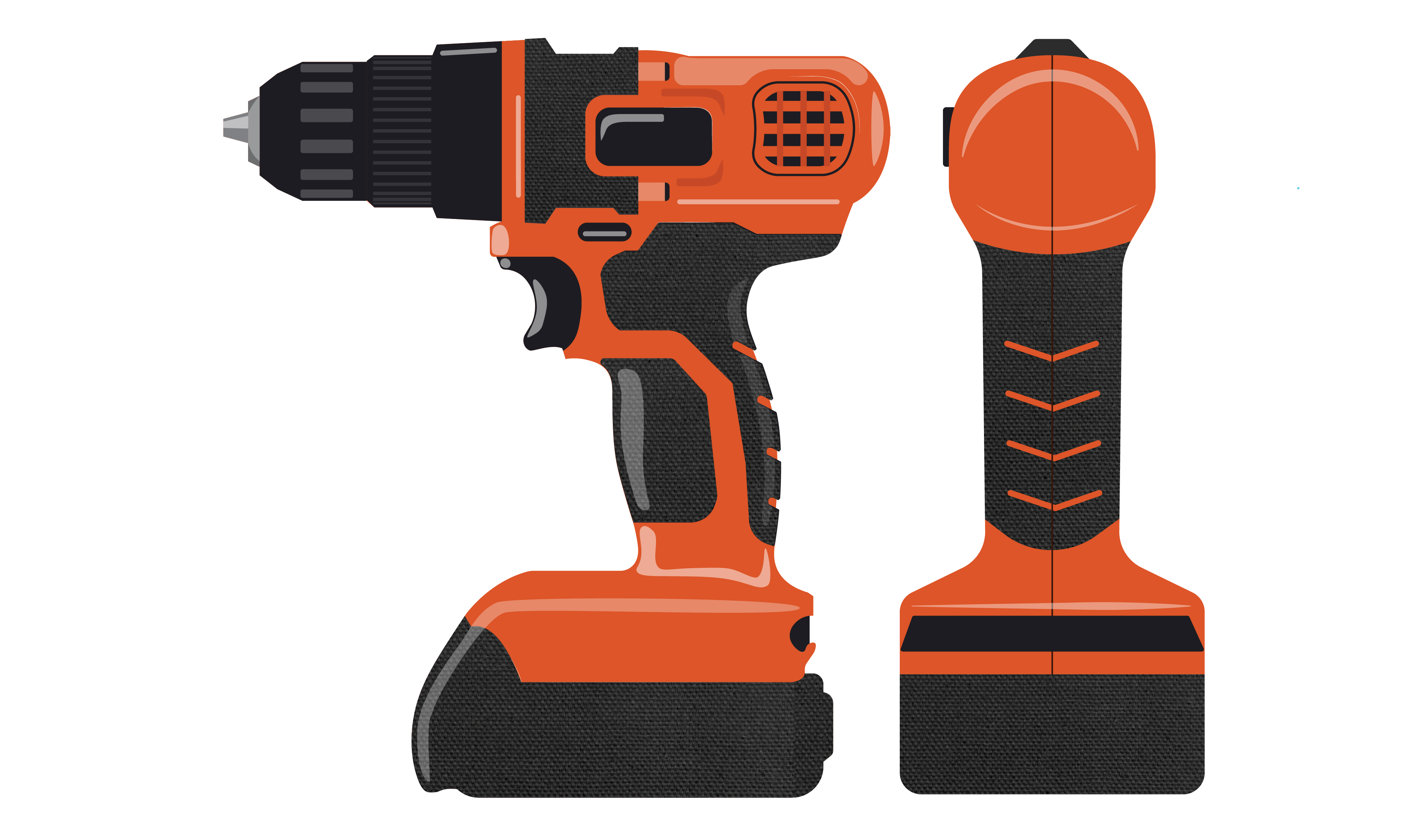
parting lines are often visible on product housing
Designers select the materials for product surfaces, whether they contain inner components or not. In many cases, the surface qualities of the materials contribute to our ability to perform an activity. For example, the sticky toes on climbing shoes make the tactile experience of climbing more efficient, similar to the slippery suede soles on good dancing shoes.
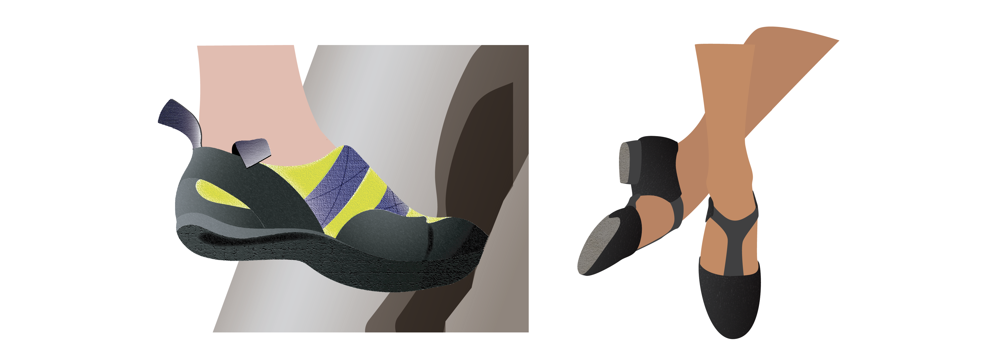
Sticky climbing shoes or slippery dancing shoes: Surface qualities contribute to our tactile experiences when using products
Professor Prasad Boradkar (2010, p.151) says that “designers tinker with the surface characteristics of form, contour, material, colour and texture to create the aesthetic experiences that users seek and desire”. After reviewing cell phone covers, referred to as skins, he developed a functional typology that differentiates them. We believe these descriptions apply to a wide range of product surfaces, as well as cell phones. Boradkar says:
- Shielding skins enclose the technical and mechanical inner components and protect them.
- Green skins are made of materials that are environmentally compatible such as biopolymers, biodegradable materials, or recycled plastics.
- Faux skins are imitations of natural materials seen when transparent plastics are used instead of glass or polyvinyl chloride is used instead of leather or suede.
- Informational skins communicate through their material, like providing the transparent ability to see the inner workings of the device or through the graphics on the surface.
Shielding and Informational product Skin
- Technological or intelligent skins depend on material properties that may be bulletproof, heat resistant, or shock resistant like bicycle helmets.
- Responsive skins are made of smart materials with changing properties that respond to stimuli. For example, skins that change colour or temperature in response to embedded thermochromic (temperature sensitive) sensors.
Example of heat-sensitive responsive skin
Since most of our contact with objects is through the material surfaces we touch, we receive a lot of tactile information every day. We experience what surfaces feel like and how or if they move, as well as the quality of the surface textures and finishes, and we notice differences as these surfaces change over time. Designers study texture samples to specify textures and finishes that are appropriate for different parts of the same product. These material choices may make a difference to the longevity of a product – if the material does not match our expectations, memories, cultural ideals, or comfort levels we may not want to keep it.
Textures and finishes are often designed to support different kinds of user experiences. Some finishes may provide an overall impression of a product – a shiny kettle, a rugged boot, or a soft toy – that indicate a certain quality to the user. For example, I prefer to use a toothbrush with a slightly textured plastic handle rather than a smooth one so that my hand doesn’t slip on the wet surface while I brush my teeth. How would you feel about using a leather toothbrush like the one below?
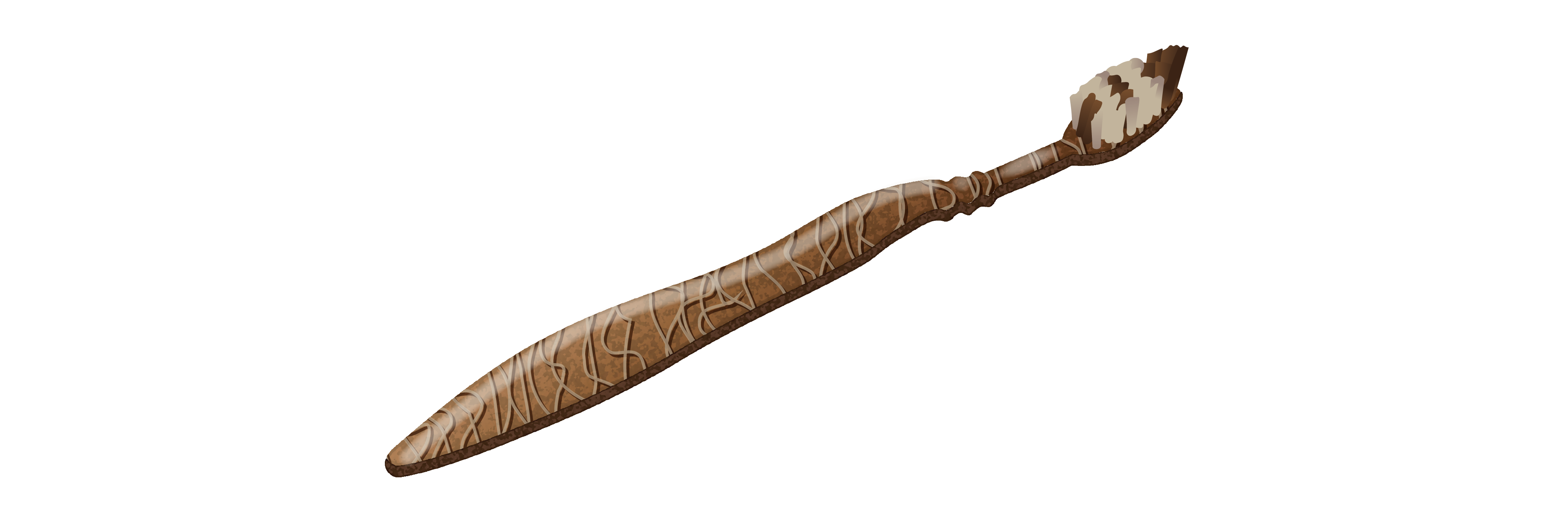
Product surface textures should suit the product task
On the other hand, if I can grasp a smooth handle with moulded indentations for my fingers, I would have a secure grasp of my toothbrush and not need a textured surface. In addition to your toothbrush, consider the different shapes, weights, and textures of the cutlery you use. There are many different cutlery designs on the market, each with a different tactile aesthetic due to weight, balance, surface treatments, and materials. Designers seem to like experimenting with the design of eating utensils. It may be fun to assess the qualities of their material choices and tactile aesthetics the next time you go out to eat – which ones provide pleasant and useful tactile affordances for you?
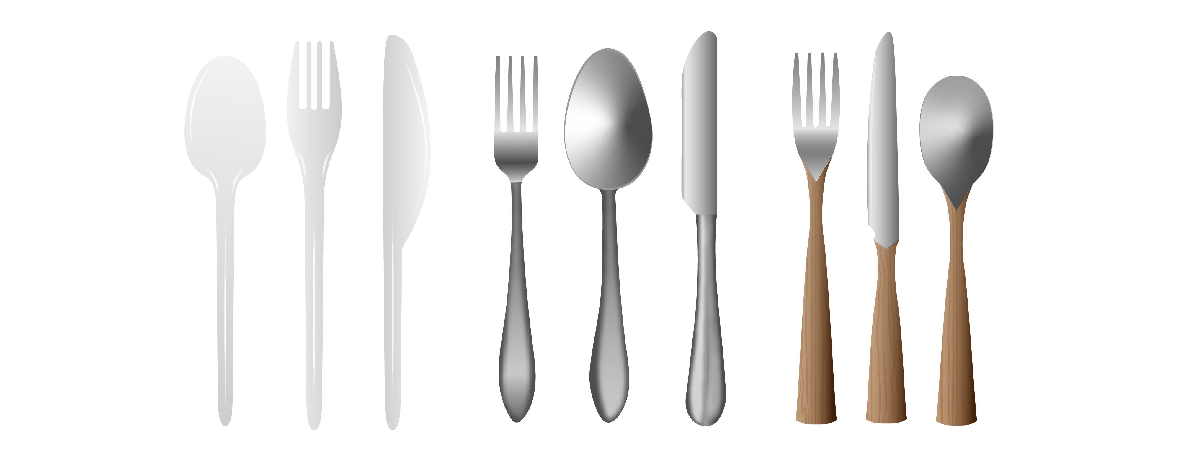
Plastic, steel, and wood all provide suitable tactile affordances for eating utensils
Not all surfaces are uniform – some may have unique structural features. If you run your fingers over the surface of an object you may perceive places where it is easy to slide over the surface and others where your fingers need to go around or interact with some of its structural features. Stuart Walker (2014) identifies the following three kinds of surface structures:
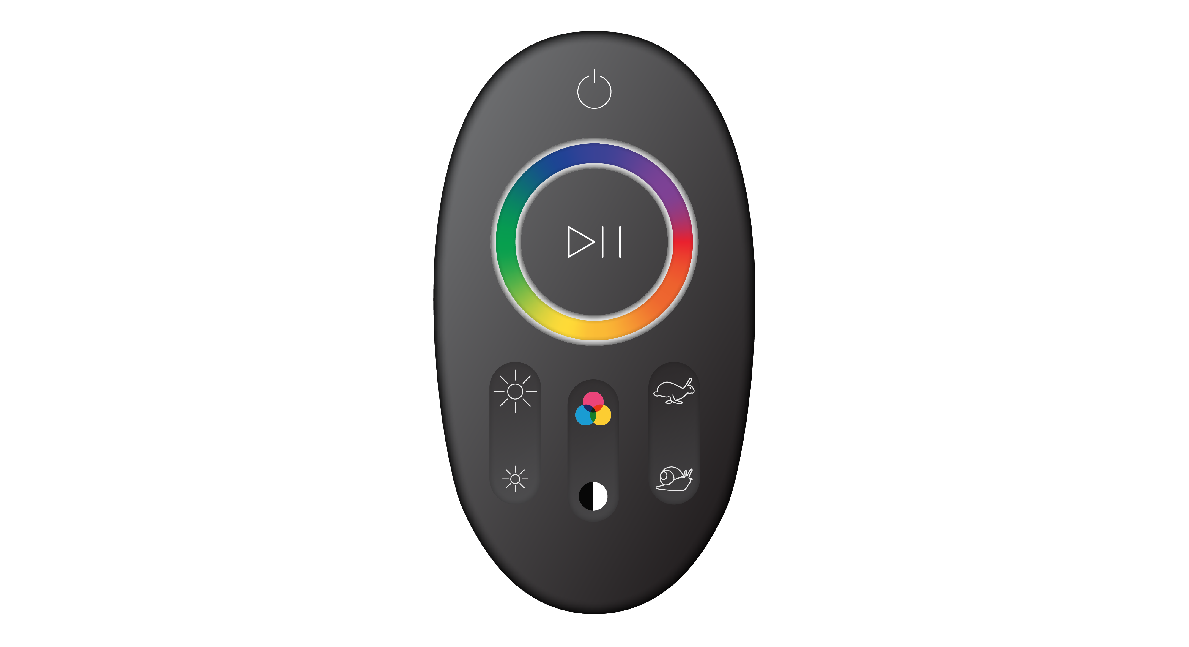
- Abrupt surface discontinuities like edges and holes. These may inform where you open and close your water bottle when filling it or may be buttons that enable you to operate a product by turning it on or off or changing its speed.
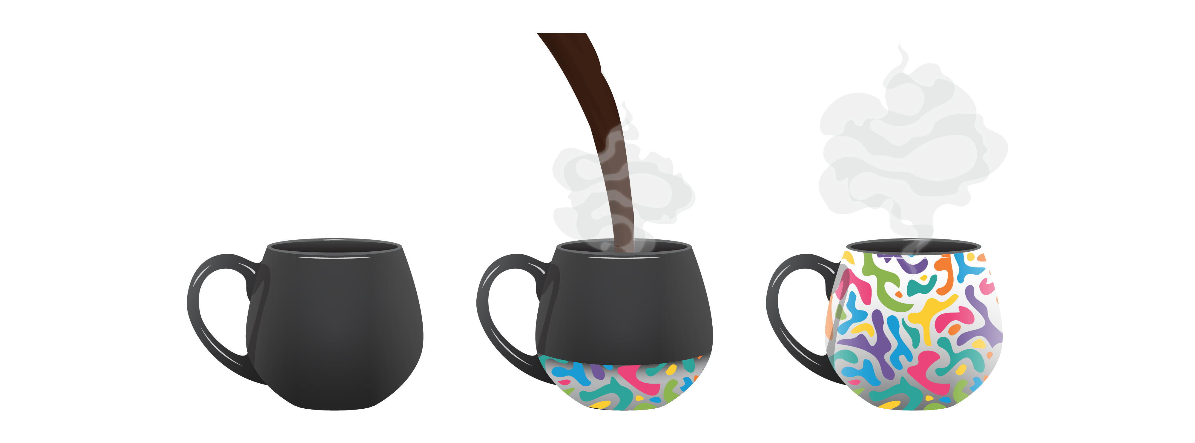
- Continuous three-dimensional surface contours like curved or flat surfaces. These may indicate the top and bottom surfaces, like the flat bottom of a vase indicates how to place it on a table, while the open top provides an affordance for filling it.
- Different surface orientations like horizontal, vertical, or slanted. These may also inform you where to grip or open an object, as in the slanted tops of waxed paper milk cartons.
The use of Braille is an example of the importance of surface structural features in the use of assistive products for vision-impaired people. In the example below, a visually impaired person is using the elevator button to open the doors.
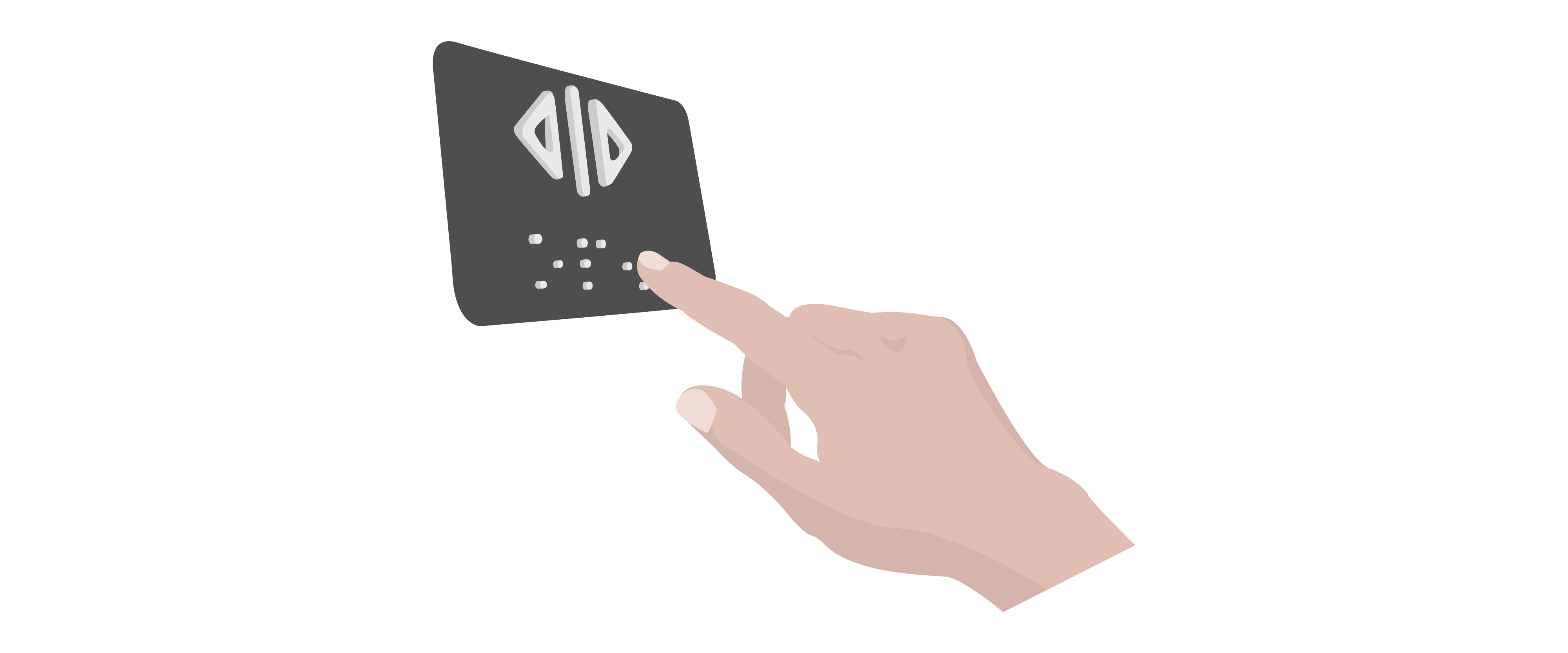
Braille buttons take advantage of surface discontinuities to provide information
Since most of our tactile interaction is with a product’s surface, a designer specifies the quality and function of those surfaces. They act as affordances for holding, grasping, opening, or sealing. They can also have moving parts that we physically interact with or that are purely decorative. For example, the raised surface discontinuities provide tactile feedback for solving the Rubik’s cube puzzle below. This could be an innovative design solution to engage a visually impaired person in solving the Rubik’s cube.
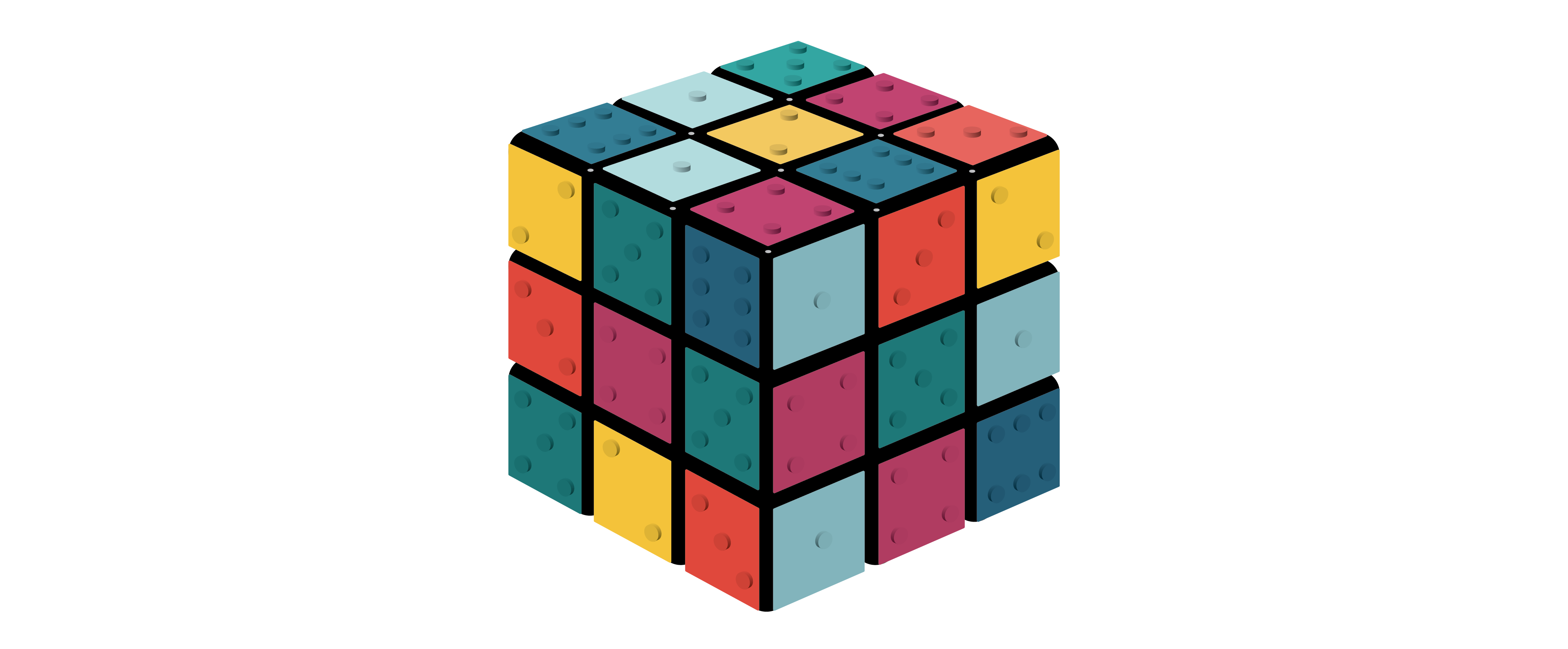
Rubik’s cube with surface discontinuities and raised dotted surface details
