
2.6 Proportions and Transitions
By now it may be clear that in every composition we are striving to make the object or artefact look simple and harmonious, no matter how many sub-elements are included. Designers iteratively adjust the visual scale of sub-elements using the principles of composition until the whole composition seems to work as a complete entity. Just as with our faces, where our eyes, nose, and mouth have different sizes and shapes, yet seem to belong together, so too can the elements in a composition be varied and still perceived as a cohesive composition.
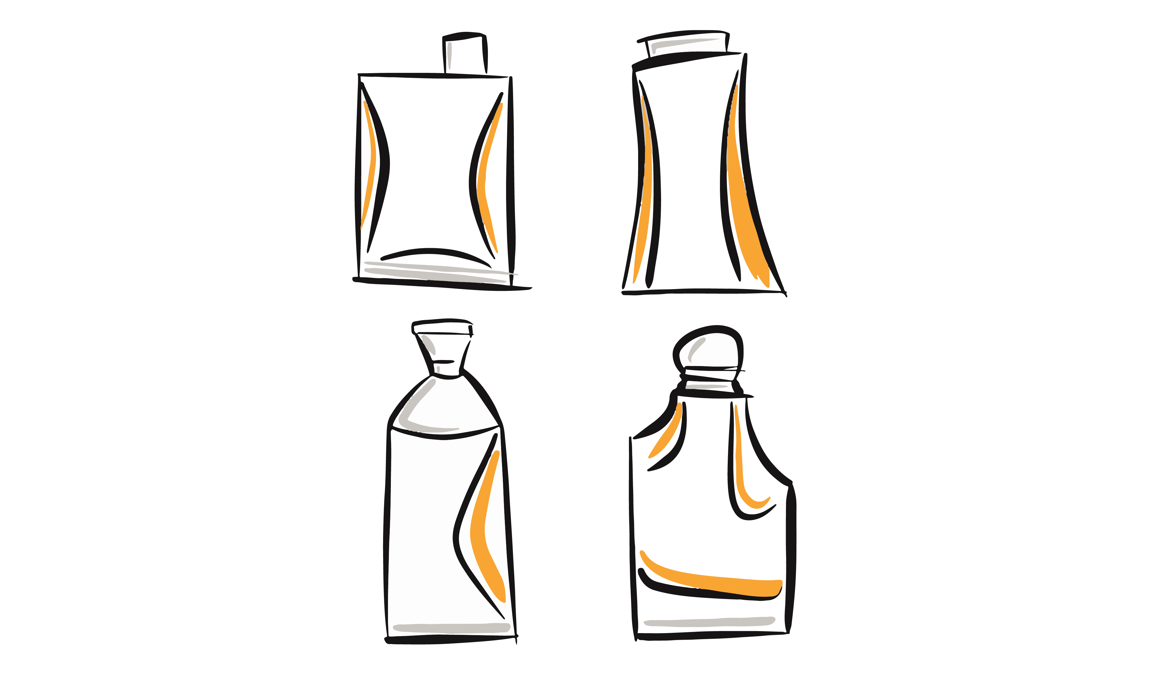
When we iterate concepts to develop a design solution, we are exploring the objective concinnity or harmony of our composition. For example, what exactly is the designer adjusting in the image of the four separate bottle concepts below? They are tweaking the proportions of several sub-elements in each bottle: the overall bottle size and shape; the position, size and shape of the top; the position of the cavity and overall proportions of the bottle. They are also focusing on how the elements are joined together through minute details and proportions. Let’s investigate proportions next.
Relative Proportions, Scale, and Size
Notice all the sub-elements that are different from one concept to the next.
ITERATIVE DESIGN DEVELOPMENT INVOLVES ADJUSTING THE PROPORTIONS AND ORIENTATION OF THE SUB-ELEMENTS IN A COMPOSITION
Proportion refers to the relationships between elements or groups of elements in an object with respect to their comparative size, quantity, or scale. Three types of proportions are commonly found in compositions:
- Overall proportions describe the character or overall configuration of a group of elements; the relationship of the parts to the whole. In the examples below, we see that these products have either a horizontal or vertical overall proportion.
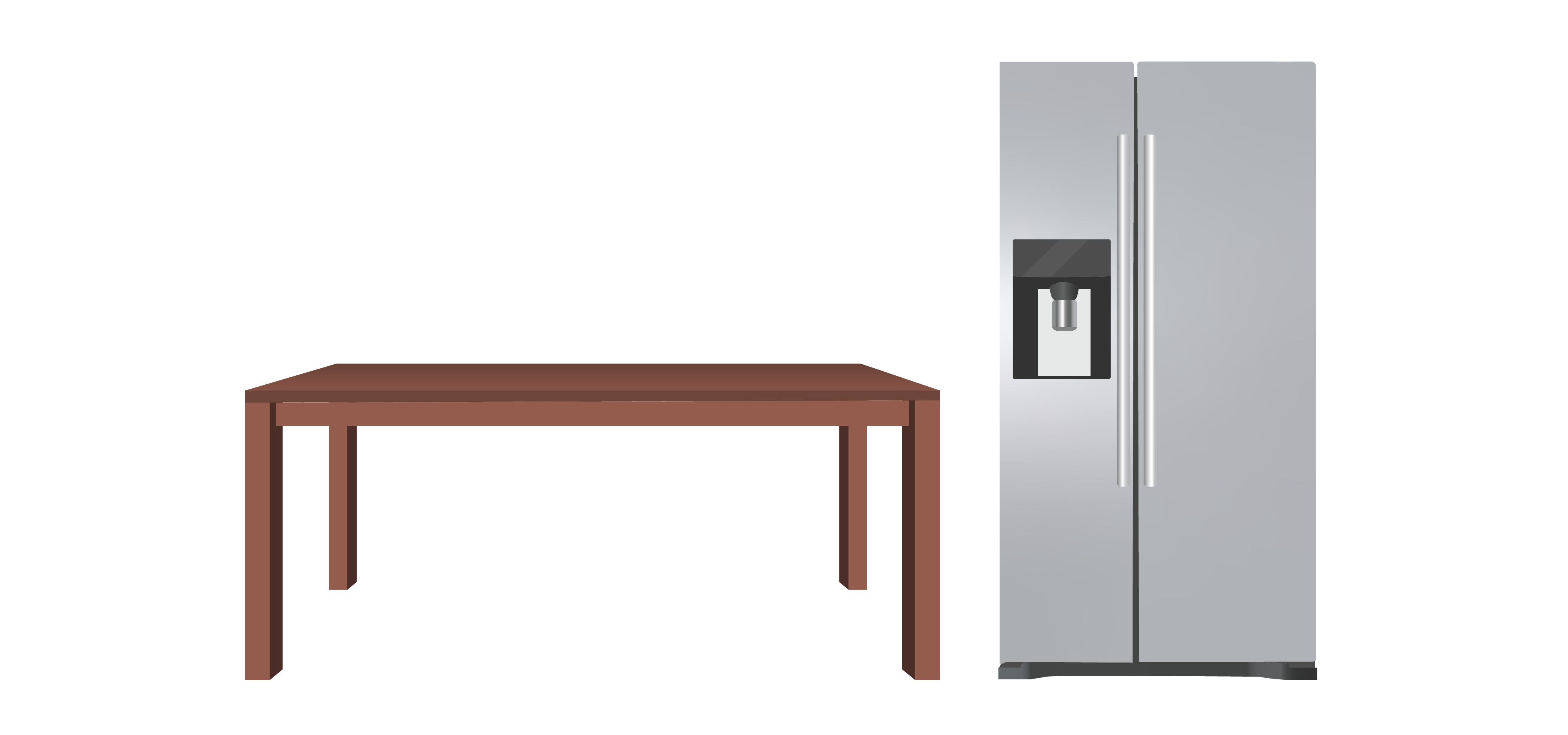
OVERALL PROPORTIONS CAN BE EITHER HORIZONTAL OR VERTICAL
- Inherent proportions describe the spatial organization of elements within a formal group with respect to length, width, and thickness. In the example below we see within a family of products that each separate product may have similar elements, like conical forms. However, each separate product has a different set of inherent proportions relative to the other products in the family. This creates variety across the line of products. Nonetheless, they are clearly related by materials, colour, and function.
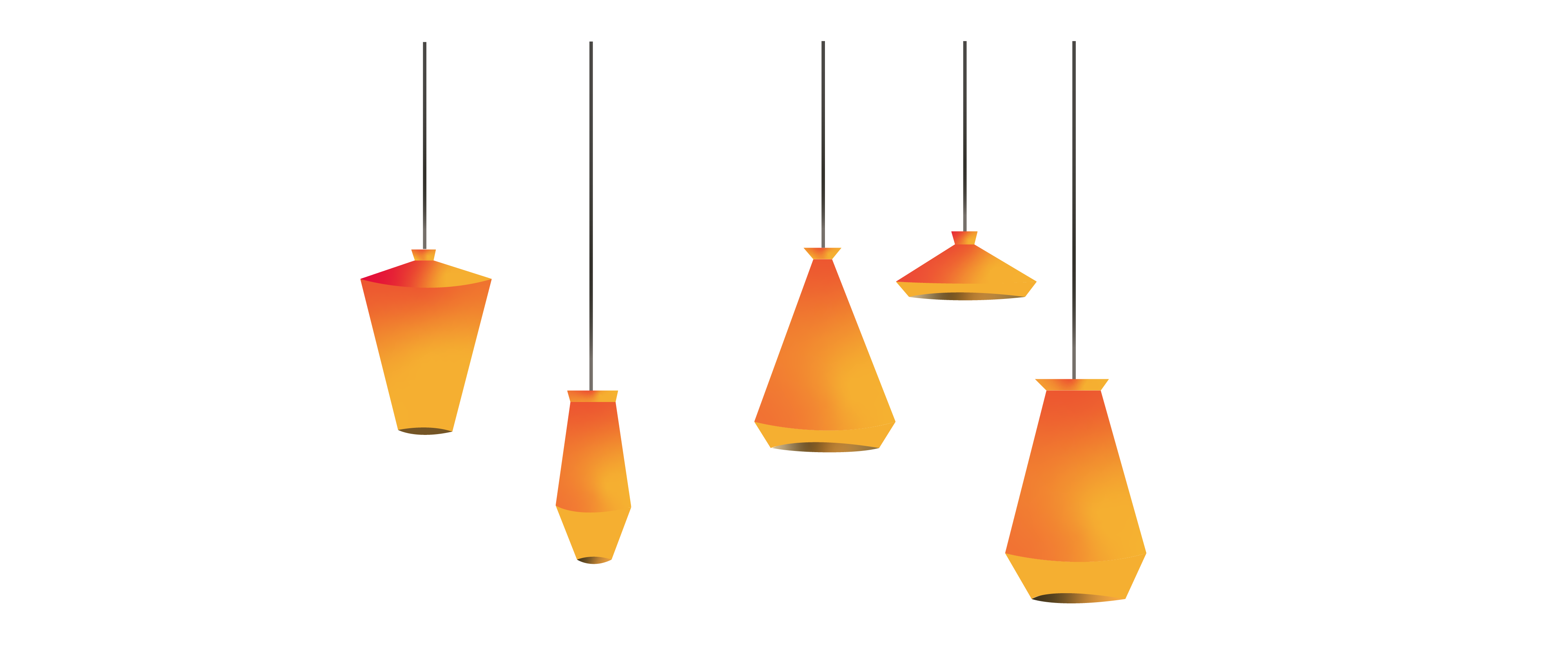
INHERENT PROPORTIONS OF SIMILAR ELEMENTS CAN VARY ACROSS A PRODUCT LINE
- Comparative proportions describe how the sub-elements within a single product composition relate to one another in terms of the whole composition (e.g. large or small, many or few). In the example below the individual modular elements resemble one another and vary by size within the overall composition. Notice that the materials, colours, and rounded corners are consistent throughout the product.
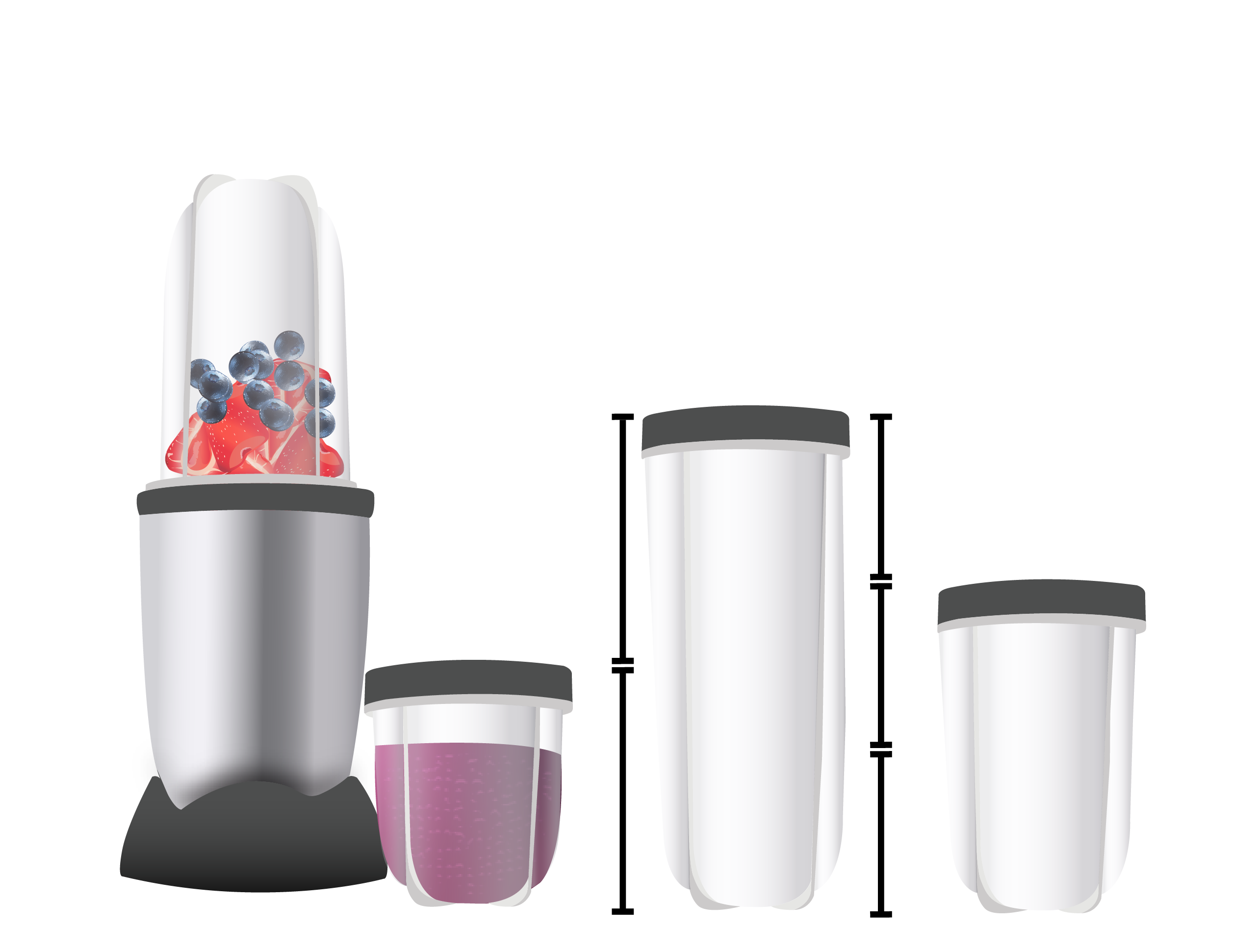
COMPARATIVE PROPORTIONS: THIS PRODUCT’S SUB-ELEMENTS RESEMBLE ONE ANOTHER AND HAVE VARYING SIZES
Proportion Systems
As we have learned, Gestalt principles clearly enable designers to contribute to an overall perception of harmony within a composition. Mathematical systems of proportion also contribute to developing a perception of compositional harmony. Historically, artists, architects, and designers have applied mathematical measures to the inherent and relative proportions within compositions to provide harmonious visual relationships. The Golden Ratio is one well-known approach to creating aesthetic balance in architectural, artistic, and design compositions. It is based on the relationship between two or more elements of a composition that have a ratio of 1 to 1.618 in proportion to one another, which is considered aesthetically pleasing to the eye.
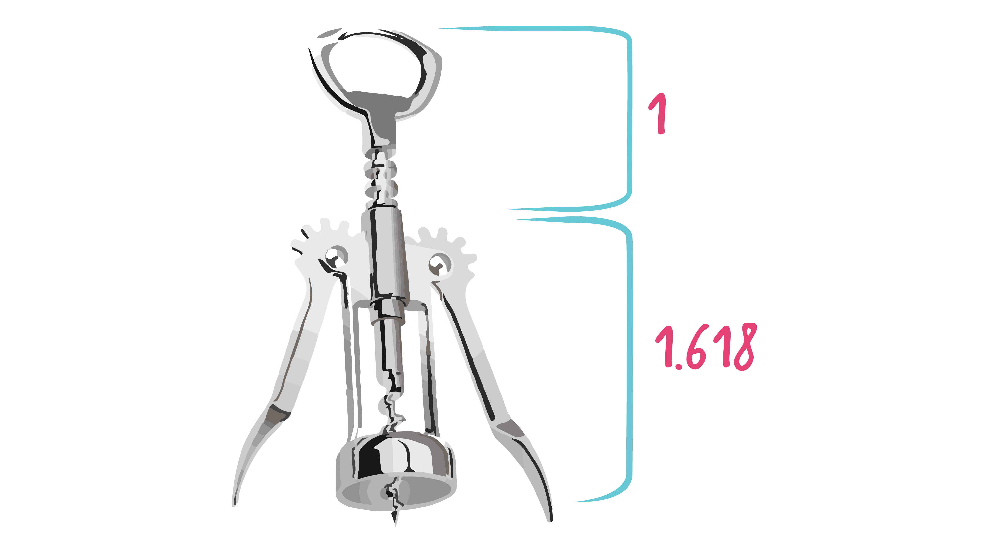
THE GOLDEN RATIO APPLIED TO THE ELEMENTS OF A CORKSCREW
You may have learned that you should place the focal point of any composition about one-third of the way in the composition, rather than at the halfway mark or centre. This is a simplified application of the Golden Ratio in which the optimal placement of an important feature is close to the division point between one-third and two-thirds as in the images below.
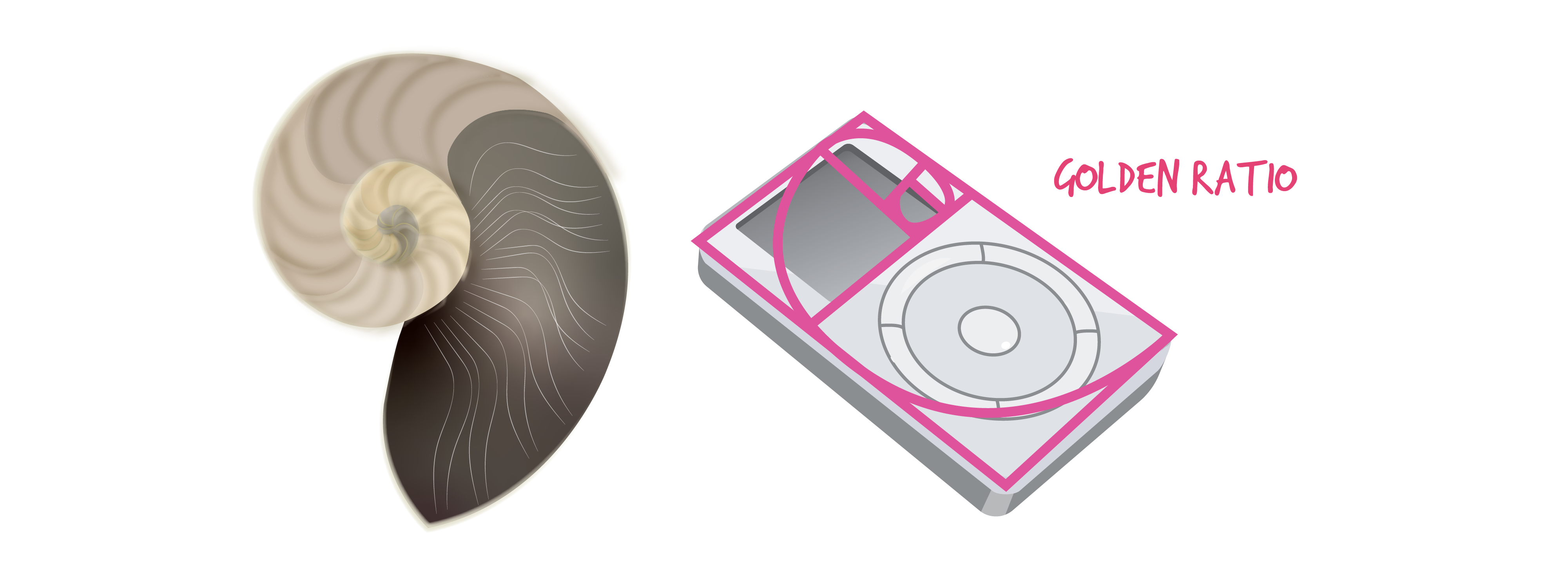
THE FOCAL POINT IN THESE IMAGES IS AT THE ONE-THIRD/TWO-THIRDS POINT
You may think that you would be unlikely to use these systems of proportion, however as noted earlier many artists, architects, and industrial designers have used them for centuries while they, along with graphic and web designers, continue to use them today.
Orientation of Axes
The axis is the imaginary line down the centre of the longest dimension of the object. It defines the strongest perceived movement of the formal composition. There are two categories of axes: static and dynamic. We perceive objects with a static axis as having a vertical and/or horizontal orientation of sub-elements, and orthogonal (right angle) relationships between elements. A camera is a typical example of an object with 2 static axes – horizontal and vertical. We perceive these objects as stable and with no indication of movement.
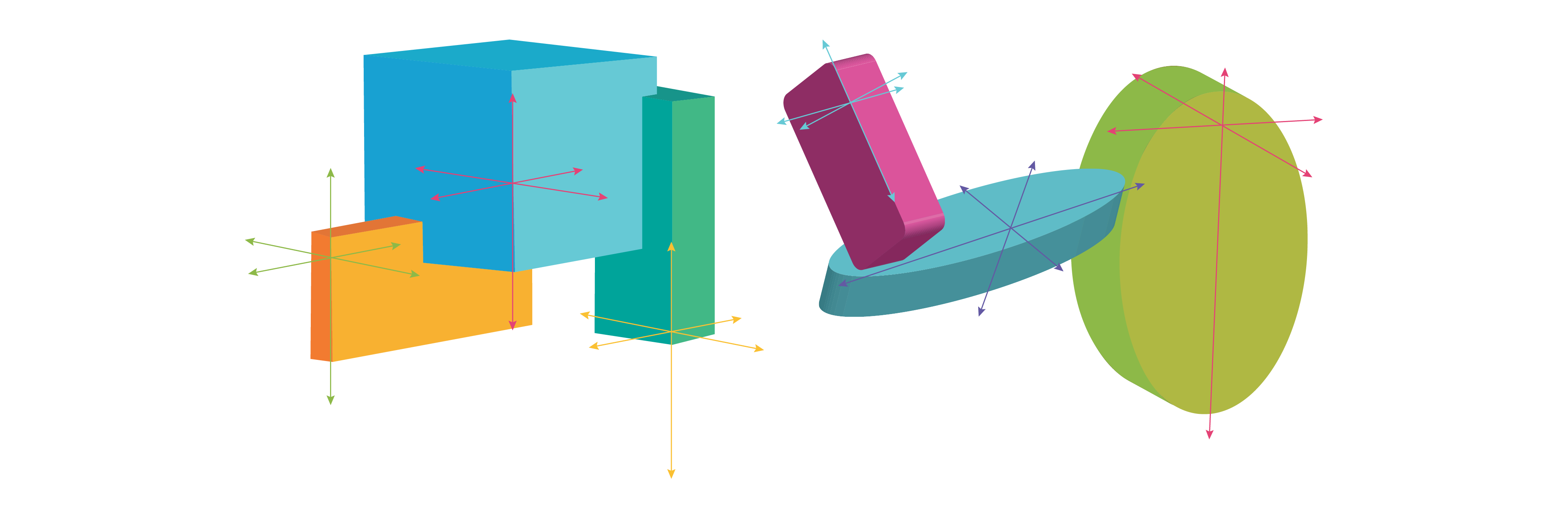
The Orientation of the axes determines whether the composition is static or dynamic
On the contrary, we perceive objects with dynamic axes as off-kilter and indicating movement, either implied or actual. In certain objects, the dynamic axes are asymmetrical and may unbalance the perception of compositional harmony. While harmony is certainly a key factor in product design compositions, there are many two- and three-dimensional compositions in which a dynamic-axes design strategy is key to making the composition appear to be more interesting. In some cultures, such as Japan, asymmetrical harmony is key to a dynamically balanced aesthetic. How do you think the diagonal axis adds compositional interest and a sense of movement to the lamp below? By comparison, what message do you get from the static horizontal and vertical axes in the camera below?
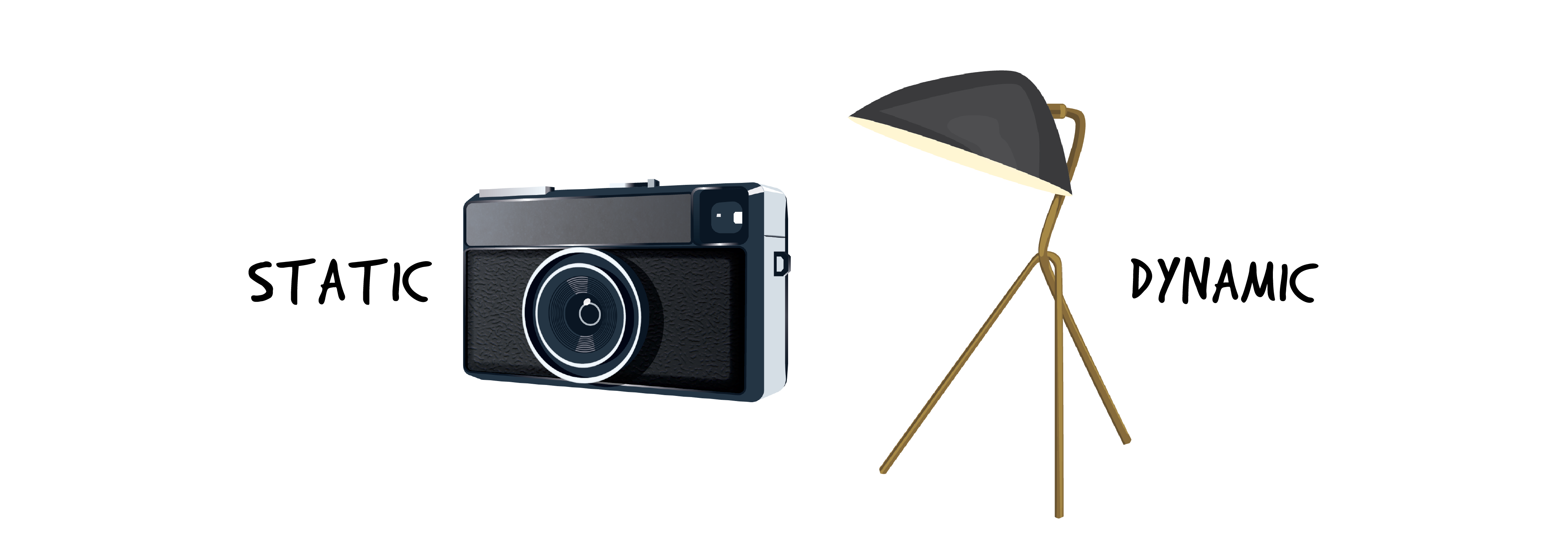
Static and Dynamic product axes communicate different messages about product use
Formal transitions between elements: FLUID Surfaces
In product design, a key point is that the user first sees or senses the whole object before noticing or being distracted by the individual sub-elements. Since any three-dimensional product is made of separate elements (e.g. a handle and a cylinder), the design team wants you to perceive it as a harmonious whole (with objective concinnity). One way to do this is to join the sub-elements of the composition together so their surfaces appear to flow into one another. Designers must decide not only when surfaces should flow together, but also when they should appear to be separate. Once again, this is an excellent opportunity for iterative design concept development, by sketching many variations.
Don’t forget that how surfaces are designed to flow into one another is not only a compositional decision, it is based on the types of manufacturing processes, materials, or production costs involved. There is no perfect design; all designs involve compromises or trade-offs among the various requirements of the product brief. In the examples below the designer may have tried to make the blower end apparent because it is an important functional affordance. For example, these two compositions show that there are different ways to design how the product’s sub-elements go together. On the left, we see chunky sub-elements with abrupt connections that do not seem unified into one whole formal composition. On the right we see sub-elements that blend or flow into one another, creating the perception of a unified product composition. Having FLUID surface transitions can simplify how you perceive the object – is it a conglomeration of a bunch of separate sub-elements stuck together or a synthesis of forms into one unified whole?
Let’s examine how the acronym FLUID can help designers unify compositions:
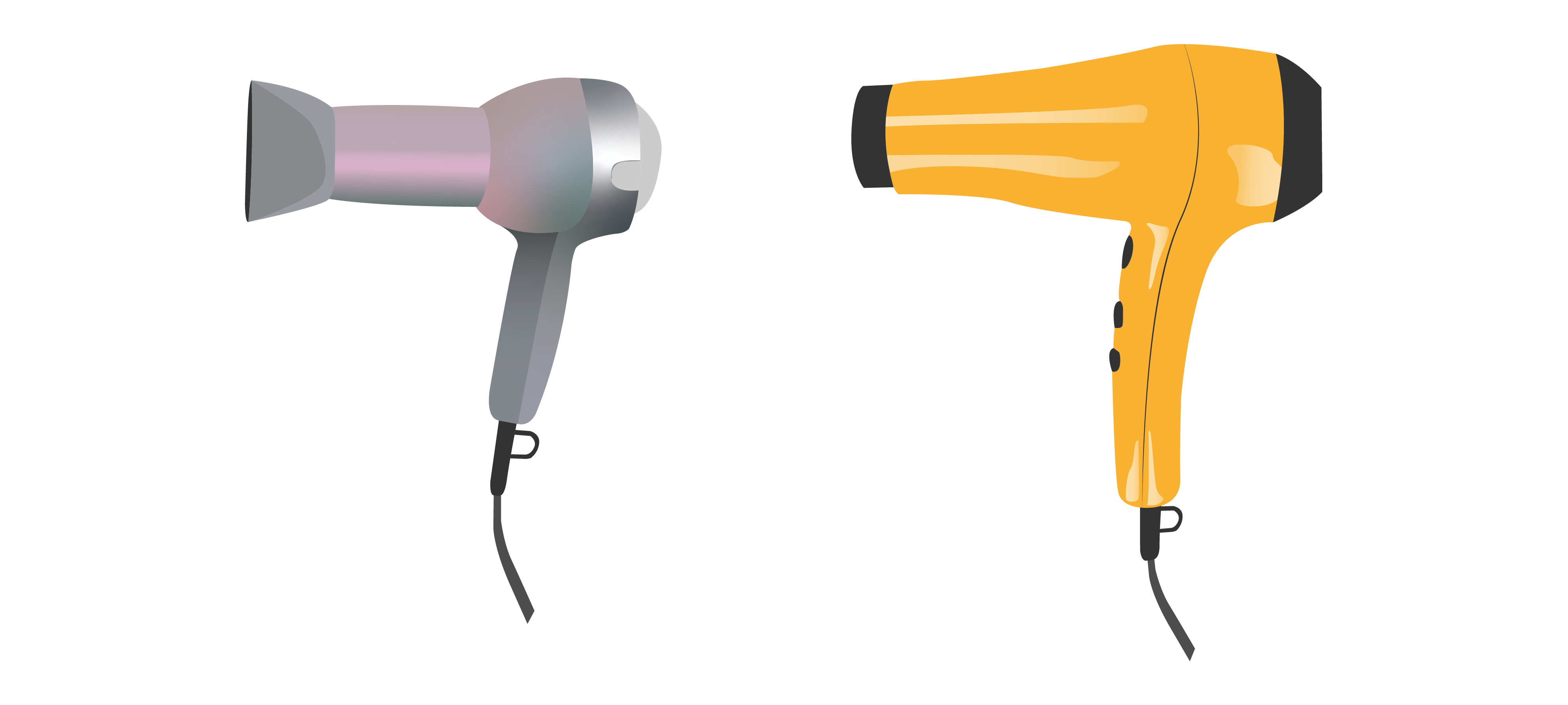
THE FORMAL TRANSITIONS BETWEEN SUB-ELEMENTS DIFFER FOR EACH OF THESE HAIRDRYERS
FLUID is an acronym that describes how elements within a composition can be unified:
F– flowing
L– links
U– unify
I– individual
D– details
In other words, we can combine sub-elements so that they are perceived as a unified part of a whole composition. The techniques for creating a sense of FLUIDity, where each individual element flows into the next, are technical, where the geometry – the mathematical relationships and properties of the surfaces, angles, and lines – between sub-elements plays a key role.
Surface Continuities
Designers use the term surface continuities to describe the appearance of the edge between surfaces, this is also referred to as the formal transitions between surfaces. These transitions depend on the size and geometric values of radii, fillets, and/or chamfers to reduce the perceived complexity of the overall composition. For example, in the image below, each of these transitional edge treatments – radii, fillets, and chamfers – occurs at the edge where two surfaces meet. If you look at your mobile phone, you may notice that it has rounded or chamfered edges. If the edge has a convex curve a radius was applied to it. If the edge has a concave curve, a fillet was applied to it. If the edge has a bevelled 450 angle a chamfer was applied to it.
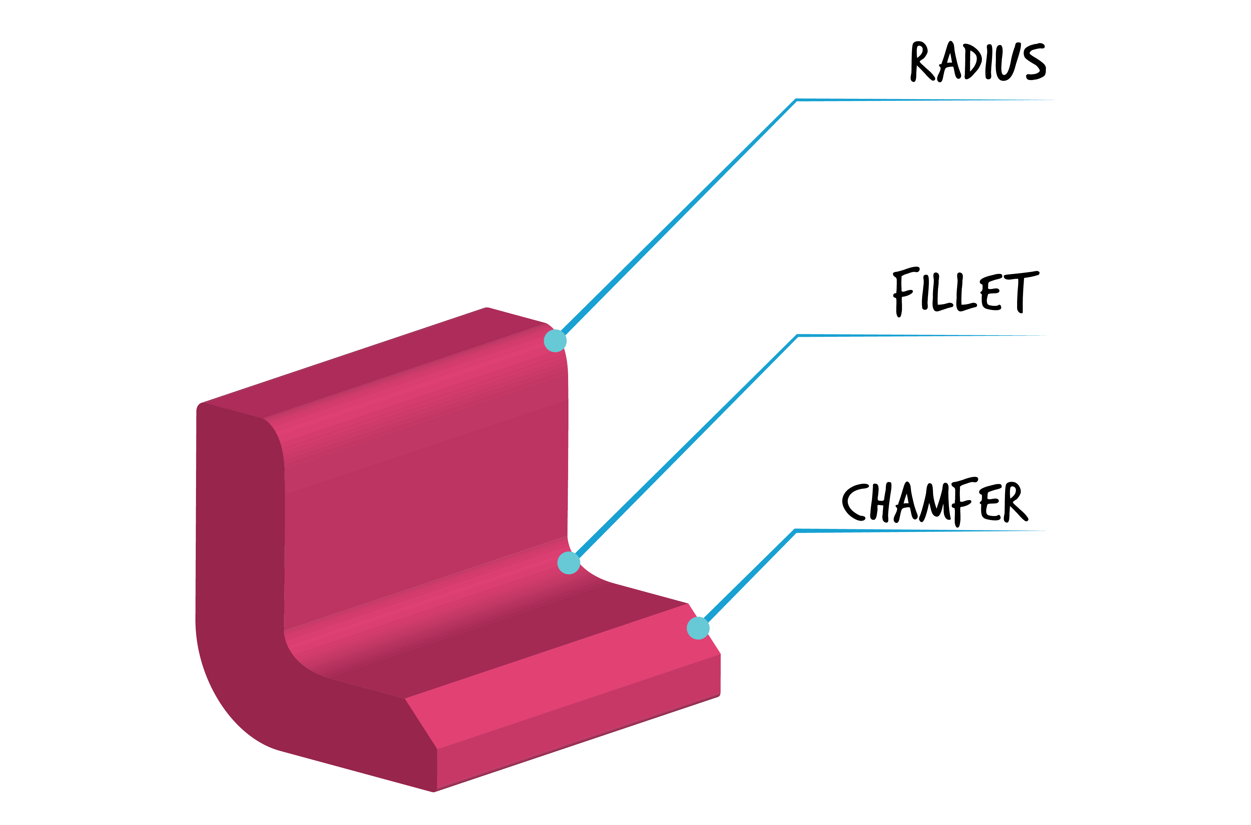
Surface Continuities: Radii, Fillets, and Chamfers
Surface continuities allow surfaces to appear to flow into each other instead of having them appear to be chunks or units of volumes simply stuck together.
The perceptual goals for considering the kind of surface continuities that join sub-elements of a product may include diverting the user’s eye by drawing their attention toward or away from that element, indicating action areas, or simply creating an overall unified impression of the product.
Continuities across surfaces: Surface Transitions
Designers use three kinds of edge-to-edge radii for surface transitions, which are visible under a light source that highlights the edges:
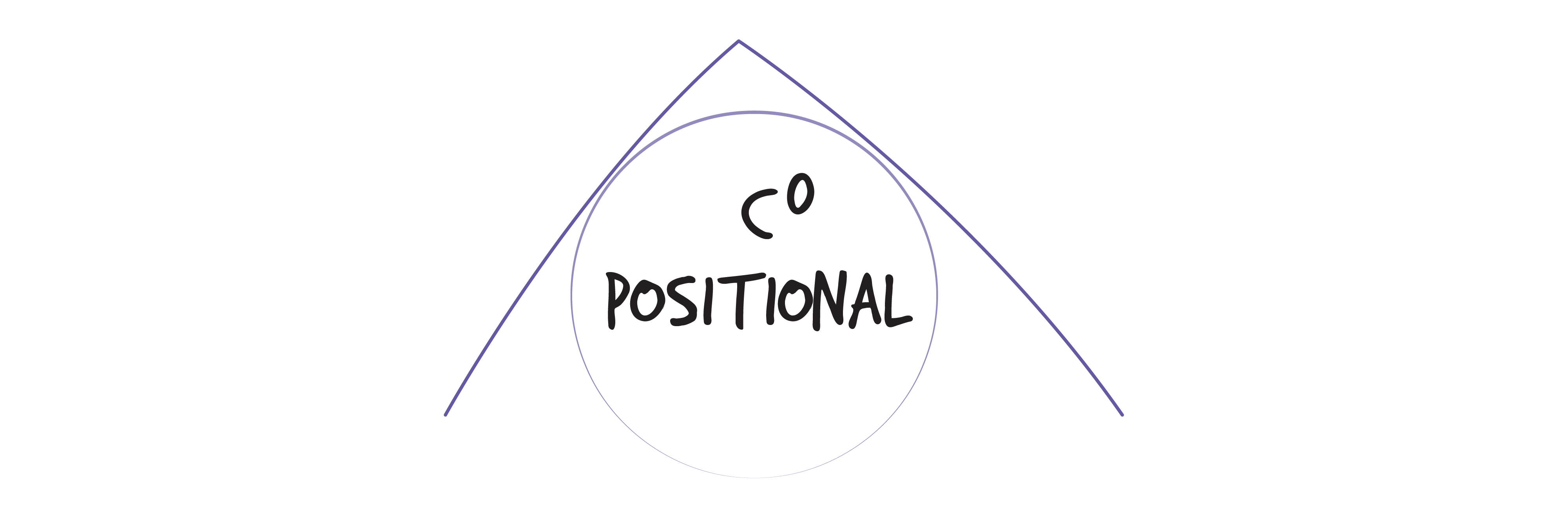
C0 or positional continuity appears as abrupt and sharp edges at the intersection of two surfaces. These edges are composed of straight lines that are perpendicular to each other and are not joined at all. In this case, there is no curvature at the edge, hence it is called C0 (curvature zero).
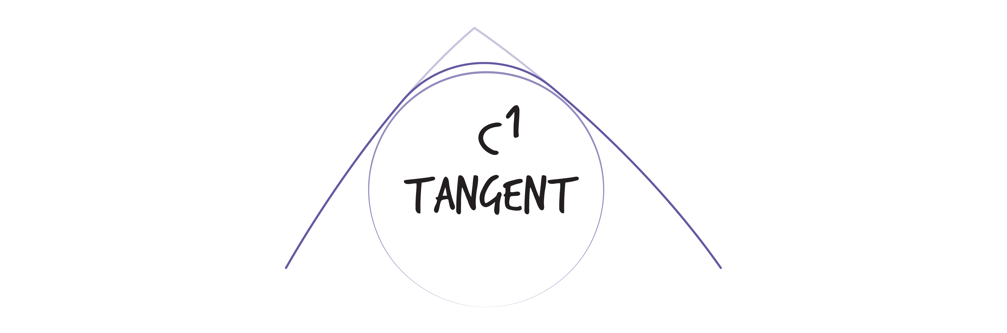
C1 or tangential continuity appears when two circular segments of different radii are joined with the same tangent. This curvature seems to be instantaneously changing where the radii join.
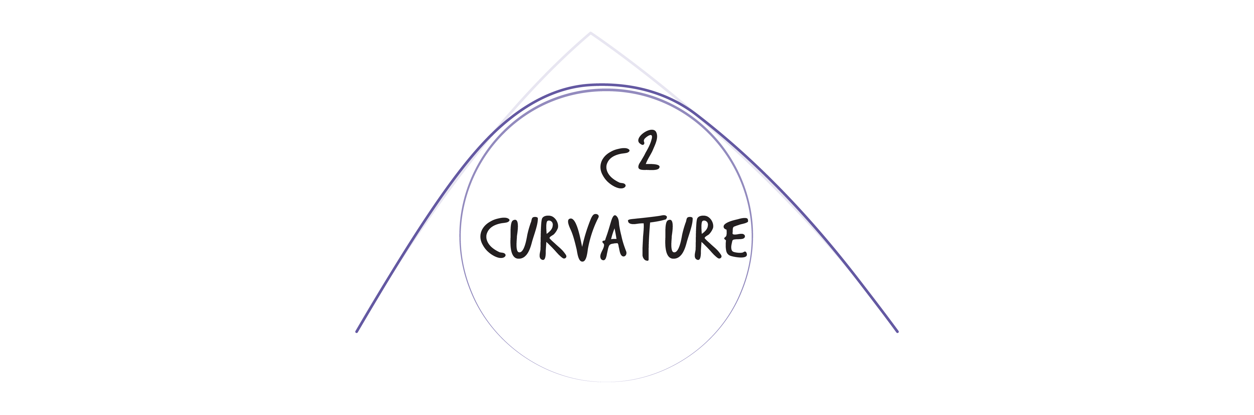
C2 or curvature continuity appears when the tangent and curvature at the edges are the same. In this case, the edges seem to flow together; it is impossible to tell where one curve ends and the other begins.
If you begin to look at the things you use, you should be able to identify the formal treatment of the edges between adjoining surfaces. Check out your mobile phone, computer, extension outlets, or your desktop.

Surface Transitions
Visual contrast can also be created through exaggerated and sharp blend lines at the point where two surfaces meet; these may indicate action areas. Blend lines are sharp curving transitions between two surfaces that emphasize the form of the overall object. They are similar to sharp C0 edges, but may not be straight lines. In the examples below you can see blend lines in a small appliance and a much larger car. They are often used in car design. Products can use FLUID continuity, contrasting blend lines, and even abrupt blend lines to highlight design features.
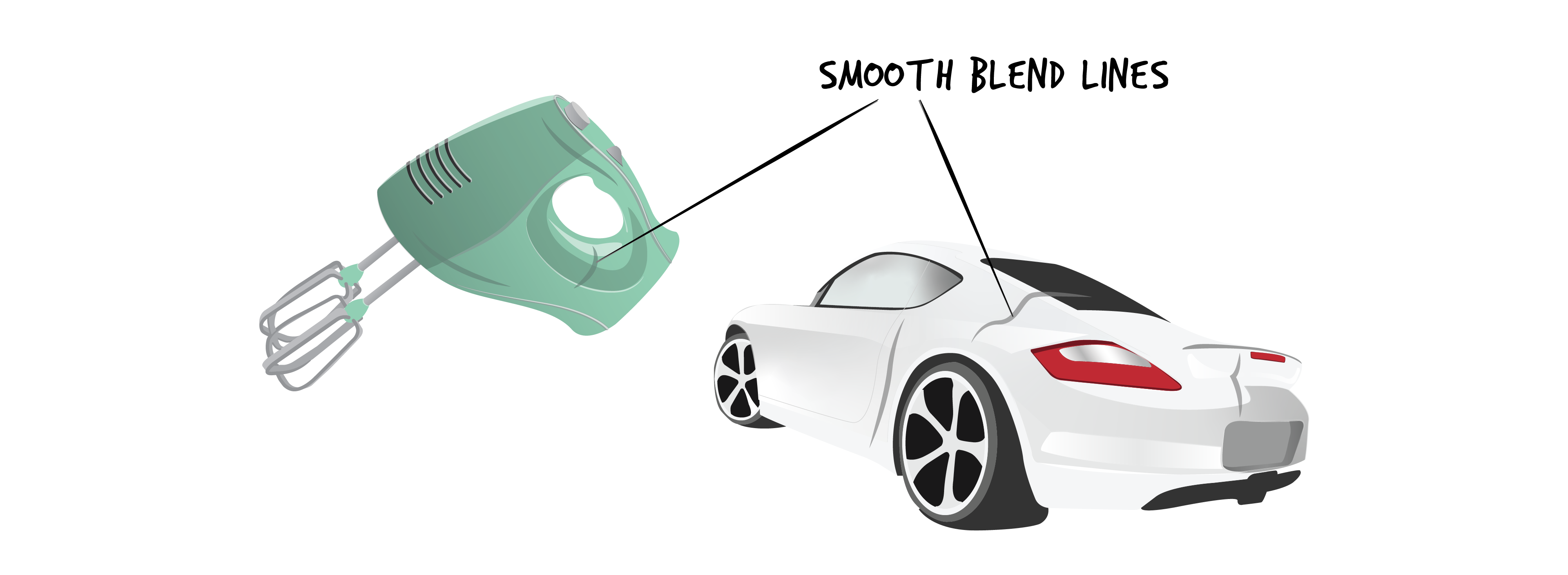
BLEND LINES SMOOTH OUT SURFACE TRANSITIONS & EMPHASIZE FORMAL DETAILS
Activity Time!
Click on the purple icons to see examples of different surface transitions within a product.
Surface Transitions
In this section, you have been introduced to a range of approaches that can be applied to unifying sub-elements so they are perceived as belonging together in any composition – art, architecture, or design. Whether by manipulating proportions of sub-elements or focusing on the transitions between surfaces, or both, a designer can tweak the overall composition so that it is perceived holistically and communicates its formal details clearly. Remember that thoughtfully designed formal features can also communicate important semantic messages.
As noted earlier, we interpret these messages and other characteristics by paying attention to the three dimensions of a product, not just what we see from a single viewing point, like the front. Some products may have unique components on one side or the other, on the top, or even on the bottom. Consequently, visual compositions achieve perceived coherence and provide interest from different viewing angles when they incorporate many of the foundational principles discussed in this chapter.
Next section: 2.7 Summary Review Activity
