
7.4 Sensory Dominance
Industrial design decisions can influence the way we experience products by organizing the multiple sensory stimuli that may improve user-product interaction (MacDonald 2001; Rashid 2003). The senses can be divided into two distinct groups based on the physical distance we need to interact with an object: the distance (distal) senses of audition, vision, and olfaction and the proximity (proximal) senses of taste and touch (Ludden et al, 2007, 2008). Most of us see, hear, or smell an artefact before we touch or taste it – a sensory order that is dictated by the stages of our interaction with it. If they were near you, you would see and smell the muffins (below) before you could pick one up. This smelly enticement is used for marketing food worldwide; it appeals to your distal olfactory senses. Have you ever found yourself craving chocolate chip cookies or french fries in the vicinity of a food court? If so, you experienced an intentional multisensory ambush!
Distal and proximal sensory order
Most designers prefer to use multisensory or multimodal features to support users, not to ambush them! A key approach to multisensory product development is to identify which sensory modality dominates our experience at each stage of user-product interaction (Fenko, Schifferstein, & Hekkert, 2008). This is called Sensory Dominance. By establishing a sensory hierarchy (or step-by-step order) of use in the design of each product, service, or environment, designers can address the sense or combination of senses that are at play during each stage of use. The best way to collect this information is to observe others interacting with the things they use until their patterns of use become apparent. This information can provide insights for designers that contribute to improving products to best suit a wide range of multisensory interaction modes. In the example below, we first see the red stapler – using our eyes – then we use it, again using our eyes to align our hands to pick up and press, and our ears to hear the click of completion. We also perform maintenance, using our eyes and hands to open the stapler channel, grasp staples, and insert them before closing the arm, and our ears to listen for the final click. When you interact with a stapler with this kind of design composition, a similar pattern of multisensory interaction will take place every time you use it.
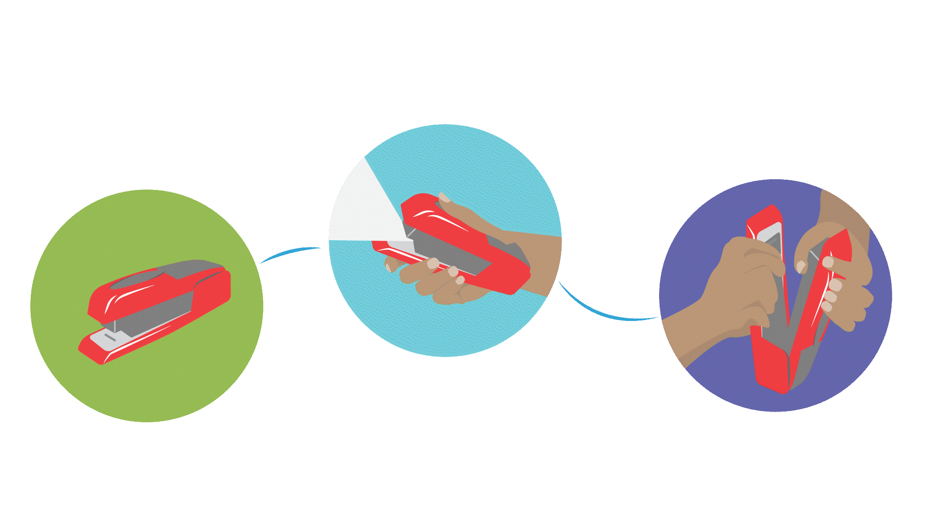
Sensory dominance at different stages of product use
Fenko, Schifferstein, & Hekkert (2008) conducted a study with students using a range of products from electronics such as alarm clocks, mobile phones, and cameras to personal tools such as shavers, guitars, snowboards, and coffeemakers. They were studying whether individual stages of product use for all kinds of products depend on a similar order of sensory interactions or not. Most of the participants concluded that vision provides the most product information in the shortest time frame, and it is heightened at certain points during interactions with products. For example, at the point of purchase, visual experience is dominant, followed by touch, auditory, smell, and taste occurring in sequential order. We call this visually dominant.
However, after the first week of having a product, vision and touch provide equal stimulation, followed by the senses of hearing, smell, and taste. After the first month, the difference between touch and vision was significant – with touch in the lead – and the senses of hearing, smell, and taste were less influential. After the first year of use, vision, touch, and hearing were similar, smell was in second place, and taste was in last place (Fenko, Schifferstein, & Hekkert, 2008). Their findings suggest that the less significant sensory modalities may play a more influential role in the later stages of product interaction and affect the emotional experience associated with products (Schifferstein & Desmet, 2007).
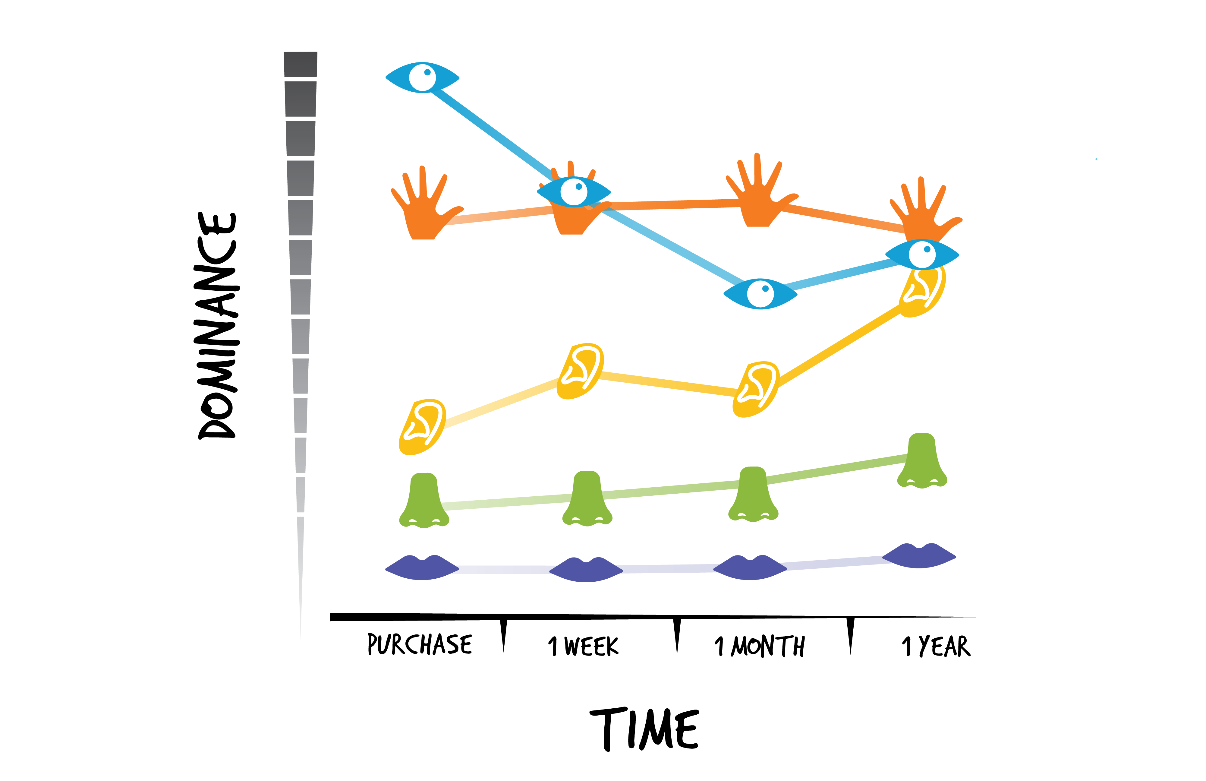
documenting changes in sensory dominance in the use of a single product over time
Of course, the role of each sense depends on the product, the frequency of use, and the importance attached to the activity performed (Schifferstein, 2006). Typically, as noted above, most of us initially react to the visual components of a product and other sensory modalities become more dominant with use. Over time we may no longer need to see (vision) the button on the alarm clock to turn it off in the early morning; simply hitting it (tactile) after hearing it (auditory) works just fine. In his TED talk, Jinsop Lee (2013) presents his 5-sense design theory in which he uses a 5-senses graph for measuring specific sensory experiences on a scale from 0 to 10, where 10 is the most intense experience. His idea is that if you run the senses across the bottom of the graph and an intensity scale up the vertical axis, a perfect experience would lead to a horizontal line running across the top! This is a great place to start to investigate how you experience your five senses while doing an activity you love; he chose to document his motorcycle ride, and we chose to document eating Pho and candy floss, as you can see below.
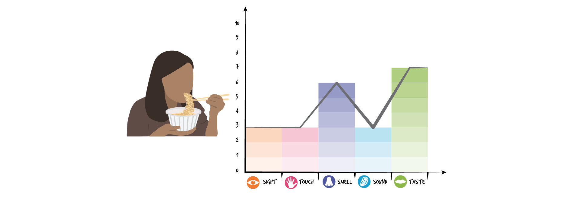
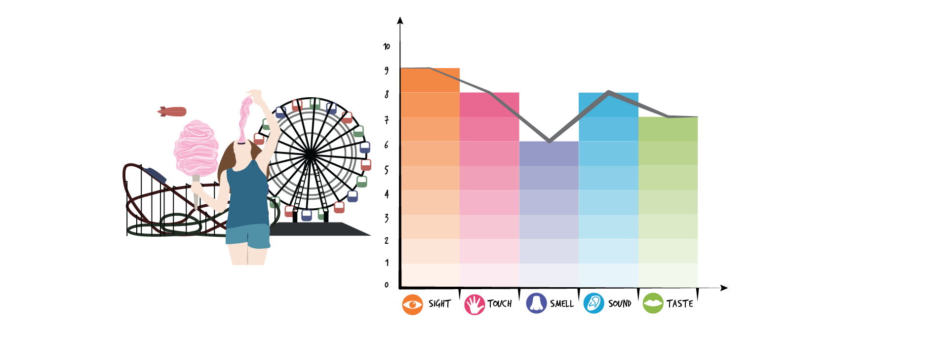
sensory dominance scales for different life experiences
Can you think of any objects in your daily life – your alarm clock, your phone, or the cutlery you eat with – that you barely look at before using them? If so, pay attention the next time you use them to reflect on which senses you engage with at each stage of use (you may need to take pictures along the way to determine what belongs in your own sensory map of use!).
Activity Time!
Match the product to the graph according to their sensory dominance over time.
Changes in sensory dominance over time differ across products
Next section: 7.5 Multisensory Delight
