
3.3 Colour Wheel and perceived Colour Relationships
You may be familiar with the concept of a colour wheel, like the one seen in the image below, a model that illustrates a circular relationship between colours (Itten, 1970). In the 17th century (1666), Sir Isaac Newton developed the first colour wheel to represent a system for understanding how colours relate to one another. Since then, many colour systems have been based on this by organizing the spectral colours in a circular array, where red and violet are placed side by side, even though we actually see them at opposite ends of the spectrum.
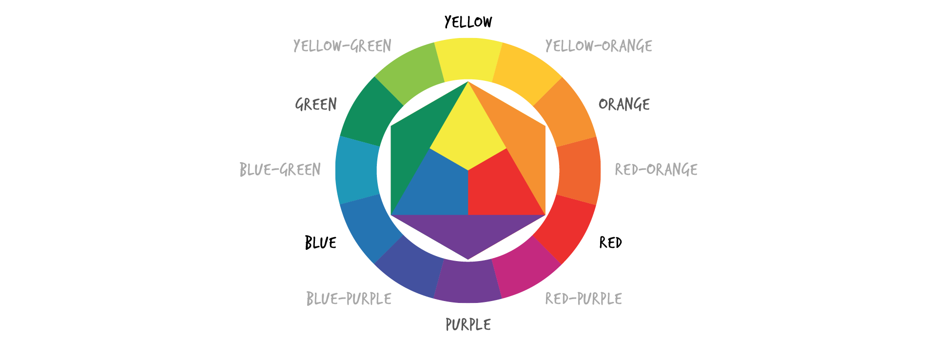
Itten’s RYB Subtractive Colour Wheel (1970)
Since then, other colour theorists have developed a range of models to demonstrate relationships among colours such as Goethe’s colour wheel and colour triangle (19th century), Maxwell’s colour triangle (19th century), Munsell’s three-dimensional colour tree (early 20th century), Itten’s colour wheel as seen above (early 20th century), and the Pantone Colour System, which is a current product design industry standard discussed later in this chapter. Colour theory is a vast area of study across disciplines that range from physics to design (Clay, 2009, Hope and Walch, 1990, Fiesner and Reed, 2104). In this section, we focus on applied colour theory that can bring products to life.
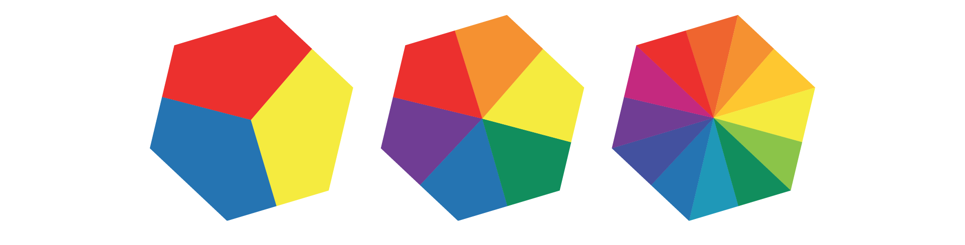
Itten’s colour wheel is the most common way we visualize the relationships of the basic colours in design. In his subtractive RYB colour model, seen above, the primary colours are red, yellow, and blue, which we see in the triangular centre area. The three secondary colours, depicted in green, orange, and purple triangles adjacent to the centre, are created by mixing pairs of primary colours. Green is composed of blue and yellow, orange is composed of red and yellow, and purple is composed of red and blue. Six tertiary colours are created by mixing primary and secondary colours, as seen in the models below (Itten, 1970).
Primary, Secondary, and Tertiary Colour Models (adapted from Itten)
As you probably know, every designer should understand basic colour theory. Colour system schemes provide a foundation for designers to select appropriate product colour relationships that will enhance a user’s product experience by communicating an aesthetic, emotional, or functional message. You can apply the following colour relationships or colour schemes in the design of products, environments, and interfaces. As you will see, we discuss relationships using an adaptation of Itten’s colour wheel as our foundation.
Monochromatic Colour Schemes
Monochromatic colour schemes are derived from a single base hue that is extended using its shades, tones, and tints. The hue never changes, but the value does. For example, in the image below, each segment depicts a monochromatic colour scheme, where the original hue is in the centre of the segment, the shade is above it and the tint is below it.

Monochromatic colour wheel
Complementary Colour Schemes
Complementary colours are positioned opposite one another on Itten’s colour wheel: red and green, blue and orange, and yellow and purple. These are derived as a product of partitive colour mixing, where complementary opposites include: yellow and blue-violet, red and blue-green, green and red-violet, and violet and yellow-green (Munsell, 1946). These hue combinations intensify (contrast) each other and catch our eye, often expressing fun or excitement (Clay, 2009). Some key points about complementary colours are that placing two complementary colours side by side creates a brighter image. However, mixing two complementary colours together creates grey.

Complementary Colours
Split Complementary Colour Schemes
In addition to the base colour, split complementary colours include the two colours adjacent to the original colour’s complement. This colour scheme has the same strong visual contrast as the complementary colour scheme, but less tension. This relationship is built with one hue plus two others equally spaced from its complement. In the diagram below the split complementary colours for green are orange/red and red/blue.

Split Complementary Colours
Analogous Colour Schemes
An analogous colour relationship includes a colour combination of three colours located adjacent to each other on a colour wheel. The analogous colours in the example below range from blue to indigo. Analogous colour schemes provide visual harmony.

Analogous Colours
Triad Colour Schemes
A triad colour combination includes three colours that are at an equal distance from each other on the colour wheel. They are perceived as stimulating and enhancing each other, as with the triad colour combination of green, violet, and orange below.

Triad Colour Combination
Discordant Colour Schemes
Discordant colours are widely separated on the colour wheel (but not complementary or triadic). Discordant colours can be eye-catching and/or visually disturbing. They deliberately break from harmonious schemes and can be said to clash or fight against each other. They are often used as attention-getting devices in advertising. For example, the red font on the violet magazine cover below is a discordant colour combination that has recently become rather fashionable.
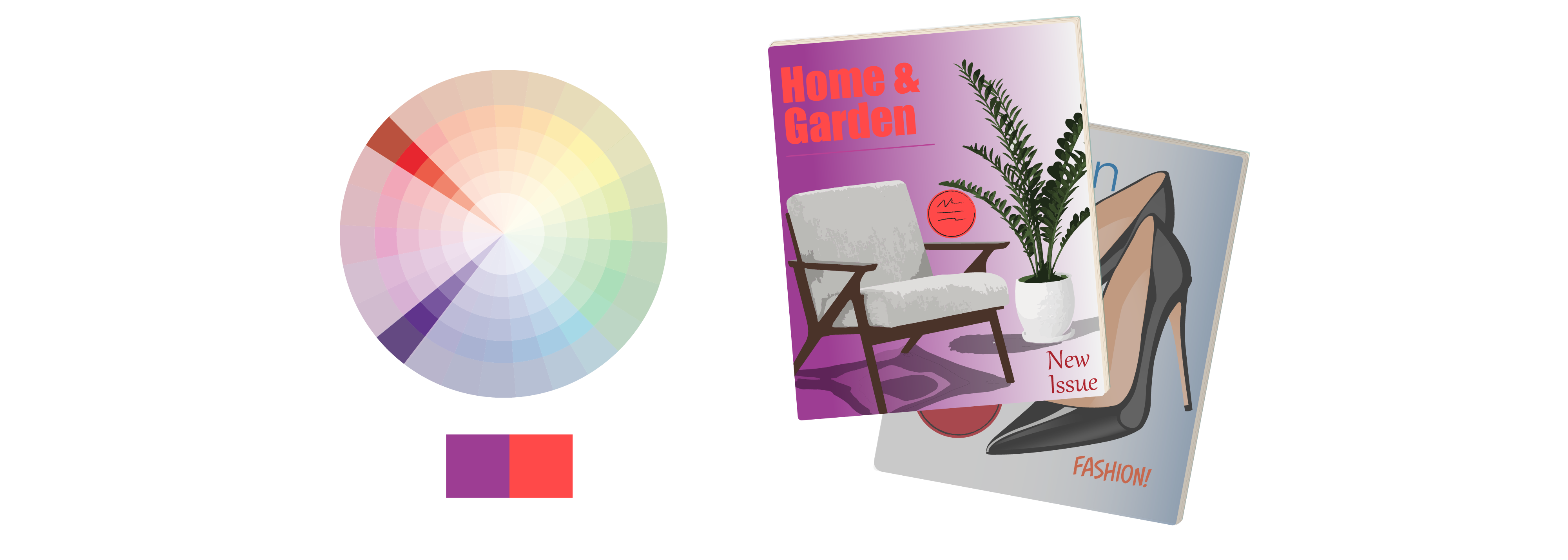
An Example of a Discordant Colour Scheme
Warm/Cool Contrast Colour Schemes
Itten divides the colour wheel into warm and cool hues. He associates warm colours with the ability to conjure up vivid and energetic perceptions. They include violets to yellows and may send us a semantic message, reminding us of the summer, sun, or fire. On the other hand, he associates cool colours with communicating the message of calm, or soothing. They include greens to violets and may remind us of spring, ice, or water.
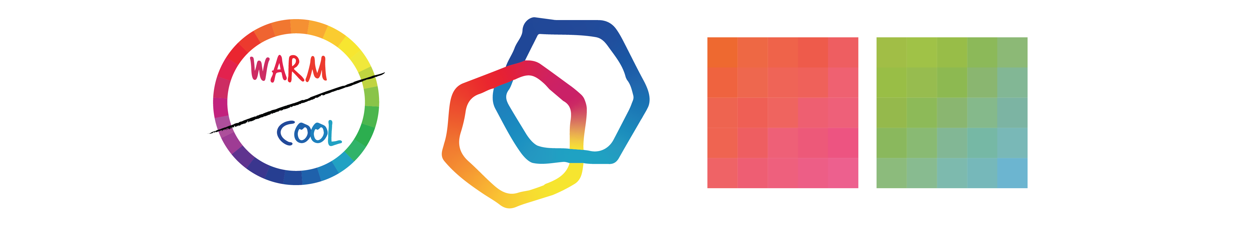
Warm red/yellow and Cool blue/green colour schemes
White, black, and grey are neutral. However, you can make colours (hues) ‘cooler’ or ‘warmer’ by playing with the vividness or colour saturation, as discussed earlier. For example, a warmer or cooler version of a blue may be manipulated by levels of saturation. There can also be warm or cool whites and greys depending on the variation of undertones mixed with the base hue. For example, a blue undertone contributes to a perception of coolness, whereas a yellow undertone contributes to a perception of warmth.

Cool Colour Palette (left) and Warm Colour Palette (right)
The first example above is a cool colour scheme or combination symbolizing refreshing cold water (blue = water) in the context of nature (green). By contrast, the second example is a warm colour scheme, with deep reds and violets symbolizing the comforting warmth of the hot drink inside.
Architects and interior designers depend on colour relationships to create a perception of depth in environments. Clay (2009) notes that warm colours (yellow, red, orange) tend to be perceived as enlarging areas or volumes whereas cool colours (blue, violet, green) reduce their perceived size, as seen in the images below. That is because warm colours generally appear to advance (to be closer to you) and cool colours appear to recede (appear to be farther away from you).

The centre shapes are the same size, but the warm yellow shapes appear larger in both cases: the warm yellow advances, the cool violet recedes
Colour contrast is often used to amplify the effects of coloured elements next to one another in a composition. For example, warm hues combined with cool ones or light tones next to dark tones may draw the viewer’s eye to the place where the contrast is the greatest, as discussed below. Even a small area of strong colour contrast could have a positive impact on the overall appeal of the composition. Many effective colour schemes depend on an unequal proportional distribution of colour – a large area of one colour adjacent to a small area of a contrasting colour, like in the images above where the small centre colour is in the middle. Other proportional distribution colour schemes follow below.
Contrast of Extension Colour Scheme
Combining warm and cool colours can also add to the contrast of the composition, creating the desired colour accent. For example, placing small areas of light colour on a dark background, or a small area of dark on a light background will create a colour accent. When you are exploring contrasting colour relationships, experiment with colour combinations as well as proportions to achieve a colour accent. For example, as you explore the ratio of areas of a warm colour to those of a cool colour you may achieve a suitable accent, as seen in some examples below. This colour principle is often applied in product design to highlight elements that users will interact with, like placing a strikingly red stop/start button against a less saturated green background, which minimizes the background or less important elements.
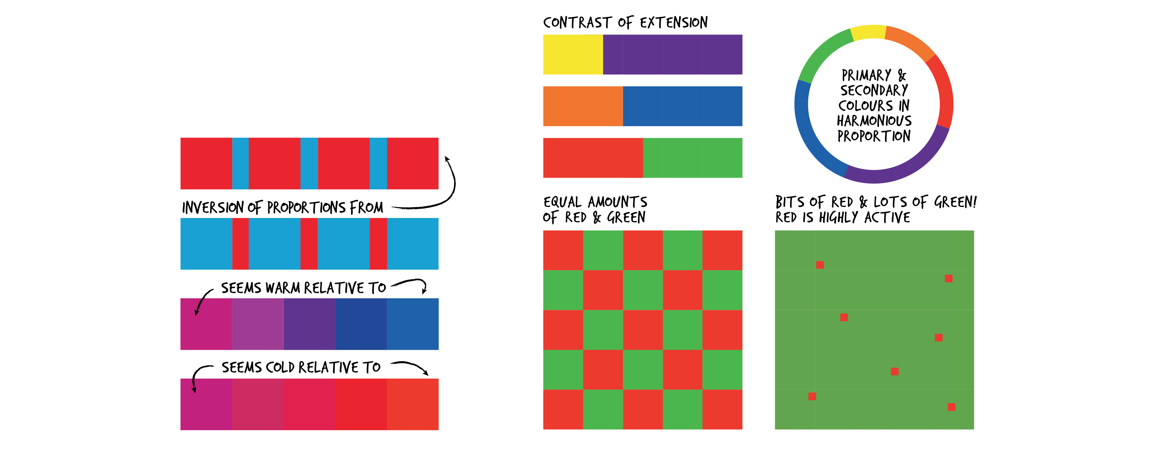
Examples of Contrast of Extension (ADAPTED FROM Itten)
Simultaneous Contrast Colour Scheme
Simultaneous contrast can also be called colour modification because identical areas of hue or tones can be perceived differently relative to surrounding or adjacent colours, as we saw in the yellow/violet examples earlier. For example, if large areas of light hues are used, the whole area will appear light; if large areas of dark values are used, the whole area appears dark. Colours can also be modified by their neighbouring colours. For example, in the coloured hexagons below, the grey element can be perceived as a different value in relation to each of the different background colours (a neutral grey appears slightly green next to pink). On the music player below, the value contrast of the white is perceived differently in relation to each of the backgrounds. The contrast is more pronounced on the vibrant blue or yellow than on the silver device.

Simultaneous Contrast Colour Schemes affect overall perceptions
Zing Colour Scheme
Zing refers to a small patch of highly concentrated colour amidst less saturated colours or greys. It is often used to attract attention or feature important elements in a product.

The Zing of bright patches of colour attract the eye (ADAPTED FROM Itten)

Zing attracts attention to product features
This is where more complexity can contribute to an interesting product colour palette, which we discuss later. To attract attention, a small amount of one colour, which could be an accent colour, can be applied to create contrast with a larger area of another background or surrounding colour.
Flicker effect
The flicker effect creates an illusion of independent movement, where two colours that are very similar in tone, but otherwise different in hues (colour) are placed beside or close to each other. This can create the optical illusion of movement or hovering.
The Flicker effect creates an illusion of movement
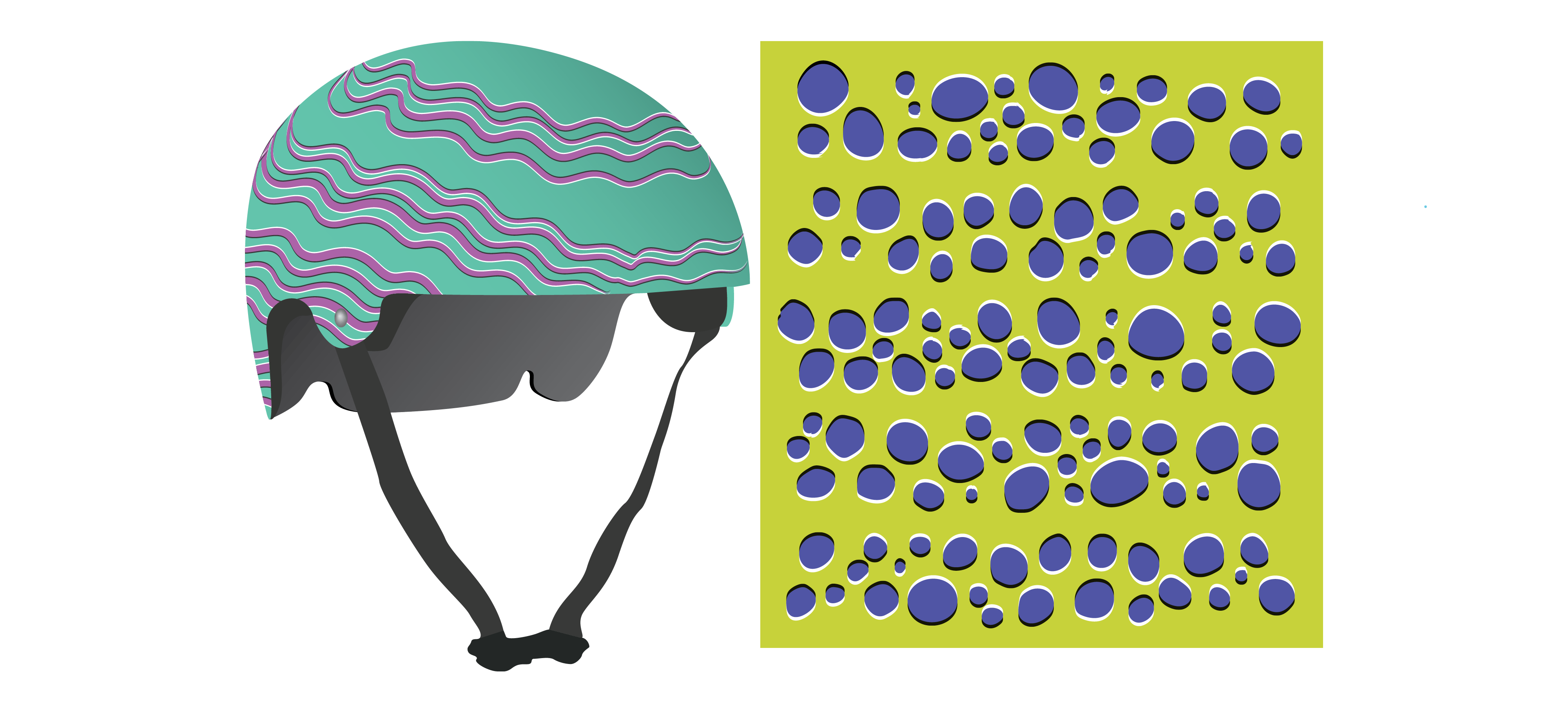
Activity Time!
Look at the following images. Take some time to reflect on the colour relationships applied to each sneaker below. See if you can match each colour scheme name to its appropriate sneaker.
THE SAME PRODUCT CAN APPEAL TO DIFFERENT USERS BY APPLYING VARIED COLOUR SCHEMES
Next section: 3.4 Light as a Compositional Element
