
7.6 Multisensory Design Principles
Layers of multisensory design interactions maximize engagement and minimize distraction if carefully considered in the early design phases. Good design can lead to clear perceptual feedback by applying the principles of flow, maintaining focus, managing demands on attention, and sequencing as discussed in the following sections adapted from Park & Alderman (2018):
1. Flow
Any designer who has lost themselves in drawing concepts has experienced flow, which is, “a state in which people are so involved in an activity that nothing else seems to matter; the experience is so enjoyable that people will continue to do it even at great cost, for the sheer sake of doing it” (Csikszentmihalyi, 1990). If you have experienced a state of flow, you will likely recognize some of the following qualities without even knowing that good design contributed to your immersive experience:
1. The ability to concentrate wholly on the task.
2. The ability to transcend time.
3. The ease and effortlessness of performance.
4. The ability to move beyond self-conscious evaluation.
These four qualities are the result of design features that minimize disruptive interactions. The next four qualities describe the user experiences of a state of flow.
5. Clarity of goals and immediate feedback.
6. Intrinsic reward from doing the activity.
7. The balance between challenges and skills.
8. A feeling of control.
Activity Time!
Select the answer or answers that best demonstrate some of the insights that you have gained in relation to this chapter’s learning objectives.
“Checklist” for Flow
A truly important user-centred goal for good design is to provide such a positive multisensory experience that the tools for achieving a user’s tasks are ultimately invisible to the user – or designed just right to support the experience of flow. In other words, as we already learned, Burns (2012) maintains, “people want toast, not toasters”, also noted earlier. Don’t we all simply want our tasks to flow well to achieve our immediate goals?
2. Maintaining Focus
Designers should look for ways to support our ability to deeply engage with a product at different stages of use, especially while other activities are demanding our attention concurrently. This design challenge is met by studying the phases we perform for each task, the steps we take to complete them, and the multisensory and physical interactions that we engage with – similar to a human factors’ task analysis – whether sharpening a pencil or driving a bus.
Good design can support our ability to focus without needless distractions. Designers can map the order of sensory dominance in performing each of the tasks at hand and design features that call for our attention at appropriate stages of use. Are there multisensory features that will help us focus on the task at hand – without distracting us from paying attention to crucial interactions? For example, the tightrope walker below has only one focus – to get to the other side. If the strap is sturdy, he will achieve his goals through multisensory engagement (visual, tactile, kinesthetic, and auditory). If the strap fails, he will be distracted and fall off, and he will not have maintained his focus or completed his goal.
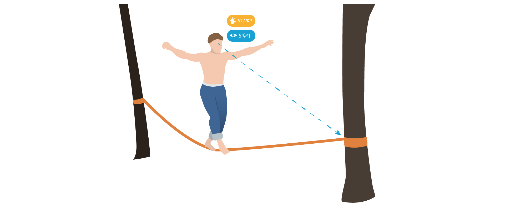
Experiencing focus and filtering distractions
We have learned that distractions do not support flow, but they may actually be necessary in some cases. For example, if our tightrope walker falls off the strap enough times, he will have ample practice to learn how to maintain his balance and fall properly, as well as how to adjust his equipment to prevent frustration and maintain focus. However, another way to design for maintaining focus is to incorporate features that require a dominant sense that can direct a user’s attention and skills onto a specific task and allow other senses to be on standby as necessary. Park and Alderman (2018) maintain that a designer can reduce the effects of interfering distractions with features that provide flexible options for secondary senses, which a user could bypass as necessary. For example, when monitoring a baby’s sleep, not every parent wants to or can be awakened by loud sounds, some may prefer to have haptic or visual feedback through vibrations or lights, depending on their individual preferences.
Maintaining focus and filtering distractions by offering customizable feedback features
It is sometimes difficult to sustain concentration on a specific task, which presents a wonderful design opportunity to develop product features that may help refocus a person’s attention quickly. Have you ever noticed that you hunch over when using your computer? Have you ever considered using a posture support device to help you maintain good posture? It could help you refocus by giving you tactile or auditory feedback when you begin to slump. Something like a sound erupting during your silent activity is one way to provide enough contrast to your immediate sensory experiences and expectations and help refocus your attention on the new sensory stimulus. This is called neural adaptation. Neural adaptation is also key to resolving the alarm fatigue (auditory) issues mentioned in Chapter 5 because a sensory change can alert you to the initial alarm message.
Product features can help with refocusing attention
3. Managing Demands on Attention
As discussed earlier, some user scenarios are multimodal (multisensory) – such as driving a car, where we need to have awareness of what’s going on inside and outside of the vehicle. In this case, there are overlapping multisensory and cognitive demands on our driving performance. From the point of view of our sensory engagement, driving is demanding. Our cognitive and sensory attention is simultaneously focused on steering, switching between the gas and brake pedals, engaging in conversation, and absorbing media updates and directional data. Our external attention also requires awareness of the car’s position in relation to other vehicles and traffic control signage and lights, road markings, and pedestrians. These simultaneous and multimodal activities demand a lot of attention, even though some operate on an automatic level. In addressing this user experience, the designer’s job is to design sensory cues for quickly and safely switching attention as circumstances change – if a bike is about to cross the path of a car, the traffic light changes, or a tire goes flat.
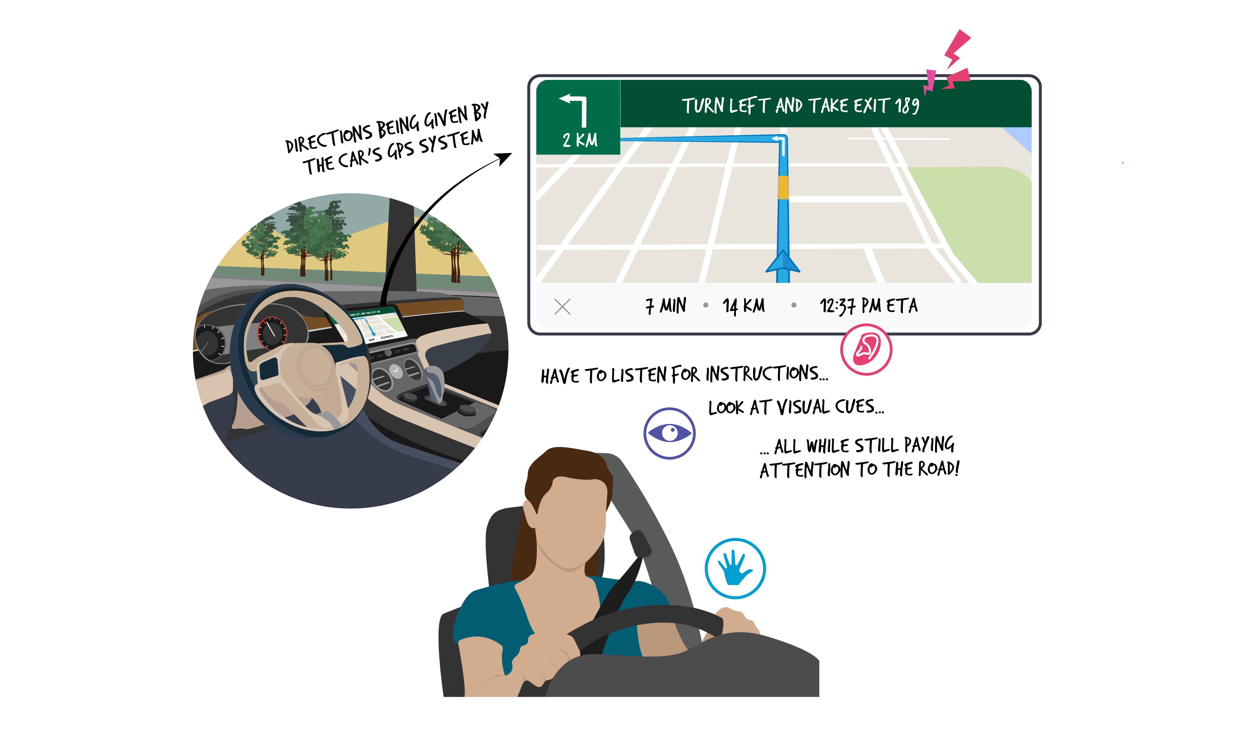
Simultaneous and multimodal activities demand a lot of attention when driving
Good design provides mechanisms for selective attention – which enable us to shift mentally or physically into and out of a sequence – to reduce sensory overload, which can lead to fatigue (Park & Alderman, 2018, Schifferstein & Spence, 2009). The design team can determine the qualities of the shifts that occur – is the transition smooth or is it unsettling? Many drivers can tell tales of troubling transitions when applying the brakes at high speeds and sliding across the road! The ability to put our phones on speaker mode while driving is a great example of design for selective attention that frees up our attention to visual and tactile interactions so that we can pay more attention to looking at the road (visual) and engaging in a remote conversation (auditory). Needless to say – as Park and Alderman (2018) point out – in some cases, the inability to pay attention can be fatal (as when not paying attention to a bicyclist suddenly appearing in your path when driving a car), whereas in others it can merely be an inconvenience (as in making a mistake typing an email)
4. Sequencing
Most of us perform tasks in an orderly progression of small sequential steps.
Orderly sequence of tasks
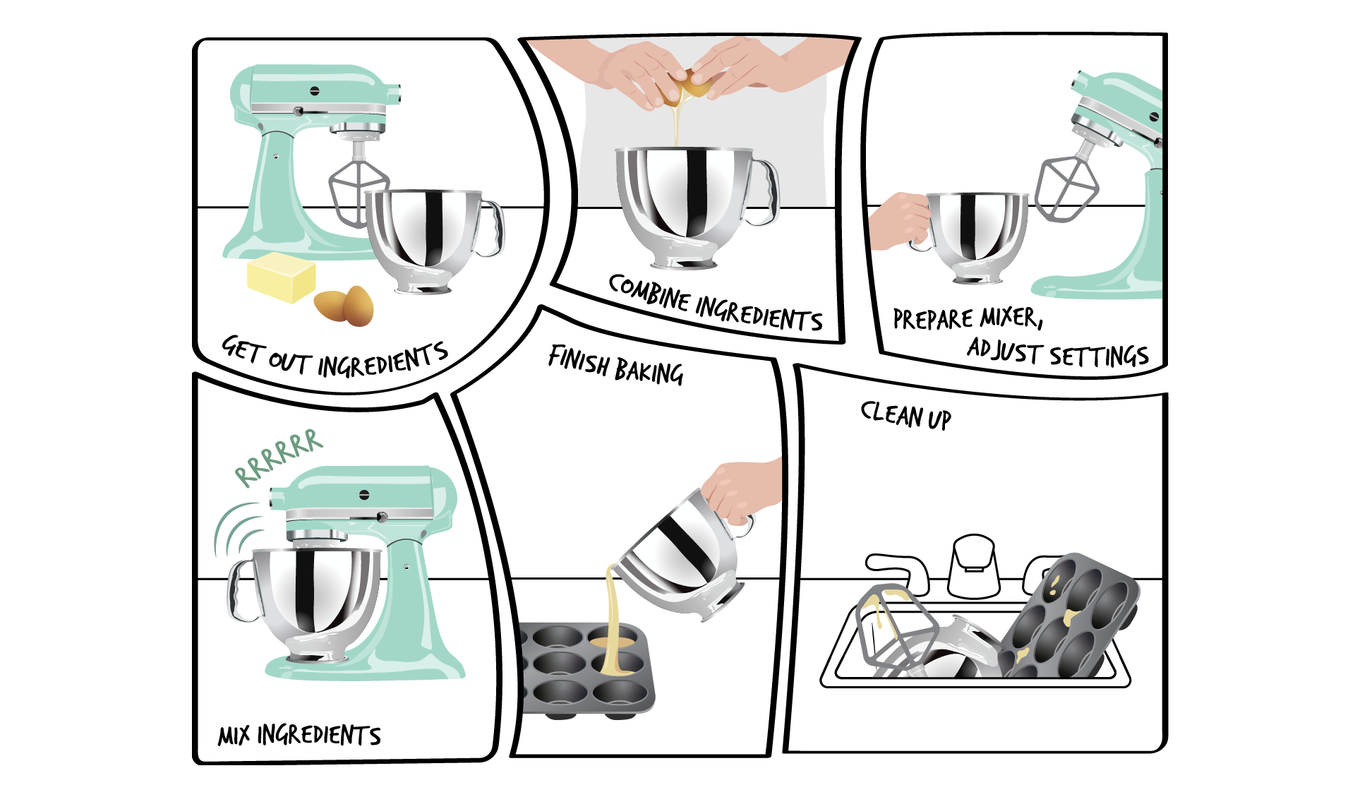
These may even be the same steps that have been designed into the experience to support sensory dominance within a hierarchy of events. Interactions with a kettle provide an example of how sensory modalities can be designed into the stages of use to set up a familiar hierarchy of events. As shown in the image below, 1) after seeing that the water level is low, the user picks up the kettle, 2) and opens it to prepare to fill it up, 3) they see, hear, and feel the weight of the water in the full kettle and place it back, and eventually 4) hear the sounds of the boiled water.
Multisensory sequencing when boiling water in a kettle to make tea
These events occur in the same order every time, calling upon different senses or combinations of senses at distinct points in the sequence. This sequence of events usually fits into our mental framework of how we like to do things. Once designers understand our patterns, they have evidence about which sensory design features correspond to most of our mental models about the hierarchies of sensory dominance throughout the product use-cycle. Routines like these can become more engaging through intentional design considerations for each stage of interaction. As we previously learned, the kettle is only one product in a sequence of routine steps – the source of water and coffee, the cups and spoons, and the milk and sugar form a part of the larger network or system that is designed for this routine. This means that many individual products are part of a larger system or context that influences how each of us goes about our activities.
Despite a designer’s best efforts to support user experiences, some people may alter the designer’s intended sequence. Some activities do not even follow a specific sequence, which could change the way multisensory layers of design features integrate into the artefact. In fact, many innovative products came about by changing the use sequence.
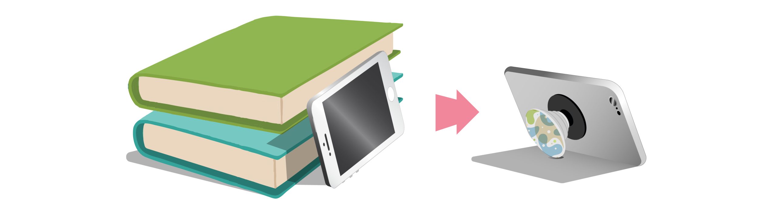
Product extensions to facilitate and enhance product use-cycles
For example, there is no stage in the sequence of cell phone use that includes repositioning the phone for different purposes. Some of us lean our phones against a stack of books. Given that a phone is such a multifunctional product, it is lacking the affordances for supporting it in a diverse range of user scenarios such as: reading recipes while cooking, watching a movie, or having face-to-face conversations. We think that phone holder mounts are a versatile option to those books! They adapt to different places of use – your car, your bed, or your desk.
