
3.6 From Colour Principles to Product Design Applications
In this chapter, it is apparent that the designer’s task is to translate colour theory into colour applications that convey messages or have desired effects for consumers. Jason Morris (2006) explored ten categories of colour applications that designers can consider for applying colour principles to enhance users’ perceptions. Let’s look at them below:
Colour as association: In this category, we can apply colours with symbolic meanings that reflect cultural, locational, or generational influences. As we have seen, colour can communicate symbolic meanings through colour metaphors or combinations. Colours also add semantic meanings to products when we have prior knowledge that enables us to interpret the message encoded into the product. For example, we associate each of the bottles below with a specific condiment – mustard or ketchup – because of our prior use experiences. Reflect on some coloured products you associate with your family rituals.
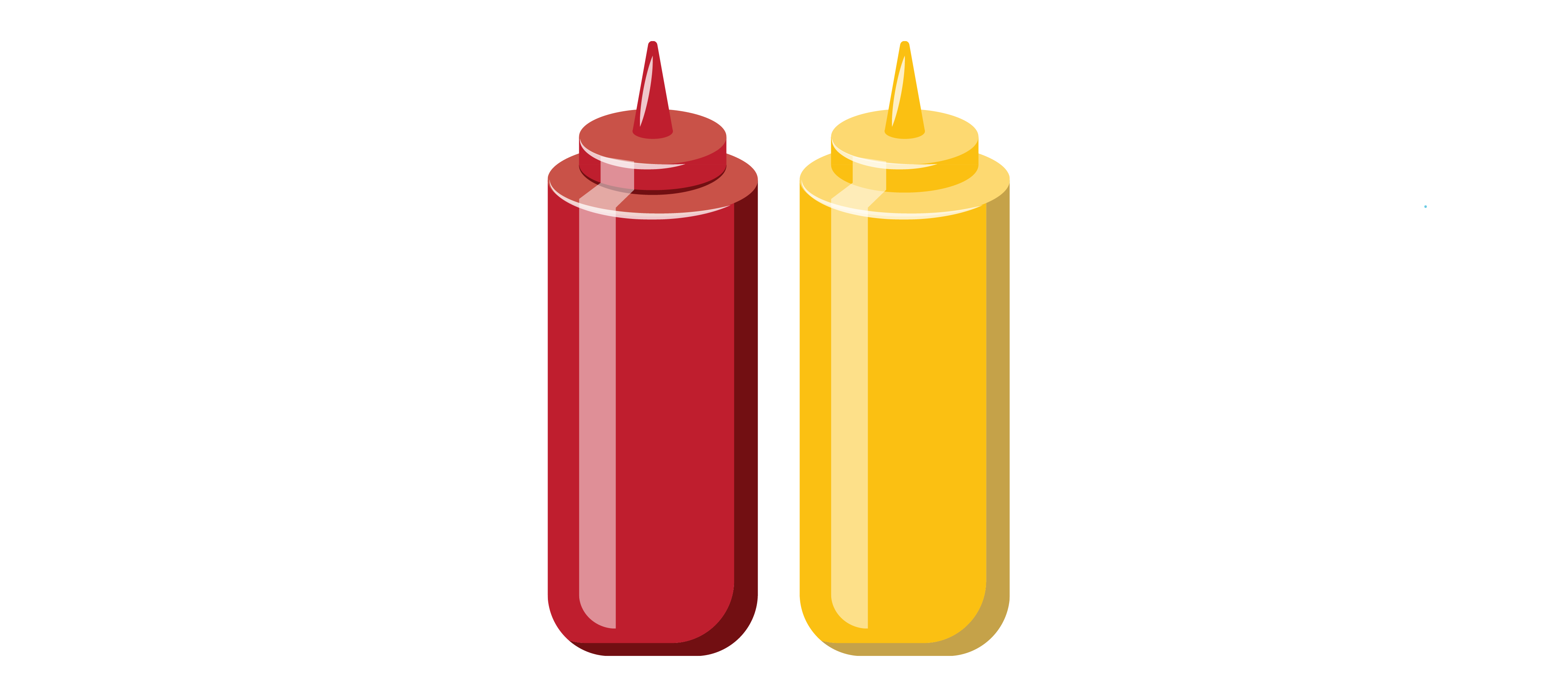
Cultural memories from past experiences can influence colour choices
Colour as user interface: In this category, we can apply colours to a user interface that acts like an affordance. Colours can be strategically placed to provide clues about the function of the product, the order of tasks, or general high-touch spots. We revisit the game controller below on which the green button is associated with “go” or “confirm”, while the red button might mean “back” or “cancel”. The coloured buttons add bright accents on the neutral white background through contrast by extension to draw attention to their functions. They act as strong highlights that capture our attention against the less saturated background. Buttons that perform special actions can be coloured, while neutral-coloured buttons perform ordinary or common actions. What other coloured user interfaces provide information for you in your daily tasks?
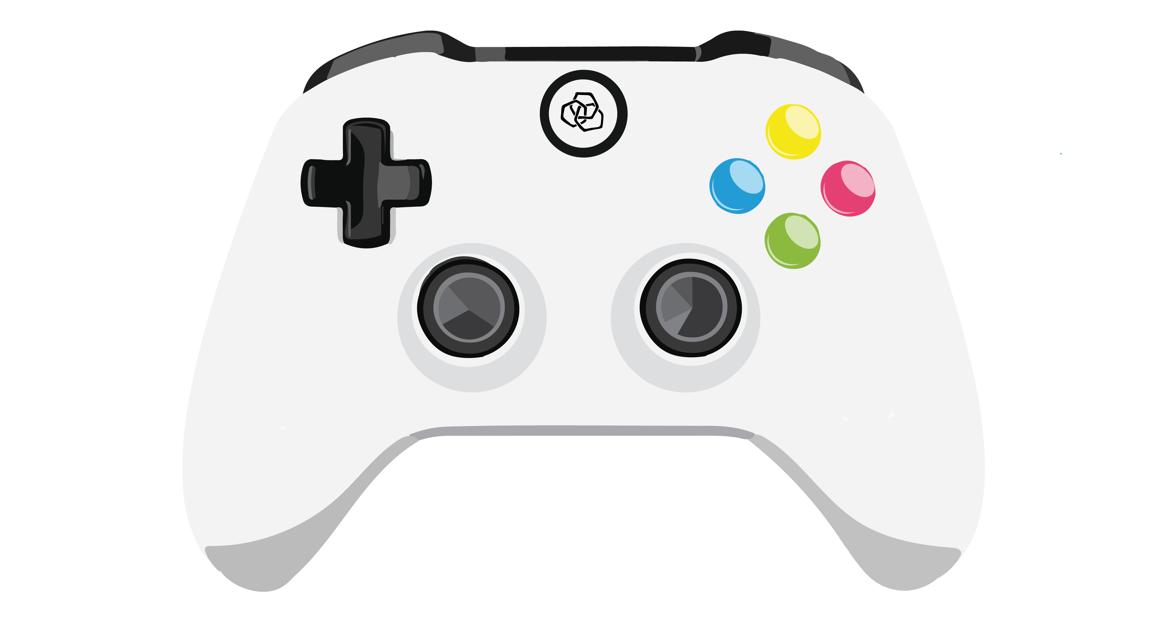
Game controller buttons leverage contrast by extension
Colour as fashion: In this category, we can apply colours that are influenced by fashion colour palettes and colour trendsetters’ forecasts. Colour trends are not random, they are the result of lengthy research and observation into global art practices, fashion and environmental design patterns, and cultural influences. This information is distilled into colour forecasts and colour trend palettes that influence designers to adopt similar colour palettes for the upcoming year, or within a given timeframe (Color Marketing Group, 2022).
Is there a colour that you no longer wear that you really liked several years ago? For many fashionable products, it may be important to follow the predominant colour trends, and there are cases where avoiding trendy palettes offers a unique alternative. For example, most of us have fridges that are likely to be white, stainless steel, or black. Very few of us have pink, yellow, or green fridges these days, so these product colours may stand out as cool or innovative.
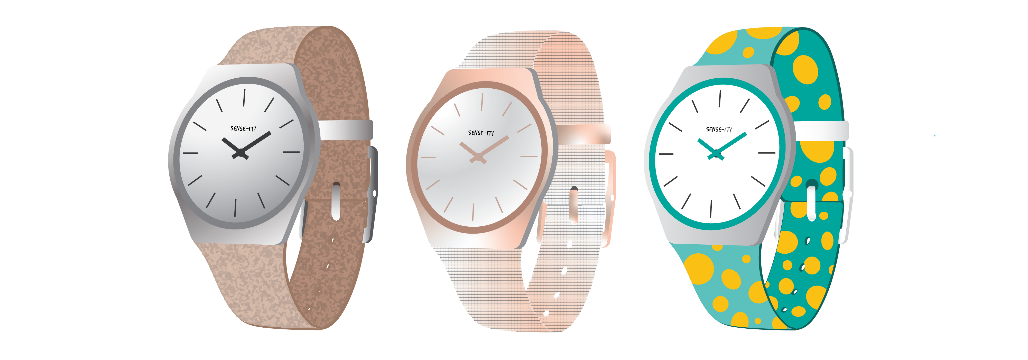
Fashionable colour variations appeal to different trends
Colour as form alteration and to modify shape and proportion In this category, we can apply a colour or colour combination to alter how a three-dimensional form is perceived by concealing or disguising it. We can use this application to masquerade or de-emphasize a form. For example, the camouflage pattern applied to a military vehicle or helmet (see below) can minimize its visibility outdoors. This approach de-emphasizes the overall form, minimizing the ability to perceive the visual boundary of the product when seen among natural features in the surrounding environment. Dazzle painting was also a form of alteration technique introduced in the First World War as a way to mislead the enemy about a ship’s range, speed, or direction.
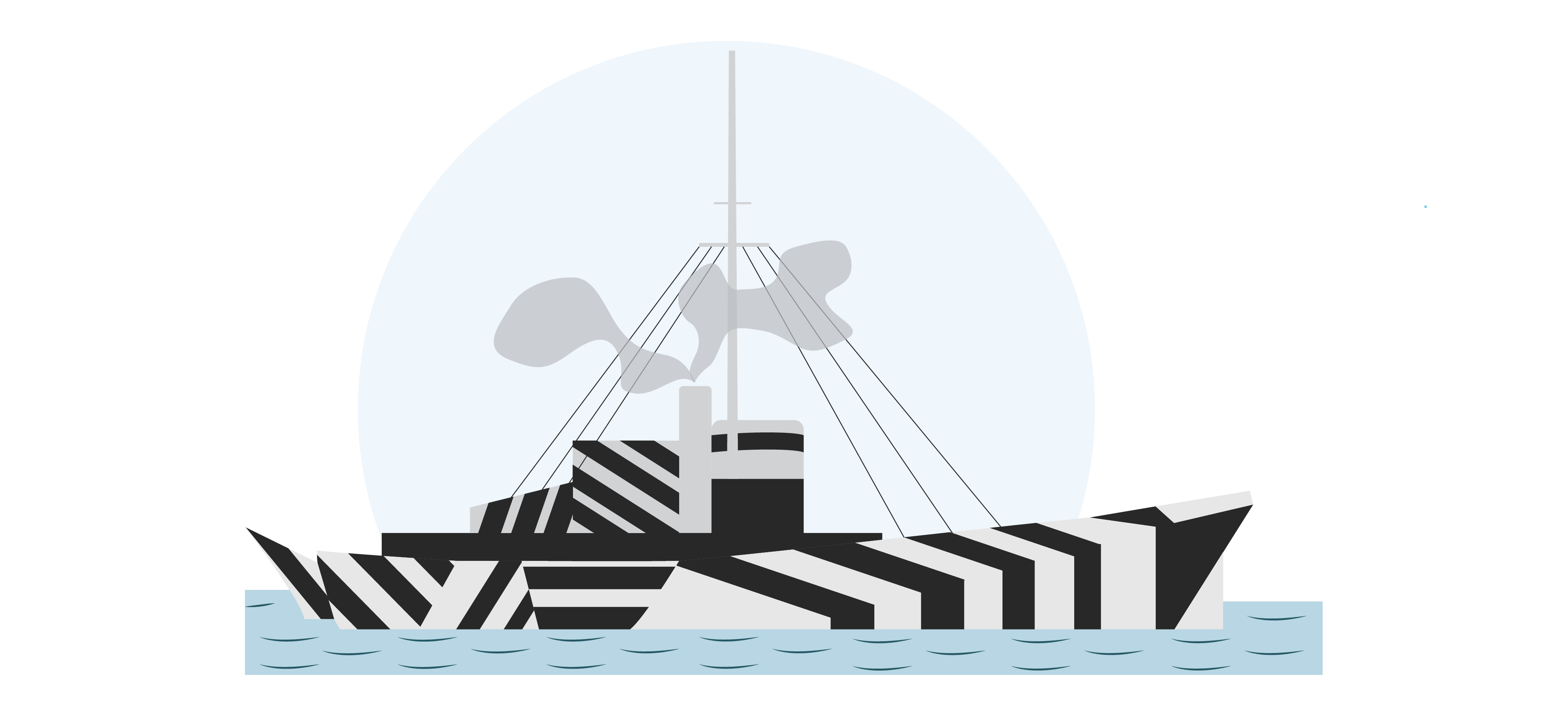
Camouflage colouration & form Alteration
Form alteration is also useful to enable products to blend into our home or office environments, where they may not appear as different or as taking up too much space. Colour can also be used to de-emphasize certain elements in a composition, particularly black or dark greys, which make elements of products appear to recede into the background, as in the stroller design below. The seat is colourful, while the structural mechanism is dark enough to avoid attracting attention.
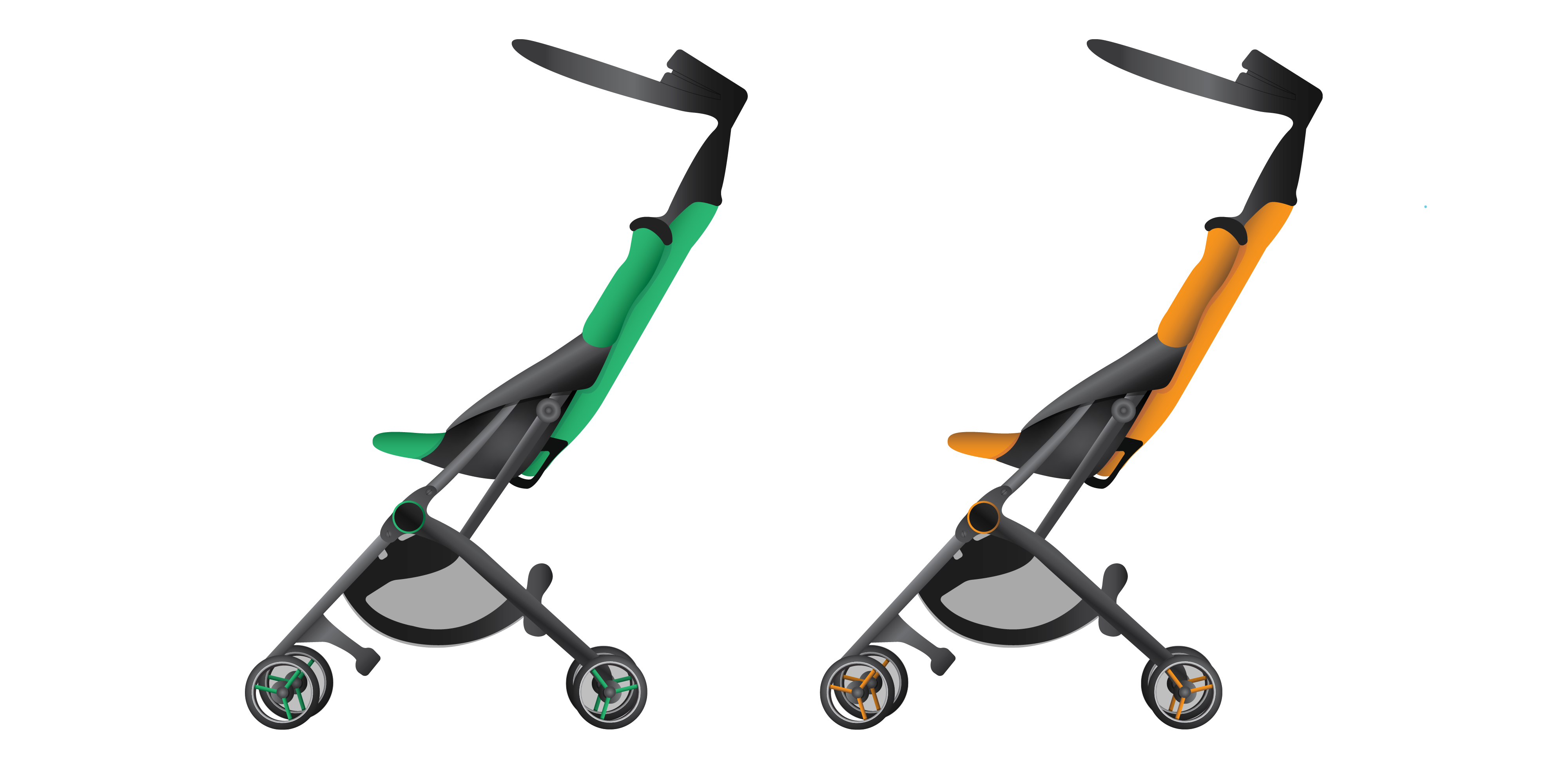
The colourful seats of these strollers attract more attention than their dark structural elements
Of course, the old tenet that black makes a person look thinner can also apply to a product! On the other hand, brighter, contrasting colours, or white could draw attention to certain form factors. Have you ever noticed people around you applying this trend?
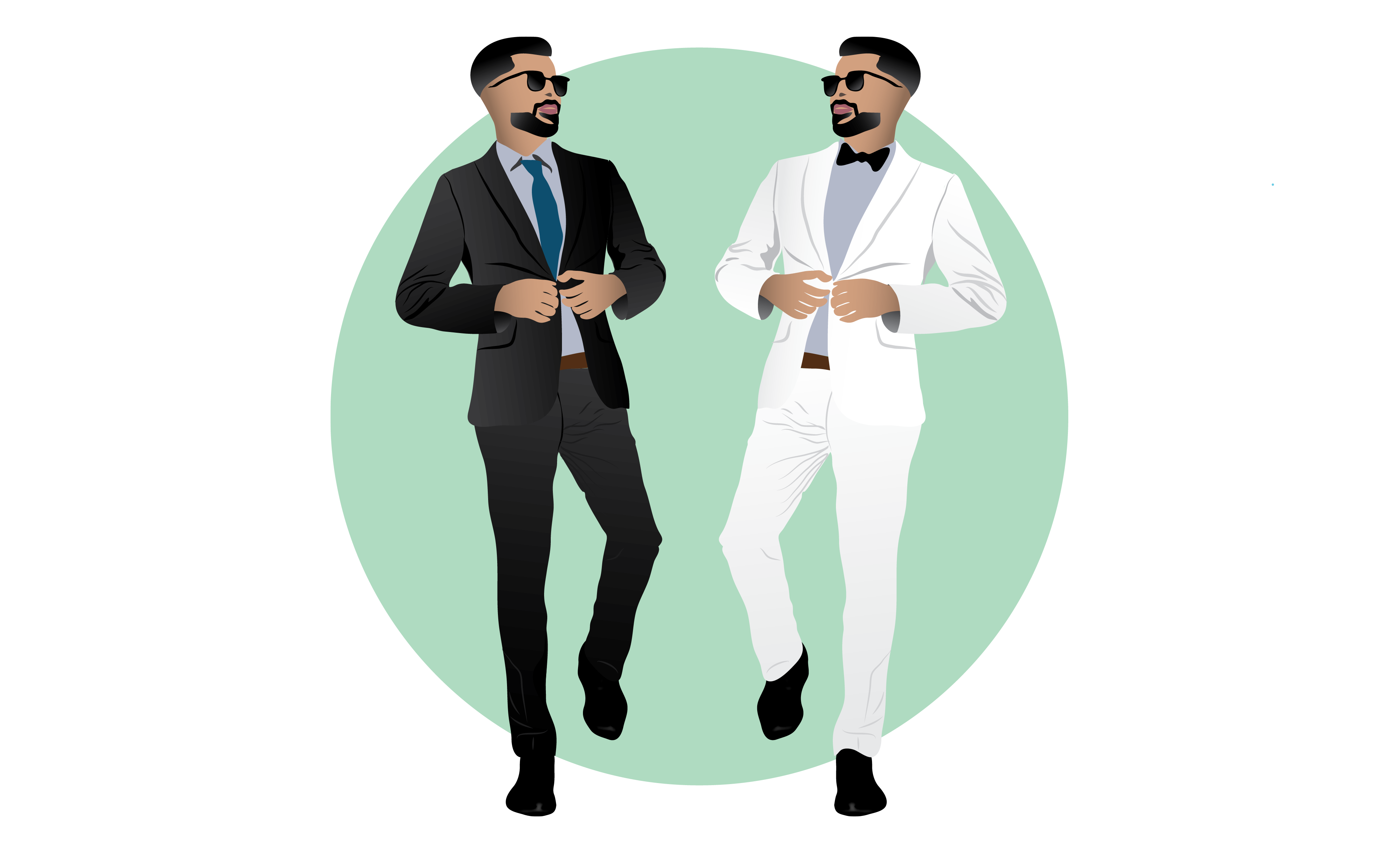
Black and white are not only fashionable – they can also modify perceptions of shape and proportion
Colour as form emphasis: In this category, we apply colour to emphasize form. Colours can accentuate various surfaces and offer a variation in perceiving three-dimensional visual details. The three factors that influence form emphasis in colour application are: the value, pigments, and the graphical application of colour. For example, applying light colours (high in value) juxtaposed with darker colours (lower in value) can create heightened contrast. Through the contrast of colour applied to different areas, some elements of a composition or overall form can be enhanced or diminished (see helmet below). To emphasize the form further, metallic pigments can be used to reflect light or precise colour blocks or stripes can be applied to emphasize contours (as in the bicycle helmet below).
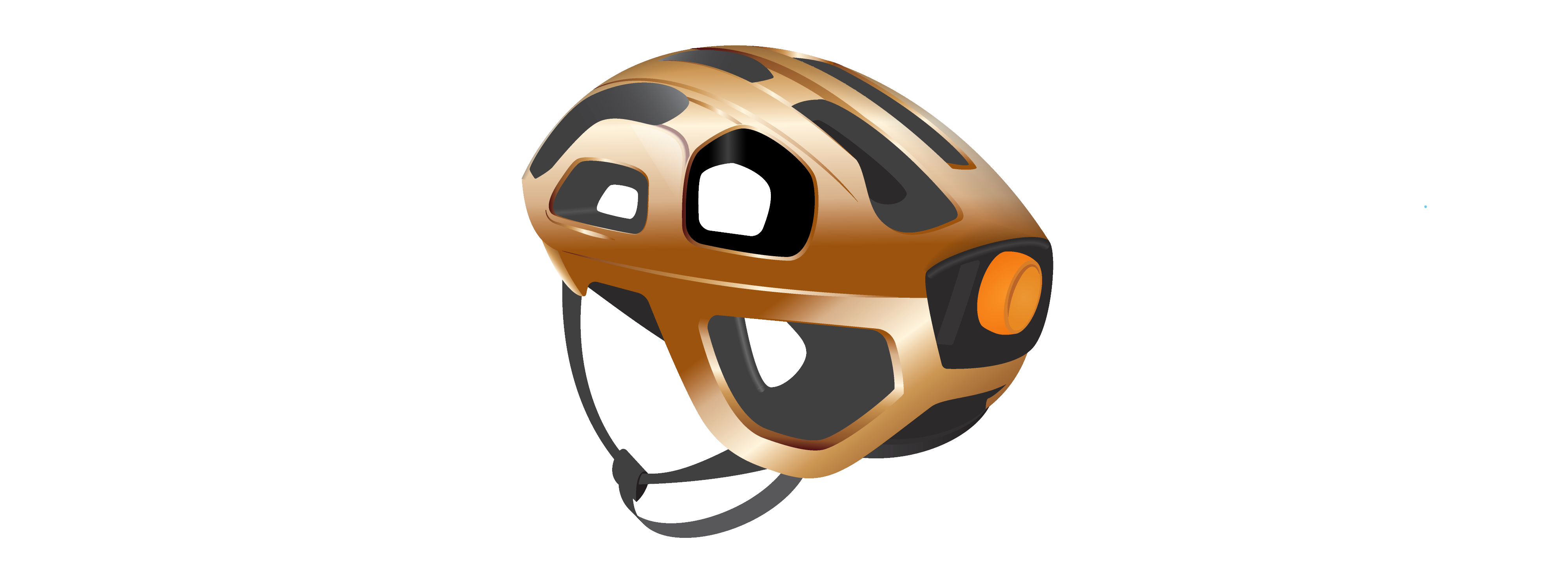
Juxtaposing light and dark colours emphasizes contours
Lastly, the perceived surface treatment of the colour application can influence how we perceive the details of the form. In the examples below, the glossier the pigments are on the product’s surface, the more light is reflected, emphasizing the blend lines that communicate the product’s contours.
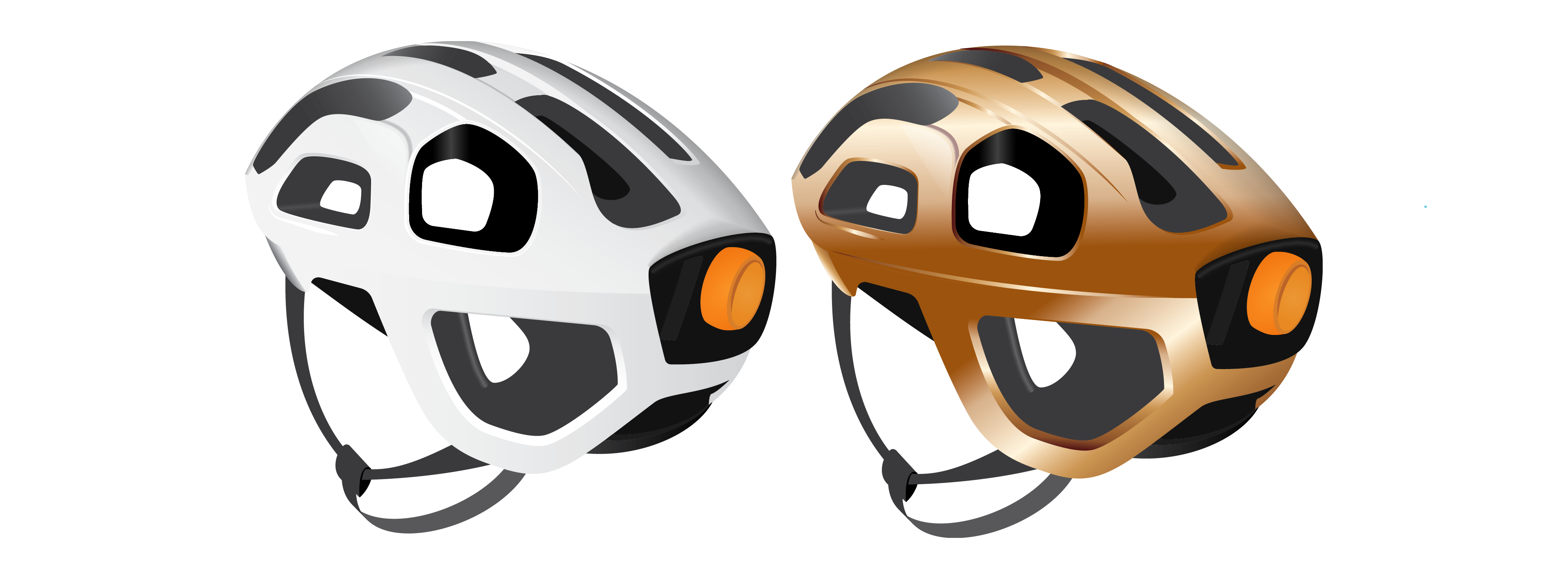
Form emphasis through colour can also be enhanced or diminished by different surface treatments ranging from flat mattE to reflective glossy
Colour as material emphasis: In this category, we apply colour to highlight material properties by emphasizing certain visual and tactile properties and surface textures. We often use this when products have a combination of materials, which may even be associated with different ways of interacting with a product. For example, a can opener may have a colourful rubber handle in contrast with sharp silver metallic blades.
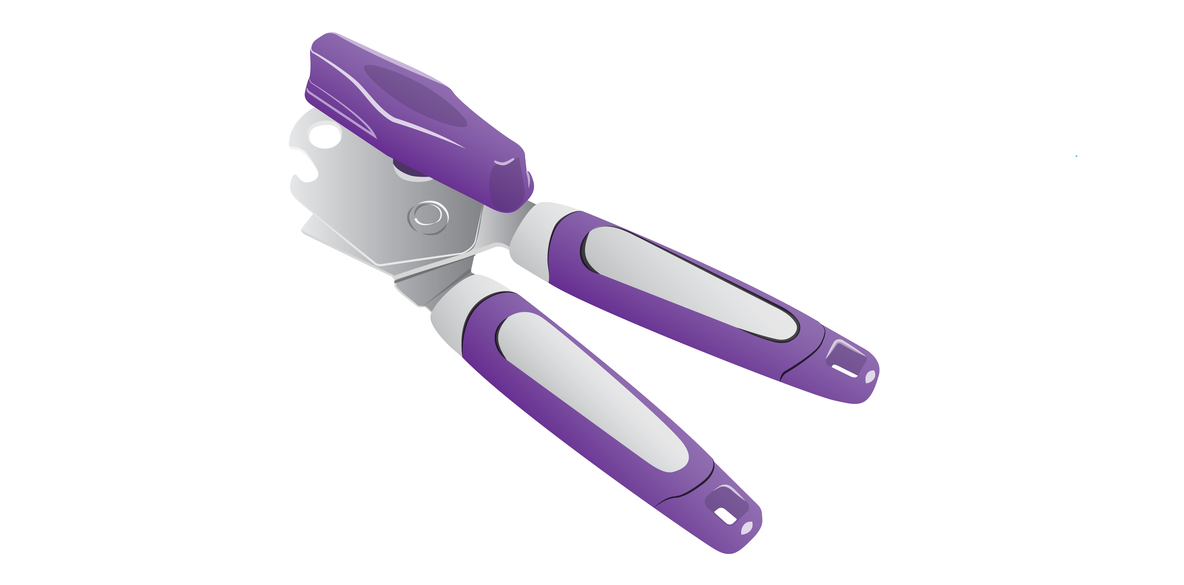
A Contrasting colour palette for different materials emphasizes affordances
Colour as material deception: In this category, we apply colour to deceive the user by making the material look like something other than it is. This is often applied when less expensive materials are used to simulate more costly ones, such as plastic standing in for marble, glass, or wood. Have you ever been surprised that a product you thought was made of a certain material was designed to hide the nature of the actual material it was made of?
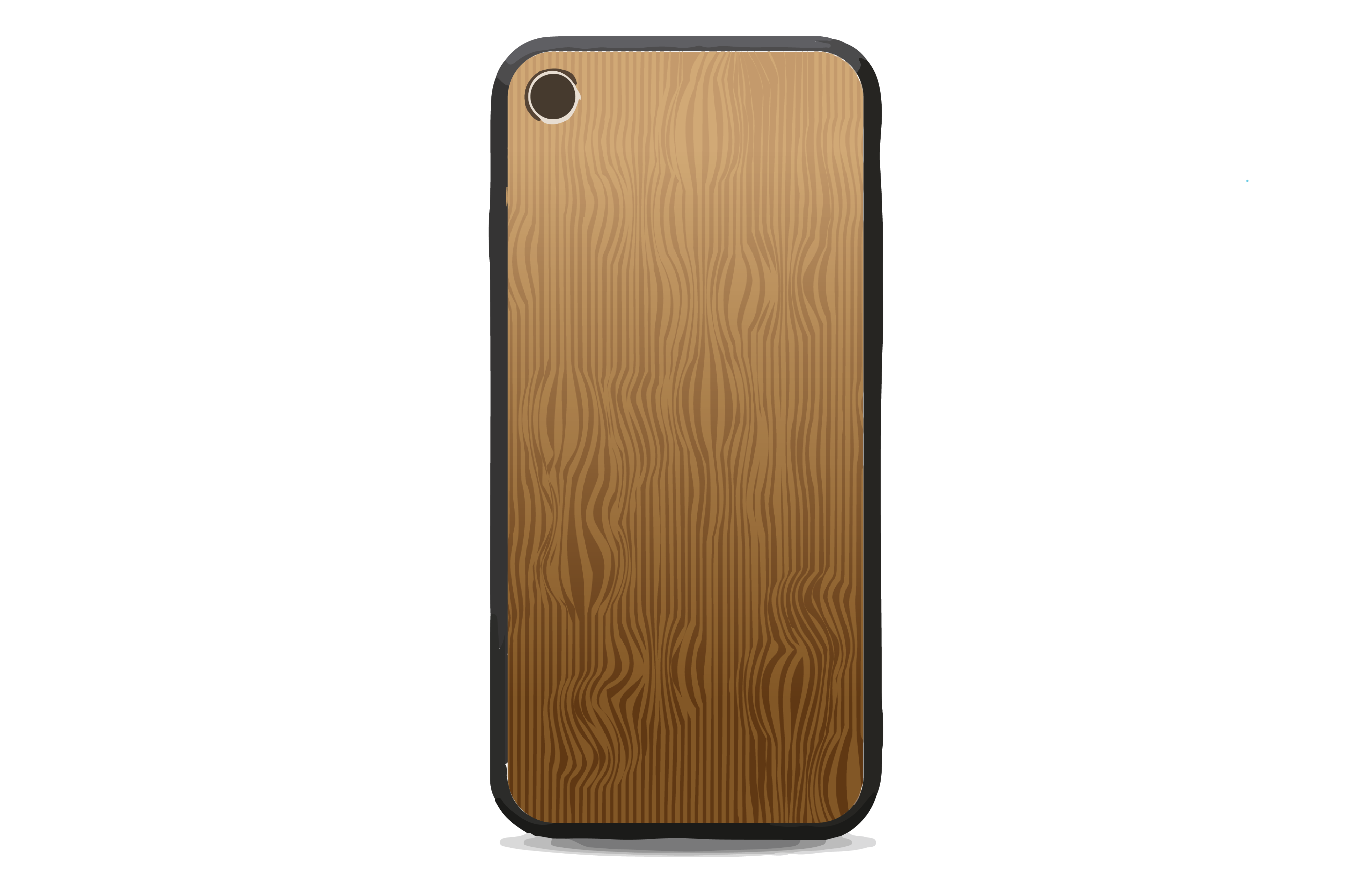
This phone looks like it has a wood grain cover, but it is plastic
Colour as contrast: In this category, we apply colour to make a product stand out in an environment. Distinctions can be created by hue, saturation, or value. This approach is often used in the design of safety products (orange cones), to draw attention (yellow strip on stair edges), or to differentiate a product from its competitors. In the example below, we see orange and white traffic cones that stand out in contrast with the grey road environment to deter vehicles away from hazards.

Traffic cones use colour contrast to attract our attention and deter us from traffic hazards
Colour as harmony: In this category, we apply colour to make a design visually compatible with its environment. For example, it can be used to achieve a quiet, harmonious environment to reduce visual chaos. The blender in the image below has contemporary kitchen appliance colours of silver, black, and white so it can harmonize with the similarly coloured kitchen setting. How does the colour of the appliances in your kitchen harmonize with the overall environment, if at all?
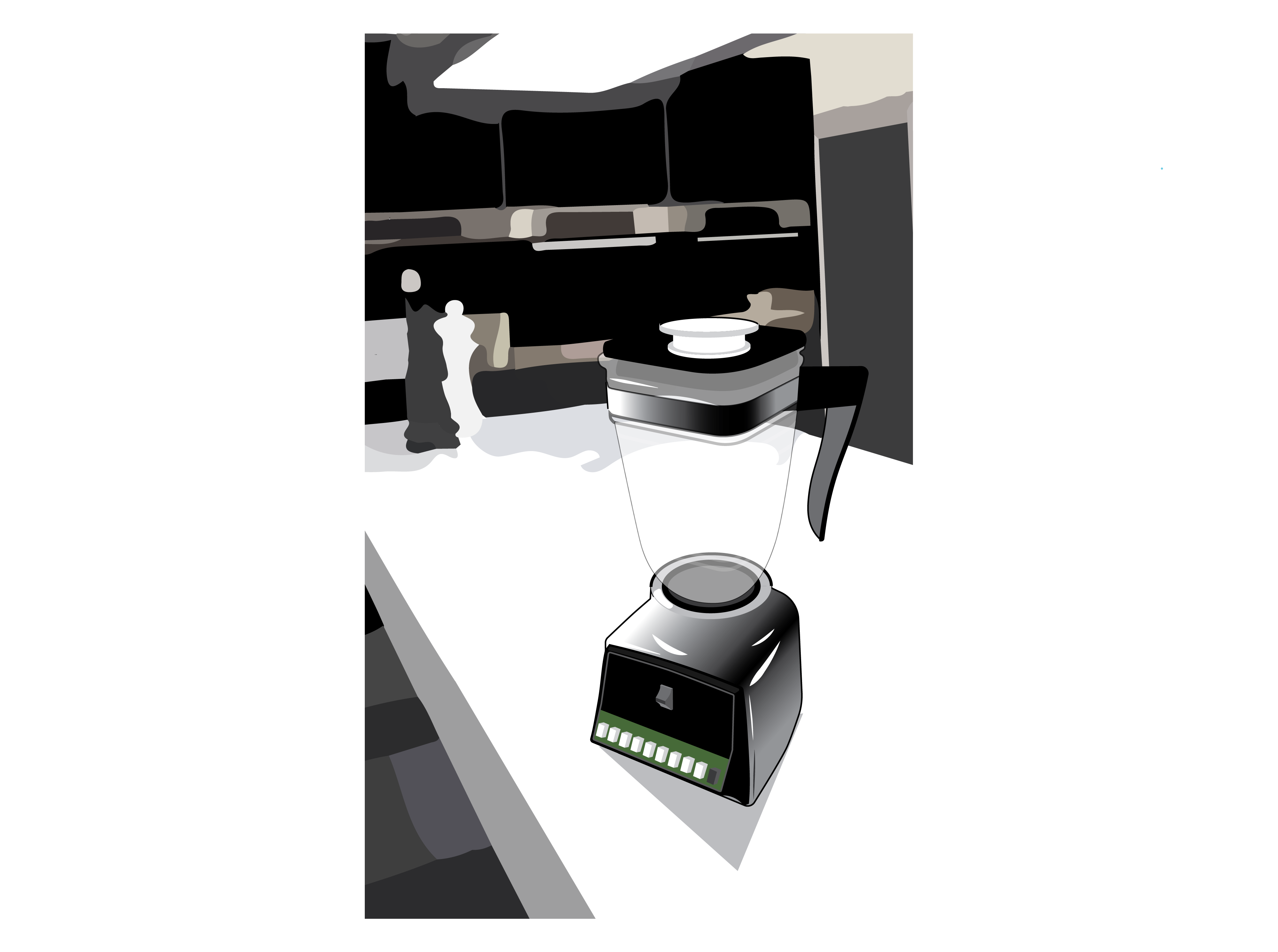
A black blender blends nicely into a black-and-white kitchen
Colour as identity: In this category, we apply colour as a branding tool. Since many purchasing decisions are made in-store or online, it is important to use colour to effectively convey information that can boost sales. Did you know that a person may pay attention to a black-and-white image for less than two-thirds of a second, whereas they may pay attention to a coloured image for two seconds or more (White, 1997)? That points to the potential for success using colour branding, especially when strong, saturated, and primary or secondary colours are used.
The branding colours for each of these products are associated with different well-known companies
The video below summarizes these applications for colour in design.
Colour As: A video about applying colour in industrial design (adapted from Morris, 2006)
Activity Time!
Take a moment to think about how colour principles can be applied to product design as explained in the video. Click on the cards to flip them. Match each “Colour as…” phrase with its associated image.
Next section: 3.7 Psychology of Colour
