
Interactives Answer Key
Section 3.3: Colour Wheel and Perceived Colour Relationships
Colour Relationships
Monochromatic: Orange shoe
Complementary: Red and green shoe
Split complementary: Green, purple, and pink shoe
Analogous: Blue, dark purple, and light purple shoe
Triad: Green, purple, and red shoe
Discordant: Red, dark purple, and light purple shoe
Section 3.6: From Colour Principles to Product Design Applications
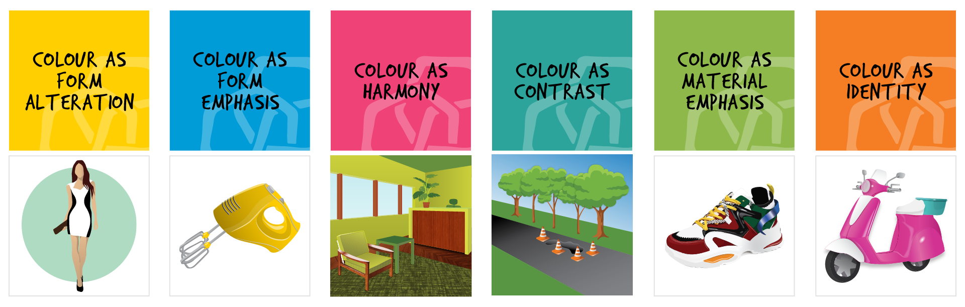
Colour As… Memory Game
Colour As Form Alteration: Woman in white and black dress
Colour As Form Emphasis: Yellow electric hand mixer
Colour As Harmony: Chair waiting room
Colour As Contrast: Road with orange traffic cones
Colour As Material Emphasis: Running shoe
Colour As Identity: Toy scooter
Section 3.8: Summary Review Activity
Multiple Choice Questions
- The symbolic meaning of colour is universal and is interpreted the same way by all users. True or false?
False. Symbolic meanings of colour can be influenced by culture, location, and generations. - The principle of using colour to confuse the ability to perceive the visual boundary of a three-dimensional product is known as:
Colour as form alteration - What are the perceived effects of a matte finish on the surface of an object?
Formal details are diminished or under-emphasized because there is little play of light on the surface transitions and the whole area is easily perceived as flat. - Gold-toned jewellery is an example of:
Colour as fashion & Colour as material deception
Gold-toned jewellery is often considered fashionable, however, it can also be a gold patina applied as material deception when the underlying metal is not gold. - Most brands use colours that are soft, muted, and subtle to help identify them. True or false?
False. Colours used for brand identities are most successful when they are strong, saturated, and primary or secondary colours. - What are the properties of a colour that can contribute to how an object contrasts with its environment?
All of the above:
– Adding a strong difference between the colour values of an object and its background &
– Adding a strong difference between the hue of an object and its background &
– Adding a strong difference in the colour saturation of an object and its background
In order to stand out and contrast with its environment, colour can be critical. Whether it’s an orange traffic cone or a yellow taxicab, colour is a powerful differentiator. Distinction from the environment can be enhanced through contrasting hue, saturation, or value. This application is important when safety is a concern.
