
3.5 Colour Specification and Colour Systems
In design, most colour choices are specified numerically (according to specific colour systems) and standardized across product elements. A part of the designer’s job is to clearly identify colours for specific product parts, specific interior areas, and/or specific interface features. This is important, especially since different parts may be manufactured or produced in different plants or even different countries. Colour systems provide a systematic way to standardize colour schemes across multiple versions of the same products or product lines.
Colour specification is based on standard systems of colour like the Pantone Professional Color System (Pantone, n.d.), the Munsell Book of Color (Munsell, n.d.), or the Colorcurve System (Stanziola, 1992). When we work with manufacturers or work on different computer applications, we need to know which standardized colour system they use to be able to provide the specifications for each colour we identify for every product component. We can refer to that colour system’s standard set of templates in books, binders, or material samples to make our colour choices. By specifying the colour codes that align with those your service provider uses, we can be assured that the end result will be the colours we have selected.

A generic example of templates for a colour specification system
Product specifications
Since it is your job as a designer to specify the colour codes for each of the elements or components of your products, you can organize your colour palette while you make your choices. This would minimally include the main body colour, a secondary colour, and the accent colour. The background colour is usually the main or overall colour of the body of the product, like the main grey colour of the sneaker in the example below. The secondary colour may be used for trim details (such as the lime green soles in the sneaker example) or for functional affordances (like the lime green laces). The accent colour may be used to highlight important elements (like the charcoal grey separation between the sole and the body of the shoe). The proposed colour palette would include at least a dominant, subdominant, and accent colour, where dominant refers to the colour of the body or overall colour, subdominant refers to the secondary colour, and the accent colour refers to those used the least and that could be the brightest or strongest.
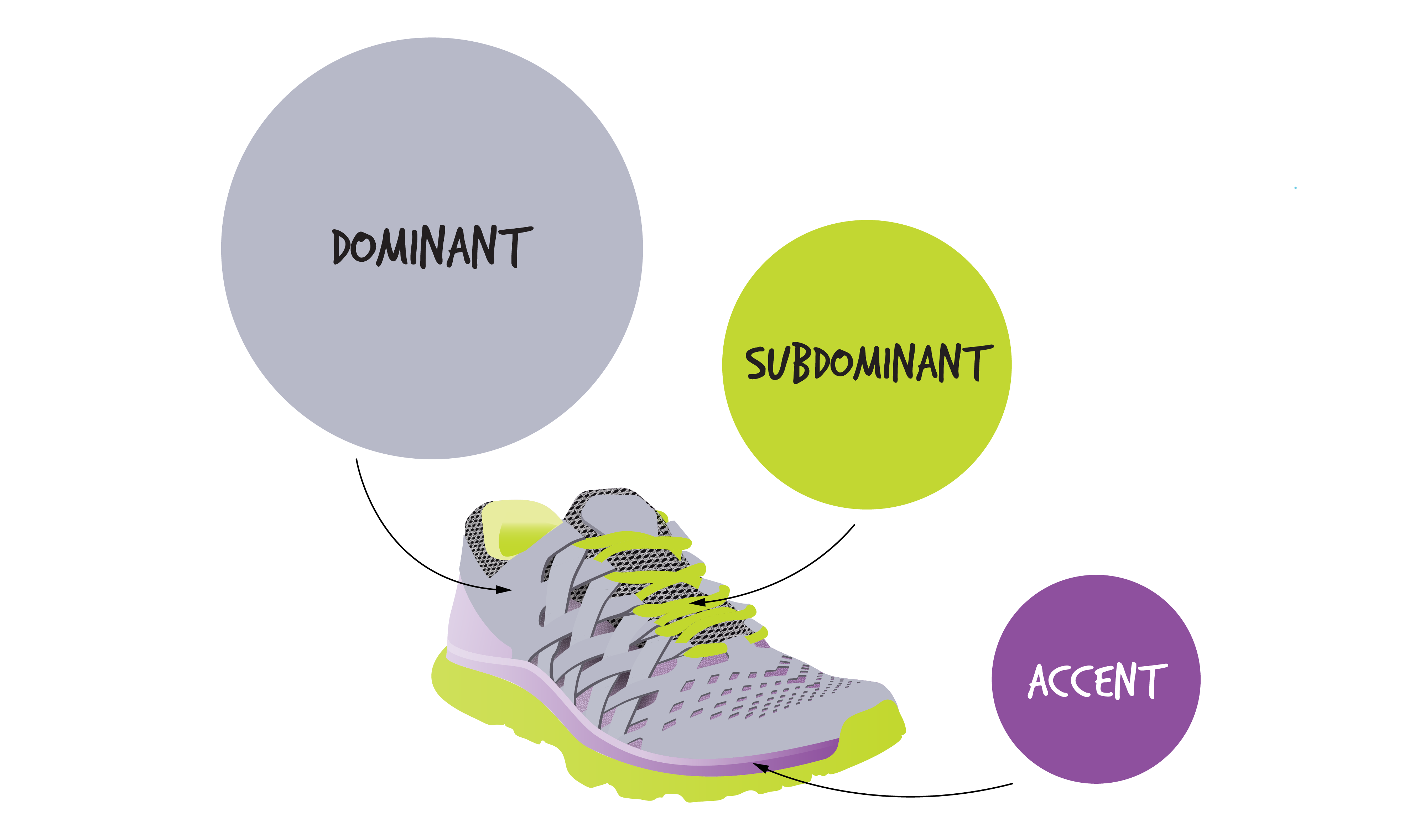
Product Colour Specifications: grey is dominant, lime green is subdominant, and charcoal grey adds a strong colour accent
Today there are numerous applications and websites that you can use to select suitable colour palettes for products, logos, and web design. Try searching for colour selection tools or colour pickers, or online colour palette generators. You can easily experiment with their online colour combinations of different values, tints, shades and tones. You can also try to develop your colour palettes using the paper paint colour samples supplied in paint stores (however the colour codes may not match those of the colour system your manufacturer is working with). You can arrange the printed colours in a composition that represents the relative dominant, subdominant, and subordinate proportions you want based on the colour principles already discussed. Are the colour relationships complementary, split complementary, or even discordant? Are they warm or cool? Do the accent colours leverage the perceptions that principles like zing, simultaneous contrast, or contrast of extension support?
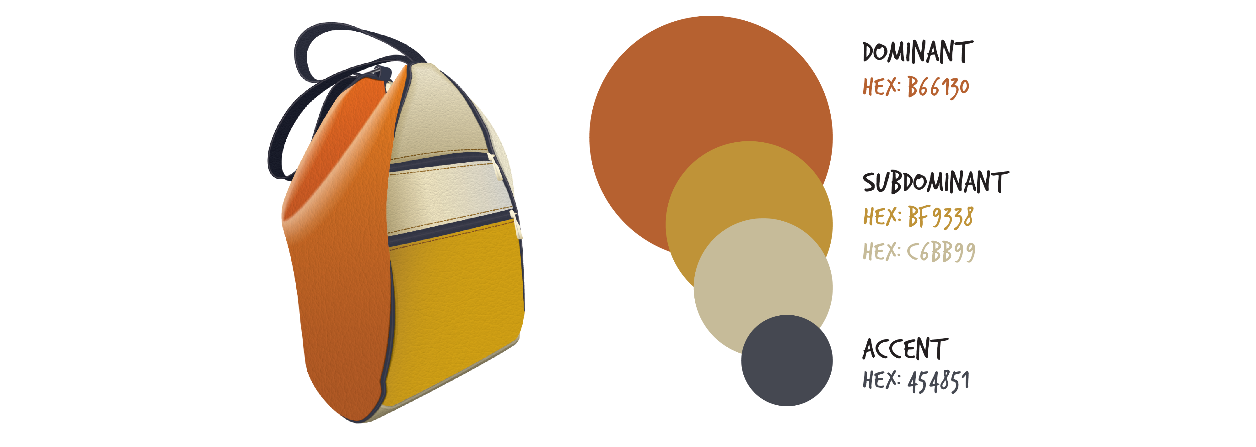
An example of a colour palette applied to product design
Next section: 3.6 From Colour Principles to Product Design Applications
