
3.4 Light as a Compositional Element
Not only do designers need to consider appropriate colour choices, but also the degree to which light is an element in either the composition or the perception of the product or both. Will the product elements be transparent, translucent, or opaque – and to what degree for each of the elements of the composition? How will the degree of transparency of product elements affect the colours? How will the different materials affect the perception of colours? Furthermore, how will the setting or environment that the product will be in influence the perceived colour, size, and composition of the product?
Transparent surfaces allow visible light to pass through them, as in the left toothbrush holder below. As the light meets transparent materials – such as plastics, glass, and resins – almost all the light travels directly through them. In this case, we clearly see whatever is on the other side of the transparent material.
Translucent surfaces such as frosted glass and some plastics allow some light to travel through them, as in the middle toothbrush holder below. In this case, some of that light becomes scattered so we may see a hazy version of whatever is on the other side, and sometimes we cannot even make out what is there.
Opaque surfaces of materials such as wood, stone, metal, and some plastics block light from travelling through them, as in the right toothbrush holder below. In this case, the light is either reflected or absorbed by the opaque material, and we only see the material surface’s colour, pattern, and texture.
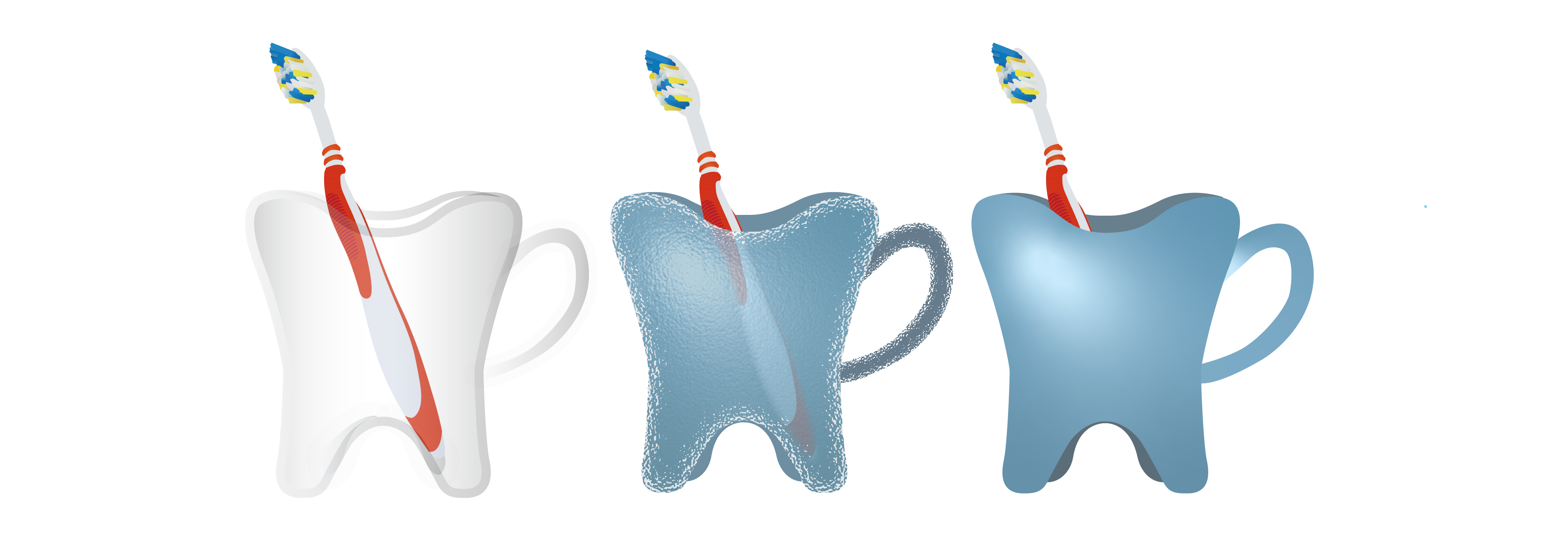
Transparent, translucent, and opaque materials support different degrees of transparency
Since objects and different materials vary in how they transmit and reflect light, we need to understand that material selection and treatment also contribute to how the overall product is visually perceived.
Activity Time!
Reflect on the value of different degrees of transparency for functional and semantic applications in design. Click on the purple icons to see some functional and semantic reasons for selecting different materials and levels of transparency for each of the jars below.
The same product can serve different purposes and be perceived differently depending on its level of transparency
We have seen that transparency, translucency, and opacity influence colour perception, but how do designers control the specific colours and colour schemes that guide our perceptions? They specify colour palettes for every product. Knowing how to choose suitable colour combinations and specify colours is key to designing a product where colours enhance the composition and communicate the product’s functional uses. Designers also want to ensure that the colours they specify are available for manufacturing.
Next section: 3.5 Colour Specification and Colour Systems
