
3.2 Basic Colour Theory

We begin with a review of basic colour theory. Colour is a property of light and can be broken into a spectrum of six distinct colours: red, orange, yellow, green, blue, and violet. Red has the longest wavelength and violet has the shortest, which is why the visual spectrum of a rainbow is arranged from red to violet. Also, did you know that white reflects all the wavelengths of the colour spectrum, whereas black absorbs all the wavelengths of the colour spectrum?

The Colour Spectrum is made visible when passing light through a prism
Did you know that the surfaces of objects have no colour of their own? They reflect specific wavelengths from the colour spectrum that result in the colours we perceive. Some wavelengths of light are absorbed and others are reflected by these surfaces. For example, the surface of a green stapler absorbs all the wavelengths of light but reflects green, so we recognize the stapler as green. These perceived colours are further modified by surface textures, surrounding colours, and lighting conditions.
Let’s try a simple experiment. Pick up a nearby marker or highlighter with a similarly coloured barrel (e.g. the yellow body of the marker and yellow ink) and draw a wide stripe on a piece of white paper. Then, place the pen barrel (the body of the pen) on the paper beside the line. Are the paper ink line and the plastic barrel the exact same colour? You are comparing the reflected light of a similar colour pigment on two different materials – are the colours exactly the same? Try it outdoors under the sun too; colours can look different under different types of lighting.
Colour Mixing
How we perceive colour depends on whether the colour is generated from pigments or lights and their respective systems for mixing colours. There are two main systems of colour mixing: subtractive and additive. Subtractive refers to mixing the pigments of inks or dyes on physical surfaces like paintings or products and additive refers to mixing light sources in atmospheric lighting (like on stage theatrical lighting) or on displays with lighted screens. In general, the colours of physical products result from subtractive colour processes, whereas screen-based products that depend on light for activating their visual qualities use additive colour processes. We begin with subtractive processes.

Subtractive Colour Palette: Red, Yellow, Blue (RYB)
Subtractive Colour Mixing refers to the process of creating colours from pigments or dyes that we perceive as reflected to us from the printed page or coloured surface. The colour we see is the only colour wavelength reflected from the surface; the other colour wavelengths are subtracted or absorbed by the medium the pigment is on, as noted earlier. In other words, we identify the colour of something by perceiving the colour of the light reflected from its surface. For example, we perceive a fire truck as red because the only wavelengths we cognitively recognize are those reflected in our eyes; the others have been absorbed or subtracted from our visual experience. In subtractive colour mixing, the primary colours are red, blue, and yellow and through overlapping, create the secondary colours of violet, green, and orange as seen in the above diagram of a Subtractive Colour Palette.

Additive Colour Palette: Red, Green, BLUE (RGB)
Additive Colour Mixing refers to the process of creating colours from projected light that we perceive when viewing screen-based surfaces such as computers, cell phones, and televisions. We also experience additive-coloured lighting in computer art, photography, interior, and stage design. In additive colour mixing coloured lights are combined to generate new or different colours. Our eyes blend and perceive the mixed hues of the red, blue, and green light sources as specific colours, depending on the strength of each of the coloured light beams. The lights are mixed when red, blue, or green filters are positioned in front of a projected ray of light. If the light is projected through all three of these coloured filters the result would be white light. In the additive system, the primary colours are red, blue, and green. The secondary colours of yellow, cyan, and magenta are created where the primary-coloured lights overlap as seen in the above diagram of an Additive Colour Palette. When you watch anything on a screen, this is the colour-mixing process that enables you to perceive the colours.
Lastly, if you have ever stared at a coloured object intensely and then shifted your gaze onto a white surface you may have noticed a coloured shape on the surface, similar to the object you were staring at, but different in colour. That afterimage is an optical reaction – if you look at a blue object you will likely see an orange afterimage. This is a physiological response to colour called Partitive Colour Mixing, where adjacent colours seem to mix and influence our understanding of colour relationships, as discussed later.
See for yourself! stare at the blue logo for 30 seconds, then look to the right for the afterimage
Hue, Value, and Saturation
A designer’s job is to specify the exact colour palettes for specific elements in any product composition. To do so, it is important to understand the terminology and effects of the properties or dimensions of colour, which are: hue, value, and saturation (or chroma). Hue refers to the pure or true colour. Value refers to either tints (adding white), shades (adding black), or tones (adding grey) of the hue. Saturation (or chroma) expresses the strength or intensity of the hue. Altering one of these dimensions affects the others and adds nuances to the colours selected for every design.
Hue refers to a colour in its pure form that has not been mixed with white, black, or another colour pigment. The primary colours red, yellow and blue are pure hues. It does not refer to a colour’s brightness or dullness.
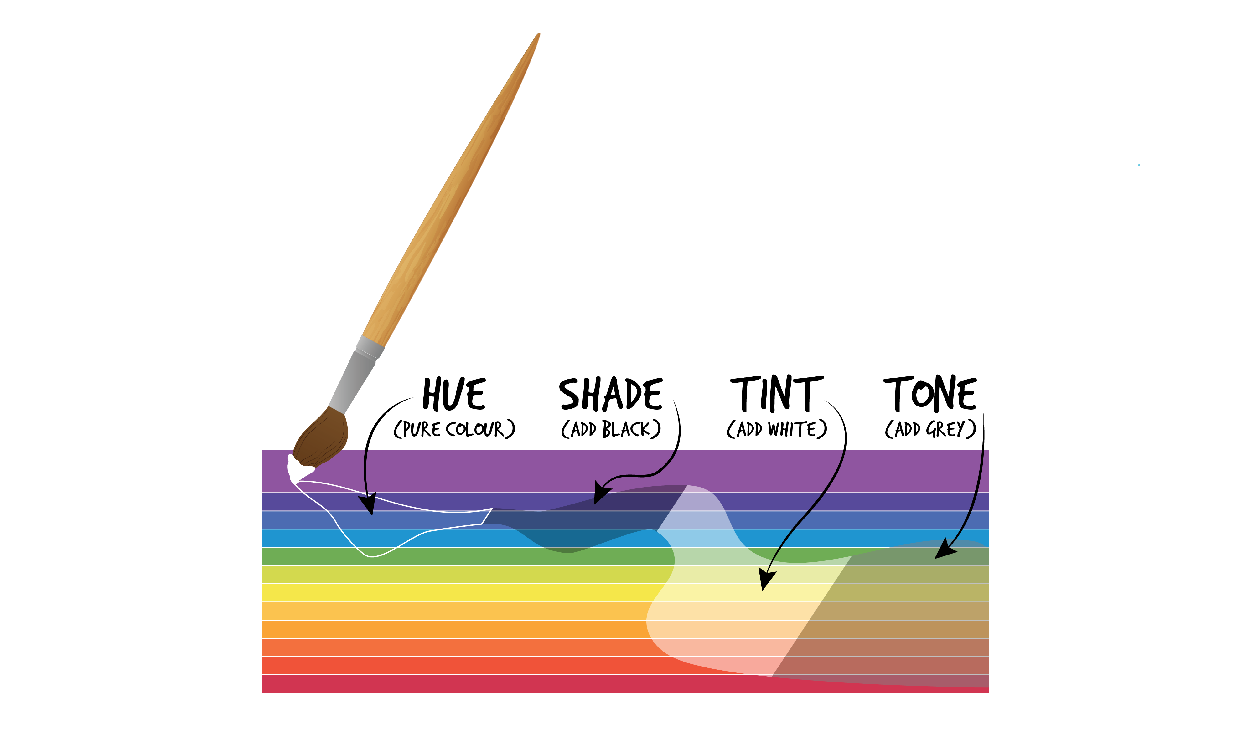
Diagram: How hues can be changed by adding black, white, or grey
Value refers to the lightness or darkness of tint, shade, or tone, not to the quality of the colour. Have a look at the row of oranges in the Contrast of Colour Values table below. The middle cell is a pure orange hue. The cells arranged to its left illustrate different values of tints from the darkest tint (with a small amount of added white) which is immediately beside the pure hue, to the lightest orange (with a larger amount of added white) as your view moves toward the left side of the table. Moving to the right of the pure hue in the centre is the lightest value orange (with a small amount of added black) and the cells become darker (with larger amounts of added black) toward the right side of the table. These variations add contrast when used in colour applications. For example, you may wear an orange jacket with a scarf of a darker orange value (that you perceive as brown) to add a bit of subdued colour flare.

Contrast of Colour Values Table
Saturation refers to the degree of purity of a hue. Rather than mixing a hue with white or black, it can be diluted, such as when you add more water to watercolour pigment to reduce its intensity. Saturation is described as pale or weak and pure or strong, rather than in terms of light and dark. In the table below you can see that the strongest saturation is in the middle cell. As the hue becomes less saturated in each direction – up and down, right and left – the hue appears more pale, weak, or strong depending on the layers of saturation. You can use the term saturation to explain the strength of the hue that you are looking at.

Colour Saturation Table: The pure hue is in the centre and the saturation values change in horizontal and vertical layers (Itten, 1970)
Achromatic Colours
The achromatic colours of white and black have lightness but no hue or saturation. They absorb (black) or reflect (white) all wavelengths of light evenly across the spectrum.

Achromatic colours: Black and White
Black and white provide the fundamentals of visual contrast. Indeed, we recognize the formal details of things by perceiving changes between light and dark (Morris, J. 2006). In a line of cells between black and white, there can be an infinite series of incremental changes in tints and shades, each progressively moving closer in value to one side (white) or to the other side (black). Where the average eye can perceive twenty incremental changes or steps, the trained eye may be able to distinguish between forty incremental changes or steps, where the steps are equal additions between each cell (Itten, 1970). Black and White can be used as achromatic colours or mixed with hues.

Black and White provide visual contrast that defines formal details
White: The human eye is sensitive to the slightest change in the purity of whites, which can be lightly tinted to produce thousands of warm or cool tones. Whites are reflective and have no distinctive hue.
Black: Blacks range from warm to cool and reddened to blued. They may vary in tone from pure pitch black to dark charcoal grey. Blacks are absorptive and have a perceived absence of reflected light.
Grey: The contrast of value scale (shown below) depicts a series of grey value contrasts between the poles of white and black (Itten, 1970). We tend to be better at distinguishing between lighter greys than darker ones.

Contrast of Value Scale: The centre figures have an identical grey value in each square
Next section: 3.3 Colour Wheel and perceived Colour Relationships
