
3.7 Psychology of Colour
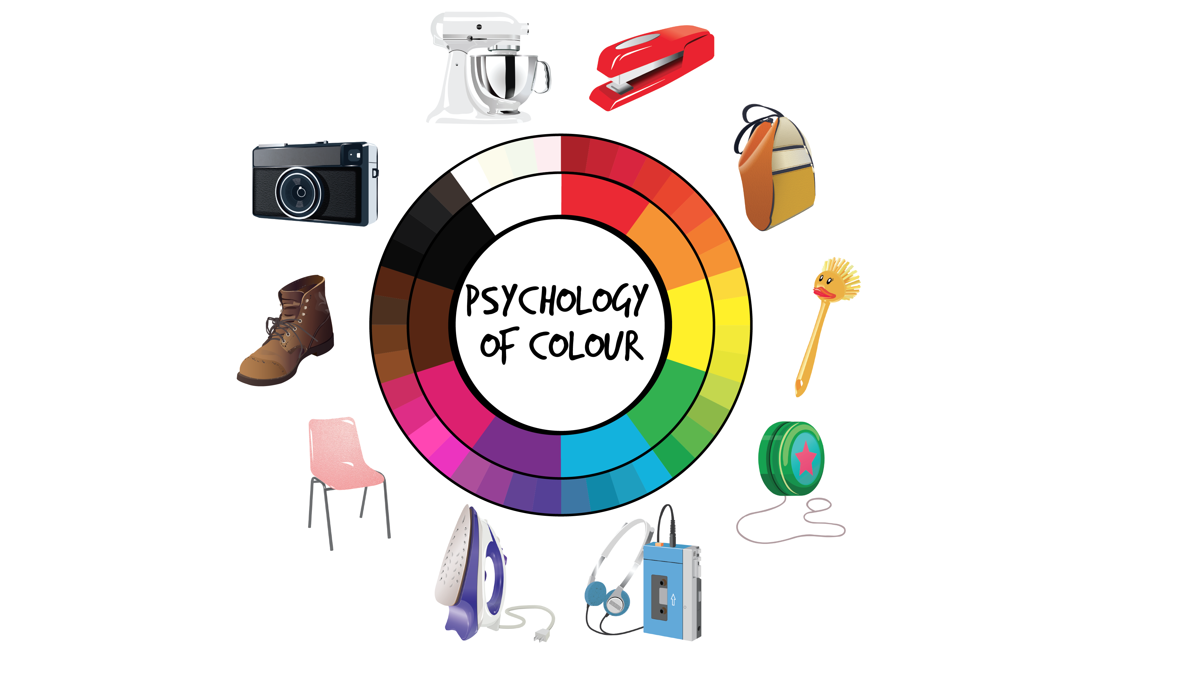
The psychology of colour is important in the design of many products
So far in this chapter, we have been discussing the principles of applying colour. Now, we turn to the psychological, cultural, and emotional importance of colours in the design process. For centuries, colours have been associated with different cultural contexts and a range of associated meanings (Ciotti, 2020). Singh (2006) found that we decide to purchase a product within 90 seconds of our initial interactions with it and that up to 90 per cent of this decision is based only on our response to the colour! As a result, marketers regard colours as persuasive factors in product design. The more we understand cultural colour references the more we can apply colours to positively influence consumers’ responses to products.
Research on the psychology of colour focuses on the cognitive and emotional associations that affect those of us with sight living in western countries. Colours influence our perceptions and behaviours, although there is a great deal of subjectivity in this experience that is not generalizable. This is especially so since responses to colours may depend on past experiences, personal preferences, upbringing, and cultural influences (Kaiser, 1984). The challenge for designers is that there is no clear formula for making colour choices that link certain colours to specific perceptual or emotional responses. Let’s review some of the attributes of colour commonly considered in the western world, keeping in mind that these associations differ among cultures.
The following attributes have been applied to colours in a North American context.
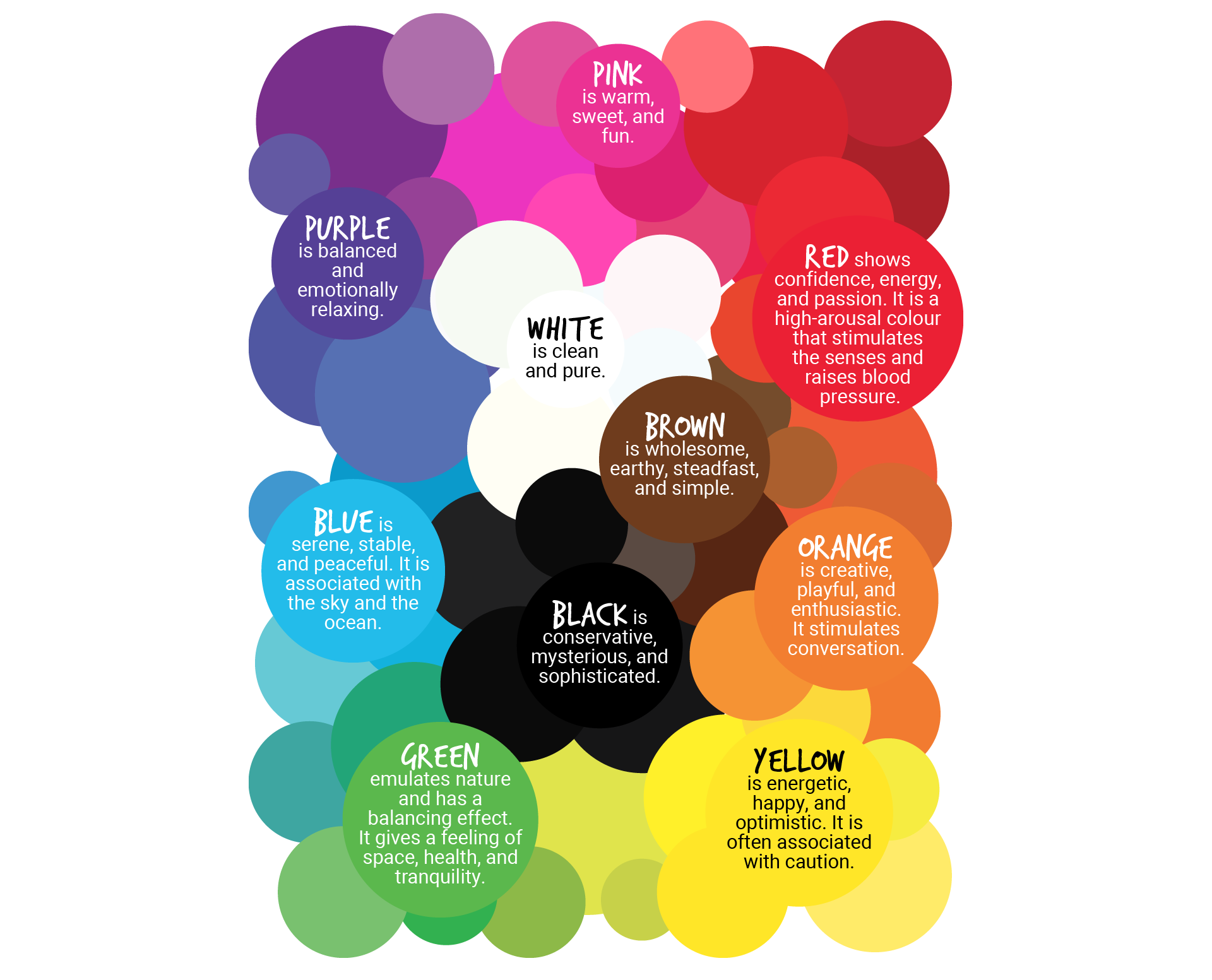
Colours communicate familiar messages
Red is connected to strong emotions, such as passion, anger, and danger. It is also associated with erotic desire in images of red lips and fingernails. Since it is so vibrant it is highly visible in the environment and a small amount of red can attract attention (applying contrast by extension). That could be why stop signs, stop lights, and fire engines are red. Add a bit of white and the high-arousal message of red changes to a gentle pink tint, often connected to romance, love, friendship, and relaxation.
Orange is perceived as less intense than red and has positive associations with creativity, happiness, joyfulness, play, and tropical countries. It is a warm colour and is second to red in terms of visibility. That also makes it useful for attention-getting highlights, as we saw in the traffic cones earlier. Since it is associated with healthy oranges and carrots, it could add semantic meanings to food product packaging and toy design.
Yellow is associated with sunshine, which is related to happiness, warmth, and action. It is pleasant and exciting, even spontaneous. Since it too attracts attention, it can be used for toys and leisure products. When paired with black, it signifies danger and is used in situations where the high contrast alerts people to beware, such as on the edges of stairs.
Green is closely connected with nature, healing, safety, and a sense of being emotionally balanced. It is also culturally linked to money. Due to its healthy and healing association, it is used in food and pharmaceutical packaging.
Blue is also associated with nature, especially the sky and water. It is perceived as calming, serene, and deeply refreshing. It can be associated with clean and cool things like cleaning products, drinks, and health, as noted in the earlier water bottle images above.
Purple has been associated with royalty and communicates power, luxury, and dignity. Tints of purple are perceived as childlike, playful, and relaxing, while shades of purple may seem dark, ominous, or sad.
Brown is another nature-related colour. Like tree trunks, it is associated with stability, timelessness, and usefulness. It sends a message of reliability and endurance, which is why briefcases and wallets are often brown.
Achromatic black is the darkest colour and is associated with darkness, depth, and evil. It is culturally connected to villains, fast cars, and designers (who often dress in black). It is considered dramatic, powerful, and sophisticated.
Achromatic white is associated with purity and goodness and is currently a popular colour for homes and offices. It communicates a message of cleanliness and sterility. It can be related to hospitals, electronic products, and clothing. North Americans consider white to be a hygienic colour. These days, most bathrooms have white appliances such as sinks, bathtubs, and toilets. However, coloured appliances were popular in the past and have changed as cultural ideas evolved.
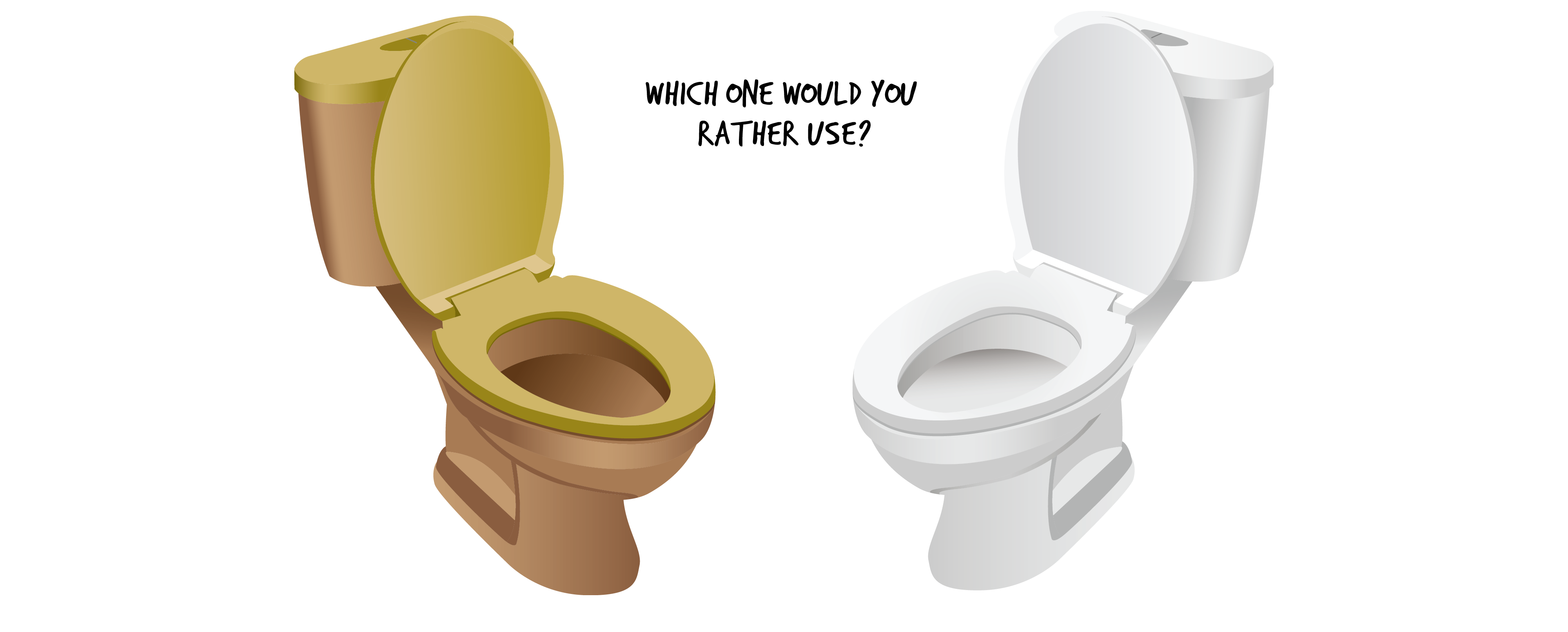
Colour choices for appliances are culturally dependEnt
Colour Association and Culture
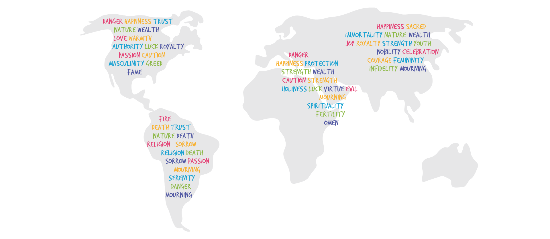
Global Colour Associations
Perceptions of colour differ across cultures with some notable differences as follows:
White is worn at weddings and is a symbol of cleanliness in North America, whereas it is a symbol of mourning in China. However, red is associated with joy and weddings in China and with caution and danger in other countries. Yellow is considered a warm and happy colour in North America, but not in Latin America where it is associated with sorrow and mourning. Green symbolizes eternal life in Japan, health and well-being in North America, and corruption in North Africa.
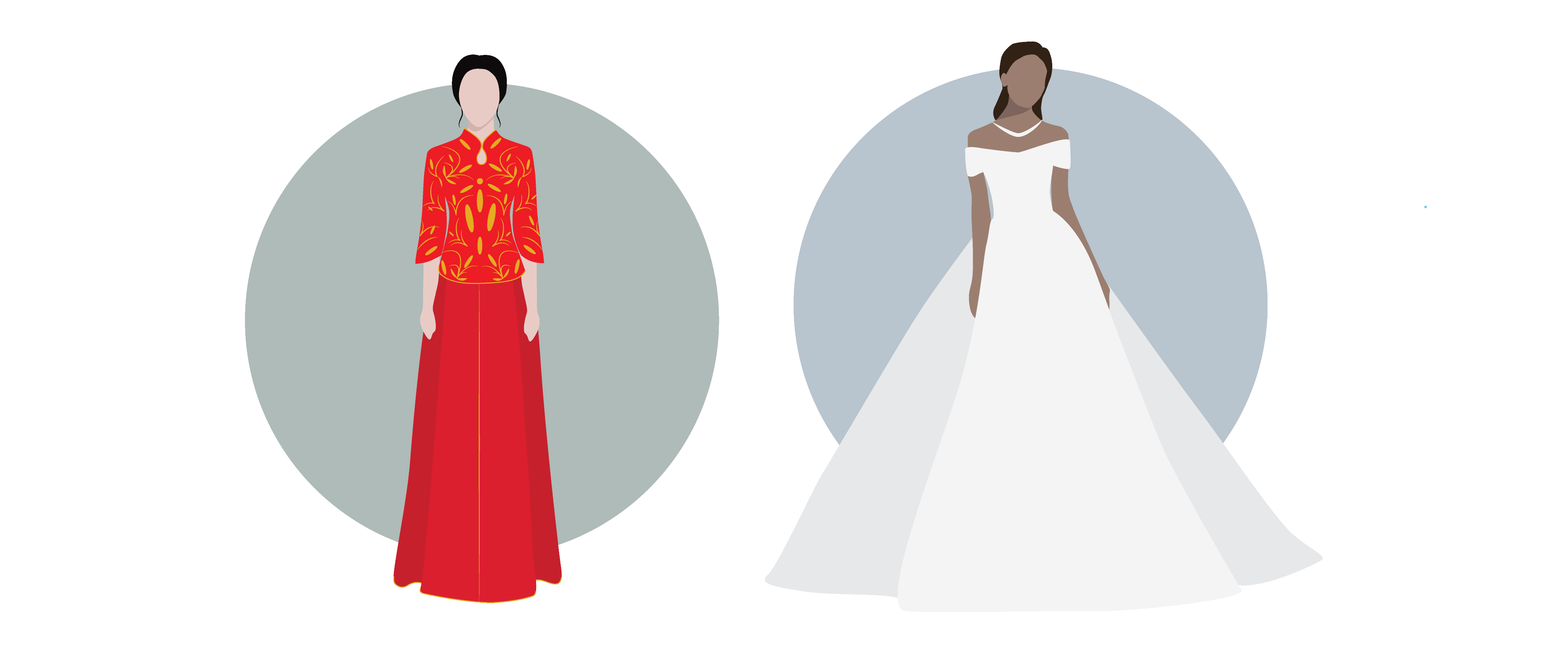
Wedding Dress Colours in different cultures
In North America, pink and blue have been associated with gender since the twentieth century, where pink is perceived as a feminine colour and blue as a masculine colour, as noted in the Design and Emotion chapter.
Given the strong relationship of colour to cultural messages, it is important for designers to become sensitive to the nuanced messages of colour that may be interpreted differently by different target markets. A well-designed and useful product with an inappropriate colour palette may not only fail in some cultural markets but could also be considered offensive and cause harm!
With all the variables in colour psychology, thinking critically about colour is necessary in product development. Reflecting upon all aspects of colours for product design including placement, references, branding, associations, and content is key to creating an informed product that appeals to your targeted audience.
Next section: 3.8 Conclusion & Key Takeaways
