7.10 The Dynamics of Movement
The dynamics of movement are another integral and multisensory part of a product’s aesthetic and emotional expression; they can support interactions between users and products by communicating functional actions. Products with moving parts are inherently multimodal because they include a crossmodal aesthetic that engages vision and kinetic (produced by motion) movement through space, as well as tactile and auditory interactions. Kinetic product movements add multimodal depth to the user experience – whether responding to the graceful overhead opening door of a high-end vehicle, or that of a contemporary kitchen cabinet, as well as deleting unwanted emails with a simple sweeping gesture (Park & Alderman, 2018). Kinetic product actions can be both manual and automated, offering us a range of multisensory experiences. Consider the kinetic movement of a printer paper tray, the pop of an umbrella opening, or the stretch of a wound-up tape measure. Designer Ben Hopson asks us to, “imagine how much richer objects could be if they looked like how they moved” (Hopson, 2009). He goes so far as to say that, “once viewed through the lens of Kinetic Design, the world is revealed to be full of lifeless objects awaiting animation” (Hopson, 2009).

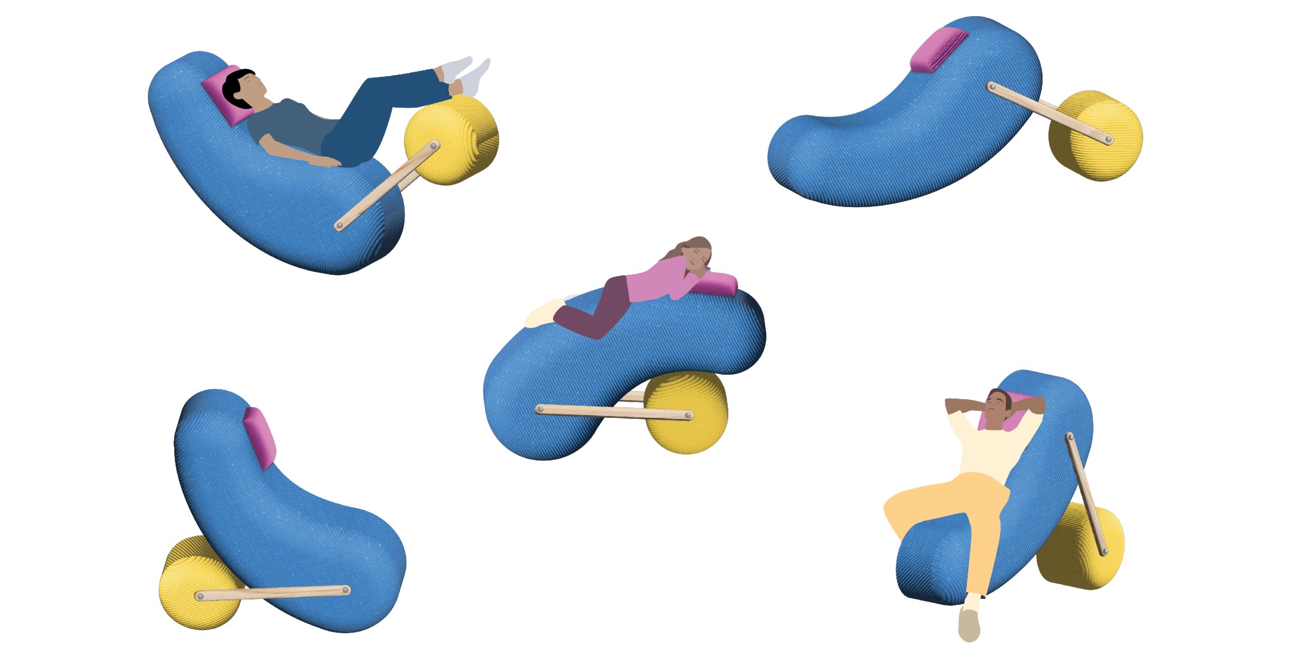
Imagine how this car door will move once the handle is activated
Moving Parts, Moving People
Moving parts are the different components within a product that move in relation to its other non-moving parts. This kinetic action can be choreographed by design to determine the appropriate physical movements and the invisible paths these movements take while dynamically changing position. In many cases, the movement is initiated by a person’s interactions with a product. This tangible interaction often involves tactile engagement with the product’s physical movements.
In fact, the choreography does not stop with the product alone, it often encompasses our “dance” when interacting with the product. This kind of responsive interaction engages us in different multisensory ways. Most of us don’t even consider that shifting in our chair to find a comfortable position or moving our body, laden with parcels, to navigate through a doorway is an interactive sensory response to how the object was designed. Design educator Heidi Overhill (2015) describes how different door knobs elicit a variety of different dances, “Some doors are fast to open; others are slow. Some are heavy, and some are light. If you are carrying two cups of coffee as you approach a door equipped with a crash bar, you can turn on your toes, push the bar with your hip and pirouette through, spinning”. Overhill informs her readers that the design of the door knob dictates the kinaesthetic movements required to open the door in a variety of circumstances.
Our kinaesthetic senses are intertwined with our other senses; watching how to do something enables us to interpret what we saw into muscle movement. This is how we learn to dance, tie shoelaces, handle a chainsaw, or paddle a canoe. Think of some actions you have observed in the past, then tried, practiced, and eventually mastered. If you can’t think of anything offhand, remember that as a baby you learned to walk by watching the people around you.
These interactions take place within the immediate space surrounding our bodies and are defined by their range of movement, which Laban (1980) named the Kinesphere. Laban also coined the term movement literacy to describe the importance of physically sensing differences in movement and being kinaesthetically aware of the body and its movements (Moen, 2006). Imagine that designers are choreographers, designing the whole interactive experience, ranging from the product’s affordances to our bodily responses. In other words, a good design considers Overhill’s (2015) idea that the user is in a multimodal dance with the product that changes depending on the external context of the situation. And, when there are parts that move, a good design incorporates an appropriate kinetic aesthetic of moving parts.

interactive multimodal & kinetic aesthetics
Hopson (2009) encourages designers to explore the aesthetics of motion by generating kinetic sketches using modelling materials (referred to as low-fidelity models). He advises designers to explore how parts can or will move before refining or prototyping models or even before figuring out the mechanisms for the movement. He is not alone in promoting choreographed movement in the ideation phase of product development – Hummels and Overbeeke (2006) explored the use of full-body spatial movement sketches to express “rich movement-based interactions.” They believe that expressive gestures may become a valuable exploratory tool for developing kinetic design concepts. Why not try to use physical gestures to kinetically mimic how your printer paper tray opens or how your electric drill works?
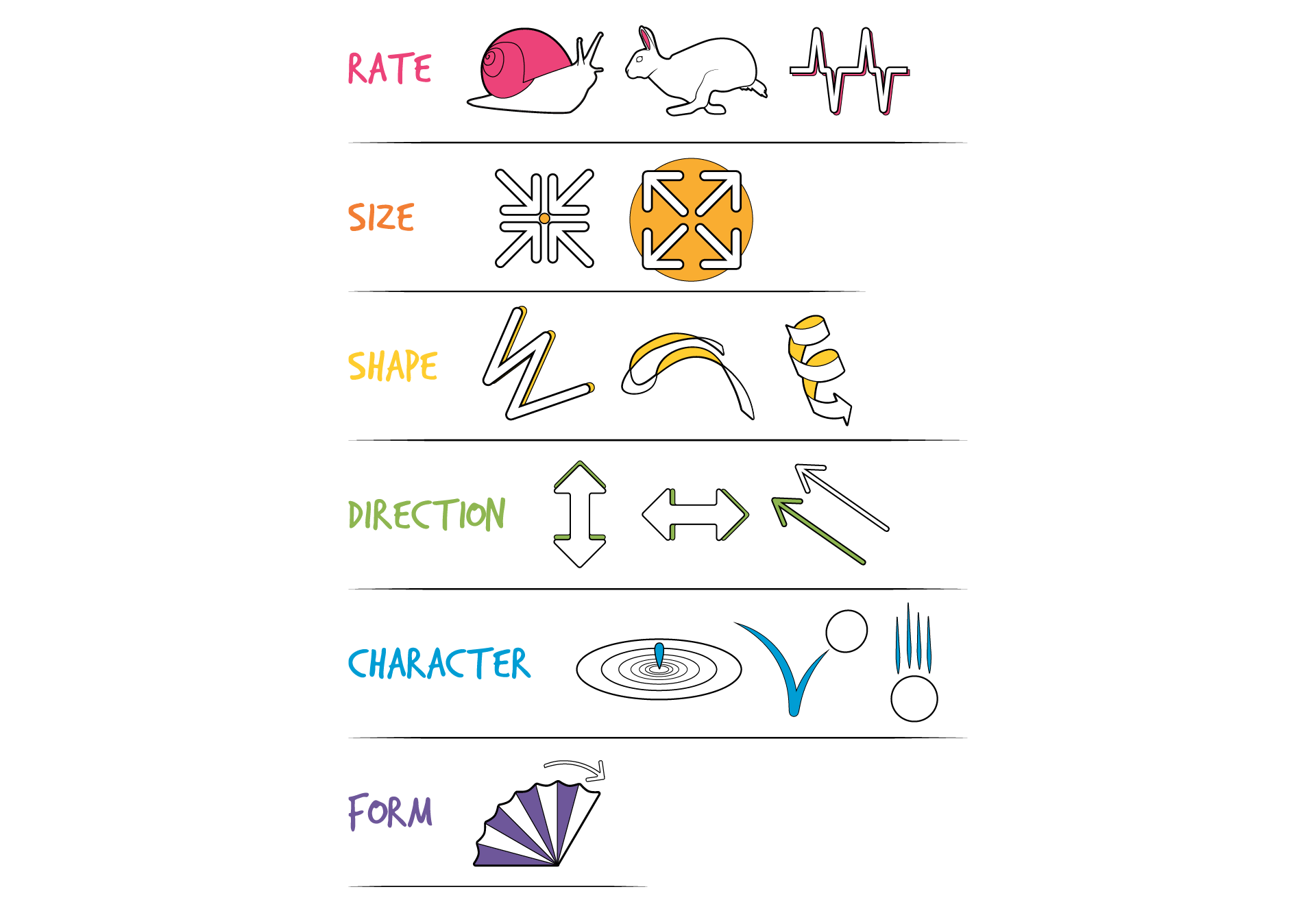
Hubel and Lussow also provided guidelines for designing kinetic features to be aesthetically cohesive properties of a product, and, in their view, are of equal importance to the aesthetics of form, colour, or material (Hubel & Lussow, 1985). They described seven attributes of kinetic movement that clarify the kinds of movement Hopson promotes. Their attributes are organized by time, sequence, and patterns with recognizable forms listed below. Each of these movement forms adds unique dynamic and animated patterns in which parts of products and people can move (Hubel & Lussow, 1985). These patterns can be applied separately or in combinations to generate a variety of kinetic and potentially multisensory iterations. As an adaptation from Laban, we can call this design movement literacy, another foundational design principle for designers to work with.
Seven Attributes of Kinetic Movement (Hubel & Lussow, 1985)
Rate: The movement can be fast, slow, constant, irregular, or frequent.
Size: The expansion or collapse can be small, big, expanding, or constricting.
Shape: The shape of the movement can be straight, curved, zigzag, spiralling, or twisting.
Direction: The direction of the movement can be upward, downward, forward, backward, sideways, or parallel.
Character: The character or expression of the movement can be concentric, bouncing, thrusting, floating, sliding, or spiral.
Form: The characteristics of the movements, when organized in time, result in specific patterns that have a recognizable form.
Function: When the particular attributes of movement are selected and organized to perform a function, they fulfill a need.

Attributes of kinetic movement
Activity Time!
In each of the three scenarios below, match the six sensory tiles (in the column to the left) you believe best matches the movement and personality of the product on the right.
Hint: Each scenario matches with one sensory tile from each tile colour group in the column to the left.
Scenario 1
Scenario 2
Scenario 3
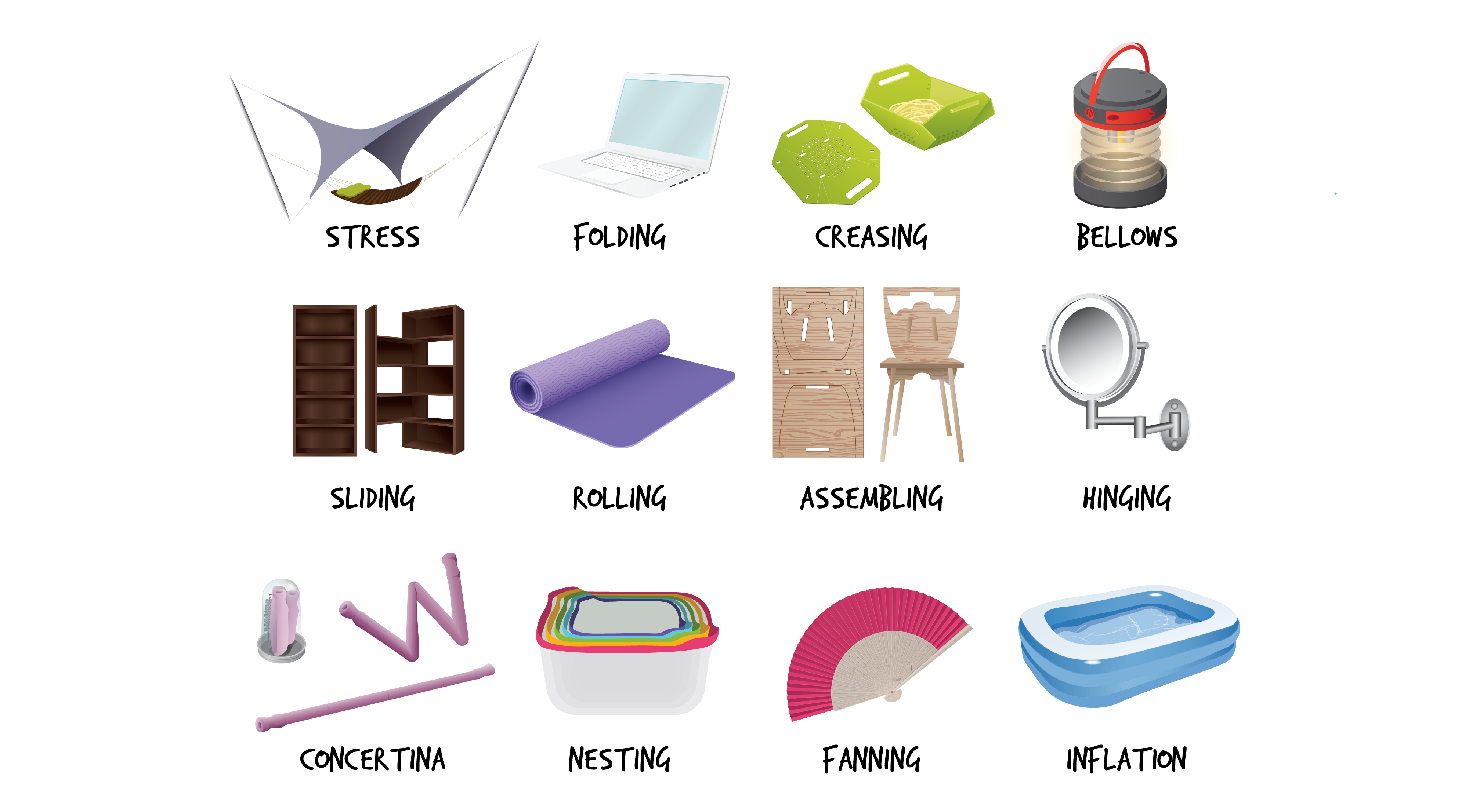
Kinetic Actions
In his book Collapsibles, Per Mollerup (2001) also categorizes product movements into types of mechanical actions that enable a person to collapse and expand a product. Try to imagine how some of the concepts of kinetic movement identified below would engage you in a multisensory kinetic dance as you open, close or otherwise use them.

Collapsible and kinetic design
Movement is multisensory, involving tactile, visual, and auditory sensations that add yet another layer to a product’s aesthetic. When we design a product, an environment, or a service the end result will rarely be static, especially if it is well-used and well-loved. It will become part of an interactive relationship that evolves with us over time. Sometimes our relationship will be intuitive and even automatic unless it does not result in achieving our objectives. At other times our relationship will be dynamic, engaging our senses at different stages of use, with dominant senses taking turns. Indeed, our capabilities may also evolve over time, with the need to interact in a variety of ways, depending on our immediate circumstances – holding a baby, carrying coffee, nursing a sprained ankle, or carrying a heavy backpack. Although environments do not move, the products we place in them need to be designed with the expectation that people will be moving around, in, and through them. Movement is not only complex, it also integrates the multisensory aesthetics of user experience. As you can see, the variations are endless; they are described here to provoke designers to explore dynamic design iterations that can delightfully engage us in multisensory product interactions.
Next section: 7.11 Summary Review Activity

