2.5 Relationships and hierarchies within compositions
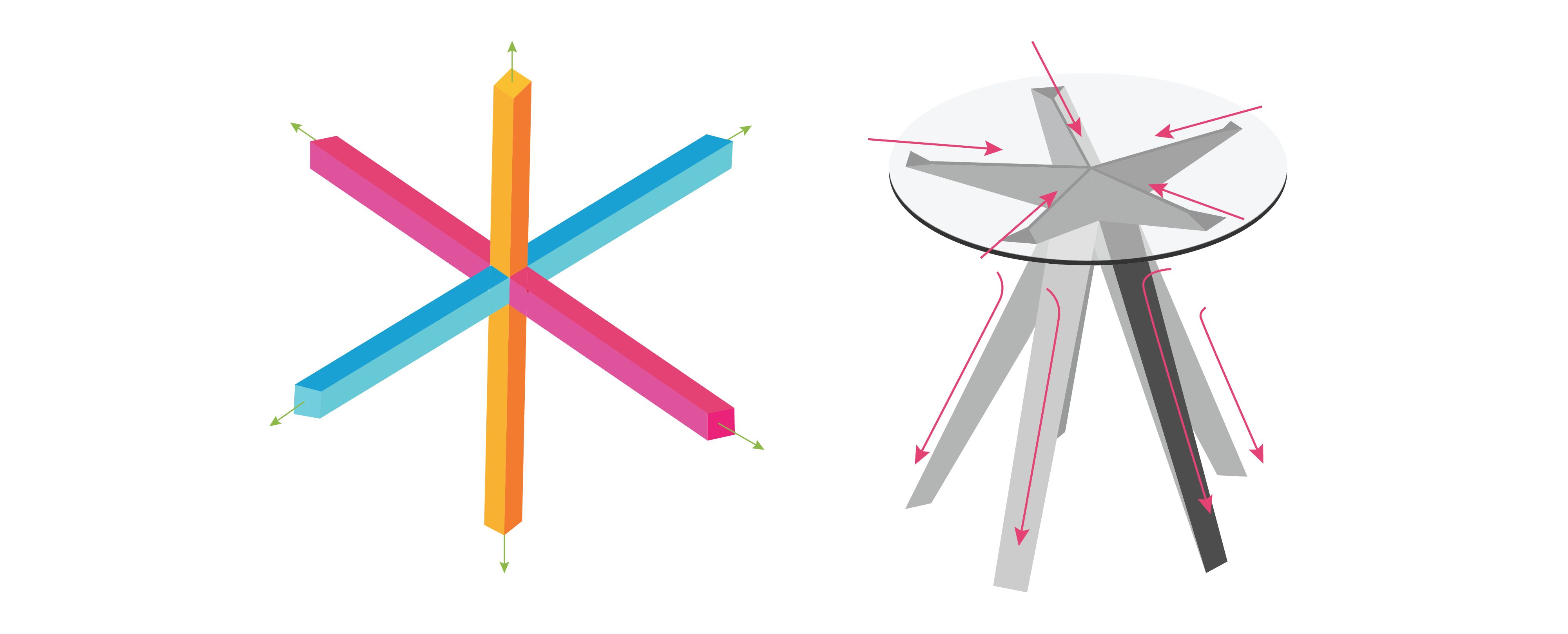
Form giving is an evolving process, requiring reflection and experimentation. Designers continually ask themselves, does the design look good? Is it interesting from all sides, and at eye level or from the top? Three-dimensional compositions should appear to have balanced directional forces from every viewpoint (360 degrees) around the whole structure or product, whether it is symmetrical or asymmetrical.

Examples of balanced directional forces from every viewpoint
Clearly, it doesn’t make sense to emphasize every element equally. If designers were to do that, all the design elements would compete for attention, and nothing would stand out. Certain elements in any composition should draw the viewer’s eye and lead it to other sub-elements for the sake of aesthetics as well as function. We do this by creating visual hierarchies of sub-elements, where at least one main element stands out, another serves as the background for the main element, and others support the main compositional elements.
According to Rowena Reed Kostellow (Hannah, 2002), we can control the participant’s attention by applying principles of composition to organizing contrasting shapes and forms. She encouraged her students at Pratt Institute to apply features that provide emphasis to develop a hierarchy of visual importance in their compositions. She would challenge them to make iterative models of compositions with the following three main components:
The dominant element: This element is the most dramatic in character.
The subdominant element: This one contrasts and complements the dominant element and adds another directional axis.
The subordinate element: The role of this element is to add three-dimensionality and to complete the unity of the composition from every viewpoint.
Activity Time!
See if you can identify each of the hierarchical elements in the products below. Drag the labels into their appropriate positions.
Hierarchy of Visual Importance
Next section: 2.6 Proportions and Transitions

