
2.4 Gestalt Principles of Perceptual Organization

GESTALT PRINCIPLES OF PERCEPTUAL ORGANIZATION
We not only design simple objects (with one main formal element) like a pencil sharpener, a comb, or a screwdriver but also products with a range of complex volumes that contain internal components and a variety of affordances like buttons and switches with specific functions. How then, do we design complex compositions that make it easy for the user to visually understand how to use the product and its parts?
For guidance, we turn to the Gestalt principles of perceptual organization developed by psychologists Max Wertheimer, Kurt Koffka, and Wolfgang Kohler in the early twentieth century, to explore how we perceive each object around us as a unified whole. The word gestalt means “something that is made of many parts and yet is somehow more than or different from the combination of its parts” (Merriam-Webster, n.d.). The artists and designers at the Bauhaus, an experimental early twentieth century German art school, explored these principles in their teaching and personal projects. Since then designers have been referring to Gestalt principles or Guidelines to organize elements by grouping similar elements, recognizing patterns, and simplifying complex images. Gestalt Principles provide visual guidelines that help designers and artists create understandable, communicative, and rich compositions.
Designers apply these visual guidelines in their formal compositions to improve the perceived aesthetics, functionality, and user-friendliness of a product. For example, when you see a handle, a spout, an interior volume, and a flat bottom, your cognitive processes register that set of elements as a vessel for containing and pouring liquid, like a pitcher or a measuring cup. You have a simplified perception of the parts that come together as a single object – this is an example of the Gestalt principle of closure, where we perceive these elements as a complete and familiar thing. It is human nature to cognitively simplify what we are seeing when we perceive complex visual components that are grouped together, so that, in this case, we recognize the object as a pitcher. By grouping elements in a design composition together into compositional areas, the message of what we are looking at becomes simplified enough to make it easier to grasp the essence of the product. Gestalt principles provide insights into how people perceive organization within vague or unclear visual compositions.
Gestalt principles have been around for at least a century and have evolved as strategies to guide the appearance of unity within the whole and the ways elements are “assembled” within a composition. These guidelines may have different names or categories, depending on which source you consult, but the categories listed below are common to most theorists. These key categories are: closure, focal point, continuity, symmetry, similarity, figure/ground, proximity, and similarity. To those, we add harmony, which is the overall goal of a composition. This includes the principles of unity and variety, rhythm, and connectedness.
Closure
Our minds have the tendency to complete a form or figure so that it is perceived as a complete and unified whole. This tendency occurs in situations where an image appears to be incomplete, when other visual information is missing, or when parts of the whole composition are hidden by other objects. Knowing this, designers want to combine the parts of a product or composition into a simple and complete whole pattern to make a strong unified impression on the person perceiving it. What do you see in the example below? Did you visually complete the triangle whose edges are defined by the blue circles?

Closure
Emphasis or Focal Point
Drawing our attention to a focal point requires design skills and many concept iterations. Designers may choose to emphasize a particular element through colour, scale, value, or contrast to catch a viewer’s eye.

Emphasis or Focal Point
Continuity or Continuation
We tend to visually follow straight and curved lines until they are interrupted in some way. It is easier to follow lines that seem to flow in a uniform direction than angular lines with sharp or abrupt changes in direction. It is important to design two- and three-dimensional patterns that have a continuous vertical or horizontal flow across a surface to ease perception. This visual flow guides us through a composition, such as packages, web sites, instructional pages, or aesthetically pleasing artwork.

Continuity or Continuation
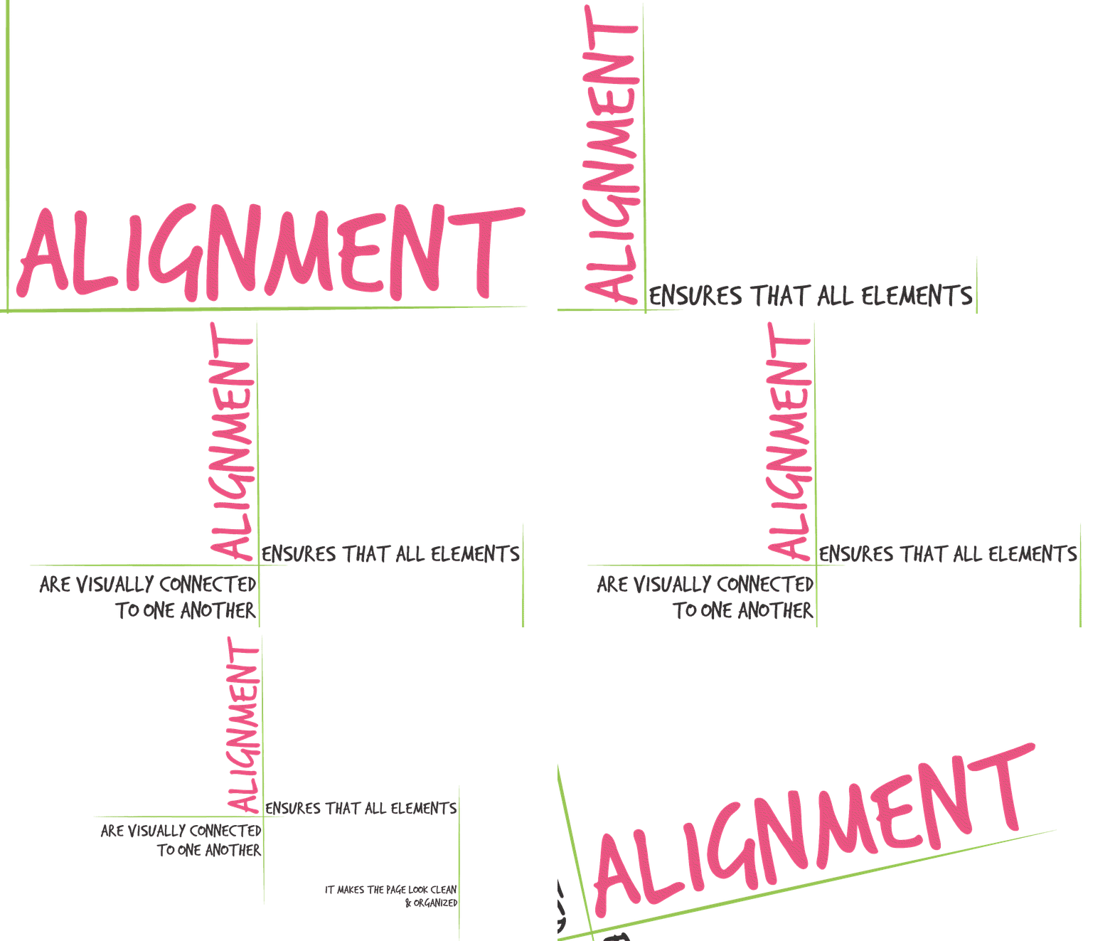
Designers can be obsessed with a subset of the guideline of continuity called alignment. We like to line up elements in a composition so that the eye flows smoothly from one to another and as soon as one element is out of place, we rework the visual connections between elements! How do we align the elements? We use a grid! Think about a time when you may have used a grid on your computer desktop to align the icons; if you have ever seen the instruction “snap to grid” then you are familiar with the concept of alignment. We often prefer to manually align elements with one another so that we can be sure to line up the items that belong near each other.
Alignment
Symmetry and Order
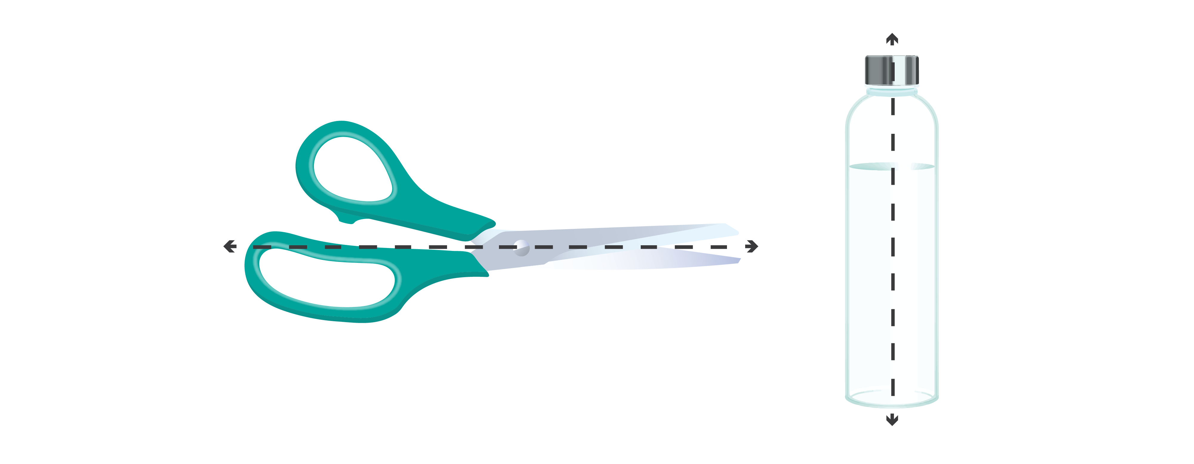
This principle focuses on the factors that support us in perceiving compositional balance. Designers can achieve this by creating symmetry or order among the positive elements and the negative spaces of any composition. Symmetry can be achieved by placing sub-elements that are perceived as having identical visual weight in a balanced composition on either side of one or more axes. An axis is an imaginary line in a composition and can be vertical or horizontal; it indicates the centre of the design distribution and helps to organize elements.

Symmetry
Symmetry on either side of an axis
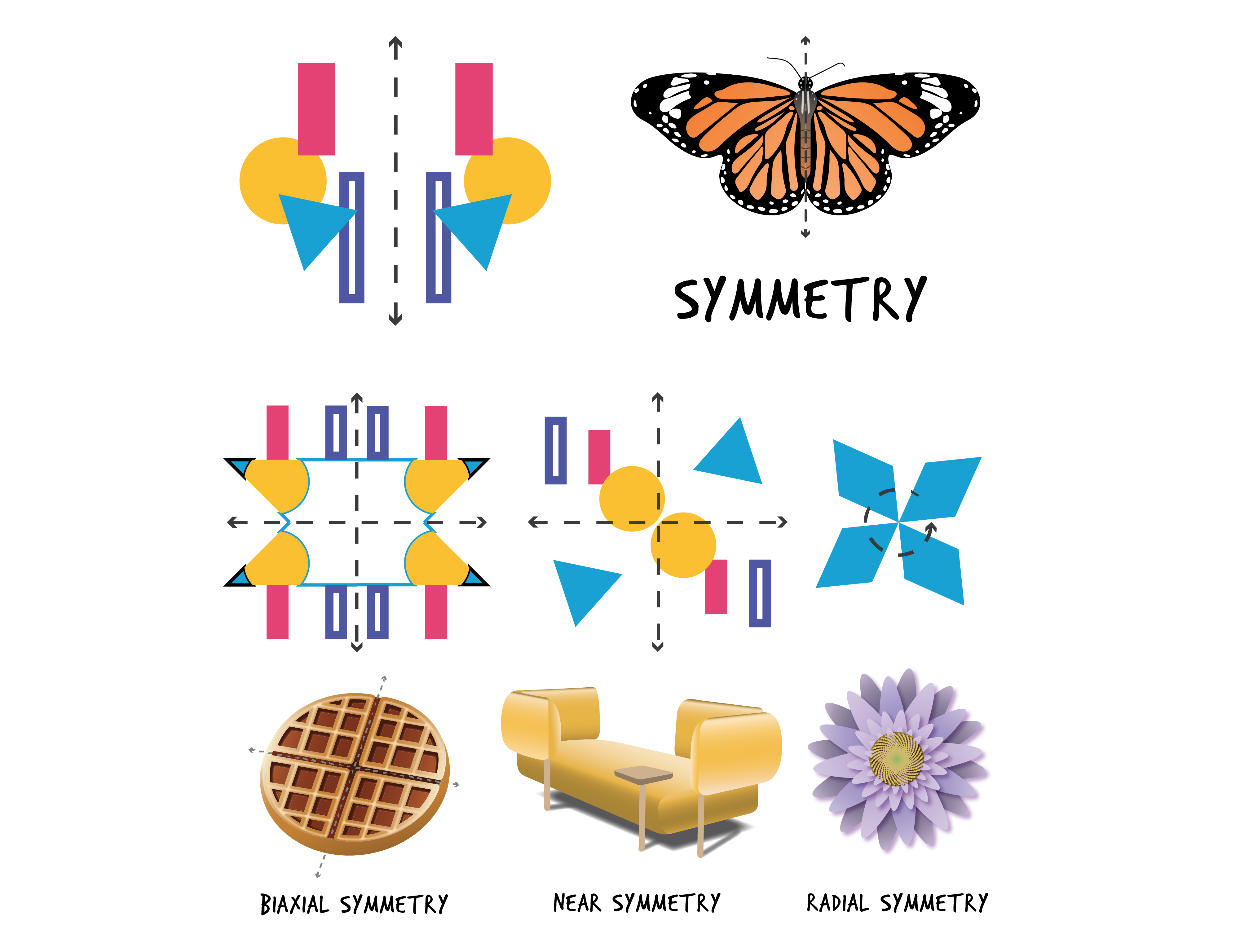
We usually perceive symmetrical or balanced compositions as stable and generally aesthetically pleasing. In symmetrical compositions, the elements on both sides of an axis appear to be equal in size, shape, and value. There are three types of symmetry: biaxial mirror symmetry (symmetry on either side of two axes, vertical & horizontal), near symmetry (symmetry on either side of a central axis where two halves may be only slightly different), and radial symmetry (symmetry around a central point).
Examples of types of symmetry
In all of these types of symmetry, some of the sub-elements might be focal points and attract your eye, however, no single area of the composition draws your eye so much that you can’t see the other areas.
Asymmetry
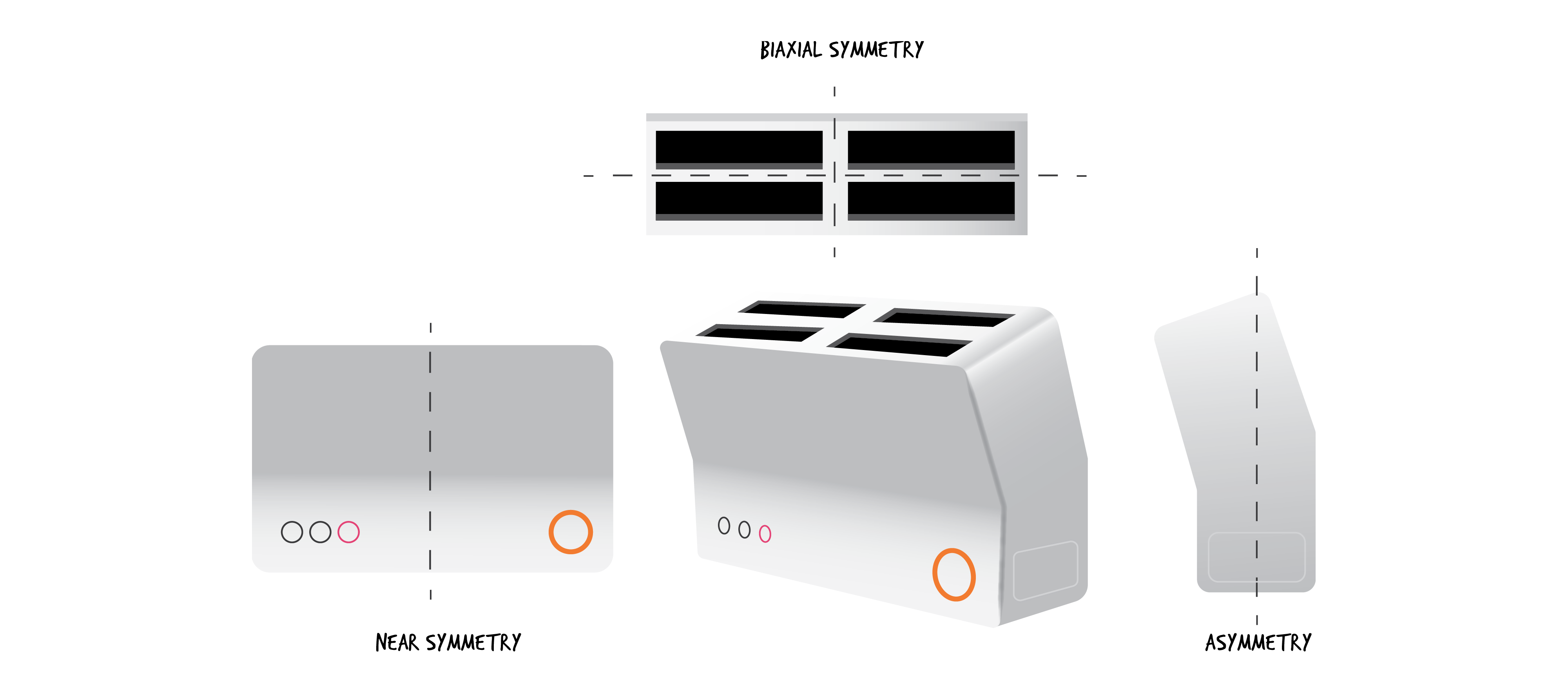
You may perceive a composition as unsettling or tense because it is not symmetrically balanced. Some people may consider asymmetrical compositions as dynamic and interesting, especially in the art world. Designers may choose to place sub-elements unevenly around an unseen compositional axis, which leads to an unbalanced composition. This strategy may work well when exploring where to place one-of-a-kind sub-elements to attract a user’s attention, as the asymmetrical focal point in the table illustrated below. However, some products may appear asymmetrical from one point of view and symmetrical from another, like the teapot depicted from its asymmetrical perspective below.

Asymmetry
multiple types of symmetry within a product
Figure/Ground
You may be familiar with the image of two heads facing one another that contains a space between them that looks like a goblet. This image illustrates the figure/ground principle – are you seeing the figure or the ground? Much like the principle of closure, this guideline depends on cognitive processing capabilities. Typically, the objects in the foreground are the focal points or main figures (like the faces) and the background provides a negative space behind the focal points. While we rarely come across two competing focal points like in this example, designers use this principle to clearly indicate which elements to focus on.

Figure /Ground
Designers should be aware of the different types of figure/ground relationships:
Stable: In this relationship, we can easily differentiate between the figure and the ground. The composition is designed to highlight one or the other.
Reversible: In this relationship, we see repetitive patterns in which the figure and ground reverse, leading to a dynamic tension in perceiving the composition.
Ambiguous: In this relationship, which we have already seen in the faces and goblet example, we are attracted to both figure and ground simultaneously, which may cause confusion.
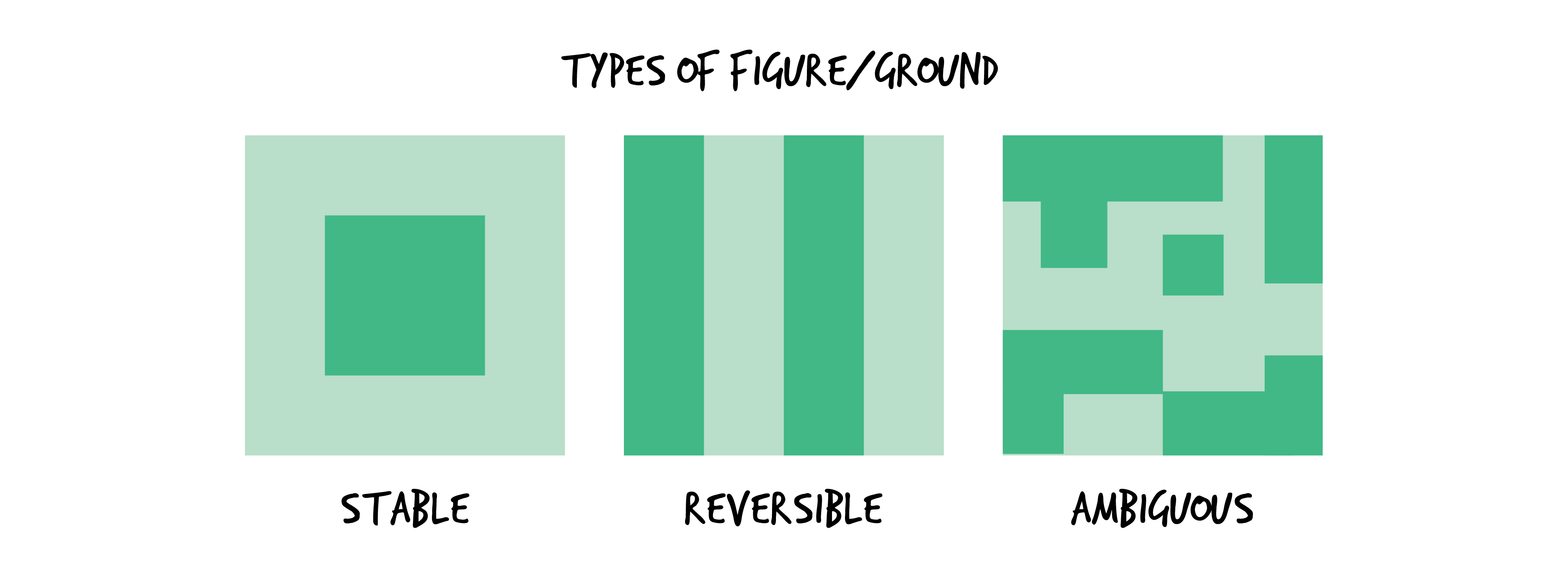
Types of Figure/Ground
Proximity
We perceive objects or shapes that are close to one another as belonging to one group of elements. Even if the shapes, sizes, and objects are radically different, they may appear as a group if they are close to one another. This principle is useful for designers working with sets of elements of different sizes and shapes: elements that are grouped in proximity to one another appear to be related to the others in that group.

ELEMENTS GROUPED IN PROXIMITY SEEM TO BE RELATED
& SEPARATE FROM ELEMENTS IN ANOTHER GROUPING
Designers intentionally try to unify compositions by combining a group of different elements within a unifying larger element, or by placing smaller elements inside larger ones as in the image below:
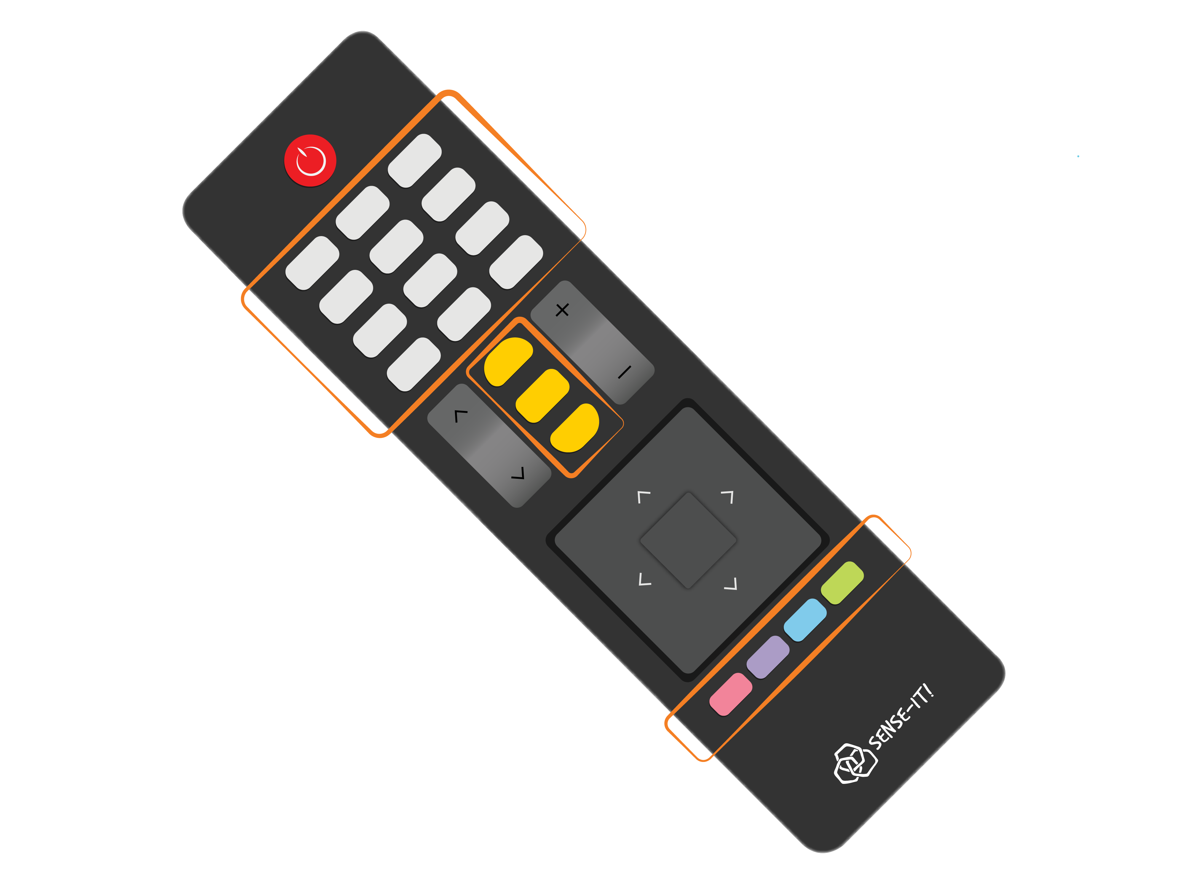
ALTHOUGH THE SHAPE AND SIZE OF THESE ELEMENTS VARY, similar buttons are grouped together by proximity
Proximity and similarity often work together and are perceived as a visual hierarchy. Either can dominate the other, depending on how they are combined and applied. In the image above, the function buttons are similar to one another and are arranged in separate groupings of sub-elements that are in proximity to one another. Sub-element groupings are organized within the composition using the principle of proximity and the following principle of similarity to provide strategies for simplifying complex design features.
Similarity
When we see objects or shapes that physically or visually resemble each other we perceive them as being part of the same composition. This principle is useful for designers who want to provide visual cues to help people interact with the important features of a composition.
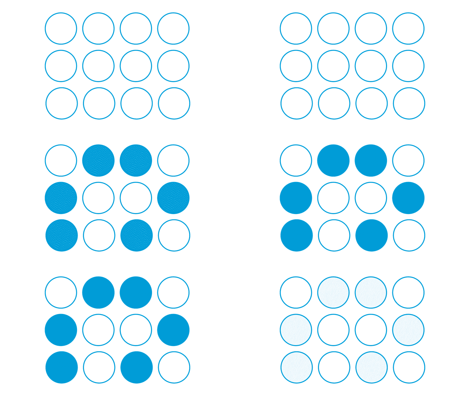
Similarity
Harmony
The Gestalt principles are applied to compositions to achieve a sense of balance or harmony, especially in three dimensions. Designer Del Coates (2003), who coined the term objective concinnity (or what we call harmony), said the goal of every designer is to achieve a perception of overall harmony, simplicity, aesthetic unity, good form, or formal elegance. To these seven Gestalt principles for achieving a well-balanced composition, we add three more: unity and variety, rhythm, and connectedness.
Unity and Variety
Ultimately each of the Gestalt principles contributes to the overriding goal of combining all the elements of a composition to help the viewer perceive the composition as unified, or complete.
Variety is the complement to unity and is needed to create visual interest. Often designers depend on the variety of sub-elements to make a composition visually stimulating and engaging, without being confusing.
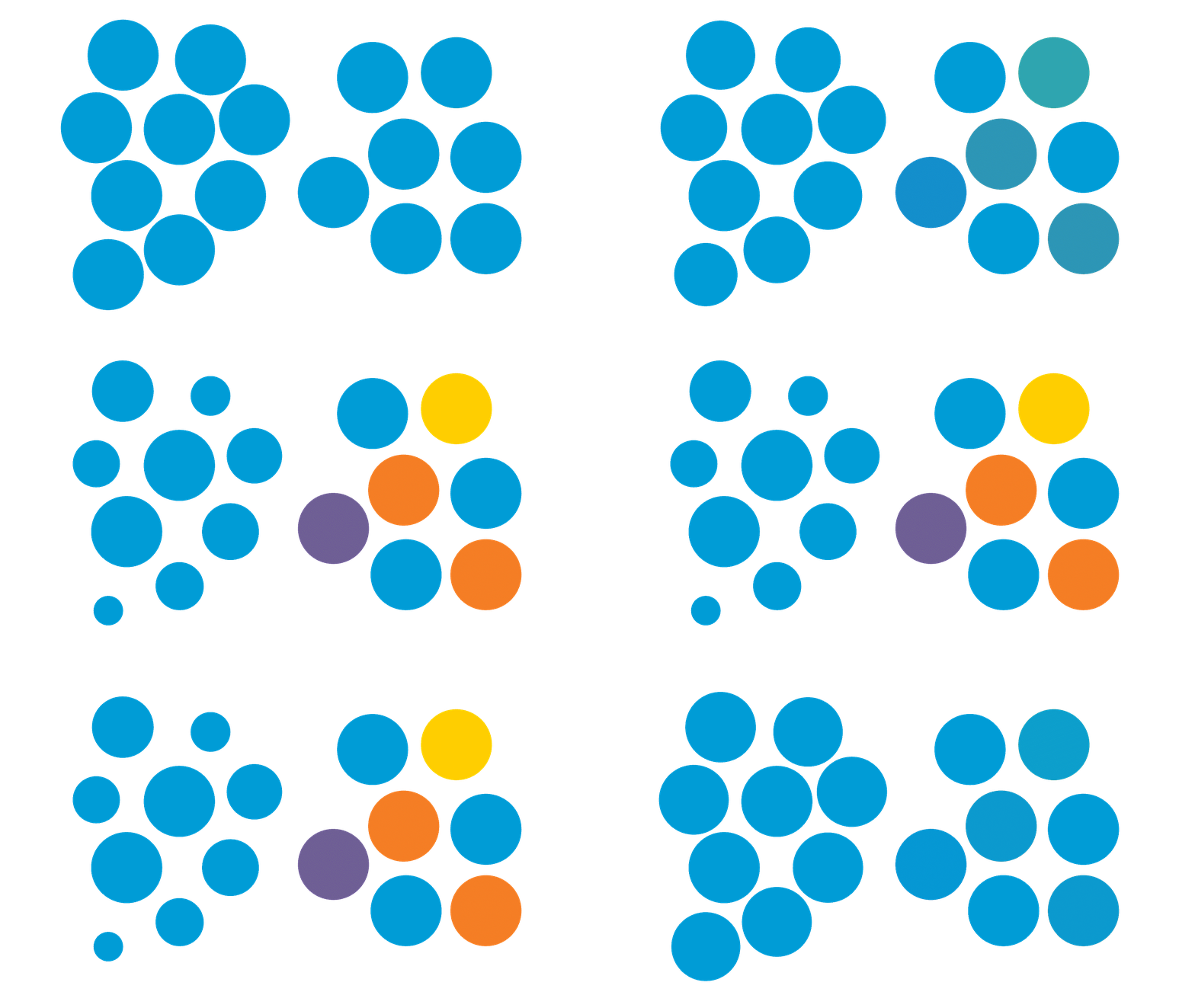
Unity & Variety
Rhythm
Rhythm refers to the recurrence or organized movement of elements through space and time. We perceive the experience of rhythms through a sequence of repeated elements. The perceived visual movements of shape, colour, or lines could be interpreted as rhythmically moving waves of water that provide visual interest through repetition.
You may determine very different messages when the rhythms are regular as compared to irregular. Regular rhythms are sequential arrangements of a repeated pattern of identical elements that build a uniform and consistent pattern. They seem to be calming or stabilizing. On the other hand, irregular rhythms are sequences arranged in irregular or unequal spacing or in dynamic patterns. They seem to be erratic or destabilizing.
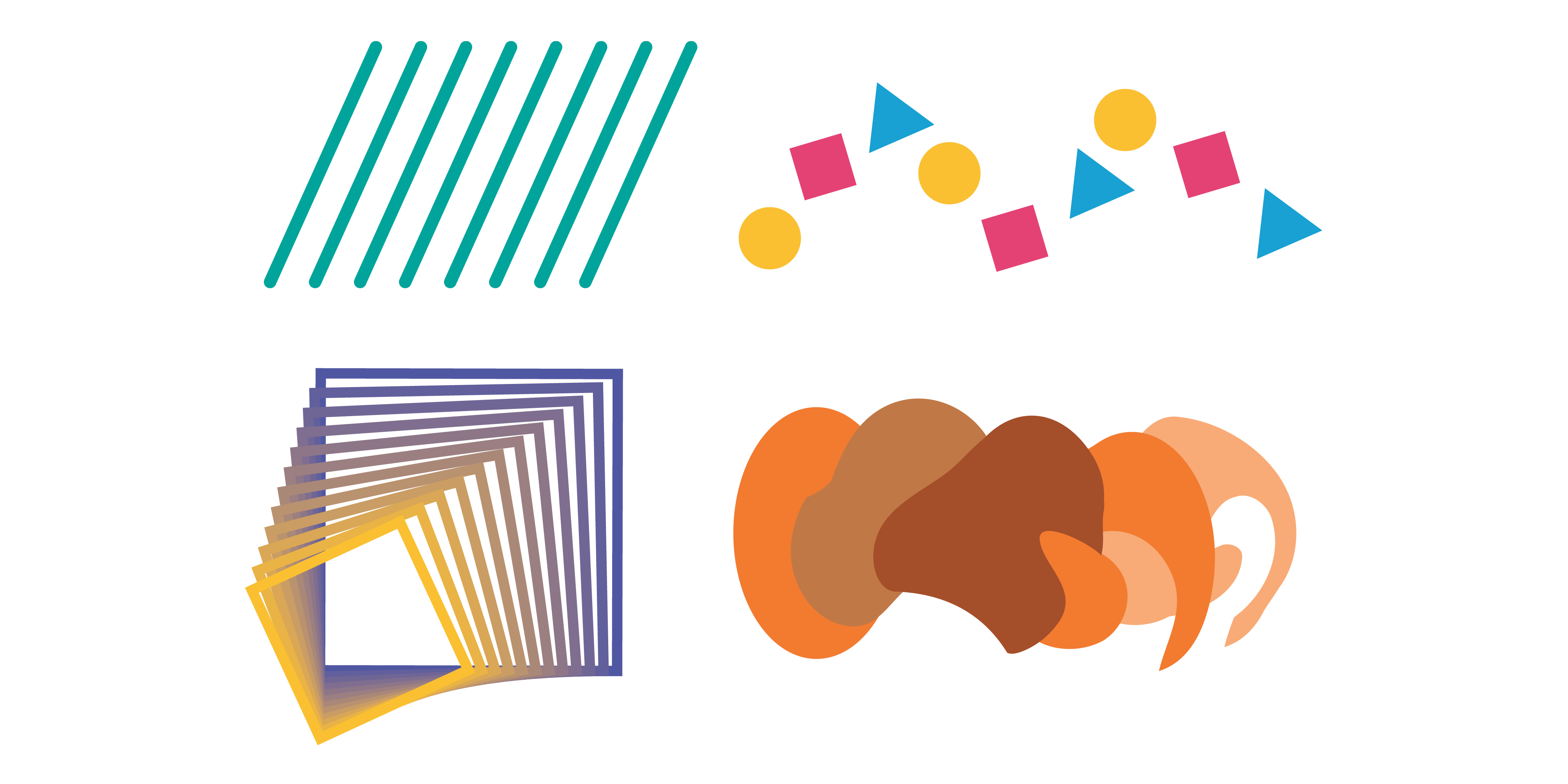
EXAMPLES OF Repitition and RHYTHM USING similar ELEMENTS

REGULAR (left) AND IRREGULAR (right) RHYTHM THROUGH REPETITION AND DYNAMIC VARIATION
Connectedness
When people see that elements are connected, they perceive them as a single unit. This guideline is related to the Gestalt principle of proximity because it includes a connecting line that brings the elements into proximity with one another. Despite the difference in physical attributes (size, shape, colour), the object is seen as part of the same group. This principle also includes physically connecting through touching, overlapping, and combining.

LINES CONNECT ELEMENTS TO ONE ANOTHER

Touching

overlapping
In three-dimensional products, unity can also be created via physical connections that touch one another. Common examples of connections between physical elements include cradling, in which one element acts like a cradle for another element (like a diamond set in a ring), wedging, in which one element has an opening that the other element fits into (like a dock for devices), and piercing, in which one element passes all the way through a hole in the other element (like a pierced earring passes completely through the ear lobe).

EXAMPLES OF CONNECTIONS BETWEEN PHYSICAL ELEMENTS
In addition, three-dimensional objects and products overlap and combine elements to create harmonious compositions. This approach incorporates the principle of similarity. It is often used to design modular components that can be combined to form a variety of configurations. Clients can mix and match related units to form office workspaces, living room furniture, and even storage containers.
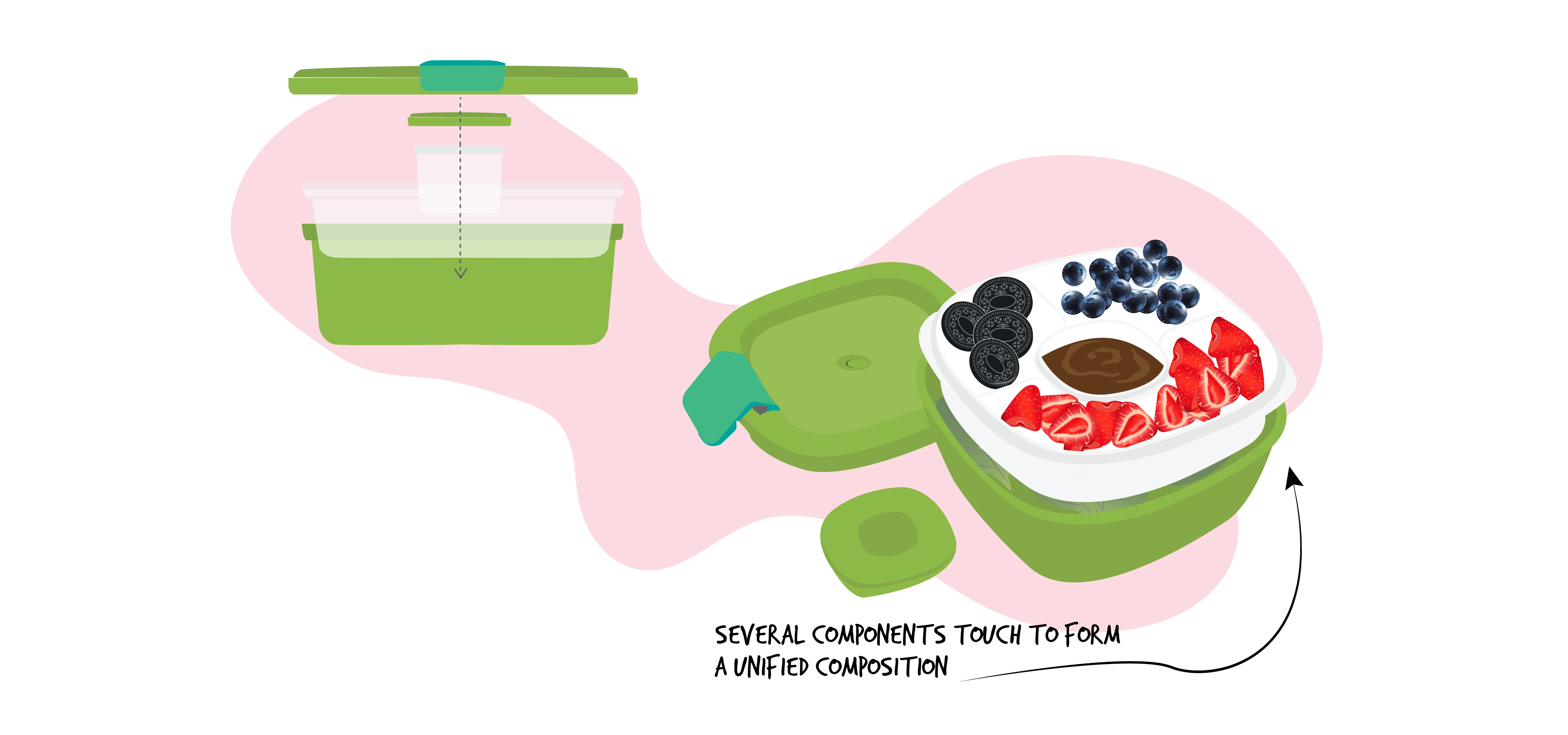
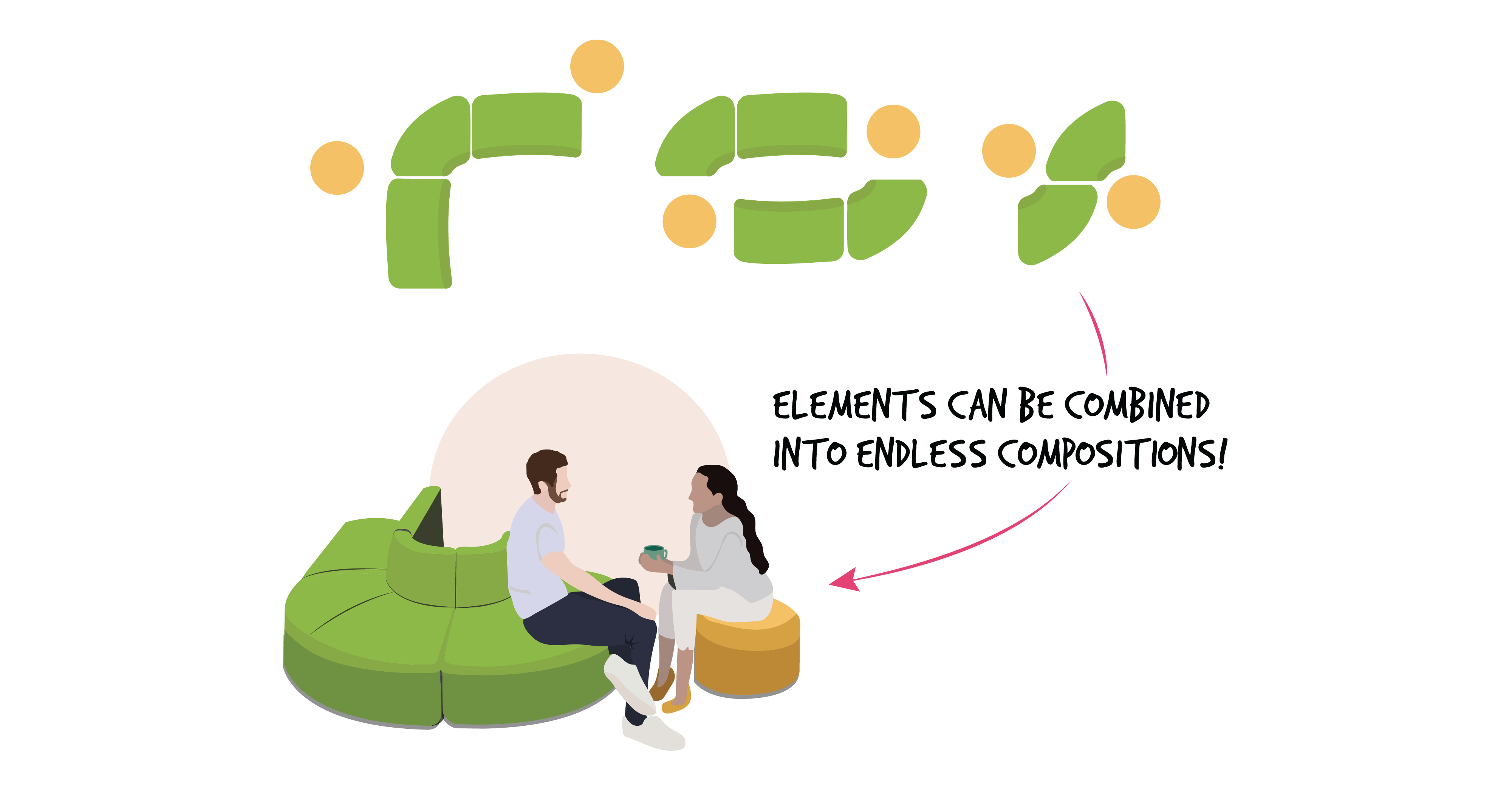
THE PRINCIPLE OF SIMILARITY IS APPLIED TO COMBINING SIMILAR ELEMENTS INTO MODULAR COMBINATIONS
Activity Time!
Consider the product below. Can you identify some of the Gestalt principles used to achieve harmony in the design of this device? Before you click on the icons below, review the principles above to see which ones you can find in this formal composition.
instances of gestalt principles applied within a single product
Next section: 2.5 Relationships and Hierarchies Within Compositions

