

 What is Graphic Design?
Graphic design means creating visual concepts either by computer software or by hand to communicate a message, idea, or concept that serves a certain purpose. Uses of graphic design include: visual identity, marketing and advertising, user interface design, publication, packaging, motion design, environmental, art, and illustration.
What you need to get started:
- A computer with access to the internet and design software.
- Some paper, pens, or pencils.
- An idea or a goal.
Why would you learn graphic design?
- In school, you might be asked to create an infographic, or a slide show, or even a polished text document. All of these can benefit from graphic design skills.
- It can help build your personal brand to reach more people or become part of your portfolio.
- Graphic design skills are perhaps the most broadly applicable creative skills. Almost every project, assignment, or document you produce can be enhanced by applying graphic design skills and principles.
The Design Process
Designing something from scratch can be a daunting task and indeed many designers find themselves stuck when they first try and launch into a new project. Fortunately, by understanding the basics of a typical graphic design process and doing a little bit of planning and research, you will have a much easier time.
- Like all creative projects, it can be helpful to sit down and think about a plan before you start drafting up a design:
- What are your goals?
- What does the client or assignment ask for?
- What kind of style are you aiming for?
- Once you have that down, you can start researching and finding images that inspire you or fit the design that you are going for.
-
- You can even compile a bunch of example images into a moodboard for easier reference as you are doing your design.
-
- Once you have a solid understanding of what you are going for, it can be helpful to take a scrap piece of paper and a pencil and very roughly sketch out where you want things to go and how you want the final product to look.
- It doesn’t matter how good you are at drawing on paper. The idea here is just to create a rough sketch so you have something to work from and so you can start to see how everything is going to fit together.
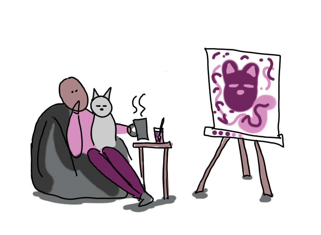 Finally, and most importantly, remember that graphic design, like all creative processes, is iterative. That means when you make something, it’s not just finished. You can go back and look at it, change and tweak things, and revise to make it better.
- You can do this with an instructor or client, or with friends, or even by yourself, if you take breaks during the design process. Sometimes all it takes is a few minutes away from the screen and a cup of coffee to give you a fresh perspective and help you really refine your design.
- You should also not be afraid of going back if you find that some part of your design is not working.
- Don’t like how you have the text laid out? Change it.
- Not liking the colour palette now that everything is together? Swap it up until you are happy with the results.
Graphic Design Basics
When we talk about graphic design, we are talking about a number of separate ‘elements’ that make up a whole design. You may be familiar with some of these already, but others might be completely new. It is important to think about all of these elements as you are planning and creating your graphic.
Colour
Designers and artists use a set of guidelines called colour theory to help effectively communicate ideas and create eye-catching elements for users. The use of colour theory helps with achieving a designer’s goals, which may be attracting attention, organizing content, and evoking emotion. Colour theory aids the designer in choosing the right colour combination for the desired effect.
- Colour terminology: There are a number of terms designers use to talk about colour that can be helpful when creating images:
-
- Hue refers to the specific colour (red, blue, purple, etc.).
- Value is the lightness or darkness of a hue (e.g. maroon is a dark red with a different value than cherry red).
- Tint is when you add white to a hue.
- Shade is when you add black to a hue.
- Chroma/intensity is the brightness or dullness of a colour (think of how close to grey, or how vibrant, a colour is).
- Colour Harmony
- Colours can be combined in various ways, but the common harmonies are monochromatic, analogous, and complementary.
- Monochromatic harmony is developed around one hue.
- Analogous harmony refers to choosing colours on that are close to each other on the colour wheel.
- Complementary harmonies are colours that are opposite of each other on the colour wheel.
- Colours can be combined in various ways, but the common harmonies are monochromatic, analogous, and complementary.
 A Tip!
Where your graphic will end up will determine the “Colour Mode” you want to work in. Both modes will let you choose any colour, but the modes control how screens or printers display colours. If it is going to be posted online or on a screen, you should use RGB Colour Mode. For printing, you want to use CMYK Colour mode, which is seen in magazines, cards, posters etc.
It can be really helpful when you are starting out to play around with colour schemes to help you get a sense of what sort of colour scheme you might want to use for your design. There are a number of free tools like Coolors or Adobe Color that can help you try out different schemes and easily make different harmonies (you can even see thousands of schemes made by other people).
As much as colour is an important part of a design, it is equally important to consider all of the other design elements when you are working on your project.
More Design Elements
Form
Line
Shape
Size
Space
Texture
Graphic Design Principles
Once you’ve thought about all of the different elements, it’s time to combine them into a full design. There are a few basic principles to keep in mind when you are roughing out your design for the first time (and as you are iterating on it to make it better!). They are: balance, rhythm, contrast, emphasis, and movement.
Balance is the arrangement of the visual weight of objects, colours, texture, and space. Balance creates emphasis, drawing the viewers attention and dividing it into symmetrical, asymmetrical, mosaic, and radial. Visual balance is important and desirable since it provides a sense of comfort for the viewer, allows them to see all areas of the composition, and emphasizes how each part may hold interest. If a composition is unbalanced, it can give a sense of tension. The areas with the most visual weight get the most attention.
Contrast is the difference between two or more visual elements in a composition. This helps to clarify the purpose of your design by creating focal points and diverting attention to the contrasting element, while adding visual interest to a composition. Certain elements that can be used as contrast in a composition include colour, type, alignment, and size. Contrast is important since the difference between the elements makes it easier to compare and comprehend.
Emphasis is when a particular element is designed to draw the attention of a viewer. This is usually an eye-catching focal point and the area that has the most significance. Emphasis can be created by using contrasts in colour, texture, and value for the eye to be drawn to a particular area, and also by strategically placing something in the area of a composition that will draw the most attention.
Movement is the direction the viewer’s eyes naturally move around a composition. This can be created through lines, shapes, edges, colour, and patterns. Movement allows the viewer to know where to look and what to do next. The movement that is made through elements keeps visual interest and lets the viewer know of change. Some effects that create movement are blurs, curves, or the display of something already in motion (e.g. a person running).
Rhythm is the repeating elements in a composition that can unite, direct, and highlight. Rhythm can include elements that are repeating in shape, colour, tone, texture, accents, and direction. Using rhythm in a composition can create momentum and life, especially when used alongside the other principles.
A Tip!
File formats in the graphic design world can be overwhelming. In general, it’s best to save your files as whatever will have the most universal use. In this case, a PDF, PNG, or JPEG at the highest resolution possible. You might encounter the terms Vector and Raster when saving. A raster is an image made up of pixels, and a vector is an image made up of shapes, lines, and points. The difference is that you can always increase the scale of a vector (because it has no pixels), whereas a raster will start to show individual pixels.
Creating Your Design
Now that you have a plan (you’ve roughed out your design and thought through all of its elements while applying design principles), it’s time to actually use some design tools to create it. Most graphic design professionals use Adobe programs such as Illustrator, Photoshop, and InDesign to create their graphics.
Those can be both expensive and difficult to learn. Luckily, there are a number of free or less expensive alternatives that you can use to create your own high quality graphics.
 Dig Deeper
Here are some extra options for you to explore for editing images that are free and/or open source.
GIMP
Inkscape
Gravit Designer
scribus
Canva
A Quick Review of The Elements of Design
 Activity: Fan Poster Design
Purpose of Activity:
Use a design program of your choice to create a graphic poster hyping up a band or show you enjoy. Designing a poster will let you bring in photos, graphics, and text to create a whole new thing.
Why are you completing this activity?
Promotional posters are a great way to practice because they bring together all of the elements of design covered in this module and allow you to create something based on a piece of media you like. It could be a poster for a band, movie, TV show, or a web series you enjoy.
Difficulty Level:
- Design a basic poster for something you like.
- Pick one of your friends favourite bands, shows, movies, etc., and design a poster to give to them.
- Create a promotional poster for an upcoming piece of media you are excited about (such as a new album release or a new season of a show you like) and post it to social media.
Learning Outcomes:
- Demonstrate the understanding of design basics including: colour theory, spacing, texture, etc.
- Apply graphic design principles to create a promotional graphic for a piece of media.
- Incorporate multiple design elements into a project including but not limited to: photos, shapes, colour palettes, and text elements.
- Demonstrate understanding of a piece of design software and create an effective final product.
Task:
In this activity, you will need to create a piece of promotional media (such as a poster or social media post) for a piece of media of your choice. It can be a musician or album, a TV series, a movie or franchise, or any other piece of media you wish.
The graphic must incorporate elements of design discussed in this module and should showcase your understanding of design principles from the module.
You can use any design software of your choice, including those recommended in the module itself, or any other software you are comfortable with. Save your graphic as a JPEG or PDF.
Time Commitment:
This assignment should take you approximately 3-5 hours to complete.
Success Criteria:
- Incorporate at least three distinct design elements covered in this module.
- Showcase an understanding of one or more design principles.
 Just Sayin’: You could consider using this activity to enhance your response to an activity in one of the other modules (you can get “2 for 1” credit for it!). For example, instead of making a poster for a band, make one that depicts the type of learner you are for the learner module. Just sayin’.
How to Complete This Activity:
- Choose a media franchise or property you like.
- Rough out a design for a promotional poster or social media post that includes a graphical element (such as edited photos for Instagram).
- Choose a design software in which you will create your graphic.
- Create your graphic using the software.
- Review and revise (either individually or with a friend or colleague).
- Submit your completed graphic.
 An Example
See an example Taylor Swift-flavoured fan graphic here (link opens in a new window).
What do I do with this?
If you are playing along using the Liberated Learner Work Binder, upload your video file to the Technologist Module folder.
If this is the only Liberated Learner activity you plan to do, then save the file wherever you’d like. Don’t forget to share it with your friends and family to wow them with your video production prowess.
