1 Zenify Your Presentation example
Zenify Your Presentation
BUS*6050 Management Communications • May 2017
Dr. Trent Tucker • University of Guelph • @ProfTucker
The purpose of this document is to provide additional information and resources about improving your presentations using the ideas of Garr Reynolds and others. It is also designed as a document to accompany the presentation versus the usual 6-thumbnails to a page PowerPoint “notes” you often see! I have to practice what I preach!
Resources:
I’ll be presenting ideas from Garr Reynolds’ books and website, namely:
- Presentation Zen: Simple ideas on presentation design and delivery (2nd edition, 2012)
- The Naked Presenter: Delivering powerful presentations with or without slides (2011)
- Presentation Zen Design: Simple design principles and techniques to enhance your presentations (2nd edition, 2014). Most of the references in this document come from “PZD2”.
I’d suggest adding Reynolds’ @presentationzen handle to the list of people you follow on Twitter. His website: www.presentationzen.com is a good source of information and ideas. His document, www.garrreynolds.com/Presentation/pdf/presentation_tips.pdf, is an excellent summary of the key ideas from his books. Finally, spend an hour online and watch his Authors@Google talk at: www.youtube.com/watch?v=DZ2vtQCESpk—well worth the time.
Here are some other resources I find extremely useful:
- • Slide:ology—the art and science of creating great presentations (Nancy Duarte, 2008)
• Resonate: Present visual stories that transform audiences (Nancy Duarte, 2010)
• Harvard Business Review HBR Guide to Persuasive Presentations (Nancy Duarte, 2012)
• The Cognitive Style of PowerPoint (Edward Tufte, 2003) from edwardtufte.com website.
The presentation I’m going to “Zenify” is entitled “Preventing Plagiarism” and was authored by Karen Marsh of Glenforest Secondary School in Mississauga (Peel District School Board). It can be found online at: schools.peelschools.org/sec/glenforest/SiteCollectionDocuments/combattingplagiarism.ppt. Karen has kindly granted me permission to subject her work to the “Zenification” process.
Less is More
A recurring theme in Reynolds’ work is simplify. “Simplify as much as you can—but no more” is design principle #12 (PZD2, p. 17). He makes observations like “simplicity is our guiding principle” and “if you can do it with less, then do it with less” (ibid). This idea is reinforced with his design principle #8: “Think communication—not decoration,” further reinforced by the suggestion that we “minimize or eliminate that which is excess” (PZD2, p. 15).
The following four slides from my presentation illustrate this “Less is More” philosophy applied to the title slide of the presentation…
 (A)
(A)  (B)
(B)
 (C)
(C)  (D)
(D)
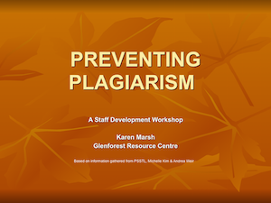
(A) This is the original slide. The presentation used PowerPoint’s “Maple” theme throughout. The maple leaves in the background don’t add anything to the meaning or the topic and distract the viewer. The extremely small (Arial, 10pt) text which reads “Based on information gathered from PSSTL, Michelle Kim & Andrea Weir” at the bottom of the slide can be removed. The information can still be conveyed by the speaker, but doesn’t have to reside on a slide.
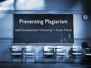
(B) For this first zenification, I used a stock photo image of a classroom chalkboard. This connotes an academic setting—the image reinforces the message rather than detracts from it like the leaves did. The background colours, blue and black—while ‘cold’—connote an authoritative and professional tone. The title, subtitle, and presenter information from the original slide remain, but additional information like affiliation has been removed. The title text has been changed from an aggressive ALL CAPS style to a softer Title Case style.
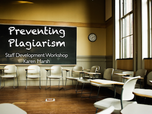
(C) Another stock photo of the same classroom, this time with natural light flowing in. It has a ‘warmer’ feel to it than the blue classroom, a lighter tone for this talk. I also changed the font to “Chalkduster” to give it a more homey / ‘classroom-y’ feel. Choose images and graphics that reinforce the messages you wish to communicate. Start with the end in mind—what is it you are trying to convey—and work all of the slides for this purpose.
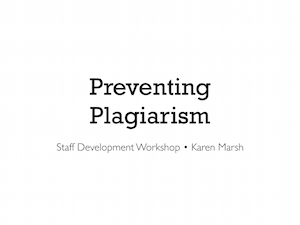
(D) This version of the title slide is simple and elegant. What is the purpose of a title slide? It is on the screen as people come into the room so they know they are in the right place. It introduces the topic and presenter—nothing more. This bare-bones approach meshes with that purpose. There is no right or wrong way to zenify a presentation—these are applications of Reynolds’ ideas to an existing slide deck—however, it all gets back to “what is the purpose of my presentation?”
