9 How Graph Misrepresents Data
- Truncated graph:
This is the most common way of data manipulation. A truncated graph usually involves manipulation of the axis to make something not significant at all look like a huge difference.
Let’s look at a real-world example.
This is an advertisement from the Chevrolet;
They claim that “more than 98% of all Chevy trucks sold in the last 10 years are still on the road”.

And this is how they presented this data; From this graph, it seems like Chevy trucks are almost two times more reliable than Toyota and ten times more reliable than Nisssan/Datsun. However, when we look at the y-axis, we realize the scale range is from 95% to 100%; so a seemingly big difference is actually nothing at all.
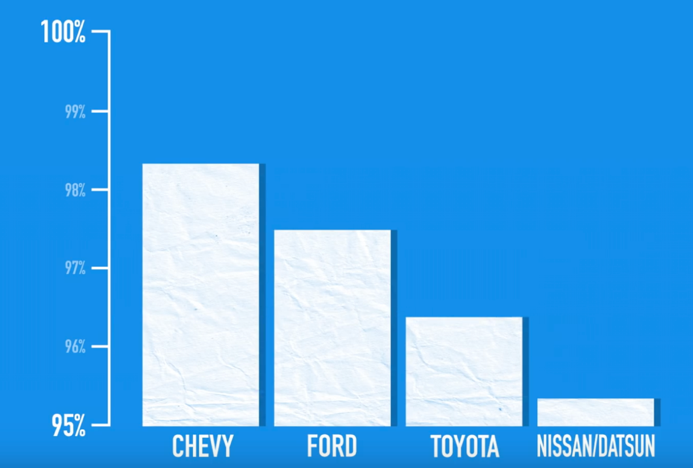
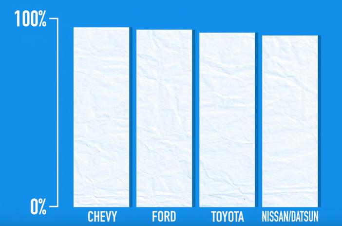
And it actually looks like this if we use normal 0%-100% scale; By using this type of data manipulation, Chevy has “successfully” manipulated customers to think they are way better than everything else out there.
This is one of the most common way graphs misrepresent data: by distorting the scale.
Zooming in a small portion of the y-axis exaggerate a barely detectable difference, and it is especially misleading in bar graphs, since we assume the difference in the size of the bars is proportional to the values.
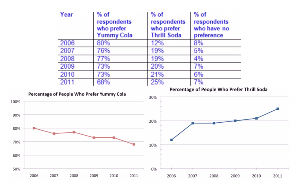
Here is another example:
The two graph below plotted the percentage of people who prefer Yummy Cola and percentage of people who prefer Thrill Cola. After the first glance, we might think the percentage of people who prefer either Cola is similar, and the percentage of people who prefer Thrill Soda is increasing. But after we notice the scale used on y-axis, we see the little trick they used:50%-100% vs. 0% 30%.
We not only see this in the business world, but also in politics;
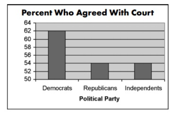
At the first glance, you would probably think that Democrats agreed almost three times more than Republicans and Independents. However, after taking a closer look, we can see the difference is much less prominent (14%). It is obvious that this graph is trying to manipulate us so we hold incorrect opinions against certain group.
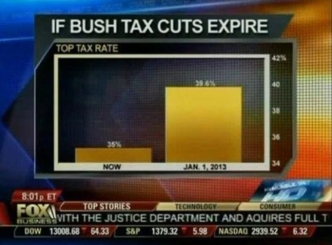
Now let’s look at an example from Fox News.
In this graph, they are trying to do the same thing as the previous example. If you take a closer look, you’ll realize the margin is only 4%. However, the graph that Fox published makes one tax rate seems 4x larger than the other. It is very obvious what they are trying to do here: manipulate their audience.
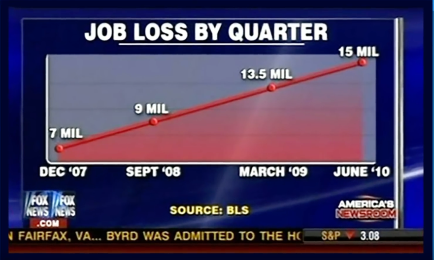
Here’s another example from Fox News:
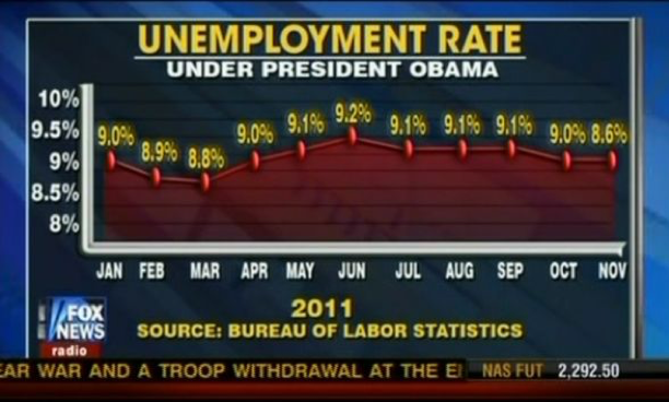
There are two mistakes in this graph:
- The value for November (8.6%) was plotted incorrectly. It should be much lower.
- It has been plotted as it looks like there is a steep increase (From March to June), but in fact, the unemployment rate is almost stable at around 9%.
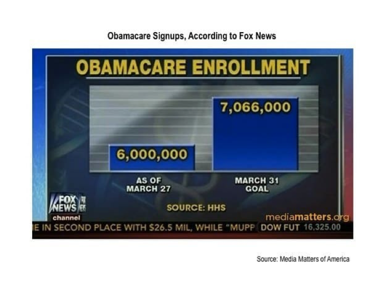
The time when 7 million was five times more than 6 million.
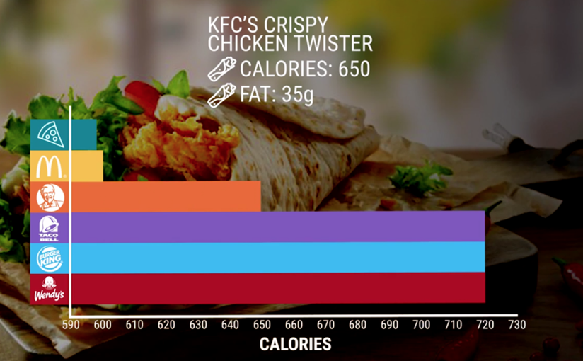
We see the same thing in nutritional information; this time the scale is distorted on the x-axis:
Axis alteration is a very powerful tool and can be used to push a false narrative.
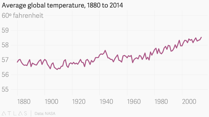
For example, take a look at this graph of global warming data from the National Review:
They intentionally used the scale from 0 to 20 degrees, making the change in ocean temperature seem insignificant, supporting their claim that: global warming is not happening.
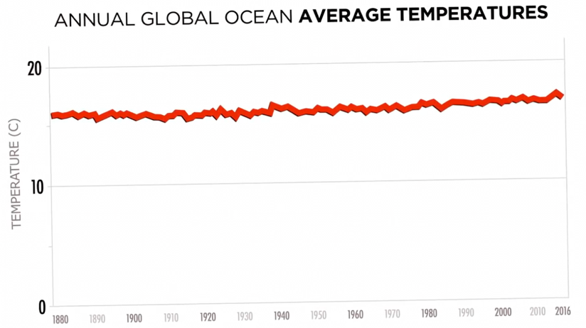
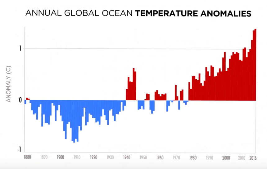
Now let’s plot it a different way. Now we can tell that the ocean temperature is definitely changing.
Also, a graph can’t tell you much if you don’t know the full significance of what’s being presented. Although the ocean temperature has only been changing 1-2 degree Celsius, the fact is, a rise in even half a degree Celsius can cause massive ecological disruption.
Same thing happened here:
The following is another example of axis manipulation:
Here Fox News is trying to give the impression that the number of job loss kept increasing from December 2007 to June 2010. If we take a look at the x-axis, the interval between March 2009 and June 2010 isn’t the same as the others.
Using more consistent data point, let’s replot the graph;
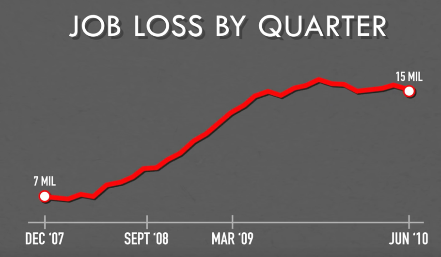
Now it is obvious that the job loss actually started to plateau since March 2009. And if you are wondering there were increasing in the first place, the timeline starts immediately after the US biggest final recession since the Great Depression.
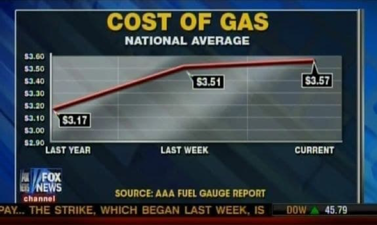
The graph where last year, last week, and today are equally far apart.
- Incomplete data
Cherry picking data is another way to mislead the audience. By including only certain parts of the data, it could skew our viewpoint in a certain way. This technique is also called improper extraction, as only a certain proportion of the data is included. Such technique is very often used when there is time as one of the axis. A time range can be carefully chosen to exclude the impact of the major event right outside it. And picking specific data points can hide important changes in between. Even if there is nothing wrong with the graph itself, leaving off data can give a misleading impression.
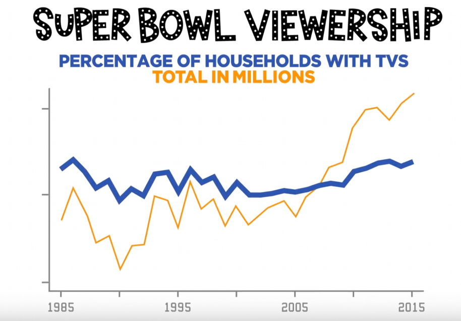
The following graph charted how many people watch the Super Bowl each year, making it look like the popularity is exploding.
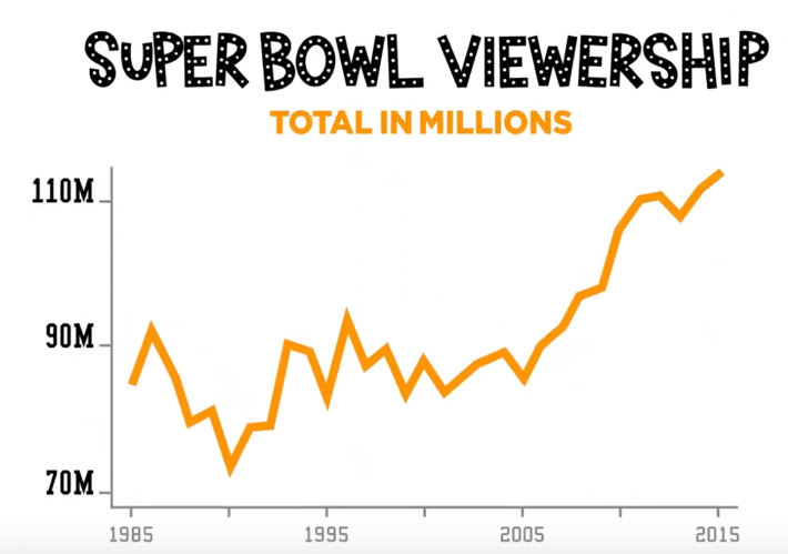
However, it did not account for the population growth.
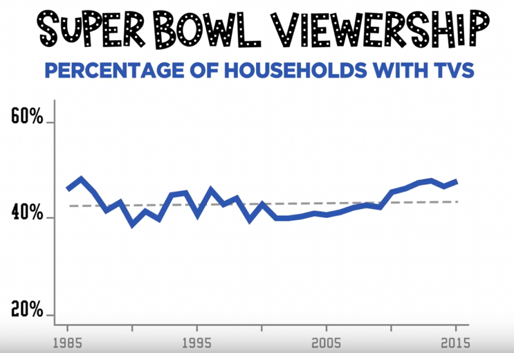
The ratings have actually held steady. Because while the number of football fans has increased, their share of overall viewership has not.
How about this graph: can it prove that college education is not worth the money (This is what Business Insider deduced from this chart):
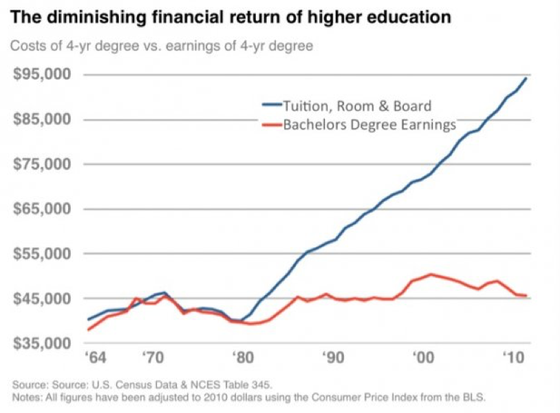
No. Because $45,000 is the average yearly income of a college grad in 2010. It’s per year. Not the net income over their lifetime. Also, the fact is, the cost of not going to college is even higher.
Let’s look at another example;
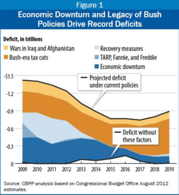
This graph shows the economic downturn and legacy of Bush policies drive record deficits.
This graph makes it look like the deficit has always been high, because the graph starts in 2009. This might make you to think that the deficit has been an ongoing problem. the truth is: The deficit was just 1.2 percent of GDP in 2007, when the housing market collapsed. When you want to show an economic downturn and record deficit, you should go back in time as far as possible to draw the whole picture.
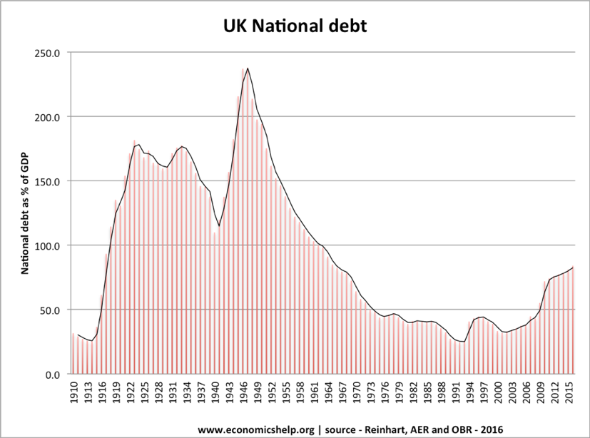
Here’s another one:
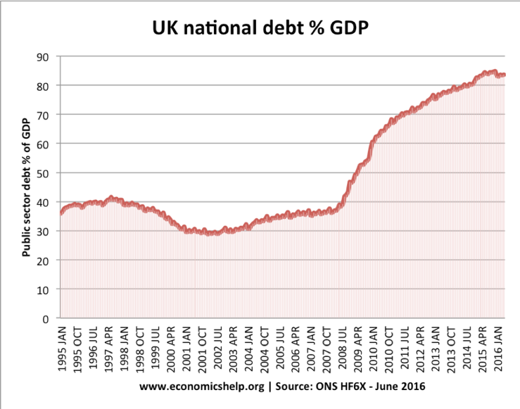
After seeing this graph, everybody would think that the UK national debt has been increasing recently and has reached the highest point in history. However, if we looked at the time previously, we can see the whole picture: the debt is actually much lower compare the 1940s.
- It’s just wrong
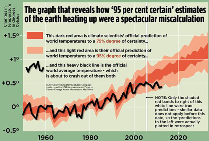
Here’s another global warming picture, from the British tabloid the Mail on Sunday. The newspaper used it to claim that global warming had stopped.
When we read newspapers, we often think the people writing the articles are experts. In fact, the journalist who wrote the article to go with this picture just didn’t understand what the graph was telling him. He made two errors:
There are two mistakes in this graph:
- The graph is showing air temperatures. In fact, air temperature is a very poor measure of global warming. Ocean temperature is a much more accurate measurement since most of the heat ends up trapped in the ocean.
- This is a very short-term graph. we need more data to see the whole picture.
This one is just wrong: we all know each component of the pie chart should add up to 100%.
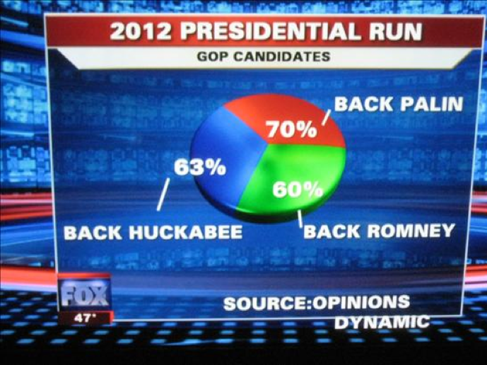
Same thing happened here:
It just doesn’t make any sense:
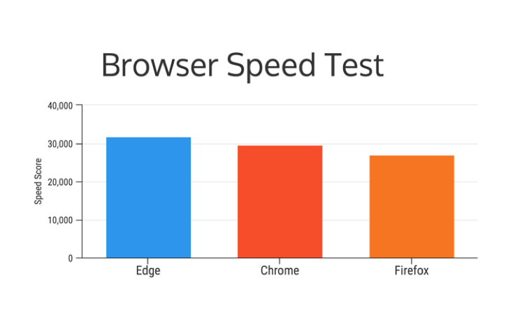
This is an advertisement from Microsoft.
Obviously, it is trying to convince the viewer that Microsoft edge is faster than Chrome and Firefox. Although that is true, it is only faster by a slight margin. From the graph it looks like Edge is 25% more faster than Chrome and 50% more faster than Firefox.
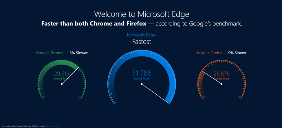
If we plot it differently, it looks something like this:
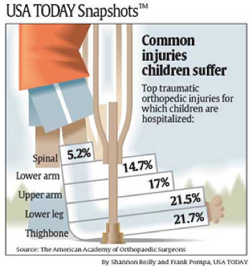
Let’s look at this graph:
You might think there’s nothing wrong with it, until you take a look at the heading: 5.2% of the common injuries children suffer are spinal injuries. That is a very scary number. The truth is: only 5.2% of traumatic orthopedic injuries are spinal injuries. And the number of spinal injuries is only about 2000 injuries per year, out of a population of 74,000,000 injuries. So the real figure is only around 0.000003%.