13 Using Statistics Canada and Interpreting Data to Generating Graphs
C Liu, A Razack, A Syed, A Wan
Feb 6, 2018
![]()
Introduction to StatCan:
Statistics Canada is a Canadian organization that collects and analyzes information on population demographics, resources, the economy, society, and culture.
Their mission: “Serving Canada with high-quality statistical information that matters.”
A few notes on how they collect information:
- There are hundreds of active surveys on all sorts of topics at any given time.
- Census data is collected every five years with the latest being in 2016, so it is fairly up-to-date. There are a lot of intricacies to combing through census information, as with any database, so here is a link with search help tips: http://www.bac-lac.gc.ca/eng/census/Pages/census.aspx.
Homepage:
https://www.statcan.gc.ca/eng/start
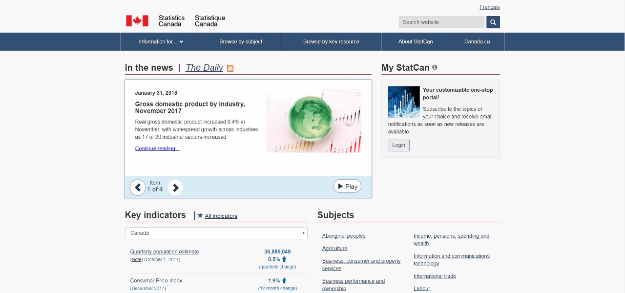
The homepage has quick links to important economic information like the quarterly population estimate, consumer price index, unemployment rate, etc. (Fig 1).
(Fig 1)
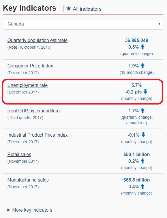
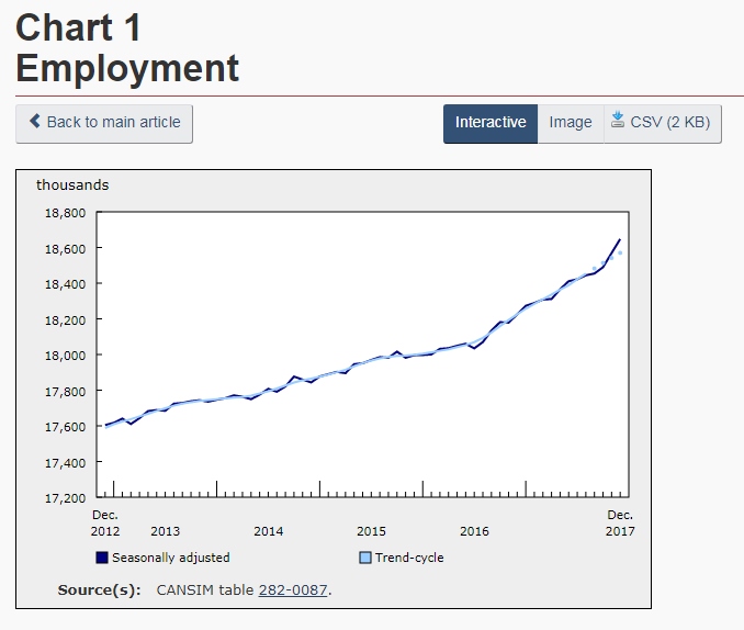
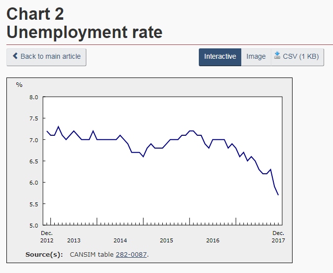
For example, under Key indicators, one can select Unemployment rate (Fig 2). This will open the page containing information on the labour force as of the date listed at the top of the page. Here, there will be a written report detailing the un/employment rates by region, different age groups, and some details on different industries. There are also line graphs displaying the employment and unemployment rates for the country for the past (approx.) five years (Fig 3 and 4).
(Fig 2)
(Fig 3)
(Fig 4)
Also on this page is a breakdown of the unemployment rate by province in bar graph format (Fig 5).
(Fig 5)
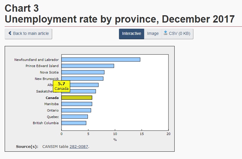
Clicking on the images will show an interactive graph as well as the raw data (below the graph) from which it was made. An image of the graph can be saved by clicking the button above the graph and saving the resulting image or the data can be saved in .csv format (button also above the graph) to be manipulated using other software.
CANSIM and searching for data:
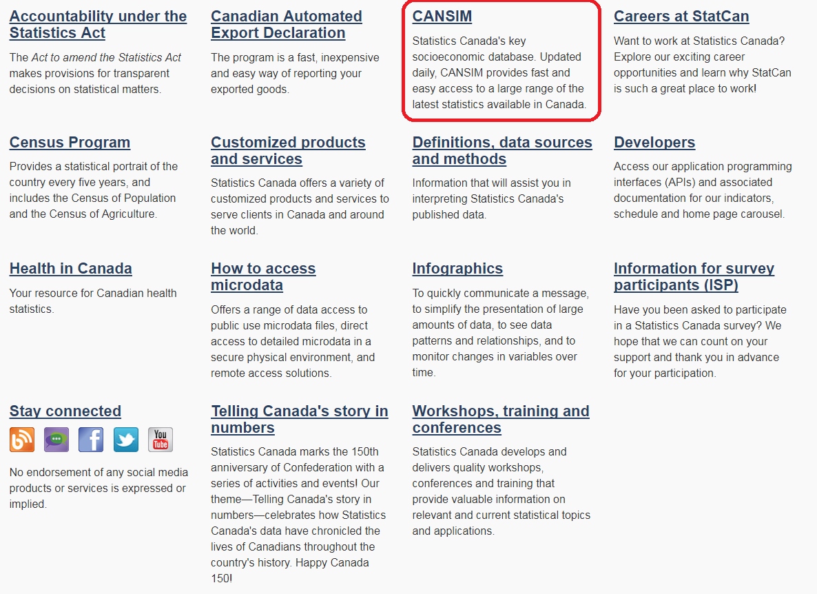
Back on the homepage, there are many links to browse by subjects: Aboriginal peoples, agriculture, etc. as well as additional links further below that lead to other important resources for data.
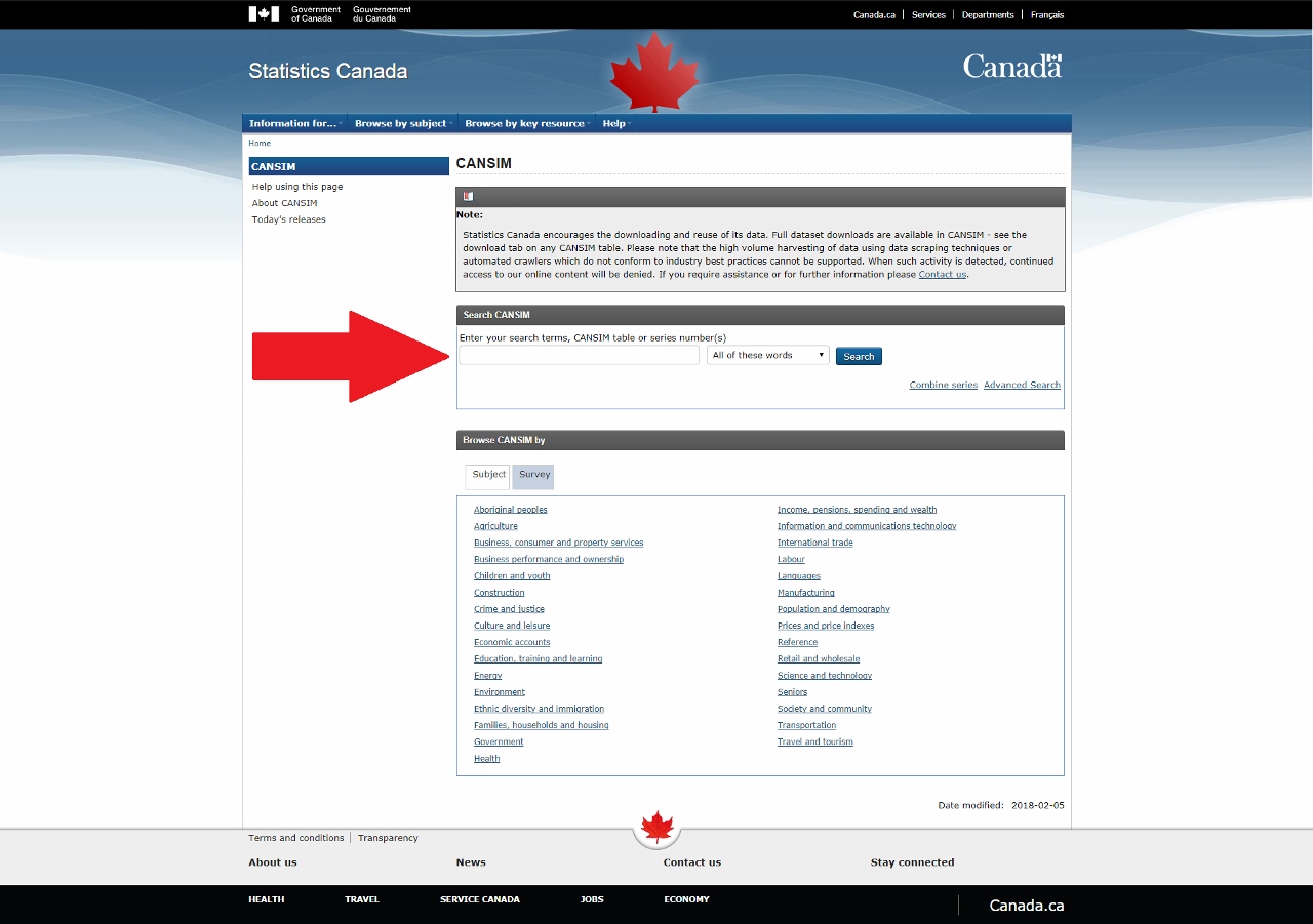
CANSIM (CANadian Socioeconomic Information Management system) is a database of socioeconomic information that has been generated from numerous surveys and is updated daily (Fig 6 and 7).
(Fig 6)
(Fig 7)
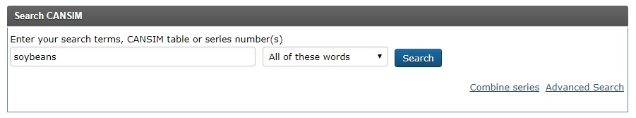
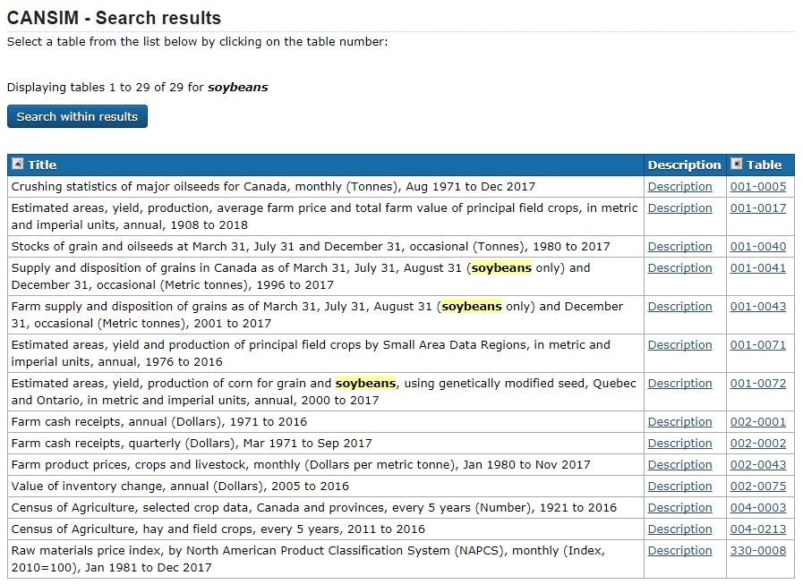
Let’s imagine that a person has a new biotechnological application that makes use of soybeans and is looking to build a new facility in Canada in a convenient location where there are a lot of soybeans. How would one go about determining what a good location would be?
Searching soybeans in CANSIM will bring up a list of tables that contain information on soybeans (Fig 8 and 9). Take a look at the titles. Clicking on the Description link will give more information on that specific table while clicking on the Table code link will open up the table containing the data.
(Fig 8)
(Fig 9)
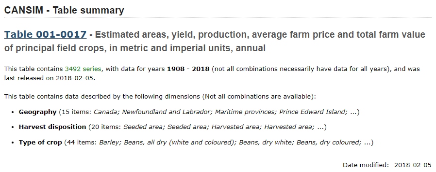
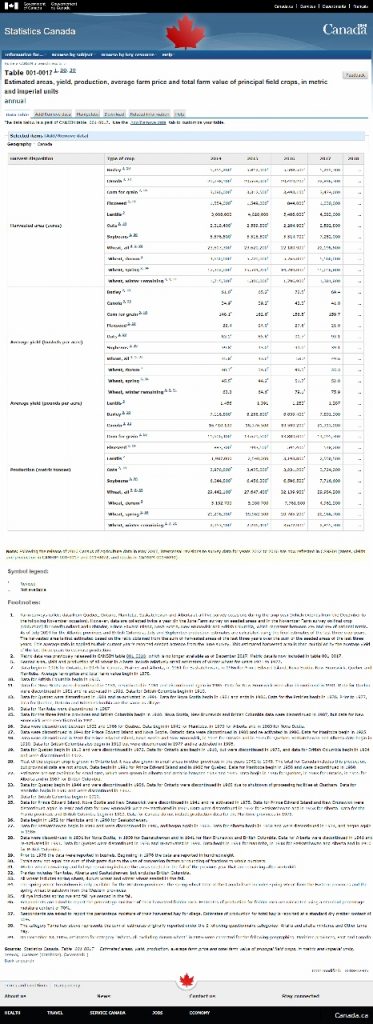
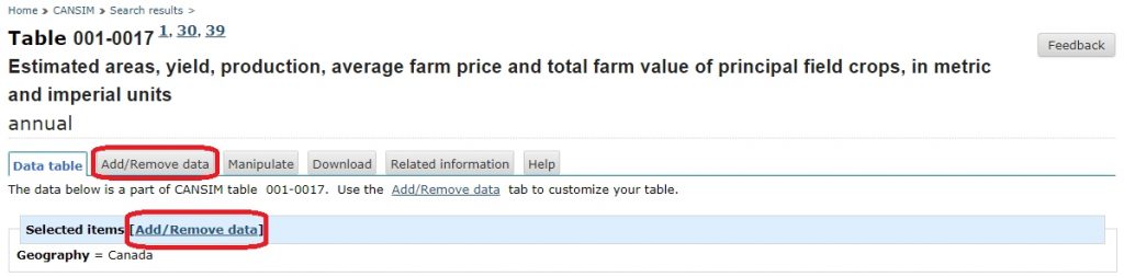
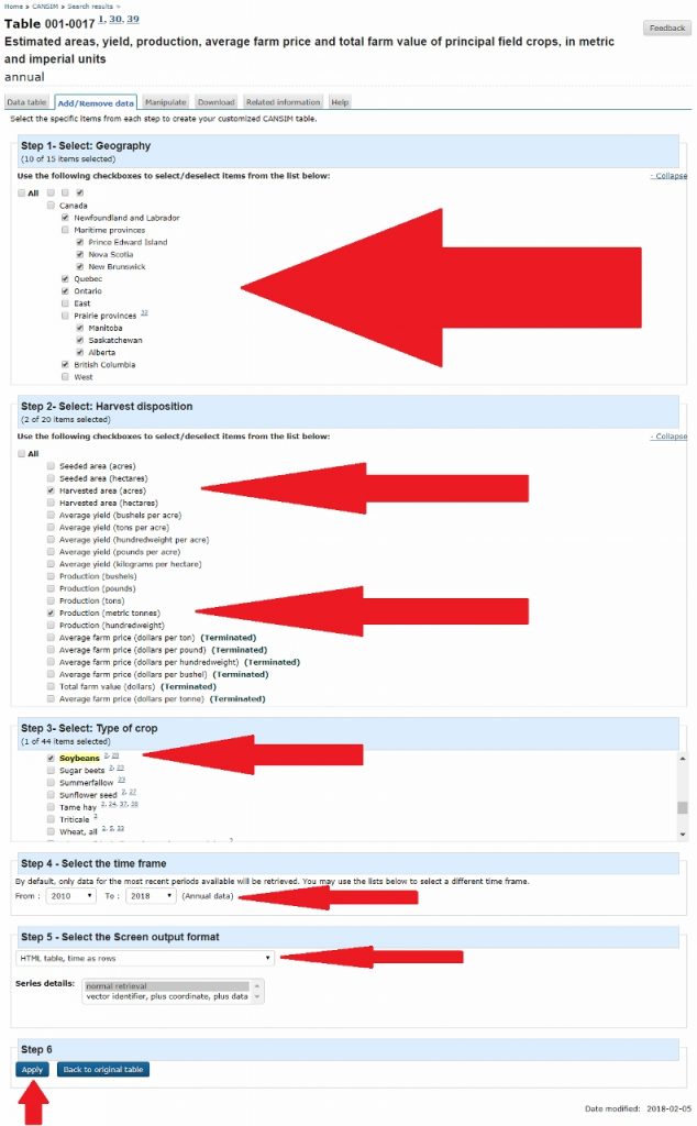
Based on the title and description, the second table looks like a good place to start (Fig 10). But after opening up the table, we see there is way too much irrelevant information (Fig 11). Let’s change that by selecting the “Add/Remove data” tab or link (Fig 12).
(Fig 10)
(Fig 11)
(Fig 12)
Here we can modify what data we are looking at by selecting the boxes that contain relevant information. For this example we will look at: each province (Geography); Harvested area (acres) and Production (metric tonnes) (Harvest disposition); Soybeans (Type of crop); select a reasonable time frame like the 2010 to 2018 (Select the time frame), and HTML table, time as rows (Select the Screen output format) (Fig 13).
(Fig 13)
Applying this will result in a table containing the data we selected (Fig 14). From there, a person can look at the trends in soybean farming for the listed provinces and decide where a good location to build would be.
(Fig 14)
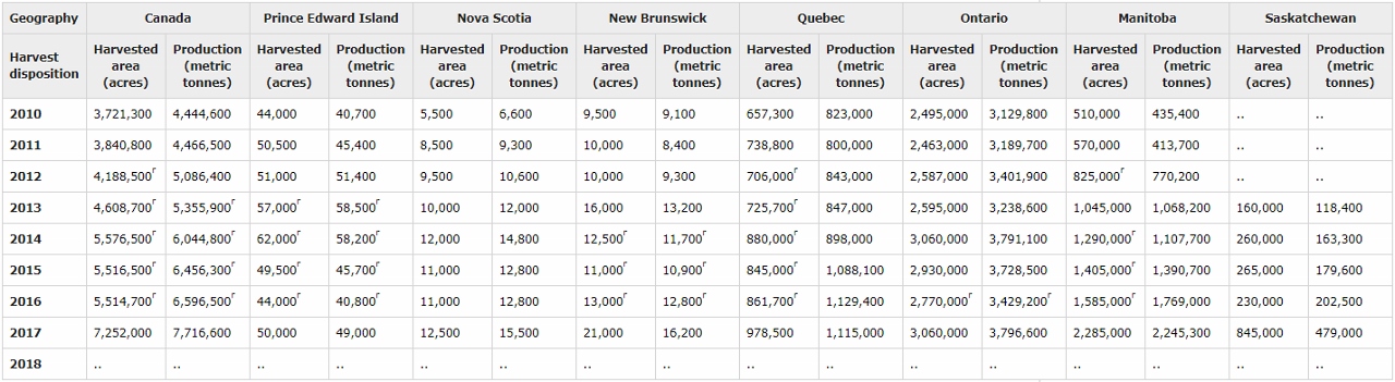
It is important to look at the footnotes to be able to properly interpret the data that has been generated.
Conclusion:
Statistics Canada is a useful, free, credible, and up-to-date source for information about Canada, socioeconomics, and many other topics. Please make use of everyone’s tax dollars and use it.
How to Interpret Data and Generate Appropriate Graphs
After obtaining your data from StatsCan or from another source, you must now be able to convey this data in the most appropriate way possible to get your point across.
What should be done first is determining what kind of data and how much you have
- If your findings are in structured numeric format with more than 4 numbers, using a table would be the best option
- If your findings have to do with relationships between numbers, such as comparing or showing trends, a graph will be a better option
Determining the type of graph would be the next step.
- Bar Graphs are best used to compare values when these values are important and the users will compare these between columns
- Pie Charts are best used when you want to visualize something as a whole
- Line Graphs are best used for continuous sets of data where a trend is to be shown
Lets use the following data as an example and see how it would best be incorporated:
Types of Apples consumed in Guelph on a monthly basis:
Granny Smith: 30
Honeycrisp: 53
Golden delicious: 81
Gala: 75
Red delicious: 162
Since we are trying to compare these values with each other the most appropriate graph to use would then be the bar graph.
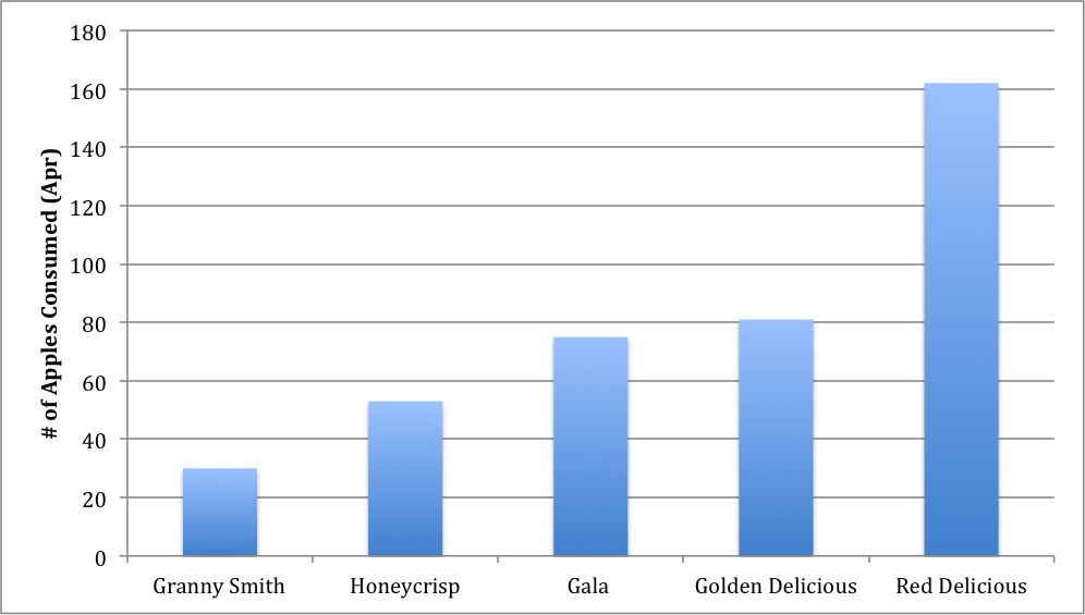
Figure 1: Types of apples consumed during the month of April in the City of Guelph
If this data was given slightly differently or if you are trying to represent the entire apple consumption in Guelph, we would be able to use a pie chart as we are visualizing the data as a whole:
Total Apples consumed in Guelph: 404
Granny Smith: 8%
Honeycrisp: 13%
Golden Delicious: 20%
Gala: 19%
Red Delicious: 40%
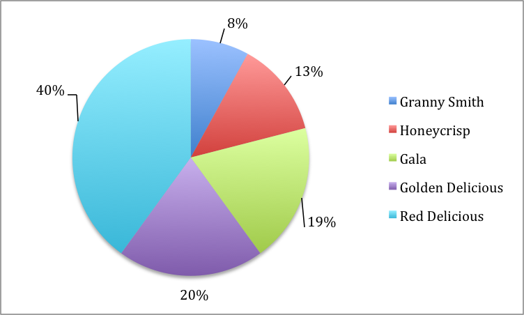
Figure 2: Types of apples eaten in the City of Guelph shown in percentages with a total of 404 apples consumed
If the data given was in the time frame of several months, for example, the most efficient way of displaying the information would be to use a line graph.
Total Apples consumed in Apr, May, Jun, Jul:
Granny Smith: 30, 37, 52, 59
Honeycrisp: 53, 60, 65, 57
Golden delicious: 81, 69, 89, 72
Gala: 75, 81, 89, 83
Red delicious: 162, 150, 161, 183
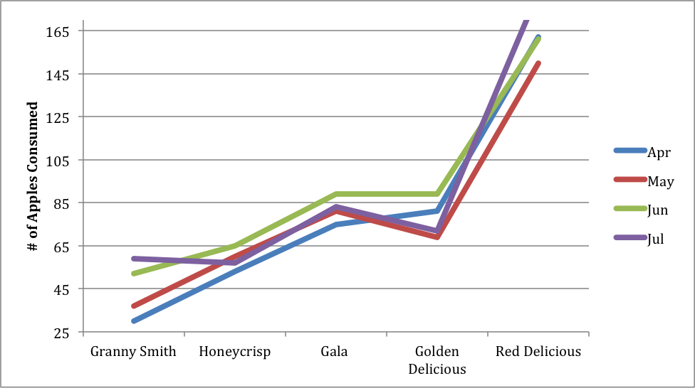
Figure 3: Various types of apples consumed in the City of Guelph over the time span of April to July
When you have a data set similar to the one above with 4 or more series of information, it may be more efficient to place said data into a table instead of to crowd a graph. A table would also be useful here to spotlight when each type of apple was consumed most during the time span.
Total Apples consumed in Apr, May, Jun, Jul, Aug, Sep:
Granny Smith: 30, 37, 52, 59, 55, 61
Honeycrisp: 53, 60, 65, 57, 67, 61
Golden delicious: 81, 69, 89, 72, 75, 76
Gala: 75, 81, 89, 83, 72, 82
Red delicious: 162, 150, 161, 183, 149, 159
Table 1: Consumption of various types of apples through the months of April to September in the City of Guelph
| Apr | May | June | July | Aug | Sep | |
| Granny Smith | 30 | 37 | 52 | 59 | 55 | 61 |
| Honeycrisp | 53 | 60 | 65 | 57 | 67 | 61 |
| Golden Delicious | 81 | 69 | 89 | 72 | 75 | 76 |
| Gala | 75 | 81 | 89 | 83 | 72 | 82 |
| Red Delicious | 162 | 150 | 161 | 183 | 149 | 159 |
With all of this in mind, it is important to remember that both graphs and tables must have titles and descriptions in order for the reader to understand what the figure represents.