11 Visualizing Your Data with Tableau
You can view this tutorial in PDF format here
INTRODUCTION
Tableau is a user-friendly platform for visualizing, analyzing, and sharing data. Its aim is to make easy-to-understand solutions based on raw data.
The platform can be easily used by individual analysts or scaled across a large organization. Tableau makes it simple for data from different individuals or departments to be combined or shared in one place.
There are multiple paid products produced by Tableau, each with unique services and customer segments:
Tableau Prep allows users to combine, shape, and clean their data from a variety of sources.
Tableau Desktop is the main platform for visualizing and analyzing data and turning them into interactive dashboards and reports.
Tableau Online allows you to publish your work online and share it with anyone you give access to.
Tableau Server gives you more control over who can see your work, and it is usually used to share data within an organization.
Tableau Public is a free service that allows you to create data visualizations from limited sources that must be published to the public server.
Tableau’s paid products enable users to collect data from a variety of sources, including Microsoft Excel spreadsheets, PDF files, and web-based data providers. Your work can even be updated live as your source data is updated. Tableau is also able to combine your data from multiple sources into one document.
Tableau can be used on desktop, tablet, or mobile, making it very convenient for sharing data with many users on a variety of platforms. Dashboards and other work can be shared with anyone you’d like to give access to it, whether by sharing links to your Tableau profile through social media or emails, or by embedding Tableau dashboards into your own website.
If you are interested in learning more about using Tableau beyond this introduction, there are hundreds of eLearning and live training opportunities available on the Tableau website. A variety of tableau certifications can also be identified through the website. More video tutorials can be found on YouTube, Lynda, or Udemy.
For an example of the power of Tableau in action, check out Western Carolina University’s profile on Tableau Public to see some of their interactive dashboards at this link
Tableau Public Tutorial
Use the following dataset to complete this tutorial!
FORMATTING AND UPLOADING DATA
It is important to ensure that data that is obtained from external sources is of good quality. If you choose to select data from online sources, choose websites that are reputable. Sites such as Statistics Canada or the World Health Organization are great resources. In the example throughout this tutorial we selected data from The Canadian Institute for Health Information.
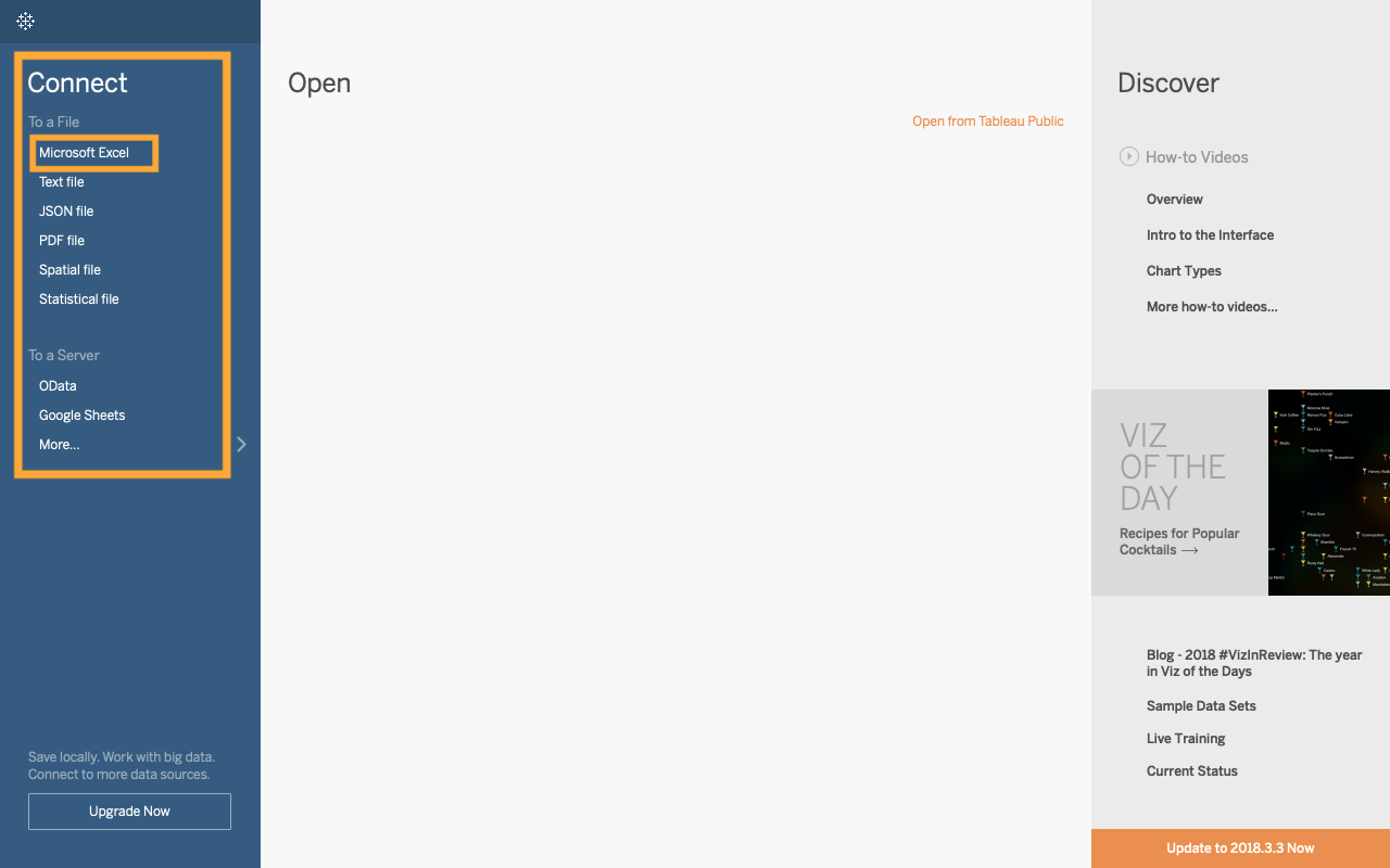
You are able to select from various file types when working with tableau.
Examples of acceptable data files include Excel files, PDF, or text files. Data can also be uploaded from servers such as Google Sheets.
The data needs to be in the correct format before uploading to Tableau
The data you want to use in Tableau should follow these guidelines.
1. The data should be granular as possible. This means that your data is detailed rather than just average values.
2. Ensure that there are no aggregated data (no total values)
3. All extra titles and notes should be removed. This excludes data headers.
4. Ensure that there are no blank cells or rows
5. The data should follow database format where it is row-oriented rather than column oriented. Tableau is optimized to work with row-oriented tables. This can be done either in Tableau or before you upload your data.
Here’s an example of how to reformat the data:
In order to optimize the data for tableau, the null data cells needs to be replaced with zeros. The extra notes at the top must also be deleted.
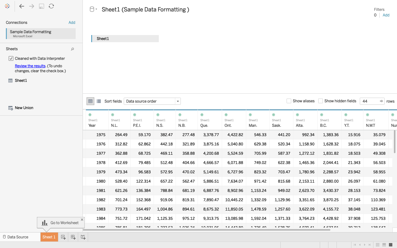
From here, you can reformat the table so that it is row-oriented. While holding the shift key, select the data that you want to be grouped together. In this example we want three columns, the year, province, and the expenditure. To achieve this, we need to group together all the province columns. After highlighting all columns we want to be grouped, click on the dropdown menu that appears in the heading of any province columns, and select pivot table. After pivoting the table you can rename your columns and being to work with your data set.
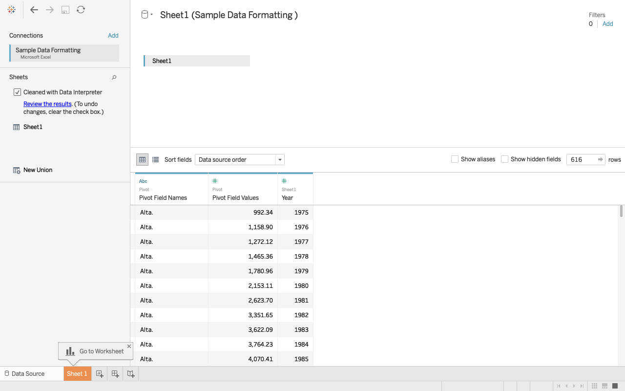
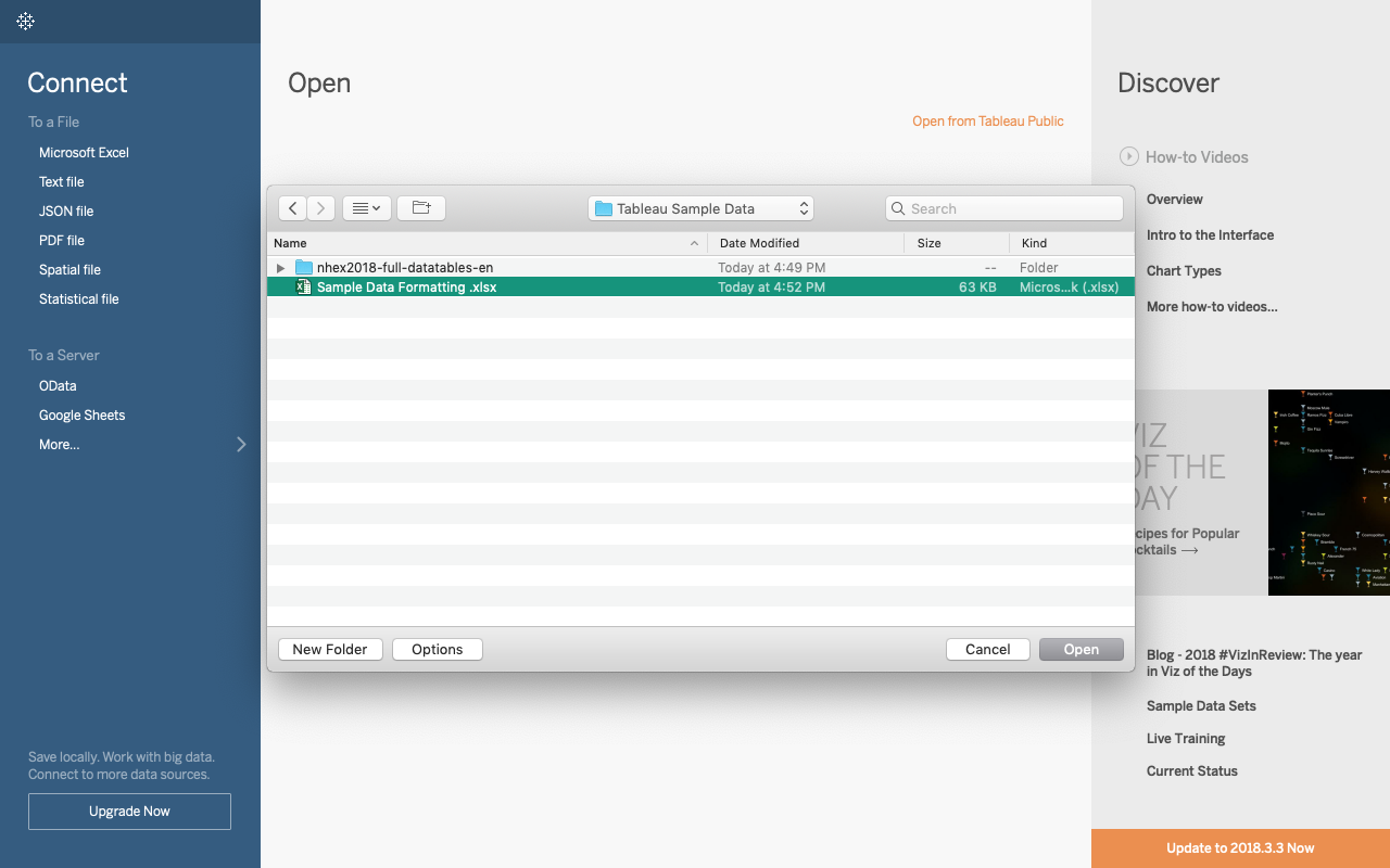
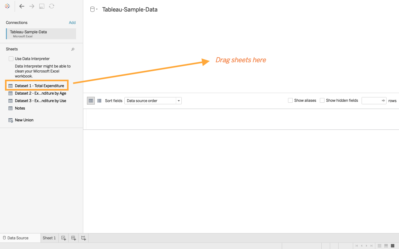
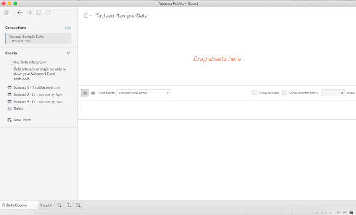
Tableau will allow you to select which sheet from the file you want to work with if you have more then one sheet in your excel file. To select a sheet, click and drag the file into the open space on the top half of the screen. During this stage you also have the option to clean up your data by checking the box on the left hand side of the screen.
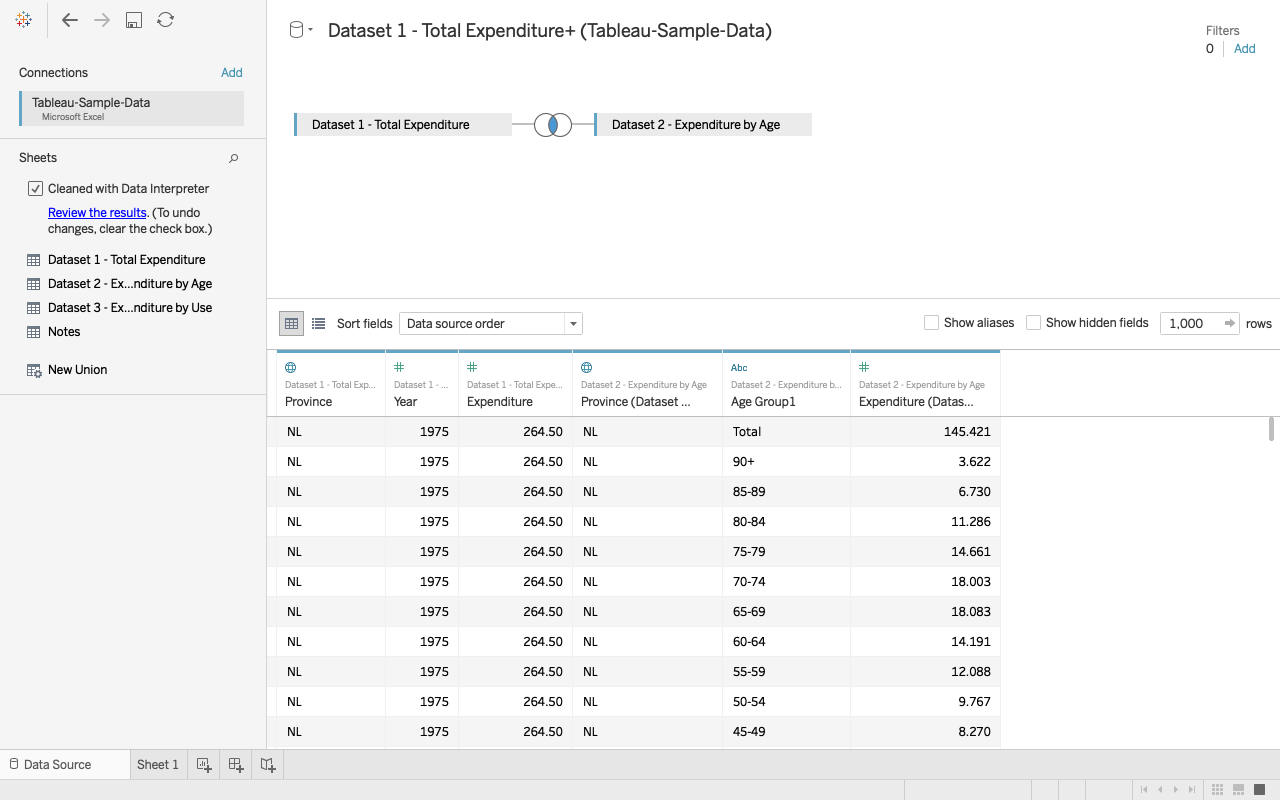
To combine a data set from two seperate sheets, click and drag the two sheets you want to the center space on the top half of the screen.
To begin manipulating and working with the data, select a sheet at the bottom left of the screen.
CREATING DATA VISUALIZATIONS
I. CREATING A MAP OF CANADIAN HEALTH EXPENDITURE BY PROVINCE IN 2016
Once you have uploaded your properly formatted geographic data your screen will look like this:
After cleaning the data and dragging the sheet to the centre, your screen should look like this: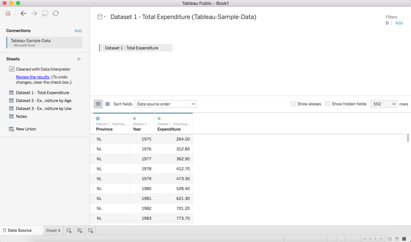
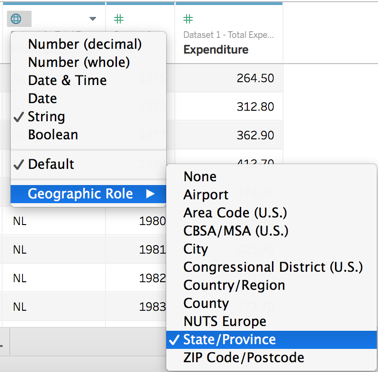
Your data is now connected, and Tableau has assigned a Data type to each column. Click the symbols in the header of each column to make sure it’s the type you want. In our case, we want to make sure the Province column is assigned a geographic role. When we click this icon, we see that Tableau recognized the Province codes and did it for us!
We can also see that Expenditure and Year have been assigned as Numbers which is also what we want. It’s important to know about this feature for future uses.
Now, on the bottom of your screen, you should see a tab labelled Sheet 1, click this. Your screen should now look like this:
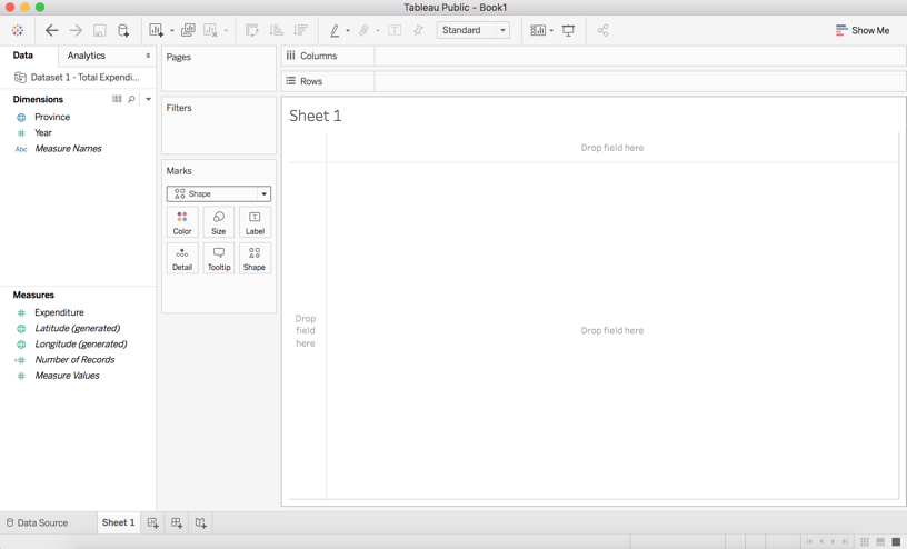
So now you’re in the worksheet and this is where you will build your map. On the left side of your screen is the Data pane. The columns of your data are listed as fields and assigned as Measures or Dimensions. Dimensions are usually qualitative data and Measures are quantitative, you can drag and drop fields into either of these categories to change their assignment if needed. You can see that Tableau automatically generated Latitude and Longitude Measures because we’re using geographic data.
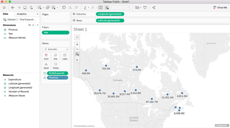
Now, to begin creating the map, drag and drop Province into the centre of your sheet. Your screen should now look like this:
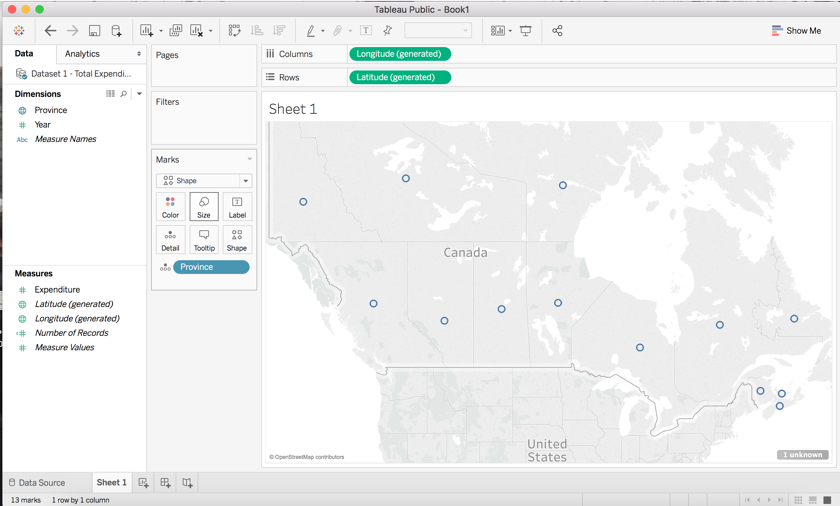
You will see that longitude and latitude have automatically been placed into the Columns and Rows shelves. You now have a basic map view that can be edited as you like by dragging and dropping other fields into the marks.
We are now going to drag Expenditure into Label:
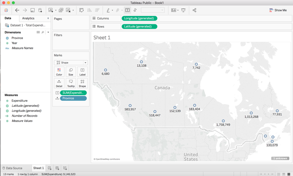
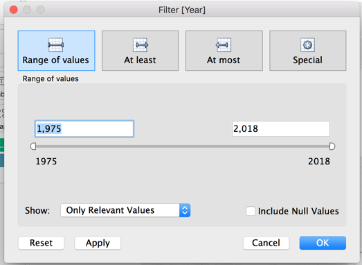
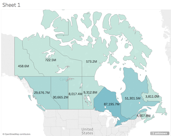
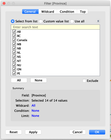
Now, each province has the sum of their health expenditures since 1975 labelled on the map. But, we only want the expenditure for the year 2016, so we have to place a filter on the map. To do this, we will drag Year from Dimensions into the Filters box. This box should appear.
Change the Range of values from 1975-2018 to 2016-2016 to just get expenditure data from the year 2016.
The expenditure labels should now change to look like the above image.
Now, we want to edit the label properties because we know expenditure is in millions of dollars. To do this, we click Expenditure in the Measures tab and the drop down menu should appear. Click on Default Properties and Number format.
(1)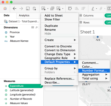
(2) 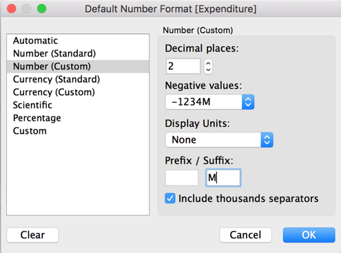
This allows us to change the properties of how Expenditures appear on our map. In the box that appears, (2), change the Suffix to “M”, so all the expenditure values will carry an M as in millions at the end. We won’t use the Display Units option because our units from our data are displayed in millions and it will not translate to the right amount with this set of data. In other cases, you can use this option. Also, set the Decimal places to 1. Your screen should now look like this:
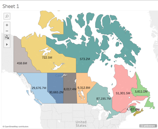
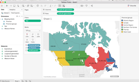
Next, we are going to colour our map based on the provinces. To do this, drag and drop Province from Dimensions to Colour in the Marks card. Make sure to change the marks tab to Map at this point from Automatic in the drop down menu. Each province is now coloured by region (see Image 1 below). You could also colour the map based on Expenditure if you chose to drag Expenditure to colour (see Image 2 below).
(1)
(2)
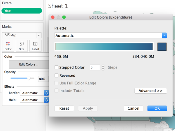
You can also click on Colours in the Marks card to edit and choose other colour schemes. Just click on Edit Colours after clicking on Colours, then click the drop-down menu underneath Palette, and choose the one you like.
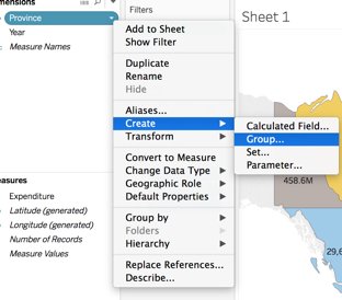
Next, we’re going to create custom territories in our map. This may be useful to look at trends in certain geographic areas on the map. To do this, click on Province in Dimension. From the drop-down menu, choose Create, then Group (Image 1). In the box that opens (Image 2), you can group provinces together based on custom sub-groups.
(1)
(2)
(3)
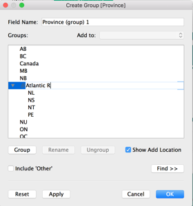
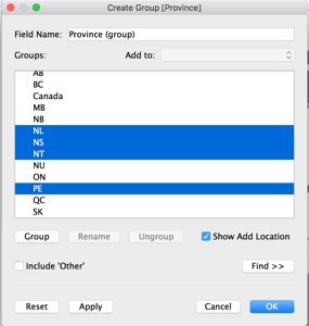
We are going to group ours based on regions in Canada. I am first going to select using the command key NL, NS, NT, PE to create a sub-group for Atlantic Canada (Image 2), click Group, then name it Atlantic Region (Image 3). I can repeat this for all regions in Canada. Click OK when finished to create all the groups and return to the main page.
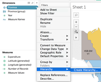
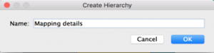
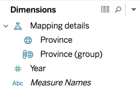
Now returning to the main page, I should see under Dimension a field called Province (group). If I drag this new field to the Marks section, it can be applied in a variety of ways to the map. But, I want to apply it in a way to create a map that groups expenditures based on these regions. So, I need to create a hierarchy of my geographic region fields. To do this, I will click on Province in Dimensions and select Hierarchy from the drop-down menu and then create Hierarchy (Image 1). From the Hierarchy dialogue box that appears, name the Hierarchy something, such as Mapping details (Image 2), then click OK. Province will now appear under Mapping details in Dimensions. Drag Province Group under this Hierarchy as well. Dimensions should now look something like Image 3.
(1)
(2)
(3)
Having this Hierarchy made will now allow us to visualize expenditures based on the geographic regions we created.
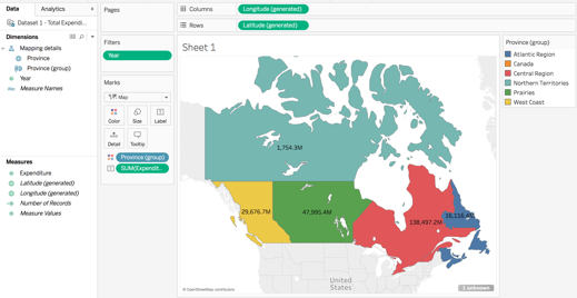
To do this, I will drag Province (group) to Colour in the Marks box. You will see the map will change and be coloured by the geographic regions (Image 1). Then, I will remove Province from the Marks box, and the expenditures for each province will sum to the region (Image 2):
(1)
(2)
Now I want to compare expenditures by region and province, so I want to create a dual axis map. So, I will drag Longitude or Latitude to the Columns or Rows shelf, respectively, depending on what axis I want my second map to appear (Longitude → Columns for besides one another, Latitude → Rows for on top of one another). For this example, I want the maps beside one another like so:
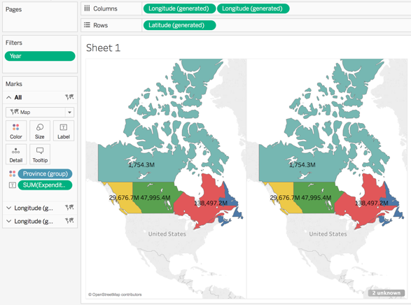
Now to change the map on the left to display expenditure by province, I will click on Longitude Generated tab to open up a Marks for just the left province. Here, I will drag Province from Dimensions to Colour. The map on the left should change to show expenditure by province, while the right map remains the same. Your screen should look like this:
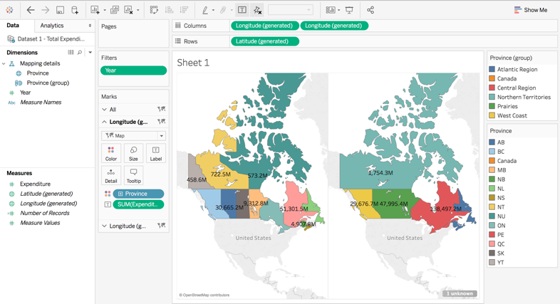
Congrats! You now have a Dual Axis Map to compare between provinces and regions the healthcare expenditures of each.
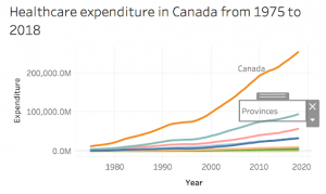
II. CREATING A LINE GRAPH OF CANADIAN HEALTH EXPENDITURE BY PROVINCE IN 1975-2018
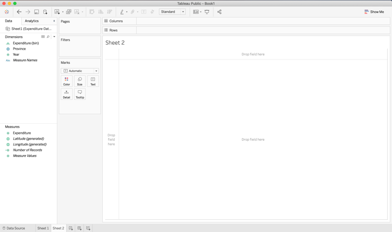
Next, we are going to create a line graph of each province’s health expenditure from 1975-2018. We are going to continue to use the same data as in the previous example, so we do not have to return to the data source tab. Click on “New Worksheet” located at the bottom right of your screen next to Sheet 1 to add a new sheet. Your screen should now look like this:
To begin building your line graph, double click on “Expenditures” in the Measures field. Your screen should now look like this:
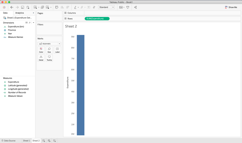
You will see that Tableau has summed the health expenditures from the years 1975 to 2018 and has placed this value in the Row shelves.
We are now going to double click on “Year” in the Dimensions field.
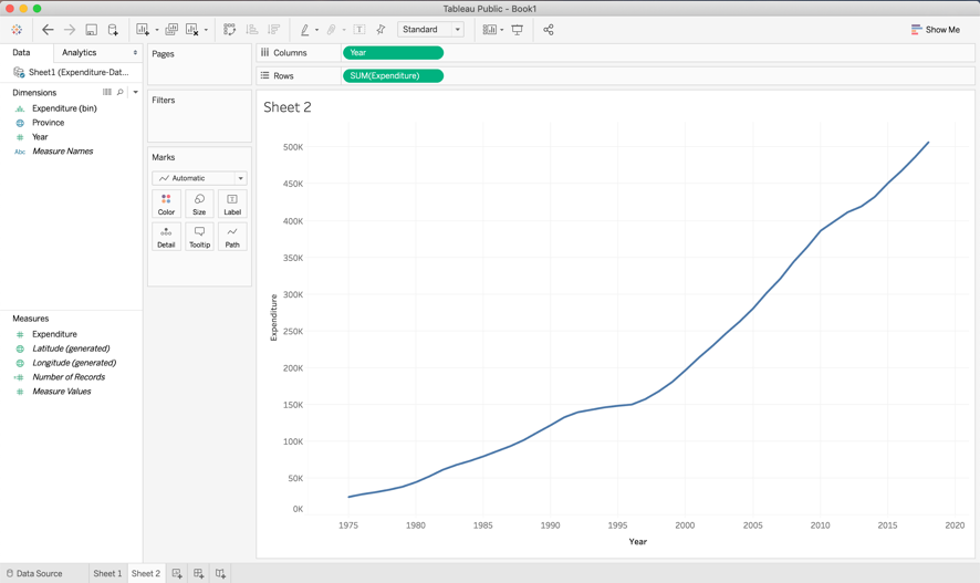
This line graph is showing the summed health expenditures across all provinces on the x-axis and year on the y-axis. We can continue to edit this graph to compare health expenditure by each individual province. To do this, double click on “Province” in the Dimensions field.
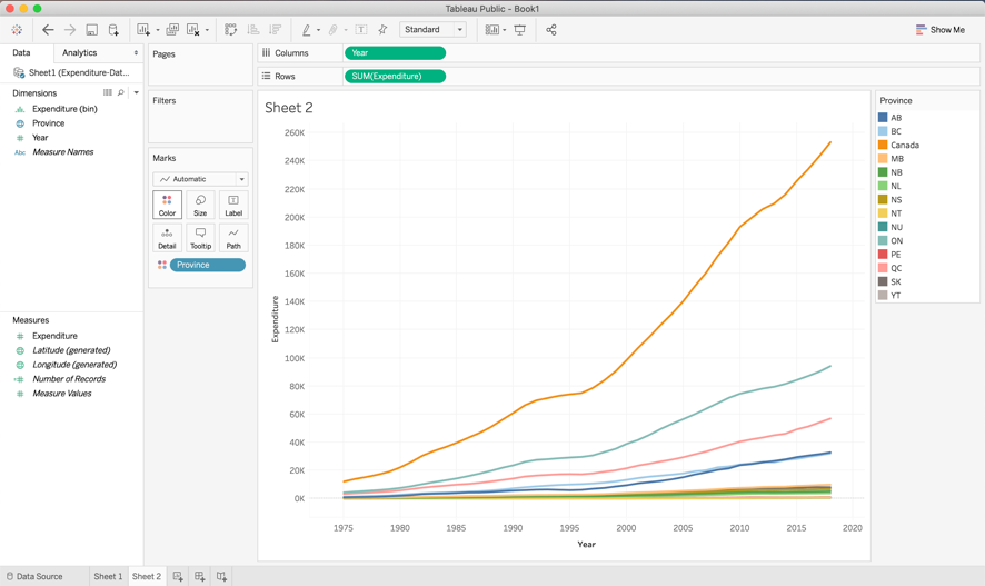
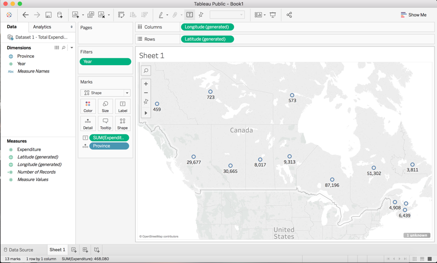
You will see that the summed health expenditure for all of Canada is still be represented on the map, which is denoted by the orange line. We can edit this by dragging “Provinces“ from the Dimensions field into the Filters box. This box should appear:
De-select “Canada” and then press “OK”. Your graph should now look like this:
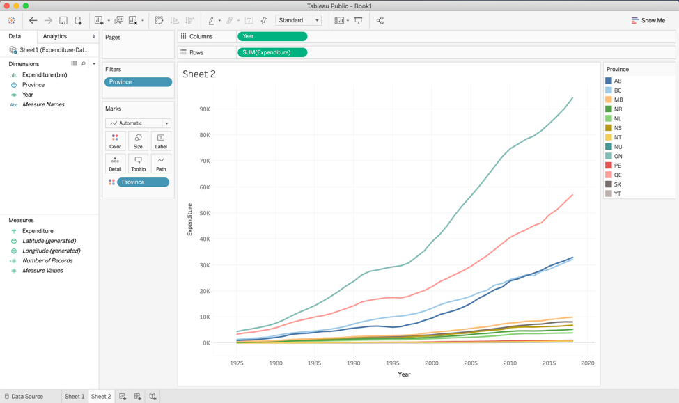
You can change the colour schemes of the line graph similar to how we changed the colour on the map in the previous example. Just click on “Color” and then “Edit Colors” and select the palette of your choice from the drop-down menu.
III. VISUALIZING THE PROPORTIONAL DISTRIBUTION OF HEALTH CARE EXPENDITURE AMONG AGE GROUPS IN CANADA
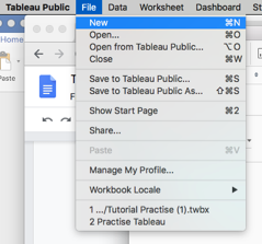
This section uses a new set of data. To create a new Tableau Public workbook with the new data, click the “New” button under the “File” tab.
Using the same data uploading method as earlier, select “Dataset 2 – Expenditure by Age” from the sample data and open a new sheet.
There are several methods of visualizing the proportional distribution of data in Tableau Public. On the first sheet, you will be creating a stacked bar graph comparing health care expenditures between provinces while also visualizing the distribution amongst age groups. On the second sheet, you will create a pie chart that visualizes the distribution of Canada’s total expenditure among age groups.
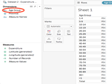
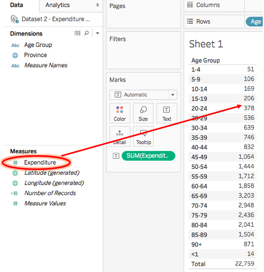
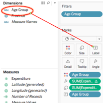
On the first sheet, start off by double-clicking on the dimension “Age Group.” A chart should appear showing the age groups.
Next, drag the “Expenditure” measure onto the undefined data column (Containing “Abc”) on the chart. The chart then lists the total Canadian expenditure for each age group.
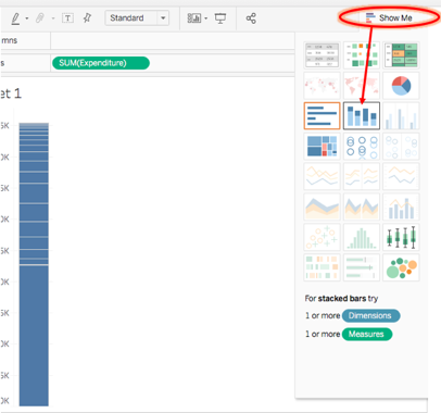
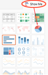
Click on the “Show Me” tab at the top right of the page to display a variety of data visualization techniques. If you already see the bar open, do not click on it. Then, select the “stacked bars” option to transform your data chart into a stacked bar graph.
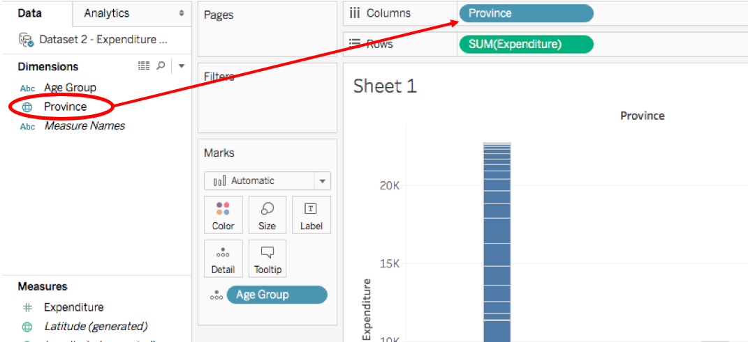
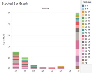
Now, divide the expenditure data into its provincial distributions. Do this by dragging the “Province” dimension into the “Columns” bar near the top of the page.
Now to add some colour to the graph to visualize the proportions better. Drag the blue “Age Group” mark to the “Color” square.
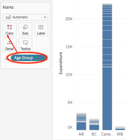
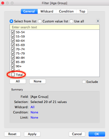
You may notice that half of each bar is one colour. This is because the “Total” value for each province is still being included. To remove this measure, drag the “Age Group” dimension to “Filters” and de-select “Total” in the “General” tab. If you wish to also remove the large bar that represents Canada’s total expenditure from the graph, repeat this step with the “Province” dimension and de-select “Canada” from the list.
Your stacked bar graph is now complete! If you wish to make the graph larger or smaller, press shift+command+B or command+B, respectively. Or you can go to the “Cell size” option in the “Format” tab.
Open a new sheet again to get started on your pie chart. To begin, double-click “Age Group” and drag in “Expenditure” the same way you did to start your stacked bar graph. You should again end up with a chart displaying age groups in the left column and their respective expenditures in the right column. This time select the “pie charts” option from the “Show Me” menu.
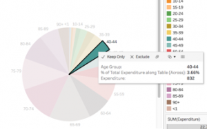
Just as you did so when making the stacked bars, add filters to remove data from the “Total” age group. You should now have a pie chart with a slice & colour representing each age group.
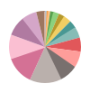
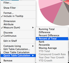
When hovering over each slice, the respective age group and expenditure value should be displayed. Another helpful piece of information is the percent of the total expenditure allocated to that age group. To add this info, click the arrow on the right of one of the green “SUM(Expenditure)” buttons in the “Marks” box. Then hover to “Quick Table Calculation” and select “Percent of Total.” This both ensures that the slices of the pie are proportionate to their respective percent of total expenditure, and will also display this information when you click on a slice of the pie chart.
To add labels to the pie chart, drag the information that you want labelled onto the “Label” box. For example, you can label the slices according to age group.
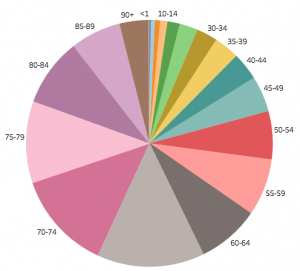
Your pie chart should now be complete! Again, if you wish to make the chart larger or smaller, press shift+command+B or command+B, respectively. Or you can go to the “Cell size” option in the “Format” tab.
Congrats! You can now visualize the proportional distribution of your own data! You’re also ready to add that data to an interactive dashboard!
CREATING A DASHBOARD WITH TABLEAU PUBLIC
Dashboards are a great way to combine your data visualizations and have them interact with one another. A lot of businesses use dashboards to keep up-to-date in real time about key performance indicators at a glance. In this example, we will combine just two of our data visualizations, the map and the line graph from the first section of the tutorial, but in reality, it can be used to combine many visualizations at once.
The first step in creating your dashboard is to open up the Dashboard tab at the bottom of the screen:
After clicking this icon, your screen should open to this:
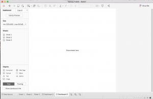
This is your Dashboard Sheet. On the left side you can see that there is a list of the sheets you have made from your current data source.
To build your dashboard, drag the sheet you want in to the centre where it says Drop sheets here. For our purposes, we will need to drag Sheet 1 and Sheet 2 where the map and line graph are saved. When you drag, you will notice an area of your screen will shade over where your graph will drop when you put it down. Organize your dashboard to look like the following:
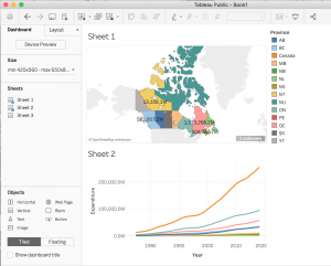
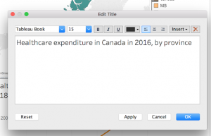
Now to add titles to the graphs that were chosen, double click on the automatic titles generated based on the sheet name, and a new window should appear, type in a title that describes the graph like so:
We can also add additional titles and objects to the dashboard by choosing an object from the Objects side panel and dragging it to the dashboard. We are going to add titles to the bottom line graph to differentiate between the Canada line and the provinces. To do this, drag ![]() to the area near the orange line that corresponds to the sum of all provinces expenditure throughout the years. Type in “Canada”. Drag
to the area near the orange line that corresponds to the sum of all provinces expenditure throughout the years. Type in “Canada”. Drag ![]() once more to label the remaining provinces. Your bottom graph should look like this:
once more to label the remaining provinces. Your bottom graph should look like this:
Now, to add an interactive layer between the graphs, we can choose a graph that can act as a filter to the other. We will choose the line graph to act as a filter to the map. To do this, click on the line graph and a grey sidebar should appear. From this bar, click the filter icon to use this graph as a filter:
 \
\
Now, when you click a given line, it will be highlighted on the above map:
Congrats, now you have an interactive dashboard that is ready to be published or saved!
CREATING A STORY WITH TABLEAU PUBLIC
With Tableau public, you are able to organize your data in order to tell a meaningful story. This is beneficial when you are doing a presentation, creating an article, or uploading to a website, as it helps your audience understand your data.
Stories are created through assembling the different worksheets and dashboards. We can highlight important data points, add text box and pictures to help convey our story. However, there are many different ways to tell a story. For example, one technique is called “tailoring in” where the story starts with a big picture view and zooms in on a specific detail. In contrast, a story can also be told by starting with a case and zooming out to that big picture view.
We are going to return to our health expenditure worksheets to create a tailoring in story and illustrate the changes in Canada’s spending in a meaningful way.
To begin, select “New Story” at the bottom right of your screen.
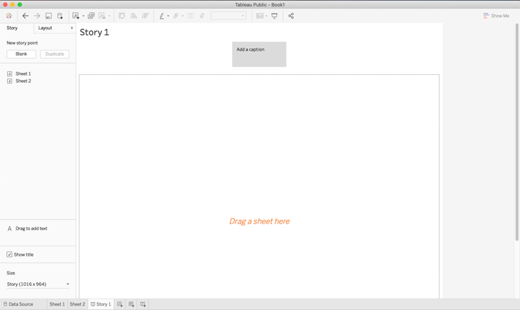
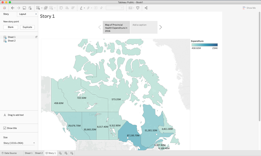
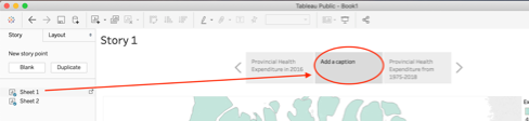
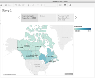
Drag “Sheet 1” and “Sheet 2” on to “Drag a sheet here”. We can rename each storyboard by clicking “Add a caption”. Rename Sheet 1 to “Provincial Health Expenditure in 2016”.
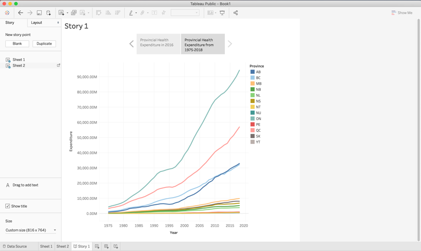
Use the arrows located on the side of the caption field to navigate to Sheet 2. Click on “Add a caption” and rename Sheet 2 to “Provincial Health Expenditure from 1975-2018”.
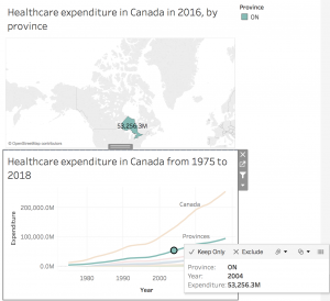
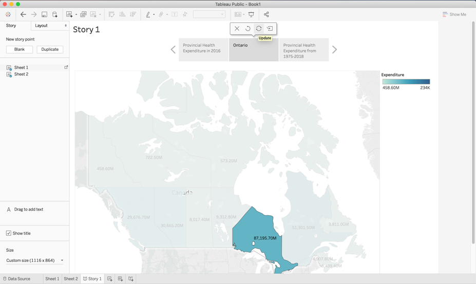
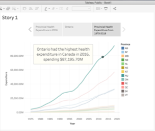
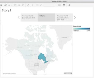
In this story, we are going to narrow in and draw attention to the province or territory that is spending the most amount of money on health. Drag an additional copy of “Sheet 1” and drop it between the two existing sheets. Select “Add a caption” and rename it to “Ontario”.
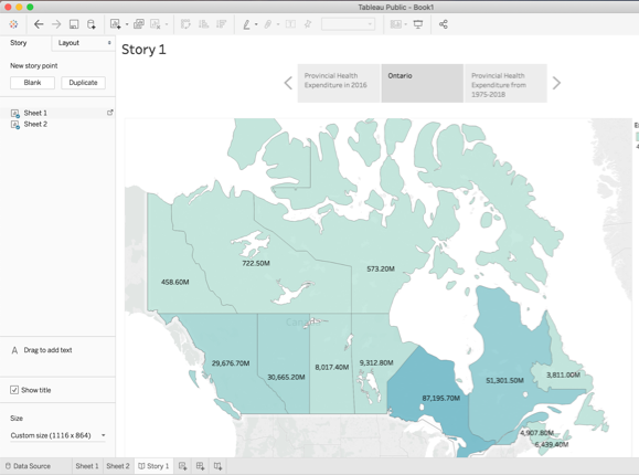
On the map, click on the province Ontario and then navigate to the caption field and select “Update”. Your screen will show Ontario highlighted from the rest of Canada.
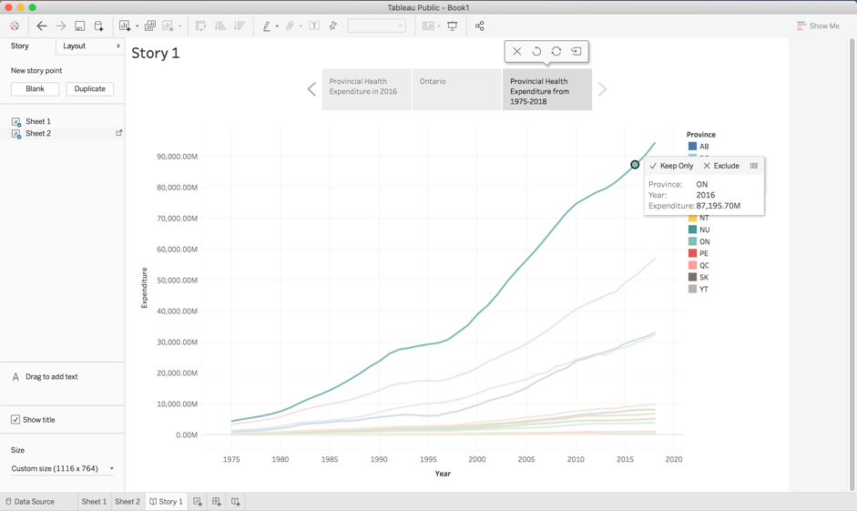
Select the right arrow to navigate to “Provincial Health Expenditure from 1975-2018”. Hover over the line representing Ontario and select the data point representing health expenditure during the year 2016. Then click “Update”. Your screen should look like this:
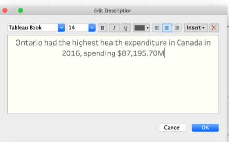
We can add a textbox to label the highlighted pointed by dragging “Drag to add text” on to the line graph. Write a key message in the textbox, such as “Ontario had the highest health expenditure in Canada in 2016, spending $87,195.70M”. Select “OK”.
You can the edit the text box by selecting “More options” which will open a drop-down menu. Expand the text box by dragging the borders in order to show the full message.
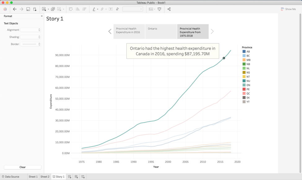
We have now created a story with three sheets of how Ontario had the highest health expenditure in the year 2016. If you choose to add a dashboard, it will allow your audience to play with data. You can navigate between the story as shown below:
SAVING AND PUBLISHING YOUR TABLEAU PUBLIC WORKBOOK
Once satisfied with your workbook, which includes sheets, dashboards, and stories, you can publish it to the Tableau Public website. This is the only way to save your work when using Tableau Public, so make sure to do it if you wish to return to the workbook in the future.
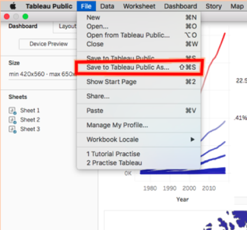
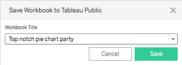
Once ready to publish, select the “Save to Tableau Public As…” option under the “File” tab.
From here, you will likely be prompted to log in to the Tableau Public website. You can create an account for free if you have not already. If you are not prompted, you are already logged in and can ignore this step.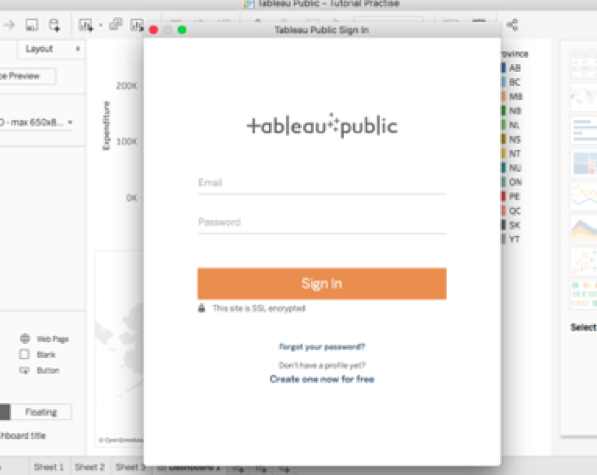
Then, create a title for your workbook.
Your workbook will then be uploaded to the Tableau Public server. This may take a couple minutes.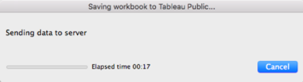
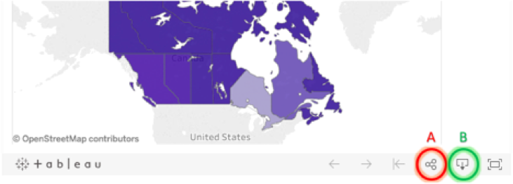
You will then be directed to the webpage on which your workbook is publicly available for download. Your workbook has now been published and saved! This page includes information on you, including a link to your Tableau Public profile, as well as additional information on the workbook. There are several options for making use of your work data visualizations that can be found at the bottom right of the workbook image.
By clicking Share (A), you can get the code for embedding the workbook into a website or the link to find the workbook on tableau public. The Share button also gives you the option to share your work over email, Facebook, or Twitter. By clicking Download (B), you or any other Tableau Public users can download your workbook and make use of the data themselves.
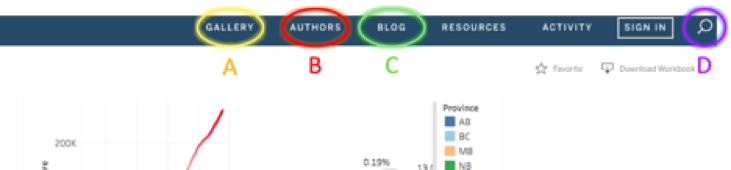
On Tableau Public, all saved data visualizations are uploaded and available to all other users. This means you can use other users’ work for your website, presentations, or research as well. To search for interesting data, there is a search function (D) at the top right corner of the webpage, along with highlighted visualizations (A), authors (B), and blogs (C).
When you wish to access your published workbook, or any public workbooks you’ve downloaded, in the future, simply open the Tableau Public application and your workbooks will be there waiting for you!