11.5 Data Visualization and Dashboards

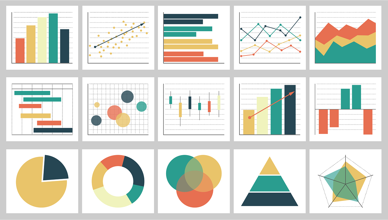
Data visualization is the graphical representation of information and data. These graphical representations (such as charts, graphs, and maps) can quickly summarize data in a way that is more intuitive and can lead to new insights and understandings. Just as a picture of a landscape can convey much more than a paragraph of text attempting to describe it, graphical representation of data can quickly make meaning of large amounts of data. Many times, visualizing data is the first step towards a deeper analysis and understanding of the data collected by an organization. Examples of data visualization software include Tableau and Google Data Studio.
Dashboards
Dashboards are a type of data visualization that provide a heads-up display of critical indicators, letting managers get a graphical glance at key performance metrics. Some tools may allow data to be exported into spreadsheets. Even the lowly spreadsheet can be a powerful tool for modelling “what if” scenarios and creating additional reports. However, if data can be easily exported, then it can potentially leave the firm dangerously exposed, raising privacy, security, legal, and competitive concerns.
These dashboards help to study and simplify data from different databases, files and different web sources so you can monitor your business more effectively. It helps us to understand the old trends, data and also manage real-time information. These dashboards look similar to automobile dashboards, and just like you take a look "under the hood" to find a problem with cars, it is advisable to to look "under the hood" for problems the businesses may be facing. This will help the decision makers simplify the data analysis process and make better faster data-driven decisions.
Difference Between a Dashboard and a Report?
Dashboard and reports are similar as well as different. Both provide past data and bring different metrics together. However, reports are more like a snap-shot. They are static while dashboards are more live and interactive. The reports give information on areas of interest but dashboards keep an eye on these areas.
Importance of Dashboards
- More value out of your Data: A properly designed dashboard is a fantastic tool to gather information and integrate cross-functional operations so as to better the core business metrics. Anyone on the team can use the dashboard and get meaningful insights so that the decisions are beneficial for the business.
- Consolidate multiple data points: Dashboards bring the data from different metrics together on a single interface, so the reports can be compiled more easily, quickly and more meaningfully.
- Align teams and departments: Dashboards provide a very clear and objective picture of what is currently happening and what is impacting the performance. They make the data very meaningful and understandable for all the teams to and departments, which would aid proper co-ordination between the overall organization.
Types of Dashboards
There are three types of dashboards: operational, strategic, and analytical. It becomes imperative for any business to understand which one is the right type.
- The operational dashboards give us a idea of what is happening now.
- The strategic dashboards keep an eye on the Key Performance Indicators (KPI).
- The analytical dashboards depend on data and help to identify the various trends.
Operational dashboards
Operational dashboards look into the current situation and answer: “What is happening now?” This dashboard will monitor real-time data against key metrics and KPIs. These can be used for your daily operations and contain contextual information, which facilitates the decision making process for any business.
Metrics you can track on an operational dashboard
- Website performance metrics like new users, bounce rates etc.
- Count of follower and activities like comments, likes etc. on social media channels.
- Return on ad spending to evaluate the digital advertising expenditure (Hayward, 2023).
Strategic Dashboards
Strategic dashboards are generally used by executives to keep and eye on the KPIs. These require less frequent updates of data as compared to the operational dashboard. These help the executives to summarize performance and keep and eye on the effectiveness of the work they do over a period of time (month, quarter, or year).
Metrics you can track on a strategic dashboard
- Monthly, quarterly, or yearly performance (fiscal or non-fiscal)
- Accounts and and new openings, growth rate.
- Earnings before interest, tax, depreciation, and amortization (EBIDTA) (Hayward, 2023).
Analytical Dashboards
Analytical dashboards generally analyze larger amounts of data. They are very helpful to understand and identify trends, insights and establish targets based on the information they unearth.
Metrics you can track on an analytical dashboard
- Annual contract value to understand what an average customer contract is worth
- Company spending habits (Hayward, 2023).
The following table will help you take a decision on which is the best dashboard for your business depending on the reporting requirements.
Table 11.5.1 Choosing the Right Dashboard Based on Business Reporting Requirements
What question are you looking to answer? |
Best Fit: Operational |
Best Fit: Strategic |
Best Fit: Analytical |
|---|---|---|---|
| What problem are we trying to solve? | Increased data awareness and access to time-sensitive data | Line of sight into top-line organizational KPIs | Access to trends or deeper insights |
| Who will use the dashboards? | Managers and their teams | Directors and executives | Analysts and executives |
| What gaps exist in our performance? | Daily performance | Monthly, quarterly performance | Performance issues, weekly performance |
| What are our goals? | Increased employee awareness and tracking against goals | Setting strategic goals, achieving KPI targets | Setting analytics goals and increased visibility into key processes |
| Source: Hayward, 2023. | |||
"12.8. ANALYSIS AND REPORTING TOOLS" from Information Systems for Business and Beyond by Shauna Roch; James Fowler; Barbara Smith; and David Bourgeois is licensed under a Creative Commons Attribution-NonCommercial-ShareAlike 4.0 International License, except where otherwise noted.

