Application: data visualization by projection on a line
- Senate voting data
- Visualization of high-dimensional data via projection on a line
- Examples
Senate voting data
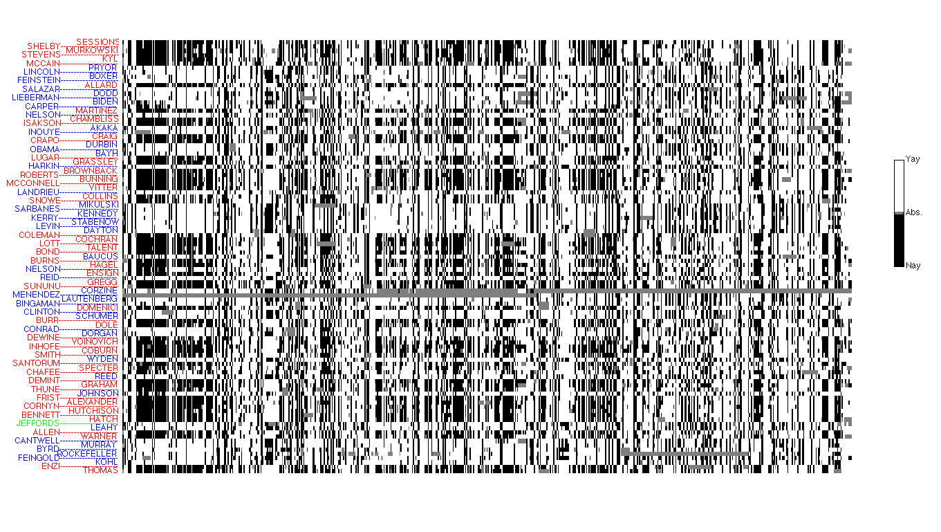 |
In this section, we are focussing on a data set containing the votes of US Senators. This dataset can be represented as a collection of  vectors vectors  , ,  in in  , with , with  the number of bills, and the number of bills, and  the number of Senators. Thus, contains all the votes of Senator the number of Senators. Thus, contains all the votes of Senator  , and the , and the  -th component of contains the vote of that Senator on bill . -th component of contains the vote of that Senator on bill .
Senate voting matrix: This image shows the votes of the Source: VoteWorld. |
 ‘s, “No” as
  ‘s, and the other votes are recorded as
  . Each row represents the votes of a single Senator, and each column contains the votes of all Senators for a particular bill. The vectors
  can be read as rows in the picture.
Visualization of high-dimensional data via projection
As seen in the picture above, simply plotting the raw data is often not very informative.
We can try to visualize the data set, by projecting each data point (each row or column of the matrix) on (say) a one-, two- or three-dimensional space. Each ‘‘view’’ corresponds to a particular projection, that is, a particular one-, two- or three-dimensional subspace on which we choose to project the data. Let us detail what it means to project on a one-dimensional set, that is, on a line.
Projecting on a line allows to assign a single number, or ‘‘score’’, to each data point, via a scalar product. We choose a (normalized) direction  , and a scalar
  . This corresponds to the affine ‘‘scoring’’ function
  , which, to a generic data point
  , assigns the value

We thus obtain a vector of values  , with components
  , . It is often useful to center these scores around zero. This can be done by choosing v such that

The zero-mean condition implies  , where

is the vector of sample averages of the different data points. The vector  can be interpreted as the ‘‘average response’’ across data points (the average vote across Senators in our running example). The values of our scoring function can now be expressed as

In order to be able to compare the relative merits of different directions, we can assume, without loss of generality, that the direction vector u is normalized (so that  ).
).
Note that our definition of  above is consistent with the idea of projecting the data points
  on the line passing through the origin and with normalized direction
  . Indeed, the component of on the line is
  .
.
In the Senate voting example above, a particular projection (that is, a direction in ) corresponds to assigning a ‘‘score’’ to each Senator, and thus represents all the Senators as a single value on a line. We will project the data along a vector in the ‘‘bill’’ space, which is . That is, we are going to form linear combinations of the bills, so that the  votes for each Senator are reduced to a single number, or ‘‘score’’. Since we centered our data, the average score (across Senators) is zero.
Examples
Projection on a random direction
 |
Scores obtained with random direction: This image shows the values of the projections of the Senator’s votes  (that is, with average across Senators removed) on a (normalized) ‘‘random bill’’ direction. Each score is a number given by (that is, with average across Senators removed) on a (normalized) ‘‘random bill’’ direction. Each score is a number given by  , with , with  a random vector (normalized to have unit Euclidean norm). We show the party affiliation, with the green color corresponding to the Independent Senator Jeffords. This projection shows no obvious structure; in particular, it does not reveal the party affiliation. a random vector (normalized to have unit Euclidean norm). We show the party affiliation, with the green color corresponding to the Independent Senator Jeffords. This projection shows no obvious structure; in particular, it does not reveal the party affiliation. |
Projection on the ‘‘all-ones’’ vector
Clearly, not all directions are ‘‘good’’, in the sense of producing informative plots. Here, we discuss a general principle that allows choosing an ‘‘informative’’ direction. But for this data set, a good guess could be to choose the direction that corresponds to the ‘‘average bill’’. That is, we choose the direction to be the parallel to the vector of ones in , scaled appropriately so that its Euclidean norm is one.
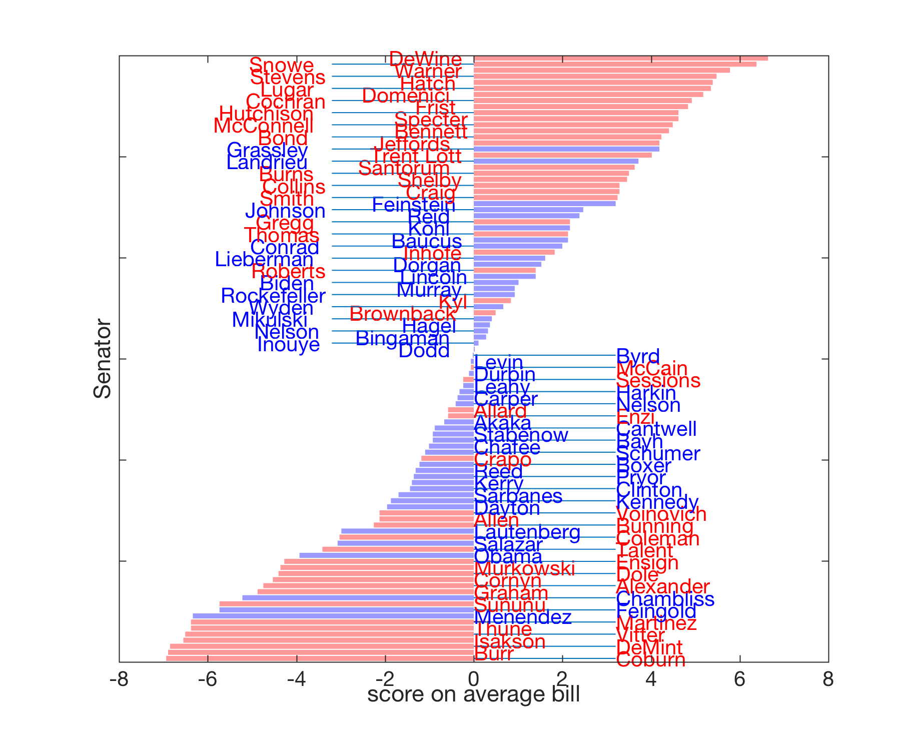 |
Scores obtained with all-ones direction: This image shows the values of the projections of the Senator’s votes (that is, with average across Senators removed) on a (normalized) ‘‘average bill’’ direction. Each score is a number given by  , with , with  a vector with elements all equal to a vector with elements all equal to  (it is normalized to unit Euclidean norm). This projection reveals clearly the party affiliation of each senator, although the information was not available to the projection algorithm. (it is normalized to unit Euclidean norm). This projection reveals clearly the party affiliation of each senator, although the information was not available to the projection algorithm.
The interpretation is that the behavior of senators on an ‘‘average bill’’ almost fully determines her or his party affiliation. Note the range of the plot (about |
![[-6;6]](https://ecampusontario.pressbooks.pub/app/uploads/quicklatex/quicklatex.com-46d91300585f75ae0a7aef51230ad4a3_l3.png "Rendered by QuickLaTeX.com") , which is higher than that of the random vector (about
, which is higher than that of the random vector (about ![[-1;1]](https://ecampusontario.pressbooks.pub/app/uploads/quicklatex/quicklatex.com-bccffef4fa81186d3d0cff81414832da_l3.png "Rendered by QuickLaTeX.com") ), allowing a better spread of scores.
), allowing a better spread of scores.