11.4 The Hertzsprung-Russell (H-R) Diagram
Table 11.4 summarizes some of the characteristics by which we might classify stars and how those are measured. We have looked at a few of these characteristics already in this chapter. When the characteristics of large numbers of stars were measured at the beginning of the twentieth century, astronomers were able to begin a deeper search for patterns and relationships in these data.
| Characteristic | Technique |
|---|---|
| Surface temperature |
1. Determine the colour (very rough). 2. Measure the spectrum and get the spectral type. |
| Chemical composition | Determine which lines are present in the spectrum. |
| Luminosity | Measure the apparent brightness and compensate for distance. |
| Radial velocity | Measure the Doppler shift in the spectrum. |
| Rotation | Measure the width of spectral lines. |
| Mass | Measure the period and radial velocity curves of spectroscopic binary stars. |
| Diameter |
1. Measure the way a star’s light is blocked by the Moon. 2. Measure the light curves and Doppler shifts for eclipsing binary stars. |
To help understand what sorts of relationships might be found, let’s look briefly at a range of data about human beings. If you want to understand humans by comparing and contrasting their characteristics—without assuming any previous knowledge of these strange creatures—you could try to determine which characteristics lead you in a fruitful direction. For example, you might plot the heights of a large sample of humans against their weights (which is a measure of their mass). Such a plot is shown in Figure 11.4 and it has some interesting features. In the way we have chosen to present our data, height increases upward, whereas weight increases to the left. Notice that humans are not randomly distributed in the graph. Most points fall along a sequence that goes from the upper left to the lower right.
Height versus Weight
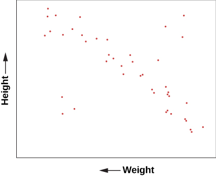
We can conclude from this graph that human height and weight are related. Generally speaking, taller human beings weigh more, whereas shorter ones weigh less. This makes sense if you are familiar with the structure of human beings. Typically, if we have bigger bones, we have more flesh to fill out our larger frame. It’s not mathematically exact—there is a wide range of variation—but it’s not a bad overall rule. And, of course, there are some dramatic exceptions. You occasionally see a short human who is very overweight and would thus be more to the bottom left of our diagram than the average sequence of people. Or you might have a very tall, skinny fashion model with great height but relatively small weight, who would be found near the upper right.
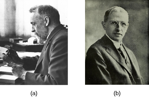
A similar diagram has been found extremely useful for understanding the lives of stars. In 1913, American astronomer Henry Norris Russell plotted the luminosities of stars against their spectral classes (a way of denoting their surface temperatures). This investigation, and a similar independent study in 1911 by Danish astronomer Ejnar Hertzsprung, led to the extremely important discovery that the temperature and luminosity of stars are related.
Hertzsprung (1873–1967) and Russell (1877–1957)
Henry Norris Russell
When Henry Norris Russell graduated from Princeton University, his work had been so brilliant that the faculty decided to create a new level of honours degree beyond “summa cum laude” for him. His students later remembered him as a man whose thinking was three times faster than just about anybody else’s. His memory was so phenomenal, he could correctly quote an enormous number of poems and limericks, the entire Bible, tables of mathematical functions, and almost anything he had learned about astronomy. He was nervous, active, competitive, critical, and very articulate; he tended to dominate every meeting he attended. In outward appearance, he was an old-fashioned product of the nineteenth century who wore high-top black shoes and high starched collars, and carried an umbrella every day of his life. His 264 papers were enormously influential in many areas of astronomy.
Born in 1877, the son of a Presbyterian minister, Russell showed early promise. When he was 12, his family sent him to live with an aunt in Princeton so he could attend a top preparatory school. He lived in the same house in that town until his death in 1957 (interrupted only by a brief stay in Europe for graduate work). He was fond of recounting that both his mother and his maternal grandmother had won prizes in mathematics, and that he probably inherited his talents in that field from their side of the family.
Before Russell, American astronomers devoted themselves mainly to surveying the stars and making impressive catalogs of their properties, especially their spectra. Russell began to see that interpreting the spectra of stars required a much more sophisticated understanding of the physics of the atom, a subject that was being developed by European physicists in the 1910s and 1920s. Russell embarked on a lifelong quest to ascertain the physical conditions inside stars from the clues in their spectra; his work inspired, and was continued by, a generation of astronomers, many trained by Russell and his collaborators.
Russell also made important contributions in the study of binary stars and the measurement of star masses, the origin of the solar system, the atmospheres of planets, and the measurement of distances in astronomy, among other fields. He was an influential teacher and popularizer of astronomy, writing a column on astronomical topics for Scientific American magazine for more than 40 years. He and two colleagues wrote a textbook for college astronomy classes that helped train astronomers and astronomy enthusiasts over several decades. That book set the scene for the kind of textbook you are now reading, which not only lays out the facts of astronomy but also explains how they fit together. Russell gave lectures around the country, often emphasizing the importance of understanding modern physics in order to grasp what was happening in astronomy.
Harlow Shapley, director of the Harvard College Observatory, called Russell “the dean of American astronomers.” Russell was certainly regarded as the leader of the field for many years and was consulted on many astronomical problems by colleagues from around the world. Today, one of the highest recognitions that an astronomer can receive is an award from the American Astronomical Society called the Russell Prize, set up in his memory.
Following Hertzsprung and Russell, let us plot the temperature (or spectral class) of a selected group of nearby stars against their luminosity and see what we find. Such a plot is shown in Figure 11.6 and is frequently called the Hertzsprung–Russell diagram, abbreviated H–R diagram. It is one of the most important and widely used diagrams in astronomy, with applications that extend far beyond the purposes for which it was originally developed more than a century ago.
H–R Diagram for a Selected Sample of Stars
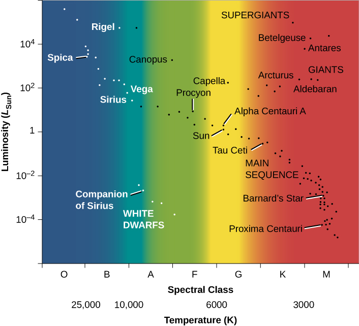
It is customary to plot H–R diagrams in such a way that temperature increases toward the left and luminosity toward the top. Notice the similarity to our plot of height and weight for people that was shown in Figure 11.4. Stars, like people, are not distributed over the diagram at random, as they would be if they exhibited all combinations of luminosity and temperature. Instead, we see that the stars cluster into certain parts of the H–R diagram. The great majority are aligned along a narrow sequence running from the upper left (hot, highly luminous) to the lower right (cool, less luminous). This band of points is called the main sequence. It represents a relationship between temperature and luminosity that is followed by most stars. We can summarize this relationship by saying that hotter stars are more luminous than cooler ones.
A number of stars, however, lie above the main sequence on the H–R diagram, in the upper-right region, where stars have low temperature and high luminosity. How can a star be at once cool, meaning each square meter on the star does not put out all that much energy, and yet very luminous? The only way is for the star to be enormous—to have so many square metres on its surface that the total energy output is still large. These stars must be giants or supergiants, the stars of huge diameter we discussed earlier.
There are also some stars in the lower-left corner of the diagram, which have high temperature and low luminosity. If they have high surface temperatures, each square meter on that star puts out a lot of energy. How then can the overall star be dim? It must be that it has a very small total surface area; such stars are known as white dwarfs (white because, at these high temperatures, the colours of the electromagnetic radiation that they emit blend together to make them look bluish-white). We will say more about these puzzling objects in a moment. Figure 11.7. is a schematic H–R diagram for a large sample of stars, drawn to make the different types more apparent.
Schematic H–R Diagram for Many Stars
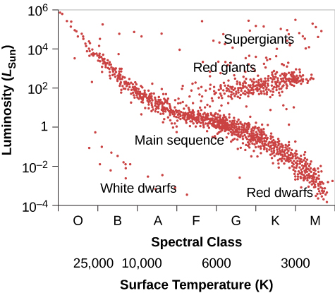
Now, think back to our discussion of star surveys. It is difficult to plot an H–R diagram that is truly representative of all stars because most stars are so faint that we cannot see those outside our immediate neighbourhood. The stars plotted in Figure 11.6 were selected because their distances are known. This sample omits many intrinsically faint stars that are nearby but have not had their distances measured, so it shows fewer faint main-sequence stars than a “fair” diagram would. To be truly representative of the stellar population, an H–R diagram should be plotted for all stars within a certain distance. Unfortunately, our knowledge is reasonably complete only for stars within 10 to 20 light-years of the Sun, among which there are no giants or supergiants. Still, from many surveys (and more can now be done with new, more powerful telescopes), we estimate that about 90% of the true stars overall (excluding brown dwarfs) in our part of space are main-sequence stars, about 10% are white dwarfs, and fewer than 1% are giants or supergiants.
These estimates can be used directly to understand the lives of stars. Permit us another quick analogy with people. Suppose we survey people just like astronomers survey stars, but we want to focus our attention on the location of young people, ages 6 to 18 years. Survey teams fan out and take data about where such youngsters are found at all times during a 24-hour day. Some are found in the local pizza parlor, others are asleep at home, some are at the movies, and many are in school. After surveying a very large number of young people, one of the things that the teams determine is that, averaged over the course of the 24 hours, one-third of all youngsters are found in school.
How can they interpret this result? Does it mean that two-thirds of students are truants and the remaining one-third spend all their time in school? No, we must bear in mind that the survey teams counted youngsters throughout the full 24-hour day. Some survey teams worked at night, when most youngsters were at home asleep, and others worked in the late afternoon, when most youngsters were on their way home from school (and more likely to be enjoying a pizza). If the survey was truly representative, we can conclude, however, that if an average of one-third of all youngsters are found in school, then humans ages 6 to 18 years must spend about one-third of their time in school.
We can do something similar for stars. We find that, on average, 90% of all stars are located on the main sequence of the H–R diagram. If we can identify some activity or life stage with the main sequence, then it follows that stars must spend 90% of their lives in that activity or life stage.
Attribution
“17.3 The Spectra of Stars (and Brown Dwarfs)” from Douglas College Astronomy 1105 by Douglas College Department of Physics and Astronomy, is licensed under a Creative Commons Attribution 4.0 International License, except where otherwise noted. Adapted from Astronomy 2e.
