Lab 4 – Putting Things in Their Place: Georeferencing Maps and Art
Introduction
Georeferencing
Georeferencing is one of a suite of related techniques that apply coordinates to a dataset, so that you know where it is located in space. Obviously, this knowledge would be particularly useful if you wish to conduct spatial analysis on that dataset, though there are other reasons it might be helpful, too. Generally speaking, this is done to raster datasets, while the labs so far have mainly involved vector datasets. See Appendix 1 for a refresher on the difference.
Coordinate Systems
If you wish to assign a location to your dataset, you need to understand how those locations are recorded. This is especially important if you are georeferencing an image of an existing map, for reasons which will be discussed shortly.
You have probably heard of latitude and longitude before. These are imaginary divisions of the globe, based on degrees. Meridians of longitude run from pole to pole, while parallels of latitude run around the earth, parallel to the equator. It is the intersection of these meridians and parallels which are used to describe location. However, it may surprise you to know that lat-long systems aren’t all necessarily the same. For example, the most common prime meridian, from which all other meridians are measured, is currently located in the United Kingdom. However, this hasn’t always been the case, and throughout history different countries have tended to use their own prime meridians, which means the latitude recorded on a historic map does not necessarily correspond to its modern latitude. Further complicating matters is the question of datums, which account for the fact that the earth is not a perfect sphere. Many datums exist, and the lat-long of a location is often slightly different depending on the datum underlying these measurements. The prime meridian, datum, and also the angular unit of measurement combine to make a specific Geographic Coordinate System.
It gets even more complicated when you consider that the earth is a globe, or more technically a spheroid, while maps are flat. Sadly, globes don’t flatten very easily, which means cartographers resort to all sorts of tricks to display the curved lines of latitude and longitude on the flat surface of the map. Each method of doing so is known as a projection, because the curved surface of the globe must be projected onto a flat surface. Each projection introduces its own particular forms of distortion. The characteristics of common projections are not especially relevant to this lab, but some documentation is available through QGIS’s Gentle Introduction to GIS [https://docs.qgis.org/3.16/en/docs/gentle_gis_introduction/coordinate_reference_systems.html]. When you add a projection to a Geographic Coordinate System, it becomes a Projected Coordinate System.
So why does this matter? Often, maps will have a grid drawn on them to represent lat-long or some other coordinate system. One of the easiest ways to georeference a map is to use the coordinates from this grid, and enter them into your GIS software to tell it where in space that map belongs. However, the datum, prime meridian, and projection used to define those coordinates matter. You need to be able to specify the coordinate system they come from, so that the GIS can make the appropriate conversions and locate the map correctly.
All of this, of course, ignores the fact that there are other ways of both measuring and describing space than simply using coordinate systems. However, GIS software is based on coordinate systems, and therefore the techniques in this lab must be also. It is worth considering what effect this reliance on a single understanding of space has on our own conceptions of the world; what ways of knowing does it privilege, and what kind of knowledge might be lost as a result? If this is a topic of interest to you, there are supplementary readings available in Appendix 2.
What is a Map?
Since this lab will discuss the use of GIS for art creation, it is worth considering where the line between map and art actually falls, or if indeed such a line exists. An example that will be discussed later in this lab is the Lake Nipissing Beading Project [https://www.lakenipissingbeadingproject.com/map], which intentionally blurs this line, and is both a map and a piece of art. However, it would not be a stretch to say that many conventional maps are beautiful, and could be considered art even if they were not created to be so. A crowdsourced list of some beautiful maps is available on StackExchange for your perusal [https://gis.stackexchange.com/questions/3083/seeking-examples-of-beautiful-maps].
Fundamental to this question of the line between map and art, is how we define a “map”. What do you think of when you use this word?
The Oxford English Dictionary defines a map as
A drawing or other representation of the earth’s surface or a part of it made on a flat surface, showing the distribution of physical or geographical features (and often also including socio-economic, political, agricultural, meteorological, etc., information), with each point in the representation corresponding to an actual geographical position according to a fixed scale or projection; a similar representation of the positions of stars in the sky, the surface of a planet, or the like. Also: a plan of the form or layout of something, as a route, a building, etc. (OED Online, 2021).
This definition is rather strict; since it relies on a fixed scale or projection, it would seem to exclude sketch maps, which often are not made to scale. It also excludes maps of imaginary places, which are still quite recognizably maps.
Other definitions, of course, might be more or less strict than that provided above; it would be dangerous to assume any one definition of “map” is authoritative. In fact, another definition is that a map is simply “a representation of a place” (Axis Maps, 2020). This very broad definition opens up the tantalizing possibility that stories, songs, dances, and other forms of expression could be considered maps. This is a perspective often associated with “deep mapping”; a few readings on this topic are provided in Appendix 2. Perhaps your own personal definition falls somewhere in between the two offered above, or you’ve never given the matter much thought before; this is perfectly acceptable. The point of this section is not to propose a right or wrong answer, but simply to invite you to consider the possibilities.
Georeferencing Historical Maps and Imagery
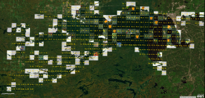
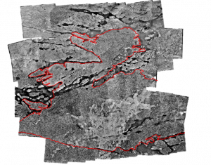
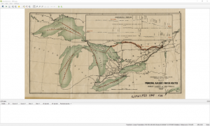
Many of the story maps shown in this course include digital copies of historical maps, georeferenced and draped over modern maps – figure 4 is just one example. The purpose of this is largely illustrative; to demonstrate a particular point in a historical narrative, while providing spatial context for modern readers of these maps. As mentioned in the introduction, however, there are other reasons you might wish to georeference an old map or other image. One is that it is often desirable to extract historic data into a format that GIS software can easily manipulate and analyze, for use in modern mapping projects. In order to do this, the map or image should first be georeferenced, so that the GIS knows where the extracted data belongs in space. One example of this is the mosaic of historical aerial photos in figure 5; because the photos have been georeferenced, we can use them to map historical land cover in the study area, and compare this to modern data on the same topic.
Georeferencing when your map has a grid
Often, maps will contain a grid indicating lines of latitude and longitude, or some other way of measuring location. In theory, this should make it simple to georeference the map, because the grid tells us where it belongs in space; all we need to do is provide that information to our GIS. Unfortunately, however, such maps rarely include information about which coordinate system the grid was based on.
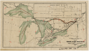
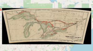
The example we will use to practice georeferencing in QGIS is a public domain map of the Georgian Bay Ship Canal sourced from Wikimedia Commons [https://commons.wikimedia.org/wiki/File:Railway_and_shipping_routes_for_the_Georgian_Bay_Ship_Canal.jpg], but these principles could be applied to any map.
- First, download your old map. Save it with an appropriate name, in a location you will be able to find easily.
- When working with data that has a known spatial location, your first step would be to open your file in QGIS, but that is not the case here. Instead, open the Raster menu located at the top of the screen, and click “Georeferencer”.
- A new window will open. In the File menu of this new window, click “Open Raster…” and open the image of your map.
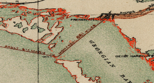
- You can use the zoom and pan tools to navigate around your map. Look for the numbers attached to each parallel and meridian; these are what we will use to assign coordinates to our map.
- Before we can assign these coordinates, however, we need to tell the GIS how we wish the map to be transformed; that is, what projection it should be in, and how it should be warped to match the coordinates. In the Settings menu, click “Transformation Settings”.
- Choose a Transformation type. More info on what each one does is available in QGIS’s documentation [https://docs.qgis.org/3.16/en/docs/user_manual/working_with_raster/georeferencer.html#defining-the-transformation-settings]. Here, we will try Polynomial 1, but you may need to experiment with several to produce the best results.
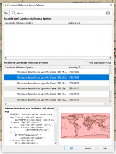
- Define the “Target SRS”, which is the coordinate system you want your map to end up in. Clicking the icon next to this dropdown menu will bring up the coordinate system selector. If your map specifies the coordinate system that was used to create it, simply use that. Otherwise, some detective work is required. The example map is from 1907; as a result, I have chosen a projection based on the Clarke datum of 1866, which was generally used in North America at this time.
- Use the “Output raster” setting to choose a name and output location for your finished file, then click “OK” to close the dialogue box.
- Now we will start assigning coordinates to our map. Scroll to the intersection of your grid that you want to begin with, then click the “Add Point” button in the toolbar.
- Use the crosshairs to click on the intersection of your grid, and the Enter Map Coordinates box will open. The number from the top/bottom of your map is the x value, and the number from the side of your map is the y value. You should also keep in mind that, in the western hemisphere, x values will be negative, no matter what is shown on your map.
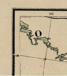
- Once you click “OK” A red dot will be placed on your map, indicating that the GIS knows the location of this point; it is now a Ground Control Point (GCP).
- Repeat step 10 until you have several GCPs spread evenly across your map.
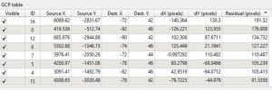
- Once you have more than the minimum required number of GCPs, the software may draw red lines on the map, indicating where you have placed the GCPs vs. where it believes those points on the map should actually be. This gives you an idea of the amount of warping to expect in your finished map.
- Once you are satisfied with your GCPs, click the “Start Georeferencing” button.
- Once QGIS indicates that georeferencing is complete, you may switch back to the main project window. Using the browser panel, navigate to where your georeferenced image is stored, and drag it into the map pane.
- To check that the map is actually in the correct location, you may wish to add a basemap from the XYZ Tiles folder in the browser pane. Make sure the basemap is below the georeferenced map in the layers panel.
- Change the transparency of the georeferenced map by double clicking on its name in the layers panel. In the layer properties box that opens, switch to the transparency page, and use the slider to change the transparency. Click apply to see the change applied to your map.
- Alternatively, you can load a shapefile of your study area. Make sure it is on top of your georeferenced map, and check that the boundaries line up.
The degree of accuracy you require for your georeferencing will depend on what you intend to do with the georeferenced map, and how closely viewers are likely to zoom in on it. In figure 10, you can see that the map mostly agrees with the Ontario boundary shown in the shapefile. At this level of zoom, therefore, the georeferencing work was adequate. If you zoom in, however, there are some areas of mismatch – see figure 11.
If these would be a problem for your use of the map, or if you expect your audience to zoom in closely, you may wish to do some more work on the georeferencing. You could try a different type of transformation, or a different target coordinate system. You could also try adding more GCPs, or even deleting some. In the Georeferencer, you will notice a table listing your GCPs. Deleting those with the highest “Residual” values may help improve the accuracy of your map.
Georeferencing when your raster doesn’t have a grid
When the method above is possible, it’s very convenient, and makes it relatively quick to complete your georeferencing. However, many maps lack grids. This is generally also the case for images you may be trying to georeference, especially old aerial photos.
As our example for this section, we will attempt to georeference a public domain map of the Welland Canal, available from Brock University [https://dr.library.brocku.ca/handle/10464/13716]. Although Brock makes a georeferenced copy of this map available, georeferencing it yourself is an excellent learning opportunity!
This demonstration begins in the same way as the previous one – open the Georeferencer, load your map, and set up your transformation settings. In this case, your target coordinate system should be the same as your QGIS project; it will be labelled as “Project CRS” in the Target SRS dropdown menu. Once you have the Georeferencer set up, proceed as follows:
- In the main QGIS window, load a basemap of your choice.
- Consulting both the Georeferencer and the main QGIS window, decide where to place your GCP. It should be clearly visible in both your unreferenced image and your base map, and should ideally be something which is unlikely to move over time – corners of buildings or intersections are excellent choices. Shorelines are less ideal, as they tend to change as water levels rise and fall, or sediment is eroded or deposited. However, in some cases, these may be all that are available to you.
- Using the Add Point button, click the location of your GCP in the Georeferencer. When the Enter Map Coordinates box opens, instead of typing in coordinates, click the “From Map Canvas” button. On your basemap, click the location corresponding to your GCP, then return to the Enter Map Coordinates box and click “OK”.
- Repeat step 3 until you have a good distribution of GCPs across your unreferenced map.
- Run the georeferencing, and load the new layer into QGIS. Change the transparency as described above to check the fit, and if necessary, try a different transformation to produce a better fit.
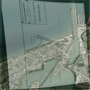
In figure 14, you can see how the georeferenced map of Port Dalhousie compares to the area in modern times. Much of the street grid is still recognizable, as are the piers and the northern half of the lower harbor. However, there have been substantial changes elsewhere – the shoreline of the inner harbor is a prime example. Note also that the abandoned piers of the first Welland Canal are gone, and that the major road at the bottom right of the image appears to have shifted position. This illustrates a key difficulty with georeferencing historical maps based on modern maps. It’s hard to know what has changed and what has remained the same over time, and it would be possible to warp the map in ways that do not represent historical reality, simply to fit our modern understanding of the area. For example, I tried to georeference that main road to its modern location, but this made the fit of the rest of the map considerably worse. Is this an error in the original map, or is it an error of geocoding? It’s difficult to know.
Sources of Historical Maps and Imagery
As with any search for spatial data, where you find your historical maps will depend to some extent on your study area, topic, time period of interest, and licensing requirements. A google image search is always a good start. However, the sites listed below can be helpful if a broad google search isn’t giving you what you need:
- OldMapsOnline [https://www.oldmapsonline.org/] is an interactive portal that will allow you to find historical maps by specifying locations on a modern map, then filtering by date and other attributes. Most of the maps are of large areas and lack fine detail.
- The Historical Topographic Map Digitization Project [https://ocul.on.ca/topomaps/] includes many topo maps of Ontario. Georeferenced versions of the maps are available through Scholars GeoPortal if you have access through your institution, but high resolution scans of the maps are publically available on the website.
- The faculty of Arts and Sciences at the University of Toronto maintains a database of maps digitized from the Canadian Sessional Papers [https://maps.library.utoronto.ca/datapub/digital/sess_papers/]. These maps cover a wide range of topics from across the country.
- The Ontario Historical County Maps [https://www.arcgis.com/apps/webappviewer/index.html?id=8cc6be34f6b54992b27da17467492d2f] page provides historical maps of many counties in Southern Ontario. It is also searchable, so that you can find lots based on who owned them at the time the maps were created.
- Library and Archives Canada [https://www.bac-lac.gc.ca/eng/collectionsearch/Pages/collectionsearch.aspx] has many digitized holdings, including maps.
- Archives of Ontario [http://www.archives.gov.on.ca/en/access/our_collection.aspx] also has many digitized holdings.
- Many university libraries also have extensive map collections, some of which are available online. The University of Toronto [https://mdlcollections.library.utoronto.ca/] and Brock University [https://dr.library.brocku.ca/handle/10464/9765] are particularly useful examples. U of T has maps from across the world, while Brock’s collection focusses on the Niagara area.
Georeferencing for Art Creation
At the beginning of the previous section, we discussed briefly how many of the storymaps shown in this course contain examples of georeferencing which are largely illustrative; that is, they are not geared towards GIS analysis of data, but rather convey spatial information to the reader through simple visual examination. However, in some very unusual cases, we might use georeferencing to create a visualization whose primary purpose is not to convey spatial information. This is the case with the Lake Nipissing Beading Project, already mentioned in the section titled “What is a Map?”.
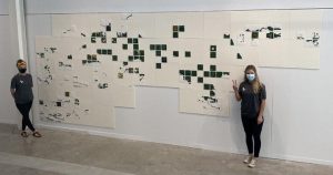
The Lake Nipissing Beading Project (LNBP) is a collaborative art project, headed by artist Carrie Allison and conducted in collaboration with Nipissing First Nation, Dokis First Nation, and Nipissing University (LNBP, 2022). Each participant in the project is given a tile representing a portion of Lake Nipissing, and asked to bead over the water in their tile. The purposes of this project are numerous – it is a way to create community during the COVID-19 pandemic, but also a way to give respect to water, and to “take back” the power of maps, which has often been used to disenfranchise indigenous people, by beading over imagery created by the state for resource extraction purposes. You might note that none of these purposes involve conveying spatial information, unless it is perhaps the information that this place and its waters are cherished, and that the people of Nipissing and Dokis are still here. Nevertheless, the output of this project is still a map, in both its physical form, and its digital georeferenced form. And even if you personally don’t consider this a map, it is worth keeping in mind that spatial data and GIS techniques were fundamental in creating the project. No matter how you look at it, it is an unusual intersection of map and art.
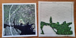
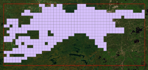
You are unlikely to need to replicate the process of georeferencing the tiles for this project. In any case, it is almost identical to the process used to georeference a map of Dalhousie. The only difference is that, instead of being georeferenced based on the features they depict, the beaded tiles are georeferenced to a shapefile. As each tile is received, it is photographed, and labelled with the number of the grid cell it belongs to. Then the corners of the tile are georeferenced to the corners of that grid cell.
Even if you will never need to replicate the georeferencing process used for this particular project, can you think of any ways that you personally might use GIS for art creation? What purposes might you find for maps that are outside the norm? What kind of stories might your maps be able to tell?
Assignment
Complete any two of the following tasks. Any georeferenced maps should be draped over a modern basemap, made semi-transparent so that both the historical and modern maps are visible, and captured with a screen shot. Please submit all items in a single PDF document.
- Using the skills you have learned in this lab, georeference a map based on its grid. Specify what coordinate system you used and why. Provide a citation for your map.
- Using the skills you have learned in this lab, georeference a map or historical air photo which does not include a grid or other coordinates. Includes a screenshot of your GCPs, and discuss how you chose their locations. Provide a citation for your map.
- Write a short proposal for an art creation project which would use GIS as a fundamental tool. Your proposal should mention any spatial data you would need, and discuss why the project would be worth carrying out.
References
Textual Sources
“Home,” Lake Nipissing Beading Project. Accessed January 13, 2022. https://www.lakenipissingbeadingproject.com/
” map, n.1″. OED Online. Oxford University Press, December 2021. https://www-oed-com.roxy.nipissingu.ca/view/Entry/113853?rskey=6Esdk6&result=3
“What is a map?” Cartography Guide. Axis Maps, accessed January 13, 2022. https://www.axismaps.com/guide/what-is-a-map
Images
Cormier, Riley J., John M. Kovacs, Kirsten Greer & Randy Restoule. “Developing Historical Aerial Photo Mosaics to Map Colonial Encrochment on the Dokis First Nation Following the Timber Surrender of 1908”. Presentation at Canadian Association of Geographers Ontario Division conference, University of Toronto, 2018.
Morris, William. The Sundering Flood. London: Longmans Green and Company, 1914. https://www.gutenberg.org/cache/epub/25547/pg25547-images.html
“Events,” Lake Nipissing Beading Project. Accessed January 13, 2022. https://www.lakenipissingbeadingproject.com/events
“The Beaded Map,” Lake Nipissing Beading Project. Accessed January 13, 2022. https://www.lakenipissingbeadingproject.com/map
“Vantages of Bermuda,” Empire Trees Climate. Centre for Understanding Semi-Peripheries, accessed January 13, 2022. https://cusp.maps.arcgis.com/apps/webappviewer/index.html?id=662422db191740f3a0e39df989567703
Data Used in this Lab
“Boundary Files,” 2016 Census. Shapefile. Ottawa, ON: Statistics Canada (2016). Catalogue no. 92-160-X.
Port Dalhousie: Second Welland Canal Period. Map. St. John’s Outdoor Studies Centre, Niagara South Board of Education, 1845. https://dr.library.brocku.ca/handle/10464/13716
Railway and Shipping Routes for the Georgian Bay Ship Canal. Map. Canadian Department of Public Works, 1907. https://commons.wikimedia.org/wiki/File:Railway_and_shipping_routes_for_the_Georgian_Bay_Ship_Canal.jpg
Basic GIS Concepts Covered in this Lab
Previously, you have learned that vector data is based on coordinates in space. Raster data, on the other hand, is based on a grid of evenly sized cells, which are frequently called pixels. If this sounds familiar, it may be because many common image formats are in fact raster data. Raster data becomes spatial when we apply coordinates to the corners of the grid; because we know the size of the pixels, this means we also know the location represented by each pixel.
Raster grids generally only have a single attribute, which must be stored in numeric form. Each pixel records the value of that attribute at the location the pixel represents. These values can be things like elevation, the amount of light or other energy reflected from that location, or population. However, you can also use numbers to encode categorical data, such as land cover, which can then be stored in a raster grid. Note that all of these examples will vary continuously over a study area; that is, everywhere in your study area will have a type of land cover, an elevation, an amount of reflected energy, and a population, even if that population is 0. Contrast this with the discrete features stored in a vector dataset – things like streetlights, roads, or waterbodies. While you technically could make a raster grid in which every pixel is or is not a streetlight, it’s probably not the most efficient way to store your data, especially when you consider that vector data can store multiple attributes, while raster data cannot.
As a final note, you may find that many of your raster datasets consist of multiple “bands”. Each band is actually a separate raster grid representing the same location, but storing a different attribute. This is most common with colour images, in which each band will store the reflectance value for one of the primary colours of light. Your computer monitor then uses the bands to determine how much of each primary colour to display, mixing them in different proportions to form the wide range of colours we see on our screens.
Some Optional Readings
GIS and Dominant Notions of Space
Elwood, Sarah. “Critical Issues in Participatory GIS: Deconstructions, Reconstructions, and New Research Directions,” Transactions in GIS 10, no. 5 (2006): 693-708, DOI: 10.1111/j.1467-9671.2006.01023.x
Pavlovskaya, Marianna. “Non-Quantitative GIS”,in Qualitative GIS: A Mixed Methods Approach to Integrating Qualitative Research and Geographic Information Systems, edited by Sarah Elwood and Meghan Cope. London: Sage Publications, 2009.
Sletto, Bjørn Ingmunn. “‘We Drew What We Imagined’: Particpatory Mapping, Performance, and the Arts of Landscape Making,” Current Anthropology 50, no.4 (2009): 443-476. DOI: 10.1086/593704
Warf, Barney & Daniel Sui. “From GIS to Neogeography: Ontological Implications and Theories of Truth,” Annals of GIS 16, no. 4 (2010): 197-209. DOI: 10.1080/19475683.2010.539985
Deep Mapping: What Maps Might Be
Roberts, Les. “Deep Mapping and Spatial Anthropology,” Humanities 5, no. 1 (2016). DOI: 10.3390/h5010005
Wood, Dennis. “Mapping Deeply,” Humanities 4, no.3 (2015). DOI: 10.3390/h4030304
Art and cARTography
Cosgrove, Dennis. “Maps, Mapping, Modernity: Art and Cartography in the Twentieth Century,” Imago Mundi 57, no. 1 (2005): 35-54. DOI: 10.1080/0308569042000289824
