Lab 3 – Spatializing Historical Narratives: Quick Mapping Techniques
Introduction
An obvious source of data for telling stories about history, are stories from history. The examples used in this lab are specifically travel narratives, and are therefore intimately concerned with place – where the authors stopped, how far they travelled, where certain sounds were heard and where certain weather conditions prevailed. However, many other kinds of narratives will at least mention places, and can therefore also be mapped. Whether you are mapping places that no longer exist, or tracing historic journeys through familiar landscapes, mapping historical narratives can help you to see them in a new light, revealing scale and context that might not be immediately evident from words alone. While these maps could conceivably be drawn with pen and paper, to communicate your spatial story widely and effectively, you will likely need to resort to GIS.
Using GIS technology does not have to be expensive, nor does it have to be complicated. While commercial GIS packages like ESRI’s ArcGIS are often taught at universities and colleges, open source solutions such as QGIS also exist and offer similar functionality. However, sometimes you just want to make a simple map, and don’t want or need to wrestle with the extensive possibilities offered by these software packages. In this case, you could use platforms such as Google Earth or even Google Maps. Google Earth, for example, offers you the ability to map points, paths, or areas, and save them for later as KML (keyhole markup language) files.
The first portion of this lab will guide you through the process of mapping locations in both Google Earth and Google Maps. The second portion will describe how to convert them into a more polished map using QGIS. Finally, the last section will discuss potential sources of historical narratives, and give a brief discussion of the process of spatializing them.
This lab assumes you have a basic familiarity with some GIS concepts, including the main vector data types (points, lines, and polygons), and what layers are in a GIS context. If you need a refresher on these subjects, please consult Appendix 1.
Basic Web Mapping with Google
The map shown below is an example of using Google My Maps to map several historical narratives. At the time of writing, the interactive version of this map can is also available online. [https://www.google.com/maps/d/edit?mid=1q2zc-AGTxVU4KH8W3r2uA1oqM2Vztluv&usp=sharing] The marks are points mentioned in the journals and travel writings of voyageurs, fur traders, surveyors and other individuals travelling by canoe between Montreal and Georgian Bay. Each colour represents a different narrative. This map was created as a rough draft for a potential GIS project, the purpose of which was to understand historical environmental conditions, particularly water levels, that existed in specific places along the route. Useful references that could be tied to a specific location were largely absent from the narratives, however, and the map ended up functioning more as a record of the kinds of places that were important to the people writing the narratives – unsurprisingly, mostly stopping places, such as portages, habitations, and trading posts.
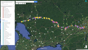
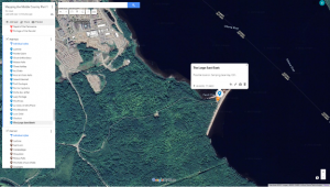
Google Maps was chosen to create this map because of its simplicity of use, but also because it makes it very easy to find locations for which you don’t have exact coordinates. A feature mentioned in many narratives, for example, is an unusual sandbank located between the portages at Les Allumettes and Les Joachims. A scroll along the river between these two locations in the satellite view of Google Maps reveals a very obvious sandbank at Chalk River, and some cross referencing between the various sources and other references confirms this to be the likely location. This would be difficult to achieve in a traditional GIS platform; while many of them do incorporate satellite imagery basemaps, these basemaps can be quite slow to load and don’t allow for the quick scrolling possible in Google Maps or Google Earth.
Another benefit of Google platforms is their searchability. Place names that still exist can simply be typed into the search bar, which makes it very easy to find the location in question! One final benefit to consider is the ease of shareability from Google. Many collaborators on this project were not familiar with GIS, so being able to send them a link to a platform they were already familiar with was a major consideration.
Google My Maps vs. Google Earth
As with any software, the different Google mapping platforms have benefits and drawbacks; the features are not identical from one to another. The table below may help you to decide which is most useful for your particular project.
Table 1: Features of Google My Maps and Google Earth
|
Google My Maps |
Google Earth |
|
| Usable without a Google account? |
X |
✓ |
| Map different datasets in separate layers? |
✓ |
✓ |
| Map points, lines, and polygons? |
X |
✓ |
| Add descriptions to points? |
✓ |
✓ |
| Add photos or videos to points? |
✓ |
✓ |
| Create presentations? |
X |
✓ |
| Embed resulting map in other websites? |
✓ |
X |
| Export spatial features to other software? |
✓ |
✓ |
One of the categories in the table 1 asks whether each mapping platform can map separate datasets in separate layers, which mirrors the way more complex GIS software tends to work. You may have noticed that the answer for Google Earth is represented by a yellow checkmark rather than a green, indicating that the answer is somewhat complicated! In short, Google Earth can only mimic the effect of layers, and with certain limitations on data display.
Google Maps
If you wish to create and save maps in Google My Maps, you will need a google account. When you are logged in to this account, follow the steps below to access this platform. If you would prefer not to create a Google account, you can skip this section, as Google Earth can be used in a similar way. See table 1 for a summary of the benefits of each platform.
- Access Google My Maps [https://www.google.com/maps/d/]
- A gallery of any maps you have already created will appear. You may edit an existing map, or use the “+ CREATE A NEW MAP” button to start a new one.
- This will open a blank map with an empty layer already added.
- To add a point, first zoom to the location you wish to mark. Then click the place marker symbol below the search bar, and click the location you wish to mark. Give the point a helpful title, and add any description you wish before clicking save. You may also add images by clicking the camera icon.
- You can edit your points by clicking on them. You can drag them to new locations, or click the pencil icon to change the title or description.
- To create additional layers on the same map, click “Add layer”. When working on a map with multiple layers, make sure the layer you want to add your new point to is selected!
- The map will automatically be saved to the Google Drive associated with your account, and can be shared from that location [https://drive.google.com/drive].
Fig 3: The Google Maps editing interface, with a newly created point. A: the pan tool, which lets you move around the map. B: The place mark tool, which lets you create points. C: The map options. D: The Base map menu, which lets you switch between map and satellite views. E: The point editor.
Google Earth
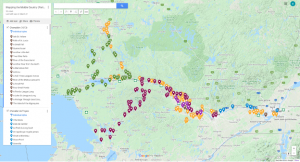
There are some downsides to using Google Maps. The first is that you can only create ten layers per map. As a result, the map linked above is actually accompanied by a second map to display the remaining narratives. [https://www.google.com/maps/d/edit?mid=1l7ozXECzi8BJWorpq14hkmUKdgfpHoqC&usp=sharing].
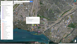
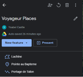
Further, what you can map in Google Maps is limited. Points can be created anywhere, and paths can be generated along existing routeways. However, it is not possible to create freehand lines, or polygons of any kind. This is more of a disadvantage than it might seem at first. In figure 5, for example, the place marks for Lachine are widely scattered despite representing the same location. There was a major fur trade depot at Lachine, which made it a common starting point for canoe journeys; as a result, it appears in many of the narratives mapped above. However, since many of the narratives don’t provide any location more specific than “Lachine”, it is difficult to place the marks with any precision, unless we are willing to assume the narratives always mean the depot when they talk about Lachine. As such, the place marks indicate a general location, rather than precise points on the landscape. It might be better, therefore, to represent Lachine as a polygon rather than a point, as in figure 6.
It is worth noting that this is still not an entirely satisfactory solution, because it assumes that the historic boundaries of Lachine are equivalent to its modern boundaries, or that the authors even thought of it as a place with strict boundaries. The question of how GIS itself influences how we think about space, and how this way of thinking interacts with other worldviews is complex, however, and well beyond the scope of this lab! If this topic is of interest to you, some supplemental readings are provided in Appendix 2.
Happily, Google Earth allows us to create a wider variety of features than Google Maps. Google Earth is available in both a web-based and a desktop version; the instructions presented here are based on the web version of the software.
- Navigate to Google Earth [https://earth.google.com/web/].
- To create a new map, click the Project button at the left of the screen
- You will be provided with several options, including to create a project for storage on your Google Drive, or to create a KML file. If you are logged in to a Google account, choose “Create a project in Google Drive”. Otherwise, choose “Create a KML file”.
- As you might expect, the “New feature” button will allow you to map a location. Scroll to the location you want to add to your map, then click this button and choose the type of feature you wish to create.
- For a point, simply click where you want the point to be added. This will open up a sidebar with numerous editing option. Some of these options will be familiar from Google Maps. Others, like Heading and Tilt, allow you to specify how this location should be viewed. This is because Google Earth can be used to create animated tours and fly-throughs of your locations. For now, simply set a title and description.
- To create a line or polygon, choose this option from the new feature menu, and then simply click where you wish each vertex to be placed. To finish a line, hit the Enter key, and to finish a polygon, place your last vertex in the same location as your first. You will again be able to edit the feature after you have created it.
Once you have created all your features in Google Earth, it is possible to create a fly-through of them, in which the software flies to each location sequentially, stopping at a predetermined zoom level. Any description text or images you have entered will be displayed in the top right of the screen. You can even add slides and videos to your presentation. Because of these features, Google Earth could be used to communicate spatial information in a style similar to the ESRI story maps discussed in many modules of this course. However, this portion of the lab requires a google account, so you may skip it if preferred.
Instructions on creating a simple animation in Google Earth are below, but you may wish to consult Google’s documentation on this topic to learn how to take advantage of the more complex possibilities of this tool [https://www.google.com/earth/outreach/learn/create-a-map-or-story-in-google-earth-web/].
- In your project overview, drag and drop the different locations so they are in the order you want to view them in.
- If desired, edit the view of your locations. First, hover your mouse over the place name, and then click the pencil icon to edit that place. You can either change the Heading, Tilt, and Altitude options in the feature editor, or tilt and zoom the map on your screen to produce the desired effect, then click “Capture this view” at the bottom left of the map.
- When all the locations are arranged to your liking, simply click the “Present” button in the project overview to run the presentation.
- You can share your project with others using the share button in the project overview. They will be able to see both your overall map and your presentation.
As previously discussed, Google Earth can mimic the effect of layers. To do this, you create separate folders to represent each layer, and then create your place marks within these folders. However, using folders prevents you from viewing your place marks in a presentation. To get around this drawback of Google Earth, you may prefer to store all your points without using layers, and simply colourcode them to indicate the difference between them.
Exporting Features from Google
As discussed in the introduction, maps in Google Maps or Google Earth can make an excellent rough draft, or be a quick way to communicate spatial information. Sometimes, however, you might want to use the features from these rough maps in a more complex GIS application. This is where KML files become useful. A file with the extension .kml or .kmz can be used to store spatial information, which can then be transferred between applications and users.
In Google Earth, you can set up your project with the intent of using it as a KML file. However, if you have not done this, you can create a KML file as follows:
- In the project overview, click the three dots in the top right corner.
- Choose “Export as KML file”
- The file will automatically be saved to your downloads folder. Store it somewhere you will be able to find it again!
In Google Maps, the process is very similar:
- Click the three dots in the top right corner of the sidebar.
- Click “Export to KML/KMZ”.
- Use the dropdown menu to choose whether to export your entire map or just the points from a single layer, then click “Download”. Note that if you export the entire map, the output will be a single KMZ file, which other GIS software will not recognize as containing multiple layers.
- As before, the file will be saved to your Downloads folder. Move and rename it as necessary.
Simple Mapping Techniques in QGIS
Importing KML Files
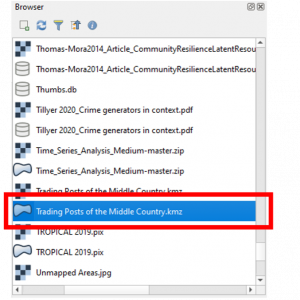
Adding a KMZ or KML file to a QGIS project is just the same as adding any other file.
- Using the browser panel, navigate to where your file is stored.
- There will likely be two copies of your file; one with a grid symbol, which indicates a raster file, and one with a polygon symbol, indicating a vector file. Simply drag and drop the vector file into your map pane to add it to your map.
Changing the Appearance of Your Data
Changing the appearance of your data is often referred to as “symbolizing” it. There are several ways to accomplish this task, including through the layer properties, and through the layer styling panel.
This lab does not discuss accepted cartographic practice, or how and when you might wish to break these rules in order to effectively communicate your data – these topics could be an entire course by themselves, and some supplementary readings are provided in Appendix 2. In addition to reading about cartography, another way to develop an eye for design is simply to look at beautiful maps, and think about how and why they work for you! For now, keep in mind that cartography is an art, and every map maker will have a different style. For this reason, instructions for what your map should look like are not provided. Rather, you should explore the different settings and options available in QGIS yourself. If you would like more in depth instructions on altering symbology in QGIS, check out the official tutorial [https://docs.qgis.org/3.16/en/docs/training_manual/basic_map/symbology.html] on this topic.
- To access the layer styling panel, click the layer styling button in the layers panel.
- Use the settings available to you in this panel to alter the appearance of your features as desired. Basic options, like colour, opacity and symbol size are available on the main screen.
- If you wish to alter other symbol settings, like outline thickness, symbol shape, and anchor point, click on the symbol preview with the words “Simple Marker” next to them. Click the “Marker” preview to return to the previous settings.
- Sometimes, you may wish to symbolize features with different attributes differently. For example, perhaps you entered a date into the description of each point when you created it, and wish to show points from different dates using different colours. To do this, use the dropdown menu at the top of the layer styling pane which currently says “Single Symbol” to change to either the “Graduated” or “Categorized” option.
- Once you have made all your changes, click the “Apply” button at the bottom of the Layer Styling panel.
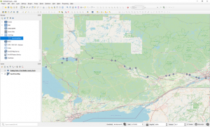
Adding Basemaps
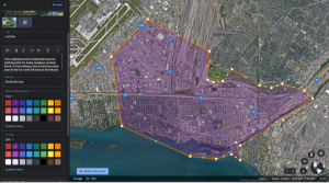
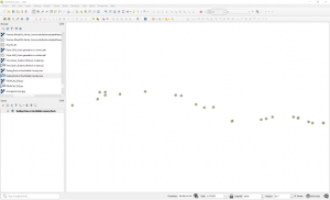
At present, your map might look something like the image below, which shows trading posts along the canoe route from Montreal to Georgian Bay. However, you wouldn’t know this by looking at the map. Even the addition of a title might not be especially helpful in this regard. What the map really wants is some spatial context – perhaps the addition of lakes, waterways, roads, and major population centres to help orient the viewer to what they are seeing.
There are two main ways to add this spatial context. The first is to build the map from scratch. You could download data about cities, waterways, and roads yourself, from sources like Ontario GeoHub [https://geohub.lio.gov.on.ca/]. These websites allow you to download shapefiles, which can then be added to your QGIS map in the same way you added your KMZ file. The process of downloading this data is discussed in a previous lab.
The other option is to add a basemap. These are pre-built maps which can be downloaded directly through QGIS. The basic QGIS install comes with access to the OpenStreetMap basemap, but you can add others if you so desire. There are excellent instructions on accessing other basemaps available on StackExchange [https://gis.stackexchange.com/questions/20191/adding-basemaps-from-google-or-bing-in-qgis/356668].
To add a basemap to your QGIS map:
- In the browser panel of QGIS, navigate to the XYZ Tiles folder.
- Drag and drop the basemap you wish to use into the map pane.
- In the layers panel, drag and drop your points so they are listed above the basemap, otherwise they won’t be visible.
- Make sure that the symbol you have chosen for your points is visible against the colours of your basemap.
Data for Mapping Historical Narratives
Finding Historical Narratives to Map
The examples used in this lab happen to be travel narratives, but these are by no means the only narrative sources of historical spatial data. Autobiographies, collections of letters, and oral histories are just a few other potential sources. It should also be noted that narratives do not have to be based in history, or even in reality, to be worth mapping. Modern stories can be just as interesting, and there are even researchers interested in imaginary and speculative geographies, and what we can learn from them. Clearly, then, if narratives are so diverse, the locations where they are stored will also be so. The narratives mapped in the examples were mostly taken from books; some in hard copy, but some available online. You might also consider government archives and museum websites in your search for narratives. Often, a google search is a good place to start, as it will include results from many of these sources. You may also find the following list helpful:
- Canadiana [https://www.canadiana.ca/] is a collection of digitized sources related to Canadian history.
- archive.org [https://archive.org/details/texts] is an online repository of books, archived websites, and other texts. Many are freely available, while others require an account to access.
- Project Gutenberg [https://www.gutenberg.org/] offers a collection of public domain e-books, which can be downloaded or read in your browser. Unlike the other sources listed here, the books are provided as transcriptions rather than scans of the originals.
- Google Books [https://books.google.com/] is another online collection of books, the text of which are searchable through Google’s interface. Some are available as full text, while others must be purchased to access more than a preview.
- Hathi Trust [https://babel.hathitrust.org/cgi/mb?a=listcs&colltype=featured] is another online library with many digitized books.
- Library and Archives Canada [https://www.bac-lac.gc.ca/eng/collectionsearch/Pages/collectionsearch.aspx] is the organization responsible for Canada’s national archive. Many holdings have been digitized and are available to view online.
- Archives of Ontario [http://www.archives.gov.on.ca/en/access/our_collection.aspx] is the provincial archive, and also has many digitized holdings.
Approaches to Mapping Historical Narratives
The narratives mapped in the examples were, with one exception, fairly short. For this reason, they were mapped using a low-tech approach. That is, place references were found simply by reading each narrative, and mapped by placing points manually. For a longer text, or even a collection of texts, you might prefer to automate this process. This can be done using Named Entity Recognition (NER) and Geocoding, which are far beyond the scope of this lab. If you are interested in implementing these techniques, Saldutti [https://towardsdatascience.com/quick-guide-to-entity-recognition-and-geocoding-with-r-c0a915932895] provides an excellent and simply written tutorial, with samples of R code included. Keep in mind, though, that geocoding relies on place names being recognizable to your geocoder, which is not always the case with historical texts, either because the places no longer exist, or the names have changed over time. These challenges are discussed further in the next section, and more information on their application to NER and similar processes is available in appendix 2.
Challenges with Mapping Historical Narratives
As mentioned in the introduction, any spatial narrative which discusses places can be mapped. This straightforward statement conceals a complex process, however. For one thing, place names may shift locations over time, or fall in and out of use, or be misrecorded or otherwise corrupted into an unrecognizable form. Further, some places may simply be described rather than named. In working with the voyageur narratives mapped above all of these problems were encountered. There is no hard and fast rule for how best to determine the location belonging to a certain place name, but some tactics you might consider include:
- Cross reference multiple historical narratives. Sometimes it will be obvious that several refer to the same location, while only one uses a recognizable name for it.
- Check scholarly works relating to your study area, including archaeological reports and documentation. Often, archival research will already have been done, or excavations may have been conducted that shed light on the topic.
- When in doubt, google. Some museums publish online exhibits that contain useful information. Community history organizations and local historians often have blogs that can be a helpful source of information, too.
One of the more difficult questions in this kind of mapping work is when a place should simply be excluded from the map. With the voyageur narratives, it was quite common for a camping place to be mentioned, but described no further, or described in such general terms that it would be impossible to locate, beyond knowing it was in between the preceding and following named locations. Such places were eventually excluded from the map, largely because the cartographer was trained in conventional GIS techniques, which deal poorly with uncertainty. However, other map makers might treat this circumstance differently. One interesting example is the approach used by Westerveld and Knowles [https://visionscarto.net/i-was-there] to map the experiences of two holocaust survivors (2018). The resulting map focusses on the relationships between places rather than precise locations, which were often unknown to the people telling their stories. As such, it is not accurate in the traditional geographic sense, and may challenge some readers’ conceptions of what a map actually is.
Assignment
Using the skills you have learned in this lab, produce both a Google Earth Presentation and a static QGIS map of a text-based narrative of your choice. Your map should include at least six locations, with images and descriptive text of your choice included in the presentation. Your submission for this project should be a word or pdf document containing:
- A link to your Google Earth project, with the appropriate sharing settings enabled. If you do not have and do not wish to create a google account, you can submit a .kmz file instead of providing a link.
- Your QGIS map in .jpeg or .tiff format
- A properly formatted citation for the narrative you have chosen to map
References
Textual References
Westerveld, Levi & Anne Kelly Knowles. “I Was There,” visioncarto. December 13, 2018. https://visionscarto.net/i-was-there
Images
Castle, Ysabel A. “Mapping the Middle Country Part 1”. Accessed January 13, 2022. https://www.google.com/maps/d/edit?mid=1q2zc-AGTxVU4KH8W3r2uA1oqM2Vztluv&usp=sharing
Castle, Ysabel A. “Mapping the Middle Country Part 2”. Accessed January 13, 2022. https://www.google.com/maps/d/edit?mid=1l7ozXECzi8BJWorpq14hkmUKdgfpHoqC&usp=sharing
Data Used in this Lab
Trading Posts of the Middle Country. KMZ File. North Bay, ON: Ysabel A. Castle, July 26, 2020.
Basic GIS Concepts Covered in this Lab
In GIS, vector data is based on coordinates in space, and has three basic types.
- A point is a single set of coordinates.
- A line is made by linking together two or more points. Often, the points in a line will be known as vertices or nodes, while the connections are called line segments.
- A polygon is made by linking points so that they completely enclose an area. Unlike in a line, the start and end vertices of a polygon are always at the same location.
Each vector data type is best suited to different features. Points, for example, simply record a location, which could be as small as a certain plant, or as large as a city. Lines are best for linear features such as roads or rivers. Polygons are good at displaying boundaries, such as the extent of a waterbody or country.
Information about each vector feature is attached to that feature in the form of attributes. In the Google Maps examples above, the attributes of each point would be the title assigned to it, and the description.
Layers work a little differently than attributes. It might be helpful to think of them as the datasets that your mapped places are stored in, though this isn’t strictly true, either. Rather, in a traditional GIS, a layer is a link to a dataset. It tells the GIS software where to find the dataset, and how it should be displayed. This distinction isn’t important for this lab, but is crucial if you will need to move or share your GIS projects. The reason for this is that your GIS project file doesn’t actually store the datasets mapped in it – these already exist elsewhere on your computer, and are quite large, so it wouldn’t make sense to duplicate them and thus double the storage requirements. The downside is that if you move your datasets, or share the project file without also sharing those datasets, the links stored in your project will no longer work, and the data will not be displayed.
Some Optional Readings
Thoughts on Mapping Historical Narratives
Carrard, Philippe. “Mapped Stories: Cartography, History, and the Represntation of Time in Space,” Frontiers of Narrative Studies 4, no. 2. (2018): 263-276. DOI: 10.1515/fns-2018-0022.
Murrieta Flores, Patricia, Christopher Donaldson & Ian Gregory. “GIS and Literary History: Advancing Digital Humanities Research Through the Spatial Analysis of Historical Travel Writing and Topographical Literature,” Digital Humanities Quarterly 11, no.1 (2017). https://chesterrep.openrepository.com/handle/10034/620256
Torgerson, Jesse W. “Can We Map Space & Place in Historical Narratives?” Traveler’s Lab. November 5, 2016. https://travelerslab.research.wesleyan.edu/2016/11/05/can-we-map-both-space-and-place-in-historical-narratives/
GIS and Conceptions of Space
Blaschke, Thomas, Helena Merschdorf, Pablo Cabrera-Barona, Song Gao, Emmanuel Papadakis, and Anna Kovacs-Györi. “Place versus Space: From Points, Lines and Polygons in GIS to Place-Based Representations Reflecting Language and Culture,” ISPRS International Journal of Geo-Information 7, no. 11 (2018). DOI: 10.3390/ijgi7110452
Freundschuh, Scott M. & Max Egenhofer. “Human Conceptions of Spaces: Implications for Geographic Information Systems,” Transactions in GIS 2, no. 4 (1997): 361-375. DOI: 10.1111/j.1467-9671.1997.tb00063.x
Huck, Jonny, Stephen Carver & Alan Watson. “The Map-Me PGIS Platform”. Accessed January 13, 2022. http://map-me.org/
McCall, Michael K. “Precision for whom? Mapping ambiguity and certainty in (Participatory) GIS.” Participatory Learning and Action 54, no. 1 (2006): 114-119. https://www.researchgate.net/publication/272419121_Precision_for_Whom_-_Mapping_ambiguity_and_certainty_in_Participatory_GIS/link/54e3c18a0cf2dbf606944369/download
Palladino, C. “New Approaches to Ancient Spatial Models: Digital Humanities and Classical Geography,” Bulletin of the Institute of Classical Studies 59 (2016): 56-70. DOI: 10.1111/j.2041-5370.2016.12038.x
Geoparsing with Historical Texts
Gregory, Ian, Christopher Donaldson, Patricia Murrieta-Flores & Paul Rayson. “Geoparsing, GIS, and Textual Analysis: Current Developments in Spatial Humanities Research,” International Journal of Humanities and Arts Computing 9, no. 1 (2015): 1-14. DOI: 10.3366/ijhac.2015.0135
McDonough, Katherine, Ludovic Moncla & Matje van de Camp. “Named Entity Recognition Goes to Old Regime France: Geographic Text Analysis for Early Modern French Corpora,” Internation Journal of Geographical Information Science 33, no. 12 (2019). DOI: 10.1080/13658816.2019.1620235
Cartographic Theory and Design
Buckley, Aileen. “Make Maps People Want to Look At”. ArcUser. Winter 2012. https://www.esri.com/news/arcuser/0112/make-maps-people-want-to-look-at.html
“Cartographic Principles,” Essentials of Geographic Information Systems. Saylor Academy, 2012. https://saylordotorg.github.io/text_essentials-of-geographic-information-systems/s13-cartographic-principles.html
Ingram, Ulrike. “Chapter 2: Map Elements and Design Principles,” Introduction to Cartography. Athens, GA: University System of Georgia. https://alg.manifoldapp.org/read/introduction-to-cartography/section/b9662d0a-4926-4947-922d-a67a2cae0eec
