Appendix II: A Quick Guide to QGIS
About This Document
It is not mandatory to read this entire document! Much of the information is also incorporated into the labs. Rather, it is intended as a quick reference guide, which compiles basic information about using QGIS into one place so that you can find it without flipping through all the lab documents.
What is QGIS?
QGIS is a free and open source GIS – that is, a geographic information system, or software package which is designed for working with spatial data. It can be used for both data analysis and data visualization, so that in addition to creating maps, you can derive new information and data. You can read more about QGIS at the official website [https://www.qgis.org/en/site/].
Installing QGIS
QGIS can be downloaded from the website linked above, and will run on Windows, MacOS, or Linux. There are several versions of the software; the most relevant for a causal user will be the latest release, and the long term release. The latest release has new features added more frequently, but should also be updated more often, whereas the long term release is more stable. You may choose either. Simply download the “Standalone installer” for the version you want to use, open it on your computer, and follow the instructions in the installation wizard that opens.
As a point of interest, you can’t update QGIS, per se. When you want to update it, you need to download and install a fresh copy.
The QGIS Interface
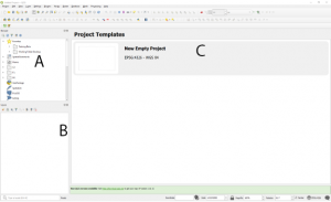
When you first open QGIS, you will see something like the image in figure 2. There will be panels labelled “Browser” and “Layers” available to you. The main panel will have a list of project templates, and will sometimes contain news items, or reminders about new versions of the software. This is also where your map will appear once you start a project and add data to it. To start a new project, simply double click the “New Empty Project”, or any other template you wish to use. EPSG:4326 – WGS 84 is the coordinate system for the template, which will be discussed shortly.
In addition to the panels, there are a number of menus and toolbars. The toolbars contain buttons relating to the most common functions of QGIS, including the zoom and pan tools. Generally, however, we will use the menus at the top of the screen to make the software do things. If you want to change the panels or toolbars visible in your interface, for example, the View menu is a good place to start.
Key GIS Concepts
Spatial Data
Spatial data are any data which incorporate a location. They fall into two broad “types”, or models, which are structurally very different from one another. These are raster data, and vector data. Beginner GIS students often think that vector data is better or more accurate than raster; this is not necessarily true. Rather, each data model is best suited for different purposes.
Spatial Data Types: Raster
You are probably already familiar with raster data, albeit in a non-spatial form. A raster is simply a grid of equally sized pixels, each of which stores a numeric value. So, a digital photograph is a raster, and the value each of its pixel stores is the amount of light reflected from a surface. To make a raster spatial, you simply assign coordinates to its corners. Then, because we know how big each pixel is and thus how far it is from the corners, we know the location of every pixel.
The values in a spatial raster represent a value measured at the location the pixel represents. This could be the amount of light reflected from that location, which is the case with satellite imagery. It could also be the elevation at that location, or the population, or the type of landcover encoded as a numeric value. These things which the data tells you about are known as the “attributes” of a place.
Rasters excel at storing and displaying attributes which vary continuously across an entire area. For example, every location on earth has a population, even if that population is 0. It also has an elevation, and a certain amount of light reflected from it. Rasters suit this kind of data because they are themselves continuous, and cover entire areas; they don’t have gaps between the pixels. However, rasters are less good at storing discrete information, such as the location of a certain lamp post. They can also only store a single type of value, so you can’t have a raster that tells you about both population and elevation at once. This would require you to use multiple grids.
Many of the raster file formats you are familiar with from digital images can be spatial – examples include tiffs, jpegs, and gifs.
Spatial Data Types: Vector
Vector data are based on individual pairs of coordinates rather than a grid of pixels. The basic feature type of vector data is a point, which is simply a set of coordinates defining a location, with attributes attached to tell you what is at that place. Points can be connected to form lines, or if they completely enclose an area, polygons. In these cases, the attributes belong to the entire line or polygon, not the individual point.
Because the coordinates of vector data represent discrete locations, vector data are best at representing discrete features. Points could be used to tell you about the locations of lamp posts, or individual trees. Lines work best for linear features such as rivers or roads. Polygons are best for features covering an area, such as a lake or a city. There is some overlap between the feature types, however; if you were looking at a map of the entire world, it might make more sense to represent cities using points than polygons!
Unlike raster data, vector data can store multiple attributes for every feature – it would be able to tell you about both the population and elevation of a city at one time. It can also store non-numeric values.
There are several spatial vector file formats. The labs for this course will focus on shapefiles, which have the extension .shp, but will also make use of kmz and GeoJSON files.
Coordinate Systems and Projections
In the sections above, you learned how coordinates are used in different ways to define the location of raster and vector data. But did you know that not all coordinates are the same? There are many different coordinate systems out there.
Think for a moment about latitude and longitude, which are a mesh of imaginary lines encircling the globe. Latitude tells you how far north or south of the equator a location is. Longitude tells you how far east or west of the prime meridian a location is. But different coordinate systems can be based on different prime meridians. Additionally, different coordinate systems will use different datums, which account for the fact that the earth is not a perfect sphere. These two features, along with a unit of angular measurement, make up a geographic coordinate system.
Geographic coordinate systems, however, are based on globes, while maps are often flat. The process of making a coordinate system designed for a globe work on a flat map is called projection, and thus maps will have projected coordinate systems rather than geographic coordinate systems. There are many different projections, all of which produce different types of distortion. This distortion can be more or less severe in certain places, so some projected coordinate systems are better for certain locations than others.
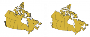
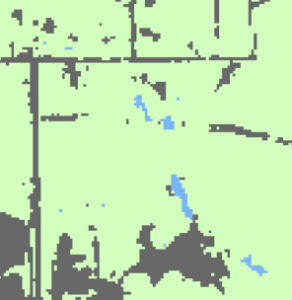
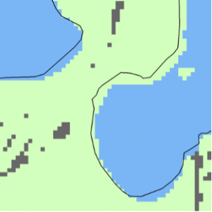
For now, you don’t need to worry too much about how to choose the best coordinate system for your map. You should, however, be aware that different projections will give your data different shapes and sizes – see figure 5 for an example. So what happens if you load spatial data with different projections into QGIS? Rather than showing you a map with misaligned data, QGIS will temporarily project your data to match the coordinate system of your project file. Therefore, changing the coordinate system of your project file will change the appearance of your data.
Opening Data in QGIS
Files from Your Computer
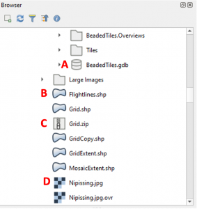
The browser panel of the QGIS interface will let you navigate your computer to find the files you want to add. Some caution is necessary here, however; it will list all files, not just those which are spatial! Some of the more common icons you may encounter are illustrated in figure 6.
- Locate the file you wish to add in the browser panel.
- Drag and drop it into the main panel of QGIS. Each file you add to your map becomes a different “layer” of data, and will be displayed on the map, as well as in the layers panel with an icon showing you how that layer looks.
- You can change the order of layers in your map by dragging and dropping their names in the layers panel.
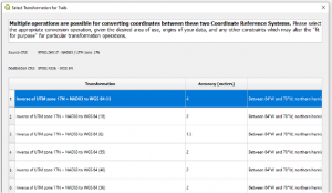
Sometimes, if the coordinate system of your data is different to the project coordinate system, you will see a dialogue box asking you how you would like it to be transformed to solve this problem – see figure 7. The column at the right of this box lists the area that each transformation is most appropriate for; pick the one that best describes the area you are mapping.
Basemaps
As well as files stored on your computer, the browser panel will let you add spatial data hosted elsewhere. This includes basemaps, which are pre-built maps intended for use as a background to your own spatial data. QGIS comes with access to the OpenStreetMap basemap by default, but you can connect to others by following these instructions from the forum StackExchange [https://gis.stackexchange.com/questions/20191/adding-basemaps-from-google-or-bing-in-qgis/356668].
- Scroll down the browser panel until you find the “XYZ Tiles” section.
- Drag and drop your preferred basemap into your map.
- Generally, you will want your basemap to be the bottom layer on your map, so you should drag and drop it to the bottom of your layers panel.
Other Methods
It is also possible to add individual vector files hosted elsewhere to your map, rather than entire basemaps. There are a number of different methods of doing so, including using APIs and using QGIS Plugins. Instructions on how to do this are included in the Spatial Data lab.
Changing the Appearance of Your Data
Often, you will want to change how your spatial data looks on the map, either to make your map look better or to communicate a specific message.
- Double click the name of the layer you want to alter in the layers panel. This will open the layer properties.
- In the sidebar at the left of the Properties window, click “Symbology”.
- There are many options for symbology, so you will need to explore them yourself. However, you should note that there are some presets provided at the bottom of the window. Basic options, like colour, opacity and symbol size can also be edited from this main screen.
- To alter more complex settings like outline thickness or symbol shape, click on the symbol preview next to the words “Simple Fill”, “Simple Line”, or “Simple Marker”.
- If you want symbols with different attributes to look different, use the dropdown menu at the top of the layer styling pane which currently says “Single Symbol” to change to either the “Graduated” or “Categorized” option.
- Once you have made all your changes, click the “OK” button at the bottom of the window.
Manipulating Your Data
Often, you will only want to use a small part of what is in your spatial data file. There are two main ways to trim it down; you can export to keep only features with certain attributes, or clip to remove features which are outside of a certain area. While there are many other ways to manipulate and analyze your data, these will be the most important techniques for a course based on narrative and visualization, rather than spatial analysis.
Exporting
- Highlight the layer you wish to edit in the layers panel, and press F6 to open its attribute table.
- Highlight the rows in the attribute table corresponding to the features you wish to keep. There are other ways to select features, including based on your map; details are available from QGIS [https://docs.qgis.org/3.16/en/docs/user_manual/introduction/general_tools.html#selecting-features].
- Once your features are selected, right click the layer name again and from the Export menu, click “Save selected features as”.
- Choose an appropriate name, location, and file format for your output file, then click “OK”.
- Your new file will likely be added to the map automatically, but can be added using the browser panel if necessary.
Clipping
You will need two layers for clipping to work – the one which you want to trim, and another representing the area where you want to keep your features. The first is known as your input layer, and the second as your overlay layer.
- In the Vector menu at the top of QGIS, open the Geoprocessing Tools menu, and click “Clip”.
- Set your input and overlay layers appropriately.
- Click the “…” button next to the Clipped text box to choose your output format. Generally, you will want to choose “Save to File”, then give your new file an appropriate name, location, and file format.
- Click “Run”. Once the process is complete the new layer will be added to the map, and you can close the clip window.
Creating Map Layouts
When you want to present your map to other people to read, it’s rarely appropriate to just give them a screenshot of the QGIS window! Instead, you should create a map layout, which lets you position your map on a page and add additional objects like a legend or a scale bar, which provide readers with context that can help them to understand what they are looking at.
- Make sure that you have all your layers symbolized and arranged as you want them to appear in the final map.
- In the Project menu, click “New Print Layout” and choose a title. This will open a blank page in a new window.
- In the Add Item menu, click “Add Map”, and draw a rectangle on the page using your mouse cursor. Your map will appear in this rectangle.
- The Add Item menu will also allow you to add legends, text, scalebars, and other items to your map. As with the map itself, you draw a rectangle on the page to set their size and location.
- You can edit each item by double clicking on it to access its properties. Most things about an item will be customizable, including colours, fonts, backgrounds, and outlines.
- Once your map layout is finished, you can export it as a PDF or an image using the Layout menu. This will generally produce a higher quality map than just capturing a screenshot.
Saving Maps in QGIS
When you save the maps you make in QGIS, they will be saved as .qps or .qgz files, generally called project files. These are not actually spatial data files. Even when you load spatial data into QGIS to make a map, this data is not saved into your project file. Instead, the project file just contains a link that tells QGIS where that data is stored, and how it should be displayed. For this reason, you should be careful about moving your spatial data files around – the links in your project file will no longer work if the data isn’t where it was when you saved the project! This means that your spatial data would no longer be displayed. If this happens to you, there are instructions in QGIS’s user manual on how to fix the problem [https://docs.qgis.org/3.16/en/docs/user_manual/introduction/project_files.html#handling-broken-file-paths].
Other Resources
QGIS has many, many functions that were not discussed here, especially when you consider that it can be further extended by installing plugins. If you would like to know more about using QGIS, there are several documents you might find helpful:
- The QGIS training manual, which comes with practice data, gives step by step instructions for many key GIS tasks [https://docs.qgis.org/3.16/en/docs/training_manual/index.html].
- The QGIS user manual contains detailed information about every aspect of the software, and is descriptive rather than instructional [https://docs.qgis.org/3.16/en/docs/user_manual/index.html].
- The QGIS gentle introduction to GIS is a thorough introduction to GIS concepts for people who may have little experience in the field [https://docs.qgis.org/3.16/en/docs/gentle_gis_introduction/index.html].
Data Sources Used in this Document
“Boundary Files,” 2016 Census. Statistics Canada (2016). Catalogue no. 92-160-X.
Castle, Ysabel A. & John M. Kovacs. “Identifying Seasonal Spatial Patterns of Crime in a Small Northern City,” Crime Science 10 (2021). DOI: 10.1186/s40163-021-0016
