Designing Inclusive Digital Experiences for Neurodiversity by Sara Boback
What is Web Accessibility and Who is Missing?
Sara Boback
Hi again! Let’s jump right in…
What is Web Accessibility?
Personally, I like this definition. Web accessibility means creating web products and web services that are designed for users of all abilities.
So, who are we designing for?
The list is endless, when we think about our designs and who we should be including. We should be considering a wide range of persons and perspectives when conducting our research, designing and testing with the aim to ensure everyone has access to information. To start some considerations could be with:
-
Persons who are visually impaired or blind
-
Persons who are hard-of-hearing or Deaf
-
The elderly
-
Non-native English speakers
-
Temporary or situational disabilities
-
Users who have cognitive and learning disabilities
-
Persons with mobility impairments

The Gap
In reality, in the design of websites and applications, many different perspectives are missing. The gap, I’m focusing on for my research project, however, are those with developmental or learning disabilities. Unfortunately, this gap persists as persons with disabilities are rarely included in research or planning work in designing websites, and additionally in my experience designers and developers are unaware of best practices and needs that persons with disabilities may have. Currently, there is little emphasis or focus is placed on designing websites to be usable for neurodiverse individuals and my research focus will be on how websites, web-applications and documents can be designed and built to enable individuals with autism, ADHD or dyslexia to have improved access to information.
What do we know now?
There has been research done that generally is accepted as web accessibility best practices to improve access broadly. I’ll outline some considerations below;
Choosing Accessible Colours
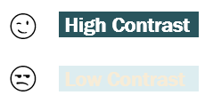
It’s important that the text colours we choose, have sufficient contrast against the background. This also applies to links!
Simple Organization
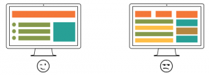
Having a logical and linear layout is shown to help generally with information consumption. Additionally, breaking up content with bullets, headings and sub-headings improves structure of the page, and can aid those navigating with assistive technology in navigating more effectively.
Descriptive Hyperlinks
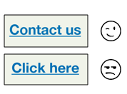
Creating descriptive hyperlinks can help with understanding context and the resources being linked to.
Videos
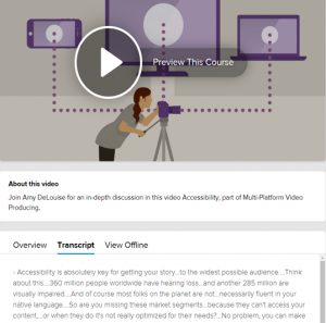
The use of captions and audio descriptions for videos greatly improves to access. Additionally, providing a descriptive text transcript assists with providing an alternate means of content access.
Helpful Forms
Forms can be one of the trickiest things, but everything goes back to clear and simple information design.
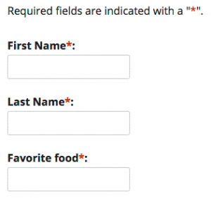
- Mandatory form controls should be clearly identified as required
- Provide clear instructions to prevent errors
- Error messages provide clear suggestions to fix errors
Great – thanks for stopping by and checking out some of this information. Pop on over to my next page to learn more about my research efforts this year!


Feedback/Errata