Equity in OER Publishing by Josie Gray
OER Design
Josie Gray
Press play on the following media player to listen to the podcast version of this chapter or read the text below.
Topics covered in this section
In this section, I will be talking about accessible and inclusive design in the context of OER. I will talk about the social model of disability, a need to balance print and digital design considerations as OER become increasingly multimodal, and how OER publishing tools can help make accessible authoring easier. I hope you enjoy.
Resource design is the area that I have the most experience in and have been thinking about the longest.
Accessible but not accessible
People who advocate for OER often talk about “access.” They argue that OER improve access to education because they are available for free online, or they say a resource is “freely accessible online.” But this word accessible is also used to signify that something is accessible for disabled people. And unfortunately, many OER that exist today are inaccessible.
Digital formats have the potential to really increase the accessibility of educational materials. They are more flexible, and people can use assistive technologies interact with the content in different ways. For example, text can be enlarged on the screen or text-to-speech technology can read the content aloud. This allows people to access the content in a way that works best for them.
But accessible digital content does not happen on its own. It requires an intentional approach. There are guidelines. The W3C maintains the Web Content Accessibility Guidelines (WCAG), which provides instructions on how to design and structure web content so it is accessible to people with a range of disabilities.
But it is also not as simple as following a set of guidelines.
Social model of disability and spectrums of access
An idea I would like to introduce here is the social model of disability. I first encountered this idea when listening to Jess Mitchell present about inclusive design, but it is an idea that has a long history in the disability rights movement.

The social model of disability offers an alternative to the individual model of disability that currently dominates our society. The individual model sees disability as grounded in the individual, a personal deficit that needs a cure or accommodation. We see this model in universities, where students need to provide documentation of a diagnosed disability to be eligible for accommodation.
In contrast, the social model looks at external factors that create barriers. It sees disability as emerging when there is a mismatch between a person, their environment, and the tools they have access to. This model looks at how accessible and inclusive design can reduce or eliminate unnecessary barriers and, in doing so, make things better for everyone.
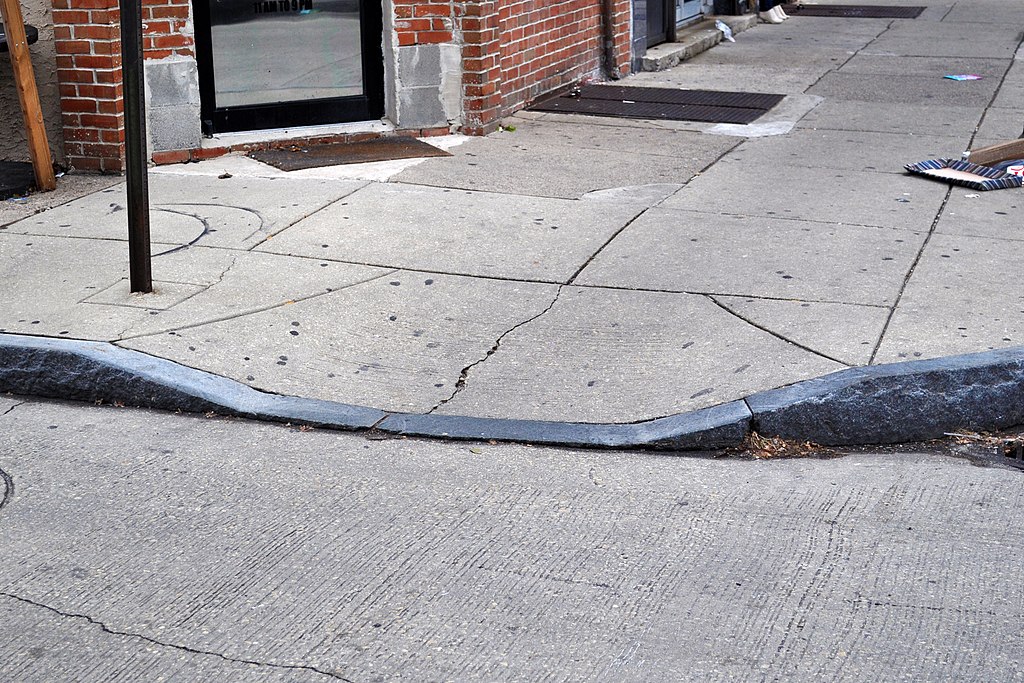
The classic example is the curb cut. A curb cut is where the sidewalk slopes down to meet the road at intersections. So rather than having to step off the curb at an intersection to cross the screen, people can go down a mild slope. This design has the largest benefit for people using wheelchairs or motorized scooters, but it benefits so many more people who may or may not have a disability, including parents with strollers or someone on a skateboard.

The social model of disability encourages us to understand disability as more of a spectrum that can affect different people in different times and in different ways. To give an example from education, when an instructor is lecturing, a Blind student will need the instructor to verbally describe images used on the slides. But this verbal description also benefits someone who has a migraine and needs to keep their eyes closed or someone who is busy taking notes. It may also help all students better understand the images on the slides.
So to go back to the design of OER, it is important to think about how these resources can be designed not just to meet accessibility guidelines but for spectrums of access that recognize the diverse abilities, technologies, contexts, and learning preferences of students.
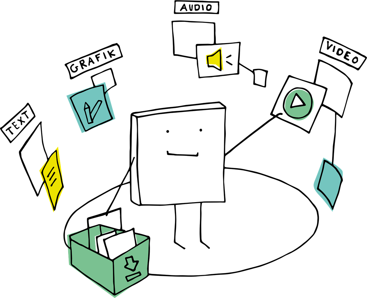
 In some ways, OER makes this easy. For example the OER publishing tool I use at work is called Pressbooks (the same tool you’re accessing this exhibit on). Pressbooks will export a resource into multiple formats that students can choose from. If they want to read it online, there is a website version. But they can also download formats to read offline on their computer, phone, or print out. The challenge arises when trying to ensure that all formats provide an equivalent learning experience. For example, OER have more support for multimedia like videos, audio, and interactive activities. But these things are not included in the offline versions, which creates a barrier for a student that does not have reliable internet access.

How can we make it easier to create accessible OER?
Another thing related to the design of OER that I wanted to talk about is possible reasons why so few OER that are being published are accessible. The short answer is that it takes work and the knowledge to even know what to do. An important thing to recognize here is who is creating OER and what supports do they have. Creating OER is often very similar to self-publishing. There is no big publisher with teams of editors and designers. Instructors writing OER are often doing a lot of that work themselves. Sometimes they have financial support or course release, but they have to do a lot more than just write content.
And OER publishing is hard work. Someone writing an open textbook for the first time is likely using a new technology and learning about open licences, copyright, publishing, digital accessibility, and more. And then there is all the pedagogical elements that go into an effective learning resource. In the long list of things to keep in mind, accessibility often gets overlooked, and there is not always resources for accessibility remediation.
So the question becomes, how do we make creating accessible and inclusive content easier? How can we empower creators to design OER that meet the diverse needs of their students? What support systems need to be in place to make this possible?
One potential area to be looking into is how we can reduce the time and cognitive load that goes into creating an accessible OER, specifically though the design of OER publishing tools. OER publishing tools can both support and impede accessible authoring:
- These tools can prompt authors to provide text descriptions for images, or they can hide alternative text boxes in a large menu.
- They can generate printable versions of interactive activities, or they can rely on manual labour.
- They can provide an accessibility checker that identifies potential problems, or they can leave that to external tools that authors may not know about.
All of these things are design decisions, and one decision over another has the potential to really improve the overall accessibility of OER.
And that’s the end of this section on OER design. Thank you for your attention. You are welcome to go explore one of the other sections or skip to the end to review the conclusion. If you have any thoughts you’d like to share with me, please do reach out.
Media attributions
- “Doesn’t fit” by maestrosphere1 is released under the Pixabay Licence.
- “Curb cut for wheelchair ramp” © Nick-philly is licenced under a CC BY-SA 4.0 Licence.
- Pressbooks logo © Pressbooks. Not under an open licence.
- “Resource OER Audio” by manfredsteger is released under the Pixabay Licence.


Feedback/Errata