4 Accessible Web Heading Styles
Properly applied heading styles will assist users who navigate the page with and without the use of assistive technologies, supporting a diverse group of individuals with both visual and semantic landmarks for easy navigation.
Headings do two things within a document:
- Change the text’s visual appearance.
- Change the text’s semantic structure. This is the associated HTML code and impacts the reading order of the page.

Best Practice for Using Headings in Mac Sites
When opening a MacSites page to edit, the logical structure to a web page is laid out for you.
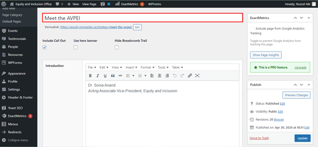
The title of the page is the first large text field available at the top of the page. The title text field is above the page permalink, outlined in red in the screenshot above. The title in MacSites is assigned a Heading 1 style on the web page.
Headings within your page content should start with Heading 2. This is common practice for most web content management systems (CMS) and avoids duplicated heading 1 items on the page.
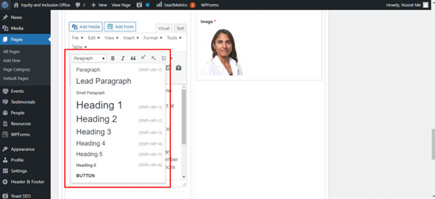
Within the content edit areas, you can select what text style is applied to text. Do not use heading styles for the body text of your website. The Paragraph style is best used for the body text. Continue with Heading 2, 3, and so on for subheadings in the body of the page. Headings should be used in numerical order, and should not skip levels (for example, Heading 2 to 4). Skipped heading levels can be extremely confusing for assistive technology users.
Visual styling is also important for holistic heading accessibility.
- Headings should have accessible colour contrast (more on this under colour contrast).
- Headings text size should be larger than the body text.
- Headings should not use All Caps. All Caps can be difficult to interpret for visual learners and be incorrectly read as acronyms by some assistive technologies.