36 Accessible Headings and Font Styles in Pressbooks
Properly applied heading styles will assist users who navigate the page with and without the use of assistive technologies, supporting diverse groups of users with both visual and semantic landmarks for easy navigation.
Pressbooks provides users two methods to add and edit content within their Pressbook: the visual editor and the text (html) editor.
When heading styles are assigned to text in the visual editor, users can choose how font will be displayed for users from the drop down menu.
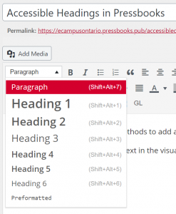
If users access the Text editor, text with an applied heading style will have the corresponding heading style tag before and after the text. For example, Heading Style 2 will have <h2> and </h2> wrapped around your text. These tags can be added manually if you are comfortable with HTML code.
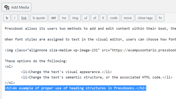
These editing options do the following:
- Change the text’s visual appearance.
- Change the text’s semantic structure, or the associated HTML code and reading order of the page.
Best Practice for Using Headings in Pressbooks
- Add a logical structure to your page by starting with Heading 2. As the chapter title uses Heading Style 1, this allows users to navigate to the page or chapter’s content quickly.
- Heading styles should be used in numerical order (for example: 1, 2, and 3 instead of 1, 3, and 2).
- Headings should have appropriate colour contrast (visit following sections on colour contrast).
- Headings should use larger text than the body text.
- Headings should not use All Caps. All Caps can be difficult to interpret for visual learners and be read as acronyms by some assistive technologies.
*Note: some changes to header formatting must be made within the Custom Style Sheet (CSS) of your associated theme. Accessible versions of each default Pressbooks theme will be available at the end of this section for download.
Best-Practice for Accessible Font Styles in Digital Contexts
- Sans serif fonts (Calibri, Arial, and Open Sans).
- Font size of 12-14 or larger.
- Bolded text.
- 1.5 minimum line spacing.
Font Styles to Avoid in Digital Contexts
- Serif fonts: Times New Roman.
- Italic or underlined fonts: Freestyle Script.
- Compressed fonts: Bernard MD Condensed.
- Fonts with uneven line weights: Broadway.
- Decorative fonts: Algerian.
- ALL CAPS.
- Underlined text that is not a hyperlink.
- Complex symbols or characters without alternative text.