29 Colour Contrast in Pressbooks
Colour contrast is the contrast value of two adjacent colours. Sufficient colour contrast is very important to improve accessibility, and can be difficult to evaluate without using a tool.
This often refers to the colour contrast of the text against the background on a page, but can also be applied to visual elements such as graphics, charts, and graphs.
Web Content Accessibility Guidelines (WCAG) 2.0 AA Colour Contrast Requirements
- Text must (AA) have a contrast of at least 4.5:1 for body text and 3:1 for headings.
- Text should (AAA) have a contrast of at least 7:1 for body text and 4.5:1 for headings.
- Adjacent colours within graphics should (2.1 AA) have a contrast of at least 3:1.
- Colour must (AA) not be used to convey meaning. For example, if colour is used in a legend, additional information such as labels or symbols should also be used.
How to Check the Colour Contrast of your Page
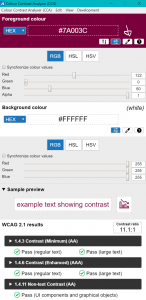
- Obtain the hex colour codes (for example, white is #FFFFFF) of the colours you would like to check.
- If you are using McMaster brand colours, these colour values are available on page eight (8) and nine (9) of the Digital Brand Standards Manual.
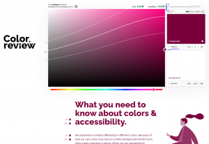
- Use a free colour contrast checker, such as color.review, to obtain the contrast for your colours.
- If your background colour is white, the hex code should be #FFFFFF. If your background colour is black, the hex code should be #000000.
- If you would like to share the results of your colour contrast check, copy the link at the top right of the page.
- There are also several free applications, such as Colour Contrast Analyser, for checking colour contrast that do not require a hex code to check contrast.
- To obtain a colour’s hex code with this application, use the dropper tool (second from the right) in order to “pick up” the colours you would like to compare.
- If you are using more than one monitor, this application may have difficulties checking the colours of elements that are not on the same monitor as the checking tool.
McMaster Brand Colour Comparisons
- If you are using McMaster brand colours together, it is very important to check the contrast of those two colours if their contrast is not provided below.
- It is recommend to aim slightly above AAA or AA contrast to account for differences in monitors or poor internet connections.
- Achieving AAA contrast will also prevent the need for further remediation at a later date when legislative guidelines change.
- The “Highlights” colours should not be used on white unless they are being used for decorative purposes only.
*New* – colours have been updated to reflect the 2024 evolved brand update.
WCAG 1.4.6 Contrast (Enhanced) AAA – on White
- Heritage Maroon (7A003C): 11 (HM Pass AAA Headers, AAA Text)
- Heritage Gold (FDBF57): 1.6 (HG Fail) – Example
- *New* Heritage Grey (495965): 7.2 (HGr Pass AAA Headers, AAA Text)
- *New* King’s Forest Green (0E5B3D): 8.1 (KFG Pass AAA Headers, AAA Text)
- *New* Bayfront Blue (0D5D78): 7.3 (DG Pass AAA Headers, AAA Text)
- Dundurn Grey (DBDBDD): 1.3 (DG Fail) – Example
WCAG 1.4.6 Contrast (Enhanced) AAA – on Black
- Heritage Maroon (7A003C): 2.7 (Fail)
- Heritage Gold (FDBF57): 12.7 (Pass AAA Headers, AAA Text)
- *New* Royal Botanical Pink (FF9980) – 10.1 (RBP Pass AAA Headers, AAA Text) – Example
- *New* Cootes Paradise Green (E4EA6C) – 10.1 (CPG Pass AAA Headers, AAA Text) – Example
- *New* Albion Falls Blue (AAD5E1) – 13.3 (AFB Pass AAA Headers, AAA Text) – Example
- *New* Pier 4 Purple (CC99CC) – 8.9 (P4P Pass AAA Headers, AAA Text) – Example