3 Introduction to the Core Skills
This workshop will cover a broad understanding of digital accessibility practices and an overview of the 7 Core Skills of Digital Accessibility (+ more helpful tricks and tips) as they relate to the McMaster environment. It is strongly encouraged that those completing this workshop also complete the Accessibility and Disability Inclusion in Teaching and Learning workshop.
By the end of this workshop, learners will:
- Be able to identify how ableism manifests in digital environments.
- Integrate accessibility into every facet of course design and delivery.
What do we mean by accessibility?
When defining digital accessibility, we are specifically referring to: “Making electronic content available and usable by everyone…at the same time, with the same use, including and especially focusing on persons with disabilities” (Shachmut, 2020).

What is ableism and how can it manifest in digital environments?
Ableism is:
- (a form of) Discrimination.
- The false idea that disabled people are by default inferior, when in truth, disability is just another way for a mind and/or body to be.
Examples of systemic ableism in digital environment:
- Captions are not embedded by default in video streaming platforms where we are uploading content
- Reminders to add alternative text to visuals not added to CMS / LMS / difficult to find in a platform
- Recommended colour combinations for branding (generally) do not support low vision / colour blind users
Why now (“more than ever”)? – Digital accessibility during COVID-19
As we have recently passed deadlines for the Accessibility for Ontarians with Disabilities Act, 2005 (AODA) for digital media and web accessibility (especially pressing with the movement to entirely online environments), it is critical that we work towards compliance and accessibility as soon as possible.
It is also important that we resist treating accessibility work as something that is:
- Secondary
- Outsourceable and
- Retroactive
Why must we do this? There has been an:
- Increase of all crisis communications being pushed through macro-communications channels at the University.
- Increase of all education / training materials being created, recorded, uploaded and/or streamed to online spaces for current and future semesters.

The shift to remote has given us a powerful and unique opportunity to recognize intersectionality of experiences of McMaster community members and to flexibly and quickly pivot to respond in supporting and fore fronting disability inclusion on campus.
These practices will also (broadly) support meeting McMaster’s Equity, Diversity, and Inclusion goals.
“McMaster’s Equity, Diversity, and Inclusion (EDI) Strategy and 2019-2022 EDI Action Plan places renewed attention on the need to achieve objectives outline in the AODA required 2012-2025 Accessibility Plan, and it highlights new aspirational disability inclusion priorities, including the exploration of universal accessibility principles and practices for example.”
Arig al Shaibah, Ph.D. , AVP Equity and Inclusion , 2018-2019 Accessibility and Disability Inclusion Update Office of Equity and Inclusion, McMaster.
Where can we begin to practice digital accessibility?
In the Online Learning Environment:
- We define the online learning environment broadly as encompassing the overall course design:
- the activities that guide students through the course,
- the assessments that reinforce their learning and
- the technologies that act as interfaces to the students’ learning experiences.
In Content Creation and Selection:
- We define content creation and selection as: learning materials for the course you create yourself or select (curate) from others, e.g., video lectures, PPT slides, written documents, links to webpages, etc.
Taken from McMaster’s evidence-based FLEX Forward: Accessibility and Inclusion in Teaching and Learning Resource: Chapter 7: Accessibility in Online and Technology-Enabled Learning available now from Avenue to Learn/Mosaic.
How do we begin to do this?
The recommended method to address online barriers is to use the principles of digital accessibility (POUR).
| Principle | Description |
|---|---|
| Perceivable | Information and user interface components must be presentable to users in ways they can perceive |
| Operable |
User interface components and navigation must be operable / able to be used |
| Understandable |
Information and the operation of user interface must be understandable |
| Robust |
Content must be robust enough that it can be interpreted reliably by a wide variety of users, including users of assistive technologies |
Digital Materials: Accessibility +1 Formula
| Diversify your digital materials | And add a different sensory modality |
|---|---|
| Articles, Handouts, Essays | Machine-readable OR HTML Versions (e.g. accessible Word docs, accessible PowerPoint slides, webpages) |
| Video | Captioned |
| Podcasts | Transcripts |
| Print Texts |
Audiobooks and accessible EPUBs |
| Images |
Alternative Text (descriptive text applied to images so that screen reader-user can interpret visual material) |
Chart adapted from: Morgan, Michelle. (2020). Accessibility in Higher Education: Considerations & Strategies During Covid-19 / EDUCAUSE Online Course.
Important considerations before beginning to create your digital content.
What purpose will the content serve to those who will have access / intended audience?
- Will it serve to convey essential information, and be posted to a public platform (e.g. a website / social media)?
- Will it be circulated for review / engagement via email?
- Will it serve to strictly act as a visual / presentation aid (e.g. audience will only access the document during a presentation (“live”)?
- Will it be recorded and posted or circulated somewhere post-presentation?
- Will it serve to act as a tool for course note-taking / post-presentation support (e.g. audience will have access to a .doc or .pptx file before/after the presentation)?
Why is this important to consider?
Receivers of digital content will experience fundamentally different levels of access to the content being distributed when considering several variables, including:
- The file type you are choosing to create and circulate (.docx, .pptx, .mp4, .pdf, etc.)
- The intended purpose of the information (Review? Interact with? Edit? Listen to?)
- As well as the environment in which the information will be presented / communicated (Asynchronous? Synchronous?)
We cannot control all of these variables.
However, we can anticipate who our audiences will be and begin to learn to design with these audiences in mind.
- Headers
- Lists
- Fonts and Links
- Tables
- Alternative Text
- Colour Contrast
- Video and Audio
These skills are very similar across digital media platforms, especially in the case of Microsoft Office 365 products.
Compliance does not always mean accessible.
Visual formatting guides how many individuals process information. The recommendations in this workshop focus heavily on the user experience of interacting with a document to ensure it is “technically and functionally usable by people with disabilities” (Robbins, 2019).
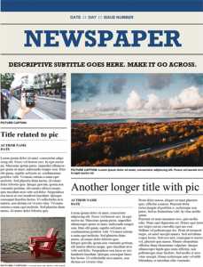
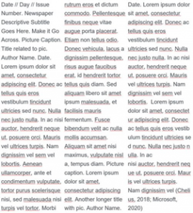
Sighted users rely on visual design elements to navigate documents such as a newspaper or website. Accessible formatting re-creates these design formats, otherwise their experience resembles the block of unformatted text on the right (Microsoft, 2020). Adhering to basic legislative compliance levels may not achieve an equitable experience.


