20 Accessible Web Colour Contrast
Colour contrast is a numerical value for the visual difference between two adjacent colours.
Sufficient colour contrast is very important to improve accessibility and can be difficult to evaluate without using a tool.
This often refers to the colour contrast of the text against the background on a page but can also be applied to visual elements such as graphics, charts, and graphs.
Web Content Accessibility Guidelines (WCAG) 2.0 AA Colour Contrast Requirements
Requirements that use “must” fall under current required accessibility guidelines.
Requirements that use “should” fall under upcoming accessibility guidelines. Where possible, you should aim for this level of contrast.
- Text must (AA) have a contrast of at least 4.5:1 for body text and 3:1 for headings.
- Text should (AAA) have a contrast of at least 7:1 for body text and 4.5:1 for headings.
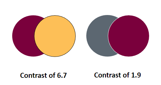
- Adjacent colours within graphics should (2.1 AA) have a contrast of at least 3:1.
- Colour must (AA) not be used to convey meaning. For example, if colour is used in a legend, additional information such as labels or symbols should also be used.
How to Check the Colour Contrast of your Page
- Obtain the hex colour codes (for example, white is #FFFFFF) of the colours you would like to check.
- If you are using McMaster brand colours, these colour values are available on page eight (8) and nine (9) of the Digital Brand Standards Manual.
- Use a free colour contrast checker, such as color.review or Colour Contrast Analyser, to obtain the contrast value for your colours.
- If your background colour is white, the hex code should be #FFFFFF. If your background colour is black, the hex code should be #000000.
McMaster Brand Colour Comparisons
- If you are using McMaster brand colours, it is very important to check the contrast of the colours if their contrast is not provided below.
- It is recommended to aim slightly above AAA or AA contrast to account for differences in monitors, poor internet connections, or lighting locations.
- Achieving AAA contrast will also prevent the need for remediation at a later date when legislative guidelines change.
- The “Highlights” colours should not be used on white unless they are being used for decorative purposes only.
*New* – colours have been updated to reflect the 2024 evolved brand update.
WCAG 1.4.6 Contrast (Enhanced) AAA – on White
- Heritage Maroon (7A003C): 11 (HM Pass AAA Headers, AAA Text)
- Heritage Gold (FDBF57): 1.6 (HG Fail) – Example
- *New* Heritage Grey (495965): 7.2 (HGr Pass AAA Headers, AAA Text)
- *New* King’s Forest Green (0E5B3D): 8.1 (KFG Pass AAA Headers, AAA Text)
- *New* Bayfront Blue (0D5D78): 7.3 (DG Pass AAA Headers, AAA Text)
- Dundurn Grey (DBDBDD): 1.3 (DG Fail) – Example
WCAG 1.4.6 Contrast (Enhanced) AAA – on Black
- Heritage Maroon (7A003C): 2.7 (Fail) – Example
- Heritage Gold (FDBF57): 12.7 (Pass AAA Headers, AAA Text) – Example
- *New* Royal Botanical Pink (FF9980) – 10.1 (RBP Pass AAA Headers, AAA Text) – Example
- *New* Cootes Paradise Green (E4EA6C) – 10.1 (CPG Pass AAA Headers, AAA Text) – Example
- *New* Albion Falls Blue (AAD5E1) – 13.3 (AFB Pass AAA Headers, AAA Text) – Example
- *New* Pier 4 Purple (CC99CC) – 8.9 (P4P Pass AAA Headers, AAA Text) – Example
Non-Text Contrast
- WCAG 1.4.11 Non-text Contrast requires at least a contrast of 3 against adjacent colours for:
- “Graphical Objects: Parts of graphics required to understand the content, except when a particular presentation of graphics is essential to the information being conveyed.”
Use of Colour (WCAG 1.4.1)
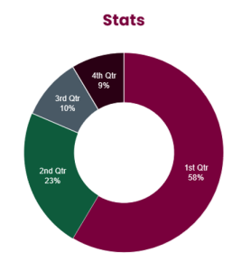
- Colour cannot be used by itself to convey meaning. This is most frequently seen with charts and graphs that use colour legends.
- If using colour, it must be combined with additional visual information, such as labels or symbols, that also meet colour contrast requirements.
- For example, a pie chart must have labelled sections that are legible.
Colour Contrast in Mac Sites
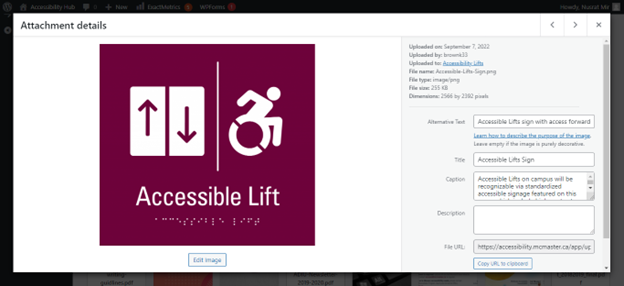
An example of good colour contrast with a title, alternative text and captions as needed for this image of an ‘Accessible Lift’ with braille below.
Changing Text Colour in MacSites
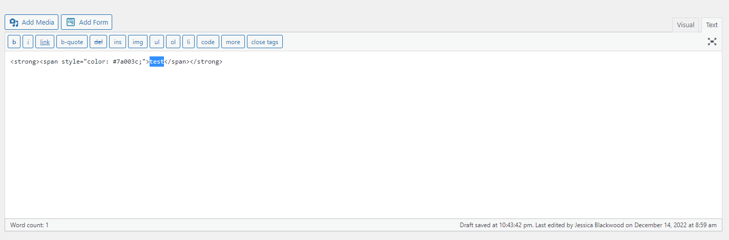
To change the colour of text in MacSites, you must insert HTML code around that text in the text editor. A screenshot of how to access this editor is available below.
For example, to change text to maroon, use the following HTML container code:
- <span style=”color: #7a003c;”></span>