4 Accessible Headings and Document Structure
Properly applied heading styles will assist users who navigate the page with and without the use of assistive technologies, supporting a diverse groups of individuals with both visual and semantic landmarks for easy navigation.
Headers do two things within a document:
- Change the text’s visual appearance.
- Change the text’s semantic structure, or the associated HTML code and reading order of the page.
Best Practice for Using Headings
- Add a logical structure to your document or page by starting with Heading 1 or 2.
- In most documents, the first heading style you use should be Heading 1 for your document’s title.
- In most web interfaces, there is already a Heading 1 on the web page, so you can start your content by using Heading 2.
- Heading styles should be used in numerical order (for example: 1, 2, then 3 instead of 1, 3, then 2).
- Headings should have appropriate colour contrast (visit following sections on colour contrast).
- Headings should use larger text than the body text.
- Headings should not use All Caps. All Caps can be difficult to interpret for visual learners and be read as acronyms by some assistive technologies.
Headings within Word
- Headings within Word can be added using the Styles menu section of the Home ribbon menu.
- These styles can be modified to meet citation formatting criteria and increases the efficiency of editing large documents.
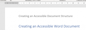
- Do not use the Title or Subtitle heading styles. These styles do not have semantic structural information associated with them and are treated as normal text by assistive technology.
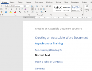
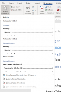
- The correct use of Heading Styles will also allow the creation of a Table of Contents in the References ribbon menu.
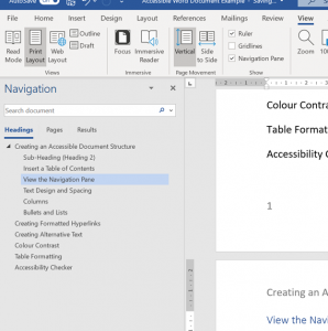
- Heading Style order can be checked by opening the Navigation Pane in the View ribbon menu.
Additional Document Structure Practices within Word
- Meaningful content added to the Header or Footer of a document should also be repeated in the body of the document to ensure users of assistive technology have access to that content.
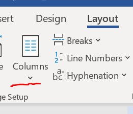
- The Layout ribbon menu should be used to create layouts like Columns, Column Breaks, or Page Breaks. Tab should be used to indent paragraphs.
- Do not use the space or enter keys to create indents or breaks in the page. Assistive technology can read these alloud as “blank” and they can increase the cognitive load required to interact with your document.
- Page numbers should be inserted via the Insert ribbon menu option and Header and Footer.

Headings within PowerPoint
- Heading styles within PowerPoint are tied to the slide structure your document is using. A simple way to ensure your slide has a title, or heading, is to use a theme template. An accessible PowerPoint template with McMaster branding can be downloaded here.
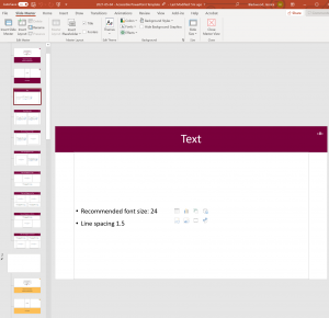
- If your slide has been constructed correctly, a title placeholder should be visible in the Slide Master or when a new slide is created.
- Modifications to the theme’s colour and “watermarked,” or built-in imagery and colours, can be made in the Slide Master view.
- A full tutorial of document and slide structure within Microsoft PowerPoint is available asynchronously here.
