31 Accessible Tables, Charts, and Graphs in PowerPoint
Accessible Tables
- Tables are a great way of displaying data but should not be used to visually structure your slides.
- Tables should be simplified whenever possible to include one header row and/or column.
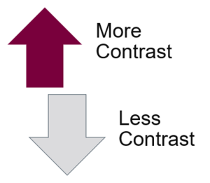
- Tables should be visually accessible (contrast).
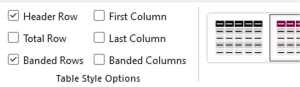
- Tables should have the Header Row and/or First Column checkboxes selected in the Table Design – Table Style Options menu.
- Tables should be briefly summarized using the alternative text field.

Charts, Graphs and Smart Art
Charts and graphs that are used to present data must be visually accessible and have alternative text.
- Many default chart and graph designs use colour to convey meaning and must be altered before presenting by adding data labels.
- Any overlayed text on graphic elements must have sufficient colour contrast.
- Charts, graphs, and smart art can also be flattened before embedding to make adding alternative text easier. Navigating grouped items with assistive technology can be difficult.
- Shape outlines are a great way to add contrast when needed, for example, a darker border.