4.6: Effective Document Design
Learning Objectives
 3. ENL1813 Course Learning Requirement 1: Plan, write, revise, and edit short documents and messages that are organized, complete, and tailored to specific audiences.
vi. Support message content with visual elements (ENL1813T CLR1.6)
4. Apply the principles of reader-friendly document design to various written formats.
The responsibility of a writer to produce reader-friendly documents extends to layout, design, and organizational elements surrounding the words themselves. If an email or report were simply a wall of undifferentiated text running for several screens or pages, any reader would be daunted by the prospect of having to scale that wall. Fortunately, writers can use document templates that make those design choices for them with established styles so that writing a document becomes a matter of just filling in the blanks; if you work for a company that uses templates for certain documents, of course you will use them also for consistency and your own convenience. Even without templates, however, you can use several techniques to help guide your readers’ eyes across the page or screen to easily find what they’re looking for. Rather than being optional nice-to-haves, such techniques are crucially important to how well your document is received.
- 4.6.1: Titles
- 4.6.2: Headings and Subheadings
- 4.6.3: Font
- 4.6.4: Line Spacing
- 4.6.5: Lists
- 4.6.6: Visual Aids
- 4.6.7: Interactive Elements
- 4.6.8: Balancing Text and Whitespace
- 4.6.9: Making Accessible, AODA-compliant Documents
4.6.1: Titles
Almost every document that exists as a standalone unit must have a title that accurately represents its contents in a nutshell. It’s the first thing a reader looks for to understand what a document is all about and should thus be easily found centred at the top of the first page of any small document, and prominently placed on the cover of larger documents (see §7.3–4 on report cover pages and cover images). Though some documents represent exceptions to this rule (e.g., business letters lack titles, and many lack subject lines), any document that brings with it the expectation of a title but omits it is like a grotesquely decapitated body; readers just won’t know what to make of it. Even emails and memos have titles in the form of subject lines (see §6.1 and §7.2 below). In whatever document you find it, a title’s following characteristics make it essential to your reader’s understanding of the whole:
- Topic summary: A title is the most concise summary possible of a topic while still making sense. If you glance at a news website or newspaper, for instance, you can get a reasonably good sense of what’s going on in the world just by reading the headlines because they are titles that, in as few words as possible, summarize the narratives told in the articles that follow.
- Conciseness: Aim for a length in the 2- to 7-word range—something that can be said repeatedly in one short breath. One-word titles are appropriate only for art (e.g., for books, films, songs, albums, etc.), but most other professional documents use a reasonable number of words to give a sense of the topic, albeit streamlined to the point of having no words that don’t absolutely need to be there. In scientific papers, titles can be quite long and carry plenty of detail, though you can expect that their audiences will rarely pronounce the full title.
- Capitalization: Capitalize the first word no matter what, as well as all major words (nouns, verbs, adjectives, adverbs, pronouns, etc.) thereafter.
- Don’t capitalize prepositions (e.g., on, to, from, in, out, of), conjunctions (and, but, or, for, nor, so, yet), nor articles (the, a, an) unless they’re the first word of the main title or subtitle (Darling, 2014a, 2014b, 2014c).
- When including a hyphenated word (i.e., with a compound-modifier hyphen), leave the second word, the one immediately following the hyphen, lowercase (see the first two examples in the titles listed at the end of this subsection).
- Structure: Use a noun, verb, or adjective phrase rather than a complete sentence.
- Main title: If your title comes in two parts with a main title and subtitle, the main title establishes the general context of the topic, perhaps with catchy or clever phrasing, and ends with a colon ( : ) with a single space after it but none before.
- Subtitle: The subtitle follows the main title with a more specific and detailed summary of the document topic.
- Position: Centre the title at the top of the page and include 1-2 empty lines below it to separate it from the opening text.
- Typeface: Use bold typeface to help draw the eye towards the title, as well as colour if appropriate.
For examples of titles that are near at hand, see the References sections at the end of most chapter sections throughout this textbook. The following collects a small selection of them:
- “Consensus on Consensus: A Synthesis of Consensus Estimates on Human-caused Global Warming” (Cook et al., 2016)
- “Fake News: Facebook and Matters of Fact in the Post-truth Era” (White, 2017)
- “Instagram Ranked Worst for Young People’s Mental Health” (RSPH, 2017)
- “Gray Matters: Too Much Screen Time Damages the Brain” (Dunckley, 2014)
- “Higgs Boson Researchers Mocked for Using Comic Sans Font” (CBC, 2012)
- “Ottawa Severs Ties with Plasco as Company Files for Creditor Protection” (Chianello & Pearson, 2015)
- “Problematic Technology Use: The Impact of Capital Enhancing Activity” (Phillips, 2015)
- The Process and Effects of Mass Communication (Schramm, 1954)
- “Understand How Consumers Use Messaging: Global Mobile Messaging Consumer Report 2016” (Twilio, 2016)
- “Who Multi-tasks and Why? Multi-tasking Ability, Perceived Multi-tasking Ability, Impulsivity, and Sensation Seeking” (Sanbonmatsu et al., 2013)
For more example titles, go to Wikipedia.org and search for articles on any business or technology topic, scroll down to the References section at the bottom, and see an abundance of legitimate titles.
4.6.2: Headings and Subheadings
After the main title of a document, using headings and subheadings as titles for sections and subsections helps guide the reader around a document’s breakdown of topics. Especially in reports, headings and subheadings that stand out in bold typeface flush (or close) to the left margin and follow a consistent numbering system, exactly as you see in this textbook, help a busy reader quickly locate any specific content they seek. Even a routine email that covers a topic in so much detail that it could be internally divided—without being so big that its content should just go into a document attachment—would benefit from bolded headings (see §6.1 for more on emailing).
If your drafting process follows the guide in this chapter, then you would have already drafted your headings and subheadings (and possibly numbering if necessitated by the size of the document) in your outline (see §4.2 above). The drafting process of fleshing out that outline may suggest tweaks to those heading and subheading titles. As titles, headings must be properly phrased and capitalized like main titles (see §4.6.1 above).
When using a word processor such as Microsoft Word, you can achieve additional functionality by using “true headings.” From the Home menu tool ribbon, heading styles are available as options in the Styles section. If you prefer to design your own styles of headings, you can click on the downward triangle at the bottom right of the style examples field and select “Create a Style.” Doing this allows you to see your entire document at a glance on the left and quickly jump to any section you wish by clicking on the Navigation Pane checkbox in the Show section of the View menu tool ribbon (or Alt + w, k), then clicking on the heading for the section you want. This is especially useful in larger documents like reports. Additionally, using such headings makes your document accessible to audiences with assistive technologies such as screen readers (see §4.6.9 below on AODA compliance).
4.6.3: Font
Font selection is an important consideration because it determines how the audience will receive a document. Font involves decisions concerning the style of type, size, and even colour. Consider the following:
1. Font Type
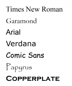 Writers considering typeface must choose between two major style categories depending on how they would like to accommodate their reader. Serif fonts like Times New Roman and Garamond have little perpendicular crossline “feet” or “hands” at the ends of letter strokes, as well as variable thickness in the strokes themselves depending on their horizontal/vertical or curving position, which altogether help readers distinguish between similar letters or combinations of letters, such as m and rn, which almost look like the same letter in a non-serif font. Serif fonts are ideal for printed documents, especially those with smallish font sizes such as newspapers. Without serifs, sans-serif fonts like Arial (the one used in this textbook) or Verdana achieve a more clean and modern look, especially on computer screens where serif fonts appear to whither away at the thin part of the stroke and are thus harder to read. In the appropriate format, all the fonts mentioned above make a document look respectable. Comic Sans, on the other hand, is appropriate for documents aimed at children, but undermines the credibility of any professional document, such as when the unfortunate choice to use it when reporting CERN particle physics discoveries became more newsworthy than the discoveries themselves (CBC, 2012).
Anticipate that audiences might care about font choices, especially if the font clashes with the content like the example above. To anyone who considers the effects that fonts have on an audience, even going with the Microsoft Word default font of Calibri has its dangers because it comes off looking lazy, being the non-choice of those who never consider the importance of font. At the other extreme, digging around for and using exotic fonts for a document is risky because they can look flakey, such as Papyrus or Copperplate (Butterick, 2013). Even if they look nice, however, the receiver opening the document on the other end may not have that font in their word processor program, requiring that program to substitute it with another font, which may look worse or mangle layouts arranged around that font. The safe bet, then, is always to go with familiar, respectable-looking serif or sans serif fonts like those identified at the top of this subsection.
2. Font Size
Size is another important consideration because readers depend on text being an ideal “Goldilocks” size for readability and are frustrated by font sizes that are bigger or smaller than that. In a standard written document, for instance, a 12-point Arial or Times New Roman is the Goldilocks size. If the MS Word default size when you open a blank document is 11-point, it’s worth increasing it for the sake of those who have slight visual impairment. Increasing the size much past 12-point has a similar effect as using the Comic Sans font type: it makes your document appear to be targeting an audience of children. Of course, situations where you want to increase the font size abound, such as for titles on title pages so that the eye is drawn immediately to them, and any time readers are required to read at a distance, such as posters on a notice board or presentation slides. As we shall see in §11.5 below, the ideal font size for bullet points in a PowerPoint is in the 30- to 35-point range, whereas a 12-point font will appear microscopic on a projector screen, if not invisible, from across the room.
Occasions for going smaller with your font size include footnotes in a report or source credits under images in a document or PowerPoint presentation. Decreasing font size to 8-point merely to get all your text to fit into a one-page résumé, however, would undermine the document’s purpose because, by frustrating the hiring manager trying to read it, it runs the risk of prompting them to just dump it in the shredder and move on to the next (hopefully reader-friendly) résumé. In such cases, choosing the right font size becomes a major life decision. Whatever the situation, strike a balance between meeting the needs of the reader to see the text and design considerations.
3. Font Colour
A choice of colour may also enter into document design considerations, in which case, again, the needs of the reader must be accommodated. Used appropriately, a touch of colour can draw the eye to important text. Colouring your name red at the top of your résumé is effective if few or no other elements in the document are so coloured because your name is essentially the title of your document (see §8.2 below). Likewise, colouring the title of other documents is effective if there are no expectations of doing otherwise (some style guidelines forbid colour).
Any use of colour for text must be high-contrast enough to be readable. The gold standard for high-contrast readability is black text on a white background. Grey-on-white, on the other hand, sacrifices readability for stylishness depending on how light the shade of grey is. A light-yellow text on a white background is nearly impossible to read. In all cases, the readability of the text should be considered not just for those with perfect vision, but especially for those who find themselves anywhere on the spectrum of visual impairment (see §4.6.9 on accessibility below). For this reason, colour should always be used to enhance a document that is already perfectly organized without it; never use colour-coding alone as an organizing principle in a document read by anyone other than you because you can never be sure if some readers will be colour blind or have other visual impairments that render that colour coding useless as a cause for confusion.
4. Boldface, Italics, and Underlining
Boldface, italics, and underlining serve various purposes in focusing audience attention on certain words. Boldface type is especially helpful in directing audience eyes towards titles, headings, and keywords as you can see at the beginning of this paragraph and throughout this textbook. Highlighting in this way is especially helpful to anyone who is visually impaired in any degree. Of course, overusing boldface undermines its impact, so it should be used sparingly and strategically. Likewise, italics and underlining have very specific purposes that we will look at under the banner of mechanics in §5.4 below.
4.6.4: Line Spacing
Single-spaced lines are common to most documents because they accommodate the reader’s need to dart quickly to the next line to continue reading a sentence. The gap between 1.0-spaced lines is just enough to clearly separate one line from another so the hanging elements at the bottom of letters like j and g don’t interfere with the tops of uppercase letters on the line below. Some documents such as academic manuscripts are double-spaced to give readers, who are usually the instructors or teaching assistants grading them, enough space to write comments and editorial marks between the lines. Because doubling the line spacing also doubles the number of pages in a print version, avoid double-spacing documents for audiences who don’t explicitly require it.
Frustratingly, some word processors such as Microsoft Word open blank pages with line spacing values other than single (1.0) spacing as their default setting, such as 1.08 or 1.15. In such cases, a couple of adjustments are necessary if you want to single-space a document you’re writing from scratch. Make these adjustments as soon as you open a blank page or by highlighting all (ctrl. + a) if you’ve already started. In MS Word’s Home menu:
- Click on the Line and Paragraph Spacing icon that has four lines representing text with two blue arrows on its left side, one pointing up and one down, in the Paragraph section of the Home menu ribbon (or just type the Alt + h, k keys).
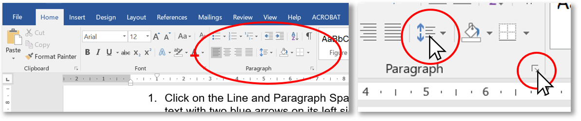
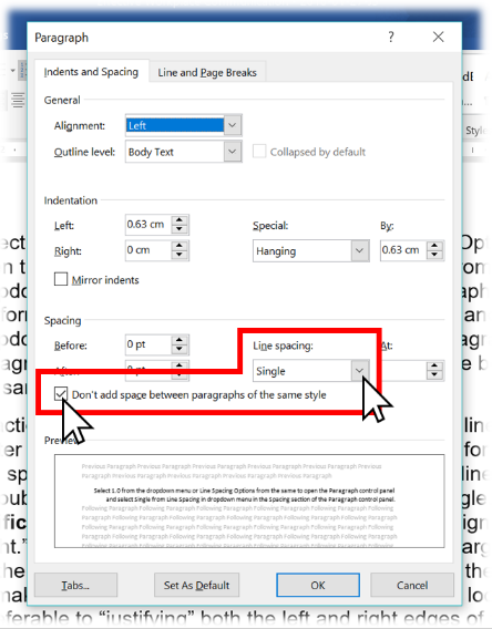 Figure 4.6.4a: Where to click to get line-spacing options in the MS Word tool ribbon (above) and Paragraph control panel (right)
 - Select 1.0 from the dropdown menu or Line Spacing Options from the same to open the Paragraph control panel and select Single from the Line Spacing dropdown menu in the Spacing section.
- Perform the same two steps as above to get the Line and Paragraph Spacing dropdown menu and select Remove Space After Paragraph or, from the Paragraph control panel, click on the “Don’t add space between paragraphs of the same style” checkbox and the Okay button at the bottom to apply the style.
The third action above prevents MS Word from adding a full line of space every time you hit Enter at the end of a line. When typing address lines for a letter without the “Don’t add space” checkbox ticked, for instance, the default line spacing will continue to look like double spacing even if you set the line spacing to single.
Justification should ideally be left as the default left-aligned or “Left-justified / ragged right.” This means that all lines are flush to the left margin and the lines end wherever the last full word fits before the right margin sends (or “wraps”) the next word down to the next line, making each line vary in length so the right margin looks “ragged,” as you can see throughout this textbook. This is usually preferable to “justifying” both the left and right edges of the text so that they align perfectly along both the left and right margins, as in the paragraph below. (If you need to do this, however, just highlight your text and click on the icon indicated by “justified text” in Fig. 4.6.4b below.) While this may look clean like newspapers often do with their orderly columns, it does so by adding extra space between the words within each line; since every line varies in length without justification, every line with it will vary in the amount of space added between words. Some lines that would be short without justification look awkward with it because the space between some words is greater than the span of small words.
To fix the excessive gaps resulting from justification such as what you see in parts of this paragraph, turn on hyphenation in MS Word via the Layout tool ribbon: select Automatic in the Hyphenation dropdown menu in the Page Setup section. This automatically adds hyphens between syllables of long words whose size and position at the end of a line would otherwise send them entirely to the beginning of the next line, decreasing the number of words in the line above and increasing the gap between each. If working in a company document template with justification, keep the justification throughout to be stylistically consistent with other documents produced in that template and ensure that the hyphenation is turned on (unlike this paragraph). Otherwise, left-aligned text is perfectly fine and may even help readers find their place if they lose it momentarily compared with the uniform brick-wall effect of justified text seen here.
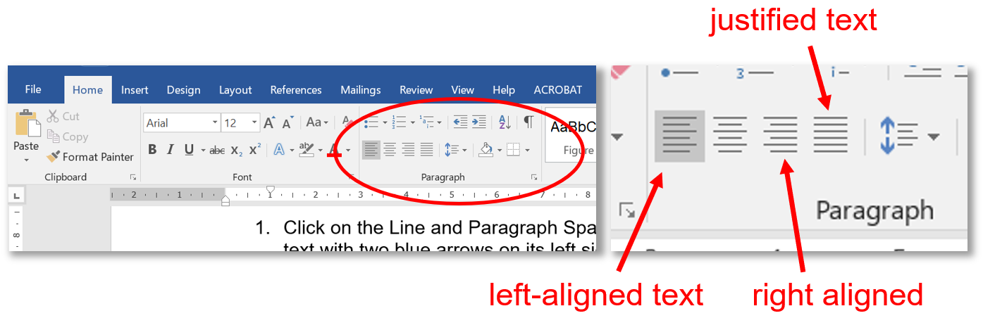
Figure 4.6.4b: Where to click to select text justification or left-aligned (“ragged right”) text in the MS Word Home menu tool ribbon
4.6.5: Lists
Another technique that helps the reader skim and easily find sought-after content is numbered or bulleted lists for a series of discreet but related items. Whether you use numbered or bulleted lists depends on your organizing principle:
| Use Numbered Lists for: | Use Bulleted Lists for: |
|---|---|
|
|
You’ve seen numbered and bulleted lists used throughout this textbook (e.g., the two bulleted lists immediately above and a numbered one in the section prior to this). Whichever list type you use, ensure each has the following:
- A sentence or phrase introducing and explaining the list and ending with a colon (see Colon Rule 1 in Ch. 5 below) before delivering the list immediately below it as you can see in the sentence that introduces this list
- Capitalization of the first letter in each point
- Periods ending each point only if it is a complete sentence on its own, whether it be in the declarative, imperative, or any other mood (see Table 4.3.1 above); a list of nouns or noun phrases, on the other hand, doesn’t end in periods
- Parallelism in the sense that each point in a list follows the same grammatical pattern, such as only full sentences, only noun phrases, or only verb phrases (or imperative sentences; recall Table 4.3.1 for more on imperative sentences); for instance, each point in the three bulleted lists in this section (including the present one) is a noun phrase (i.e., it begins with a noun) and the numbered list in §4.6.4 above, as a step-by-step procedure, is a sequence of imperative sentences (i.e., each begins with a verb: “Click,” “Select,” “Perform”).
The need for parallelism extends also to lists within a sentence. See §5.2 below for more on how to correct for faulty parallelism.
4.6.6: Visual Aids
The cliché that a picture is worth a thousand words holds true because images are excellent aids to understanding when placed near the messages they illustrate. Just as the visual elements in this textbook support and reinforce the content, such as those in §4.6.4 above, so photos, graphics, charts, and graphs provide readers something that can be understood and remembered at a glance—as long as those visuals are used appropriately. Of course, the main criterion for usability is if the image helps the reader understand the text better. If the image is complementary, it can only help. If it is unnecessary, confusing, or contradicts the text, however, the image isn’t worth the time and effort it takes to add it to your document. When considering using an image, ask yourself:
- Aesthetic considerations:
- Does the image look good?
- Are the colours complementary?
- Technical considerations:
- Is the image resolution of sufficiently high quality?
- Or is it too pixelated to use?
- Legal considerations:
- Does the image’s copyright licence permit or forbid use by others?
- Am I using the image for educational or commercial purposes?
- Design considerations:
- Is it big enough to see?
- Is it placed appropriately?
The ideal size depends on the resolution, detail of the content, relative importance, and the use to which the document will be put. The following guidelines help ensure that the images you use will meet aesthetic, design, technical, and legal expectations:
- Aesthetic guidelines:
- Choose images that look like they were produced by professional photographers, illustrators, or graphic designers—the sort you would see in a magazine or professional industry website.
- Professionals usually produce images with a limited palette of colours that work well together.
- Use images that are in focus and well-framed with the central image clearly visible rather than too far in the background or so close that important aspects are cropped out.
- Design guidelines:
- An image or graphic that is crucial to the reader’s understanding and is highly detailed really deserves to stretch across the text block from margin to margin.
- An image that is more ornamental and relatively simple can be inset within the text either on the left or right margin, or centred on the page without text on either side.
- Important images, especially those labelled as figures, must be placed as near as possible to the text they support and even referred to in the text (“See Figure 2 for an illustration of . . .”)
- Ensure that the text and corresponding image aren’t separated by a page break if the text is close to the top or bottom of the page. The reader’s eye must be able to move between the image and corresponding text in the same field of view to seal their understanding.
- Technical guidelines:
- Screen resolution must be at least 72dpi (dots per inch), the internet standard; anything less than 72 may appear pixelated even on the screen, especially if maximized in size across the page.
- Images in documents that will be printed should be 300dpi to avoid appearing pixelated on paper.
- Preferred image file types include JPEG (.jpg) and PNG (.png). The latter includes the possibility of contouring so that the image doesn’t necessarily have to be a square or rectangle. You can make a PNG image file of your handwritten and scanned signature, for instance, by erasing the white background around the pen strokes in Photoshop and saving the image as a PNG. That way, you can drag and drop your signature onto a signature line in an electronic document and it won’t block out the line underneath if your signature typically sprawls out over lines.
- Legal guidelines:
- To stay on the right side of copyright legislation, searching online for images that are free to use is easy by including licensing status in an advanced Google Image search. From the Google Images search screen:
- Click on the Settings spring-up menu at the bottom right.
- Select Advanced Search.
- Scroll down and click on the “usage rights” dropdown menu at the bottom.
- Select “free to use or share” or whatever licensing status suits your purposes.
- Otherwise, you can acquire the right to use images for commercial purposes by purchasing them from stock photo vendors such as Getty Images, Adobe Stock, or Shutterstock.
- To stay on the right side of copyright legislation, searching online for images that are free to use is easy by including licensing status in an advanced Google Image search. From the Google Images search screen:
With modern word processors, placing an image is as easy as dragging and dropping the image file from a folder into a document (or copying and pasting). Sometimes you will need to be a little craftier with capturing images, however. For instance, if you need to capture a still image of a YouTube video to use as an image such as you see near the end of §4.3.4 above, you can pause the video at the moment you would like to capture and use your computer’s screen-capturing program to get the image.
- On a Windows-based computer:
- Open the included Snipping Tool (Microsoft Support, 2017) to turn the cursor into crosshairs.
- Click and drag the crosshairs to select the desired portion of the screen for capturing; when you release the cursor, the captured image will open immediately in the clipboard. Ensure that you’ve included only the elements necessary, rather than the whole screen, plus a short span of margin on each side.
- Save the image in a folder from the clipboard or add it directly to the document by switching immediately to the document window (Alt + tab) and pasting it (ctrl. + v) wherever you’ve placed your cursor.
- On a Mac, use Shift + Command + 4 and use the crosshairs to select the desired portion of the screen (Apple Support, 2017).
Once your image is in your document, use the layout options to place it where appropriate. Clicking on it may produce a layout icon near the top right that you can click on to open the dropdown menu (alternatively, you can right-click on the image and select the Wrap Text option from the dropdown menu). The default setting left-justifies the image and displaces the text around where you put it, but other layout options allow you to place it elsewhere on the page so that your text wraps around it (“Square,” “Tight,” or “Through”) or so that text doesn’t move around it at all (“Behind” or “In front of text”), which gives you the freedom to move the image anywhere.
See §3.5.5 above for further information on labelling an image according to APA style guidelines and §4.6.9 below on alt-text captioning images for accessibility.
4.6.7: Interactive Elements
Another aid to understanding that can benefit readers of an online or electronic document is a weblink that provides them with the option of accessing other online media. Hyperlinking is easy in modern word processors and online applications such as websites and email simply by highlighting text or clicking on an image and activating the hyperlinking feature. Press the control and k keys simultaneously (Ctrl + k), paste the web address into the URL field (copy it by clicking on the web address bar or keying Alt + d, then Ctrl + c), and hit the Okay button (Microsoft Office Support, 2016). Users prefer links that open new tabs in their browser rather than take them away entirely, so seek out that option when hyperlinking. By doing this for an image of a YouTube video screenshot, for instance, you enable readers of a document (including a PowerPoint presentation) to link directly to that video in YouTube (as you can with the YouTube image near the end of §4.3.4 above) rather than embed a large video file in your document. You can additionally link to other areas within a document, as the document version of this textbook does with links to various sections like the one in the previous sentence.
4.6.8: Balancing Text and Whitespace
Another consideration that helps a reader find their way around a page is the balance of text and whitespace, which is simply a gap unoccupied by text or graphic elements. The enemy of readability is a wall of text that squeezes out any whitespace, whereas a well-designed document uses whitespace to usher the reader’s eyes towards units of text. Whitespace margins frame the text in a document, for instance, as well as give readers something to hold on to so that they don’t cover up any text with their thumbs. Margins should be 3cm or 1″ (2.54cm), which are the default margin sizes in most word processors’ (e.g., Microsoft Word’s) blank 8.5″x11″ document. Margins also focus attention on the text itself, which makes any crowding of the margins an offense to good design. An attempt to cram more information into a one-page résumé by edging further and further into the margins, for instance, follows the law of diminishing returns: the hiring manager might take your sacrifice of the document’s readability as a sign of selfishness—that you place your own needs above that of your audience, which suggests you would do the same to the customers and management if it suited you (see §8.2 below for more on résumés).
4.6.9: Making Accessible, AODA-compliant Documents
The Accessibility for Ontarians with Disabilities Act (2005) sets out guidelines for how workplaces can help people with disabilities, including accommodations that extend to document design. Many of the recommendations covered in the sections throughout §4.6 above, such as font size and colour, are justified as accommodations to people with even mild visual impairment. Someone with colour blindness, for instance, may be confused if you use coloured text alone as an organizing principle, which is why you should use colour only to enhance text readability while using other means of organization such as boldface type (see §4.6.3.4 above). Not only must you accommodate such individuals, but also those whose severity of impairment requires that they use assistive technologies such as screen readers that convert text to automated voice. The more straightforward your text is presented, as well as formatted with “true headings” that a screen reader can identify as headings, the easier a person with a disability can hear and understand your message when it’s read out by a screen reader.
Once you are done drafting your document, you can begin to check for any accessibility issues and act on them right away. In MS Word, just to go to File and, in the Info tab, select the “Check for Issues” button in the Inspect Document section. It will identify accessibility problems in your document as well as suggest fixes (watch the video below for a demonstration). For instance, if you have a photo without alt text, it will prompt you to write a caption by right-clicking on the image, selecting “Edit Alt Text…” from the dropdown menu, and writing a one- or two-sentence description of the image so that users with screen readers will be able to hear a description of the image they can’t see very well or at all. See the Creating Accessible Documents resources (Algonquin College, 2013) for more on how to make your documents AODA compliant.
Key Takeaways
 Make your document easy to follow at a glance and accessible by using a variety of document design features such as titles, headings/subheadings, lists, visual aids, interactive elements, line spacing, and appropriate font types, sizes, and colours.
Exercises
 1. Collect a variety of professional documents, such as reports, memos, and letters. If you have perfect vision, impair your vision perhaps by dimming the lights at night or using a friend’s or family member’s prescription glasses. What do you notice about the readability of those documents when you’ve limited your eyesight? What organizational elements do you especially appreciate when trying to make sense of the document when you’ve otherwise hindered your ability to read?
2. Take any multi-page assignment you’ve done in MS Word that also includes non-text elements like photos. Run an accessibility check on it using the procedure described in §4.6.9 above and fix the issues identified.
3. Produce a dummy document that follows guidelines in each of the §4.6 subsections above. The content doesn’t much matter so much as the inclusion of features. Ensure that it has:
- A proper title
- Some headings and subheadings
- A well-chosen font
- Single-spacing (1.0 with the “Don’t add space” checkbox checked)
- A numbered and a bulleted list A properly labeled image
- A hyperlink
- Nicely balanced
- An accessibility check that you act upon by following the recommended fixes for AODA compliancewhitespace and text
References
Academic Algonquin. (2013, July 29). Using the accessibility checker [Video file]. Retrieved from https://www.youtube.com/watch?time_continue=62&v=mSY2EyA0rH4
Algonquin College. (2013). Creating accessible documents. Accessibility Resources. Retrieved from https://www.algonquincollege.com/accessibility-resources/accessible-education-tools/creating-accessible-documents/
Apple Support. (2017, November 20). How to take a screenshot on your Mac. Retrieved from https://support.apple.com/en-ca/HT201361
Butterick, M. (2013). Bad fonts. Practical Typography. Retrieved from https://practicaltypography.com/bad-fonts.html
CBC. (2012, July 4). Higgs boson researchers mocked for using Comic Sans font. CBC News. Retrieved http://www.cbc.ca/newsblogs/yourcommunity/2012/07/do-you-use-the-comic-sans-font.html
Darling, (2014a). Prepositions. Guide to Grammar and Writing. Retrieved from https://plato.algonquincollege.com/applications/guideToGrammar/?page_id=1622
Darling, (2014b). Conjunctions. Guide to Grammar and Writing. Retrieved from https://plato.algonquincollege.com/applications/guideToGrammar/?page_id=1566
Darling, (2014c). Articles and other determiners. Guide to Grammar and Writing. Retrieved from https://plato.algonquincollege.com/applications/guideToGrammar/?page_id=162#art
Microsoft Office Support. (2016, September 7). Create or edit a hyperlink. Retrieved from https://support.office.com/en-us/article/create-or-edit-a-hyperlink-5d8c0804-f998-4143-86b1-1199735e07bf
Microsoft Support. (2017, April 26). Use Snipping Tool to capture screenshots. Retrieved from https://support.microsoft.com/en-ca/help/13776/windows-use-snipping-tool-to-capture-screenshots
