LOCALITIES
VIEW MAUD LEWIS’S BLACK CAT AND KITTENS HERE
Figure 10.1 Maud Lewis, Black Cat and Kittens, 1955. Oil on pulpboard, 30.5 x 30.7 cm.
Private collection.
A fluffy black cat and two equally charming kittens stare out from the canvas in this Maud Lewis painting. They are surrounded by cheerful lavender, white, yellow, and red tulips. Above them two branches arch, laden with bright pink blossoms. The colours are whimsical, and the flat swaths of colour lack distinction between foreground and background, with the artist’s signature, “M. Lewis,” scrawled conspicuously on the green grass. Cats in various colours and combinations are a common subject in Lewis’ work. Her simple, yet effective compositional techniques—for example, the economic use of brush strokes—create a strikingly graphic composition (Cronin 2021). Lewis painted hundreds of similar feline works with her iconic cats; she was a prolific painter and her artworks have been reproduced on everything from fridge magnets to umbrellas. Art historian Ray Cronin explains that the repetition of popular motifs, like cats, in Lewis’s works tell a palatable regional narrative about Nova Scotia’s idealized folk past (Cronin 2021).
Maud Lewis met her husband Everett by unexpectedly showing up at his doorstep in response to an advertisement he had posted; he had wanted to hire a housekeeper. Several weeks later, in 1938, they were married. They moved into Everett’s one-room house, where they lived for the rest of their lives. Lewis began selling hand-drawn and hand-painted Christmas cards that proved popular with her husband’s customers as he sold fish door to door near Yarmouth, Nova Scotia. She was encouraged to keep painting, often using bright colours to draw the objects from the world around her, including flowers, oxen teams, horses, birds, deer, and cats. Now considered one of Nova Scotia’s most beloved artists, Maud Lewis’s biography has been heavily romanticized; scholars have often positioned her as an “outsider” artist, both in terms of her rural location and lack of formal training.
Watch the short NFB documentary, Maud Lewis: A World without Shadows (1976, 10 min) here:
Her endearing story and choice of subject matter have made her an important figure in the history of art in Nova Scotia. In her lifetime, her paintings sold for five or ten dollars apiece, but they now sell for tens of thousands of dollars. She is so treasured by Nova Scotians that a large collection of her work, including the one-room house she shared with Everett, is now permanently displayed in the Art Gallery of Nova Scotia. Following the death of Lewis and her husband, the government of Nova Scotia bought the house and placed it in the care of the Art Gallery of Nova Scotia.
Look at and explore the Maud Lewis installation at the Art Gallery of Nova Scotia. As the website explains:
After the death of Maud Lewis in 1970, and subsequently of her husband, Everett Lewis, in 1979, their lovingly painted home began to deteriorate. In reaction, a group of concerned citizens from the Digby area started the Maud Lewis Painted House Society; their only goal was to save this valued landmark.
After a number of years of fundraising, the society realized that the project was going to take more resources than they could gather. In 1984, the house was sold to the Province of Nova Scotia and turned over to the care of Art Gallery of Nova Scotia.
In 1996, with funds from the federal Department of Canadian Heritage and from private individuals, the processes of conservation and restoration began. The final, fully restored house is on permanent display in Halifax at the Art Gallery of Nova Scotia.
Look at the Virtual Tour of Lewis’ fully restored house. What strikes you about it? What is your reaction to the paintings inside the house?
Though Lewis is best known for her small paintings on board, the tiny one-room house she shared with Everett for thirty-two years is perhaps her greatest work. She decorated every available surface, inside and out, from bread boxes and trays, to the walls, windows and doors. It’s not typical to find these types of works—often referred to as folk art—in major public art institutions, nor is it common to see folk art like this written into dominant histories of art. Typically, artists who produce folk art are self-taught; tend to make art as a hobby, not as a career; don’t follow traditional or trending modes, styles, or conventions within their art practice; and are interested in making art that tells stories about their direct life and community.
Art historian Erin Morton describes the reasons that folk art is typically left out of fine art narratives and institutions in her book For Folk’s Sake: Art and Economy in Twentieth-Century Nova Scotia. She points to the important role of the local as both generating art and shaping art’s role in visual histories.
The place of folk art in Nova Scotia during the second half of the twentieth century was deeply connected to notions of its existence as a historical, and traditional, material object category there. This book is about the process through which folk art became institutionalized in Nova Scotia during this period in ways that were important to the ongoing historicizing of the province’s cultural identity, and the ideological apparatus that has determined which material objects fall in and out of this category amidst economic, social, and political debates over its boundaries.
There is certainly a well-established connection between the development of Nova Scotia’s tourism industry and the use of folklore in branding an antimodern cultural identity, thanks to generations of mainstream cultural selectors who classified the province’s homespun material culture and everyday stories and songs as “folk” during the first part of the twentieth century.
Morton continues:
My study shows that folk art’s particular rise as an aesthetic category worthy of collection and display in fine arts institutions—and, indeed, the development of these very institutions in Nova Scotia—is not well understood despite its connection to a transnational cultural landscape of Euro-American folklore that [Ian] McKay first identified twenty years ago. Part of the reason for this is that art institutions apply the label folk art to works produced in non-art-world settings. In other words, folk art as a concept does not exist without a museum curator or a university intellectual defining it as such. (Morton 2016, 3-4)
LEARNING JOURNAL 10.1
In For Folk’s Sake, Erin Morton remarks that “Lewis’s reputation grew far beyond her local community. This renown came thanks to the assistance of such public history makers as the Canadian Broadcasting Corporation (CBC), the National Film Board of Canada (NFB), the popular press, and, eventually, the Art Gallery of Nova Scotia. They explored her everyday life and art making in radio and TV broadcasts, film, newspaper and magazine articles, and exhibitions. In the words of one writer, recognition of Lewis’s work grew quickly because public attention focused on her as “a rural, isolated, poverty stricken, handicapped, female folk artist–the ultimate marginalized outsider,” turning her into a marketable hero-figure in the face of adversity” (Morton 2016, 176).
Watch the trailer for the 2017 film Maudie, which features two Oscar-nominated actors and was widely circulated at festivals. How does this film compare to the NFB film Maud Lewis: A World Without Shadows in its treatment of Maud Lewis and of place? How does each portray Nova Scotia? How do they connect the work of Lewis to community and people?
By the end of this module you will be able to:
- explain the concepts of centre, periphery, and regionalism and how they have been implicated in the way the artistic canon has been constructed
- describe the characteristics of and artists associated with Magic Realism
- discuss the significance of London Regionalism, the Emma Lake Workshops, and The Regina Five in terms of regional artistic production
- analyze the various forms of artistic activity in places like NSCAD, Vancouver, and Winnipeg.
It should take you:
Maud Lewis Text 13 min, Video 12 min
Centre-Periphery Text 6 min
Magic realism in the Maritimes Text 16 min, Video 9 min 30s
The Emma Lake workshops Text 10 min
All eyes on Halifax: NSCAD Text 10 min, Video 9 min
London (Ontario) calling Text 15 min, Video 4 min
Vancouver School Text 32 min, Video 8 min
Winnipeg Gothic Text 14 min, Video 6 min
Qaumajuq in Winnipeg Text 6 min, Video 26 min
Race, space, and place Text 13 min, Video 5 min
Learning journals 8 x 20 min = 160 min
Total: ~ 6.5 hrs.
Key works:
- Fig. 10.1 Maud Lewis, Black Cat and Kittens (1955)
- Fig. 10.2 Alex Colville, To Prince Edward Island (1965)
- Fig. 10.3 Mary Pratt, Red Currant Jelly (1972)
- Fig. 10.4 Marion Nicoll, Bowness Road, 2 a.m. (1963)
- Fig. 10.5 Roy Kiyooka, Emma Lake (1958)
- Fig. 10.6 Garry Neill Kennedy, An American History Painting (The Complete List of Pittsburgh Paints Historic Colour Series) (1989)
- Fig. 10.7 Greg Curnoe, View of Victoria Hospital, Second Series (1969–1971)
- Fig. 10.8 Greg Curnoe, Doubtful Insight (1987)
- Fig. 10.9 Ian Wallace, Lookout (1979)
- Fig. 10.10 Jeff Wall, Landscape Manual (1969)
- Fig. 10.11 Jeff Wall, Mimic (1982)
- Fig. 10.12 Marcel Dzama, Untitled (2002)
- Qaumajuq Inuit Art Centre in Winnipeg
- Fig. 10.13 Zinnia Naqvi, The Wanderers – Niagara’s Falls, 1988 (2019) from the Yours to Discover series
- Fig. 10.14 Shellie Zhang, A Place for Wholesome Amusement (2018)
Centre-periphery
Canada, as we know, is rather large—it is difficult to create a single narrative of Canadian history when there is so little in common from east to west and north to south. The idea of regionalism has been used, particularly within settler understandings of place, to help reconcile the large and diverse geographical areas and populations within Canada. Regionalism proposes an interest in the distinctive local character of a specific geographic area. Regional identities are strikingly different among provinces and territories, as well as within these places. Regional identities and differences, as well as the actual size of Canada’s bigger cities (Montreal, Toronto, and Vancouver) have contributed to the centre-periphery divide in the artworld and in the writing of Canadian art history.
The “centre” of centre-periphery relations are those bigger cities today with artists, curators, and institutions that participate in the international art scene. In contrast, the “periphery” is everything else, namely the Prairies, the Maritimes, the North, and cities like Winnipeg, Regina, Edmonton, Calgary, and Vancouver. Addressing the centres and peripheries within Canada means considering the complex matrix of power relations, situated knowledges, economic dependencies, and geographic considerations that, for example, place Regina on the periphery of art scenes still often seen as centred in Toronto, Montreal, and Vancouver. Because of the vast geographic distances between cities in Canada, artists have had for centuries to band together, to form collectives, to collaborate to create art scenes and find exhibition spaces, and to work together to achieve visibility. As scholar and co-publisher of the web journal OnCurating, Ronald Kolb writes,
Referring to the Centre-Periphery (or the Core-Periphery) model, one must be aware of its origins in economics: Centre-Periphery basically describes an (unequal) relationship between places. It is used as a spatial description of a relation between a so-called “advanced” (or dominating) place and its allegedly “lesser developed” (or serving) periphery. In this model, the centre is the place of power (of law, of trade, of military force) and is a door to the rest of the world. The periphery is a remote, rural place, and it delivers raw materials, food, and other resources to the centre under the condition of exploitation. The centre provides goods and “superior” products (Kolb, Regli, and Richter 2019, 3).
The centre-periphery model is a long-established method of understanding settler-colonial Canada, particularly as a resource economy, under the banner of the Metropolitan-Hinterland Thesis. This thesis is primarily based on J.M.S. Careless’ now-widely quoted 1954 essay, “Frontierism, Metropolitanism, and Canadian History,” which was built upon Harold Innis’s 1930 book The Fur Trade in Canada. According to this thesis, the Western Canadian provinces (BC, Alberta, Saskatchewan) are a hinterland to the political and economic forces of central Canada (Ontario and Quebec). The effect of the centre-periphery model on traditional narratives of art has not necessarily accounted for the flourishing of art and art scenes in locations and communities outside Canada’s bigger metropoles. Professor of English and Creative Writing Douglas Reichert Powell describes critical regionalism as a “deliberate use of region as a way to envision and critique relationships among people and places and envision better alternatives” (2007, 10). In this section, we jump from place to place to examine some of those so-called “peripheries,” not as marginalized or peripheral to the main story, but as challenges to it; places where critical regionalism can push against globalization as homogenization. And in some places, regionalism is about artists and artworks that indicate a flourishing of local histories, people, and ideas.
Magical Realism in the Maritimes
In his essay “Here & there, now & agin regions end where countries begin” (note the play of regional accent on “agin” or again), John Murchie points out that “There is no comprehensive history of the visual arts in Atlantic Canada. Historically speaking, this geopolitical space, carved out of a continent once referred to as the ‘new world’ is a dead site, its newness long past; that past is also lost to memory, forgotten as though it did not exist, or having existed, it did not matter” (Murchie 1997, 16). He acknowledges that the only element of Atlantic Canada’s art history to make it into the the National Gallery of Canada and into the narrative of a broader Canadian art history was a movement called Magic Realism. Magic Realism is a form of painting that typically makes use of accurate detail that is smooth to the point of having photographic clarity. Magic Realism occupies a place between Surrealism and Photorealism; subjects are rendered with a photographic naturalism, but where the use of flat tones, ambiguous and odd perspectives, and strange juxtapositions suggest an imagined or dreamed reality. The term magic realism is often associated with a style of literature in mid-20th century Latin America, but the term was actually coined by artist and critic Franz Roh in his 1925 book Nach-Expressionismus: Magischer Realismus, which describes an artistic style derived from Neue Sachlichkeit that shifted from expressionism to a more realistic visual language and unsettling imagery. In Canada, Alex Colville is one of the leading figures associated with Magic Realism. Colville was an iconic Atlantic Canadian painter who spent the majority of his life working and living in the Maritimes. Magic Realism is typified by an approach that infuses symbolism in everyday scenes as well as a magical, sometimes upsetting, surreal quality.
VIEW ALEX COLVILLE’S TO PRINCE EDWARD ISLAND HERE
Figure 10.2 Alex Colville, To Prince Edward Island, 1965. Acrylic polymer emulsion on hardboard, 60.9 x 91.4 cm. National Gallery of Canada, Ottawa.
The movement flourished at one of the many small liberal-arts universities that dot the Maritimes. Alex Colville attended Mount Allison University from 1938 to 1942 and, after serving as a war artist in the Second World War, he returned to Mount Allison where he was a professor from 1946 to 1963. Colville chose his subject matter from his immediate environment: his family, the animals he kept, and the open windy landscape near his home. His representations, however, are never simply a recording of the everyday. Instead, they are highly representational reflections of a world which is at once filled with the joyful and the beautiful, the disturbing and the dangerous. To Prince Edward Island (1965) reveals a number of themes that recur in Colville’s work: transportation, the sea, and the relationships between the people represented (the woman and the partly obscured man behind her) and the viewer themselves. The woman with the binoculars illustrates the power inherent in a gaze, the dynamic that exists between the person looking and the person being looked at, who in turn is looking back at the gazer. Colville’s works are meticulously calculated and constructed, following a long and careful process for each composition that involves taking precise measurements and proportioning these to an underlying geometric scheme.
If we consider the art movements occurring across Canada in the 1960s, when Colville painted To Prince Edward Island—movements such as abstraction and conceptual art—Murchie’s considerations of art history and Atlantic Canada are resonant. Colville was not working within dominant schools or approaches to art in Canada, nor was he located in a geographic center in which these forms of art were thriving. It is difficult to fit Colville into major narratives of art. This does not mean, however, that Colville’s impact on artistic production and the movement of Magic Realism was not significant. Colville shaped the next generation of student painters, particularly in his role as an instructor at Mount Allison.
Colville and Magic Realism influenced a generation of students and artists located in Atlantic Canada. John Murchie suggests that, of all of the art production from the region in this moment, and for all that Magic Realism was “difficult to digest” in the narrative of Canadian art, the movement was so significant that art institutions had no choice but to find a way to fit the movement into the story:
I characterised the public recognition of Atlantic Canadian visual art with the hyperbolic equation Atlantic Canada + art = Colville. […] Alex Colville was identified as the representative of what had value in the visual culture of Atlantic Canada. […] All one must do is look at any survey or representation of contemporary art in Canada by the National Gallery during the 1950s and 1960s, and Alex Colville’s production will be present as the pre-eminent, and more often than not, the only example of art in the Atlantic region (Murchie 1997, 20-21).
Both Christopher Pratt and Mary Pratt were students of Colville who took up the stylistic qualities of Magic Realism in their own practices. Through his work, Christopher Pratt presents his vision of Newfoundland and urges us to consider how progress and the modern world are transforming the island.
Watch the trailer for Immaculate Memories, a 2018 documentary on the work of Christopher Pratt here:
Pratt’s paintings are largely the products of his imagination, yet they are infused with memories of people, places and events that have been filtered and clarified through his search for order and simplicity. Like Colville’s process, his paintings are very carefully organized and precisely executed. Everything inessential is eliminated from the work.
The darkness that lies just below the surface of the quotidian, of the everyday, is a central theme in the work of Mary Pratt. Home life, daily rituals, the wrapping, preserving and presentation of food—this is the stuff of Mary Pratt’s realist paintings. Pratt grew up in Fredericton and in 1953 she studied at the School of Fine Arts of Mount Allison University in Sackville, Nova Scotia, where Alex Colville was a faculty member. A few years later, Mary Pratt moved with her then-husband, Christopher Pratt, to a small town in Newfoundland. She spent most of her twenties supporting her husband and did not begin to paint again until she was almost thirty, in the early 1960s.
As writer Lisa Moore has noted, “Pratt’s life in small-town Newfoundland was replete with domestic tasks, and the roles of mother and homemaker came to profoundly influence her painting” (“Slideshow,” 2013). Many scholars, including Moore, have pointed out Pratt’s truly remarkable handling of the “drama of light” which in some instances is juxtaposed with a darker side or meaning in her works. According to Moore, the light in Pratt’s artworks “seems sentient, a living thing, a pulsation or emission, imbuing the paintings with an erotic and almost mystical desire” (“Slideshow,” 2013).
Her experiments in light transform ordinary moments into charged theatrical scenes. What Pratt found, however, was that light changed faster than she could sketch or paint. She responded to this dilemma by using a camera to “still” the light and the moment. The photograph became a record of a potent visual experience that she could later interpret in her paintings. Her brand of realism is called Photorealism, to signal the use of photographs by painters as a means to reproduce their subjects with great precision in mediums such as painting, drawing and sculpture. Mary Pratt addressed the everyday objects of women’s domestic lives. By depicting her everyday domestic subjects close-up and in detail, they often suggest a larger symbolic meaning. Her choice of the domestic as subject, on objects and scenes connected to her role as mother and housewife, exemplify the 1970s feminist slogan “the personal is political,” although Pratt herself shied away from any explicit feminist statement in her painting.
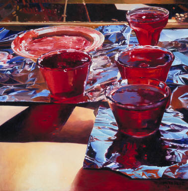
As she so often did, Pratt was working away in her kitchen when she noticed the scene she went on to capture in Red Currant Jelly (1972). She was instantly struck by the sunlight shining through the jelly sitting on the windowsill. “It was afternoon and the window was facing east, she remembers, and the soft light reflected on the metal foil beneath the jelly” (Simpson 2020). Jellies and jams would become a recurring motif in her practice for decades. She took a photograph of the scene; she had only recently begun to use it as a tool or reference point in her painting. Another abiding theme that emerged with Red Currant Jelly is the use of red, a colour with symbolic meaning that runs through her oeuvre, seen in later jelly paintings, or in the blood and guts of her eviscerated chickens or butchered meat.
Watch National Gallery of Canada Curator Jonathan Shaughnessy and Mireille Eagan, Curator at The Rooms in St John’s, discuss Red Currant Jelly in the context of Pratt’s oeuvre:
Alex Colville and Christopher and Mary Pratt were not interested in the art styles and movements that dominated the 1950s and 60s, abstraction chief among them. While the Painters Eleven and their Abstract Expressionism, the Automatistes and Regina Five explored the possibilities of non-objective art, in the Maritimes these artists staked a claim for realism–an Atlantic realism.
LEARNING JOURNAL 10.2
Alex Colville’s work has surpassed the local and, for many, has a universal appeal. His works have been particularly influential for filmmakers. Watch this clip of curator Andrew Hunter discussing his 2014 exhibition at the Art Gallery of Ontario on the work of Alex Colville. In what ways do Colville’s works transcend geography? Why might they be so appealing to writers and filmmakers?
The Emma Lake Artists’ Workshops and the Regina Five
A spirit of artistic ambition and rebellion with regard to abstraction developed in Regina, Saskatchewan in the 1950s. The attitude of abstraction captured the minds of a group of artists associated with the Norman Mackenzie Art Gallery and the Regina College School of Art at the University of Saskatchewan. In 1961, Ronald Bloore, Director at the Norman MacKenzie Art Gallery, curated The May Show at the Gallery. The exhibition featured the work of five young artists: Arthur McKay, Douglas Morton, Edward (Ted) Godwin, Kenneth Lochhead and Bloore himself. Everyone expected paintings of wheat fields, grain elevators and cows but, “instead of the familiar legislative building in Regina and grain elevators and portraits of Mounties,” a visitor to the Gallery “merely found ’abstract’ paintings of senseless splashes of paint which didn’t look like Regina or the prairies at all” (Verrall 81). The May Show impressed the curator of the National Gallery of Canada and that same year it was brought to Ottawa under the title Five Painters from Regina; hence, the moniker they are known by today: the Regina Five. This collective became a hub of avant-garde activity in the city of Regina, a group that also included poet and painter Roy Kiyooka and modernist architect Clifford Wiens.
Seminal to the development of the Regina Five were the Emma Lake Artists’ Workshops in northern Saskatchewan (Emma Lake is near Prince Albert). For more than four decades starting in 1955, the Emma Lake Workshops saw some of the most important gatherings in the nation’s art history. For the Saskatchewan-based artists involved, the workshops were pivotal for their focus on the creation and advancement of a dynamic arts culture in the province and as a way for individual artists to overcome feelings of isolation from the Canadian art centres like Toronto and Montreal. The two-week-long August workshops set the country’s visual culture in dramatic, new, modern directions, particularly in the Prairies and western Canada. The Murray Point Art School at Emma Lake, which ran as a summer school program from 1936 to 1955, was revived by Arthur McKay and Kenneth Lochhead as the Emma Lake Art Camp. Painters McKay and Lochhead invited contemporary artists and thinkers from outside of Saskatchewan to work and exchange ideas with leading local talent. By bringing in significant critics and artists from the outside, they felt they could establish stronger contact with the art world at large, and in this way invigorate their own art. Every year, one artist or critic from outside of the province was invited to lead activities at the workshops, which were meant to introduce a wide-ranging group of Prairie artists to some of modernism’s best-known practitioners and critics. The first Emma Lake workshop, held in August 1955, was led by B.C.-based artist Jack Shadbolt, and the very last one was held in the summer of 1995. In total, some eighty artists and critics came to Emma Lake, including some of modernism’s best-known practitioners and critics: American painter Barnett Newman (in 1959), New York art critic Clement Greenberg (in 1962), Russian-American artist Jules Olitski (in 1964), and American sculptor Donald Judd (in 1968).
Originally from Ottawa, Kenneth Lochhead was Director at the School of Art at Regina College and was the first coordinator of Emma Lake, and the workshops were critical to his own development as an artist. Writing to Lochhead in 1967, Greenberg commented, “You have no idea of how much I’m betting on Saskatchewan as N.Y.’s only competitor” (1979, 41).
VIEW MARION NICOLL’S BOWNESS ROAD, 2 AM HERE
Figure 10.4 Marion Nicoll, Bowness Road, 2 am, 1963. Oil on canvas, 138.2 x 186.3 cm. Glenbow Museum, Calgary.
Of the women artists who attended the Emma Lake workshops, Marion Nicoll is one of the best-known. The artist had begun in 1947 to experiment with the kind of automatism techniques introduced by Jock Macdonald, with whom Nicoll taught at the Provincial Institute of Technology and Art in Calgary. In August 1957 at Emma Lake, Nicoll worked closely with American artist Will Barnet, who had a dramatic impact on her art making: her approach becoming much more flattened, somewhat geometric with hints of the organic and hard edge abstraction. In explaining her style, Nicoll stated:
I hate a mushy line . . . an uncertain intermingling. . . . Painting for me is all on the picture plane, the actual surface of the canvas, with the power held in the horizontal and vertical movements of the expanding color shapes. There can be, for me, no overlapping transparencies or fuzzy edges – all these are a hangover from romantic, naturalistic painting. (Marion Nicoll, 1975, n.p.)
In Bowness Road, 2 am (1963), it is clear that Nicoll’s exploration of abstraction is based on observable things in the world. The painting references her Calgary neighbourhood of Bowness; the earthy colours and abstract shapes give the viewer a feeling of space.
VIEW ROY KIYOOKA’S EMMA LAKE HERE
Figure 10.5 Roy Kiyooka, Emma Lake, 1958. Watercolour on wove paper, 37.8 x 55.5 cm. National Gallery of Canada, Ottawa.
Japanese-Canadian artist Roy Kiyooka was born in Moose Jaw, Saskatchewan, and studied, like Nicoll, in Calgary. Kiyooka’s brother recalled, “Outside of art school much of the socializing took place at the Nicolls’ home in Bowness where artists/students met to argue about modern art/existentialism and the avant-garde in other centres—Les Plasticiens—Montreal—Abstract Expressionism—New York—London—Paris. Bowness was the Paris on the Bow for a short time” (Nasgaard 160). In the 1950s, Kiyooka was a teacher in Regina, working alongside Kenneth Lochhead. He participated in the August workshops many times, and his exceptional watercolour, Emma Lake, which you see here, references nature through experimentation in modernist abstraction. Kiyooka plays with patterns, and the juxtaposition of delicate watercolour brushwork may be inspired by the lake itself.
LEARNING JOURNAL 10.3
Select two artists who participated in the Emma Lake workshops, or two members of the Regina Five. Research their artistic production and compare and contrast two of their works. As part of your research, try to recreate, using any materials you have around you, the works you’ve selected, to get a sense of the artists’ processes and methods.
All eyes on Halifax: NSCAD
Conceptual art was a global movement that focused on local issues and concerns. In Canada there were three centers of conceptual art—Toronto, Vancouver, and Halifax—but it was Halifax that shaped the early Canadian conceptual art scene in the mid-1960s. As a hub for conceptual art, Halifax arose unexpectedly in 1967 with the decision of the Nova Scotia College of Art to hire Garry Neill Kennedy as president.
VIEW GARRY NEILL KENNEDY’S AN AMERICAN HISTORY PAINTING HERE
Figure 10.6 Garry Neill Kennedy, An American History Painting (The Complete List of Pittsburgh Paints Historic Colour Series), 1989. Latex paint on canvas, 193.6 x 122 x 4.9 cm. National Gallery of Canada, Ottawa.
Kennedy brought together his own personal histories and outlook with the basic tenets of conceptual art. Often, Kennedy assigned himself a central task or question, such as “What is the average-size Canadian painting?”, “What is figure painting?”, or “What commercial paints include references to American history in their names?” Then, choosing his materials, he gave himself over to the process in an effort to address that task or question. The resulting artwork is the output of Kennedy’s efforts. For example, for An American History Painting (1989), he stacked, according to length, from floor to ceiling, the names of paint colours in a particular inventory in swatches of those colours. The shortest name in this work is “Gunstock,” which he also uses for the entire background of the piece. This was a coincidence that Kennedy appreciated as he remarks:
It’s an obelisk, and it lists all of these colours one on top of the other. I looked at the names of these colours and I stacked them–56 of them–starting with the bottom one, which is Smokey Mountain Blue and quite long, then the top one which is Gunstock and quite short. If you stack one on top of the other, you get this gradual pyramid. It looks like the Washington Monument. It’s amazing. The military is endemic in this work: Soldier Green; Bunker Hill; Texas Star; Kitty Hawk; Fort Leavenworth. These words are interspersed on this mountain of colours and painted on the wall as you see it at the National Gallery–31 feet high. I was trying to say that the U.S.A. is a country of guns and money (NGC, 1997).
In addition to a lengthy career as a practicing artist, Kennedy was also an adept administrator. He immediately set out to modernize and professionalize the Nova Scotia College of Art by upgrading the facilities; establishing an art gallery to provide a venue for exhibitions by students and faculty; changing the name to the Nova Scotia College of Art and Design (NSCAD); and, most crucially, hiring a new faculty of artists that he had met during his time in art school in the United States. To cultivate a strong bond between NSCAD and New York artists and art institutions, Kennedy invited established American artists, including John Baldessari, Sol LeWitt, and Claes Oldenburg, to visit, give talks, and install exhibitions. These visitors participated in two noteworthy initiatives: the Projects Class and the Lithography Workshop.
The Projects Class was a course run by David Askevold, a conceptual artist working in installations, video, film and photo-text works, sculpture and photography. Askevold selected notable conceptual artists and invited them to submit brief conceptual projects that he and his students would then carry out. For example, Sol LeWitt presented a “to do” list for the class that encouraged students to create:
- a work that uses the idea of error
- a work that uses the idea of incompleteness
- a work that uses the idea of infinity.
Robert Smithson suggested a work that would involve mud being dumped over a cliff. Lawrence Weiner asked students to “remove” some unspecified thing halfway between the Equator and the North Pole.
Visiting artists were also offered the opportunity to produce a limited-edition print with the help of a master printer in NSCAD’s lithography workshop. Typically, 50 prints were made of each work, and the copies split 50/50 between the artist and NSCAD, with the intention of generating sales. The lithography workshop produced more than 170 editions of prints by an impressive list of artists which includes Claes Oldenburg, Philip Pearlstein, Gene Davis, Vito Acconci, Michael Snow, Joyce Wieland, Guido Molinari, Sol LeWitt, Jack Chambers, Eric Fischl, and Les Levine.
Throughout the 1970s, the type of visitors to NSCAD broadened to include artists with a variety of approaches and attitudes, and a range of designers, critics, art historians, and art educators. NSCAD’s reputation as a hub of conceptual activity and as a point of connection for artists and students from across the global conceptual art scene soared within the international art community. While NSCAD became a veritable “who’s who” of minimalist and conceptual artists, even awarding an honorary doctorate to Andy Warhol in 1972, it was a bit of an enigma to much of the local Halifax community. As NSCAD professor Bruce Barber puts it, “conceptual art was one of the truly avant-garde art movements of the 20th century, hence the possibility for an institution away from the center, like NSCAD, to paradoxically become a centre” (Barber 2001). The lithography workshop brought numerous renowned artists to Halifax between 1969 and 1980, helping to establish NSCAD’s reputation as a hotbed for conceptual art—no small feat for a small regional art school in a small city on the rocky edge of North America (Mendritzki 202).
The lithography workshop at NSCAD was resuscitated in 2019. The Lithography Workshop: Contemporary Editions brought eight artists—Shuvinai Ashoona, Jordan Bennett, Shary Boyle, Brendan Fernandes, Amy Malbeuf, Ed Pien, Derek Sullivan and Ericka Walker—to NSCAD to work with Master Printer Jill Graham to create new print editions and re-establish the workshop. Watch an overview video of the relaunched Litho Workshop here:
In this video, you get an in-depth view of artist Shary Boyle’s contribution to Contemporary Editions.
LEARNING JOURNAL 10.4
Develop a piece of conceptual art in the style of Askevold’s projects class. Write an idea or task and have two or three of your friends execute it and share their results with you. In choosing your friends, think about your own community and network of peers. How does it shape the ways in which they respond to your “Projects Class” task?
London (Ontario) calling
Often overshadowed by Toronto, the seemingly-peripheral city of London, Ontario was home, in the 1960s, to a group of artists who decided to challenge and de-centre the centre-periphery model as it applied to art-making and exhibitionary practices. For the next twenty years, the city “drew the attention of the national and international art media for its energetic community of artists, filmmakers, novelists, poets, musicians, and activists who collectively became known as the London Regionalists, or more often and more simply, as the Regionalists” (Regimbal 2014).
Regionalism in London was the subject of articles in popular and art-specific magazines in the 1960s and 1970s, and of a major touring exhibition organized by the National Gallery of Canada in 1966. Despite its name, Regionalism developed a profile of international significance when many artists from London began showing across Canada and around the world, including at the São Paulo Biennial in 1969 and 1987. Canadian novelist and poet George Bowering recalled, “I do remember the eager hubbub of those London, Ont. Regionalists, their homemade art galleries, ironic picnics, theatre workshops, their gladsome business. They gathered” (Regimbal 2014).
London artist Greg Curnoe was an artist-activist and worked primarily as a painter who also experimented with video, sculpture and photography. He was an ardent regionalist, and a key figure in the development of the art scene in 1960s London, Ontario, turning it into an important artistic centre. Rejecting the notion that an artist could thrive only in the big cities of Toronto or New York, he instead founded the Regionalism movement, which celebrated everyday life and experience. Curnoe stated, “Provincialism is what people do when they live, as they think, ‘out in the sticks,’ and they try to imitate what they think is hip in the big centres. Regionalism is simply what people do when they are integrated people, when they are at ease with other people from other environments” (Bruce Kidd, 1973). In other words, Curnoe eschewed the need that many artists felt (and still feel) to emulate the art of bigger centres. He argued instead that you could be “at ease” in a smaller city and produce artworks just as worthy of exhibition and critique as those of New York or Paris.
Watch the video, “Greg Curnoe—You Have To Do Something” for an overview of Curnoe’s role in trying to make London, Ontario “happen” here:
Judith Rodger provides this overview of Curnoe’s contribution to London Regionalism:
Greg Curnoe was, without question, at the centre of the art movement known as London Regionalism. In what he called the “backwater” of London, Ontario, Curnoe’s various studios were the gathering places for a group of artists who supported each other but developed distinct styles of their own. If they occasionally used the word “regionalism” to describe themselves, it was entirely without reference to other movements of the same name around the world. It was Curnoe’s desire to ground his art in authentic, local culture—his daily encounters with his surroundings—rather than in the latest international trend. As he wrote in 1963, “We are not using regionalism as a gimmick but rather as a collective noun to cover what so many painters, writers, and photographers have used—their own environment—something we don’t do in Canada very much” (Curnoe 1963, 9).
Later, after he had named both a magazine and a gallery “Region,” Curnoe explained that he had been unaware of 1930s American Regionalism: “The idea that London’s developing artistic community was an outgrowth of U.S. regionalism was totally inaccurate.” (Curnoe, 1983) What consolidated the group’s name in public consciousness was the National Gallery of Canada’s 1968 landmark Heart of London exhibition, which toured smaller cities across Canada with works by John Boyle (b. 1941), Jack Chambers (1931–1978), Greg Curnoe, Murray Favro (b. 1940), Bev Kelly (b. 1943), Ron Martin (b. 1943), David Rabinowitch (b. 1943), Royden Rabinowitch (b. 1943), Walter Redinger (1940–2014), Tony Urquhart (b. 1934), and Ed Zelenak (b. 1940). (Rodger 2016)
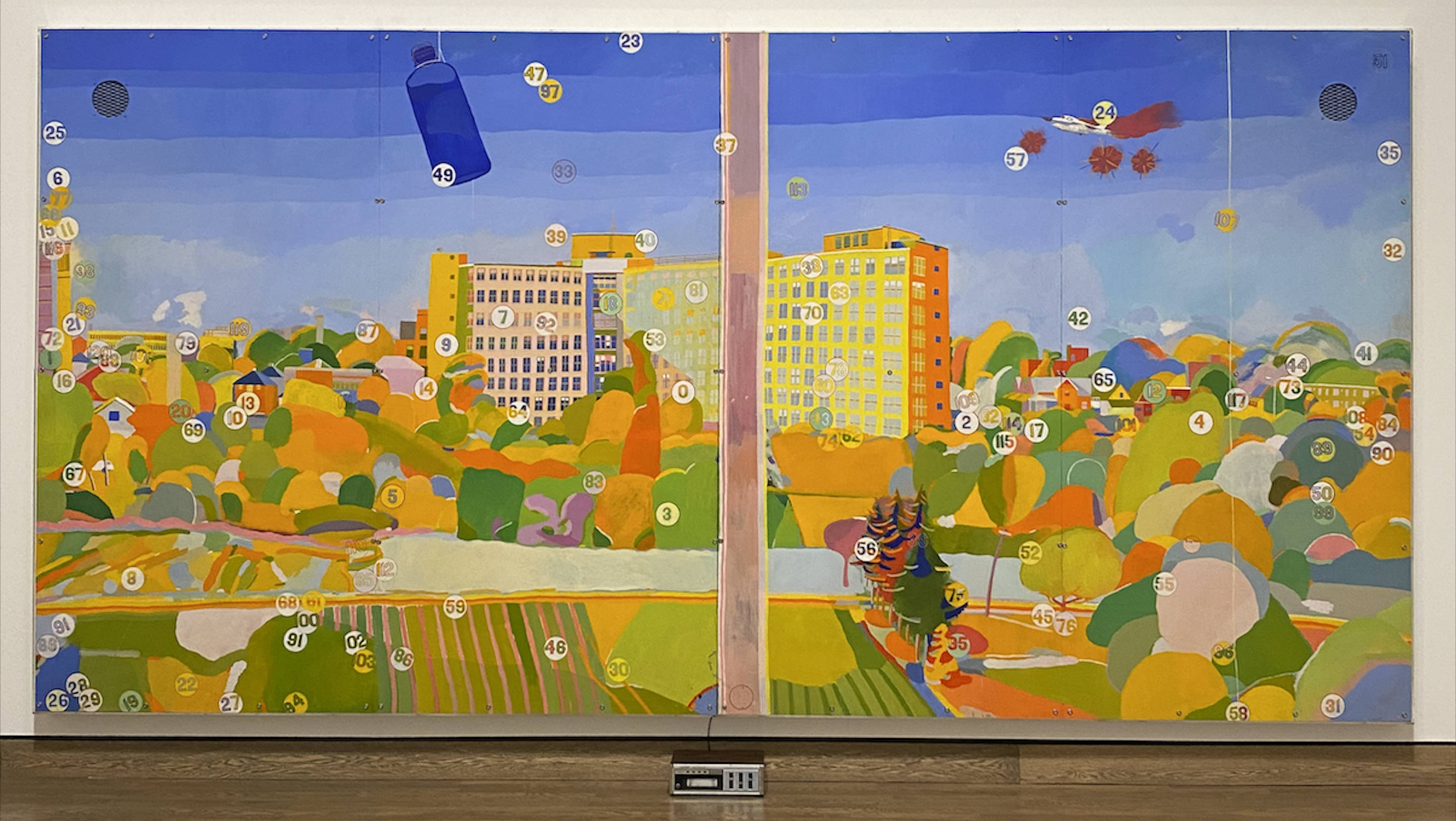
Curnoe’s View of Victoria Hospital, Second Series (1969–1971) is a true multimedia artwork, consisting of oil on wood as well as stamp and ink, wallpaper, a plexiglass frame, an audiotape and tape player, loudspeakers, and an eight-page printed text in a notebook. The book is a guide to the numbers you see painted on the image, which correspond to the various phenomena Curnoe saw and heard from this view of the hospital in London from the artist’s studio: weather conditions, light effects, birds, traffic, clouds floating by. The time and date are also noted in the book, while the tape recordings, which play on the speakers in the gallery space, are of noises Curnoe heard from his studio window. “The spectator is constantly led…to switch from one level to another to recreate through the spontaneous perception of the visual, textual, and acoustical elements, not only the scene in its details, but also the disorder of the events which occurred during the making of the work” (King 222). The viewer experiences the artwork on three levels at the same time—reading, looking, and listening. “The 120 items listed in the notebook provide a kind of guide to Greg Curnoe and, in so doing, the notebook becomes a form of non-linear biography” (King 222). It is also an artwork deeply grounded in the local, thus exemplifying the characteristics of the regionalism to which Curnoe devoted much of his life and career.
Another London, Ontario artist was Jack Chambers. He studied art in London and Mexico before enrolling at the University of Western Ontario. He left in 1953 for Europe, eventually spending time in Spain. This period had a great impact on his personal and artistic life. Chambers returned to Canada in 1961 and began working on his ground-breaking film, The Hart of London. He founded the London Film Makers Co-op in 1967 to encourage the making and distribution of films. Like Curnoe, Chambers was a key player in the London Regionalism scene, an activist, fervent supporter and lobbyist for the rights of artists. In 1969 Chambers was diagnosed with leukemia and given only months to live; however, he went on to live with the illness for nine years. During that time, he won numerous awards and accolades, and set record sale prices for a living artist in Canada. Chambers also took up Victoria Hospital as a subject in a work that is quite different from Curnoe’s.
VIEW GREG CURNOE’S DOUBTFUL INSIGHT HERE
Figure 10.8 Greg Curnoe, Doubtful Insight (Catalogued as What If Daily Life in Canada Is Boring?), March 23, 1987. Gouache, watercolour, stamp pad ink, pastel on wove paper, 117.8 x 190.5 cm. Art Gallery of Ontario, Toronto.
LEARNING JOURNAL 10.5
Curnoe’s oeuvre demonstrates a real interest in how language could be explored through visual art. From an early age, he experimented with rubber stamps, his cousin’s printing press, and even the date stamps from his father’s office. Later, words became the focus of many of his works. Curnoe is also well known for his small-edition artist books. The artwork Doubtful Insight (1987) reads, “What if daily life in Canada is boring?? & what if I am not aware of what is interesting to others about my life??” These phrases represent Curnoe’s investigation of Canadian identity, but more importantly they point to his regional or personal interests and suggest how his regionalism connects to Canadian identity more broadly. Reflect on this artwork and ask yourself the following: What does regionalism mean to you? Do you agree with Curnoe that Canadian identity is regional (based in cities, towns, or other smaller areas), or do you think it is national (based on being Canadian as a whole)? Why?
The Vancouver School
NSCAD saw a flourishing of conceptual activity on Canada’s East Coast. On the West Coast, Vancouver saw a very different form of conceptual activity taking place based on a very specific set of local conditions. As curator Melanie O’Brian asserts in her book Vancouver Art & Economies,
Since the mid-1980s, the once-marginal city of Vancouver has developed within a globalized economy and become an internationally recognized centre for contemporary visual art. Vancouver’s status is due not only to a thriving worldwide cultural community that has turned to examine the so-called periphery, but to the city’s growth, its artists, expanding institutions, and a strong history of introspection and critical assessment. As a result, Vancouver art is visible and often understood as distinct and definable (O’Brian 2007, back copy).
Expo ’86, the Vancouver World’s Fair, catalyzed a boom in developments in the city, such as a new downtown trade and convention centre and a rapid transit system, which raised public expectation of the city and what it could be. It also marked a moment in which Vancouver’s economy became increasingly privatized. This shift affected the social and cultural fabric of Vancouver, very quickly making the city increasingly unaffordable for artists and artist-run centres, and public funding for arts and culture less available.
The term Vancouver School (or Vancouver School of Photoconceptualism) began to be applied to a number of artists in Vancouver around 1990 and always includes Jeff Wall, Ian Wallace, Rodney Graham, Christos Dikeakos, Ken Lum and sometimes Roy Arden and Stan Douglas, though some in this list may be reluctant to identify themselves with the term photoconceptualism. Conceptual photography, or Photoconceptualism, is a type of photography that illustrates an idea. Often it is a type of photography that is staged to represent an idea. The term “Vancouver School of Photoconceptualism” often refers to a common critical sensibility towards photography, rather than a unified aesthetic or formal attributes. While a number of the photoconceptualist artists also make video and sculpture, the Vancouver School as a contemporary brand is forever linked with Jeff Wall’s pioneering use of photographic transparencies: large hyper-realistic photographs that compete with the size and stature of historical paintings found in museums, mounted in shallow boxes and illuminated from behind (Modigliani 2018, 2).
The name “Vancouver School” comes from an essay published in 1990 by Ian Wallace entitled “Photoconceptual Art in Vancouver” in which he outlined the development of Vancouver photoconceptualism as emerging from the intellectual and text-based practices of conceptual art and the late-modernist aesthetics of abstract painting and Minimalism, which Wallace said he and others adopted along with a “postmodern” dose of skepticism towards the modernism that still dominated much of the art world.
This skepticism and criticality was enabled by Vancouver’s marginal or peripheral position in terms of the global art world. It had no significant art market for artists to aspire to during the 1960s and 70s, and so Vancouver artists were deeply engaged with regional themes and images while experimenting in a plurality of media. Vancouver has, over the years, fostered a highly developed intellectual climate that has made the city conducive to an amalgamation of particularly advanced art practices. The work of the Vancouver School launched Vancouver into the international art market; today “Vancouver” has become almost a brand name, denoting such artistic qualities as intellectual rigour, stringent conceptual refinement and precision, and most of all a deeply critical commitment towards the politics of the image and image production in particular. Vancouver’s rise in the international art world in many ways occurred because of its insular location at the edge of the world. Why a tradition of unparalleled artistic intellectualism has originated precisely there—in a city that, by all standards, could just as well be labelled a West Coast backwater fighting off the rivalling shadows of say, L.A. or San Francisco—is an enigma of locale.
The early work of the Vancouver School was focused on the urban fabric and the immense changes underway to the cityscape of Vancouver. From there the artists moved away from the city as subject, but place and landscape remain key concerns in the work of Wallace and Wall in particular. While the work of Wall, Wallace, and Lum, for example, cannot be lumped together aesthetically, there are some characteristics which bind these artists together into a “school.” These artists rejected an image of an idealized local landscape in favour of an anti-theatrical image of Vancouver as a modern centre of industry from the late 1960s onward. They introduced photography and cinematography into the waning dominance of conceptual art in the late 1970s, and made an argument for photography’s capacity to question the postmodern image world. Their works, as previously stated, are characterized by a high degree of intellectualism due in part to the theoretical training of many of them (Wall and Wallace are both trained art historians as well as studio artists).
Ian Wallace graduated from the University of British Columbia in 1968 with an MA in art history and began his teaching career at UBC, soon after moving to the Vancouver School of Art (now the Emily Carr University of Art and Design). He was also a practicing photographer and was among the first photographers to use large-format photography in the 1970s, equating photography with the scale of cinema, advertising, and history painting.
In 1973 Wallace produced his first large-scale panoramic photographic work, La Mélancolie de la rue. The triptych comprises three hand-coloured photographic panels with different images placed in stark juxtaposition: the facade of the new Winnipeg Art Gallery, a bulldozed landscape of the new suburbs, and a squatter’s shack on the Maplewood Mudflats in North Vancouver. By placing together radically different images and presenting them as one work, Wallace opens space for interpretation between the different images in La Mélancolie de la rue, as well as a reflection on the very nature of the medium and the “truth claim” of photography. Coined by cinema studies scholar, Tom Gunning, the term truth claim addresses the belief that traditional photographs index what is seen in a photograph, in other words, that they accurately depict reality. The work of Wallace (and many of his fellow Vancouver School artists) often questions the status of photography, its truthfulness. La Mélancolie de la rue is cited by some critics as the origin of Photoconceptualism in Vancouver..
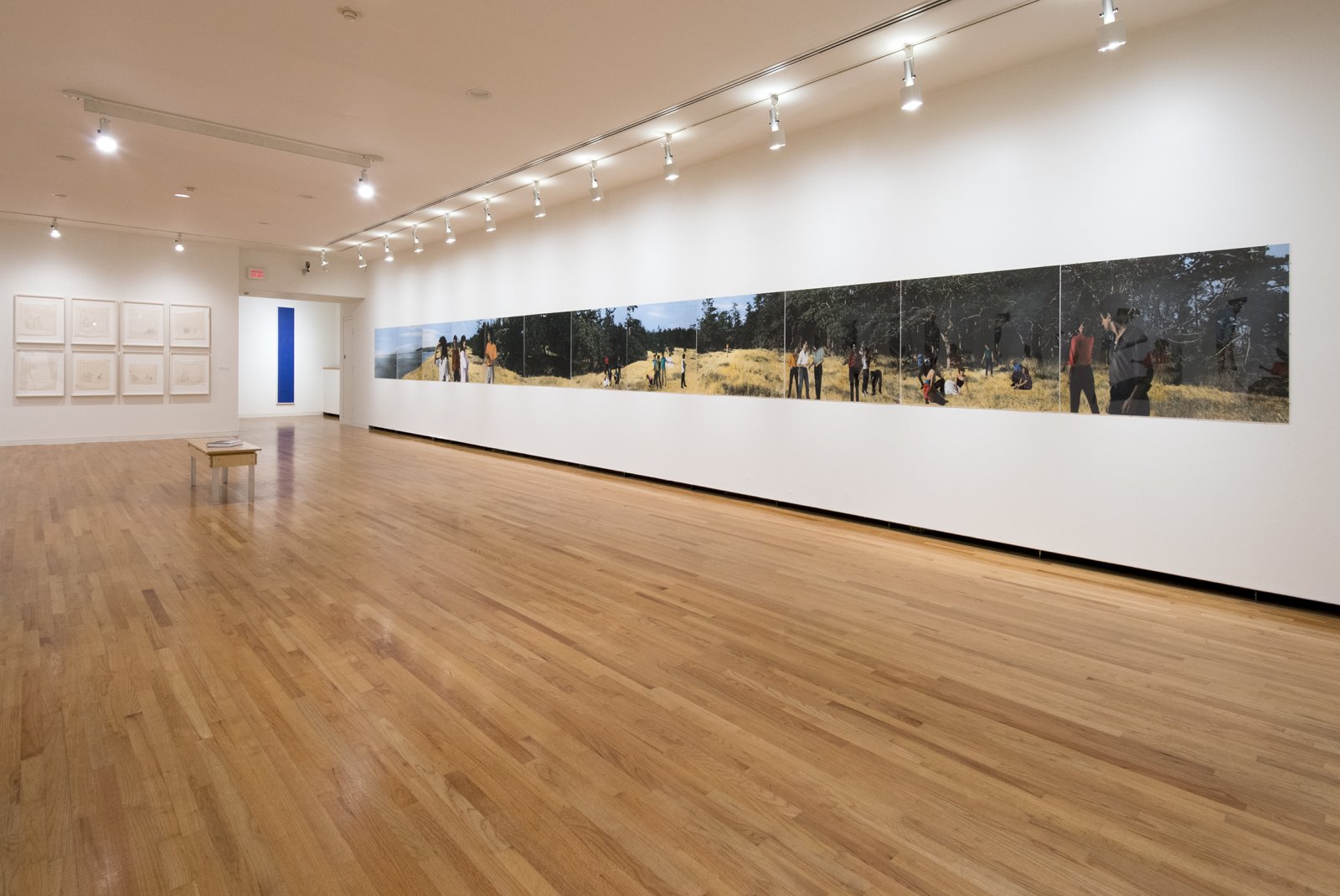
Lookout (1979) is a panorama of a rough Canadian West Coast landscape composed of a succession of moments in time and space. The images are hand-tinted black and white photographic enlargements that span a total length of approximately 14.5 metres and are sandwiched between plexiglas and the wall. The use of the panoramic format, a perspective that extends beyond the scope of human vision, references the impact and historical significance of cinema, while the size of the work approximates the grand scale and importance of history painting. Wallace constructed Lookout by separately photographing the various individuals in his studio (seen on the contact sheets in the installation itself), pasting these figures onto images of the landscape, then re-photographing and hand-colouring the enlarged images. As none of the individuals in the work were photographed in the actual park, Wallace’s composition is fictional. The physical disengagement of the figures emphasizes many peoples’ present-day detachment with nature, reinforced by the urban dress and gestures of the models. The process and meaning are important here—and are what make this work a photoconceptual piece.
The 1980s saw Wallace begin to integrate painting and photography at the same time that he began to exhibit his work internationally. Similar to Andy Warhol’s diptychs and silkscreens, Wallace explores the theoretical and formal possibilities of painting alongside photography’s indexical quality, as seen in the Clayoquot works. It was as a student of art history that Wallace came to his visual arts practice, and this theoretical grounding permeates his sustained meditations on modernist painting, conceptual art, literature, and photography. These concerns are apparent in works like Support/Surface I & II (2007), a diptych in which photographs are laminated onto canvas with large white monochromatic bands on either side. The images of a painter’s studio show a wooden stretcher leaning against the wall, a large piece of raw canvas strewn about the floor, a large unpainted canvas against the studio wall, a level, a bucket with paintbrush and step stool. The works represent the process of representation itself and ask when a painting is in fact, finished. For Wallace, pairing fundamentally contrasting media—the visual emptiness of the painted monochrome against the visually dense, documentary nature of the photographic image—demonstrates a thorough and sustained reflection on the nature of representation as a method to construct meaning in the world.
Ian Wallace and Jeff Wall both began their careers exploring monochrome abstract painting and minimal sculpture before turning to conceptual photography. Their formative work is indebted to earlier conceptual photographic works like Ed Rusha’s Twentysix Gas Stations (1963) and Every Building on the Sunset Strip (1966), which are the opposite of creative photography, or Robert Smithson’s The Monuments of Passaic (1967) in which Smithson photographed various industrial relics he found in Passaic, New Jersey, and re-imagined them as “monuments” from a different time, musing on their artistic significance. Dan Graham’s Homes for America (1966-67) is a particularly important reference point for one of Wall’s most important works, Landscape Manual (1969).
VIEW JEFF WALL’S LANDSCAPE MANUAL HERE
Figure 10.10 Jeff Wall, Landscape Manual (detail), 1969. Self-published book. Morris and Helen Belkin Art Gallery, Univeristy of British Columbia, Vancouver.
Jeff Wall is one of the most influential contemporary artists in the world today and has been credited with an increased attention to and visibility of photography as an important medium in the art world. Wall was a student of Ian Wallace’s at UBC before beginning a PhD in 1970 at the Courtauld Institute in London. He never finished that degree, but he read widely in philosophy; studied art history, sculpture, photography, and film; kept up with contemporary art and art criticism; and delved into the increasingly influential field of critical theory, including film theory. In 1987 he began teaching at UBC, where he still works today. In the early 1970s, after an interruption of seven years, Wall returned to art making and began handling photography in a new way. Set in advertising lightboxes, his large-scale back-lit cibachrome transparencies cast a fresh eye at modern life. All his subsequent works, mostly showing assembled figures or portraits, sometimes partly manipulated, include references to classic painting, cinema, or theatre. Though his works often look documentary, his photographs are subtly out of kilter with the reality they depict.
Jeff Wall’s major work from his early period is his 1969 Landscape Manual, a cheaply printed booklet with typewritten texts and half-tone reproductions of city views of indifferent quality taken from a car window. The annotated text includes a commentary on the making of the landscape photographs. The images illustrating the manual show subjects such as a suburban road with vacant lots, cars, and houses. By using the approach of an instructional book, Wall provides a critical narrative on the generic, de-featured, suburban landscape all the while parodying the “objective” gaze of documentary photography. Landscape Manual is deeply conceptual. Its anti-aesthetic strategy is reinforced by the printed “25¢” price on the cover. This low-tech manual, 40 pages in length and published in an edition of 400, parodies a scientific manual, and as with other early photoconceptualist works by Wallace, Wall’s manual has something of the character of collage or montage and dérive of the Situationists. The work is also a visual examination of the mechanisms of photography; in Landscape Manual, Wall challenges the photographic image as “fact” by illustrating its constructed and contrived making. Photography was historically believed to capture truth, but with this work Wall demonstrates that this is most certainly not the case. The photographs in the manual turn away from literal readings of “Vancouver as it used to be,” to an understanding that “Vancouver never looked like that.”
Figure 10.11 Jeff Wall, Mimic, 1982. Transparency in light box, 198 x 228.5 cm. Copyright Jeff Wall.
Mimic (1982) can be seen as a turning point in Wall’s career, an evolution of his practice. The starting point for Mimic was not another work of art but a racist incident that Wall himself had observed on the street: a working-class white man with his girlfriend in tow had raised his finger to the corner of his eye in a gesture intended to mock the facial features of an Asian man walking nearby. Recreating the incident meant hiring appropriate people to play the three roles, rehearsing the action, and finally staging and restaging the scene until the photographer was satisfied. In other words, the activity was like making a shot for a film, with Wall in the combined position of director and cinematographer. Many critics have referred to Gustave Caillbeotte’s Paris Street; Rainy Day (1877) as a possible source for Mimic, but there is a shift here in that Wall’s photograph does not refer to or depend upon any single painting from the past for its existence.
Writer and art historian Sharla Sava writes:
Pictures such as Jeff Wall’s Mimic (1982), Milk (1984), and Diatribe (1985), or, more recently, A View from an Apartment (2004-05) are compositions intended to convey typical figures whose interpretation relies on the dramatic structure of social meaning. As viewers, we search for the motives which, stemming from the interior world of the subject, have become embodied as recognizable physical gestures. As well, we look to the exterior world portrayed in the picture to see what role these gestures will play in the constitutions of the public world. In each case, the picture, composed of actors posing on location, is an artificial construction of fragments which appears as a dramatic, novelistic unity while the camera, with its indexical relationship to the real, inevitably confirms an element of objective reality…Because the social subjects portrayed in the work are staged and directed, we can see that the use of typology approximates a theatrical, cinematic mode. But they are actors deprived of the ability to speak, frozen in arrested motion. (2007, 56)
What Sava is getting at in her assessment of Wall’s photographs is the artist’s exploration of our faith in images, our belief in representation. Many of Wall’s photographs both reveal the photographic mechanisms involved in producing the final image while simultaneously carefully contriving and orchestrating scenes.
Wall is also well-known for quoting from art history in his large-scale photographs. Watch this TVO video which takes a close look at his painting A Sudden Gust of Wind (after Hokusai) (1993):
LEARNING JOURNAL 10.6
Consider A Sudden Gust of Wind (after Hokusai) and answer the following questions in two or three paragraphs: How does Jeff Wall uphold or push against the idea of instantaneity, in this artwork and in his process? How does the idea of “instantaneity” connect with current culture and cultural products? How do traditional cinematic techniques support Jeff Wall in communicating his concept? Look closely at the characters in the work who don’t all appear to connect. Describe what you think their relationships are; what are they all doing here together?
If what became known as Vancouver photoconceptualism began in part as a reaction to the quickly gentrifying and growing economic climate of Vancouver, it was quickly absorbed by it and participated in it. The artwork of the Vancouver School photographers was quickly commodified into a burgeoning—and most importantly international—art market. Melanie O’Brian charts the shift in Vancouver’s relationship to the art market:
Ostensibly existing outside the effects of an international art scene or the art market, Vancouver has been perceived as a peripheral city that manages to produce remarkable artists without the powerful promotional systems evident in cities like New York or London. It might be argued that Vancouver has now shed its previous status as marginal and arrived on the international art map, commercial endeavors playing an increasingly significant role in its growth and maturation. The tactic toward internationalism is another sign of Vancouver’s changing art economy, and reflects a larger move within the city and province to recognize the benefits of culture to the general economy. Given the effects of globalization on Vancouver, the art world mirrors a shifting aspiration toward the international that can be attributed to at least two significant factors. First, that the visual arts, as part of the cultural sector, have been identified as contributing to the gross domestic product, and second, that the international success of a handful of Vancouver artists has set a benchmark for interested outsiders as well as for subsequent generations of Vancouver artists.
[…]
Within this period of growing international reputation, art and artists in Vancouver were branded, concurrent with the rise of a culture of designer labels and market research. Since the mid-1980s, Rodney Graham, Ken Lum, Jeff Wall, and Ian Wallace (and sometimes Roy Arden and Stan Douglas) have been entangled and exported under the Vancouver School label. French art historian Jean-Francois Chevrier is cited as being responsible for the designation, which is at once useful and erroneous, a term that could only be achieved from a distanced, outside perspective and in conjunction with other such “schools” of practice or thought. It has been argued that this label arose at a moment when consumer labeling—not only for products but for cities and lifestyles—became ever more important to marketers. The assignation functioned to represent Vancouver to an international art world, establishing a benchmark for the manner in which Vancouver art is to be understood. The vehicles for the presentation of Vancouver art include important international museum exhibitions, biennials, and art fairs, pointing to an ideological construct that follows a world’s fair or Expo model to promote identities that serve a dominant paradigm. The artists held under the Vancouver School umbrella do not often exhibit their work in Vancouver and are represented by galleries in New York, London, and Frankfurt rather than in Vancouver (or Canada, for that matter). Thus, the market economy for their work exists internationally, while their intellectual economy is constructed between home and away. (O’Brian 2007, 13-23)
The intellectualism and the criticality of the photoconceptualists in Vancouver came to be at odds with the way their work was co-opted and absorbed into the global international art market, a process which has in many cases stripped the work of its political implications. As Sava writes, “Photoconceptualism has become popular as a term used to address this period of art production in Vancouver. Yet it has been terms such as photoconceptualism which have obscured the political and aesthetic implications of this historical transition” (2007, 50). The 2017 exhibition Pictures from Here at the Vancouver Art Gallery attempted to redress the perception that photoconceptualism is simply apolitical spectacle and the only dominating force in the Vancouver art scene. You can read more about the exhibition here.
Winnipeg Gothic
As in Vancouver, contemporary art in Winnipeg is a product of a unique set of local conditions. In Vancouver, it was the city’s rapid rise to economic prominence that catalyzed its art scene; in Winnipeg, it was the city’s long and storied past. Historically known as the “Gateway to the West,” Winnipeg, Manitoba sits on the eastern edge of the Canadian Prairies. Also commonly referred to as the Forks, for the area’s confluence of two major rivers, it was a crossroads of canoe routes travelled by Indigenous peoples long before European settlement. Under French colonial settlement it became known as Fort Rouge, and it was subsequently named Fort Garry when the British Hudson’s Bay Company established an outpost there. Manitoba joined Confederation in 1870 and developed rapidly after the arrival of the Canadian Pacific Railway in 1881. By 1911, Winnipeg was Canada’s third-largest city.
But the area that Winnipeg currently occupies is layered with a traumatic social history. In 1869–70 it was the site of the Red River Resistance, an uprising led by Louis Riel in which a predominantly Métis group of hunters and farmers from Rupert’s Land sought to maintain occupancy rights to their land and gain recognition of Métis culture as Rupert’s Land came under control of the Canadian government. There was the massive failure of the “Republic” of New Iceland at Gimli; a group of Icelandic settlers granted land near Lake Winnipeg by the Canadian government proved ill equipped for Canada’s brutal winters, and many lost their lives. By 1914, Winnipeg as an economic center declined further when the Panama Canal opened, reducing international trade’s reliance on Canada’s rail system. In this era there was massive unemployment and inflation. The Winnipeg General Strike of 1919, one of the most famous and influential strikes in Canadian history, resulted in Bloody Sunday: troubled by the growing number of protestors and fearing violence, Mayor Gray called in the Royal Northwest Mounted Police, who rode in on horseback charging into the crowd of strikers, beating them with clubs and firing weapons. Other layers of historical trauma have marked Winnipeg: both Russian Mennonites fleeing persecution and Jewish holocaust survivors arrived in search of a safe haven at different moments in Manitoba’s history.
The idea that Winnipeg is haunted by the ghosts of its past has had a profound impact on its artists. Contemporary art offers us a unique and potent means to process collective, historic trauma. Its philosophy informs the work of a number of contemporary artists from the Canadian prairies. Most of these artists don’t set out to recreate Winnipeg’s past; rather, they have a heightened sensitivity to the traumas of history.
The contemporary gothic genre in Winnipeg was found first in the work of the Winnipeg Royal Art Lodge in the 1990s. Gothic was originally a form of 12-13th century architecture, but has come to mean anything dark, broody, and scary, thanks to the 19th-century Victorians. Based in Winnipeg and founded in 1996, the Winnipeg Royal Art Lodge was the collective of Michael Dumontier, Marcel Dzama, Neil Farber, Drue Langlois, Jon Pylypchuk, and Adrian Williams. The majority of the works produced were small-scale drawings and paintings which often incorporated text and a twisted combination of fairy-tale innocence and sinister innuendo. Surrealist influence is evident in some of the Lodge’s drastic dark humour; for example, at their drawing sessions a work would be passed from one to the other, much like the Surrealist exquisite corpse game in which each participant takes turns writing or drawing on a sheet of paper, folding it to conceal his or her contribution, and then passing it to the next player for a further contribution. For members of the Lodge, anything was a suitable surface for their collaborative artworks: matchbook covers, old envelopes, cereal box flaps, loose-leaf paper, hotel stationary. The artists would meet every Wednesday night for years to make art. As time wore on, their ideas and ambitions drifted apart, and they disbanded officially in 2008. Many of the members went on to great things. Marcel Dzama became a bona fide art star.
VIEW MARCEL DZAMA’S UNTITLED HERE
Figure 10.12 Marcel Dzama, Untitled, 2002. Ink, watercolor, and root beer concentrate on paper, 27.9 x 35.6 cm. Museum of Modern Art, New York.
Dzama rose to international acclaim for his drawings of unusual humanoid figures, fantastical animals, and imaginary hybrids. In a review of Dzama’s work in the New York Times, Deborah Solomon writes:
When you first see the art of Marcel Dzama, you may feel you are looking at illustrations from some quaintly antique children’s book. He specializes in pen-and-ink drawings in which pale, slender women routinely meet up with rabbits and talking trees. Yet Dzama isn’t making art for children.
He uses his innocent-looking style to capture a savage contemporary universe, a place that is grimmer than any Grimm’s tale. It’s as if you have wandered off the proverbial path to grandmother’s house and stumbled upon some secret internment camp where bossy personality types (men with rifles, flying bats) oversee the wounded and the weak.
[…]
Born in 1974 in the isolated Canadian wilds of Winnipeg, Dzama grew up in a working-class family, the oldest of three children. His father, a baker, worked behind the cake counter at a Safeway supermarket. (“I made friends with the cake decorator, and she would give me gingerbread all the time,” the artist said.) He recalled himself as a tense, dyslexic youth who had trouble decoding basic sentences and dreaded the pressure of having to stand up in front of his classmates to read a passage from Shakespeare aloud. Early on, he took refuge in drawing; he started a comic strip about his teddy bear, “whose name happened to be Ted,” he said.
He earned his first fame in 1996 as a senior at the University of Manitoba. There he founded the Royal Art Lodge, an ironically named collective that can put you in mind of hunters and wild boar. But this lodge’s members wielded colored pencils, and they sat around late into the night, often working on one another’s compositions; in coming years, they would exhibit together as well, locally at first and then at galleries in Los Angeles, New York and London.
[…]
Dzama spoke of the piece [Snowman Canisters] as a personal farewell to chilly Winnipeg and his entire Canadian past. Yet even the past is never really past, as that other Marcel, the author of “Remembrance of Things Past,” was always reminding us.
Dzama’s work is deeply resonant with the place in which the artist grew up and established his career. His recent shift to creating large-scale tableaus and animated videos, where he uses many characters from his earlier drawings, have propelled him to international success. His work has also been used for the cover of music albums, notably The Else by They Might Be Giants, Guero by Beck, and Reconstruction Site by The Weakerthans. Dzama has produced numerous collaborations with artists and collectives, including the New York City Ballet.
LEARNING JOURNAL 10.7
Diana Thorneycroft is another example of a Winnipeg-based artist whose work, similarly to Dzama’s, considers the darker side of supposedly innocent or benign objects like dolls, toys and cartoon characters. In her series A People’s History she uses dolls and toys to craft scenes of events in Manitoban and Canadian history that are often left out or minimized (much like the art of “peripheries” that we’ve examined in this module). Her use of toys in didactic scenes are unsettling. Art historian David Garneau writes about the series as it was displayed in 2011 at the Art Gallery of Regina that:
Diana Thorneycroft’s photographs are excoriating. They are beautiful instruments designed to cause pain. Her child-like play is tainted by a sinister adult knowingness. Her seductive, richly coloured scenes meticulously contrived with dolls, toys, miniatures and backdrops from “Group of Seven” paintings are reminiscent of photo-illustrated storybooks. But the stories they tell are horrific events from Canadian history. These are not tales of the ‘Mad-Trapper,’ train robbers, rumrunners or other rogues whose crimes time renders into colourful legend. These are our national shames that many would rather bury and forget. […] Thorneycroft has a history of working with dolls. Much of her work concerns the sexualizing and abuse of children. Her pictorial revelations are not designed to titillate but to warn, to break the silence. Secrets shield predators. Perhaps if children were not as protected from adult designs they might be better able to recognize, avoid or call out abusers. I think that Thorneycroft makes these images in a storybook style not to trivialize these events but as a literal model for future story and history books. These are reasonably palatable portals to indigestible realities that children need to know something about in order to protect themselves. Canadians also need to know the fullness of their country’s stories if history is not to repeat itself. (Garneau 2011)
Watch Thorneycroft’s PechaKucha talk delivered in Winnipeg in 2020 on this series.
Choose one work that she shares and investigate the historical scene using one or two online sources such as The Canadian Encyclopedia. How does Thorneycroft’s work interpret the event itself? How does it situate the location where the event occurs and its relevance to Canadian history? How does it unsettle the viewer through her visual style?
Qaumajuq in Winnipeg
Winnipeg has recently made headline news with the opening in 2021 of Qaumajuq, the first Inuit Art Centre, a 40,000 square foot addition to the Winnipeg Art Gallery (WAG). Why was Winnipeg chosen as the location for this important addition to Indigenous visual art in Canada? The WAG has one of the world’s biggest and most extraordinary collections of Inuit art; it has exhibited and published on Inuit art more than any other museum in the world. Qaumajuq (which means “it is bright, it is lit” in Inuktitut) showcases more than 10,000 Inuit works from the WAG’s collection, many of which had previously been relegated to storage. In addition to exhibitions, Qaumajuq will also offer a space for research and education, bridging Canada’s north and south and raising the profile of Inuit art.
Qaumajuq responds to the legacies of colonialism at the WAG. Gabriella Angeleti writes an overview of the inaugural exhibition at Qaumajuq in The Art Newspaper:
A recent online preview event for Qaumajuq began with a land acknowledgement, or formal statement intended to recognise Indigenous communities as the original stewards of the region. The WAG was built on the ancestral lands of the Anishinaabe, Ininiwak, Anishininiwak, Dakota and Dene peoples, and on the homeland of the Métis Nation.
The centre’s inaugural exhibition, Inua (27 March-19 December [2021]), meaning “Inuit move forward together” and organised by a team of Inuit curators, presents the work of more than 90 contemporary Inuit artists, including several new commissions. It will be accompanied by a series of virtual programmes that seek to advance the understanding of historical and contemporary Inuit art.
Founded in 1912, the WAG holds the largest public collection of Inuit art in the world, comprising around 14,000 pieces by more than 2,000 artists that date back as far as the 1880s. In 1964, it became the first museum to organise a major exhibition dedicated to Inuit carvings, and it was the first to appoint a full-time curator of Inuit art in 1972. Despite those milestones, its collecting history—as with most institutions that own Indigenous works of art—is fraught.
The Vienna-born curator Ferdinand Eckhardt became the director of the WAG in 1953 and acquired Inuit soapstone carvings for the museum from the Hudson’s Bay Company (HBC) in Winnipeg, a historic fur trading post that had a pivotal role in the development of Canada and the displacement of Inuit communities. He was later criticised for framing Inuit works as an advanced form of folk art and failing to give the artists the same due as their European counterparts.
Other colonial undertones, like the problematic history of the HBC, its entanglement in colonialism and its role in commercialising and exploiting Inuit artists, were also largely ignored in subsequent shows, some critics argued. Most of what eventually arrived in the WAG’s Inuit collection was donated by Winnipeg-based collectors with ties to the HBC, which now operates as a chain of department stores.
The lead curator of Inua, Inuk art historian Heather Igloliorte, and the WAG’s head of Indigenous initiatives, Julia Lafreniere, who is Métis, say the curatorial framework and programming of the museum will act as a rebuttal to the WAG’s past and challenge the anthropological presentation of Indigenous histories in museums. Organisers will continue to collaborate with a panel of Nunavut advisors to ensure that Indigenous voices are at the forefront from now on (2021).
Watch lead curator and art historian Heather Igloliorte take you through Inua in this virtual tour:
Race, space, and place
Location and place have been important subjects for artists whose work asks viewers to consider how location, identity, migration, and belonging are all intimately connected. What makes a place meaningful to people in personal, political, cultural, and social terms? Can an artist’s image of a place communicate a sense of that meaning? How are ideas of home connected to neighbourhoods, the city, and space? And, in turn, how do these particular places inform feelings of identity and a sense of home?
VIEW ZINNIA NAQVI’S THE WANDERERS HERE
Figure 10.13 Zinnia Naqvi, The Wanderers—Niagara’s Falls, 1988, from the Yours to Discover series, 2019. Inkjet print, 76.2 x 121.92 cm.
The Wanderers—Niagara’s Falls, 1988 (2019) by Zinnia Naqvi is part of a series entitled Yours to Discover, which takes its name from the province of Ontario’s former tourism slogan. The images are contemporary still-lifes that combine found family snapshots with board games, VHS tapes, books, and other objects reminiscent of the 1980s aura of the photographs. The family photographs in each image are from trips take by her parents from Karachi, Pakistan as they considered the prospect of immigrating to Canada. In this photograph, the family is imaged at one of Canada’s best-known tourist sites, Niagara Falls, Ontario. During her family’s reconnaissance missions, they visited other well-known tourist destinations like the CN Tower, Cullen Gardens and Miniature Village.
Zinnia Naqvi is an interdisciplinary artist based in Tiohtià:ke/Montréal and Tkaronto/Toronto. Her work addresses colonialism, cultural translation, language, and gender through the use of photography, video, the written word, and archival material. Through Naqvi’s family tourist visits to places like Niagara Falls, the family were sold on the utopic possibility and seemingly pristine landscapes they encountered. Shortly after immigrating, Naqvi was born in the suburbs of Pickering, Ontario, where she grew up.
Naqvi’s series Yours to Discover was installed outside in Vancouver during the Capture Photography Festival in 2021. Watch a guide to the installation here (note that the video tour is in Korean but with English subtitles):
The incorporation of popular board games and toys gives the images a playful, dynamic appearance; only at a closer reading of the work do its more critical and political aspects become evident. “Resembling still lifes…[s]ome of the objects surrounding the images speak to stereotypical depictions of other cultures—such as Disney’s Aladdin and Pocahontas. Books pertaining to the immigrant experience are also subtly integrated into the compositions, with titles such as The New Pakistani Middle Class and Touring Home From Away visible upon closer inspection” (Martens 2019).
The photographs are carefully constructed still-lifes shot in the artist’s studio. Curator Darrin Martens writes,
Naqvi’s images reflect a shared reality for many people living in Brampton, where more than half of its residents are new immigrants, and visible minorities account for the majority of its population, particularly those of South Asian descent. Traditionally, the tableau vivant incorporated costumed actors strategically placed within a carefully lit, prop-filled scene, which was then painted or photographed to narrate a specific event, action, or idea. In this series Naqvi takes the concept of living pictures to another level of discourse and critical engagement. The Naqvi family’s photographs insert the Pakistani body within these tourist environments, creating a backdrop that challenges traditional pictorial representation. Issues related to consumerism, development, personal agency, and colonial cultural stereotypes are each subtly, yet tactically, embedded into Naqvi’s images (2019).
VIEW SHELLIE ZHANG’S A PLACE FOR WHOLESOME AMUSEMENT HERE
Figure 10.14 Shellie Zhang, A Place for Wholesome Amusement, 2018. Neon and acrylic
30.48 x 127 cm (each).
Shellie Zhang is a Beijing-born artist who lives and works in Tkaronto/Toronto. Themes of tradition, gender, the diaspora and popular culture permeate her works. In her 2018 neon installation work, A Place for Wholesome Amusement, Zhang reimagined the marquee signage of an old theatre that has left important legacies to Chinese and Jewish immigrants in Toronto. The artist was invited to research the holdings of the Ontario Jewish Archives (OJA) for overlaps between Jewish and Chinese histories in the city. Her research at OJA unearthed the history of a building on the north-east corner of Dundas and Spadina at 285 Spadina Avenue that is today a Rexall pharmacy. The building was first known as the Standard Theatre, which opened as a Yiddish theatre in 1922 and five decades later hosted Chinese cinema as the Golden Harvest Theatre (Zhang n.d.). This particular location is adjacent to the historical immigrant ghetto of St. John’s Ward in Toronto, an area that was home to Irish, Italian, Black, Jewish, and Chinese immigrants, among others. It was a lively cosmopolitan area where many immigrants, as Annie Wong notes,
were subject to discriminatory policies and normalized racism. By the 1960s, the neighbourhood was largely demolished for the construction of the new City Hall and Nathan Phillips Square. The displaced Chinese relocated just a few blocks west to become neighbours, once again, with the Jewish community that had established the Standard Theatre in 1921. Over the course of its history, the Standard Theatre underwent various name changes and transformations from its “wholesome” beginnings as Toronto’s first Yiddish playhouse in the 1920s: into a movie theatre, place of burlesque, and then a venue for punk bands and community dance recitals. In 1975, the Hong Kong–based motion picture studio Golden Harvest acquired the building and began screening legendary Kung Fu films starring the likes of Bruce Lee and Jackie Chan, targeted to the growing Chinese audience in Canada (2018).
Watch this video which introduces A Place for Wholesome Amusement:
In A Place for Wholesome Amusement, the marquee designs from the Standard Theatre are reimagined as simplified neon sculptures and based on an historical drawing from the archive, while the design used to represent the Golden Harvest signage is entirely imaginary. Wong analyzes the installation, writing:
By way of this speculation, Zhang also invites us to imagine what social dynamic may have existed within the spatial overlapping of cultures. What can be suggested in the social spaces where Chinese family clan associations formed nearby to where Jewish labour unions were established? Zhang’s playful invention of the Golden Harvest Theatre’s marquee gestures towards what she describes as “a new hope” for future practices of remembering and rethinking “the silos” of the past, the ways in which institutional archives can sometimes produce cultural histories isolated from one another. In this space beyond the residual is a form of collaborative remembering, a narratology shaped by the resilience of past cultural texts and the desire for future pluralistic frameworks. Side by side, the two marquees, in their proximity, propose a kind of kinship, a way to engage in a cross-cultural collective memory (2018).
The neon installation addresses how one site can comprise multiple cultural histories, and how this site served as a “hub for cultural expression and cohesion for two different communities” in Toronto (Zhang n.d.). When the neon sculptures were exhibited at the artist-run centre FENTSTER in 2018, they were accompanied by historic information detailing more than 75 years of the building’s continuous operation, along with reproductions of archival materials. The immigrant stories and histories embedded in places and architecture are made tangible in Zhang’s installation.
LEARNING JOURNAL 10.8
Take a minute to answer the following questions: where were you born, what is your ancestry, and where do you feel a sense of home? What place, what city or location makes you feel at home and like you belong? As “A Place to Belong,” a podcast about the history of multiculturalism in Canada, states:
For many Canadians, the answers to the first two questions probably involve a country outside of what is now Canada. The country we know today has been shaped by policies that encourage immigration and welcome a wide array of people from all corners of the globe. In fact, almost a quarter of Canada’s current population is foreign born. But the journey to a multicultural Canada hasn’t been a straight path. As you’ll learn over the course of this five-part series, government policies in the 19th and 20th centuries restricted or banned mainly non-European communities from entering the country. Even if they were able to settle here, many faced [and face] hardships in a society that historically viewed many immigrants, particularly non-white people, as quote unquote ‘undesirable’ (“A Place to Belong,” 2022).
Thinking about Zinnia Naqvi’s The Wanderers – Niagara’s Falls, 1988, or Shellie Zhang’s A Place for Wholesome Amusement, choose one of these artworks and, in one or two paragraphs, discuss how the artwork you selected engages with themes of migration, belonging, identity, multiculturalism, location, and urban development. Be sure to address visual details in the artworks and consider your own emotional reactions to the work.
OBJECT STORIES
- Jessica Mace on “A Cheap Farm House” (c. 1864—)
- Hilary Doda on Bessie Bailey Murray (designer), Nova Scotia Wool Mural (1953)
- Mark Cheetham on Noel Harding, The Elevated Wetlands (1997-98)
- Gabrielle Moser on Stan Douglas, Every Building on 100 West Hastings (2001)
References
“A Place to Belong Podcast Episode 1: How We Got Here.” 2022. Canadian Encyclopedia. January 19, 2022. https://www.thecanadianencyclopedia.ca/en/article/a-place-to-belong-podcast-episode-1
Angeleti, Gabriella. 2021. “World’s Biggest Inuit Art Collection Revealed at Winnipeg’s New Museum within a Museum.” The Art Newspaper, March 25, 2021. https://www.theartnewspaper.com/2021/03/25/worlds-biggest-inuit-art-collection-revealed-at-winnipegs-new-museum-within-a-museum
Barber, Bruce, David Askevold, Iain Baxter, Gerald Ferguson, Garry Neill Kennedy, Charlotte Townsend-Gault, and Dennis Young. 2001. Conceptual Art: The NSCAD Connection, 1967-1973. Halifax, NS: Anna Leonowens Gallery.
Boyle, John. 1993. “Reflections on Greg Curnoe: He Is Us.” Carnet 1 (Spring): 20-26.
Careless, J.M.S. “Frontierism, Metropolitanism, and Canadian History,” Canadian Historical Review 35, no. 1 (1954): 1-21.
Cronin, Ray. Maud Lewis: Life and Work. Toronto: Art Canada Institute, 2021.
Curnoe, Greg. 1992 “Five Co-op Galleries in Toronto and London from 1957 to 1992.” June/July 1992, Writings File 1992, Greg Curnoe Fonds, E.P. Taylor Research Library and Archives, Art Gallery of Ontario, Toronto.
Curnoe, Greg. 1983. “Region.” Paper presented to the Regionalism Conference, London, ON, October 1, 1983, Writings File 1983, Greg Curnoe Fonds, E.P. Taylor Research Library and Archives, Art Gallery of Ontario, Toronto.
Curnoe, Greg. 1963. “Region=Regionalism.” Gazette (Western University, London, ON), March 15, 1963.
Garneau, David. “Diana Thorneycroft: A People’s History.” Exhibition pamphlet. Art Gallery of Regina. September 1 – October 8, 2011.
Greenberg, Clement. 1979. Letter to Kenneth Lochhead, March 120, 1963. Quoted in David Howard, “From Emma Lake to Los Angeles: Modernism on the Margins,” In The Flat Side of the Landscape: the Emma Lake Artists’ Workshops. Saskatoon: The Mendel Art Gallery.
Innis, Harold A. 1930. The Fur Trade in Canada: An Introduction to Canadian Economic History. Toronto: University of Toronto Press, 1930.
Kidd, Bruce. 1973. “Interviews with Canadian Artists: Bruce Kidd Interviews Greg Curnoe.” Canadian Forum 53, no. 632 (August): 22-30.
King, James. 2017. The Way It Is: The Life of Greg Curnoe. Toronto: Dundurn Press.
Kolb, Ronald, Camille Regli, and Dorothee Richter. 2019. “Centres ⁄ Peripheries–Complex Constellations.” On-Curating 41 (June): 3-11.
Krauss, Rosalind, Denis Hollier, Annette Michelson, Hal Foster, Silvia Kolbowski, Martha Buskirk, and Benjamin Buchloh. 1994. “The Reception of the Sixties” (roundtable discussion). October 69 (Summer): 3-21.
Lee, Anton. 2017. “Unlearning the Vancouver School.” Canadian Art, June 14, 2017. https://canadianart.ca/reviews/pictures-from-here-vancouver-art-gallery/.
Mendritzki, Erica. 2020. “NSCAD Lithography Workshop: Contemporary Editions.” Border Crossings. (March). https://bordercrossingsmag.com/article/nscad-lithography-workshop-contemporary-editions
Modigliani, Leah. 2018. Engendering an Avant-garde: The Unsettled Landscapes of Vancouver Photo-conceptualism. Manchester: Manchester University Press.
Morton, Erin. 2016. For Folk’s Sake: Art and Economy in Twentieth-Century Nova Scotia. Montreal and Kingston, McGill-Queen’s University Press.
Murchie, John. 1997. “Here & There, Now & Agin Regions End Where Countries Begin.” Art Libraries Journal 22(4): 6-23.
Marion Nicoll: A Retrospective, 1959-1971. 1975. Edmonton; Calgary: Edmonton Art Gallery; Glenbow Museum.
Nasgaard, Roald. 2008. Abstract Painting in Canada. Vancouver: Douglas & McIntyre, 2008.
O’Brian, Melanie. 2007. Vancouver Art and Economies. Vancouver: Arsenal Pulp Press.
Powell, Douglas Reichert. 2007. Critical Regionalism. Chapel Hill, NC: University of North Carolina Press.
Régimbal, Christopher. 2014. “Institutions of Regionalism: Artist Collectivism in London, Ontario, 1960–1990.” Fillip 19 (Spring). https://fillip.ca/content/institutions-of-regionalism.
Roh, Franz. 1925. Nach-Expressionismus: Magischer Realismus: Probleme der Neuesten Europäischen Malerei. Leipzig: Klinkhardt & Biermann.
Rynor, Becky. 2017. “An Interview with Garry Neill Kennedy.” Magazine (National Gallery of Canada), February 14, 2017. https://www.gallery.ca/magazine/artists/an-interview-with-garry-neill-kennedy.
Sava, Sharla. 2007. “Cinematic Pictures: The Legacy of the Vancouver Counter-Tradition.” In Melanie O’Brian, ed. Vancouver Art and Economies. Vancouver: Arsenal Pulp Press.
“Slideshow: Mary Pratt’s Luminous Still-Lifes.” 2013. Canadian Art. November 29, 2013. https://canadianart.ca/features/mary-pratt-luminous-still-lifes/
Simpson, Peter. “The ‘erotic’ jellies of Mary Pratt” Ottawa Citizen, April 4, 2015. https://ottawacitizen.com/entertainment/local-arts/the-erotic-jellies-of-mary-pratt
Solomon, Deborah. 2005. “Drawn to Trouble” New York Times, September 4, 2005. https://www.nytimes.com/2005/09/04/magazine/drawn-to-trouble.html
Verrall, Krys. 1999. “Five Painters in Ottawa: The Governance of Exhibitionary Spaces.” Master’s thesis, York University.
Wall, Jeff. Landscape Manual. 1969. United States Documents, August 18, 2015. https://documents.pub/document/jeff-wall-landscape-manual.html.
Wark, Jayne. 2009. “Conceptual Lithography at the Nova Scotia College of Art and Design.” Journal of Canadian Art History/Annales d’histoire de l’art canadien 30 (Fall): 60-91.
Wong-Mersereau, Amelia. 2021. “How To Not Disappear.” Canadian Art. March 4, 2021. https://canadianart.ca/features/how-to-not-disappear/
Wong, Annie. 2018. “Shellie Zhang Recovers Spectral Traces from a Diasporic Past.” Canadian Art. April 3, 2018. https://canadianart.ca/features/shellie-zhang-recovers-spectral-traces-from-a-diasporic-past/
Zhang, Shellie. n.d. “A Place for Wholesome Amusement, 2018.” Shellie Zhang. https://shelliezhang.com/a-place-for-wholesome-amusement1
an interest in the distinctive local character of a specific geographic area
occupies a place between Surrealism and Photorealism; subjects are rendered with a photographic naturalism, but where the use of flat tones, ambiguous and odd perspectives, and strange juxtapositions suggest an imagined or dreamed reality
