6.4 Types of Graphics
Before getting into details on creating, formatting, and incorporating graphics, consider the types and their functions. You can use graphics to represent the following elements in your writing:
- Objects — If you’re describing a fuel-injection system, you’ll probably need a drawing or diagram of the thing. If you are explaining how to graft a fruit tree, you’ll need some illustrations of how that task is done. Photographs, drawings, diagrams, maps, and schematics are the types of graphics that show objects.
- Numbers — If you’re discussing the rising cost of housing in Vancouver, you could use a table with the columns being for five-year periods since 1970; the rows could be for different types of housing. You could show the same data in the form of bar charts, pie charts, or line graphs. Tables, bar charts, pie charts, and line graphs are some of the principal ways to show numerical data.
- Concepts — If you want to show how your company is organized, such as the relationships of the different departments and officials, you could set up an organization chart, which is boxes and circles connected with lines showing how everything is hierarchically arranged and related. This would be an example of a graphic for a concept; this type depicts nonphysical, conceptual things and their relationships.
- Words — Graphics can be used to depict words. You’ve probably noticed how some textbooks may put key definitions in a box, maybe with different colour in the background. The same can be done with key points or extended examples.
Creating Accessible Graphics
Graphics are a key way to persuade and inform your audience, so you’ll want to make sure that everyone can benefit from them. If you haven’t written alt text for your photos, for example, someone using a screen reader couldn’t understand them. Choosing the wrong colour palate would make it hard for someone who’s colourblind (or who’s viewing the material in black and white) to understand your graphics. Choosing a colour that has a negative association in another culture might also give readers a negative impression of your graphics.
Karwai Pun, who works for the U.K. Home Office, has created a series of posters to show how to design accessible graphics. You’ll notice that a lot of the advice works for all users. Take a moment to scroll through these graphics and see how you can apply what you’ve learned when creating charts and graphs in the rest of the chapter.
Poster Image Descriptions
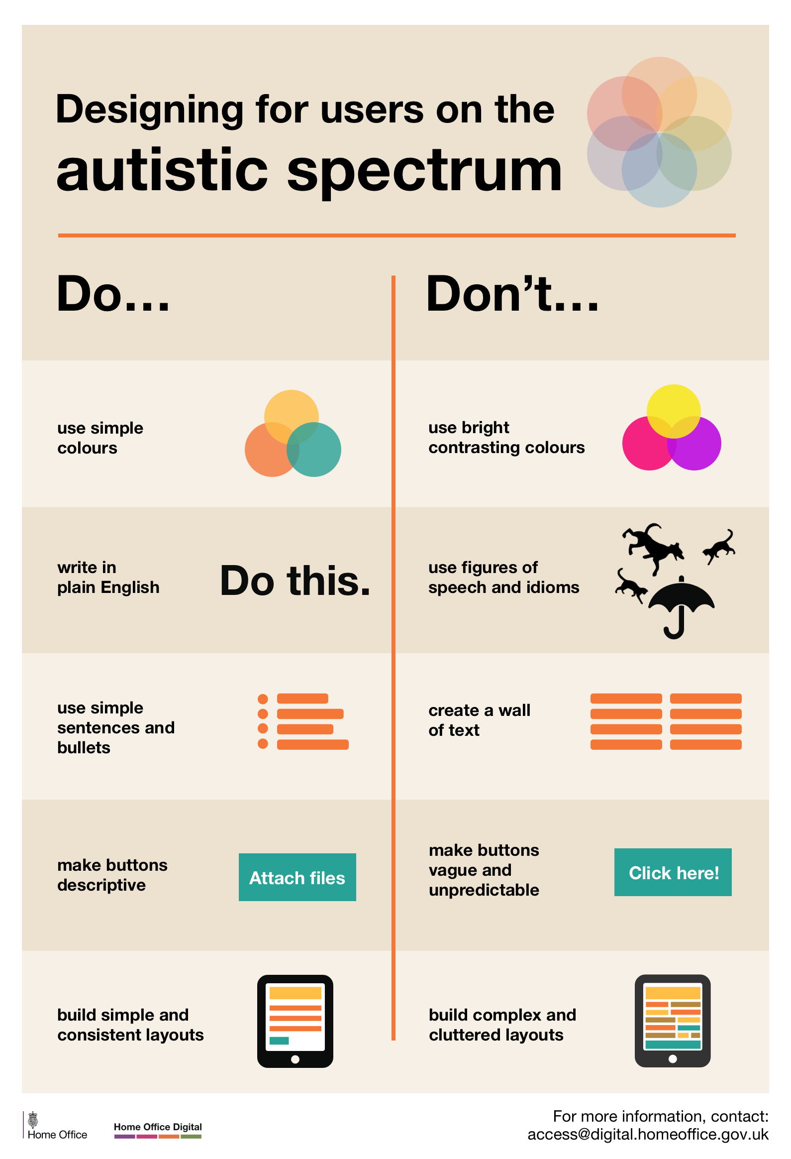
Designing for users on the autistic spectrum
Do
- use simple colours
- write in plain English
- use simple sentences and bullets
- make buttons descriptive – for example, Attach files
- build simple and consistent layouts
Don’t
- use bright contrasting colours
- use figures of speech and idioms
- create a wall of text
- make buttons vague and unpredictable – for example, Click here
- build complex and cluttered layouts
View poster for the autistic spectrum
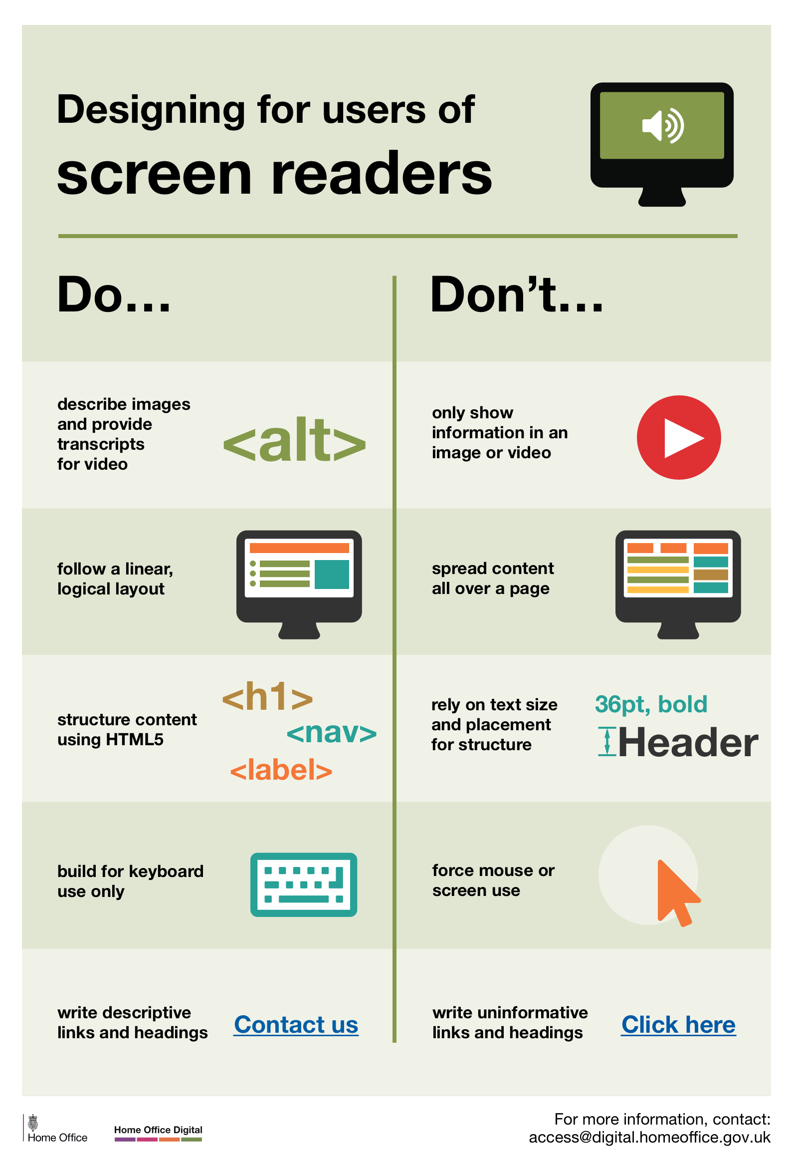
Designing for users of screen readers
Do
- describe images and provide transcripts for video
- follow a linear, logical layout
- structure content using HTML5
- build for keyboard use only
- write descriptive links and heading – for example, Contact us
Don’t
- only show information in an image or video
- spread content all over a page
- rely on text size and placement for structure
- force mouse or screen use
- write uninformative links and heading – for example, Click here
View poster for screen readers
Designing for users with low vision
Do
- use good contrasts and a readable font size
- publish all information on web pages (HTML)
- use a combination of colour, shapes and text
- follow a linear, logical layout -and ensure text flows and is visible when text is magnified to 200%
- put buttons and notifications in context
Don’t
- use low colour contrasts and small font size
- bury information in downloads
- only use colour to convey meaning
- spread content all over a page -and force user to scroll horizontally when text is magnified to 200%
- separate actions from their context
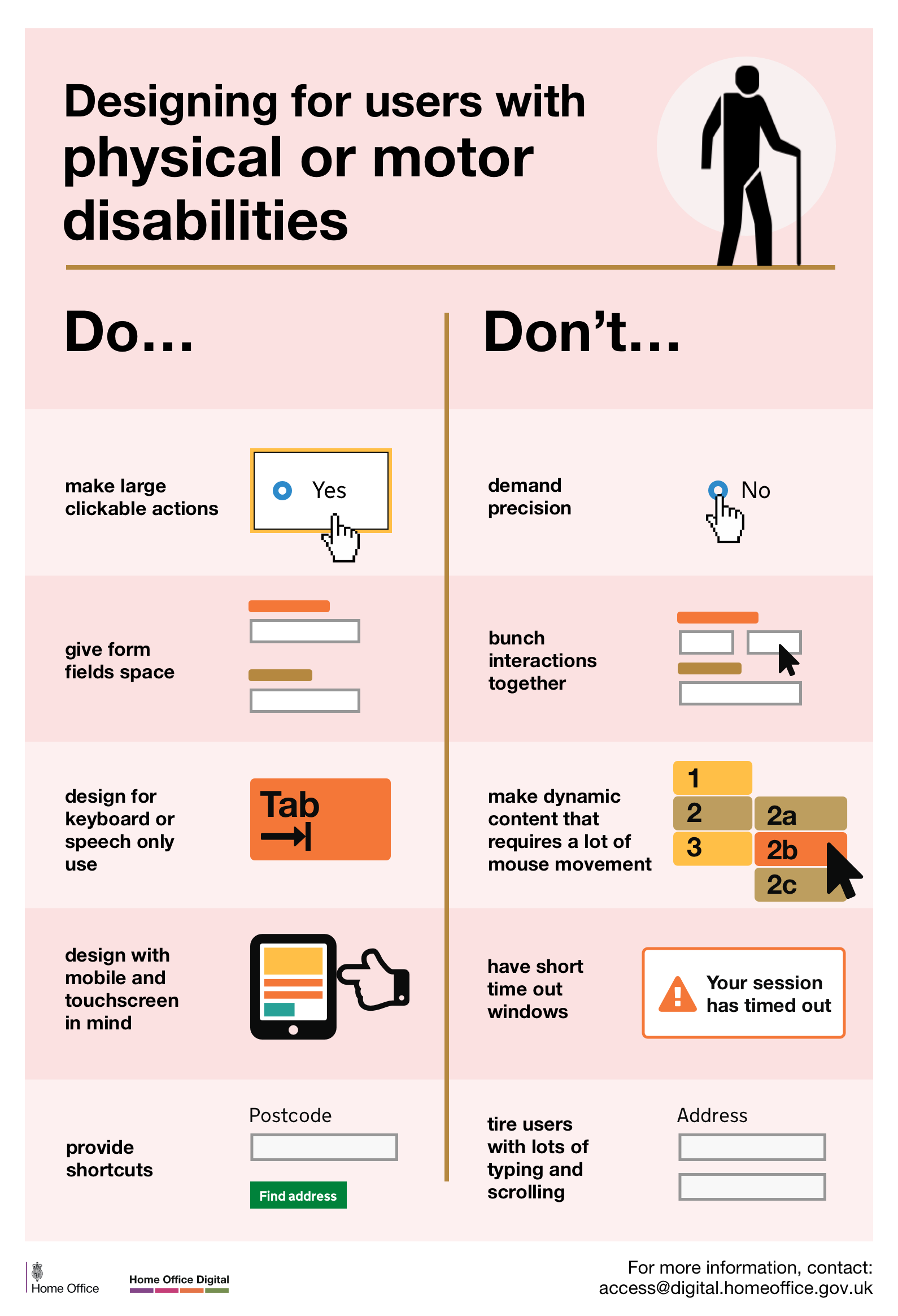
Designing for users with physical or motor disabilities
Do
- make large clickable actions
- give form fields space
- design for keyboard or speech only use
- design with mobile and touch screen in mind
- provide shortcuts
Don’t
- demand precision
- bunch interactions together
- make dynamic content that requires a lot of mouse movement
- have short time out windows
- tire users with lots of typing and scrolling
View poster for physical or motor disabilities
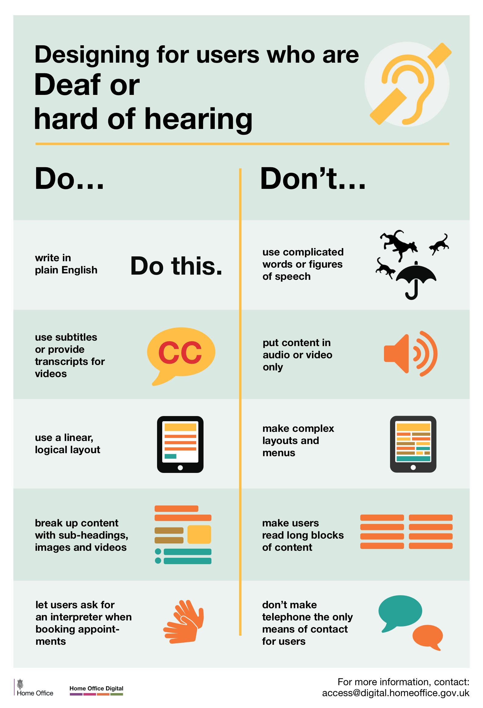
Designing for users who are D/deaf or hard of hearing
Do
- write in plain English
- use subtitles or provide transcripts for video
- use a linear, logical layout
- break up content with sub-headings, images and videos
- let users ask for their preferred communication support when booking appointments
Don’t
- use complicated words or figures of speech
- put content in audio or video only
- make complex layouts and menus
- make users read long blocks of content
- don’t make telephone the only means of contact for users
View poster for Deaf or hard of hearing
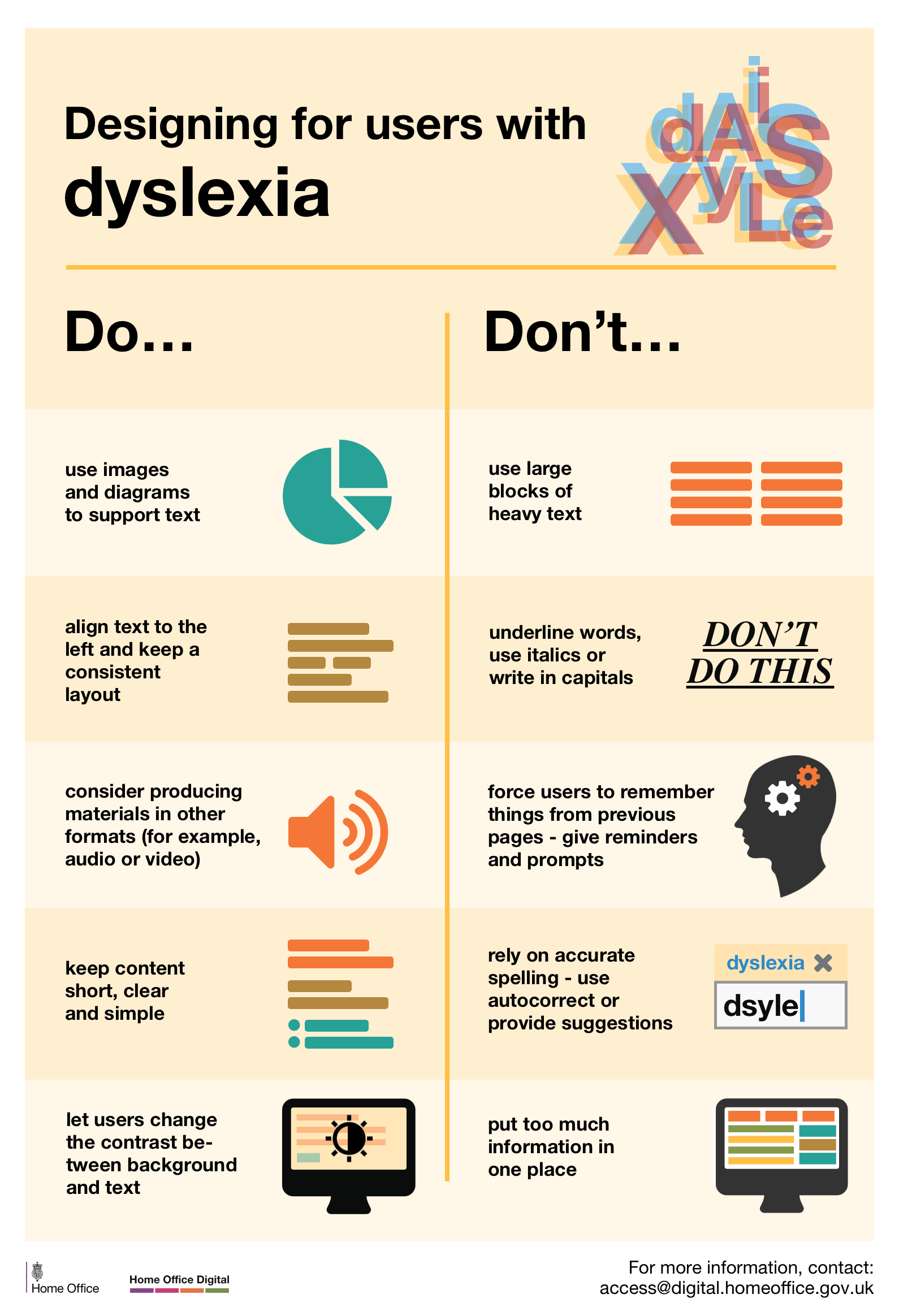
Designing for users with dyslexia
Do
- use images and diagrams to support text
- align text to the left and keep a consistent layout
- consider producing materials in other formats (for example, audio and video)
- keep content short, clear and simple
- let users change the contrast between background and text
Don’t
- use large blocks of heavy text
- underline words, use italics or write capitals
- force users to remember things from previous pages – give reminders and prompts
- rely on accurate spelling – use autocorrect or provide suggestions
- put too much information in one place
This Do’s And Don’ts Of Designing Accessible Services page also contains plain text versions of the posters.
Attribution
“Types of Graphics” from Business Writing For Everyone by Arley Cruthers is licensed under a Creative Commons Attribution-NonCommercial 4.0 International License, except where otherwise noted.
