14.3: Gestalt Theory
Graphic design can be a source of conflict in some workplaces. People often have strong opinions about what they like and dislike when it comes to visuals, and their opinions can be highly subjective and based in individual context. This can make it hard to fairly evaluate graphics when we are not the target audience. It may prove useful to assimilate some technical language to talk about design choices.
Gestalt Theory is a framework that can help us understand how people look at visuals as a whole. It was developed in the 1920s by the German psychologists Max Wertheimer, Wolfgang Kohler, and Kurt Koffka (Pappas, 2014). The term Gestalt means unified whole, and there are six basic Gestalt principles: (1) similarity, (2) continuation, (3) closure, (4) proximity, (5) figure/ground, and (6) symmetry and order.
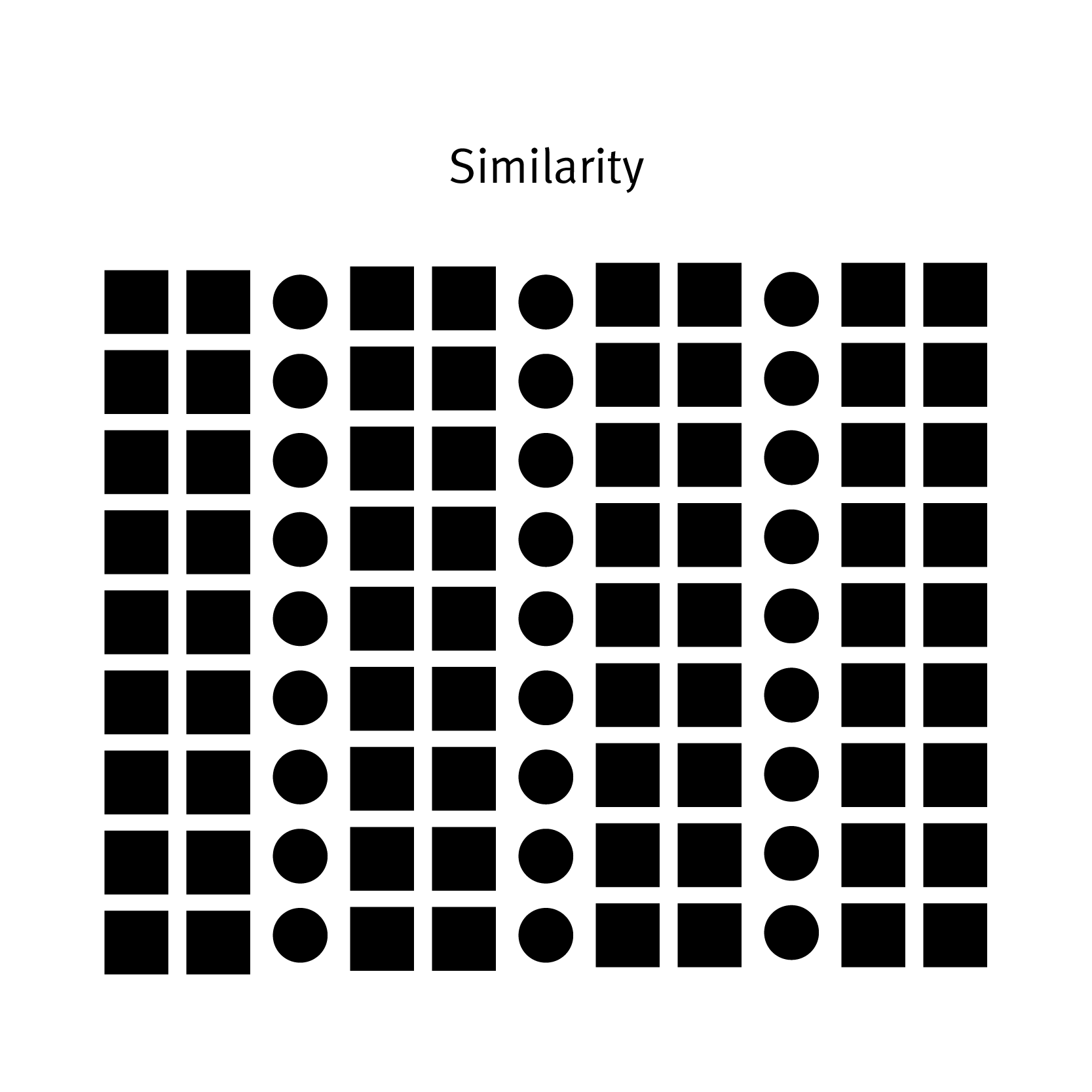
Similarity
Continuation
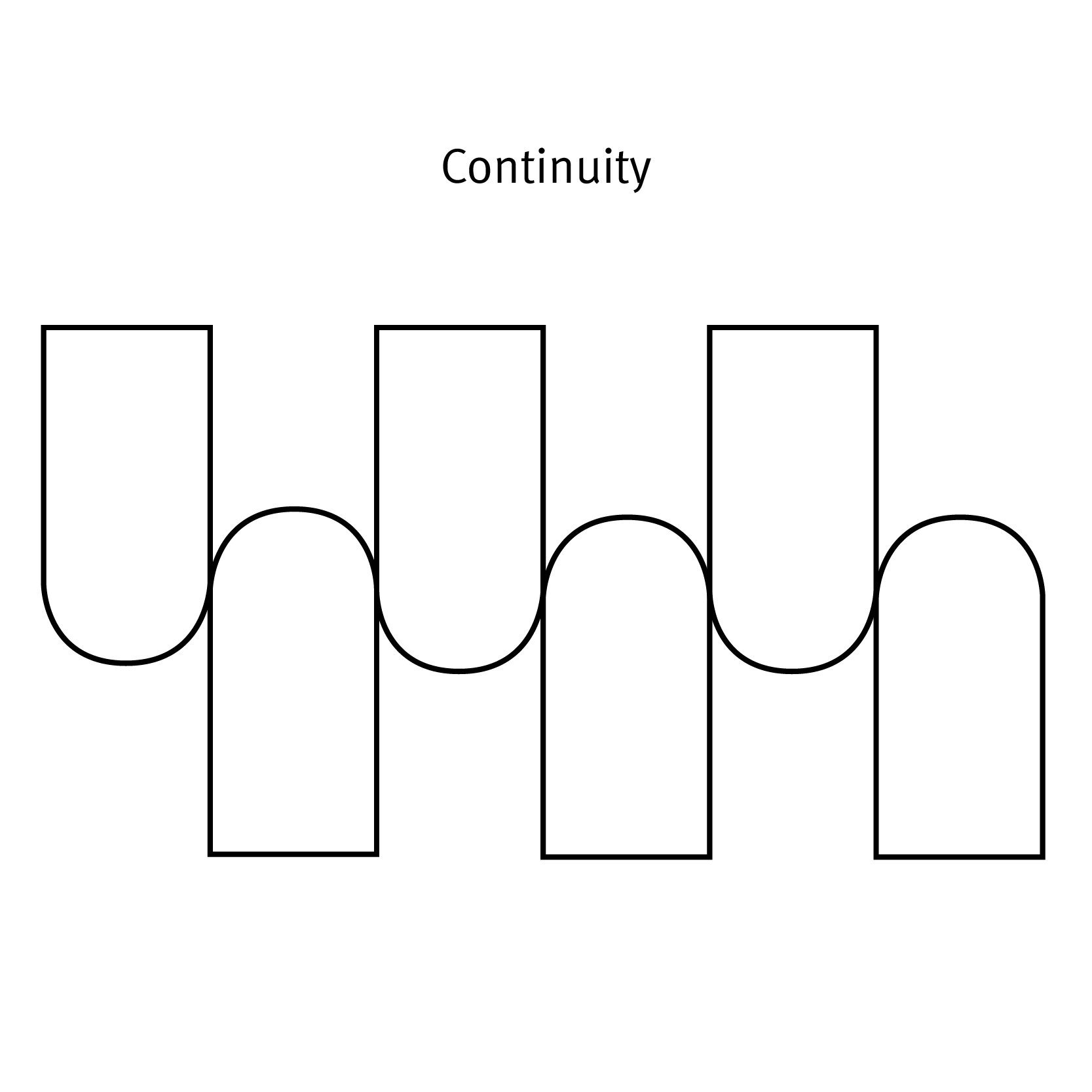
Continuation is the tendency of the mind to see a single continuous line of connection rather than discrete components (see Figure 14.3.2). The eye is drawn along a path, line, or curve, as long as there is enough proximity between objects to do so. This tendency can be used to point toward another element in the composition, or to draw the eye around a composition. The eye will continue along the path or direction suggested by the composition even when the composition ends, continuing beyond the page dimensions.
To understand this principle, think about this famous optical illusion, which is a drawing of a tree that has several faces hidden in it. You’re able to see the faces because your mind “continues” the lines to complete the shape of the face.
Closure

Closure is a design technique that uses the mind’s tendency to complete incomplete shapes (see Figure 14.3.3). The principle works if the viewer is given enough visual information to perceive a complete shape in the negative space. In essence, the mind ‘closes’ a form, object, or composition. In the example above, the triangle is formed by the viewer’s mind, which wants to close the shape formed by the gaps and spaces of the adjacent circles and lines. The partial triangle, outlined in black, also hints at the missing shape. The above optical illusion is also an example of closure, because your mind ‘closes’ the head shape.
Proximity

Proximity is an arrangement of elements that creates an association or relationship between them (see Figure 14.3.4). If individual elements are similar, they will probably be perceived first as a whole and second as discrete components. If, like the example above, some of the components form to create a large ‘whole,’ similar elements positioned away from the main shape will also be associated with the large shape. In this case, the viewer interprets them as falling off or away from the main shape. The shapes used do not have to be geometric to create the effect of proximity. Any components that are similar in shape, colour, texture, size, or other visual attribute can achieve proximity.
Thinking about proximity helps you to think about how your audience is finding relationships between the parts of your document. For example, if a photo is under a headline in a newspaper, the audience will associate the two elements. Many of the headlines contained in this list of famous newspaper gaffes, for example, are proximity errors.
Figure/Ground
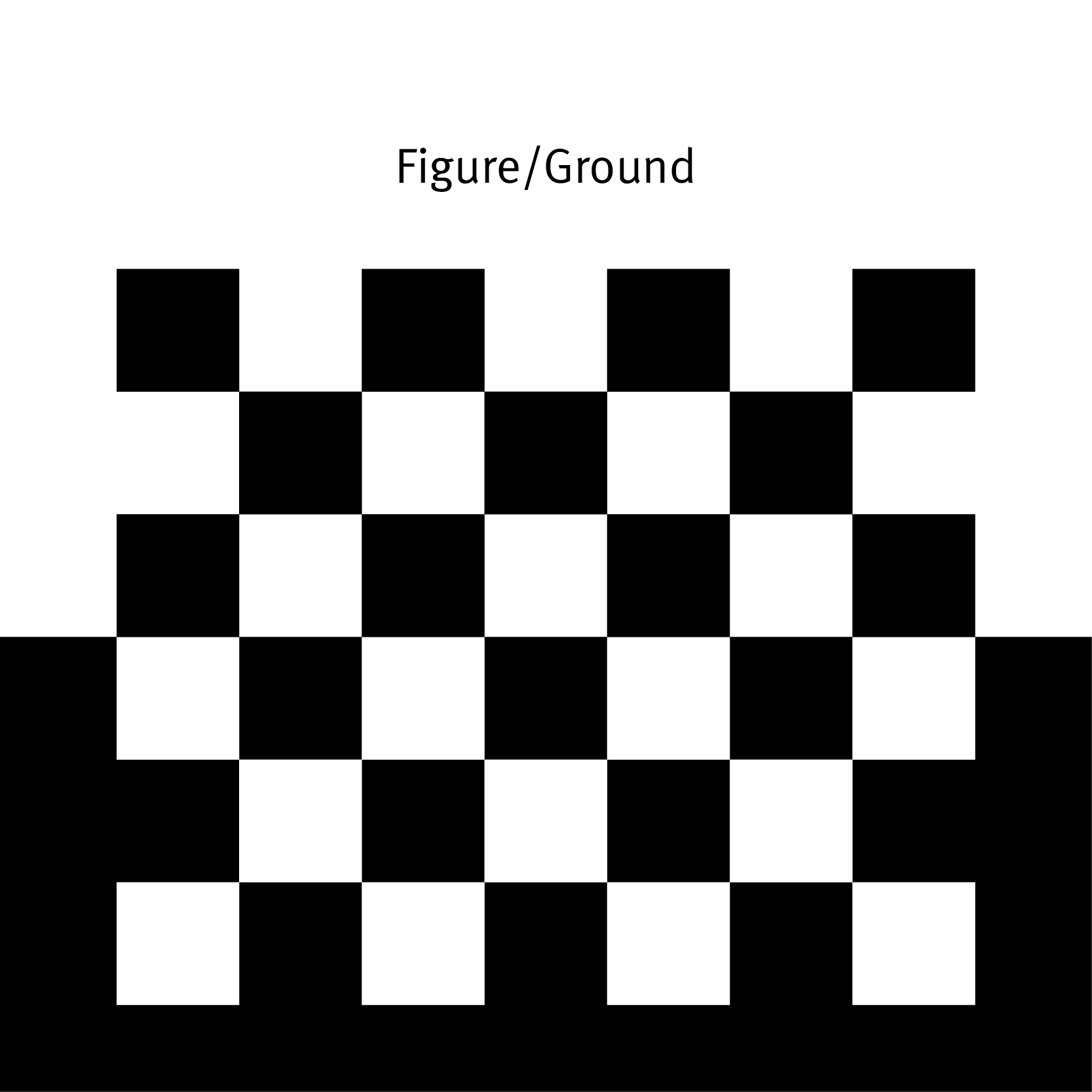
Figure/ground segregation refers to the contrast between the foreground and background of an image. Graphic designers often use this principle to design negative space around an object. The area where it’s most commonly used is when laying text over an image. If there is not enough contrast between the figure and the ground, the reader will not be able to read the text.
Symmetry and Order
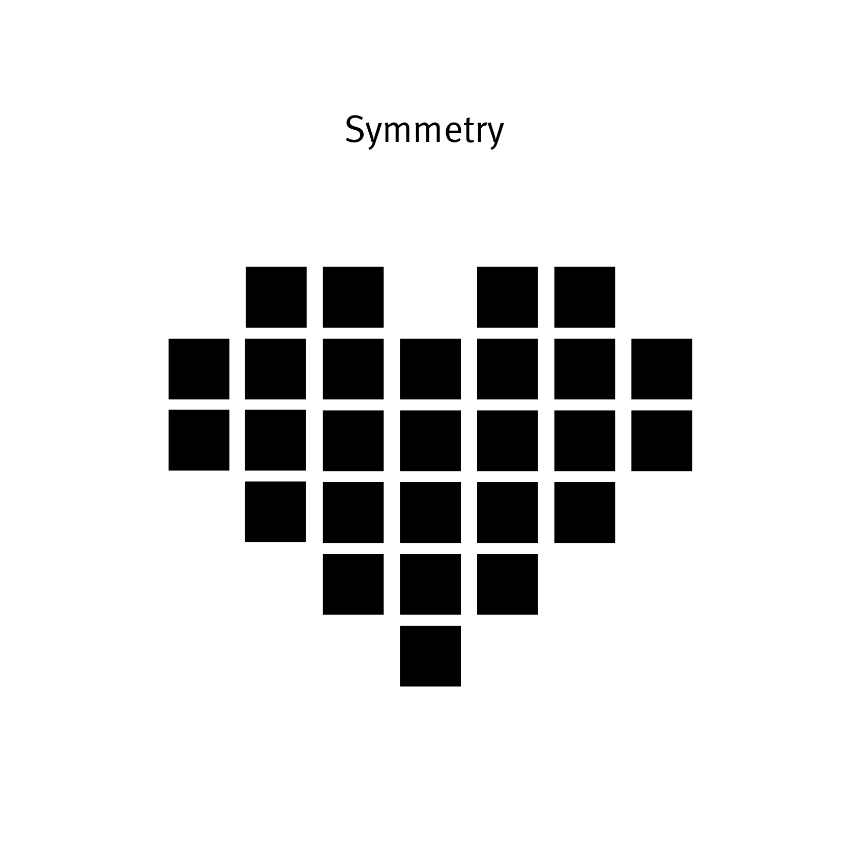
Symmetry and order follow the premise that a composition should not create a sense of disorder or imbalance (see Figure 14.3.6), because the viewer will waste time trying to mentally reorder it rather than focus on the embedded content. The photographic example in Figure 14.3.7 is composed symmetrically and allows the viewer to concentrate on the figure in the centre. Achieving symmetry in a composition also gives the composition balance and a feeling of harmony.

Image Description
Figure 14.3.2 image description: A series of rounded rectangles lined up to create a continuous curvy line across the shapes to illustrate the principle of continuity. [Return to Figure 14.3.2]
Figure 14.3.7 image description: A poster for the Chicago World’s Fair, which has a strong sense of symmetry in its composition. There is a big tower stretching across the middle of the page and two smaller towers of equal lengths on each side of it. [Return to Figure 14.3.7]
References
Pappas, Christopher. (2014, January 7) Instructional design models and theories: Gestalt theory. https://elearningindustry.com/gestalt-theory
