Module 1: Structuring Your Online Course
Structuring the Online Environment
Our course shells are essentially websites for our courses. Though their use is restricted to registered students, and doesn’t involve much actual web development, they are used by students like websites. This layout can have an impact on the overall quality of the course.[1]
Reflection
The Goal: Creating a Learner-Centred Shell
We are all familiar with the learning outcomes that drive our course content and our assessments. But what is our goal when we are designing the structure of the course?
In a basic sense, the goal of a learning management system is to facilitate the transmission of course content and learning activities. We might say that a successful course structure is one that involves the least time spent finding things, and the most time spent engaging with learning materials. Instructors should aim to create course shells that are clear and easy to navigate.
A recorded lecture, no matter how good, is useless if students can’t find it. A discussion thread is only engaging insofar as students can easily participate in it. As a result, the goal of the LMS is to be learner-centred. We are creating a structure for students, and its success is dependent on how well students are able to find the materials they need, participate in activities, and engage in learning.
How to create a learner-centred course shell?
One thing we can do is put ourselves into our students’ shoes. Pretend that you are the student who is logging in for the first time and navigating your course. Look back at the reflection activity that you’ve just completed, and then take a look at your course. Would your course be enjoyable or frustrating to navigate? Is your course easy to use? Is everything laid out clearly? Would you find everything easily if you were logging in for the first time?
Tip: Your LMS should have a “Student View” or similar feature that displays the course from the student’s perspective. This is a great way to evaluate your own course design.
Activity: Course Scavenger Hunt
Pick one of your courses (an old course works well), and ensure that all content items and assignments are visible. Turn on Student View and find a partner/friend/child (don’t ask a fellow instructor!) Ask them to navigate through your course. They should have no trouble finding anything, even if they haven’t been in school for years or have never used this LMS. See if they can locate the following items. They are not allowed to ask you any questions.
If you don’t have anyone to ask, enter Student View and try your best to emulate a user entering the course for the first time.
Basics:
- the course’s schedule
- the date of the final exam (if applicable)
- the first assignment: what is it, when is it due, and where can they submit it
- the instructor’s email
- the location of the first week’s material (if synchronous, where can they find the virtual classroom; if asynchronous, where are the learning materials)
- the topic taught in week five
Advanced:
- the weighting of all assignments
- the course’s learning outcomes
- the course’s late marks policy
- how can they submit their assignments?
- are quizzes done synchronously as a class, or are they open for a longer period of time?
Feel free to add anything here that is relevant to your course.
How did they do? Was everything easy to find? Was it frustrating? Anything in particular that confused them?
Explore your LMS
Whatever the results of your first analysis of your own course, the sky is not the limit. In reality, we are limited by our LMS. Whether you use Blackboard, Canvas, Moodle, D2L, or another course management tool, we as faculty must create our courses within the bounds of our LMS. Each has its own strengths and weaknesses. It is important to explore its functionality and limitations. Knowing what you can and can’t do will help you brainstorm realistic design and structural changes to implement.
Tip: Ask your department coordinator or chair to see if you can get an empty course shell without students. This will give you a sandbox area to play with, testing out ideas and structures without interfering with a live course. If you can’t get a course, ask your IT department when students lose access to a course. Once they do, a course from an old semester can be used to test out new ideas.
Ease of Navigation
We want our courses to be easy to navigate. We want students to spend as little time as possible looking for material and as much time as possible engaging with the material.

In 2001, a web designer popularized the idea that good websites should be structured such that everything a user wants can be found within three clicks.[2] This makes sense: we might assume that students would get frustrated if they can’t find what they are looking for. The more clicks it takes, the more likely it is that a student will give up.
We definitely want to avoid frustrated students: students who are angry or anxious are not going to learn well.[3]
However, the three click rule is heavily disputed and has generally been abandoned.[4] This is probably good news, since the restriction would be very onerous for faculty.
This module proposes a different principle: Everything should be easily findable. Don’t make students think about where to find things. Make them think about the course material.
The path to any item (an assignment, video, or discussion board) should be easily understood. We don’t want students to think about where things are. We want that part to be obvious. We want them to save their brain power for engaging with the material, not finding it or trying to figure out what it is. Unsurprisingly, students responded positively to courses that involved minimal time finding specific pieces of information.[5]
Below are a set of tips for faculty to apply in their own courses to make content obvious in its location and its place in a course. Select an item to learn more about it.
Naming Tips for Clarity:
Select a topic below, marked with an arrowhead, to reveal more information.
Descriptive Naming
Whenever you create something in your course, you have the opportunity to name it. Using names that describe the content is a simple way to create a sense of order in your course.
For example, instead of naming something “Lesson 1,” use a title that describes the content of the lesson, such as “Lesson: Introduction to Plato.” Instead of naming something, “Assignment,” try, “Assignment 1: Annotated Bibliography.”
Your course template may have default items in them. Rename them to better reflect how you use them. For example, if you have a “Course Information” section that has only the course outline and schedule, you could rename it. “Course Outline & Schedule.” Though it is a small change, these things add up and make navigating the course much easier.
Download transcript [PDF] | Watch the ~20-second video Module 1: Descriptive Naming [Video].
Tip: AODA requires us to rename links to a description of where they go. Consider the following:
- A raw link: https://www.gutenberg.org/files/1656/1656-h/1656-h.htm
- A descriptive link: Read Plato’s Apology
A screen reader or other assistive technology will either read out a link’s text to the user or ignore the link entirely. Neither is ideal for students. So, naming your links is not only great for clarity, but also a requirement under AODA.
Listen to a screenreader read out this tip:
Provide Metadata
Similar to naming things descriptively, adding in metadata to the names will make mental indexing easier. Consider the following ways of organizing a course’s weekly learning modules:
Download transcript [PDF] | Watch the ~20-second video Module 1: Provide Metadata [Video].
You can probably imagine that, over the course of a 14-week semester, adding the week number helps students (and yourself) mentally index content to easily find what they are looking for.
In the same vein, we can provide students with metadata in other places:
- number assignments
- differentiate between: assignments, discussions, knowledge checks, and other activities
- include key information for assignments (due date and weighting) in their name or description
Be Consistent
No matter how you organize your course, it should be consistent from week to week. Whatever organizational method you adopt, it should be applied throughout the course. It helps if each week has a similar layout. For example, you could start each week with an introduction and to-do list, then move onto the lectures and activities.
This doesn’t mean that you need to use the same activities each week, but that the general organization of each week should be consistent.
Navigation Tips for Easy Pathways:
Select a topic below, marked with an arrowhead, to reveal more information.
Use Course Links
We don’t know how our students will interact with our course. Course links are a great way to provide multiple pathways through our course. For example, we could have all our assignments in an “Assignments” folder. In addition, each weekly folder can also have links to that week’s assignments. This way, students could get to the assignment directly from the “Assignments” folder, but also access their assignment the week they are introduced to it.
You might also want to put a link to an assignment when creating a weekly communication with students or if you’re creating a to-do list. The idea is to create pathways that are relevant to the student at an appropriate time. You wouldn’t put a link to the first assignment in a communication in the middle of the course, and neither would you put a link to an “Introduce Yourself” activity in week 5.
Download transcript [PDF] | Watch the ~1:30 minute video Module 1: Use Course Links [Video].
Use the Menu
Your course should have a main menu that you can customize. Using this menu to your advantage can create a really easy navigation experience for students. In addition to considering the names of these items (remember to give everything in your course an accurately descriptive name), consider whether your most commonly used tools and places are there.
Take a high-level look at your course and reflect on what tools and places students often visit in the course. Are they easily accessible from the menu? Is the path to each destination clear?
For example, if you use a discussion board a lot, it might be worth creating a link to the discussion board in the main menu. If students have multiple journal assignments throughout the semester, it makes sense to add a shortcut to their journal page in the menu. Combining these general shortcuts with individual shortcuts (e.g., a link to the first journal in the first week, a link to the third journal in the appropriate week) makes everything easier to find.
Here are some example course menu items:
Watch the ~30-second video Module 1: Course Menus [Video].
Consider your Landing Page
Your LMS may let you change your course’s entry point. If this is the case, consider changing it to create a “homepage” that has the information that students need. Perhaps it is a to-do list for the week, or a reminder about an upcoming assignment, or a link to the schedule or calendar, or your most recent announcement. Maybe the current home page goes somewhere that is useful for your course.
Unlike a website, which can have multiple entry points, your course usually has only one. Thinking about what information you want students to see when they enter the course can be very helpful.
A Matter of Balance
We are all familiar with the concept of chunking content to present it in more digestible formats. The idea was popularized in the 1950s by a thinker who concluded that human short-term memory is capped at remembering seven things.[6] However, since then the simple rule of seven has been criticized. Others have suggested four chunks, but reaching any particular number is controversial.[7] Rather, it is more likely that the limit of visual overload and short-term memory retention varies from person to person, task to task. Humans in general might remember fewer rather than more, and prefer smaller groupings, but each individual’s limits are determined by their individual context. Creating balance in your course is important. Put too many things into your menu (in an effort to make everything easily found), and the menu will quickly overwhelm and each individual item will lose its emphasis. Place too few items in the menu and it ceases to have value. You might be able to use dividers, headings, or hierarchy trees in your menu. This will certainly help create structure. You’ll need to explore your LMS to find out what you can and can’t do. The same goes for navigational pathways. Put too many pathways, from everywhere to everywhere, and there is no logic anymore. Finding a balance that works for you and your students takes time and experimentation.
Grouping Tips to Keep Students Focused:
Select a topic below, marked with an arrowhead, to reveal more information.
Create Folders or Modules
Folders or modules are a powerful way to group content. Without it, our course will just be a list of items, activities, text, images, and videos. We might have nice descriptive labels, but without folders all these things will be in one big list.
Think about your own computer: are all your documents in the same place as your music, videos, and photos? Probably not. You likely create and use folders to give a sense of structure to your computer. Applying the same principles to your course is a good idea.
It’s a good idea to create folders or modules for each week’s materials, putting them into one convenient place, especially if you have many each week. If your course is synchronous and doesn’t have more than one item per week, creating folders might wind up being counterproductive. There’s no point in making a folder if you’ll only put one thing in there!
On the other hand, if you have several pieces of content for one week, and three of them are all information about a quiz, consider creating a folder called “Quiz 1 Information” (or something similar) to help visually separate and group similar categories of content.
Download transcript [PDF] | Watch the ~1:00 minute video Module 1: Create Folders [Video].
Embed Content
Embedding refers to the ability to integrate web items (activities, graphics, videos) into another post. For our purposes, this means that instead of linking out to an external website with a video (YouTube, for example), you can embed that video inside your course’s LMS. Primarily, this speaks to the grouping principle, where students will be able to see text content, images, videos, and activities all in the same page without having to navigate out of the course.
It also helps generally when we talk about confidence and clicks. Opening multiple tabs, going to multiple websites can easily overwhelm a user and cause them to get lost. By embedding content, we can keep things visually together as much as possible and keep the student from having to navigate outside our course.
Tip: Many activities and videos that you might use will have their own embed code. It is usually denoted by the “< >” symbol. Simply copy the embed code into an HTML editor in your LMS. If you need help figuring out how to embed content, contact your library or educational technology expert to show you the ropes.
Not everything can be embedded, and some things that can be embedded don’t always offer you a neat code to use. You can try this code to see if it works:
<iframe width=”825″ height=”825″ src=”URL”></iframe>
Download transcript [PDF] | Watch the ~1:00 minute video Module 1: Embed Content [Video].
What can you embed?
- videos and multimedia (YouTube, Vimeo, MS Stream, SoundCloud)
- Google Forms/Microsoft Forms
- Google slides and other Google Office Products
- PowerPoint slides (when hosted on OneDrive)
- Activities such as:
- Mentimeter
- Padlet
- EdPuzzle
- Mural
- Quizlet
- Flip Grid
- H5P
Reach out to your librarian or ed tech specialist to determine which ed tech tools your institution currently recommends, alongside tips and tricks to help you embed content.
Linking Out: Websites and Files
Sometimes we can’t help but have students navigate outside of our course. They’ll need to visit web pages, go to the library, review documents, or participate in activities that can’t be embedded into the LMS.
When linking out (to the library for example), set the link to “Open in the current window.” This allows the user to use the backspace to get back to the LMS. Students who don’t realize that they are in a new tab can find the experience disorienting and frustrating when the “Back” function on their browser doesn’t work. Of course, there may be times when a workflow is interrupted or there is a loss of data (such as when filling in a form) that results from opening a link in the same window. In such cases, opening a link in a new window is preferable. You can also use descriptive names for the links to specify when it opens in a new window, which provides useful metadata for your students.
For files, we are tempted to upload Word documents, since that is usually the file type we do our work on. However, most internet browsers do not support viewing word documents online. This means that when you upload a Word document, the student will download it to their computer. They will then have to open it on their own computer.
On the other hand, all browsers support viewing PDFs online. So, when a student clicks on an uploaded PDF it will open on their browser. They will be able to download it from there if they choose. Essentially, this keeps the student’s attention on their internet browser where the course is housed. They can easily flip between the PDF and anything else housed on the LMS.
Keeping Students on the Same Page
Research has shown that students are more engaged when learning items (readings, assignments, activities, etc.) for a particular week are grouped together visually on a single page.[8] This makes sense — students can get lost quickly if they need to jump around the course shell to complete their assigned tasks.
Introducing Your Structure to Students
Now that you’ve created your course’s structure, you’ll have to introduce this structure to students. Your students may be familiar with navigating other courses using the same LMS, but it’s their first time using your course. You might do things a little differently from other instructors, so it’s important to present an overview of your course. We’ll want to introduce two parts of our course: how to navigate the structure we’ve built in the LMS, alongside how the pieces of the course (activities, readings, lectures) fit together. Introducing the first helps students understand the lay of the land, while introducing the second helps them figure out what they are looking for.
Select a topic below, marked with an arrowhead, to reveal more information.
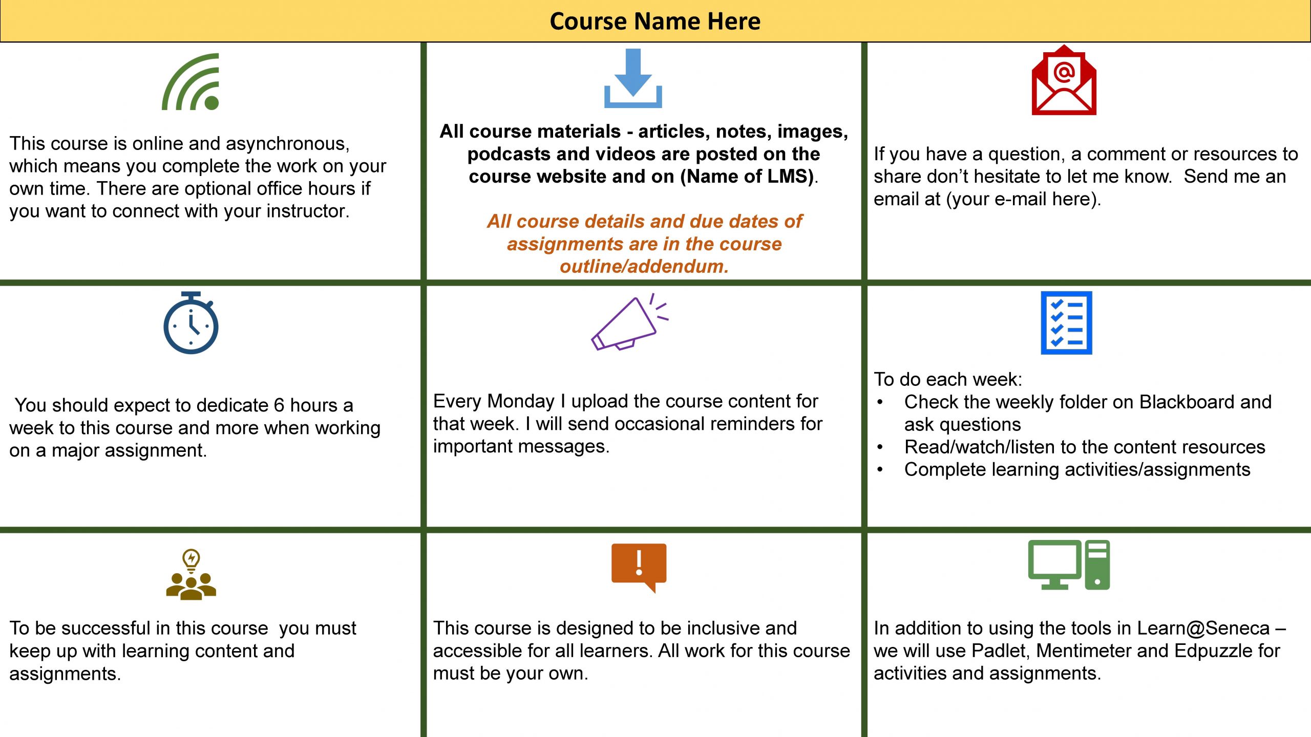
Create a High-Level Course Overview
Take a look at your syllabus — it probably lists the assessments you’ll use and their weighting. That’s a really useful way for students to see what is involved in the course. But there is much more that takes place in your course. Things like lecture attendance expectations, educational tools used, whether office hours are regularly scheduled, time commitments, whether there are readings or activities, or how often learning materials are posted.
Similar to the course description in the syllabus, you are providing a description of how the course will run. Knowing these things can help students better understand what they need to succeed and what sorts of things they should be looking for. You could share this information via a graphic or text paragraph.
You can download the following High-Level Course Overview template of the image below and edit it to suit your own course in Adobe Acrobat or other PDF editing software.
Give Students a Tour
Now that you’ve created your course’s structure and put the activities, outlines, content, and assessments where they belong, you’ll want to show students where to find things. A nice way to do this is to create a screencast of you going through your course while narrating what you’re doing. Students will be able to see exactly where to find things, and understand the unique organizational method that you’ve chosen for your course.
Much like how you’d explain the weighting of a quiz, or tell students what your late policy is, it also makes sense to tell them where to find things and how to navigate the course’s structure.
Tools to use for screen casting:
- PowerPoint
- QuickTime
- Loom
- Screencast-o-matic
- any virtual conference meeting tool (record a meeting with just you)
Ask your librarian or educational technology specialist for recommendations on software to use and tutorials to get you started!
Key Takeaways
Strive to make courses easily navigable as possible. Three main principles to keep in mind are:
- Use descriptive names for content and provide metadata
- Create pathways through the course that make sense from the student’s perspective
- Group like content together
Additional Resources
- How we create intuitive (Findable & Usable) online learning experiences?
- Online Course Design Best Practices Checklists [PDF]
- "Designing a High-Quality Online Course," California Department of Education. ↵
- Zeldman, J. (2001). Taking Your Talent to the Web: A Guide for the Transitioning Designer. Indianapolis: New Riders. ↵
- Goleman, D. (2020). Emotional intelligence. New York: Bantam Books, 183. ↵
- See: Laubheimer, P. (2019, August 11). The 3-click rule for navigation is false. Nielsen Norman Group. Retrieved November 22, 2021, from https://www.nngroup.com/articles/3-click-rule/, UX myths. (2010, June 1). Myth #2: All pages should be accessible in 3 clicks. UX Myths. Retrieved November 22, 2021, from https://uxmyths.com/post/654026581/myth-all-pages-should-be-accessible-in-3-clicks and Porter, J. (2016, March 25). Testing the three-click rule. Centre UIE Center. Retrieved November 22, 2021, from https://articles.uie.com/three_click_rule/ ↵
- Troop, M., White, D., Wilson, K. E., & Zeni, P. (2020). The user experience design for learning (UXDL) framework: The undergraduate student perspective. The Canadian Journal for the Scholarship of Teaching and Learning, 11(3), 11-12. https://doi.org/10.5206/cjsotl-rcacea.2020.3.8328 ↵
- Miller, G. A. (1956). The magical number seven, plus or minus two: Some limits on our capacity for processing information. Psychological Review 63 (2), 81–97. ↵
- Cowan, N., Morey, C.C., & Chen, Z. (2007). The legend of the magical number seven. In Sala, S. (Ed.), Tall Tales about the Mind and Brain: Separating fact from fiction (pp. 45-59). Oxford University Press. ↵
- Rubin, B., Fernandes, R., Avgerinou, M. D. & Moore, J. (2010). The effect of learning management systems on student and faculty outcomes. (S2). Internet and Higher Education 13, 82–83. ↵
